The Advanced Counter widget from Element Pack Pro lets you display animated numbers in a clean and engaging layout. It helps highlight statistics, milestones, or achievements with customizable styles and animation controls. This documentation explains how to use and customize the Advanced Counter widget in Elementor.
Enable The Advanced Counter Widget
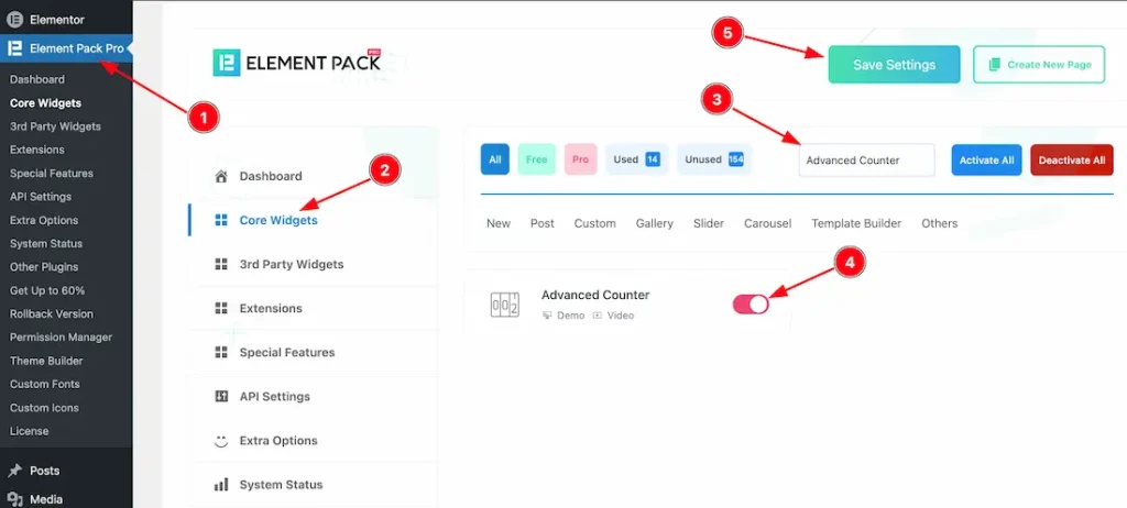
To use the Advanced Counter widget from Element Pack Pro, first, you have to enable the widget.
- Go to WordPress dashboard → Element Pack Pro Plugin dashboard.
- Then, Click the Core Widgets Tab.
- Search the Advanced Counter Widget Name.
- Enable the Advanced Counter Widget.
- Hit the Save Settings Button.
Inserting The Advanced Counter Widget
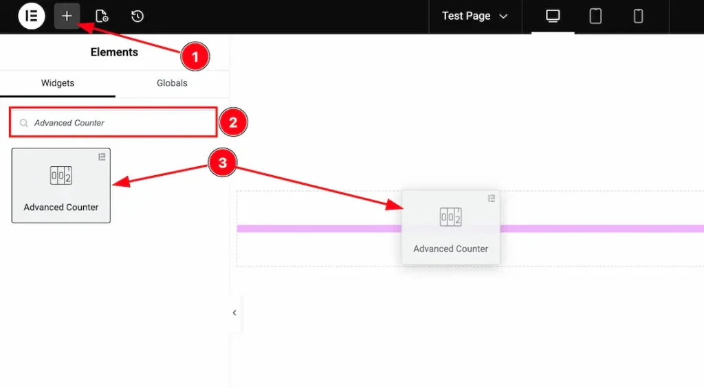
1. Go to the Elementor Editor Page and hit the “+” icon Button.
2. Search the Advanced Counter name.
3. Drag the widget and drop it on the editor page.
Work With The Content Tab
Counter Layout Section
Go to Content → Counter Layout
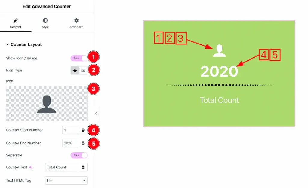
1. Show Icon/Image: Enable/disable the show icon/image switcher button to show/hide the icon/image from the counter.
2. Icon Type: Here, you can choose the icon type- icon and image. Here, we select the icon type – icon.
3. Icon: This option lets you set the counter icon.
4. Counter Start Number: You can set the counter start number from here.
5. Counter End Number: You can set the counter end number from here.
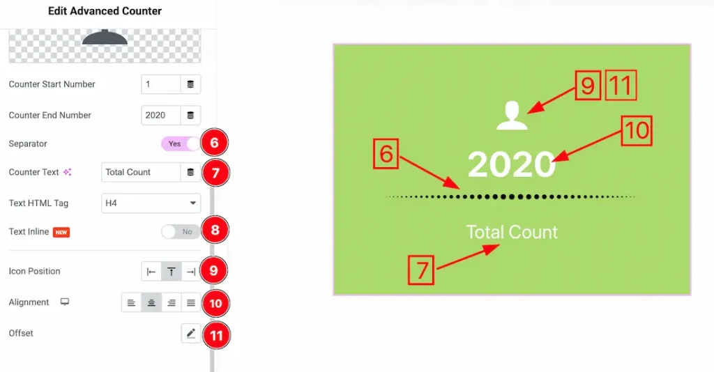
6. Separator: Enable/disable the show separator switcher button to show/hide the separator from the counter.
7. Counter Text: This option lets you change the counter text.
8. Text Inline: If you enable the text inline switcher button, then your counter texts will appear in a single line.
9. Icon Position: You can set the icon position left, Top and right.
10. Alignment: You can set the counter text alignment- left, center, right, and justify.
11. Offset: You can set the icon’s horizontal and vertical offset from here.
Additional Options Section
Go to Content → Additional Options
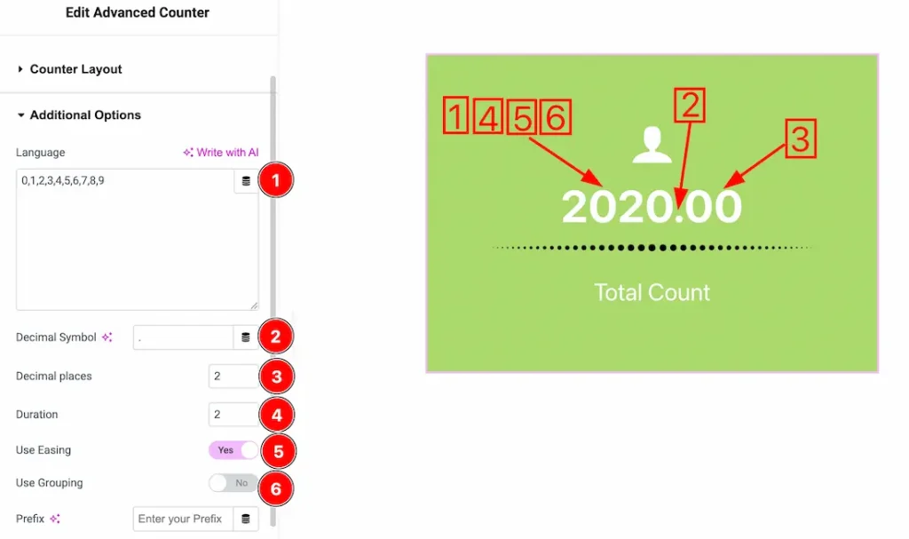
1. Language: You can put your preferred language inside the language field.
2. Decimal Symbol: You can add your preferred decimal symbol inside the decimal symbol input field.
3. Decimal Place: You can set the counter’s decimal place from here.
4. Duration: You can add the counter animation duration from here.
5. Use Easing: Enable this option to apply a smooth animation effect to the counter while it increments.
6. Use Grouping: Enable this option to separate large numbers with a grouping symbol (e.g., 1,000) for better readability.
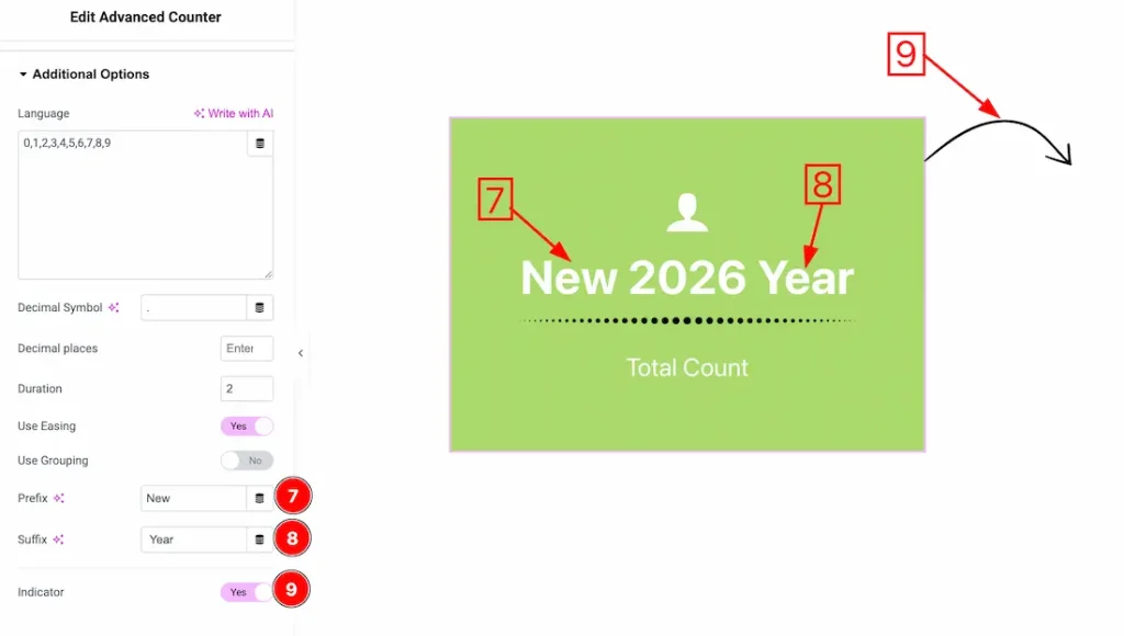
7. Prefix: You can set the counter prefix from here.
8. Suffix: You can set the counter suffix from here.
9. Indicator: Enable/disable the indicator switcher button to show/hide the indicator from the counter.
Work with The Style Tab
Icon/Image Section
Go to Style → Icon/Image
Come to the icon/image section, you will get two customization options- Normal and hover. Lets preceed with the normal tab section-
1. Icon Color: This option lets you change the icon color.
2. Background Type: You can change the color of the icon/image background to classic or gradient. Here we choose the Background type Classic.
3. Background Color: This option lets you change the icon background color.
4. Padding: You can add the icon/image padding from here.
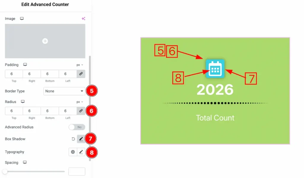
5. Border Type: You can set the Border Type to Default, None, Solid, Double, Dotted, Dashed, or Groove. We choose here the Border Type None.
6. Border Radius: Customizes the border corners for roundness.
7. Box Shadow: The Box Shadow property is used to create the shadow around the Category Button. It takes four values: Horizontal offset, Vertical offset, blur, and Spread to customize the Box shadow.
Position: you can set the Box Shadow position Outline and Inset. Here we set the Box Shadow position Outline.
Box Shadow Color: This lets you change the Box Shadow color.
8. Typography: Change the font family, size, weight, style, transform, decoration, line height, letter spacing, and word spacing from here.
8. Advanced Radius: After enabling the advanced Radius switcher button, you will get an option to input the custom value of the icon/image radius. Just click on the link option to learn and get the custom radius value.
9. Spacing: You can adjust the icon/image spacing from here.
10. Size: This option lets you change the icon/image size.
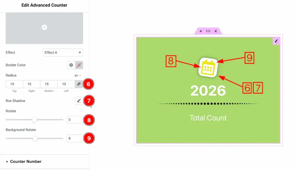
11. Rotate: You can adjust the icon/image normal rotation from here.
12. Background Rotate: This option lets you rotate the icon/image normal background.
Now, let’s proceed to the Hover Tab –
1. Icon Color: This option lets you change the icon/image hover color.
2. Background Type: This option lets you change the background hover type to classic or gradient. Here, we select the background type- classic.
3. Background Color: This option lets you change the background hover color.
4. Effect: You can add the counter icon/image hover effect from here.
5. Border Color: This option lets you change the hover border color.
6. Radius: This option lets you change the icon/image hover radius.
7. Box Shadow: You can add the icon/image hover box shadow from here.
8. Rotate: You can adjust the icon/image hover rotation from here.
9. Background Rotate: This option lets you rotate the icon/image hover background.
Counter Number Section
Go to Style → Counter Number
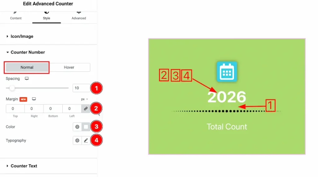
Come to the Counter Number section, you will get two tabs- Normal and Hover. Let’s proceed with the Normal tab section-
1. Spacing: You can adjust the counter number spacing from here.
2. Margin: You can adjust the counter number margin from here.
3. Color: This option lets you change the counter number normal color.
4. Typography: Change the font family, size, weight, style, transform, decoration, line height, letter spacing, and word spacing from here.
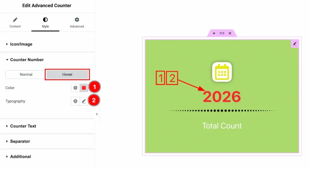
Let’s proceed with the hover tab-
1. Color: This option lets you change the counter number hover color.
2. Typography: Change the font family, size, weight, style, transform, decoration, line height, letter spacing, and word spacing from here.
Counter Text Section
Go to Style → Counter Text
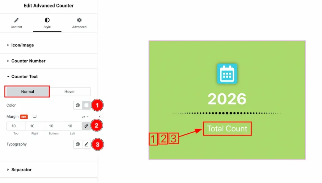
Come to the Counter Text section, you will get two tabs- Normal and Hover. Let’s proceed with the Normal tab section-
1. Color: This option lets you change the counter text normal color.
2. Margin: You can adjust the counter text margin from here.
3. Typography: Change the font family, size, weight, style, transform, decoration, line height, letter spacing, and word spacing from here.
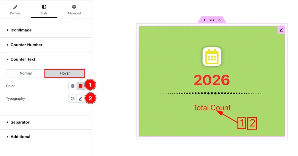
Let’s proceed with the hover tab-
1. Color: This option lets you change the counter text hover color.
2. Typography: Change the font family, size, weight, style, transform, decoration, line height, letter spacing, and word spacing from here.
Separator Section
Go to Style → Separator
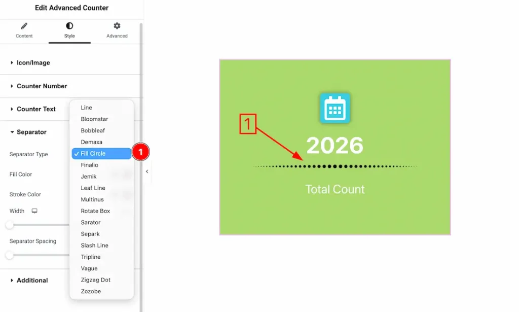
1. Separator Type: Here, you will get many separator styles, and you can choose one of them that you prefer.
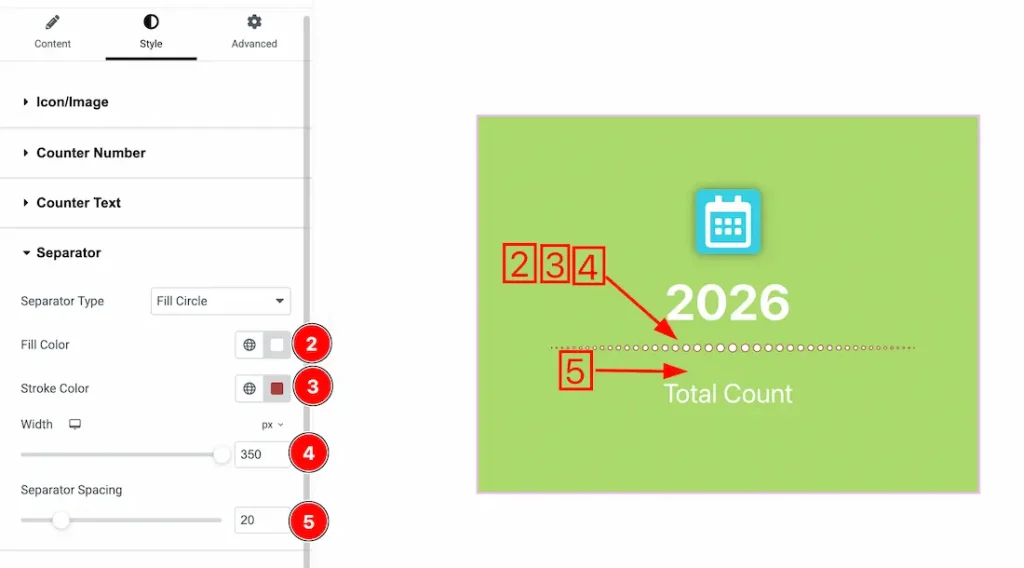
2. Fill Color: This option lets you set the separator fill color.
3. Stroke Color: This option lets you set the separator stroke color.
4. Width: You can set the separator width from here.
5. Separator Spacing: You can adjust the separator spacing from here.
Additional Section
Go to Style → Additional
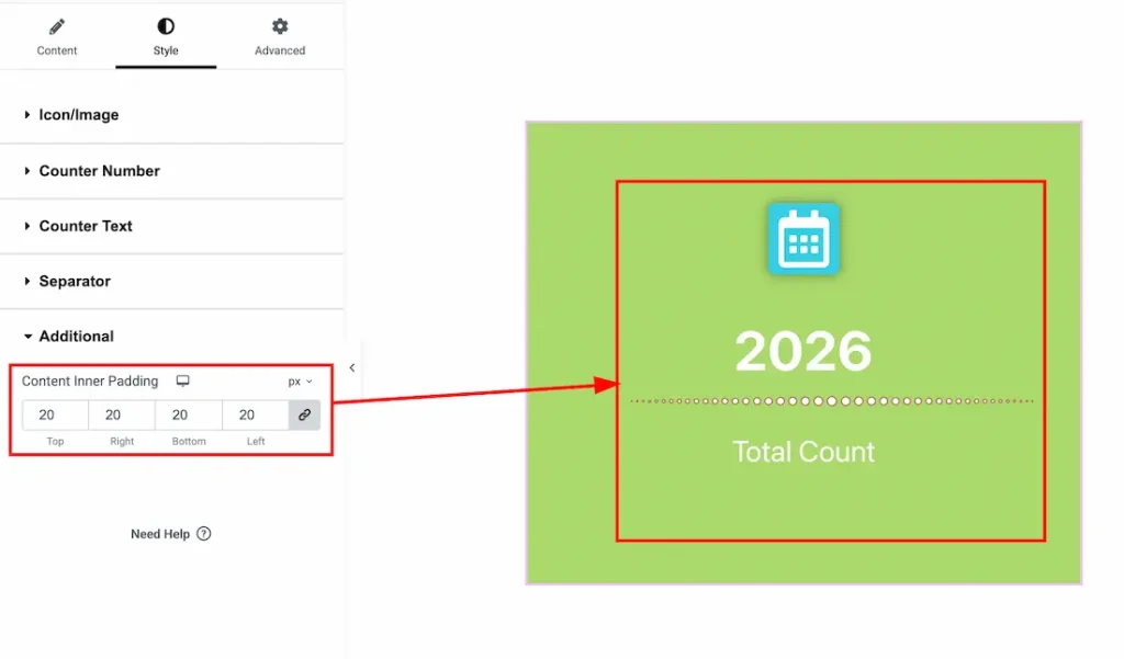
Content Inner Padding: You can adjust the overall content inner padding from here.
All done! You have successfully customized the Advanced Counter widget on your website.
Video Assist
You can also watch the video tutorial to use the Advanced Counter widget. Please visit the demo page for examples.
Thanks for being with us.