
To use the EDD Product Carousel Widget, you need to install the EDD. Follow the “How to use Easy Digital Download plugin” documentation for instructions.
EDD Product Carousel Widget
EDD Product carousel widget shows the download products in carousel/slider mode. Let’s start exploring the customizations so you can better use them to your advantage.
Inserting EDD Product Carousel Widget
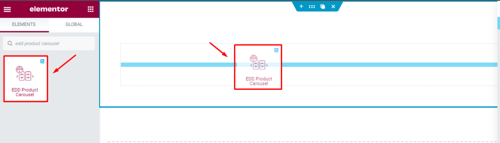
Go to the Elementor page, Searchbar is On the top left corner, just search by name of the widget “ EDD product carousel” and it will appear on the bar. Just drag and drop on the page. Here you go. Your job is done.
Explore all the elements of the Content Tab
Layout Customization
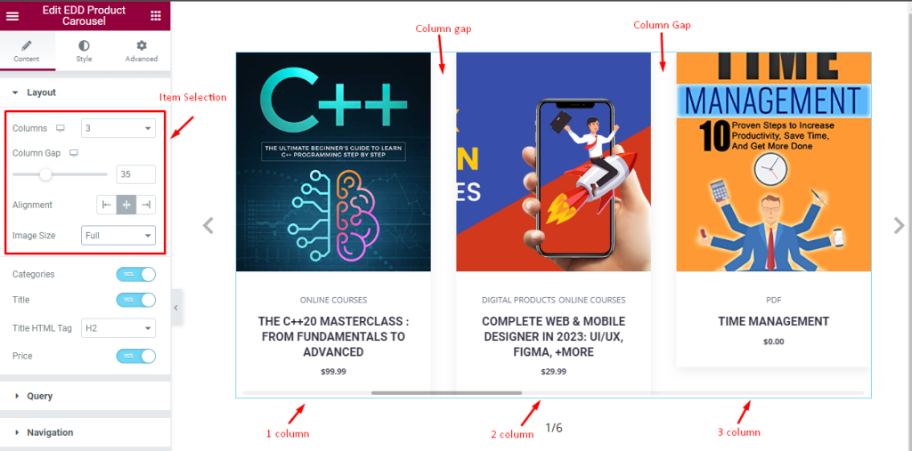
Go to Content > Layout
Here, you can select the number of Columns to display your products. The default column value is set to 3. Column Gap is there for adjusting the gaps between the items. You can also select content Alignment (left, center, right) for the widget. Alignment works on text content.
After that, you can customize the size of the product images using the Image Size option.
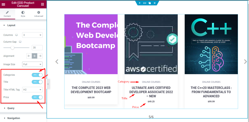
Below, there are three switchers that let you show or hide the categories, title, and price text on the widget. Of course, turning off them will hide that information. Also, you can select a Title HTML Tag from the options.
Query Section Controls
Go to Content > Query
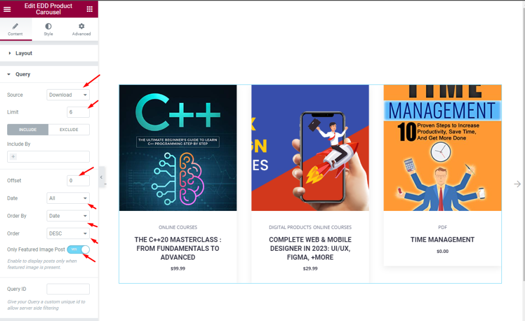
In the query section, you will be able to select the Source of the displayed items. The source could be the Download items by EDD or manually selected items. With a Limit control, you can set the number of products to be displayed one after another within the widget.
The Include/Exclude fields are filters to show or hide specific items by their authors/terms (categories, tags, etc.).
The Offset value can be set according to the ascending number of items and used to bypass one item from the display.
The Date, Order By, and Order options are for sorting the query.
Only the Featured Image Post switcher is used to show only that product that has a set featured image.
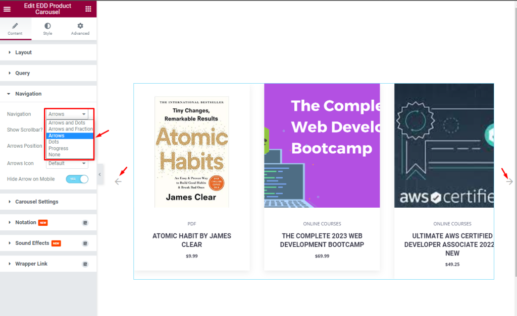
Navigation settings
Go to Content > Navigation
In the navigation section, you will have several options for the navigation indicator.
Here, you will see six options to set the Navigation part, only Arrows is selected by default, and you can set any of them as you want.
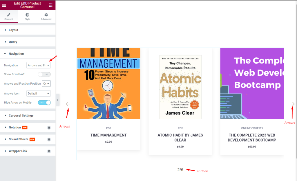
For instance, Arrow and Fraction option is selected here, and you can see the arrows on the left and right sides while the Fraction will appear at the bottom of the EDD Product Carousel.
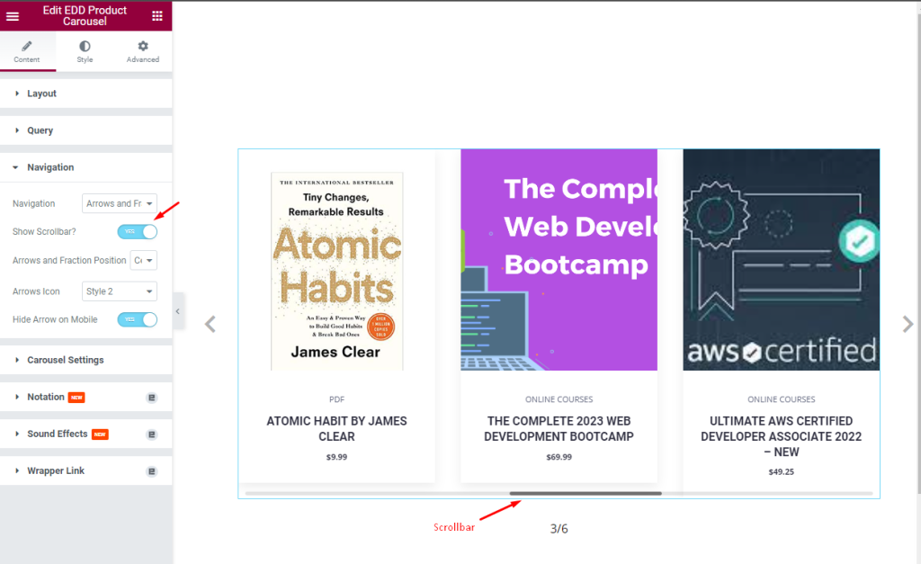
Enabling the Show Scrollbar will make a scrollbar appear at the bottom of the EDD product carousel. The scrollbar appears once the items are scrolled using the navigation.
Arrow and Fraction Position option will let you choose the display position of the navigation. You will get 23 unique Arrow icon styles to choose from.
When turned on, the Hide Arrow on Mobile switcher hides the arrow on a mobile device.
Explore Carousel Settings
Go to Content > Carousel Settings
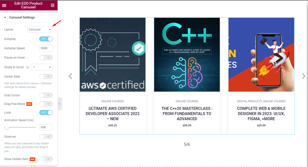
This section mainly holds the animation settings for the carousel. Here, you can select between Carousel and Coverflow Layouts for the EDD product carousel.
Layout Carousel is selected by default.
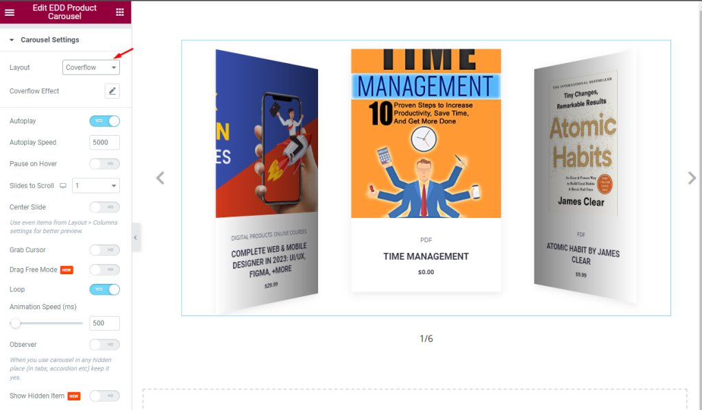
Layout Coverflow has a different look with a more direct animation style.
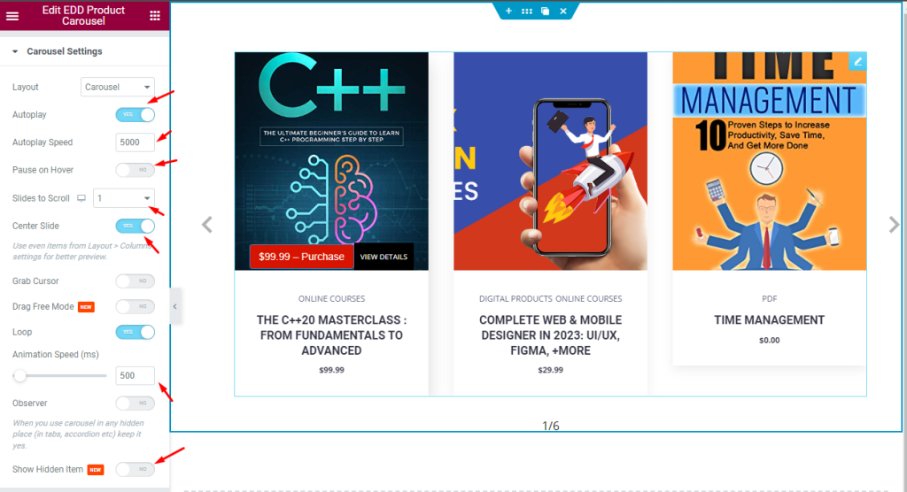
The rest of the settings let you enable the Autoplay switcher, which will automatically play the carousel animation. Autoplay Speed is used for adjusting the speed of the slide to scroll.
Pause on Hover switcher pauses the animation when the mouse hovers over any product.
Slide to Scroll is used to slide how many columns or slides to scroll at a single stroke on the mouse wheel.
Loop switcher will set the slide in a loop if enabled, and the slide will repeat infinite times. You can set the animation speed(ms) for the slides.
Explore customizations with Style tab
Item Customization
Go to Style > Item
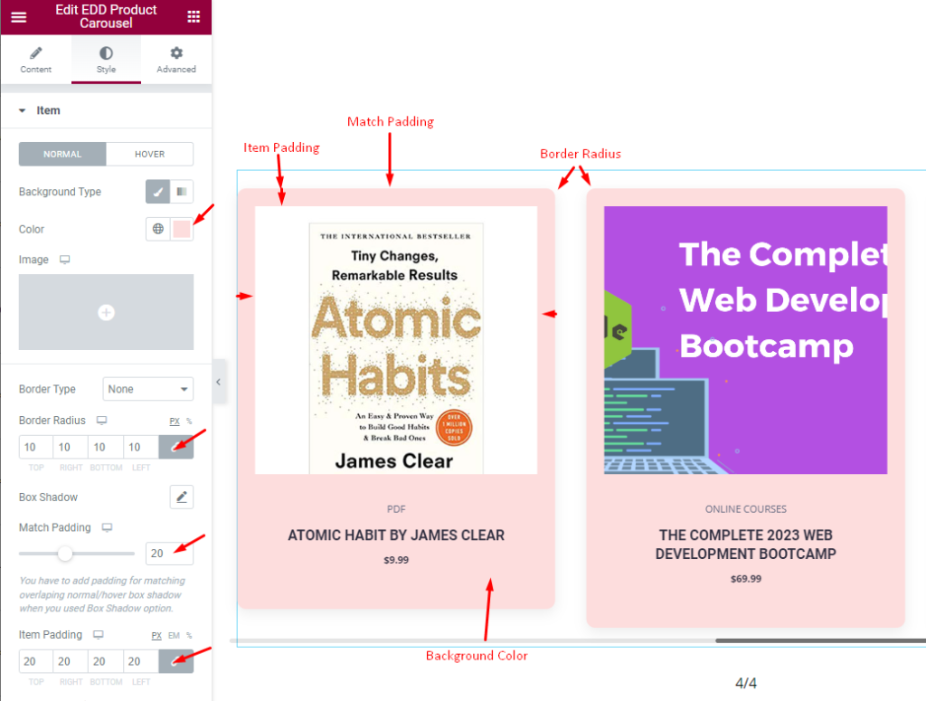
In the Item section, the options are divided into Normal and Hover modes.
Here, you can set a nice background color by configuring the Background Type option and selecting a color from the color palette.
You can set a border around the items. The Border Radius field determines the roundness of the border, while the Match Padding scrollbar lets you adjust the total padding to match the length of all items. To give the items more visual appeal, adjust the Item Padding to create inner spacing.
Also, there is a Box Shadow option that lets you create 3D shadows around the items.
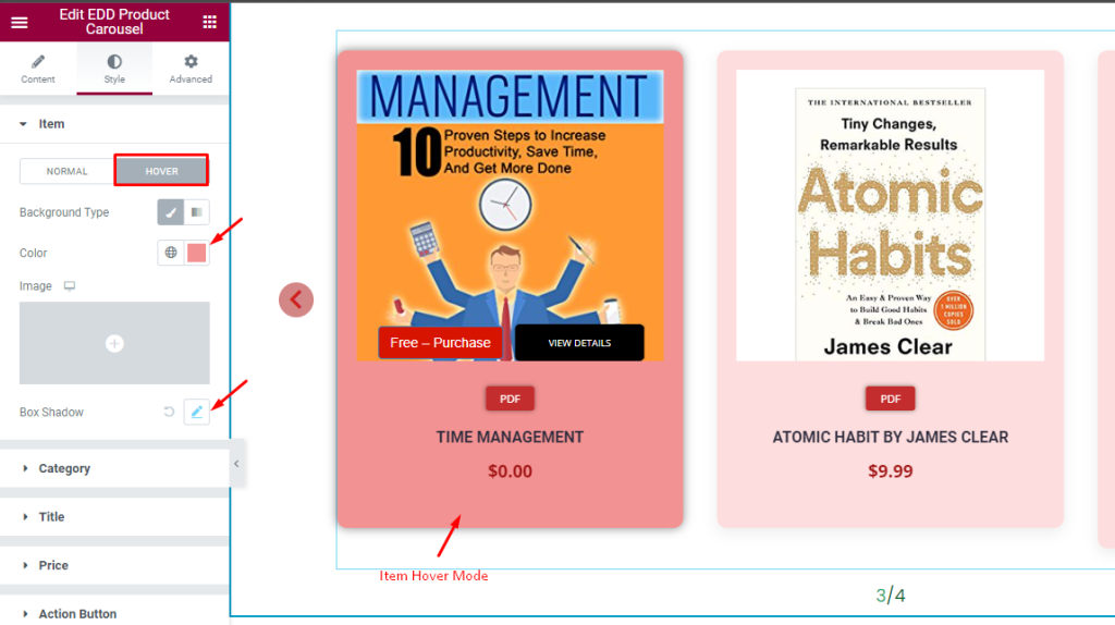
Switching to the Hover subsection, you can set the background color and the Box Shadow. These modifications will enhance the item’s look when the items are hovered over by your visitors.
Category Section Customization
Go to Style > Category
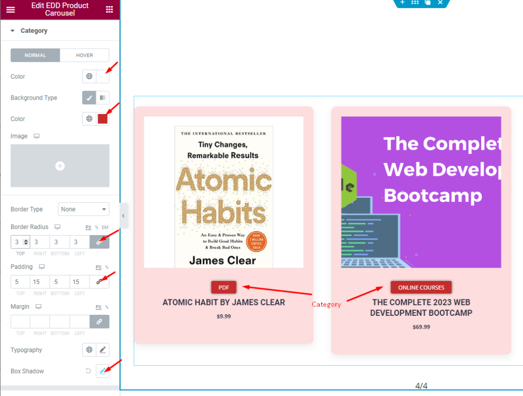
Here, you can Enhance the appearance of the product Category tag by utilizing the options.
Let’s start with the text color and background color. You can set a border and then set a rounded edge by adjusting the border radius values. You can also create internal spacing with padding.
Then, you can use margin to adjust the position of the category. With the typography option, the category text font can be customized. Finally, add a box shadow for an extra touch of style.
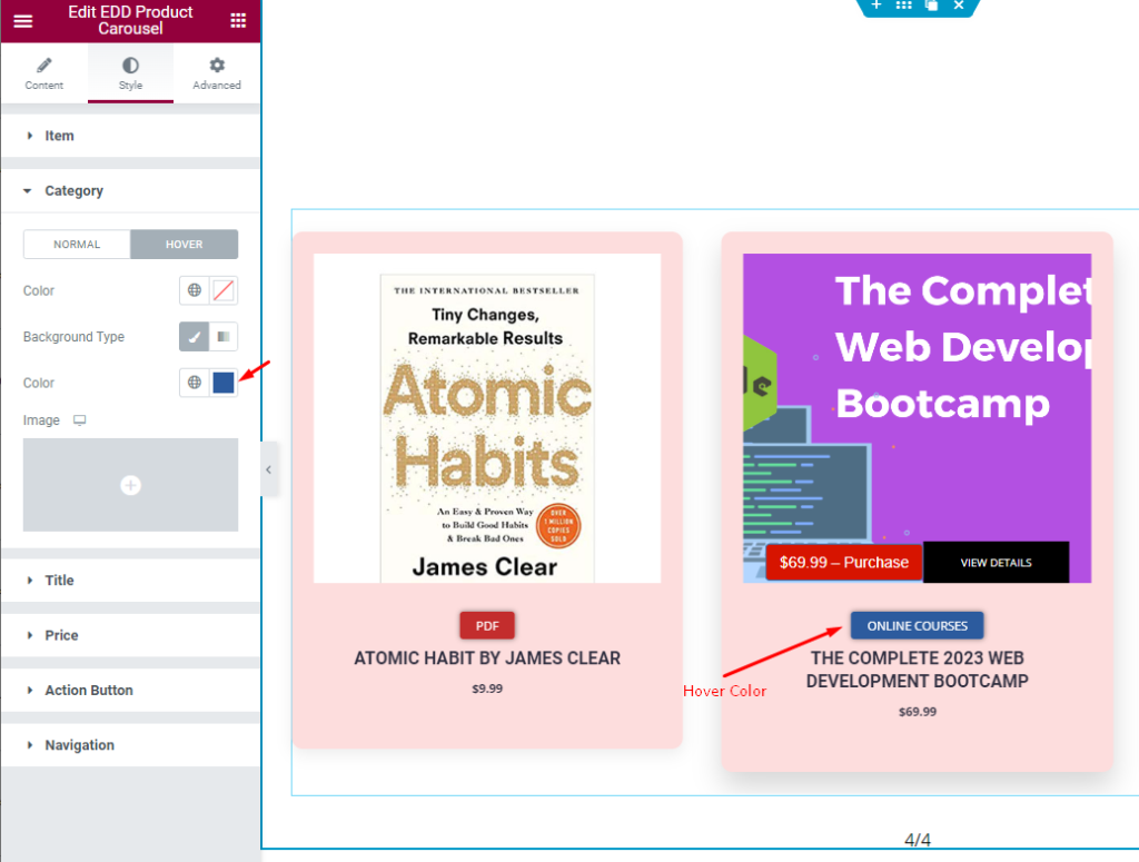
The Category Hover subsection allows you to set text color and background color to create a hover effect.
Title Customization
Go to Style > Title
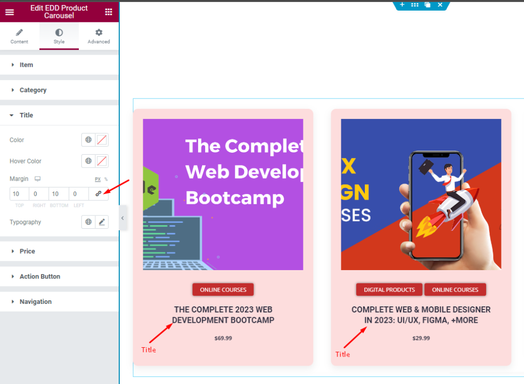
In this section, you can style the Title of the EDD Product Carousel. The options include text Color, Hover Color, Margin and Typography.
Price Customization
Go to Style > Price
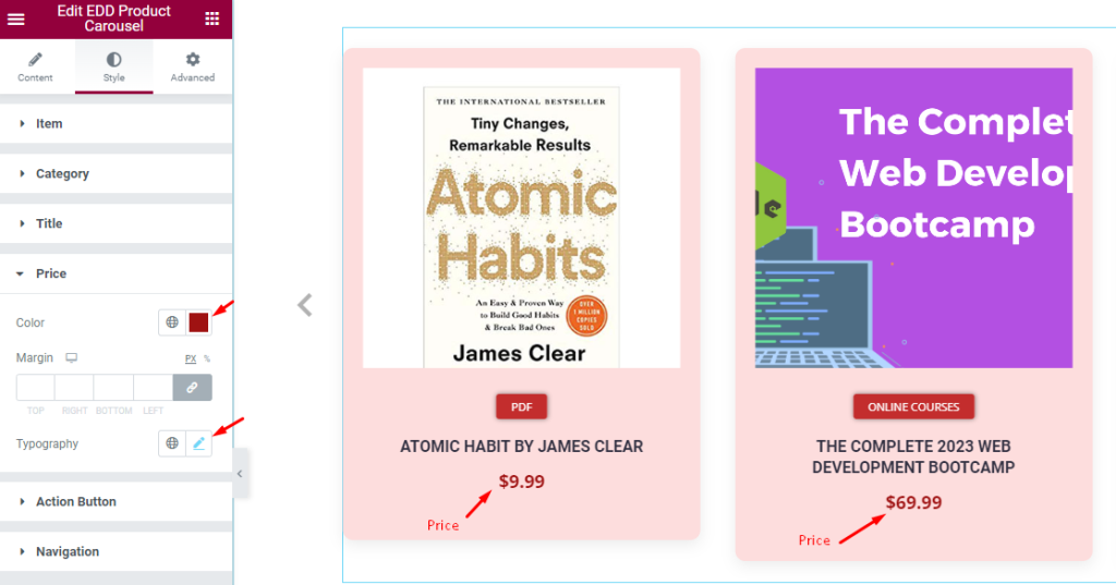
In the price section, you can enhance its appearance by selecting a custom color, margin and typography.
Action button Customization
Go to Style > Action Button
There are two action buttons, “View Details” and “Purchase,” which can be customized individually.
View Details Button
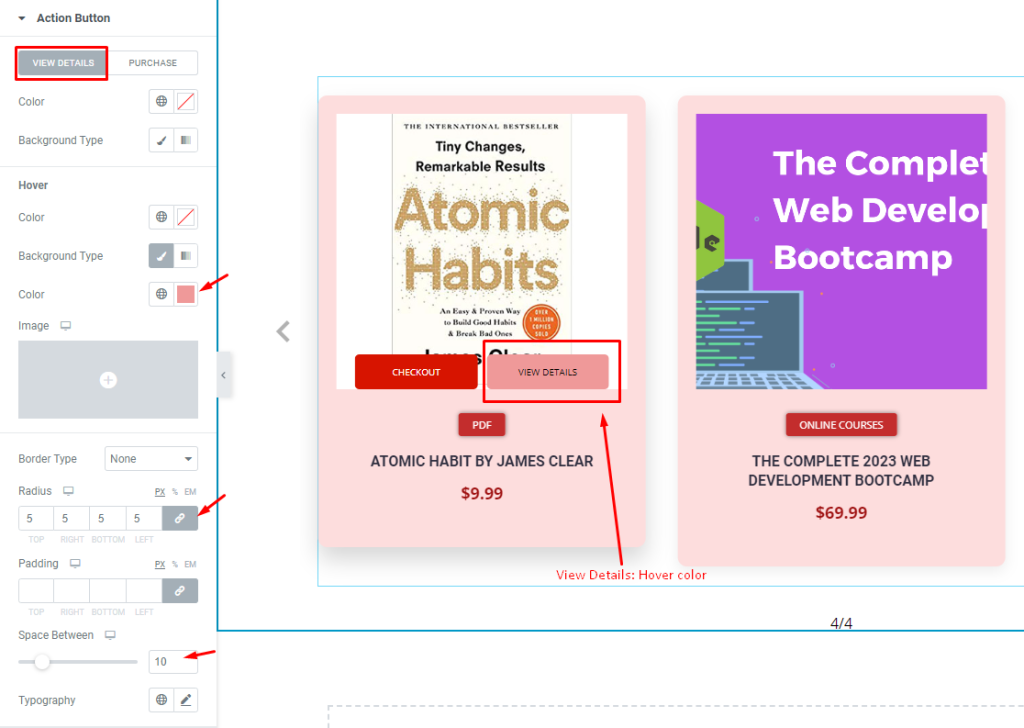
For the “View Details” button, the text color and background type options are available for both default and hover modes.
Then you can configure a border around the button and further adjust the border radius for a rounded effect. The default padding provides enough inner space, but you can adjust the space between the two buttons if needed. Lastly, you can customize the typography as desired.
Purchase Button
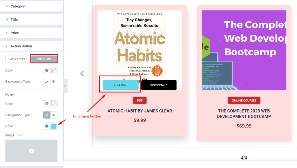
For the “Purchase” button, you have options to customize the color and background type, the same default and hover settings. The rest of the options follows the same as the View Details button.
Navigation section Customization
Go to Style > Navigation
The navigation section offers several options for customization for each of the following navigation styles, such as ARROW, FRACTION, SCROLLBAR, and OFFSET. You can tailor each of these options to your liking.
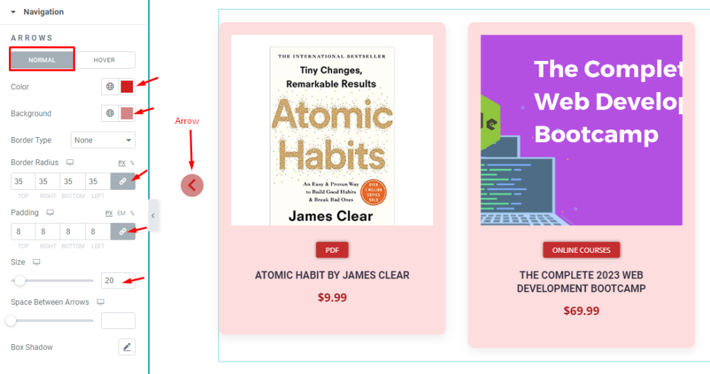
ARROW Customization
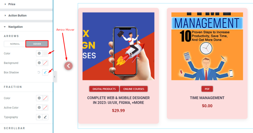
The appearance of the arrow in the navigation section can be improved by using the available options. There are two modes; normal and hover.
In the normal mode, you can set the color and background color for the arrows. To make the arrow round, you can increase the border radius to its maximum value. You can also adjust the size of the arrow icon and add space between arrows and a box shadow.
Use padding values to increase the background area of the arrows.
For the hover style of the arrows in the navigation section, you can set the color, background color, and add a box shadow.
FRACTION customization
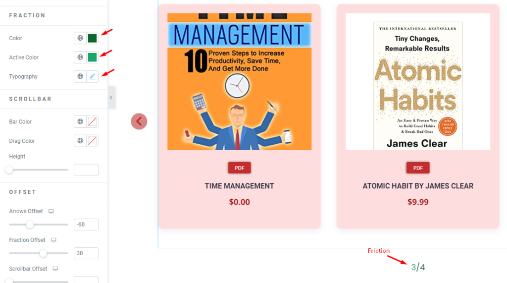
The fraction in the navigation section can be customized by setting the color, active color, and typography. You can increase the font size from typography to ensure the fraction numbers are more visible.
SCROLLBAR customization
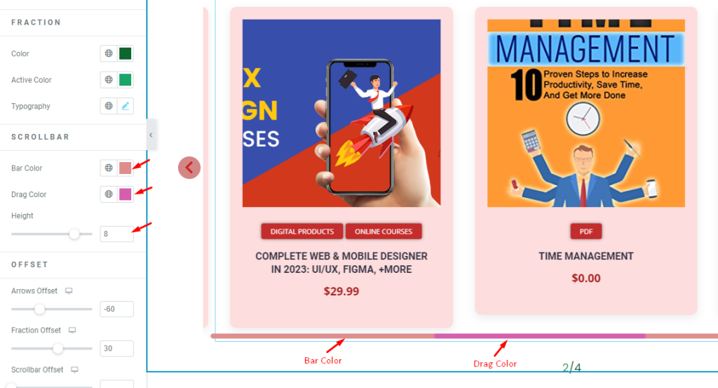
For the scrollbar, get options including Bar Color, Drag Color, and Bar Height. These settings can be adjusted as desired, as shown in the screenshot.
Set OFFSET
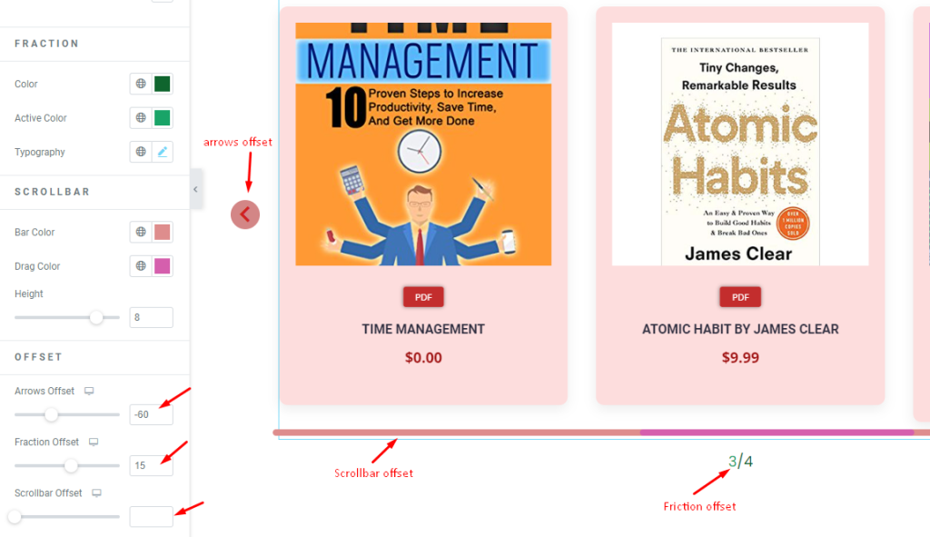
The OFFSET feature allows you to modify the placement of the arrows, fractions and scrollbar. Please go ahead with adjustments as per need.
Video Assist
A tutorial video coming soon.