
In this documentation, we will show you how to customize the Caldera Form widget presented by Element Pack Pro.
Download and Install the Caldera Form
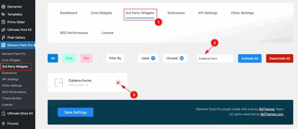
- Go to Element Pack Pro > 3rd Party Widget dashboard.
- Search by the ” Caldera Form ” name.
- Then click on the ” Plugin ” icon on it will redirect to Caldera Form website.
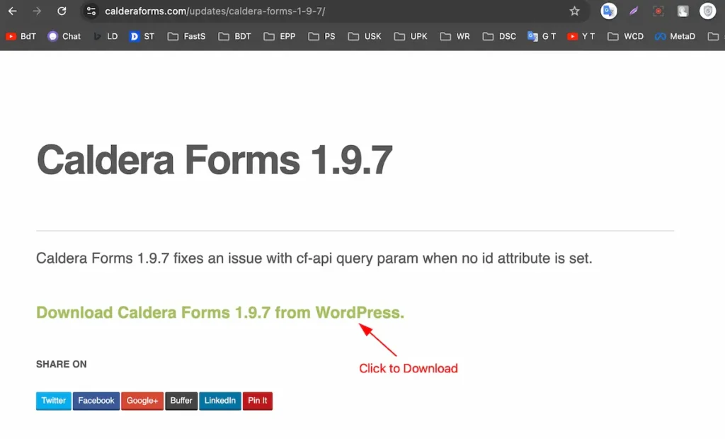
Download the Caldera From plugin.
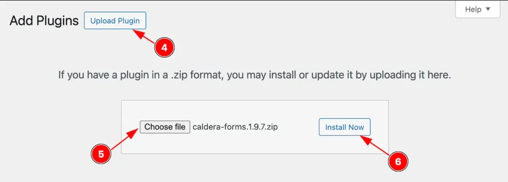
- Click on the ” Upload Plugin ” it will open a choose file.
- Click on the ” Choose file ” and select downloaded file.
- Then click on the ” Install Now ” button.
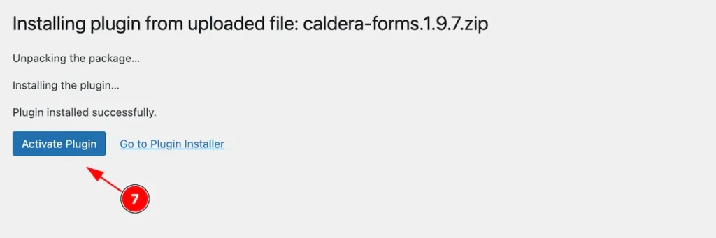
- Now click on the ” Activate Plugin ” button to activate the Caldera Form.
Activate the Caldera Form
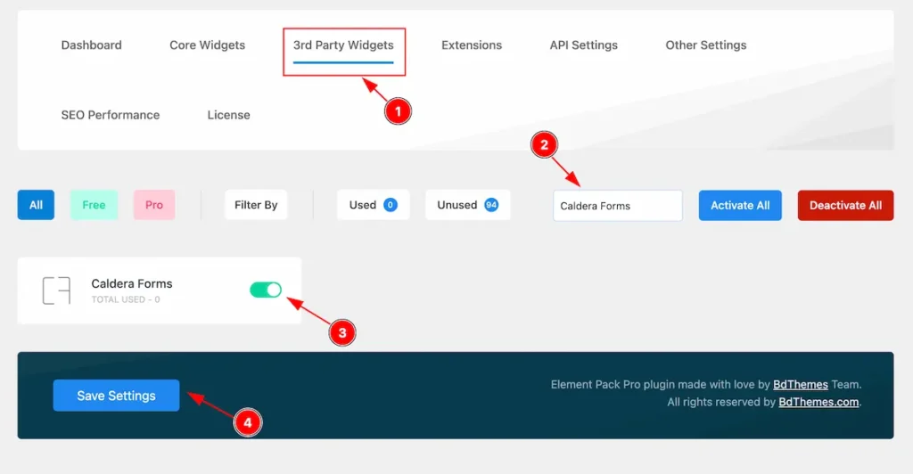
- Go to Dashboard Element Pack Pro > 3rd Party Widgets.
- Search by the ” Caldera Form ” name.
- Activate the ” Caldera From ” widget.
- Click on the ” Save Settings ” button to make the save changes.
Make a Form
If you want to know how to make custom forms with the Caldera Form plugin, please refer to their official website for tutorials.
Inserting The Caldera Form Widget
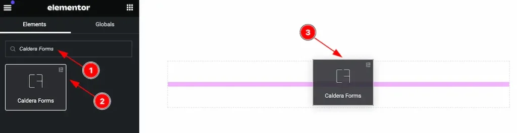
Inserting the widget by following this,
- Search by the Caldera From widget name.
- Then select the appear widget ( with Element Pack Pro logo T.R corner).
- After Drag and Drop it on the Elementor Editor page.
Content Tab
The Content tab controller displayed here offers the flexibility to adjust the layout of the widget according to your preferences.
Layout Section
Go to Content > Layout
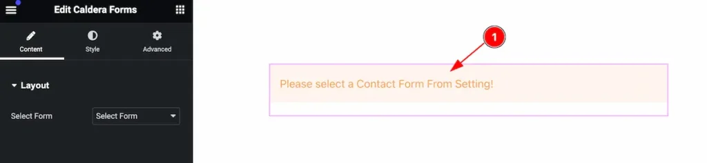
- After selecting the Caldera From it will appear a message to select the Form.
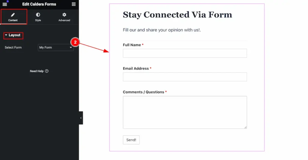
- Select Form: Select the form from the source. This will appear the form.
Style Tab
Provide the controller to make the visual appearance or presentation of the tabs. This includes aspects that are visually appealing and cohesive with the overall design of the interface.
Label Section
Go to Style > Label
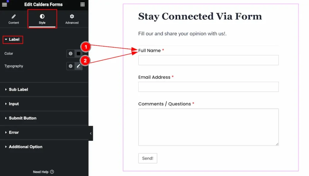
Make the label interactive by following,
- Color: Set the color for the label.
- Typography: Set the typography for the label.
Sub Label Section
Go to Style > Sub Label
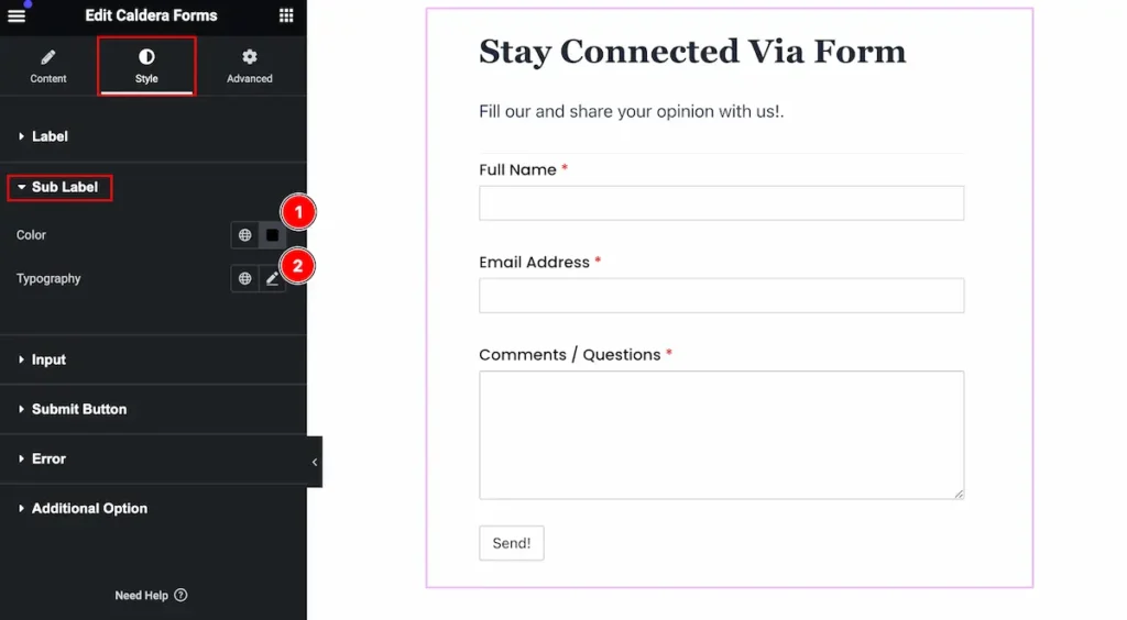
Make the sub label interactive,
- Color: Set the color for the sub label.
- Typography: Set the typography for it.
Input Section
Go to Style > Input
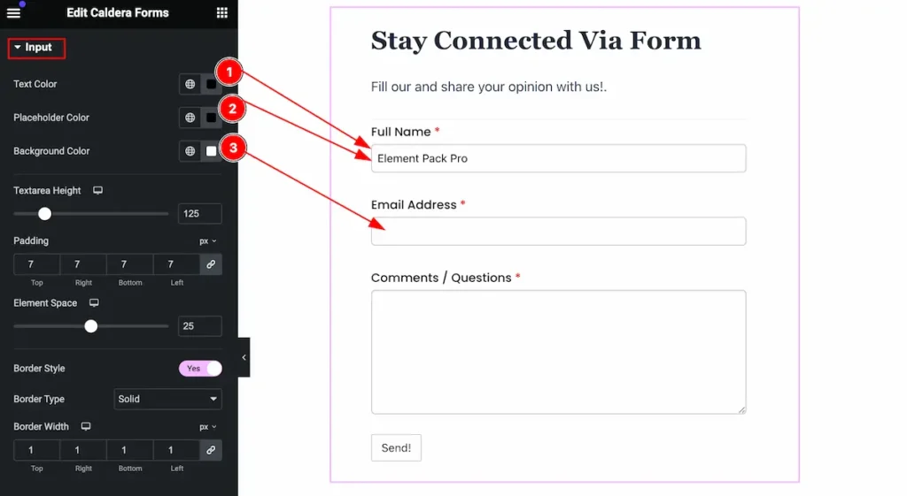
Make the input field more interactive by following,
- Text Color: Set the text color for input.
- Placeholder Color: Set the placeholder color for it.
- Background Color: Set the background color for it.
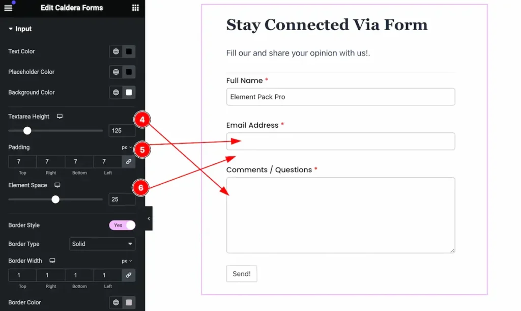
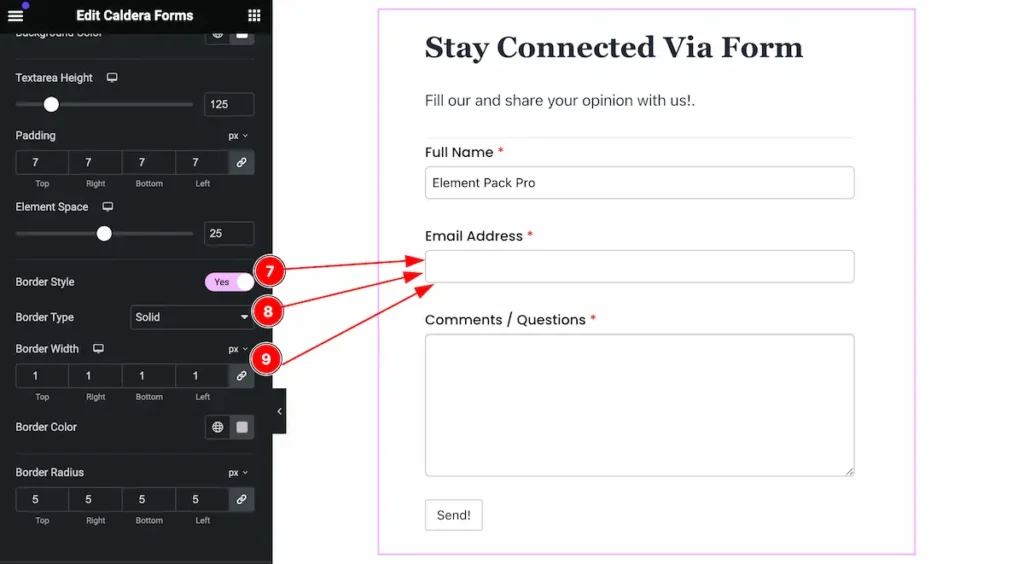
- Textarea Height: Set the textarea height for the input section.
- Padding: Set the padding.
- Element Space: Set the Element Space for it.

- Border Style: Set the style for the border.
- Border Type: Set the type the border.
- Border Width: Set the width for the border.

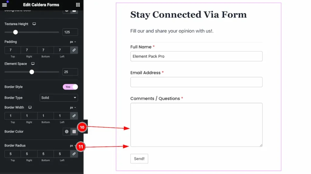
- Border Color: Set the color for the border.
- Border Radius: Set the border radius.
Submit Button Section
Go to Style > Submit Button
Normal State form the Submit Button
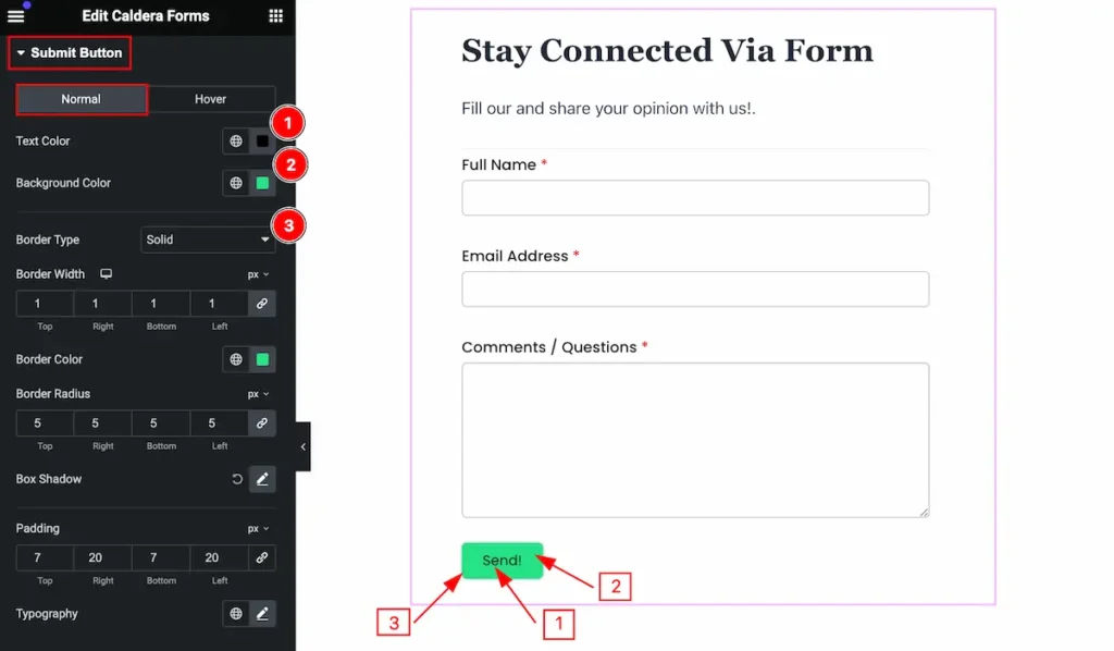
Make the submit button stylish by following,
- Text Color: Set the text color for the button.
- Background Color: Set the backgroud color.
- Border Type: Set the border type.
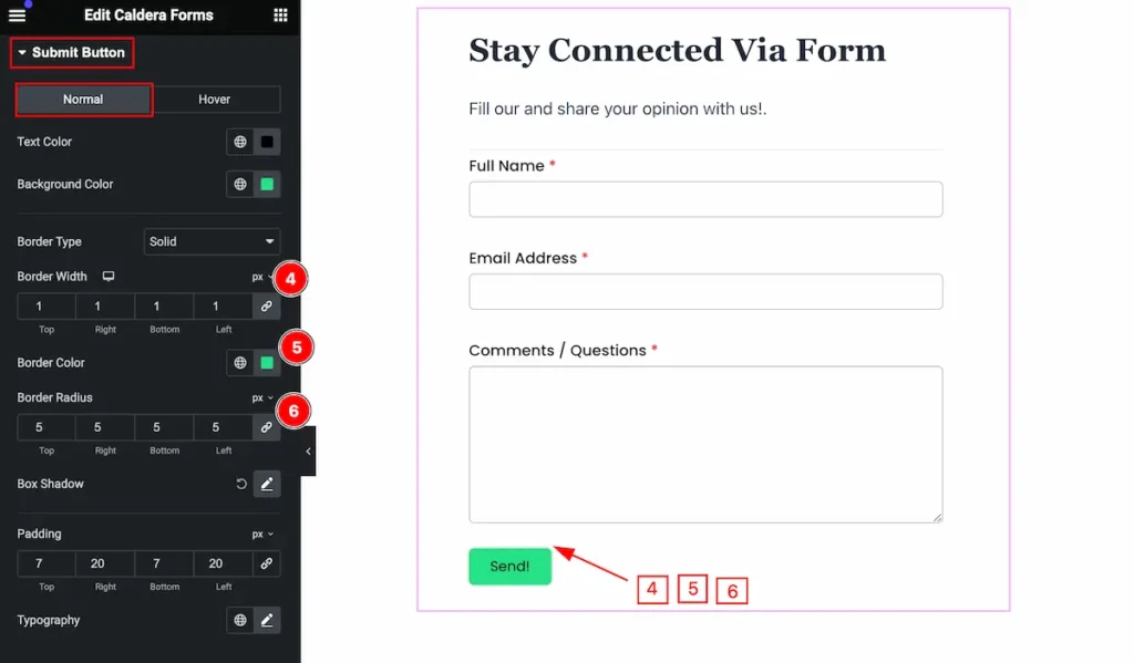
- Border Width: Set the width for the border.
- Border Color: Set the color for the border.
- Border Radius: Set the radius for the border.
- Border Style: Set the border style for input.
- Border Type: Set the border type.
- Border Width: Set the border width for input.
- Border Color: Set the color for the border.
- Border Radius: Set the radius for the border.
Hover State form the Submit Button
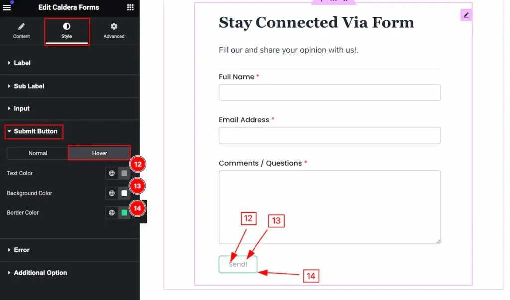
The changes will appear on mouse hover,
- Text Color: Set the text color for the button.
- Background Color: Set the background color.
- Border Color: Set the border color.
Error Section
Go to Style > Error
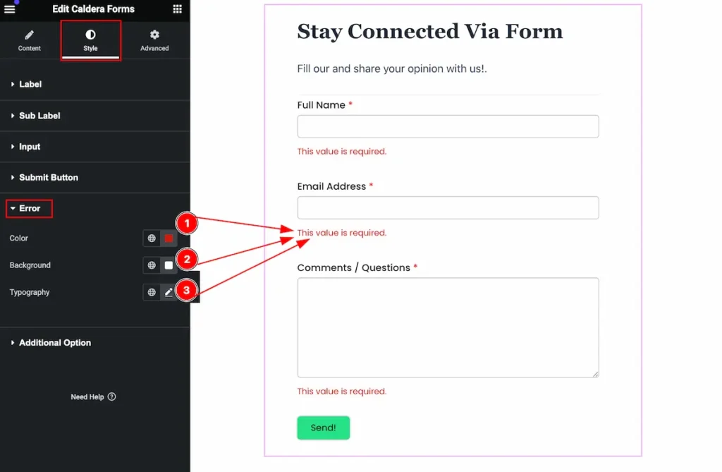
Make the error stylish,
- Color: Set the color for the error message.
- Background Color: Set the background color.
- Typography: Set the typography.
Additional Options Section
Go to Style > Additional Options
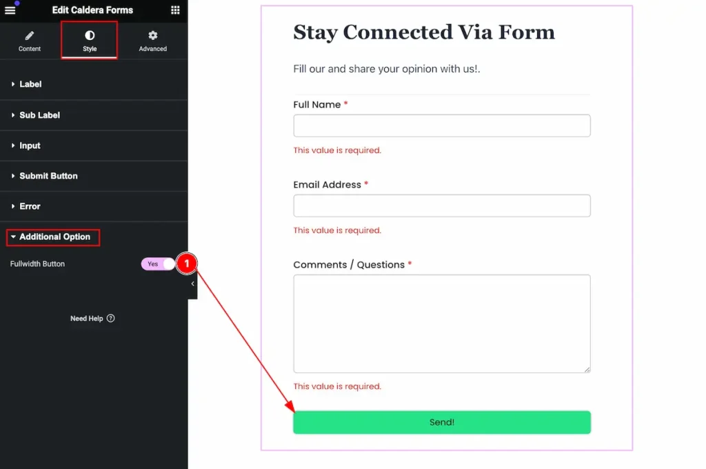
- Fullwidth Button: Enable the switcher to show the fullwidth button.
Video Assist
You can watch the video above to learn about the Caldera Form widget.
Please visit the demo page for examples.
Thanks for staying with us.