The Video Gallery widget from Element Pack Pro is a powerful and flexible tool for displaying multiple videos in an organized, visually appealing layout on your website. It allows you to showcase video collections in grid, masonry, or carousel-style formats with extensive customization options, making it easy to present multimedia content in an engaging and responsive way. With support for various video sources and layout controls, the Video Gallery widget helps enhance user interaction and improve the overall viewing experience through Elementor. In this documentation, we will cover how to use and customize the Video Gallery widget provided by Element Pack Pro for Elementor.
Enable The Video Gallery Widget
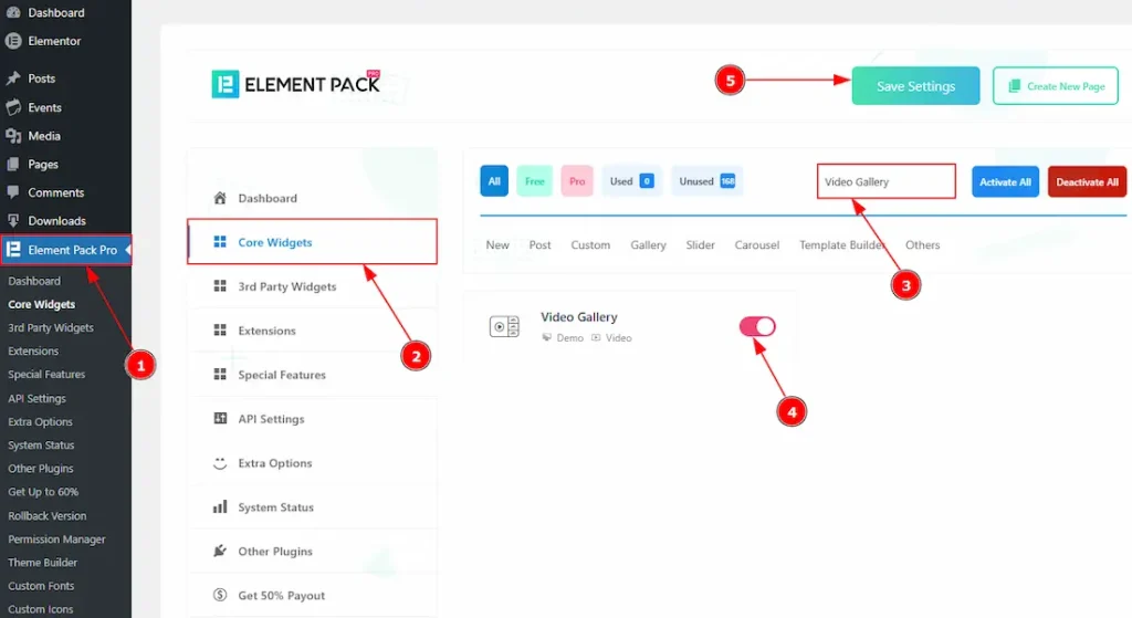
To use the Video Gallery widget from Element Pack Pro, first, you have to enable the widget.
- Go to WordPress dashboard → Element Pack Pro Plugin dashboard.
- Then, Click the Core Widgets Tab.
- Search the Video Gallery Widget Name.
- Enable the Video Gallery Widget.
- Hit the Save Settings Button.
Inserting The Video Gallery Widget
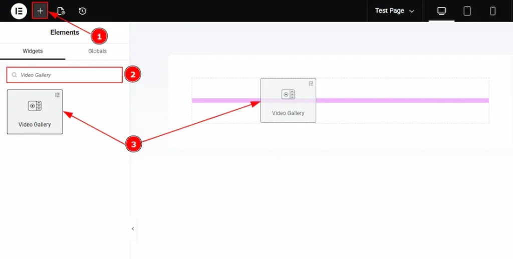
1. Go to the Elementor Editor Page and hit the “+” icon Button.
2. Search the Video Gallery name.
3. Drag the widget and drop it on the editor page.
Work With The Content Tab
Video Gallery Section
Go to Content → Video Gallery
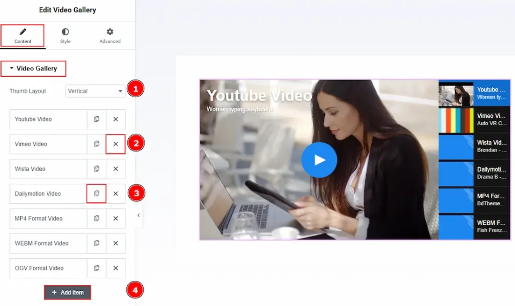
1. Thumb Layout: You can change the layout for the thumbnails of the video gallery widget with this option. Here, we have selected the thumb layout as Vertical.
2. Close Button: You can click on the close icon to close the item.
3. Copy Button: You can click on the copy button to copy & duplicate the item.
4. Add Item: You can click on the add item button to create & customize more items.
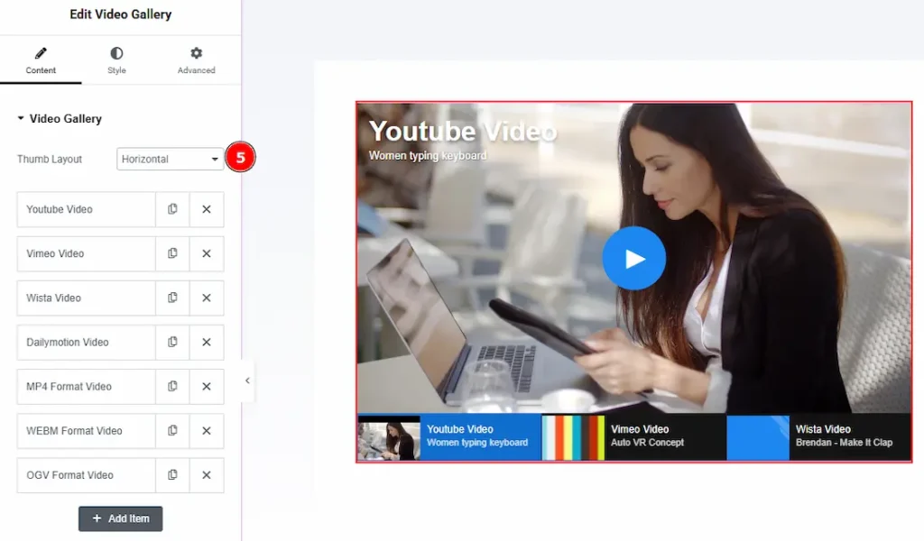
5. Thumb Layout: If you select the thumb layout as horizontal, you will get to see this visual.
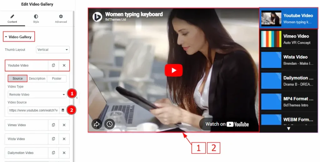
In the video gallery items, each item contains more options. There are three tabs that present those options. These are Source, Description & Poster. Let’s start with the Source Tab –
1. Video Type: Here, you can select the video type that you want to add to the gallery. You can choose between Remote Video & Local Video.
- Remote Video: This option allows you to add videos from different platforms.
- Local Video: This option allows you to add video from WP local storage.
2. Video Source: If you have selected the video type as remote video, then you will get this option to submit the video link to import the video to your gallery.
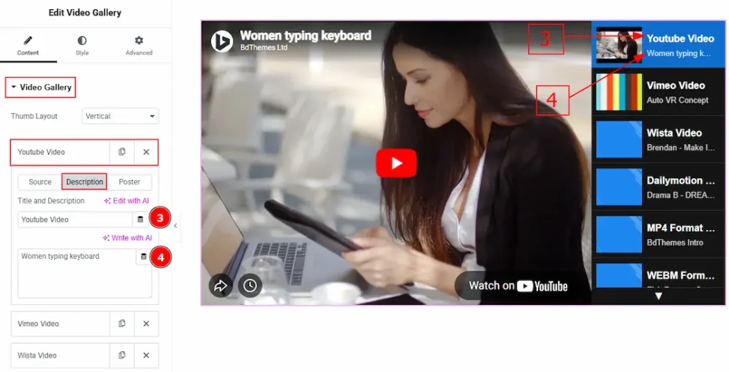
Now, let’s proceed to the Description Tab –
1. Title: You can add a title to your video and make changes to the title with this option.
2. Description: You can add a description to your video and make changes the description with this option.
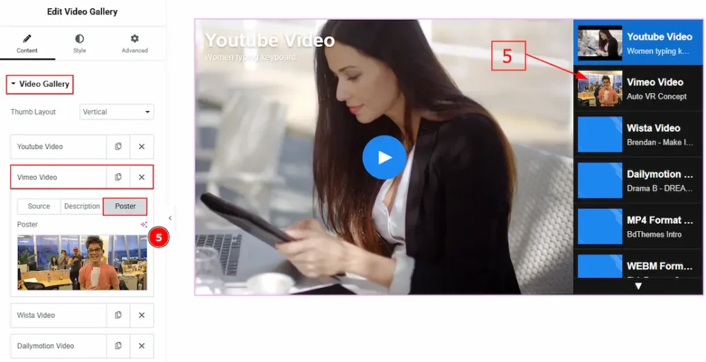
Now, let’s proceed to the Poster Tab –
5. Poster: You can add a poster to your video thumbnails with this option.
Video Section
Go to Content → Video
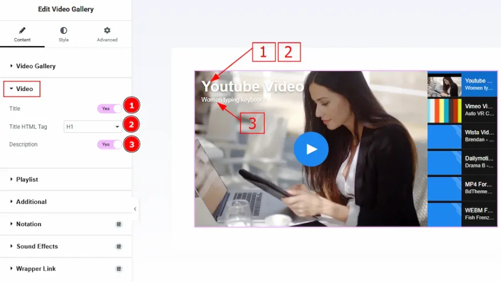
1. Title: Enable the switcher to the title of the video for your audience with this option.
2. Title HTML Tag: You can select the title HTML Tag with this option.
3. Description: Enable the switcher to show the video description to your audience with this option.
Playlist Section
Go to Content → Playlist
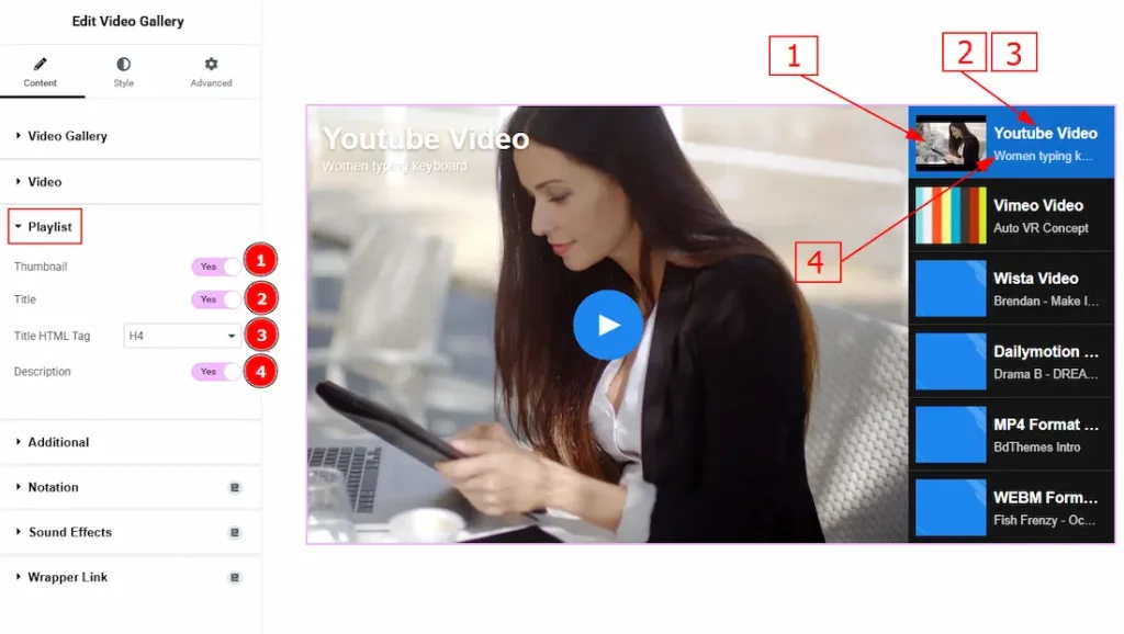
1. Thumbnails: Enable the switcher to show the video thumbnails to your audience with this option.
2. Title: Enable the switcher to show the title on the video thumbnail with this option.
3. Title HTML Tag: You can select the HTML tab for the video thumbnail title with this option.
4. Description: Enable the switcher to show the description on the video thumbnail with this option.
Additional Section
Go to Content → Additional
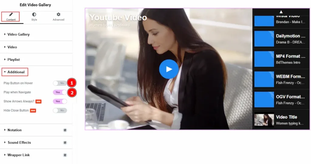
1. Play Button on Hover: Enable the switcher to show the play button while hovering over the video.
2. Play when Navigate: Enable the switcher to resume the video where it had left off before while playing.
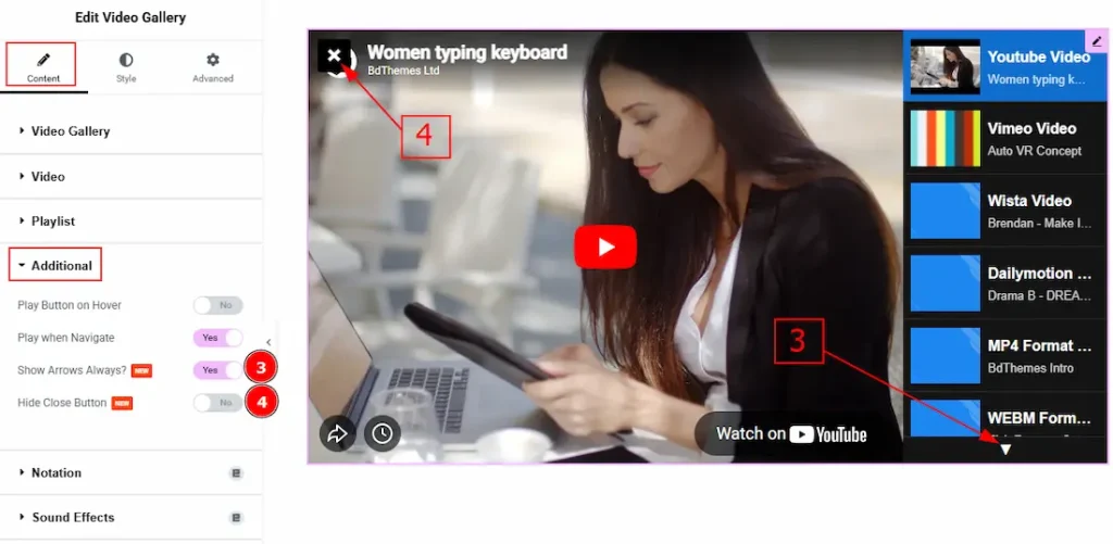
3. Show Arrows Always: Enable the switcher to show the arrows icon always on the playlist.
4. Hide Close Button: Enable the switcher to hide the close button with this option.
Work with The Style Tab
Video Title Section
Go to Style → Video Title
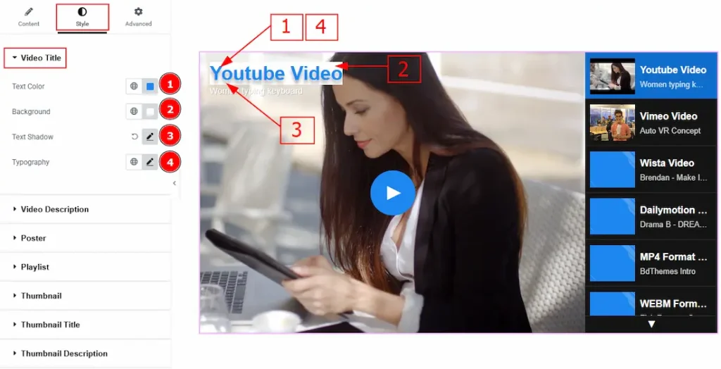
1. Text Color: You can make changes to the video title text color with this option.
2. Background: You can make changes to the video title background with this option.
3. Text Shadow: You can add a shadow effect to the title with this option.
4. Typography: Change the font family, size, weight, transform, style, decoration, line height, letter spacing, and word spacing from here.
Video Description Section
Go to Style → Video Description
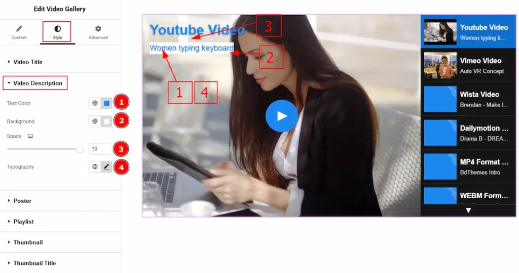
1. Text Color: You can make changes to the description text color with this option.
2. Background: You can make changes to the description text’s background color with this option.
3. Space: You can adjust the space between the title and the description with this option.
4. Typography: Change the font family, size, weight, transform, style, decoration, line height, letter spacing, and word spacing from here.
Poster Section
Go to Style → Poster
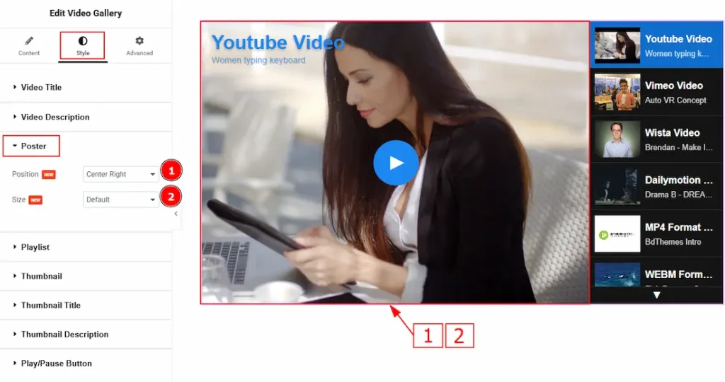
1. Position: You can adjust the position of the poster with this option.
2. Size: You can select the poster visual size with this option.
Playlist Section
Go to Style → Playlist
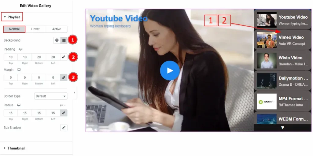
In this section, we have three more tabs. These are Normal, Hover & Active. Let’s start with the Normal Tab first –
1. Background Color: You can change the playlist background color with this option.
2. Padding: You can adjust the inner space of the playlist item field with this option.
3. Margin: You can adjust the space around the playlist items with this option.
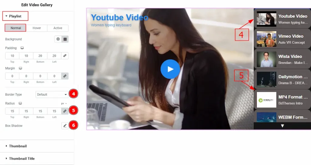
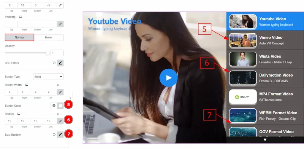
4. Border Type: You can add and change the border types with this option.
5. Radius: You can control the roundness of the border with this option.
6. Box Shadow: You can add a shadow effect to the playlist items with this option.
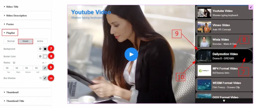
Now, let’s proceed to the Hover Tab –
7. Background Color: You can change the playlist’s background hover color with this option.
8. Border Color: You can change the border hover color with this option.
9. Radius: You can control the roundness of the border with this option.
10. Box Shadow: You can add a hover shadow effect to the playlist item with this option.
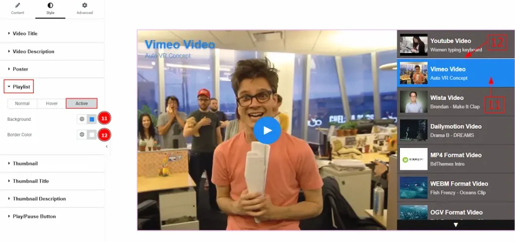
Now, let’s proceed to the Active Tab –
11. Background: You can change the playlist’s background active color with this option.
12. Border Color: You can change the border active color with this option.
Thumbnail Section
Go to Style → Thumbnail
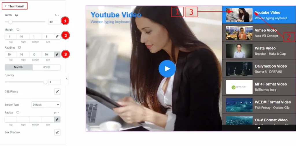
1. Width: You can adjust the width of the thumbnail image with this option.
2. Margin: You can adjust the space around the thumb image with this option.
3. Padding: You can adjust the inner space of the thumb image with this option.
In this section, we have two more tabs. These are Normal & hover. Let’s start with the Normal Tab first –
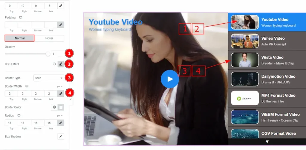
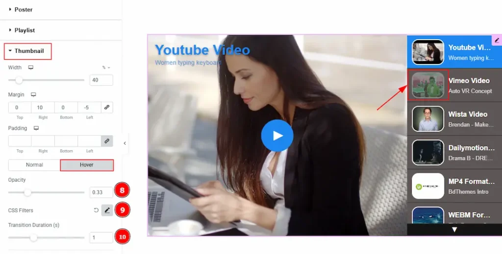
1. Opacity: You can adjust the blurriness of the thumb image with this option.
2. CSS Filters: This setting lets you apply visual changes to the image. In this setting, you can modify properties like Blur, Brightness, Contrast, Saturation, and Hue.
- Blur: Softens the image, reducing sharpness.
- Brightness: Adjusts the overall lightness or darkness.
- Contrast: Modifies the difference between light and dark areas.
- Saturation: Controls the intensity of the colors.
- Hue: Shifts the overall color spectrum.
3. Border Type: You can add and change the border types with this option.
4. Border Width: You can set the thickness of the border with this option.
5. Border Color: You can change the border color with this option.
6. Radius: You can control the roundness of the border with this option.
7. Box Shadow: You can add a shadow effect to the Thumb image with this option.
Now, let’s proceed to the Hover Tab –
8. Opacity: You can control the blurriness of the thumb image with this option.
9. CSS Filter: You can edit and make changes to the thumb image with this option.
10. Transition Duration: You can adjust the transition duration of the thumb image while hovering over it with this option.
Thumbnail Title Section
Go to Style → Thumbnail Title
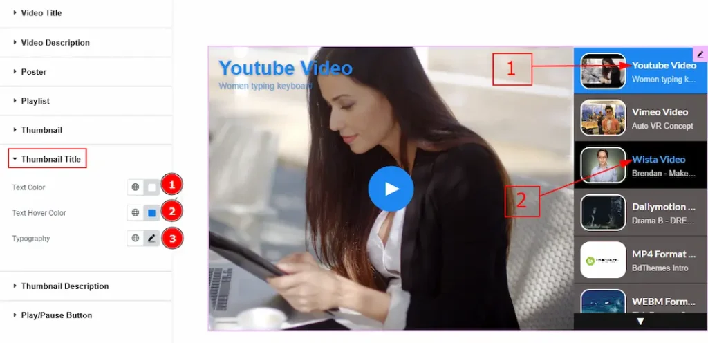
1. Text Color: You can change the thumbnail title text color with this option.
2. Text Hover Color: You can change the thumbnail title text hover color with this option.
3. Typography: Change the font family, size, weight, transform, style, decoration, line height, letter spacing, and word spacing from here on both normal & hover.
Thumbnail Description Section
Go to Style → Thumbnail Description
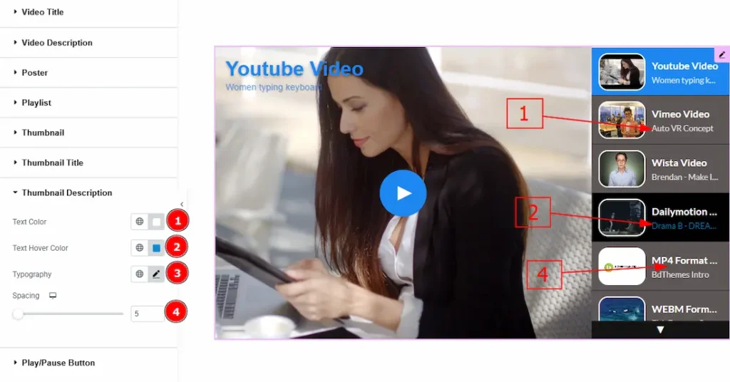
1. Text Color: You can change the thumbs description text color with this option.
2. Text Hover Color: You can change the thumbs description text hover color with this option.
3. Typography: Change the font family, size, weight, transform, style, decoration, line height, letter spacing, and word spacing from here.
4. Spacing: You can adjust the space between the thumbs title & description with this option.
Play/Pause Button Section
Go to Style → Play/Pause Button
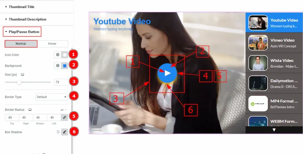
In this section, we have two more tabs. These are Normal & Hover. Let’s start describing the Normal Tab first –
1. Icon Color: You can make changes to the play button icon color with this option.
2. Background Color: You can change the background color of the play button with this option.
3. Size: You can adjust the size of the play/pause icon with this option.
4. Border Type: This option allows you to add and change the border type.
5. Border Radius: This option controls the roundness of the border.
6. Box Shadow: You can add a shadow effect to the play/pause button with this option.
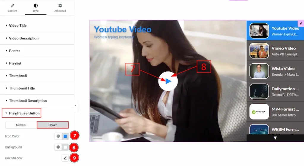
Now let’s proceed to the Hover Tab –
7. Icon Color: You can make changes to the play/pause icon hover color with this option.
8. Background Color: You can change the background hover color with this option.
9. Box Shadow: You can add a hover shadow effect to the play/pause button with this option.
Video Assist
You can also watch the video tutorial to learn more about the Video Gallery widget. Please visit the demo page for examples.
Thanks for being with us.