In this documentation, we will show you how to customize the Info List widget by Ultimate Store Kit.
Enable the Info List Widget
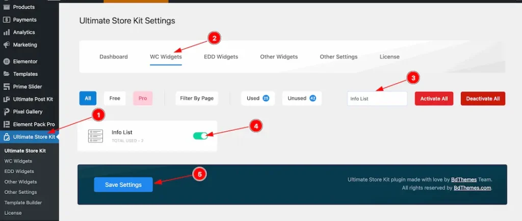
To use the Info List widget by Ultimate Store Kit, first, you have to enable the widget.
- Go to WordPress > Ultimate Store Kit Plugin dashboard.
- Then Click the WC Widgets Tab.
- Search the Info List Widget Name.
- Enable the Info List Widget.
- Hit the Save Settings Button.
Inserting The Info List widget
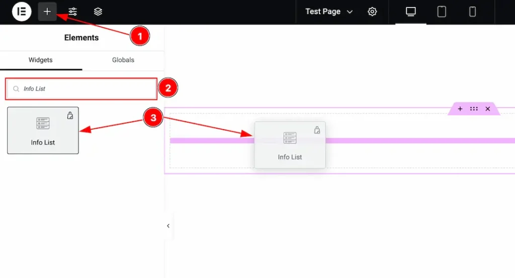
- Go to the Elementor Editor Page and Hit the “+” (Add Element) icon button.
- Search the Info List widget.
- Drag the widget and drop it on the editor page.
Work with the Content Tab
Items Section
Go to Conetent >Items
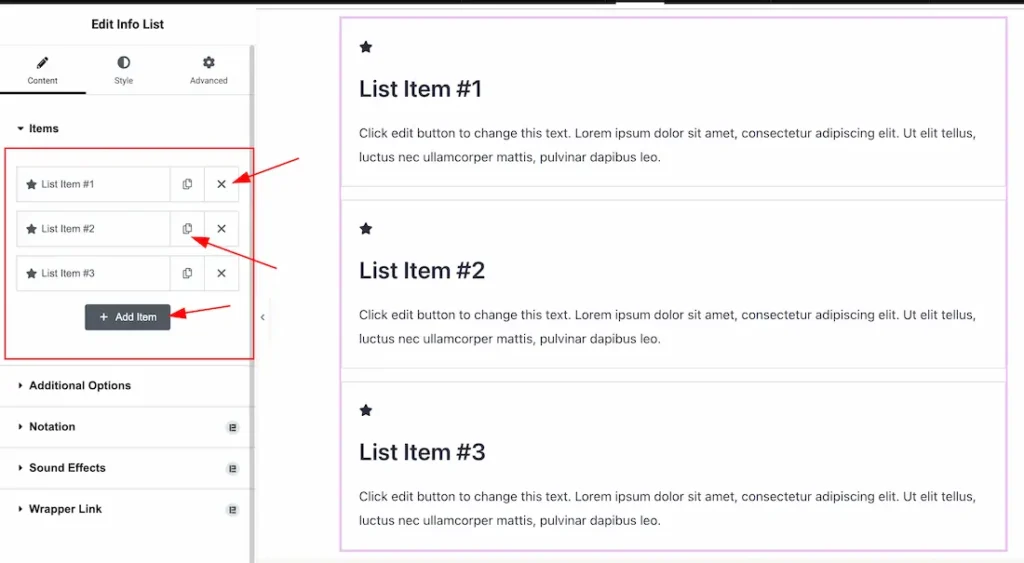
Add & Remove Items: Come to the Items section, you can add the Info List widget items (with the Add Item button) and also remove the Item by Close icon button. If you want you also can copy the item.
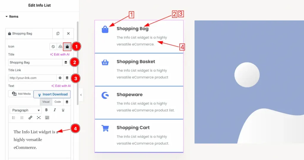
1. Icon: This option lets you set the Info List Icon from here.
2. Title: This option lets you set the Title of the Info List.
3. Title Link: You can set a link under the Title.
4. Text: This option lets you set the Text for the Info List Items.
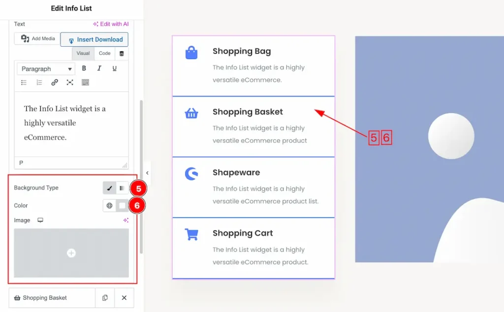
5. Background Type: You can change the color of any item background to classic or gradient. Here we choose the Background type Classic.
6. Background Color: This lets you change the item Background color. If you want, you also can change an image to the Background.
Additional Options Section
Go to Conetent > Additional Options
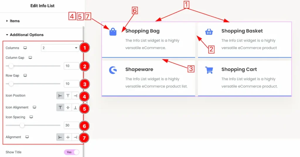
1. Columns: You can set the items columns number from here.
2. Column Gap: This option lets you set the gap between columns.
3. Row Gap: This option lets you set the gap between Rows.
4. Icon Position: This option lets you set the icon position.
5. Icon Alignment: This option lets you set the icon alignment.
6. Icon Spacing: This option lets you set the icon Spacing.
7. Alignment: This option lets you set the icon alignment as – left, center, & right.
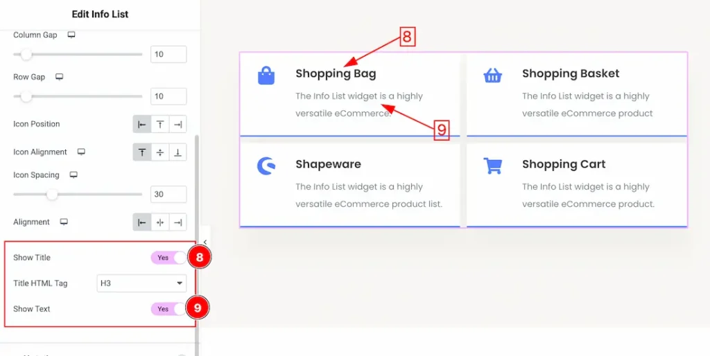
8. Show Title: Enable/ disable the Show Title switcher button to show/hide the Title from the Info List. You can also set the Title HTML Tag from here.
9. Show Text: Enable/ disable the Show Text switcher button to show/hide the Text from the Info List.
Work with The Style Tab
Items Section
Go to Style > Items
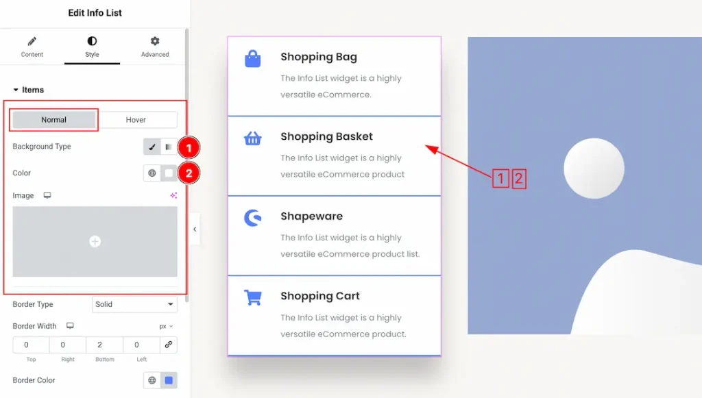
Come to the Items section, you will get two sub-sections; Normal and Hover.
You will get the following customization option in the Normal subsection-
1. Background Type: You can change the color of item background to classic or gradient. Here we choose the Background type Classic.
2. Background Color: This lets you change the item Background color. If you want, you also can change an image to the Background.
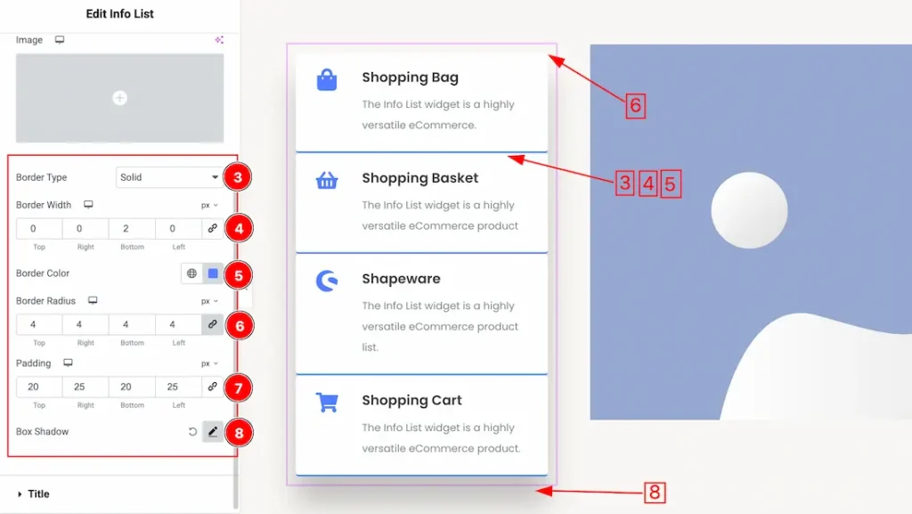
3. Border Type: You can set the Border Type to Default, None, Solid, Double, Dotted, Dashed, or Groove. We choose here the Border Type Solid.
4. Border Width: The border width property allows you to control how thick or thin the border is.
5. Border Color: This lets you change the Border color.
6. Border Radius: Customizes the border corners for roundness.
7. Padding: Add spaces around an object to increase the inner area. Padding allows you to control the internal space within an element.
8. Box Shadow: The Box Shadow property is used to create the shadow around the Item. It takes Four values: Horizontal offset, Vertical offset, blur, and Spread to customize the Box shadow.
Position: you can set the Box Shadow position Outline and Inset. Here we set the Box Shadow position Outline.
Box Shadow Color: This lets you change the Box Shadow color.
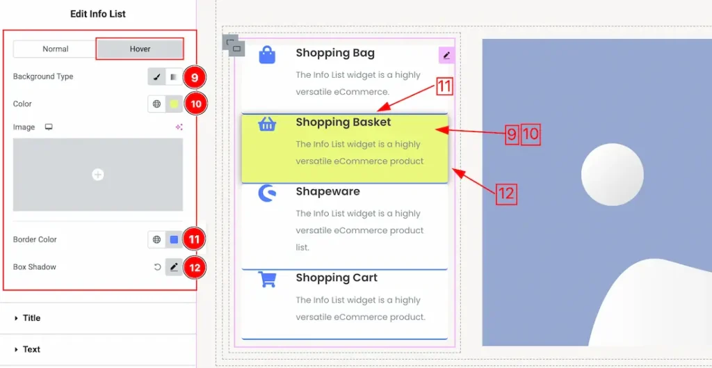
9. Background Type: You can change the color of item hover background to classic or gradient. Here we choose the hover Background type Classic.
10. Background Color: This lets you change the item hover Background color. If you want, you also can change an image to the hover Background.
11. Border Color: This lets you change the Border hover color.
12. Box Shadow: You can set the Item hover Box Shadow from here.
Title Section
Go to Style > Title
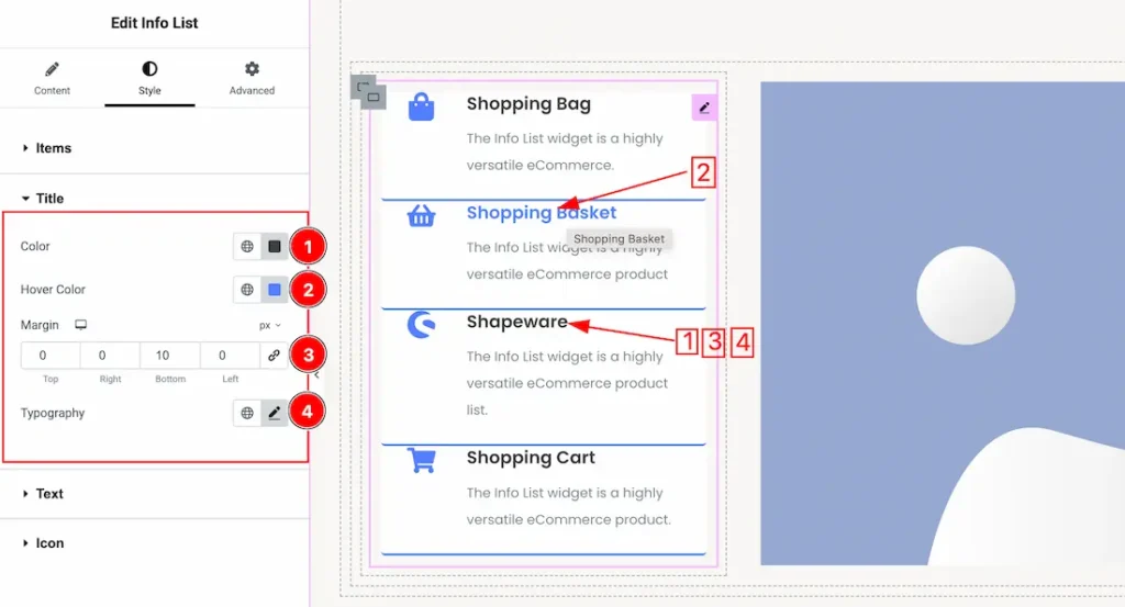
1. Color: This option lets you set the Title normal color.
2. Hover Color: This option lets you set the Title hover color.
3. Margin: Adjusts the position of an object over the canvas.
4. Typography: Change the font family, size, weight, style, transform, decoration, line height, letter spacing, and word spacing from here.
Text Section
Go to Style > Text
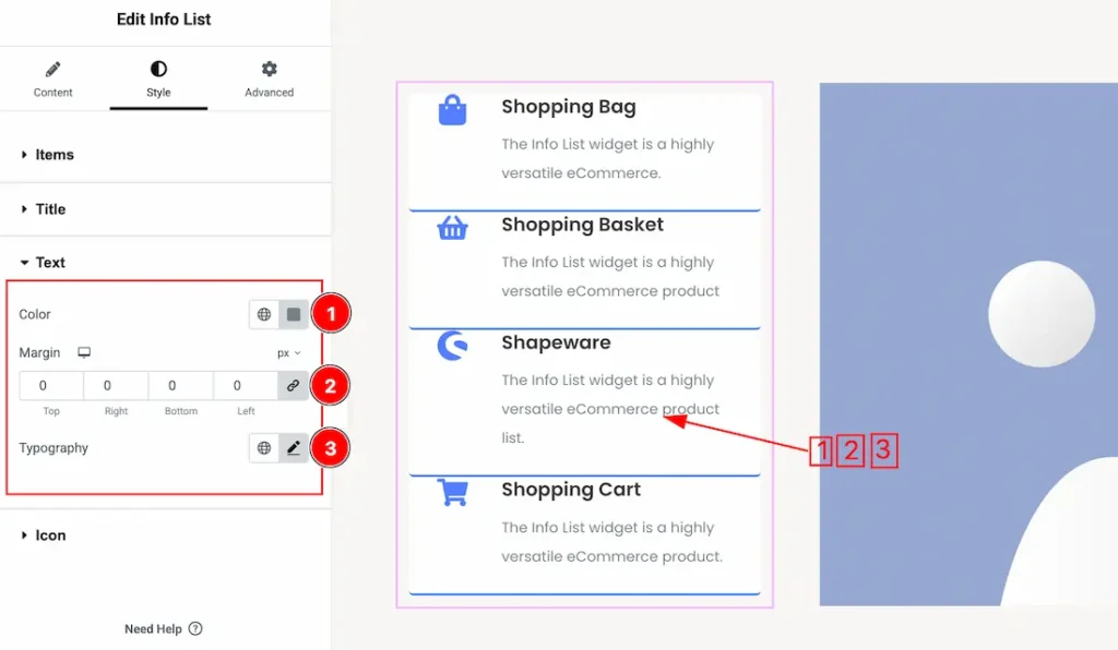
1. Color: This option lets you set the Text normal color.
2. Margin: Adjusts the position of an object over the canvas.
3. Typography: Change the font family, size, weight, style, transform, decoration, line height, letter spacing, and word spacing from here.
Icon Section
Go to Style > Icon
Come to the Icon section, you will get two subsections; Normal and Hover.
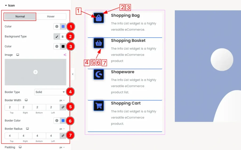
In the Normal subsection, you will get the below customization options-
1. Color: This option lets you set the Icon normal color.
2. Background Type: You can change the color of background to classic or gradient. Here we choose the Background type Classic. If you want then you also can set an image as icon background.
3. Background Color: This option lets you set the Icon background color.
4. Border Type: You can set the Border Type to Default, None, Solid, Double, Dotted, Dashed, or Groove. We choose here the Border Type Solid.
5. Border Width: The border width property allows you to control how thick or thin the border is.
6. Border Color: This lets you change the Border color.
7. Border Radius: Customizes the border corners for roundness.
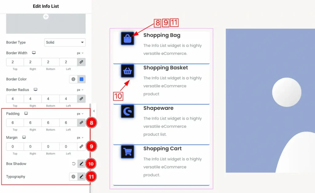
8. Padding: Add spaces around an object to increase the inner area. Padding allows you to control the internal space within an element.
9. Margin: Adjusts the position of an object over the canvas.
10. Box Shadow: The Box Shadow property is used to create the shadow around the icon. It takes Four values: Horizontal offset, Vertical offset, blur, and Spread to customize the Box shadow.
Position: you can set the Box Shadow position Outline and Inset. Here we set the Box Shadow position Outline.
Box Shadow Color: This lets you change the Box Shadow color.
11. Typography: Change the font family, size, weight, style, transform, decoration, line height, letter spacing, and word spacing from here.
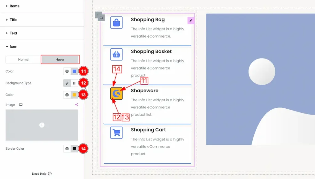
In the Hover sub section, you will get the below customization options-
11. Color: This option lets you set the icon hover color.
12. Background Type: You can change the color of hover background to classic or gradient. Here we choose the Background type Classic. If you want then you also can set an image as icon background.
13. Background Color: This option lets you set the Icon hover background color.
14. Border Color: This option lets you set the icon hover boder color.
All done! You have successfully customized the Info List widget on your website.
Video Assist
You can also watch the video tutorial to learn more about the Info List Widget. Please visit the demo page for examples.
Thanks for being with us.