In this documentation, we will show you how to customize the EDD Standard Grid Widget by Ultimate Store Kit.
Enable the EDD Standard Grid Widget
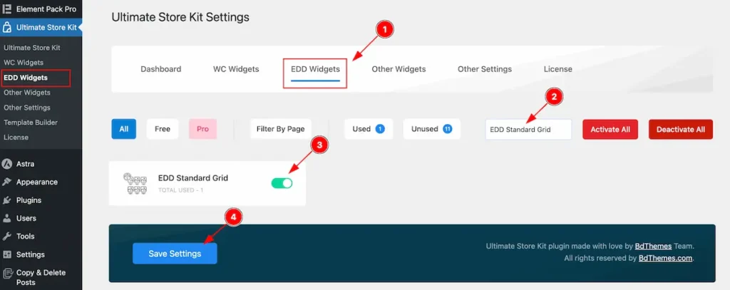
To use the EDD Standard Grid from Ultimate Store Kit Widget must be enabled. Navigate to WordPress Dashboard > Ultimate Store Kit Plugin dashboard.
- Navigate to EDD Widgets Tab.
- Search by the EDD Standard Grid Widget Name.
- Enable the EDD Standard Grid Widget.
- Hit the Save Settings Button.
Inserting The EDD Standard Grid widget
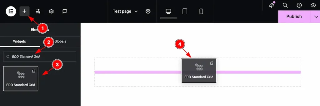
- Go to the Elementor Editor Page and Hit the Add Element ” + ” Icon.
- Search by the EDD Standard Grid widget name.
- The widget will appear, Check the Ultimate Store Kit logo on top right corner.
- Select the widget then Drag and Drop it on the editor page.
Configuring the Content Tab
The Content Tab provides options to manage and structure the core settings of elements. It allows to define the content and functionality to align with design goals.
Layout Section
Go to Content > Layout
The layout section contains the basic controls of the featured box. Make changes by following the instruction.
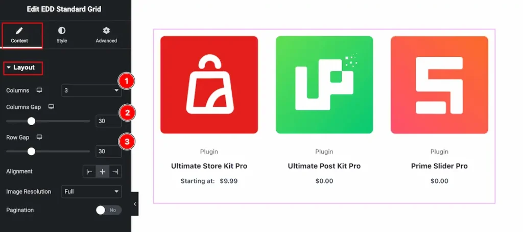
- Columns: Select the column to be appear on the layout section.
- Column Gap: Set the gap between the columns.
- Row Gap: Set the gap between the rows.
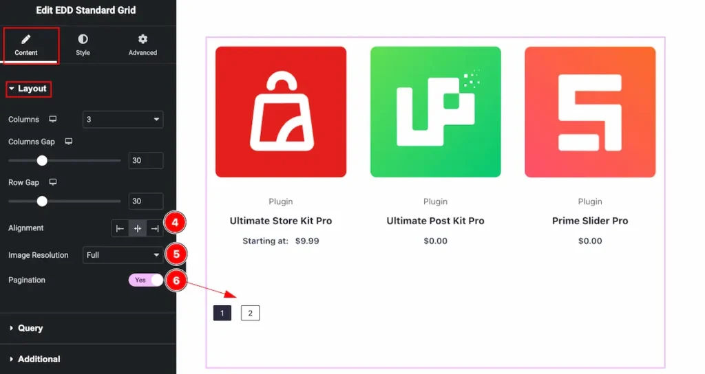
- Alignment: Set the alignment for the content.
- Image Resolution: Set the resolution for the images.
- Pagination: Enable the switcher to show the pagination. It helps to navigate quickly.
Query Section
Go to Content > Query
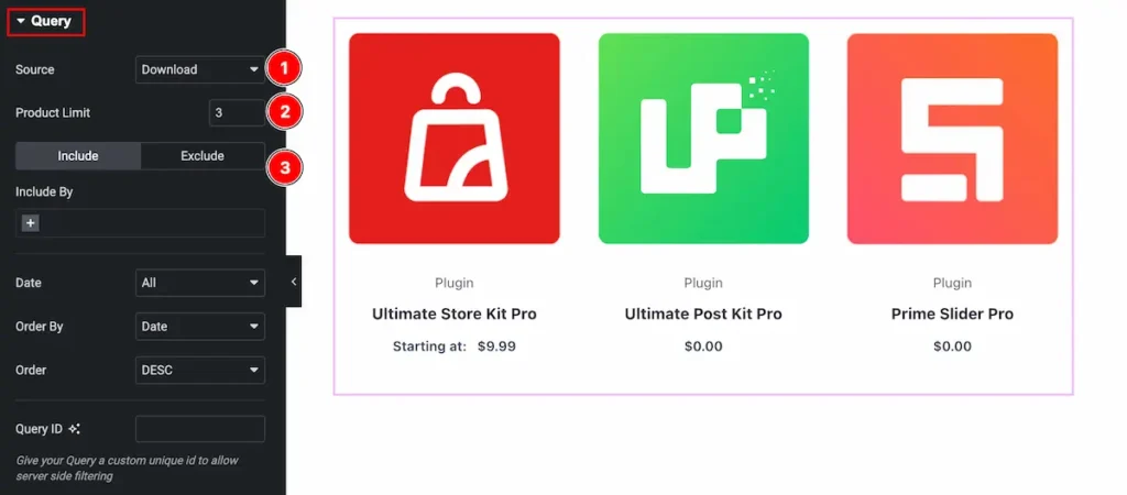
Make the query for standard grid by following the instruction,
- Source: Select the source for the Standard Grid.
- Product Limit: Set the limitation for the products, It will show certain number of products only.
- Include: This feature is showing the included data only.
Learn more about the Query, Please follow this documentation.
Additional Section
Go to Content > Additional
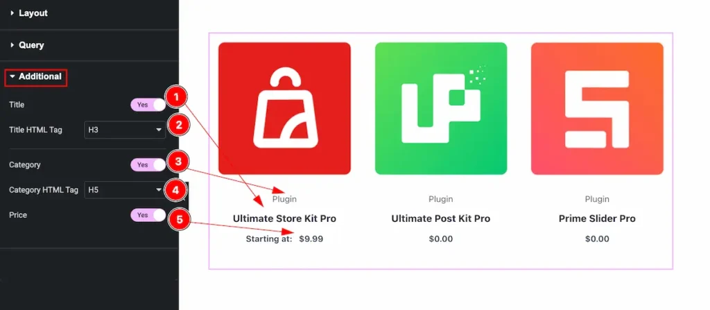
- Title: Enable the switcher to show the Title for the Standard Grid widget.
- Title HTML Tag: Set any HTML Tag for Title ( H1, H2, H3, H4, H5, H6, p, span ). The title tag is essential for both user experience and search engine optimization (SEO).
- Category: Enable this to show the Category.
- Category HTML Tag: Set any HTML Tag for Category ( H1, H2, H3, H4, H5, H6, p, span ). The Category tag is essential for both user experience and search engine optimization (SEO).
- Price: Enable the switcher to show the Price.
Designing with the Style Tab
The Style Tab offers a range of options to enhance the visual appearance of elements, enabling precise adjustments and creative design possibilities. It helps create polished and engaging layouts effortlessly.
Item Section
Go to Style > Item
Normal Tab
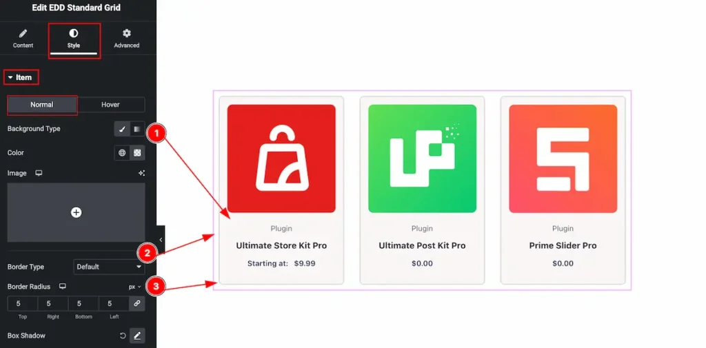
- Background Type: Set the Background type for item, choose color from the Item section.
- Border Type: Set the border type for the grid item.
- Border Radius: Set the border radius for the item.
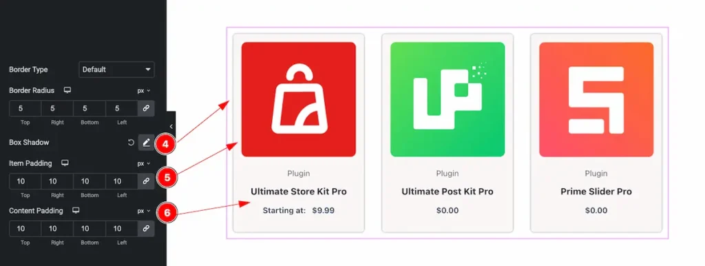
- Box Shadow: Set the shadow for the box.
- Item Padding: Add inner space by adding the item padding, The padding works for the image.
- Content Padding: Set the padding for the content only.
Hover Tab
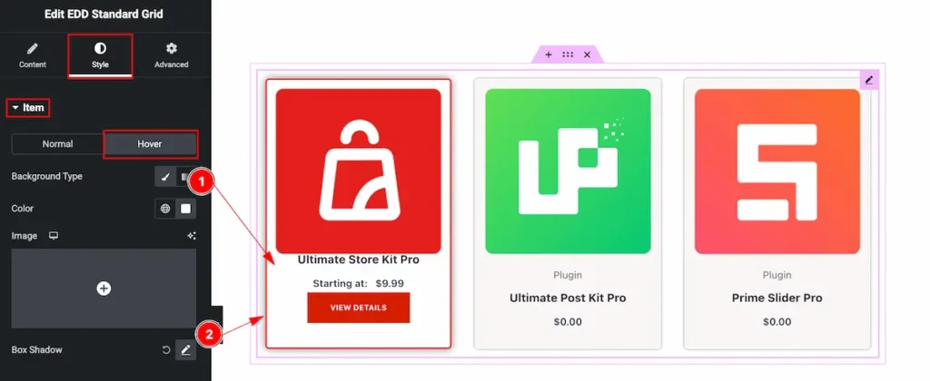
The changes will appear for the hover tab,
- Background Type: Set the background type color for the item, Select the color for the item plate.
- Box Shadow: Set the shadow for the box item of grid section.
Title Section
Go to Style > Title
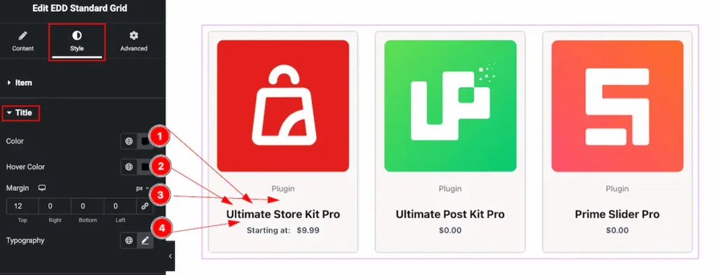
- Color: Set the color for the title of the standard grid.
- Hover Color: Set the hover color, It will appear on mouse hover over of it.
- Margin: Set the margin for the Title.
- Typography: Set the typography for the title.
Category Section
Go to Style > Category
Normal Tab
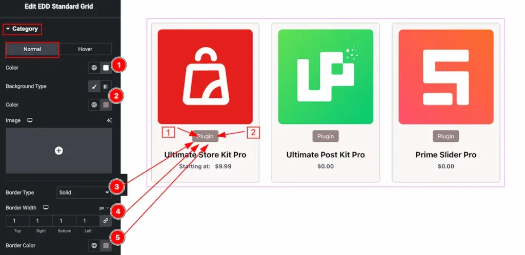
- Color: Set the color for the background item.
- Background Type: Set the background Type color for selecting the background of the category item.
- Border Type: Select the type for the border item.
- Border Width: Set the width for the border item.
- Border Color: Set the color for the border of the category item.
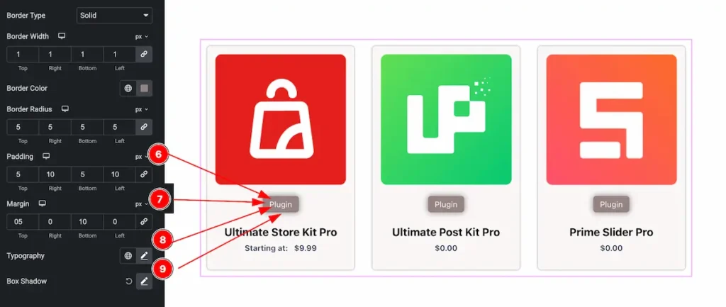
- Padding: Set the padding for inner space of the item.
- Margin: Set the margin for the outer space.
- Typography: Set the typography for the item.
- Box Shadow: Set the box shadow for the item.
Hover Tab
Than changes will appear on mouse hover,
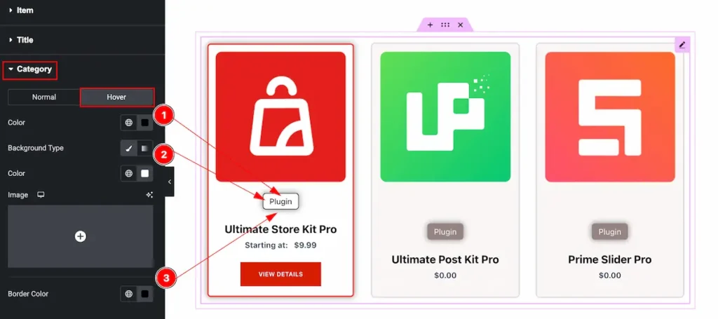
- Color: Set the color for the Category.
- Background Type: Set the background type color for the category.
- Border Color: Set the border color for the category item.
Price Section
Go to Style > Price
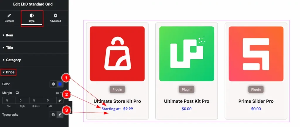
- Color: Set the color for the price of the Standard Grid.
- Margin: Set the margin for the price section.
- Typography: Set the typography for the price section.
Action Button Section
Go to Style > Action Button
View Details Button
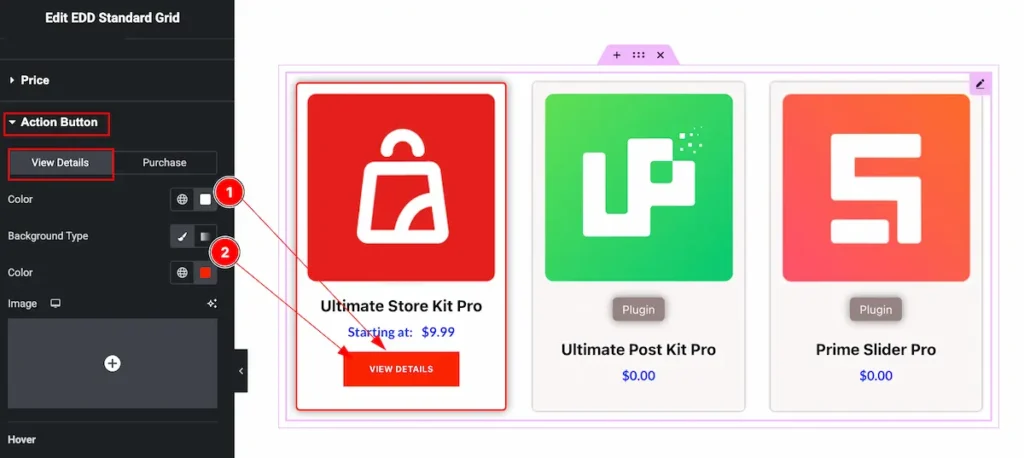
- Color: Set the color for the view details button.
- Background Type: Select the background type color for the button.
Hover
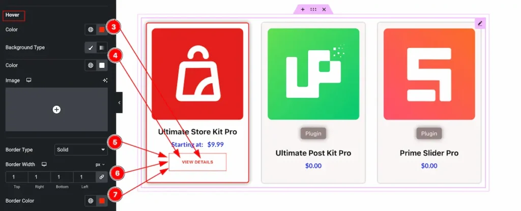
- Color: Set the color for the button.
- Background Type: Select the background Type color for the button.
- Border Type: Select the border type for the button.
- Border Width: Set the width for the border.
- Border Color: Set the color for the border section.
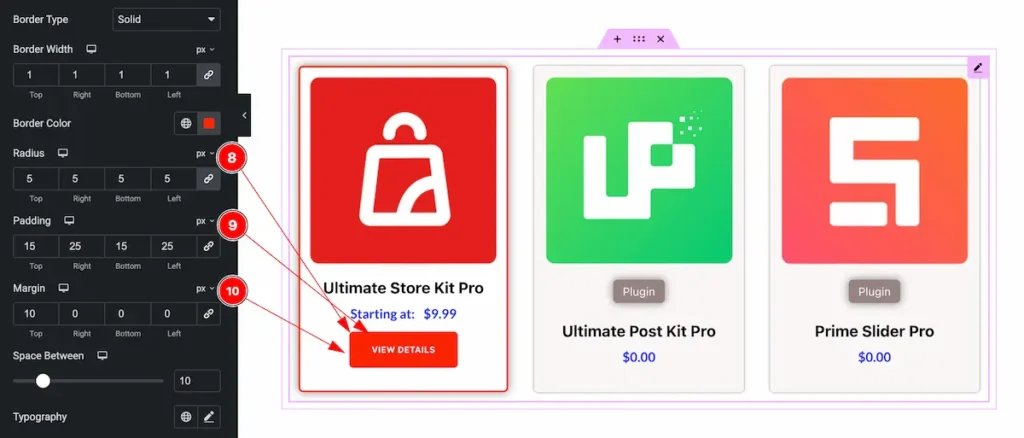
- Radius: Set the border radius by setting the order.
- Padding: Set the padding for the background.
- Margin: Set the margin for the inner space.
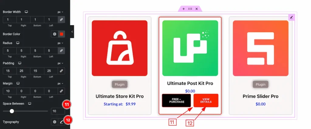
- Space Between: Set the space between the butons.
- Typography: Set the typography for the button.
Purchase Button
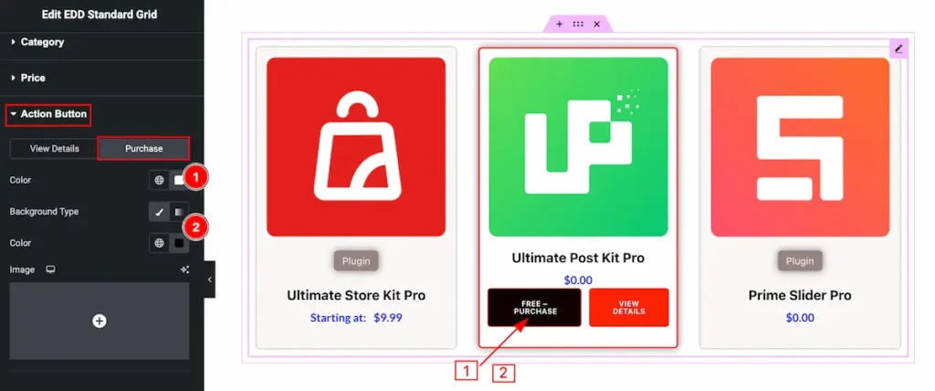
- Color: Set the color for the button.
- Background Type: Set the background type color for the Purchase button.
Video Assist
Video Tutorial is coming soon! Please visit the demo page for examples.
Thanks for being with us.