In this documentation, we will show you how to customize the EDD Standard Carousel Widget by Ultimate Store Kit.
Enable the EDD Standard Carousel Widget
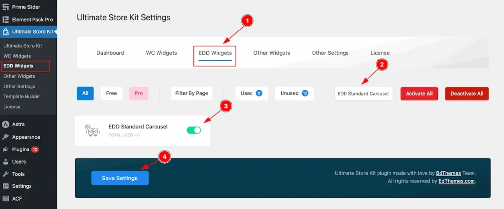
To use the EDD Standard Carousel from Ultimate Store Kit Widget must be enabled. Navigate to WordPress Dashboard > Ultimate Store Kit Plugin dashboard.
- Navigate to EDD Widgets Tab.
- Search by the EDD Standard Carousel Widget Name.
- Enable the EDD Standard Carousel Widget.
- Hit the Save Settings Button.
Inserting The EDD Standard Carousel widget
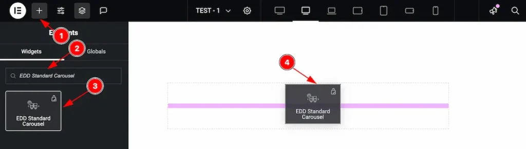
- Go to the Elementor Editor Page and Hit the Add Element ” + ” Icon.
- Search by the EDD Standard Carousel widget name.
- The widget will appear, Check the Ultimate Store Kit logo on top right corner.
- Select the widget then Drag and Drop it on the editor page.
Configuring the Content Tab
The Content Tab provides options to manage and structure the core settings of elements. It allows to define the content and functionality to align with design goals.
Layout Section
Go to Content > Layout
The layout section contains the basic controls of the featured box. Make changes by following the instruction.
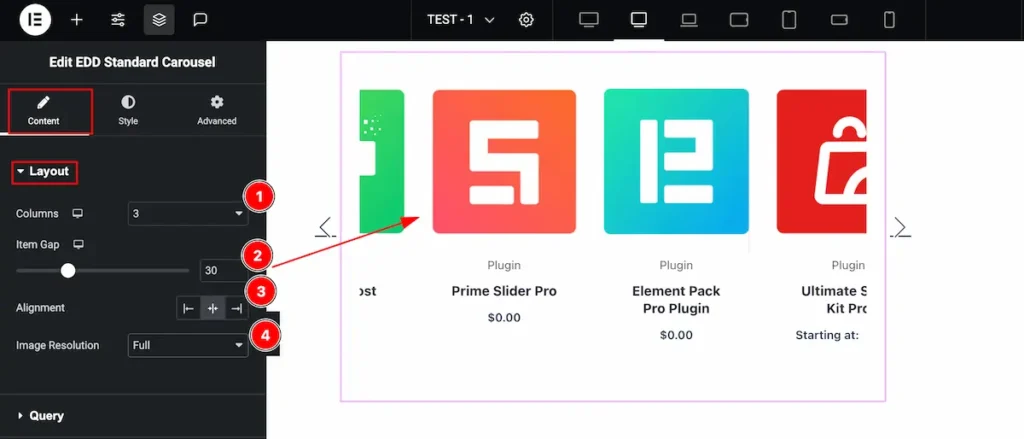
- Columns: Set the columns for the layout section.
- Item Gap: Set the gap between the columns.
- Alignment: Set the alignment for the Items.
- Image Resolution: Set the resolution for the image. Different resolution appear
Query Section
Go to Content > Query
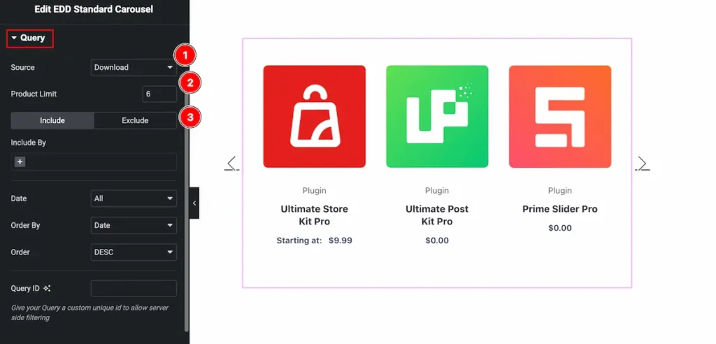
- Source: Select the source for the carousel item.
- Product Limit: Set the limitation for the product item.
- Include/Exclude: Include or Exclude item your wish.
Please read more about the query section.
Additional Section
Go to Content > Additional
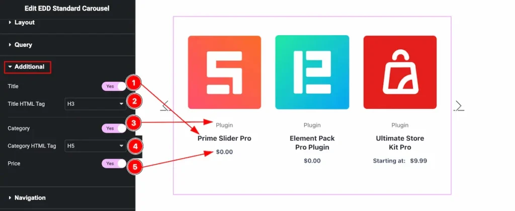
- Title: Enable the switcher to show the Title of the carousel item.
- Title HTML Tag: Set any HTML Tag for Title ( H1, H2, H3, H4, H5, H6, p, span ). The title tag is essential for both user experience and search engine optimization (SEO).
- Category: Category can be shown by enabling the switcher. All the category will be appear.
- Category HTML Tag: Set any HTML Tag for Category ( H1, H2, H3, H4, H5, H6, p, span ). The Category tag is essential for both user experience and search engine optimization (SEO).
- Price: The Price will appear on the carousel item if enable the switcher.
Navigation Section
Go to Content > Navigation
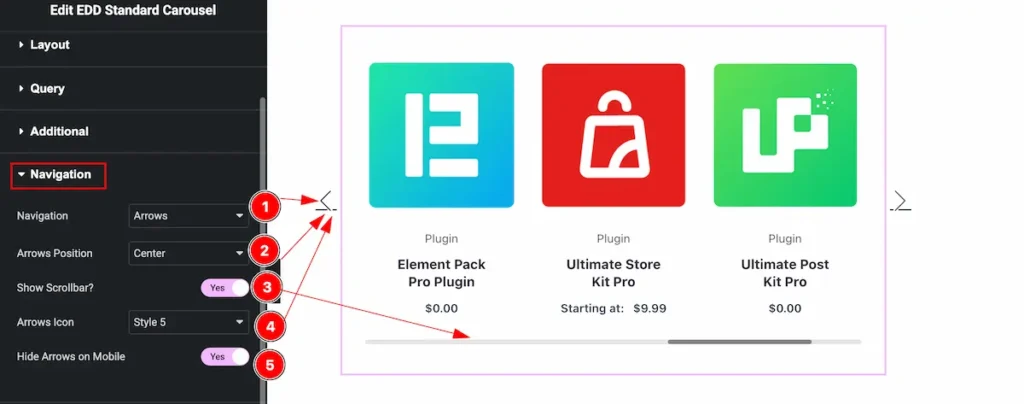
- Navigation: Select available navigation items ( Arrows, Arrows and Dots, Arrows and Fraction, Dots, Progress bar, None).
- Arrows Position: Set the position of the arrows ( Center, Top Right, Top Left, Bottom Left, Bottom Right ).
- Show Scrollbar?: The scrollbar appear below the carousel items slides. Enable the switcher to show the scrollbar.
- Arrows Icon: Select multiple icon from the arrows icon list section.
- Hide Arrows on mobile: The feature will turn off the arrows for the mobile devices only if it is enabled.
Carousel Settings Section
Go to Content > Carousel Settings
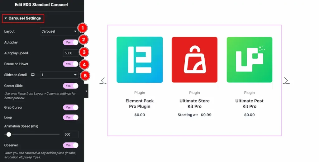
- Layout: Select the layout of carousel ( Carousel, Cover flow ).
- Autoplay: The Carousel item will play automatically when enable the Autoplay feature.
- Autoplay Speed: Set the speed for automatically playing the carousel.
- Pause on Hover: On Mouse hover over the carousel will pause. Enable the switcher to activate it.
- Slides to Scroll: Select the sliding items and it will slide according to it.
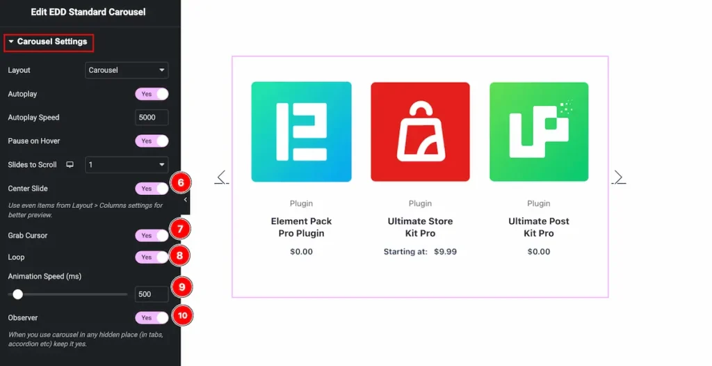
- Center Slide: Enable the switcher to slide the content in centre.
- Grab Cursor: Enable the is to grab the slider, The cursor pointer will turn into grab feature.
- Loop: Enable the switcher to loop the content.
- Animation Speed: Set the speed for animation. The speed count in ( ms ).
- Observer: Enable the switcher to work with the observer.
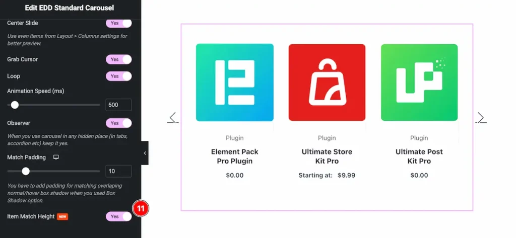
- Item Match Height: This feature is to make all the item height same, Enable the switcher to match the same height of the carousel item.
Designing with the Style Tab
The Style Tab offers a range of options to enhance the visual appearance of elements, enabling precise adjustments and creative design possibilities. It helps create polished and engaging layouts effortlessly.
Item Section
Go to Style > Item
Normal Tab
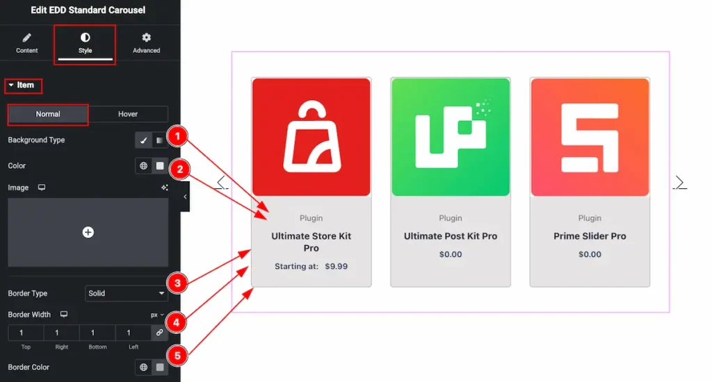
- Background Type: Select the Background type for the carousel item. Select the Color or Gradient for the background.
- Color: Select the color from the color plate of it.
- Border Type: Border for the items ( Solid, Double, Dashed, Dotted, etc. ).
- Border Width: Set the thickness of the border by selecting the width.
- Border Color: Set the color for the border.
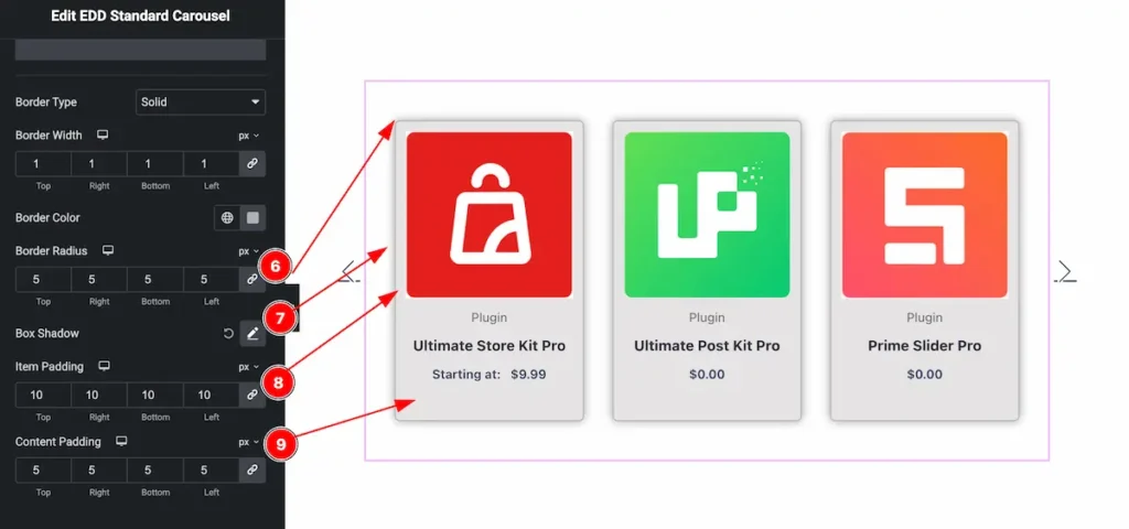
- Border Radius: Make the border radius by setting the number on there.
- Box Shadow: Make the shadow for the box item.
- Item Padding: Set the padding for the items.
- Content Padding: Make space for the inner content of the items.
Hover Tab
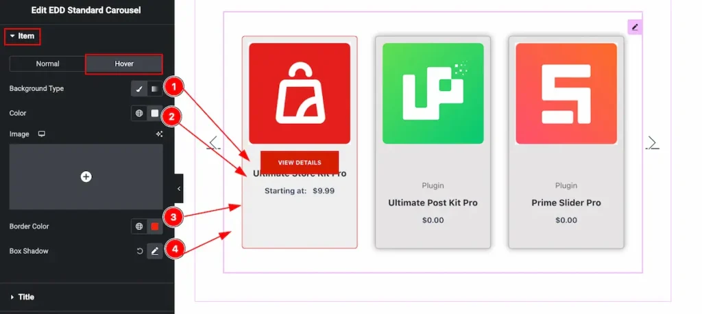
- Background Type: Select the Background type for the carousel item. Select the Color or Gradient for the background.
- Color: Select the color from the color plate of it.
- Border Color: Set the border color for the hover item of carousel.
- Box Shadow: Set the shadow for the carousel item.
Title Section
Go to Style > Title
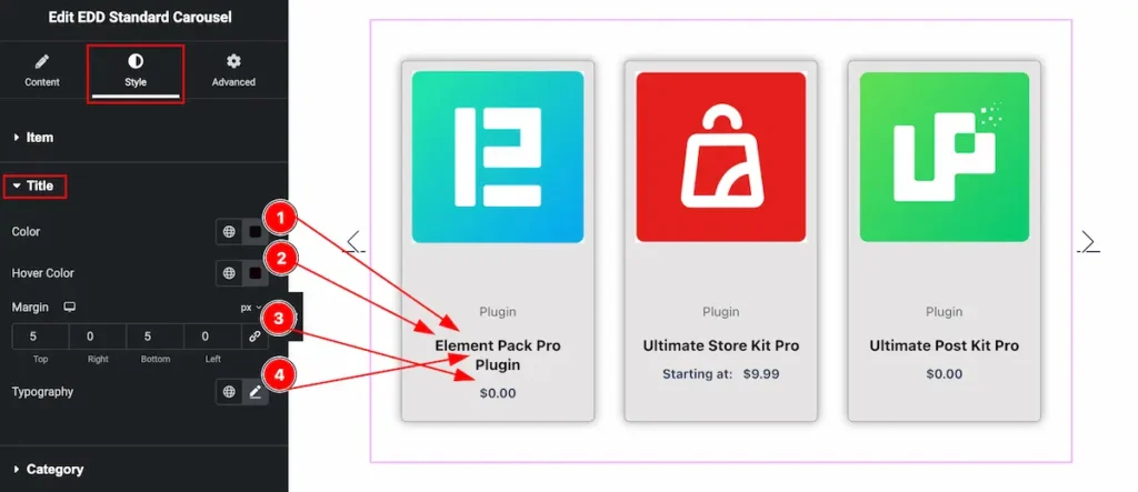
- Color: Set the color for the Title.
- Hover Color: Set hover color for the title section.
- Margin: Set the margin for it.
- Typography: Set the typography for the title.
Category Section
Go to Style > Category
Normal Tab
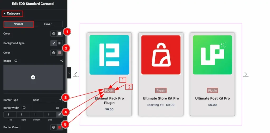
- Color: Set the color for the category text.
- Background Type: Select the background type for the category item and set it by following this.
- Border Type: Set the type for the border ( Solid, Dotted, Dashed, etc ).
- Border Width: Set the width for the border item.
- Border Color: Select the border color of it.
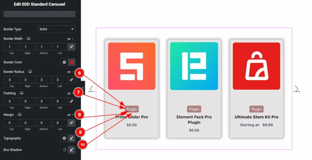
- Border Radius: Set the border radius by following the controls.
- Padding: Set the padding to make inner space of it.
- Margin: Set the margin for the outer space of the category button.
- Typography: Set the typography for the category text item.
- Box Shadow: Make the box shadow for the items.
Hover Tab
The changes will appear on mouse hover over the category items.
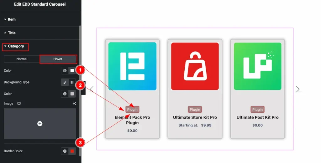
- Color: Set the color for the category text.
- Background Type: Select the background type for the category items, Select the color or gradient and set according to it.
- Border Color: Set the color for the border item.
Action Button Section
Go to Style > Action Button
VIEW DETAILS
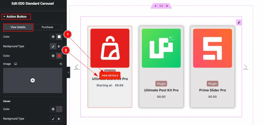
- Color: Set the color for the view details button.
- Background Type: Select the background type for the category items, Select the color or gradient and set according to it.
Hover
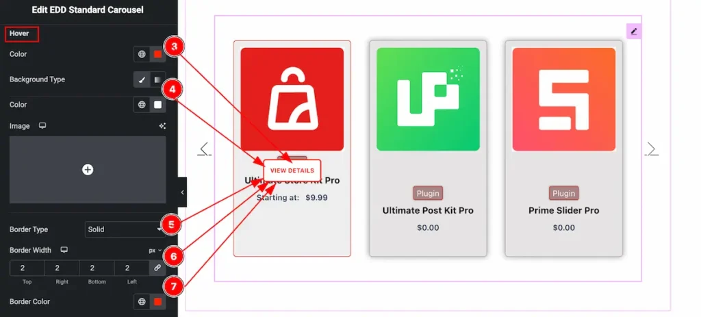
- Color: Set the color for the View Details Button.
- Background Type: Select the background type for the View Details item and Select the color or gradient and set according to it.
- Border Type: Set the type for the border ( Solid, Dotted, Dashed, etc ).
- Border Width: Set the width for the border item.
- Border Color: Select the border color of it.
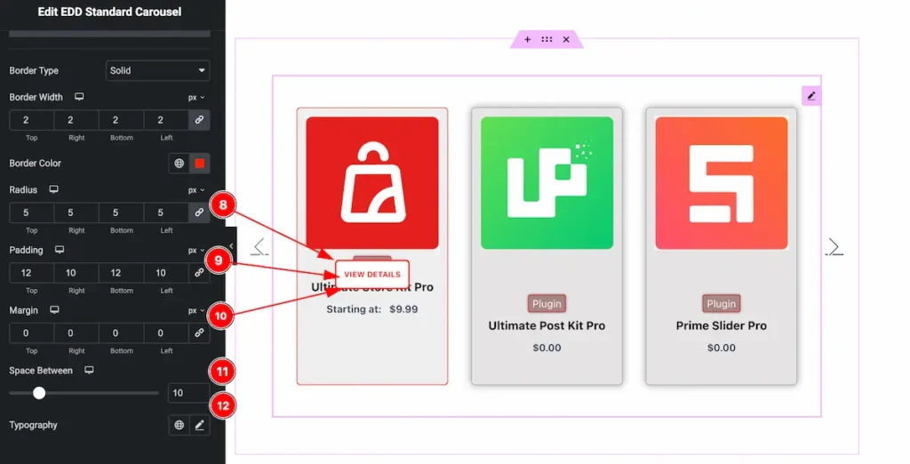
- Radius: Set the border radius by following the controls
- Padding: Set the padding for the button to make inner space.
- Margin: Set the margin for the button to get outer space.
- Space Between: Make space between the buttons .
- Typography: Set the typography for the buttons.
PURCHASE
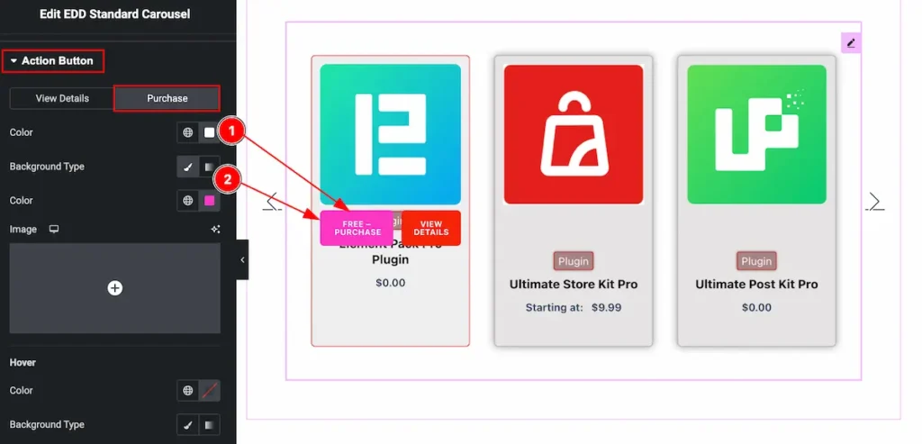
- Color: Set the color for the purchase button text.
- Background Type: Select the background type for the Purchase Button and Select the color or gradient and set according to it.
Price Section
Go to Style > Price
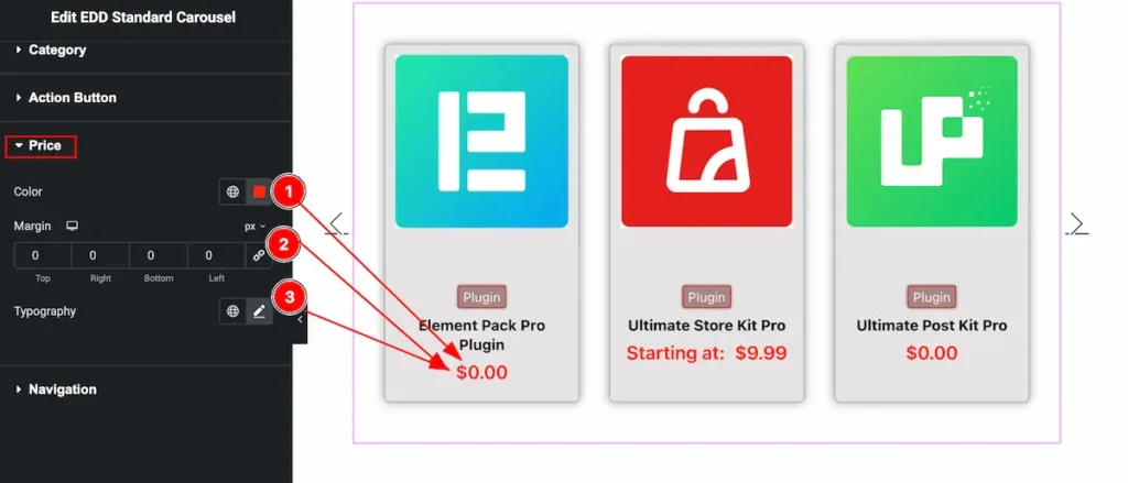
- Color: Set the color for the price button.
- Margin: Set the margin for the button.
- Typography: Set the typography for the button.
Navigation Section
Go to Style > Navigation
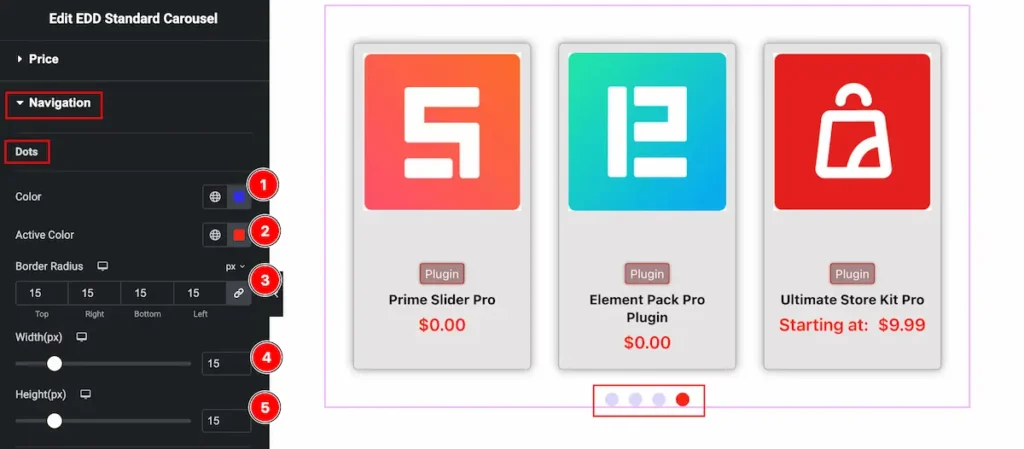
- Color: Set the color for the dots.
- Active Color: Set the active color.
- Border Radius: Make the border radius for the dots.
- Width(px): Set the width for the dots.
- Height(px): Set the height for the dots.
Video Assist
Video Tutorial coming soon! Please visit the demo page for examples.
Thanks for being with us.