In this documentation, we will show you how to customize the Account Logout Widget by Ultimate Store Kit.
Enable the Account Logout Widget
To use the Elementor Account Logout Widget from Ultimate Store Kit, you must first enable the widget.
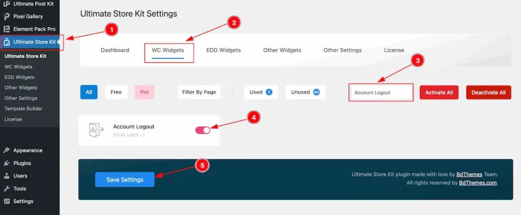
- Go to WordPress Dashboard > Ultimate Store Kit Plugin dashboard.
- Then Click the WC Widgets Tab.
- Search the Account Logout Widget Name.
- Enable the Account Logout Widget.
- Hit the Save Settings Button.
Inserting The Account Logout widget
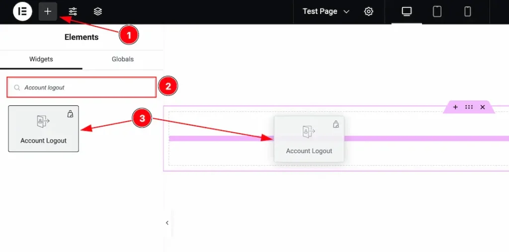
- Go to the Elementor Editor Page and Hit the Get Back To Button.
- Search the Account Logout widget.
- Drag the widget and Drop it on the editor page.
Work With The Style Tab
Button Section
Go to Style > Button
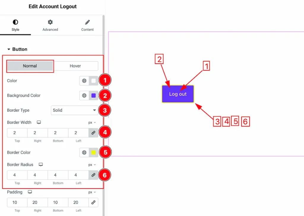
Come to the Button section, you will get two sub-sections; Normal and Hover.
In the Normal Tab section, you will get the below options to customize it.
1. Color: This option lets you change the Button Normal Color.
2. Background Color: This option lets you change the Button Background Color.
3. Border Type: you can set the Border Type to Default, None, Solid, Double, Dotted, Dashed, or Groove. We choose here the Border Type Solid.
4. Border Width: The border width property allows you to control how thick or thin the border is.
5. Border Color: This lets you change the Border color.
6. Border Radius: Customizes the border corners for roundness.
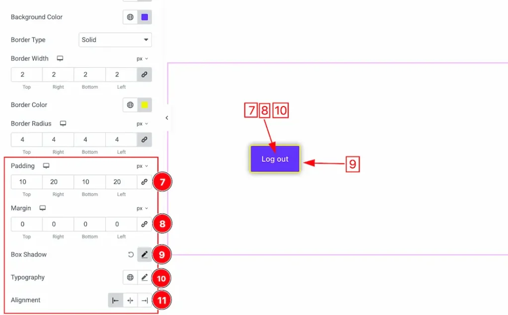
7. Padding: Add spaces around an object to increase the inner area. Padding allows you to control the internal space within an element.
8. Margin: Adjusts the position of an object over the canvas.
9. Box Shadow: The Box Shadow property is used to create the shadow around the Category Button. It takes Four values: Horizontal offset, Vertical offset, blur, and Spread to customize the Box shadow.
Position: you can set the Box Shadow position Outline and Inset. Here we set the Box Shadow position Outline.
Box Shadow Color: This lets you change the Box Shadow color.
10. Typography: Change the font family, size, weight, style, transform, decoration, line height, letter spacing, and word spacing from here for the button.
11. Alignment: This option lets you set the Button Alignment – Left, Center, and Right.
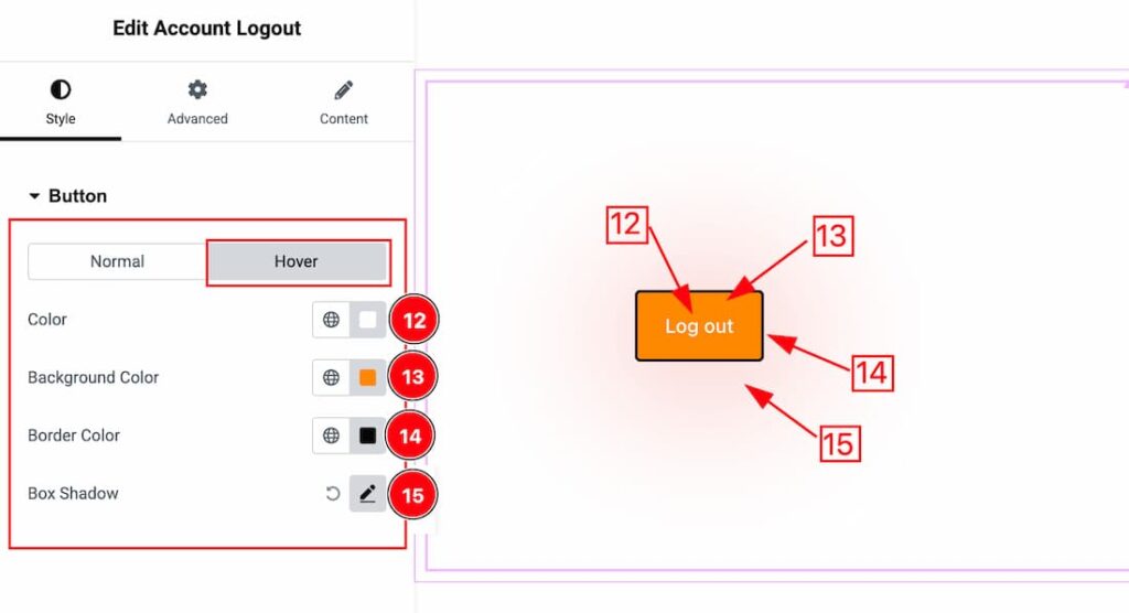
In the Hover Tab section, you will get the below options to customize it.
12. Color: This option lets you change the Button Hover Color.
13. Background Color: This option lets you change the Button Background Color.
14. Border Color: This option lets you change the button Border Color.
15. Box Shadow: Set the Button Box Shadow for the Hover mode.
Video Assist
The Video will coming soon. Please visit the demo page for examples.
Thanks for being with us.