In this documentation, we will discuss the customization of the Dynamic Carousel widget, brought to you by the Ultimate Post Kit Pro addon for Elementor.
Why Dynamic Carousel Widget
The Dynamic Carousel Widget allows you to display your posts, pages, or any custom post type in a flexible and responsive carousel layout. It automatically fetches content from your WordPress database and showcases it beautifully with advanced layout, animation, and filtering options.
Key Features
- Dynamic Content Source – Display data from posts, pages, custom post types, ACF fields, or WooCommerce products.
- Carousel Layout Styles – Present your content in an interactive carousel format with multiple slide effects, autoplay, and navigation controls.
- Multiple Layout Options – Choose from Grid, Masonry, or Metro layouts inside the carousel to match your website’s design.
- Custom Query Options – Filter items by categories, tags, authors, or specific post IDs.
- Advanced Filtering & Sorting – Allow users to sort and filter carousel content interactively.
- Customizable Design – Fully control the appearance of each carousel item, including images, titles, excerpts, and metadata.
- Responsive & Lightweight – Ensures your carousel looks great on all devices while maintaining fast performance.
- Navigation & Autoplay Controls – Customize arrows, dots, slide speed, and autoplay behavior for a smooth user experience.
Enable The Dynamic Carousel Widget
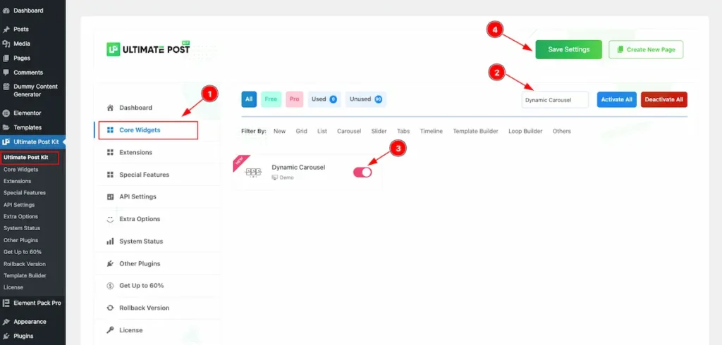
To use the Dynamic Carousel widget from Ultimate Post Kit Pro, first, you have to enable the widget. Navigate to the WordPress Dashboard.
- Go to Ultimate Post Kit Pro > Core Widgets section.
- Search by the Widget Name ” Dynamic Carousel ” and it will appear the.
- Now Enable the Switcher of the Dynamic Carousel.
- Hit the Save Settings button.
First Create a Template for Dynamic Carousel
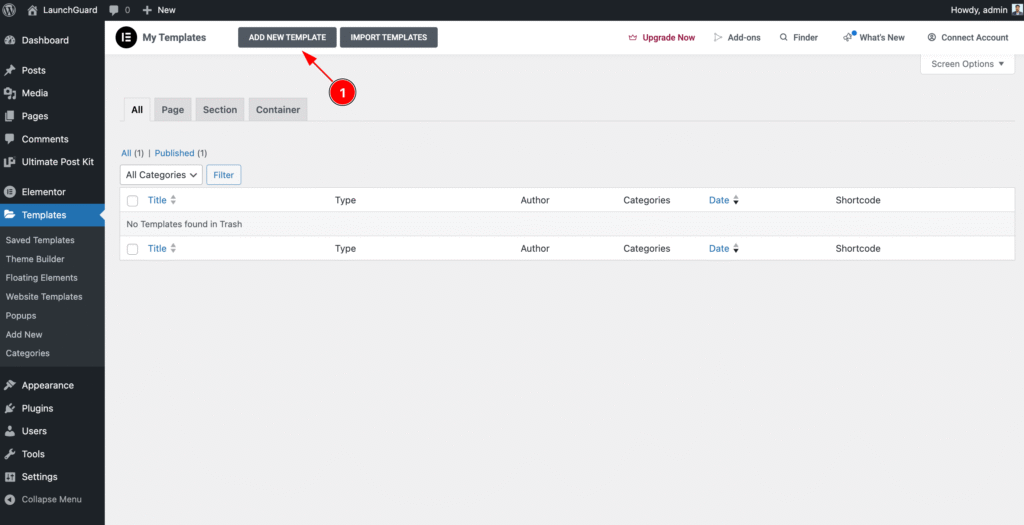
- Navigate to the Templates section of WP Dashboard then click on the ” ADD NEW TEMPLATE ” button to and it will appear Form now click on it.
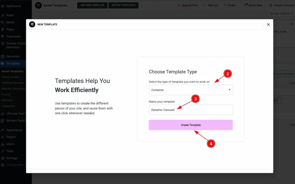
- Select the type of template want to work with. Container.
- Set the Name of the Template. e.g.: Dynamic Carousel.
- Once Done Click on the “Create Template ” button it will create a template and redirect to the Elementor Editor Page.
Create Custom Grid on the Template
Using this template, you can create any design you want, and it will appear on the front page. You can add any elements you like. Here, a simple design is demonstrated as an example.
Add Image Widget
It will work as a featured image.
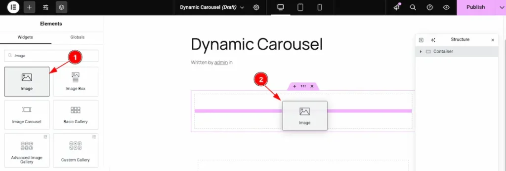
- Find the ” Image ” widget on the Widget panel and drag it.
- Drop it on the page.
Dynamic Features image
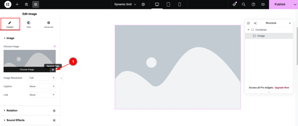
- Hover Over the image and it will appear the ” Dynamic Tags ” Icon and click on it.
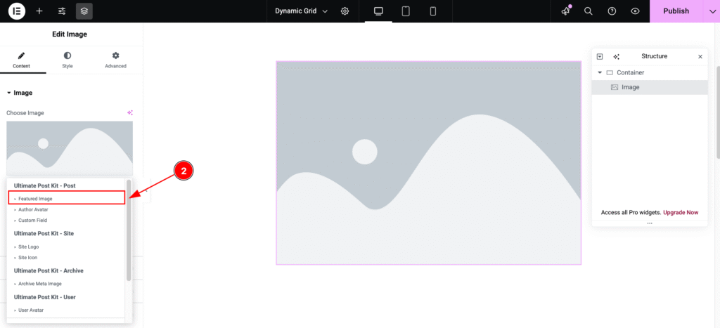
- It will appear the Ultimate Post Kit dynamic Content. Now Select the ” Featured Image “.
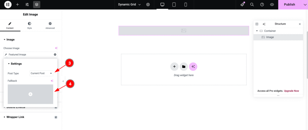
- Post Type: Select Current Post as the post type. This will pull only the current post’s content from the source.
- Fallback: Set an alternative image to display if the post’s featured image is not available.
Add Heading Widget
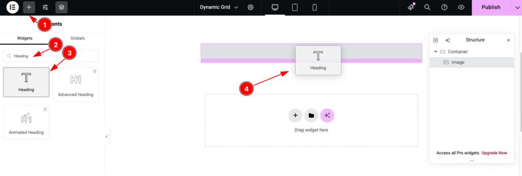
- Click on the “+” icon to open the widget panel.
- Search for the “Heading” widget and select it when it appears.
- Drag the Heading widget.
- Drop it onto the editor page.
Dynamic Post Title
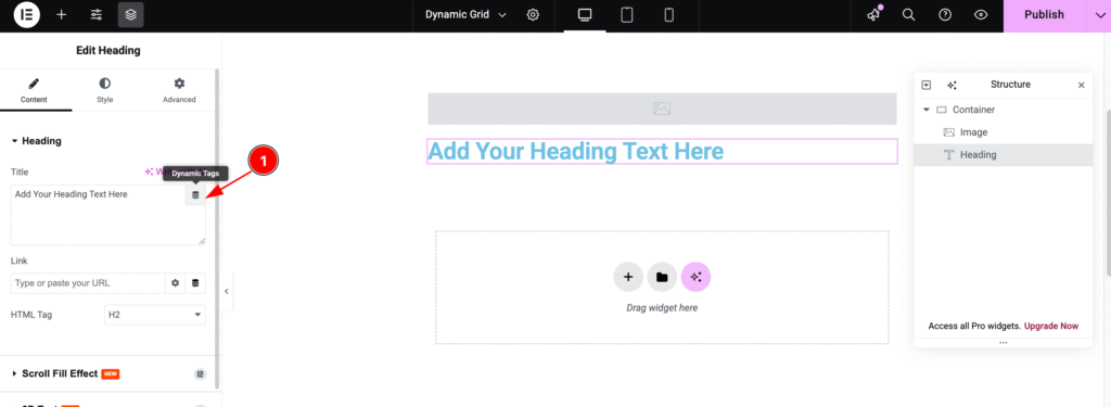
- Hover over the heading, and the “Dynamic Tags” icon will appear. Click on it to proceed.
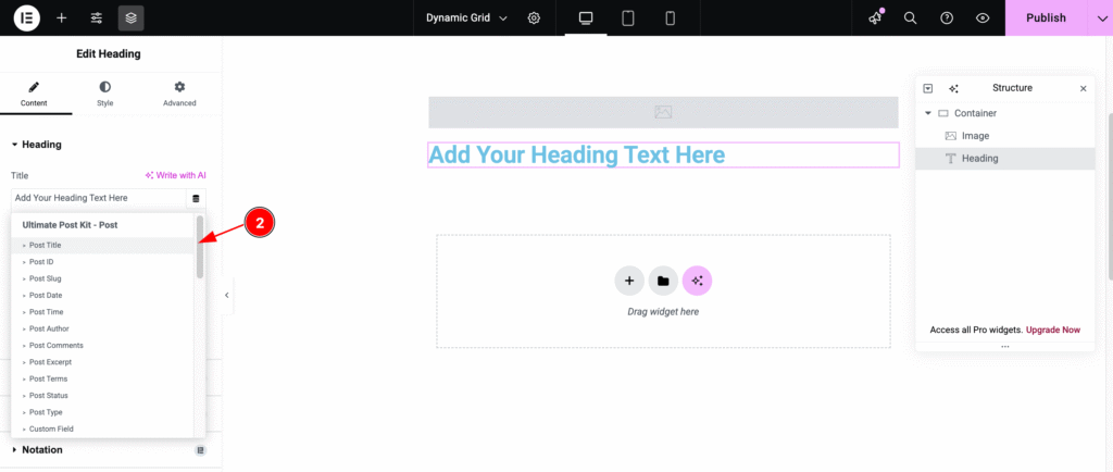
- Now, select “Post Title” as the dynamic post content. Choose it from the Ultimate Post Kit post section.
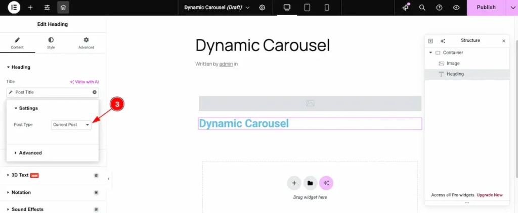
- Post Type: Choose the Post type ” Current Post ” to pull data from the current post.
Dynamic Post Link
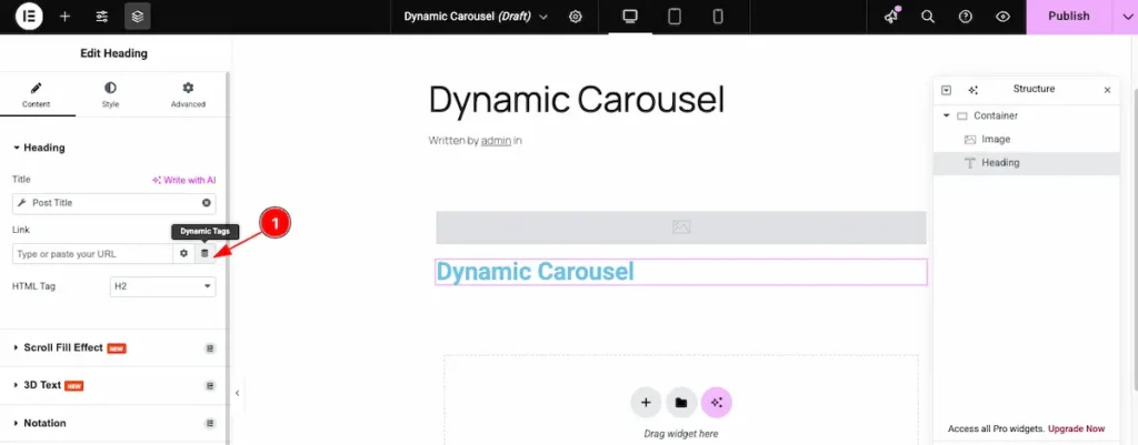
- Link: Click on the “Dynamic Tags” icon in the link section and select the desired dynamic tag.
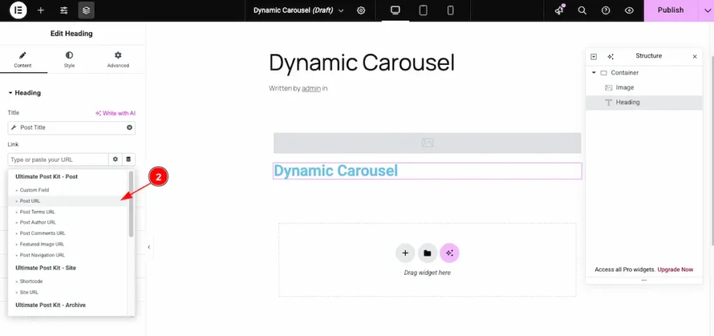
- Post URL: Set the link to the post by selecting the post URL.
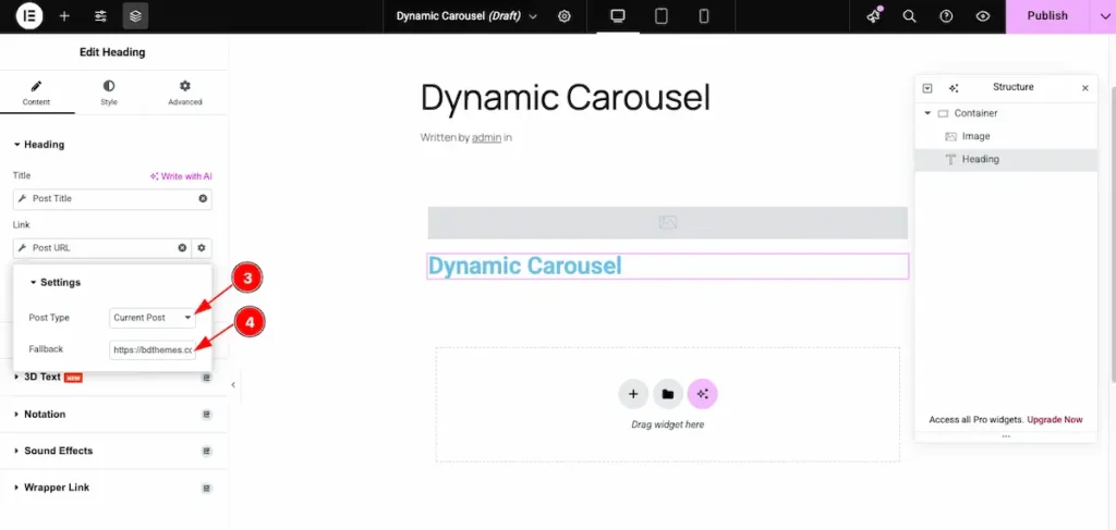
- Post Type: Choose the post type in the settings. Set it to Current Post to display content from the current post.
- Fallback: Set a fallback link. If there’s an issue loading the real link, the fallback link will act as a backup.
Add Text Editor Widget
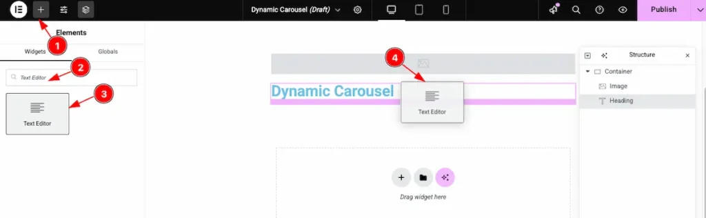
- Click on the “+” icon to open the widget panel.
- Search for the widget named “Text Editor”, and it will appear in the results.
- Select the widget, then drag.
- Drop it onto the editor page.
Dynamic Text Select
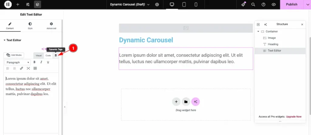
- Now, click on the “Dynamic Tags” icon to choose the dynamic tag for the post.
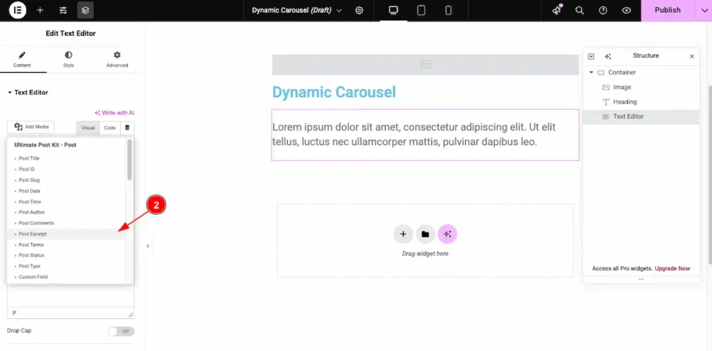
- Now, select the “Post Excerpt” option to display the excerpt for the post.
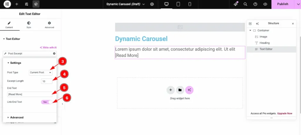
- Post Type: Choose the type of post you want to display. This will select content from the chosen post type.
- Excerpt Length: Set the number of words to show in the post excerpt. For example, setting it to 10 will display only the first 10 words.
- End Text: Enter the text to appear after the post excerpt, such as
[ Read More ]. - Link End Text: Enable this option to make the End Text clickable, linking it to the full post.
To learn how to create a template using the Dynamic Widgets of Ultimate Post Kit, please follow the documentation here.
Insert Dynamic Carousel Widget
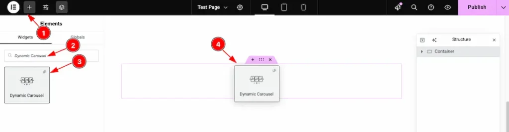
- Go to the Elementor Editor page and click the Add Element “+” icon.
- Search for the Dynamic Carousel widget by name.
- The widget will appear — you can check the Ultimate Post Kit ( UP ) logo on the top-right corner.
- Select the widget, then drag and drop it onto the editor page.
Content Tab Customization
Go to Content > Layout
Select the Custom Template
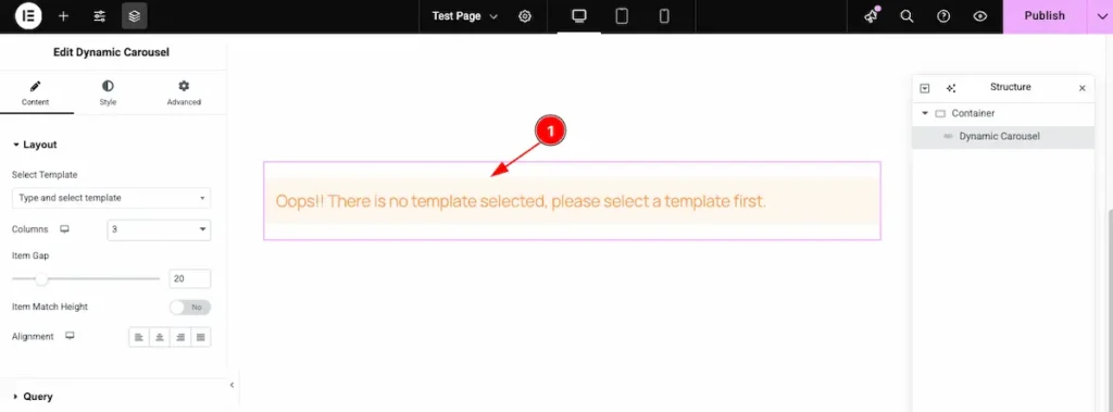
- After inserting the Custom Template, you may see the message: “Oops! There is no template selected, please select a template first.” This means you need to select a template before proceeding.
Choose an already created template to continue.
Search by the template and select it
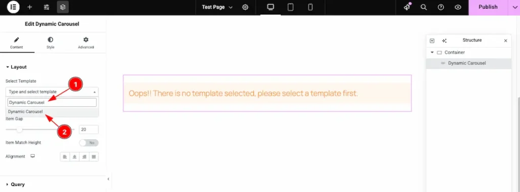
- Search for the template by its name, for example: “Dynamic Carousel.”
- Once it appears in the results, select the template to apply it.
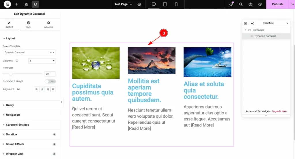
- After selecting the template, the Dynamic Carousel appears according to the template’s design. It automatically displays all the posts within the selected section.
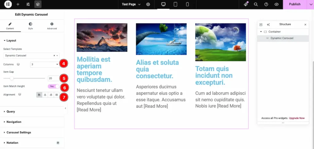
- Columns: Set the number of columns you want to display on the page.
- Row Gap: Adjust the space between each row.
- Item Match Height: Enable the switcher to set the All the items in same Height.
- Alignment: Choose the position of the content — Left, Center, Right, or Stretch.
Query
Go to Content > Query
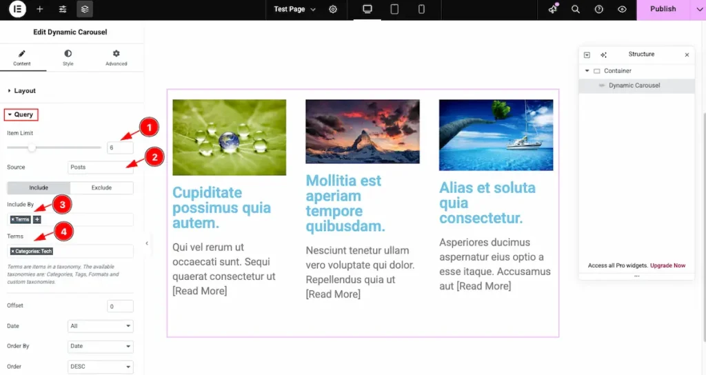
- Item Limit: Set the number of grid items to display. For example, if you set it to 6, only 6 items will appear.
- Source: Select the Source and choose the content you want to demonstrate the content.
- Include By: Choose the criteria for including items, such as category or tag.
- Terms: Search for and select the desired terms (tags or categories). The grid will display posts matching the selected terms..
Learn more about the Query follow the Link.
Navigation
Go to Content > Navigation
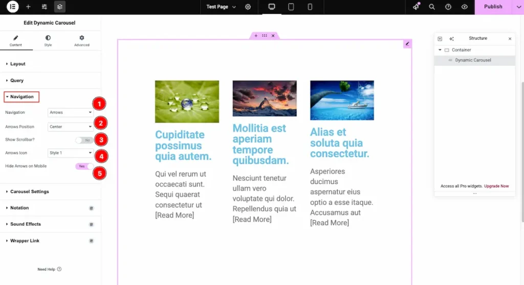
- Navigation: Choose the navigation indicator type. You can select from Arrows, Dots, Arrows & Dots, Arrows & Fractions, Progress, or None.
- Arrows Position: Select the position of the navigation arrows. Options include Center, Top Center, Bottom Center, and more.
- Show Scrollbar?: Enable this option to display a scrollbar at the bottom of the carousel. The scrollbar will animate as you scroll through the content.
- Arrows Icon: Choose a custom style for the navigation arrows. Multiple icon options are available to match your design.
- Hide Arrows on Mobile: Enable this switcher to hide the navigation arrows on mobile devices for a cleaner, more compact layout.
Carousel Settings
Go to Content > Carousel Settings
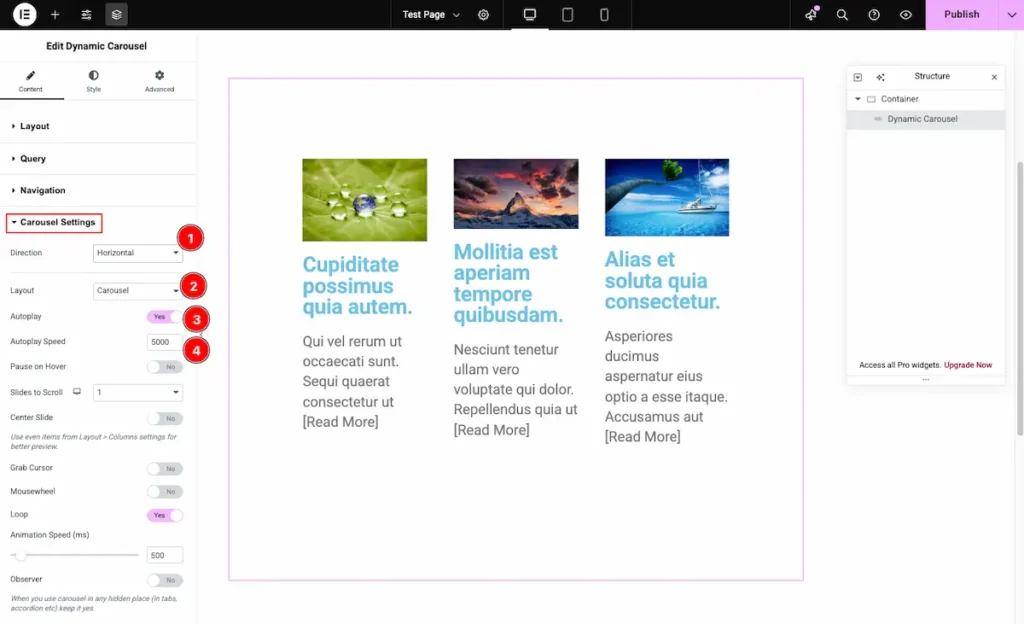
- Direction: Set the scrolling direction of the carousel. You can choose between Horizontal or Vertical based on your layout preference.
- Layout: Select the carousel layout style. Available options include Carousel and Coverflow for different visual effects.
- Autoplay: Enable this option to activate automatic sliding of carousel items.
- Autoplay Speed: Define the speed of the autoplay transition. Set the duration (in milliseconds) to control how fast the carousel slides between items.
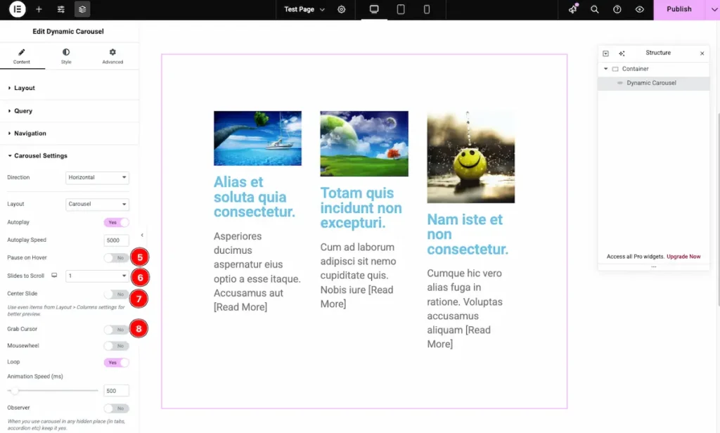
- Pause on Hover: Enable this option to pause the carousel when the mouse hovers over it.
- Slide to Scroll: Set how many slides move at once during each transition.
- Center Slide: Enable this feature to keep the active slide centered in the carousel.
- Grab Cursor: Turn this on to display a grab cursor, indicating that users can click and drag to scroll through the carousel.
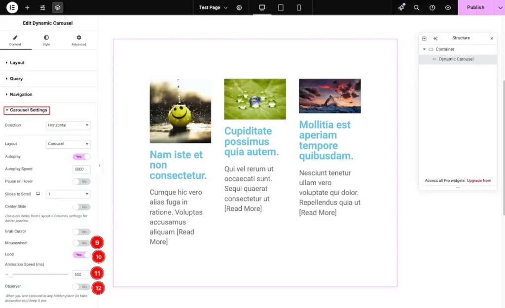
- Mousewheel: Enable this option to allow users to navigate through the carousel using their mouse wheel.
- Loop: Activate this to make the carousel loop continuously, so it starts again automatically after the last slide.
- Animation Speed (ms): Set the transition speed between slides in milliseconds. For example, 500 ms for smooth animation.
- Observer: Enable this to automatically refresh the carousel when content or layout changes are detected in real time.
Designing with the Style Tab
The Style Tab offers a range of options to enhance the visual appearance of elements, enabling precise adjustments and creative design possibilities. It helps create polished and engaging layouts effortlessly.
Items Section
Go to Style > Items
Normal
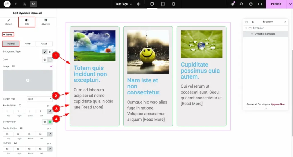
- Background Type: Choose the background type for the items in the normal state. You can select either an image or a color as the background.
- Border Type: Choose the border style for the item grid. Available options include Solid, Dotted, Dashed, or None.
- Border Width: Set the thickness of the border around each item.
- Border Color: Select the desired color for the border.
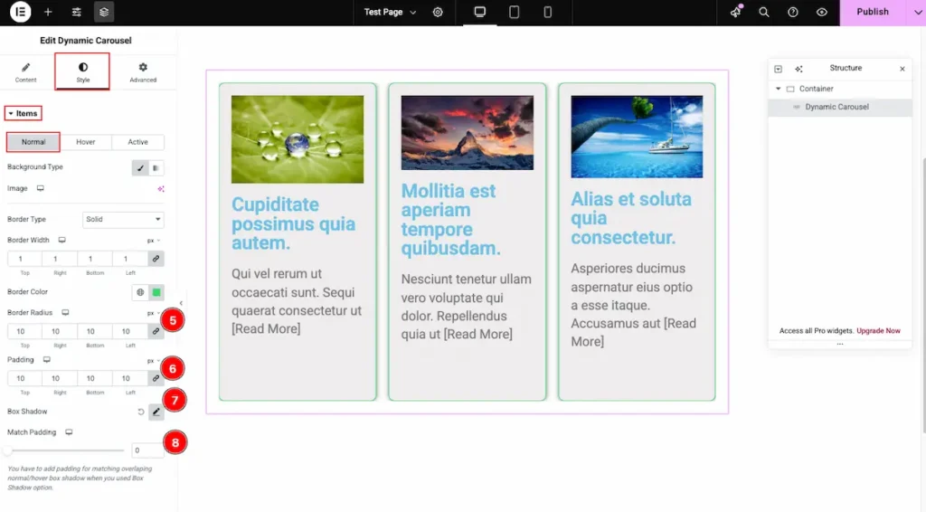
- Border Radius: Set the roundness of the carousel item’s corners. A higher value makes the corners more curved.
- Padding: Define the inner spacing inside each carousel item to adjust the content spacing.
- Box Shadow: Add shadow effects around each carousel item to enhance depth and visual appeal.
- Match Padding: Enable this option to automatically align the carousel item’s padding with the overall section or container padding for consistent spacing.
Hover
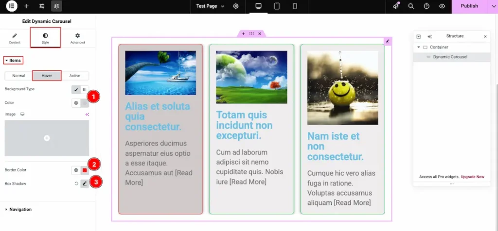
- Background Type: Choose the background type for the items on hover. You can set it as an image or a color to create an engaging hover effect.
- Border Color: Select the color of the border that will appear when the item is hovered over.
- Box Shadow: Adjust the shadow for the item box to enhance depth and highlight the item when hovered.
Active
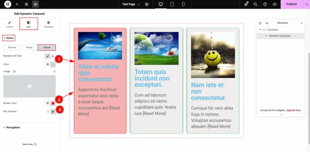
- Background Type: Choose the background type for the items on hover. You can set it as an image or a color to create an engaging on the Active Items.
- Border Color: Select the color of the border that will appear when the item is active.
- Box Shadow: Adjust the shadow for the item box to enhance depth and highlight the item when active.
Video Tutorial
Video Tutorial Coming Soon!
Please visit the demo page for more examples. Thanks for staying with us.