In this documentation, we will discuss the customization of the Dynamic Accordion widget, brought to you by the Ultimate Post Kit Pro addon for Elementor.
🧩 Dynamic Accordion Widget
The Dynamic Accordion Widget allows you to display your posts, pages, or any custom post type in an elegant and interactive accordion layout. It automatically pulls content from your WordPress database and presents it in collapsible sections, making your content clean, organized, and easy to navigate.
🔹 Key Features
- Dynamic Content Source – Display content dynamically from posts, pages, custom post types, ACF fields, or WooCommerce products.
- Interactive Accordion Layout – Present your data in expandable and collapsible sections for a user-friendly reading experience.
- Multiple Content Options – Show titles, excerpts, featured images, or custom fields inside each accordion item.
- Custom Query Control – Filter and organize items by categories, tags, authors, or custom post IDs.
- Advanced Sorting & Filtering – Dynamically arrange content and allow users to interact with your accordion data.
- Customizable Design – Control every part of your accordion’s appearance — icons, borders, typography, and colors.
- Responsive & Lightweight – Ensures smooth performance and a perfect fit across all device sizes.
- Toggle & Icon Control – Choose from various toggle icons, expand/collapse behaviors, and animation styles.
Perfect for FAQs, post listings, or dynamic data sections — the Dynamic Accordion Widget gives you full control with simplicity and flexibility.
Enable The Dynamic Accordion Widget
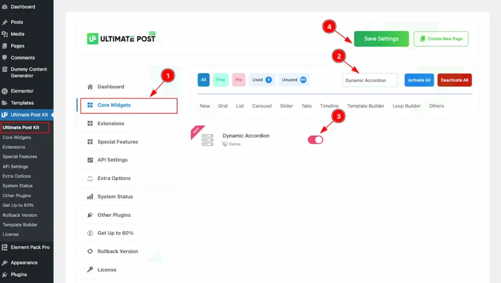
To use the Dynamic Accordion widget from Ultimate Post Kit Pro, first, you have to enable the widget. Navigate to the WordPress Dashboard.
- Go to Ultimate Post Kit Pro > Core Widgets section.
- Search by the Widget Name ” Dynamic Accordion ” and it will appear the.
- Now Enable the Switcher of the Dynamic Accordion.
- Hit the Save Settings button.
First Create a Template for Dynamic Accordion
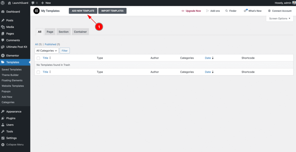
- Navigate to the Templates section of WP Dashboard then click on the ” ADD NEW TEMPLATE ” button to and it will appear Form now click on it.
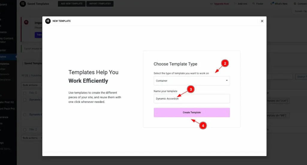
- Select the type of template want to work with. Container.
- Set the Name of the Template. e.g.: Dynamic Accordion.
- Once Done Click on the “Create Template ” button it will create a template and redirect to the Elementor Editor Page.
Create Custom Accordion Template
Using this template, you can create any design you want, and it will appear on the front page. You can add any elements you like. Here, a simple design is demonstrated as an example.
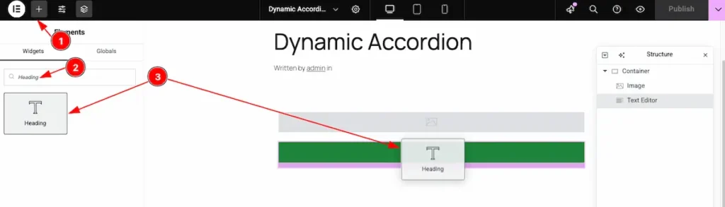
Add Heading Widget
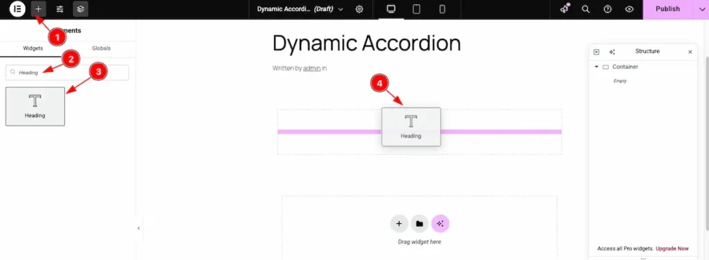
- Click on the “+” icon to open the widget panel.
- Search for the “Heading” widget and select it when it appears.
- Drag the Heading widget.
- Drop it onto the editor page.
Add Image Widget
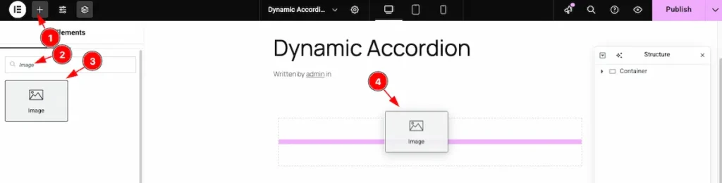
- Click on the “+” icon to open the widget panel.
- Search for the “Image” widget and select it when it appears.
- Drag the Image widget.
- Drop it onto the editor page.
Dynamic Image Feature
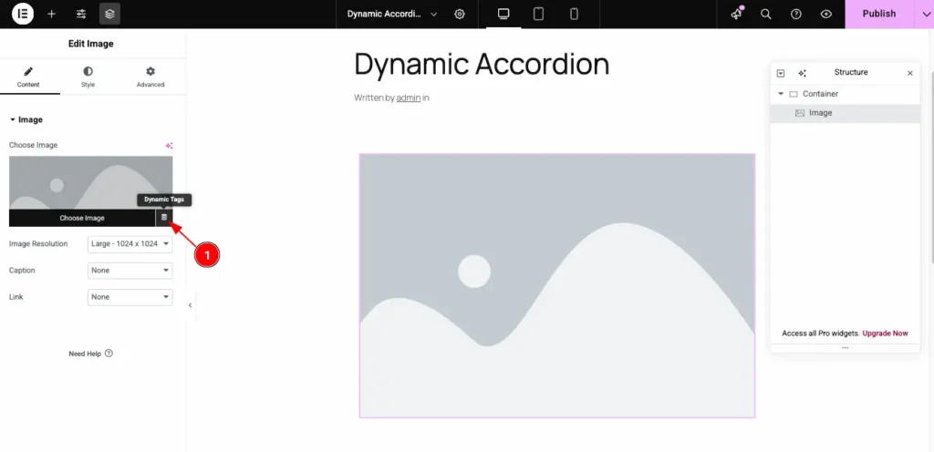
- Click on the Dynamic Icon and select the desired dynamic tag from the list.
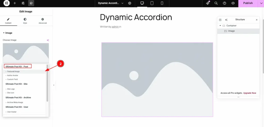
- Select the Featured Image from the dynamic content options.
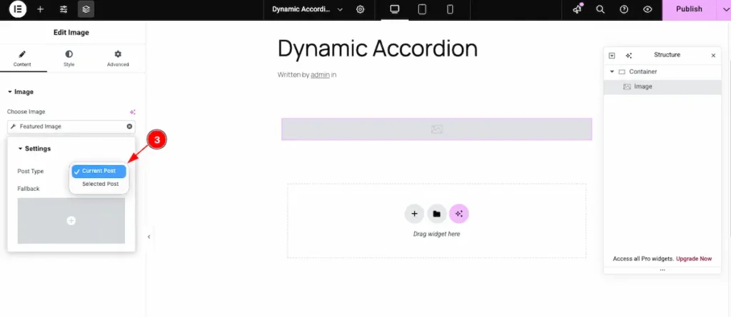
- Post Type: Select the current post type. This option automatically pulls and displays data from the corresponding section.
Add Button Widget
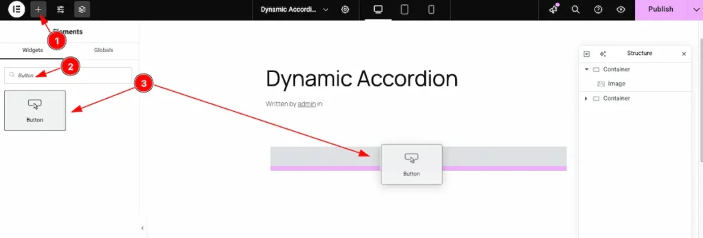
- Click on the “+” icon to open the widget panel.
- Search for the “Button” widget and select it when it appears.
- Drag the Button widget and Drop it onto the editor page.
Dynamic Link for Button
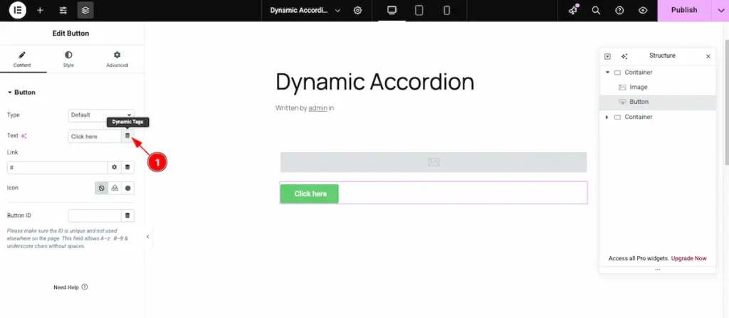
- Click on the Dynamic Icon and select the desired dynamic tag from the list.
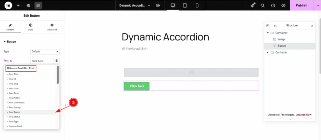
- Now, choose “Post Terms” for the button to dynamically display the taxonomy terms (like categories or tags) associated with the current post.
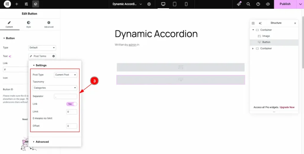
- Now, configure the Settings for the section:
- Post Type: Choose Current Post to fetch data dynamically from the current post.
- Taxonomy: Select the specific taxonomy you want to display (e.g., Category or Tag).
- Separator: Choose a separator (such as a comma or slash) to appear between multiple terms.
- Link: Enable this switcher to make each term clickable and linked to its archive page.
- Limit: Define how many terms to display. Setting it to 0 means no limit.
- Offset: Set an offset number to skip a specific number of terms before displaying the rest.
Add Heading Widget
- Click on the “+” icon to open the widget panel.
- Search for the “Heading” widget and select it when it appears.
- Drag the Heading widget and Drop it onto the editor page.
Dynamic Post Title
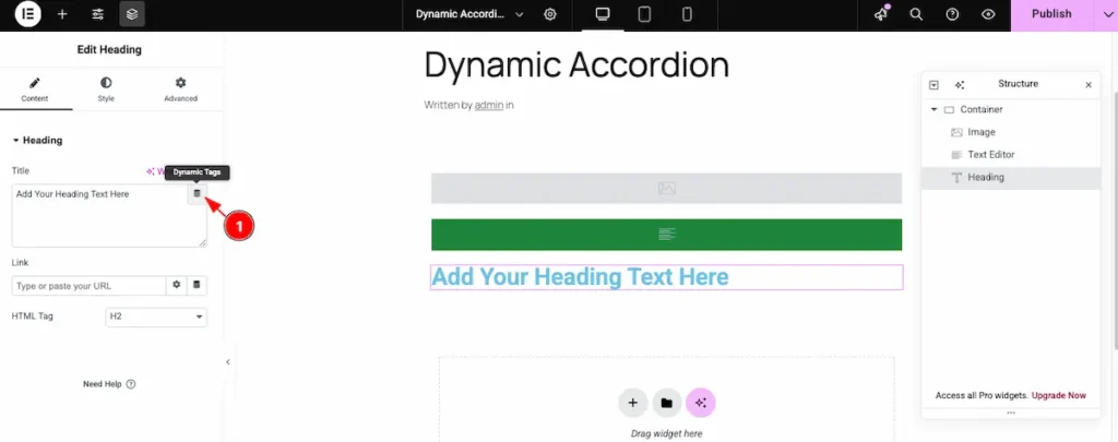
- Click on the Dynamic Icon and select the desired dynamic tag from the list.

- Select the Post Title option from the Ultimate Post Kit – Post section to dynamically display the title of the current post.
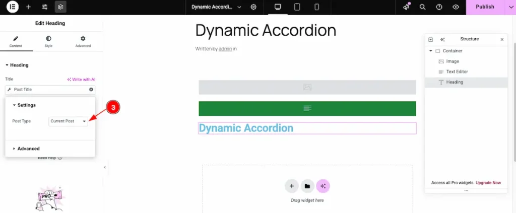
- Post Type: Select the current post type. This option automatically pulls and displays data from the corresponding section.
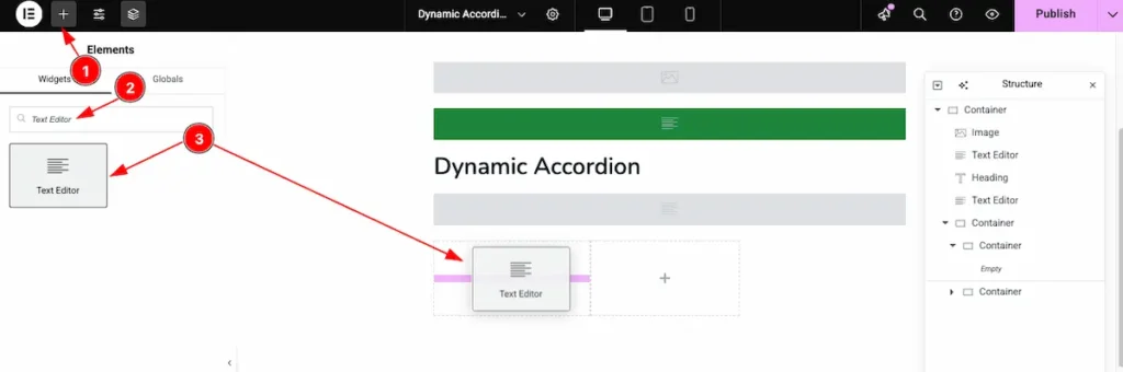
Add Text Editor Widget
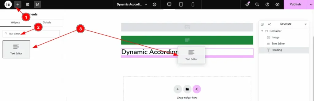
- Click on the “+” icon to open the widget panel.
- Search for the “Text Editor” widget and select it when it appears.
- Drag the Text Editor widget and Drop it onto the editor page.
Dynamic Post Excerpt
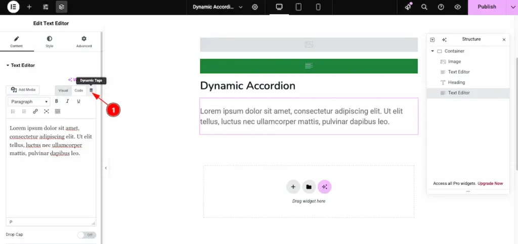
- Click on the Dynamic Icon and select the desired dynamic tag from the list.
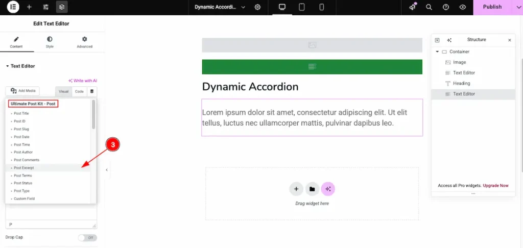
- Now select the Post Excerpt option from the Ultimate Post Kit – Post section to dynamically display a short summary or excerpt of the current post.
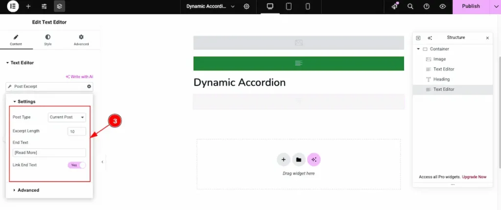
- Set the settings for the dynamic content.
- Post Type: Select the desired post type for this settings section.
- Excerpt Length: Define the number of words or characters to display in the post excerpt.
- End Text: Add custom text to appear at the end of the excerpt, such as [Read More].
- Link End Text: Enable this option to make the end text clickable, linking it to the full post.
Add Text Editor ( For Date )
- Click on the “+” icon to open the widget panel.
- Search for the “Text Editor” widget and select it when it appears.
- Drag the Text Editor widget and Drop it onto the editor page.
Dynamic Post Date
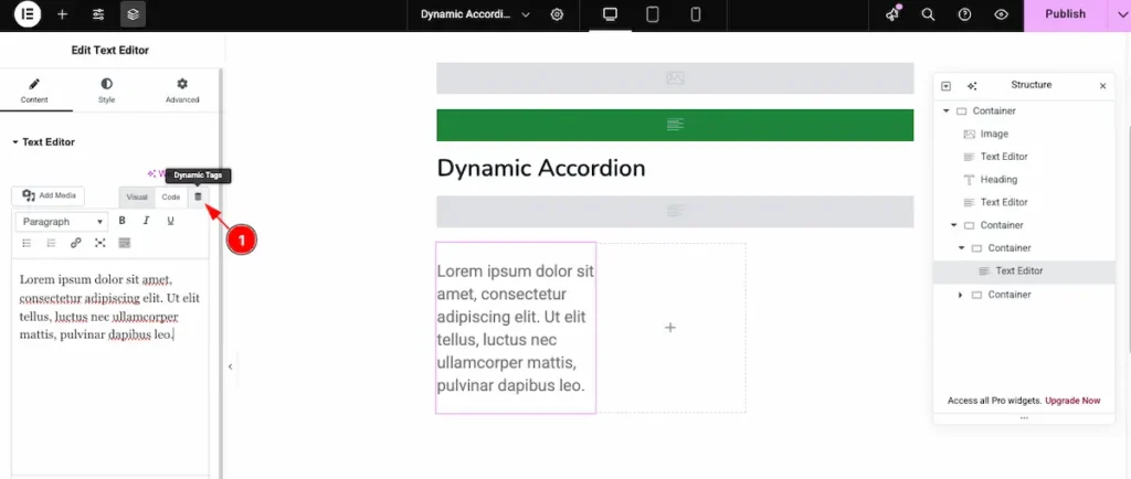
- Click on the Dynamic Icon and select the desired dynamic tag from the list.
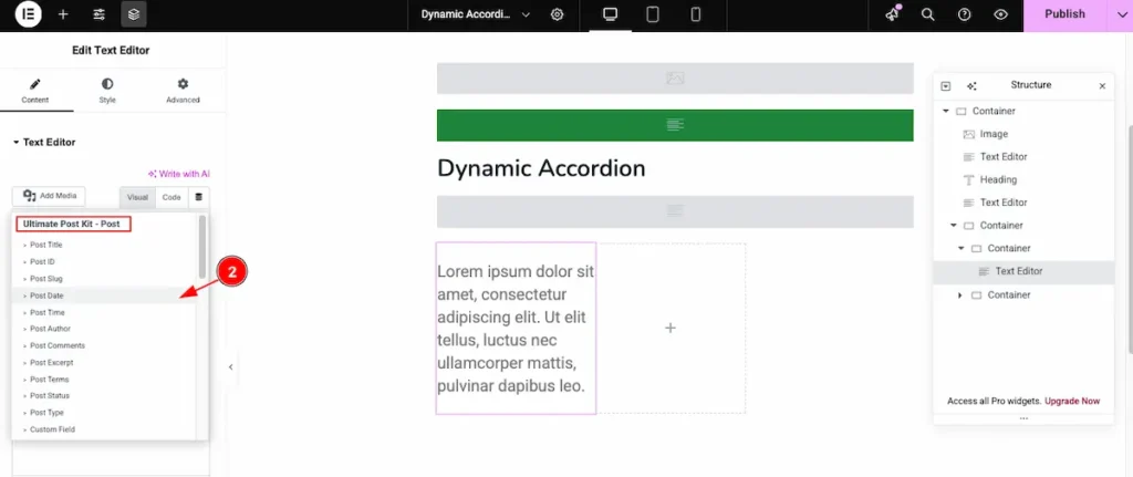
- Now, select Post Date from the Ultimate Post Kit – Post section to display the published date of the current post. This will dynamically show the post’s date based on your WordPress date and time settings.
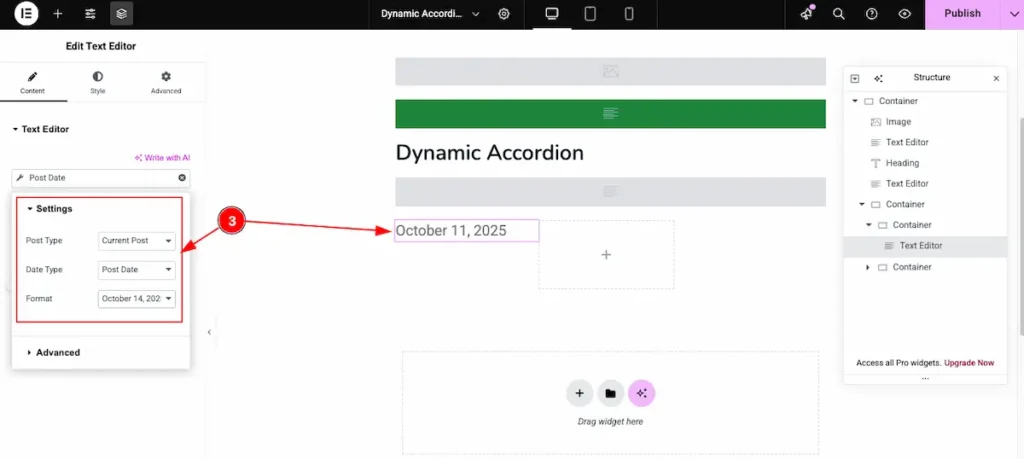
- Select the content for the Posts.
- Post Type: Select the current post type to pull the date information dynamically.
- Date Type: Choose which date to display, such as published date, modified date, or custom date.
- Format: Select the preferred date format to control how the date appears on the frontend.
Add Text Editor ( For Author )
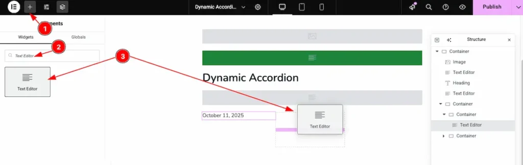
- Click on the “+” icon to open the widget panel.
- Search for the “Text Editor” widget and select it when it appears.
- Drag the Text Editor widget and Drop it onto the editor page.
Dynamic Feature – Post Author
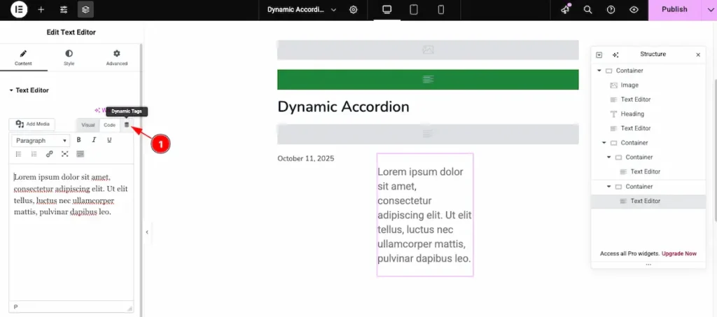
- Click on the Dynamic Icon and select the desired dynamic tag from the list.
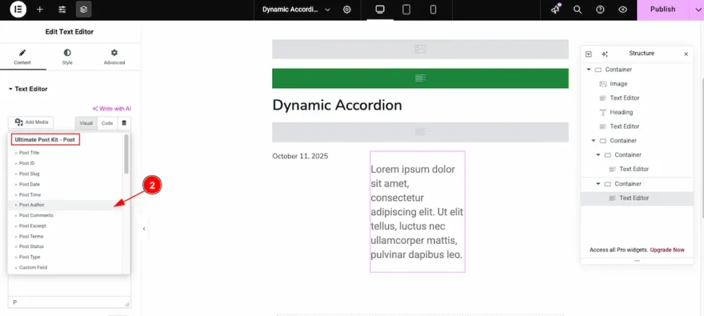
- Post Author: Choose the “Post Author” dynamic content from the Ultimate Post Kit – Post section. This will automatically display the author of the current post.
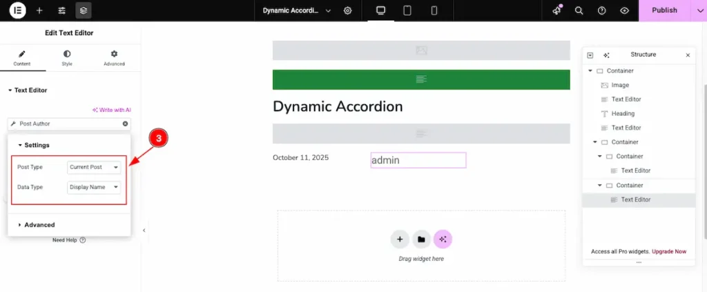
- Post Type: Select the type of post you want to display. This ensures the dynamic content pulls data from the correct post type.
- Date Type: Choose the type of date to display for the post. Options usually include the published date, modified date, or custom date fields.
Final Design of the Template
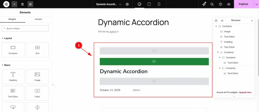
- The Dynamic Accordion will display all posts dynamically. Each accordion item includes:
- Image: Shows the featured image of the post.
- Heading: Displays the post title dynamically.
- Text Editor: Pulls the post excerpt or custom content.
- Button: Can link to the post URL or custom link dynamically.
This setup ensures every accordion item reflects the current post content automatically.
Insert Dynamic Accordion Widget
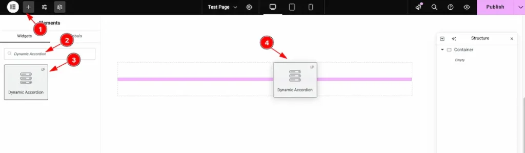
- Go to the Elementor Editor page and click the Add Element “+” icon.
- Search for the Dynamic Accordion widget by name.
- The widget will appear — you can check the Ultimate Post Kit logo on the top-right corner.
- Select the widget, then drag and drop it onto the editor page.
Content Tab Customization
Content Section
Go to Content > Layout
Select the Custom Template
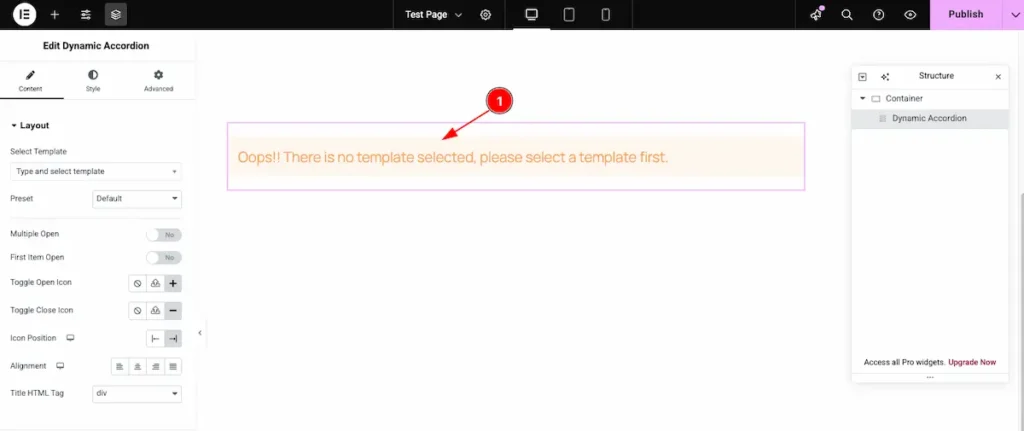
- After inserting the Custom Template, you may see the message: “Oops! There is no template selected, please select a template first.” This means you need to select a template before proceeding.
Choose an already created template to continue.
Search by the template and select it
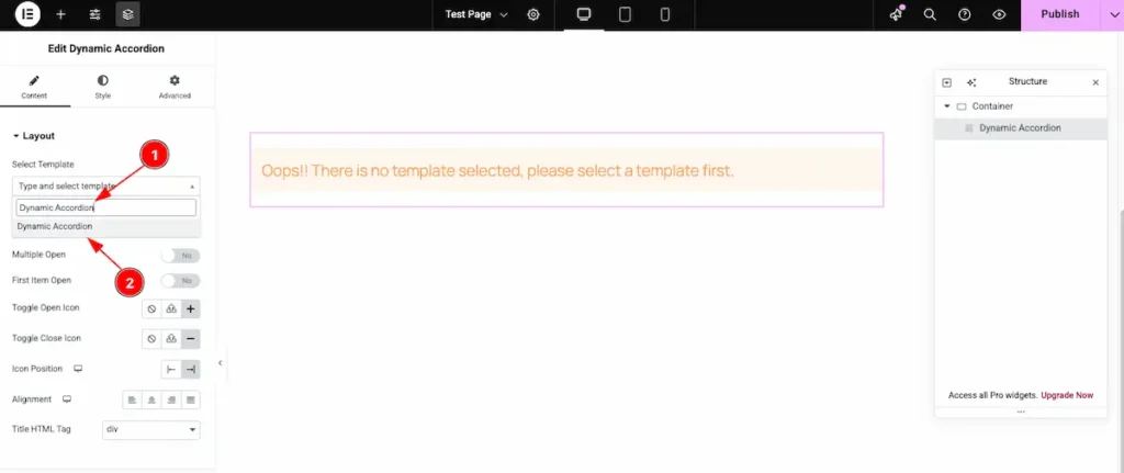
- Search for the template by its name, for example: “Dynamic Accordion.”
- Once it appears in the results, select the template to apply it.
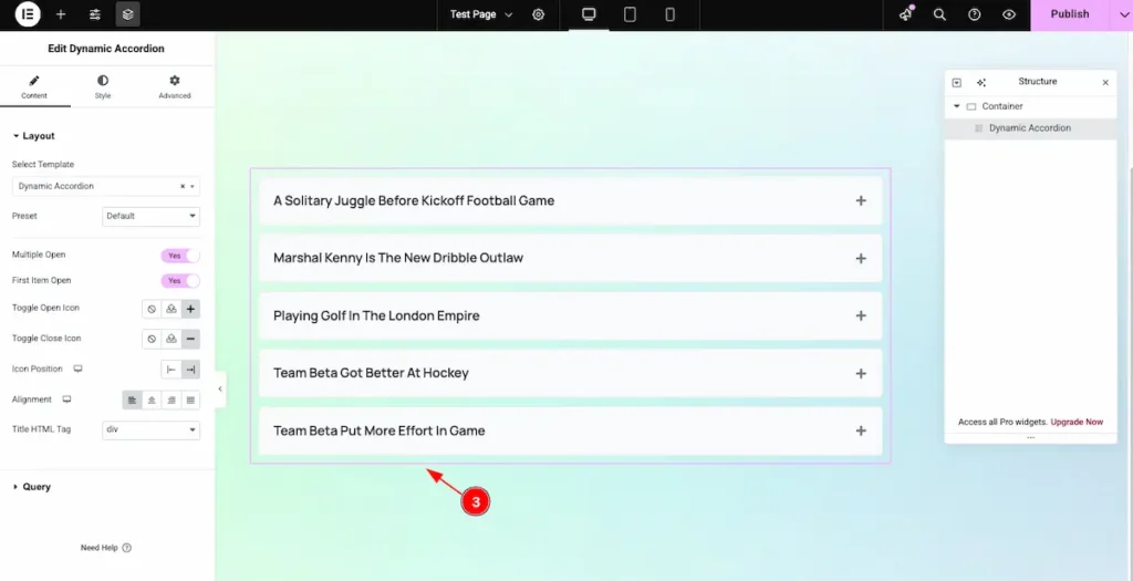
- After selecting the template, the Dynamic Grid appears according to the template’s design. It automatically displays all the posts within the selected section.
Select Preset
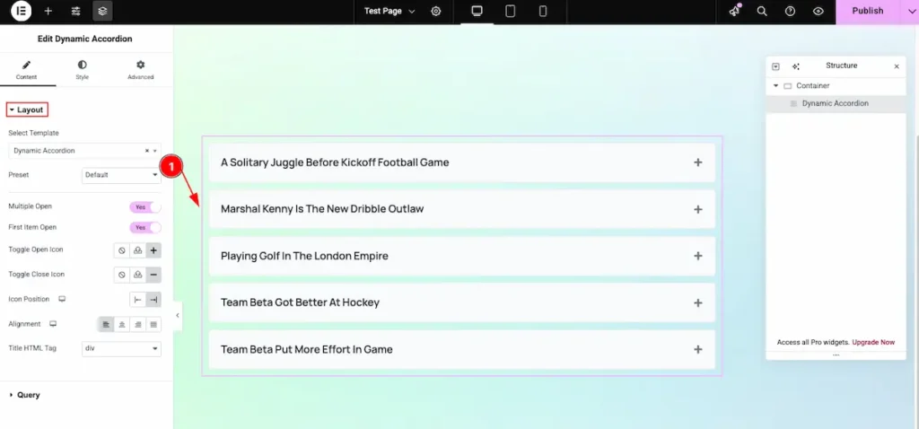
- Default: The default preset appears with the standard design layout, providing a clean and simple look by default.
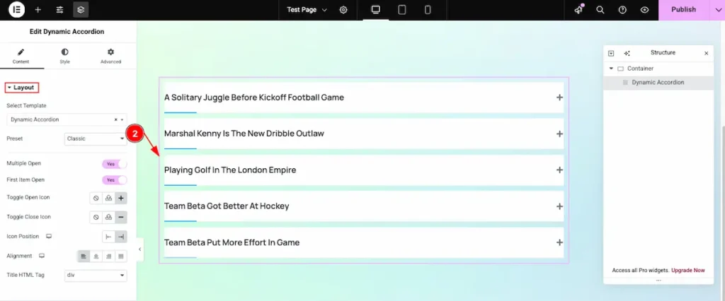
- Classic: This preset offers a different animation style for the accordion, where the bar animates smoothly when opened.
Multiple Open
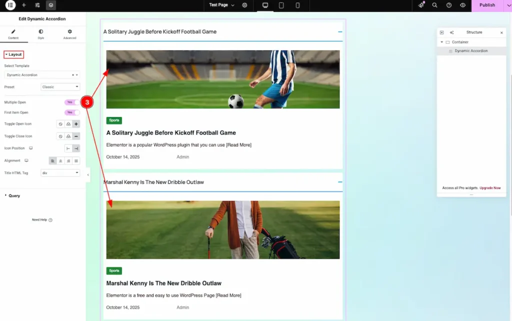
- Multiple Open: Enable this switcher to allow multiple accordion sections to remain open at the same time.
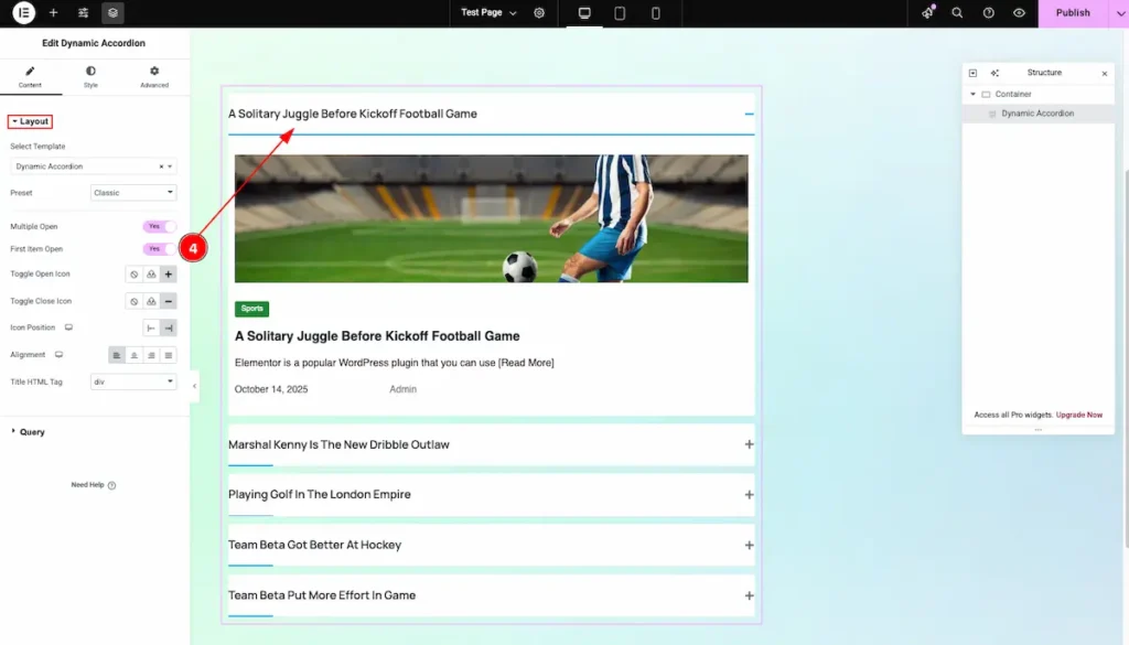
- First Item Open: Enable this switcher to automatically open the first accordion item by default.
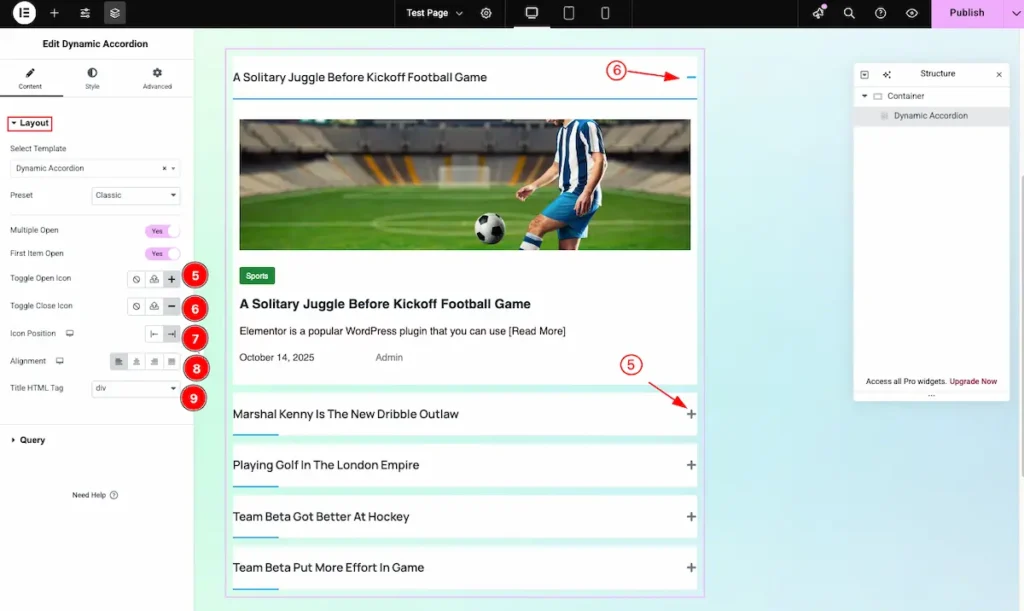
- Toggle Open Icon: Set the Icon to demonstrate the Open position Icon.
- Toggle Close Icon: Set the Icon to demonstrate the Close position icon.
- Icon Position: Set the position of the icon. It will appear on the right side of the accordion title.
- Alignment: Set the alignment of the accordion layout. You can choose from Left, Center, Right, or Justified.
- Title HTML Tag: Set any HTML Tag for Title ( H1, H2, H3, H4, H5, H6, p, span ). The title tag is essential for both user experience and search engine optimization (SEO).
Query Section
Go to Content > Query
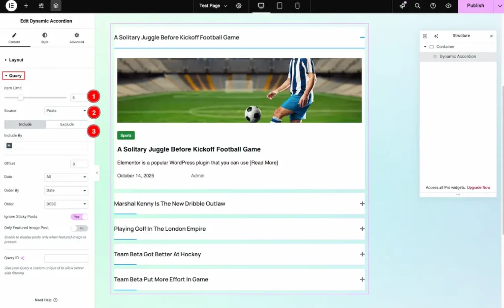
- Item Limit: Set the number of grid items to display. For example, if you set it to 4, only 4 items will appear.
- Source: Choose the source you want to display. It can be Post, Query, or other available content types.
- Include or Exclude: Use this feature to Include or Exclude the Post want to demonstrate.
Learn more about the Query follow the Link.
Designing with the Style Tab
The Style Tab offers a range of options to enhance the visual appearance of elements, enabling precise adjustments and creative design possibilities. It helps create polished and engaging layouts effortlessly.
Items Section
Go to Style > Items
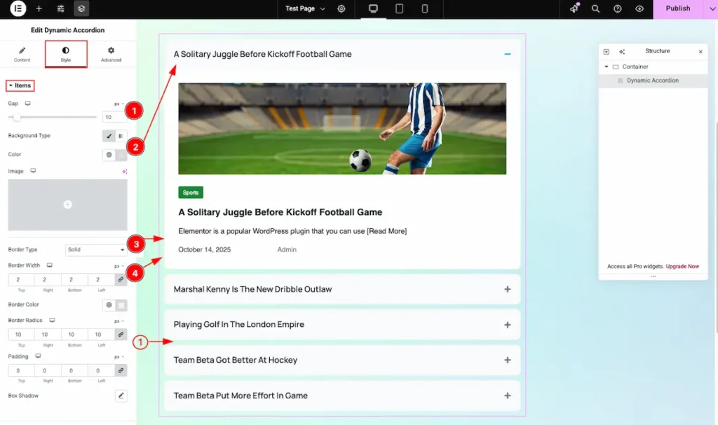
- Gap: Defines the spacing between each accordion item.
- Background Type: Choose the background for the items, either a color or an image.
- Border Type: Select the style of the border (Solid, Dashed, Dotted, or None).
- Border Width: Set the thickness of the border around each item.
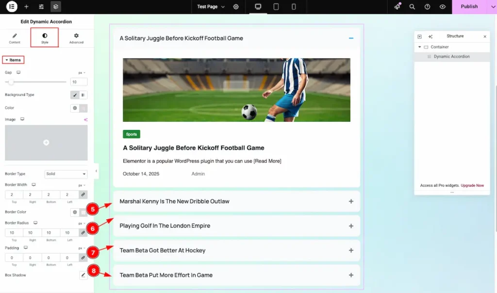
- Border Color: Choose the color for the border of each item.
- Border Radius: Set the roundness of the corners for the items’ border.
- Padding: Define the inner spacing between the content and the item’s border.
- Box Shadow: Apply a shadow effect to give depth to each item.
Header
Go to Style > Header
Normal
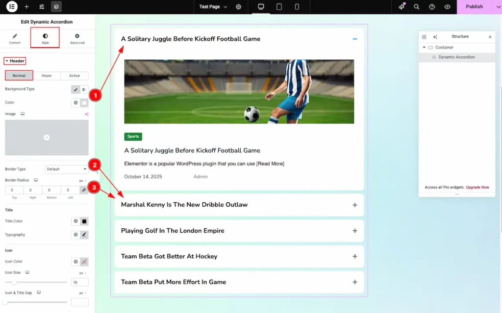
- Background Type: Choose the background color for the header item.
- Border Type: Select the type of border, e.g., Default, Solid, Dashed, or Dotted.
- Border Radius: Adjust the corner roundness for the header item’s border.
Titile
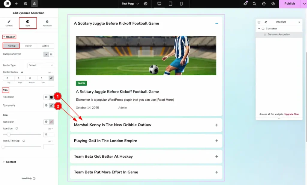
- Title Color: Choose the color of the header title text.
- Typography: Configure the font style, size, weight, and spacing for the header title.
Icon
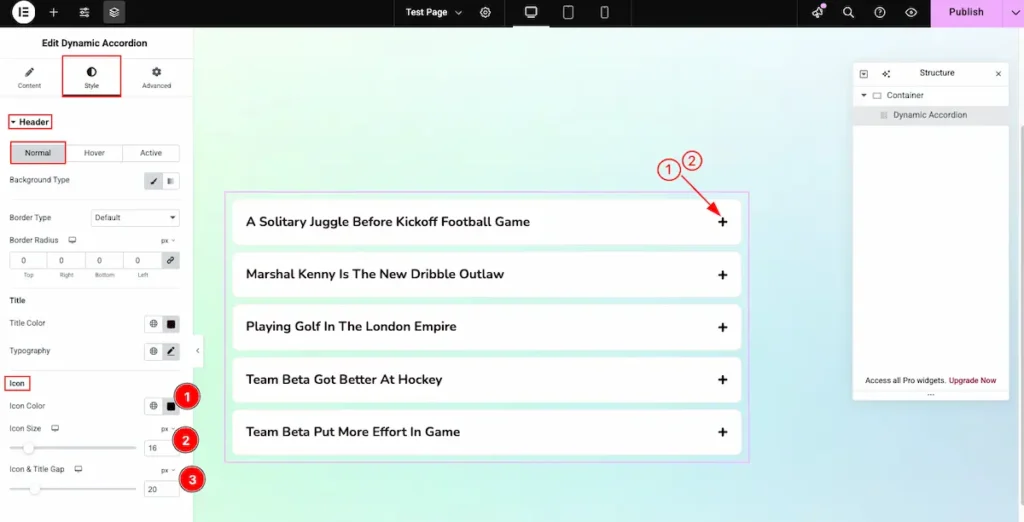
- Icon Color: Choose the color of the accordion icon.
- Icon Size: Set the size of the icon.
- Icon & Title Gap: Adjust the spacing between the icon and the title.
Hover
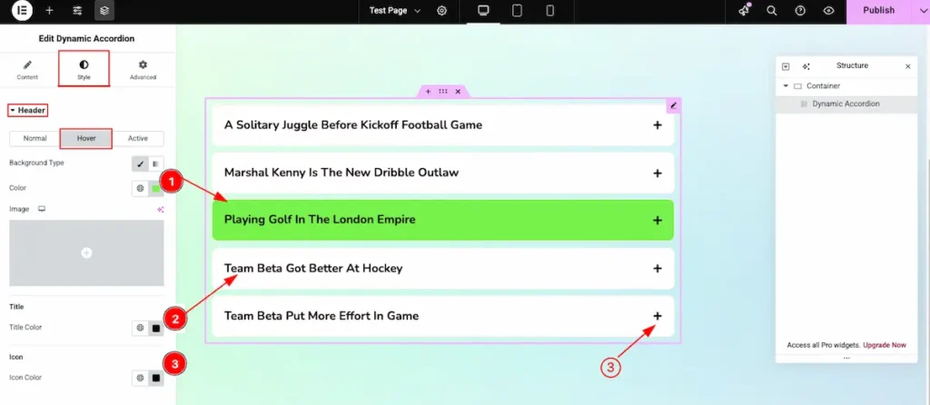
- Background Type: Choose the background type (e.g., color) and select it.
- Title Color: Set the color for the accordion title.
- Icon Color: Set the color for the accordion icon.
Active
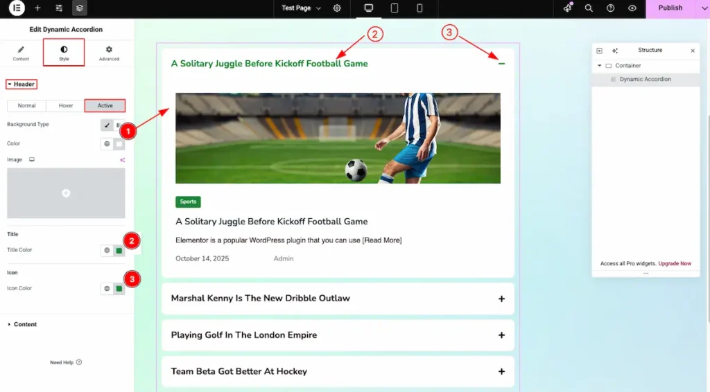
- Background Type: Choose the background type (color or image) and apply it.
- Title Color: Set the color for the accordion header title.
- Icon Color: Set the color for the accordion icon.
Content
Go to Style > Content
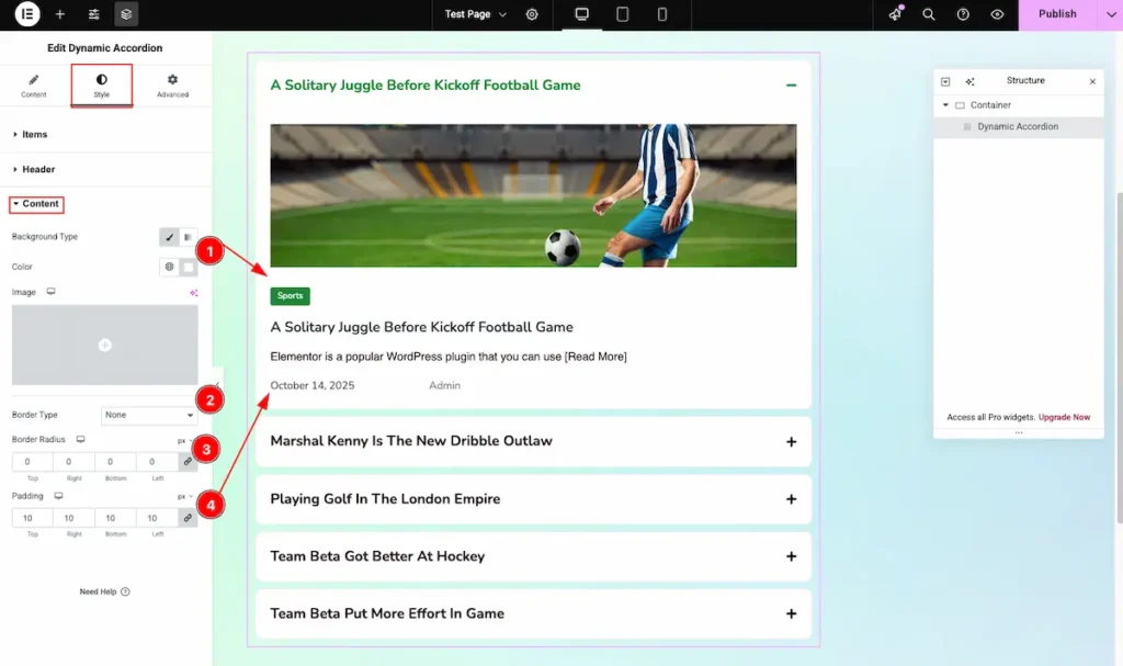
- Background Color: Set the background color for the accordion content area.
- Border Type: Choose the type of border (solid, dashed, dotted, or none).
- Border Radius: Adjust the border radius to round the corners.
- Padding: Set the padding for the inner space inside the accordion content.
Video Assistant
Video Tutorial Is Coming Soon! Please check the Demo.
We appreciate your support.