In this documentation, we will show you how to customize the Tabs widget presented by the Element Pack Pro add-on.
Inserting Widget
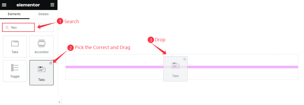
Open your page in the Elementor editor, search by the Tabs widget name check the Logo of Element Pack, then drag and drop it.
The default view of Tabs Widget
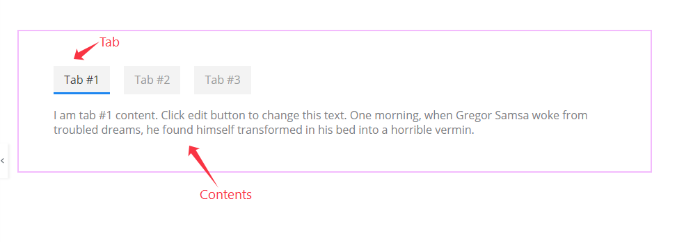
The Tabs widget displays the Tabs and Contents, It works as Nav.
Content Tab Customization
Tabs Section
Go to Content > Tabs
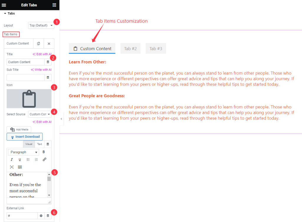
Find the Layout, Tab Items > Title, Sub Title, Icon, Select Source, and External Link options.
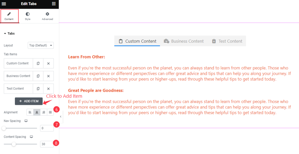
Also find the Alignment, Nav Spacing, and Content Spacing options.
Additional Section
Go to Content > Additional
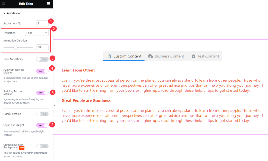
Find the Active Item No, Transition, Animation Duration, Tabs Nav Stikcy, Fullwidth Nav on Mobile, Swiping Tab on Mobile, Hash Location, and Equal Tab Height options.
Style Tab Customization
Tab Wrapper Section
Go to Style > Tab Wrapper
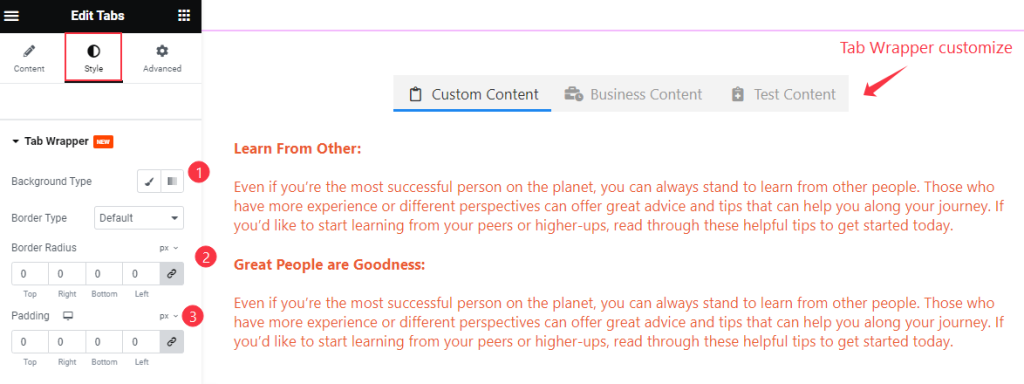
Find the Background Type, Border Type, Border Radius, and Padding options.
Tab Section
Go to Style > Tab
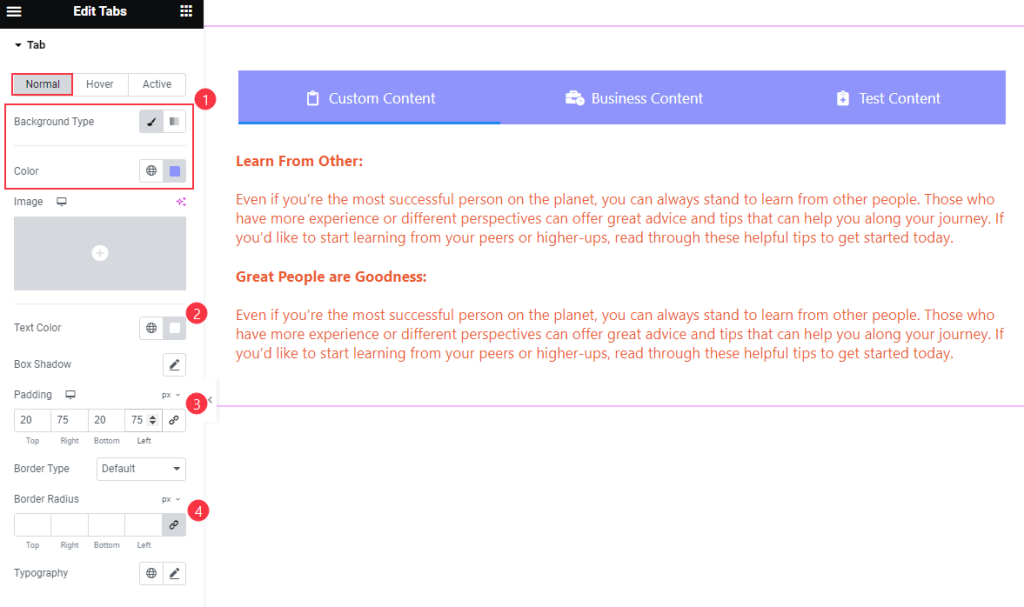
Find the Background Type Color, Text Color, Box Shadow, Padding, Border Type, Border Radius, and Typography options in Normal Mode.
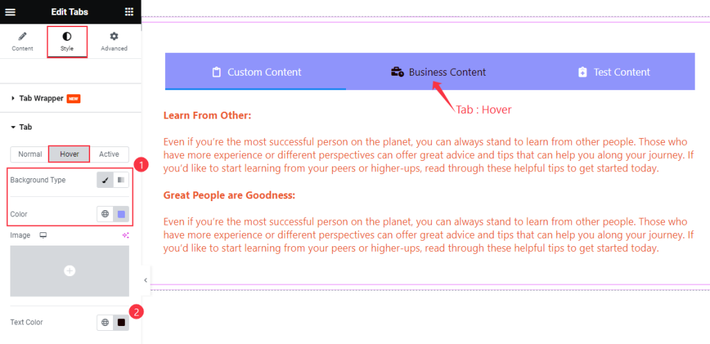
Also, find the Background Type Color and Text Color options in Hover Mode.
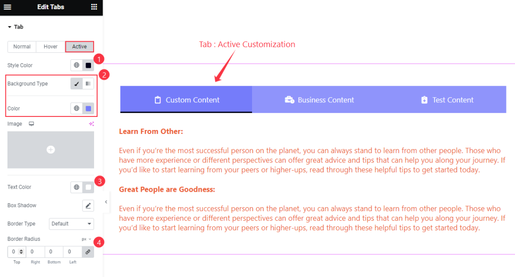
Then find the Style Color, Background Type Color, Text Color, Box Shadow, Border Type, and Border Radius options in Active mode.
Sub Title Section
Go to Style > Sub Title
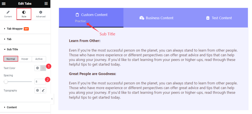
Find the Text Color, Spacing, and Typography options.
Content Section
Go to Style > Content
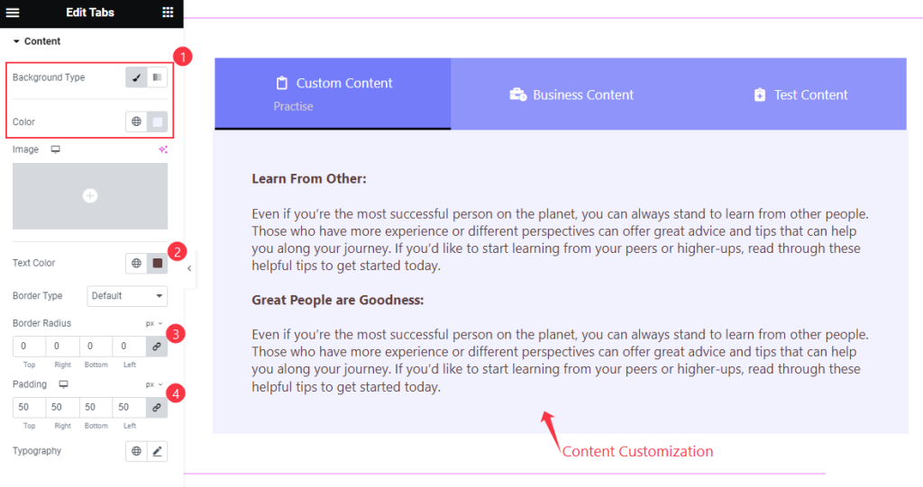
Find the Background Type Color, Text Color, Border Type, Border Radius, Padding, and Typography options.
Icon Section
Go to Style > Icon
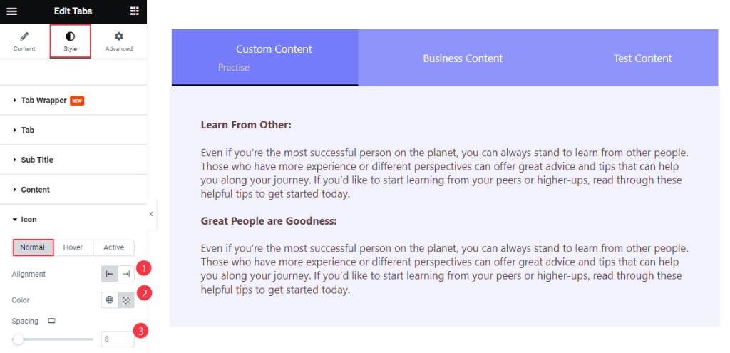
Find the Alignment, Color, and Spacing options in Normal Mode.
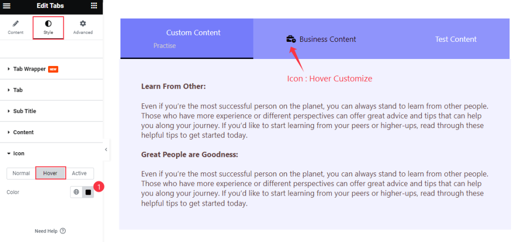
Also, find the Color option in Hover Mode.
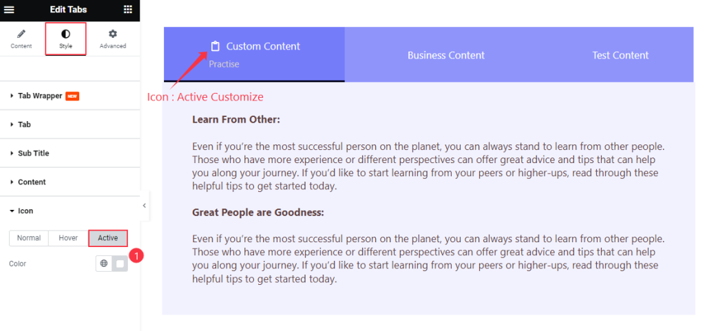
Then find the Color option in Active Mode.
Video Assist
Watch the Tabs video tutorial here. Please visit the demo page for examples.
Thanks for being with us.
