In this documentation, we will provide comprehensive guidance on how to use the Element Pack Pro Social Share widget for Elementor. This widget allows you to add stylish and interactive social sharing buttons to your website, enabling visitors to easily share your content across various social media platforms. It is a flexible and user-friendly tool designed to increase engagement, improve content visibility, and enhance your website’s social presence with customizable layouts, styles, and effects.
Social Share Widget – Key Features
- Multiple Social Platforms
Support popular networks like Facebook, Twitter, LinkedIn, Pinterest, WhatsApp, and more. - Customizable Icon Styles
Choose from different icon shapes, sizes, colors, and hover effects to match your website design. - Floating & Inline Options
Add share buttons inline with content or as floating elements for better visibility. - Share Count Support
Option to display the number of shares for each social platform. - Label Options
Show labels on hover to make the buttons more informative. - Custom URL & Content
Set custom URLs or dynamic content for sharing, including posts, pages, or products. - Responsive Design
Fully responsive and works perfectly across desktops, tablets, and mobiles. - Highly Versatile
Ideal for blogs, portfolios, eCommerce sites, and marketing campaigns to increase social engagement.
Activate Social Share Widget
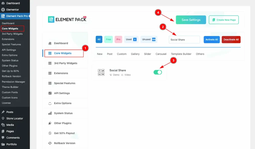
- To use the Social Share widget from Element Pack Pro, first, you have to enable the Core Widgets. Navigate to the WordPress Dashboard.
- Go to Element Pack Pro > Core Widgets section.
- Search by the Widget Name ” Social Share ” and it will appear the.
- Now Enable the Switcher of the Social Share Widget.
- Hit the Save Settings button.
Insert Social Share Widget
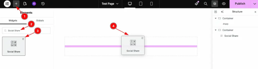
- Go to the Elementor Editor page and click the Add Element “+” icon.
- Search for the Social Share widget by name.
- The widget will appear — you can check the Element Pack Pro logo on the top-right corner.
- Select the widget, then drag and drop it onto the editor page.
The default view of Social Share

The Social Share displays the social share Buttons.
Content Tab Customization
Share Buttons section
Go to Content > Share Buttons
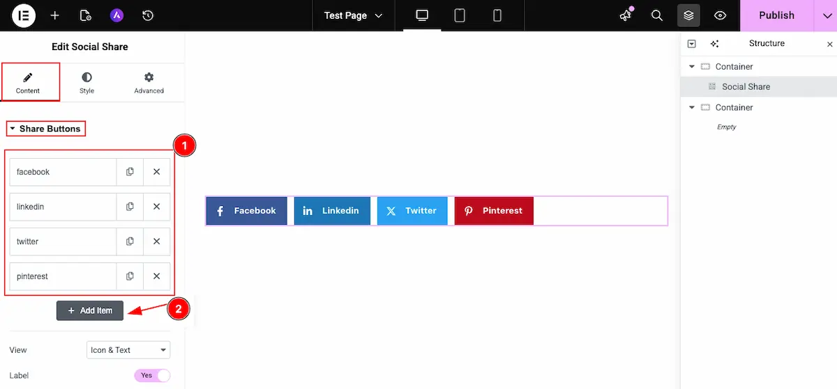
- All the social share item list will appear here.
- Click on the ” + Add Item ” button to add new items for the social share.
Select Social platform and Content
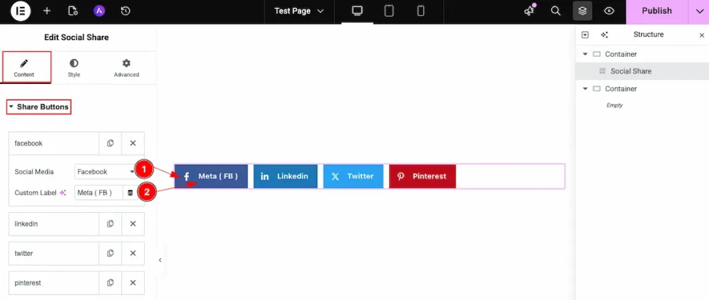
- Social Media: Choose the social media platform from the section.
- Custom Label: Set the custom label for the share buttons.
Copy Link
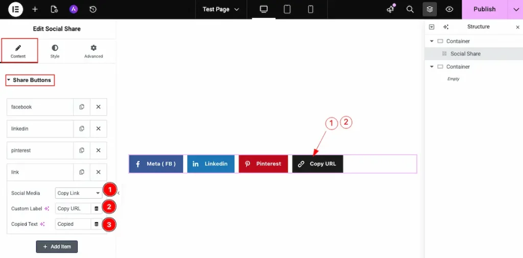
It provide a special feature to copy link button. It’s an amazing feature to copy any url.
- Social Media: choose the social media option to ” Copy Link “. The button appear default icon for copy.
- Custom Label: Set the custom label that want to demonstrate.
- Copied Text: Choose the text that will display after copied the link. e.g.: Copied
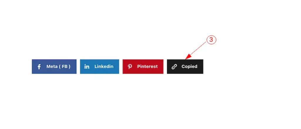
The ” Copied ” text appearing while copy the link.
Features for the social share buttons.
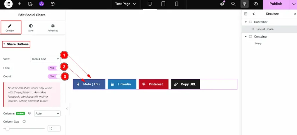
- View: Now select the view for the social share buttons. Available Views are;
Text & Icon: It will demonstrate the Text and Icon both for the social share.
Icon: It will display only the Icon.
Text: It will display the Text only. - Label: Enable the switcher to show the Label for the social share button.
- Count: It will appear the counter number of sharing. How many times it shared.
Note: Social share count only works with those platform: vkontakte, facebook, odnoklassniki, moimir, linkedin, tumblr, pinterest, buffer.
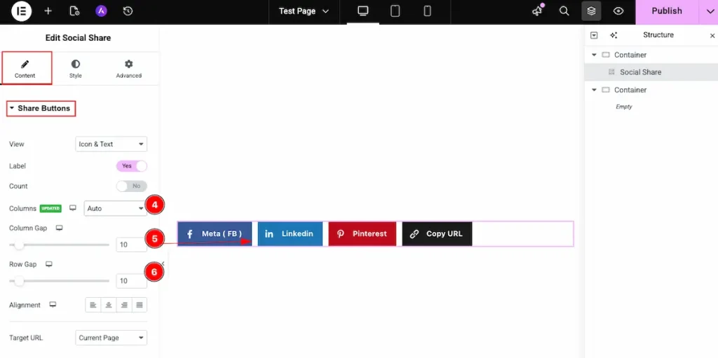
- Columns: Choose the columns layout for displaying the buttons. It demonstrate the columns. Different layout are available for the columns. Choose the Auto for automatically displaying.
- Column Gap: Set the gap between the columns.
- Row Gap: Set the gap between the Rows.
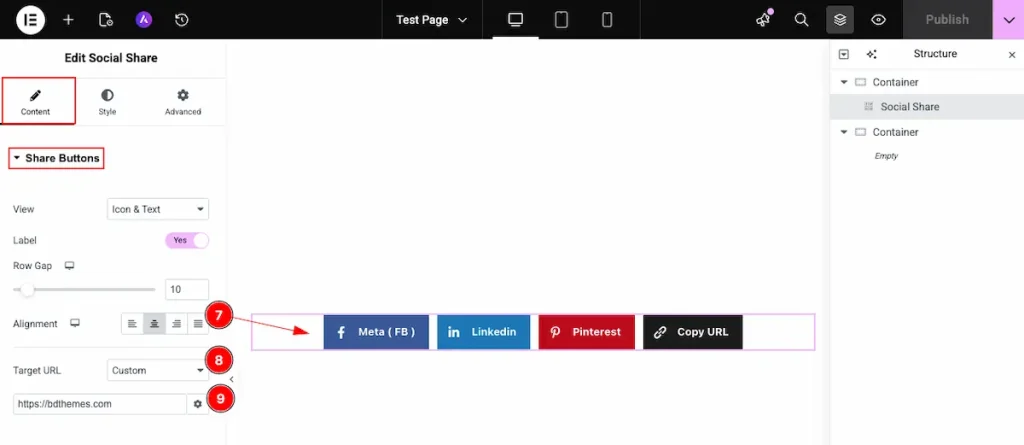
- Alignment: Set the alignment for the share button. Left, Center, Right , Justified. It will refer the position of the buttons.
- Target URL: Set the target URL via the share button. It has two Target URL.
Current Page: It refer the current page URL.
Custom: Set the custom URL that want to target.
Style Tab Customization
Share Buttons section
Go to Style > Share Buttons
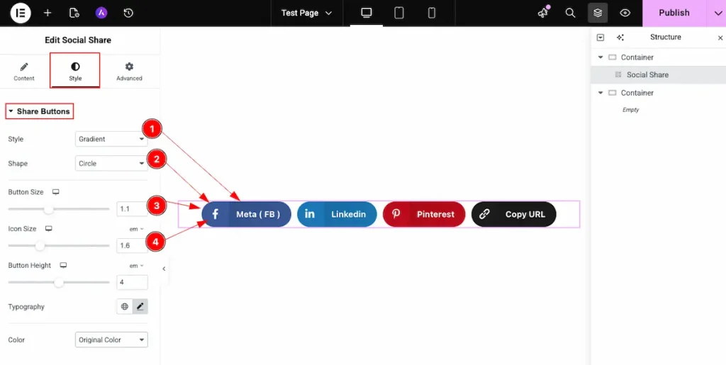
- Style: Choose the style for the share buttons. Available styles are Flat, Framed, Gradient, Minimal, Boxed Icon.
- Shape: Select the shape for the Buttons. They are Square, Rounded, Circle.
- Button Size: Set the size for the buttons. The size measure in em format.
- Icon Size: Select the size for the Icon.
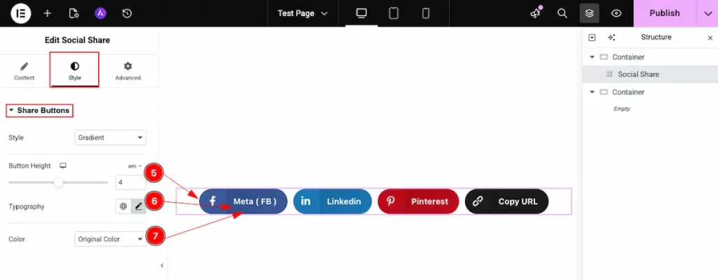
- Button Height: Set the height for the button.
- Typography: Choose the typography for the button.
- Color: Select the color for the share buttons.
Original Color: The original color refer the primary color of those social media.
Custom Color: Refer any color that want to demonstrate.
Custom Color
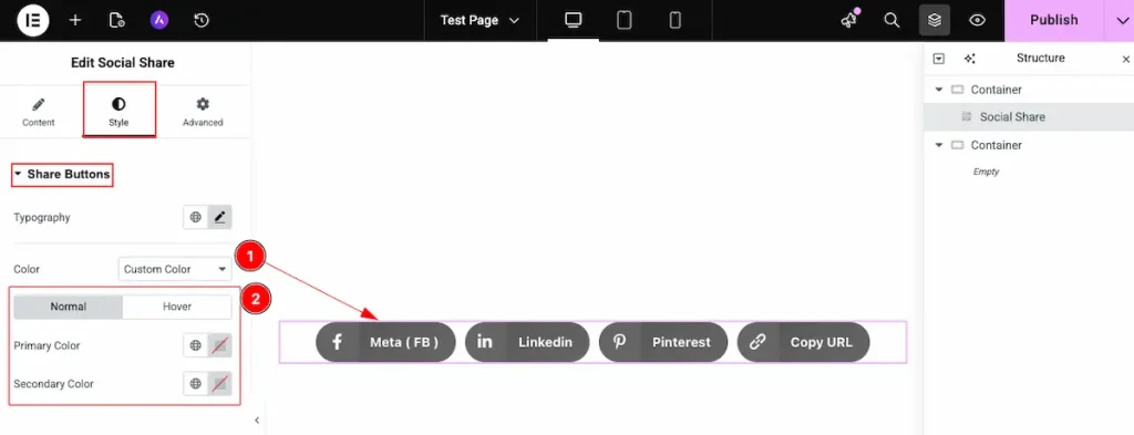
- Color: Select the color as Custom Color for the social share button.
- It appear all the color to display in normally and on hover over the button.
Normal
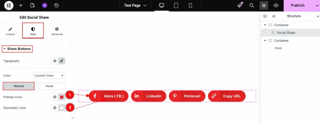
- Primary Color: Select the primary color for the social share buttons. It set the color globally. It changes all the button to same color.
- Secondary Color: Choose the color for the button Text.
Hover
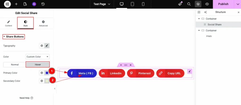
It represent the demonstration while hover over the button.
- Primary Color: Select the primary color for the social share buttons. It set the color globally. It changes all the button to same color.
- Secondary Color: Choose the color for the button Text.
Video Assist
Watch the Share Buttons Widget video tutorial here. Please visit the demo page for examples.
Thanks for being with us.