In this documentation, we will show you how to customize the Product Grid widget presented by Element Pack Pro.
Inserting The Product Grid Widget
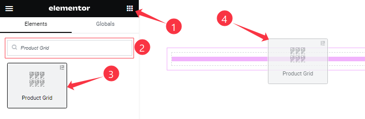
Open your page in the Elementor editor, search by the widget name, then drag and drop it on the page.
Content Tab Customizations
Product Items Section
Go to Content > Product Items
Step-1
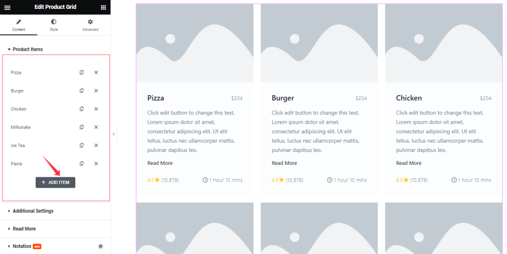
Here you can add Product Grid widget items (with the Add Item button).
Step-2
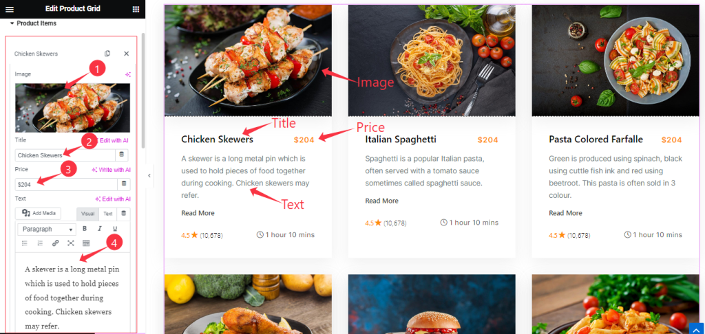
For each Product item, find the Item Title, Image, Price, and Text options.
Step-3
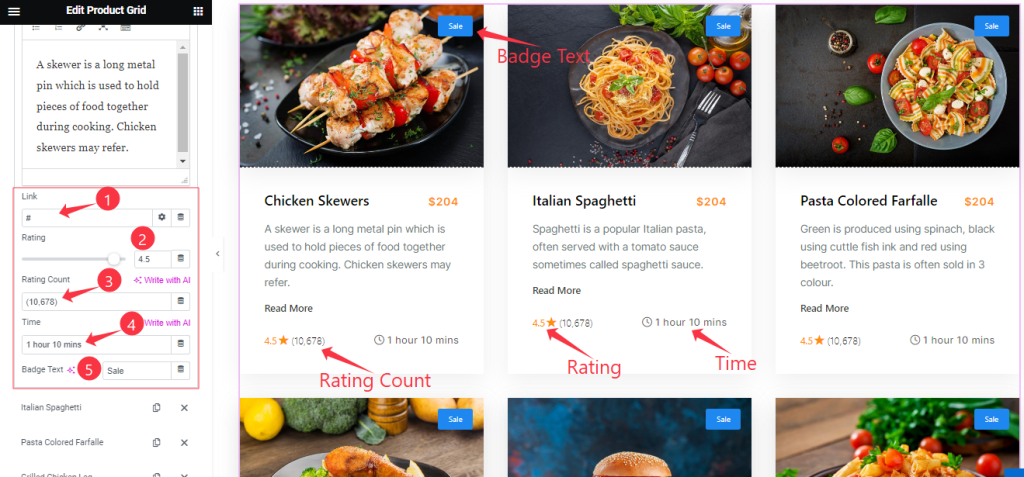
For each Product item, also find the Item Link, Rating, Rating Count, Time, and Badge Text options.
Style For Item
Newly feature added for making the individual color for the items.
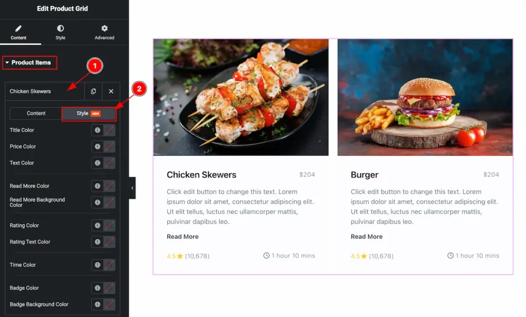
- Select any Items and click on it the options appears.
- Select the Style tab for customising the item.
Set styles for Items
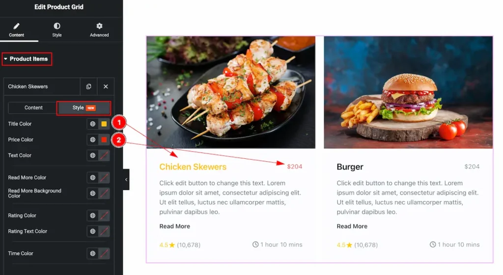
- Title Color: Select the color for the Title.
- Price Color: Set the price color of it.
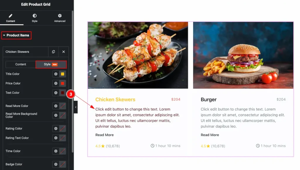
- Text Color: Set the text color for the items.
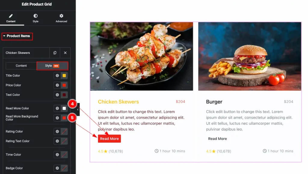
- Read More Color: Set the text color for the read more button.
- Read More Background Color: Set the background color for the button.

- Rating Color: Set the rating color for the item.
- Rating Text Color: Set the text color of the rating.
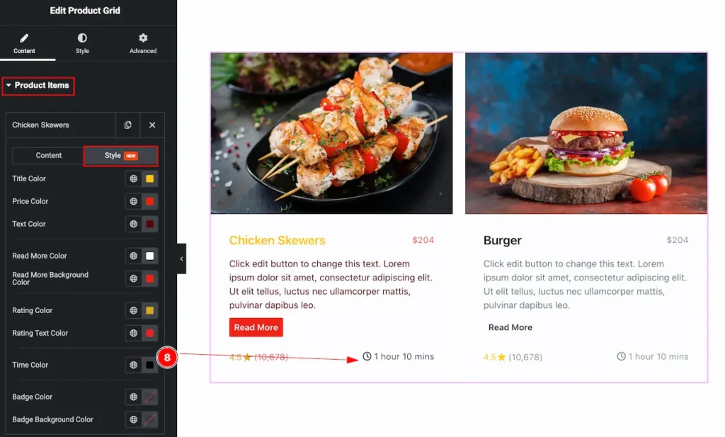
- Time Color: Set the time color.
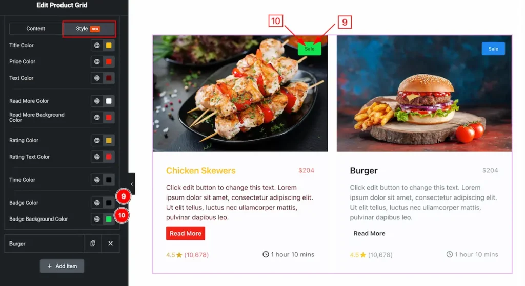
- Badge Color: Set the color for the badge text.
- Badge Background Color: Set the background color for the badge.
Additional Settings Section
Go to Content > Additional Settings
Step-1
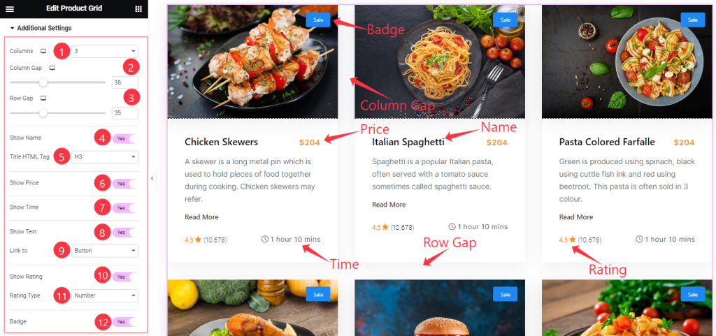
Come to the Additional Settings section, Find the Columns, Column Gap, Row Gap, Title HTML Tag, Link To (Button, Title, Image, Item Wrapper), and Rating Type (Star, and Number) options.
Also, Find the Show Name, Show Price, Show Time, Show Text, Show Rating, and Badge switchers.
Step-2
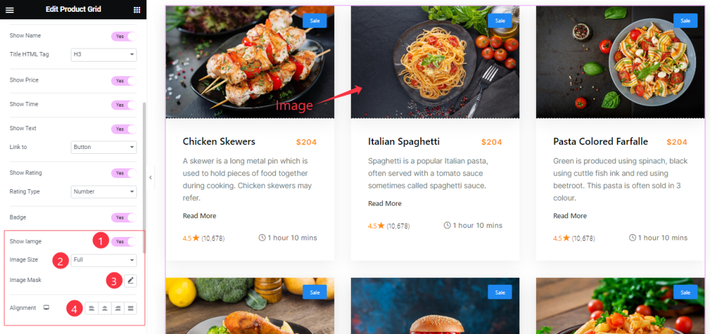
Here also Find the Show Image, Image Size, Image Mask, and Alignment options.
Read More Button Section
Go to Content > Read More
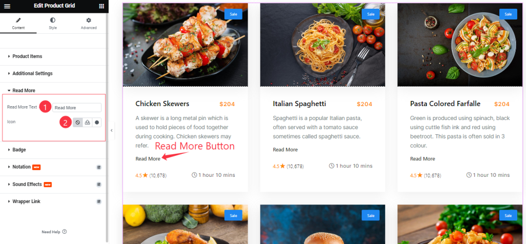
Find the Read More Button Text and Icon options.
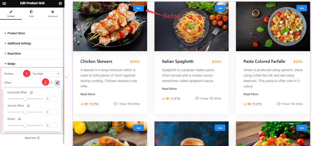
Badge Section
Go to Content > Badge
Here Find the Badge Position (9 Positions), and Offset options.
Work with The Style Tab
Style The Items Section
Go to Style > Items
Step-1
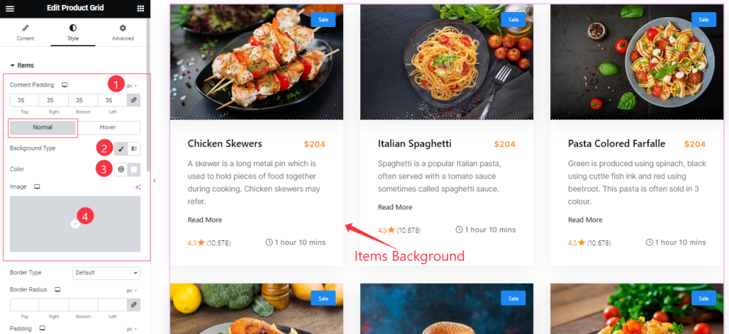
Come to the Items section, you will find two sub-sections; Normal and Hover.
In the Normal Mode, Find the Content Padding, Background Type ( Classic, and Gradient), Background Color, and Image options.
Step-2
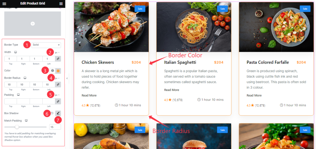
In the Normal Mode, Also find the Border Type, Width, Color, Border Radius, Padding, Box Shadow, and Match Padding options.
Step-3
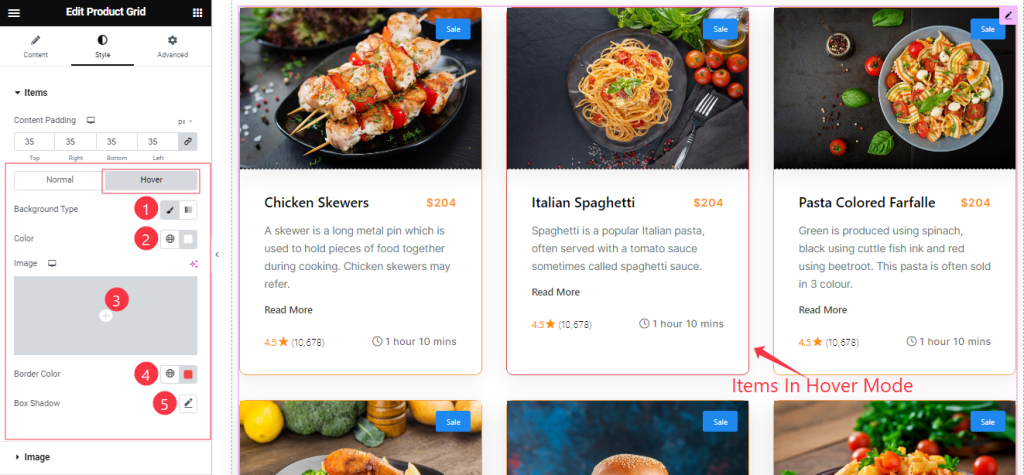
In the Hover Mode, you will get a similar customization option as in the Normal mode. So please try it yourself.
Image Section
Go to Style > Image
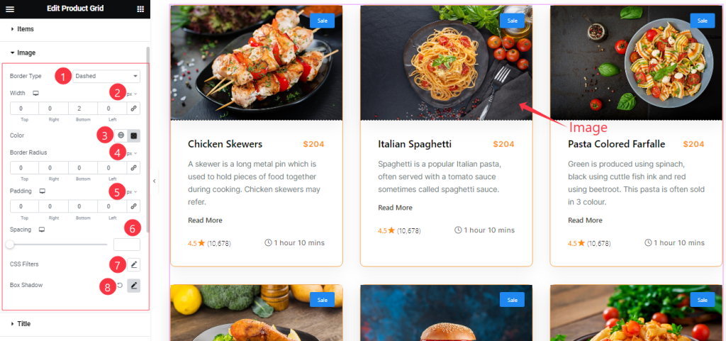
Here Find the Border Type, Width, Color, Border Radius, Padding, Spacing, CSS Filter, and Box Shadow options.
Title Section Customization
Go to Style > Title
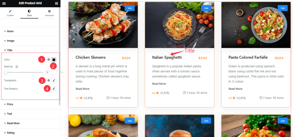
Find the Title Color, Spacing, Typography, and Text Shadow options.
Style The Price Section
Go to Style > Price
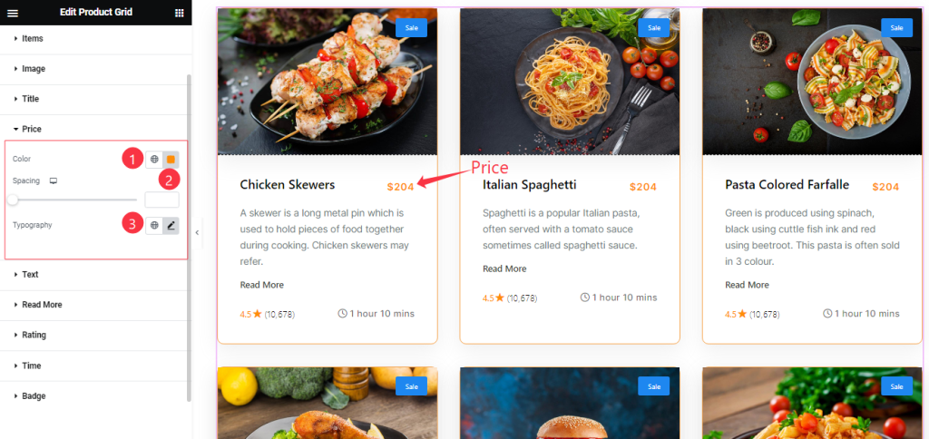
Find the Price Text Color, Spacing, and Typography options.
Text Section Customization
Go to Style > Text
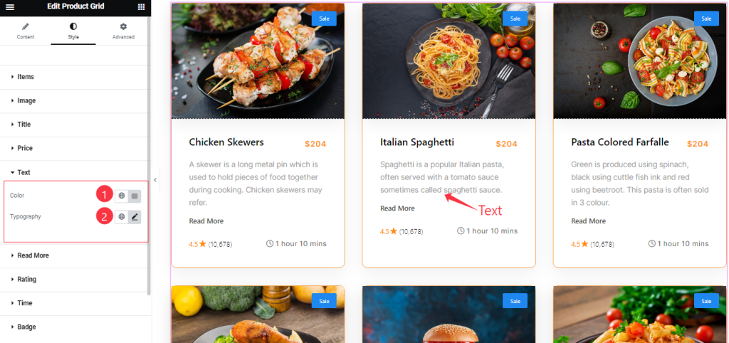
Come to the Text Section, Find the Text Color and Typography options.
Read More Button Section
Go to Style > Read More
Step-1
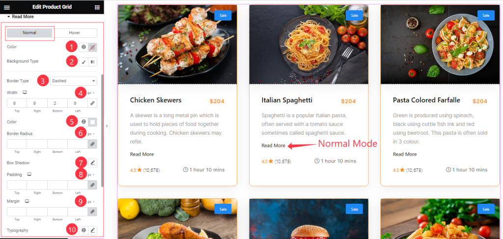
Come to the Read More section, you will find two sub-sections; Normal and Hover.
In the Normal Mode, Find the Read More Text Color, Background Type ( Classic, and Gradient), Background Color, and Image options.
Also find the Border Type, Width, Color, Border Radius, Padding, Box Shadow, Margin, and Typography options.
Step-2
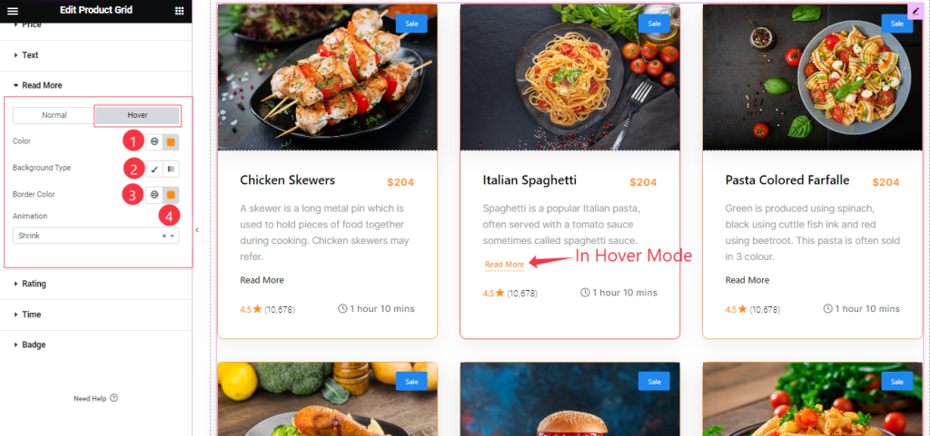
In the Hover Mode, Find the Read More button text Color, Background Type, Background Color, Border Color, and Animation (27 Styles) options.
Style The Rating Section
Go to Style > Rating
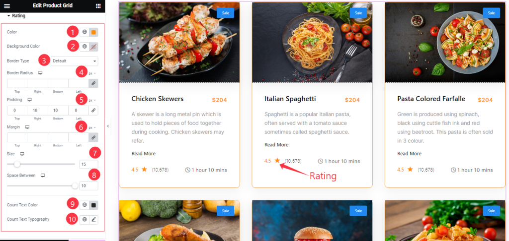
Here Find the Rating Color, Background Color, Border Type, Border Radius, Padding, Margin, Size, Space Between, Count Text Color, and Count Text Typography options.
Time Section Customization
Go to Style > Time
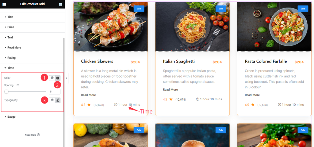
Come to the Time section, you will get a similar customization option as in the Price section. So please try it yourself.
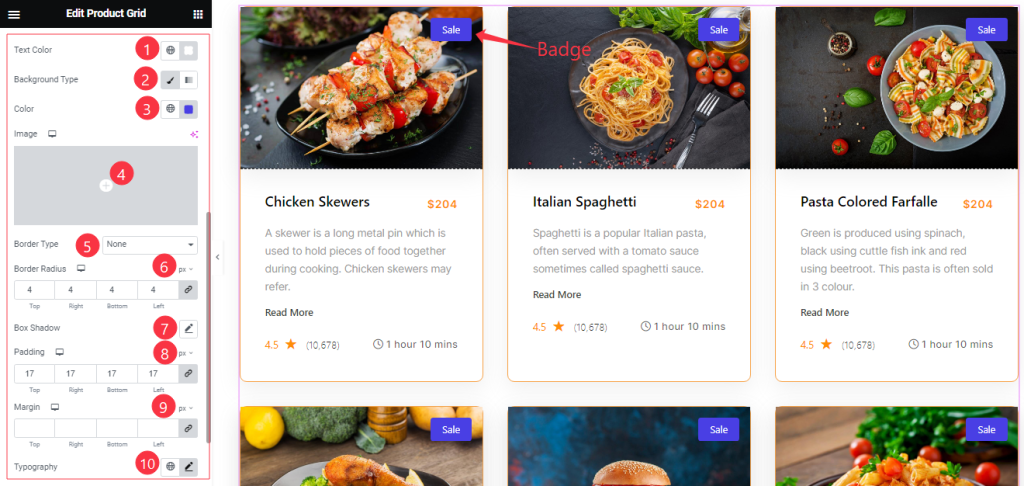
Style The Badge Section
Go to Style > Badge
Come to the Badge section, you will get a similar customization option as in the Rating section. So please try it yourself.
All done! You have successfully customized the Product Grid widget on your website.
Video Assist
You can also watch the tutorial video about the Product Grid widget. Please visit the demo page for examples.
Thanks for staying with us.