In this documentation, we will discuss the customization of the Turnar Slider widget, brought to you by the Prime Slider.
Enable The Turnar Slider Widget
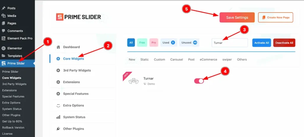
To use the Elementor Turnar Slider widget from Prime Slider, first, you have to enable the widget.
- Go to WordPress dashboard > Prime Slider Plugin dashboard.
- Then Click the Core Widgets Tab.
- Search the Turnar Slider Widget Name.
- Enable the Turnar Slider Widget.
- Hit the Save Settings Button.
Inserting The Turnar Slider widget
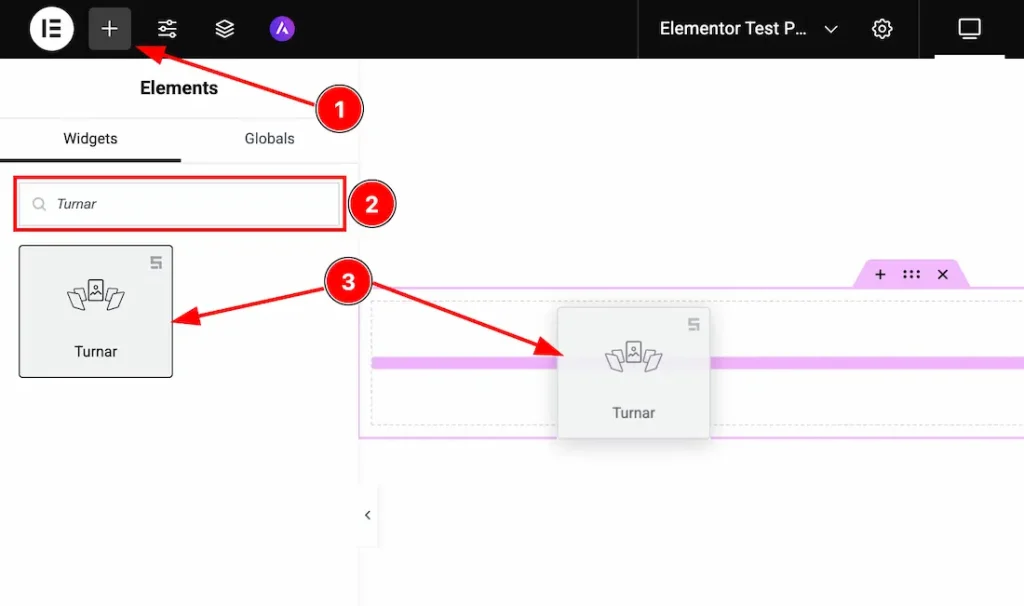
1. Go to the Elementor Editor Page and Hit the “+” icon Button.
2. Search the Turnar Slider widget.
3. Drag the widget and Drop it on the editor page.
(Note: You need both Elementor and Prime Slider Pro installed to use this widget.)
Work With The Content Tab
Layout Section
Go to Content > Layout
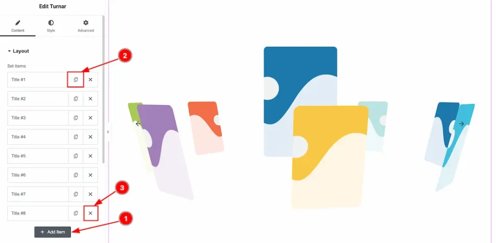
1. Add Item: You can add a new item by clicking the “+”Add Item button.
2. Copy Item: This option lets you copy the same item.
3. Close Item: You can delete the Slider item by clicking the Close icon button.
Come to the each slider item, you will get the below cuatomization options-
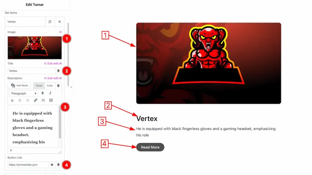
1. Image: You can set an image for the slider item from here.
2. Title: This option lets you change the title text of the slider item.
3. Description: This option lets you change the description text of the slider item.
4. Button Link: You can set a button link under the button.
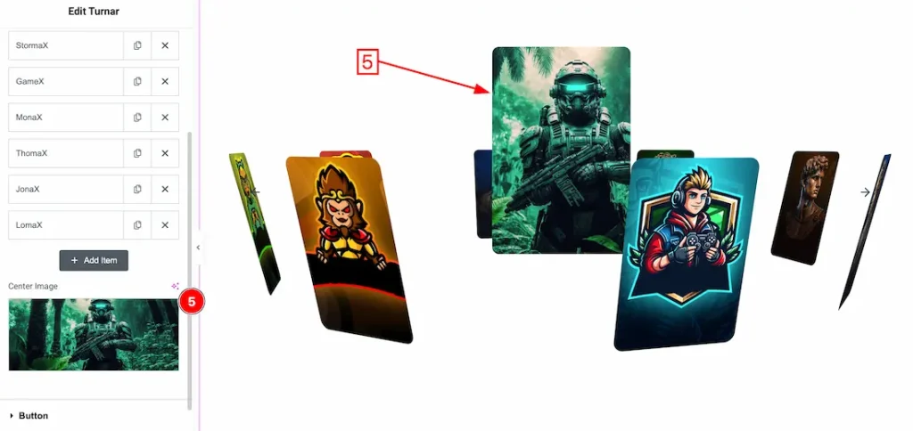
5. Center Image: This option lets you set the center image of the slider.
Button Section
Go to Content > Button
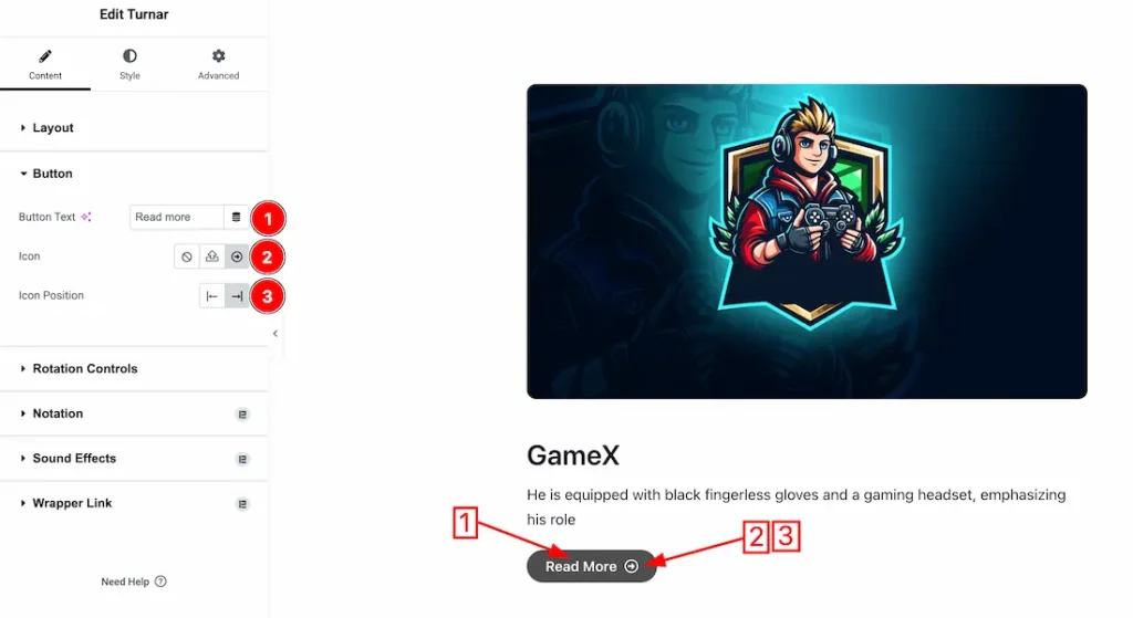
1. Button Text: This option lets you change the button text.
2. Icon: This option lets you change the button icon.
3. Icon Position: You can set the button icon position left and right.
Rotation Controls Section
Go to Content > Rotation Controls
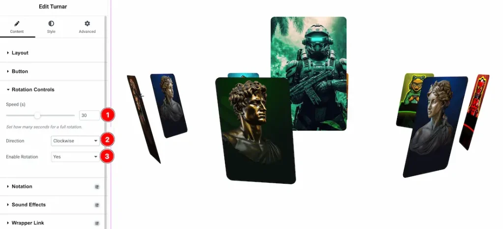
1. Speed: You can adjust the rotation speed from here.
2. Direction: You can set the rotation direction as – Clockwise, and Anti-Clockwise.
3. Enable Rotation: If you enable the rotation type- yes then your slider automatically rotating.
Work with The Style Tab
Center Image Section
Go to Style > Center Image
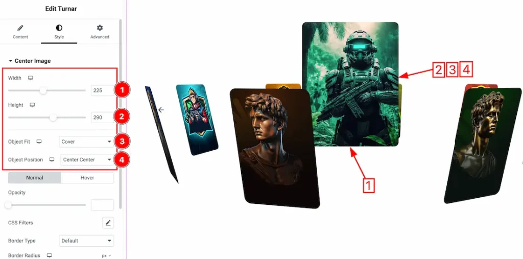
1. Width: This option lets you set the center image width.
2. Height: This option lets you set the center image height.
3. Object Fit: You can set the object fit type- Default, Fill, Cover, Contain and Scale Down.
4. Object Position: You can set the object position – Center Center, Center Left, Center Right, Top Center, Top Right, Top Left, Bottom Center, Bottom Left, and Bottom Right.
Here you will get the two tabs section; Normal and Hover. Let’s proceed with the Normal tab section.
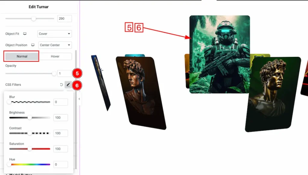
5. Opacity: You can adjust the center image opacity from here.
6. CSS Filter: You can set the CSS Filters for the center image from here.
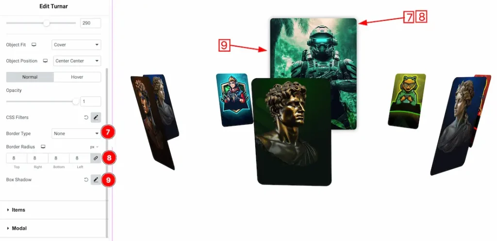
7. Border Type: You can set the Border Type to Default, None, Solid, Double, Dotted, Dashed, or Groove. We choose here the Border Type Solid.
8. Border Radius: Customizes the border corners for roundness
9. Box Shadow: The Box Shadow property is used to create the shadow around the Category Button. It takes Four values: Horizontal offset, Vertical offset, blur, and Spread to customize the Box shadow.
Position: you can set the Box Shadow position Outline and Inset. Here we set the Box Shadow position Outline.
Box Shadow Color: This lets you change the Box Shadow color.
In the Hover tab section, you will get the below customization options-
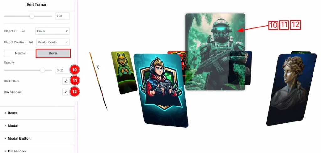
10. Opacity: You can set the center image hover opacity from here.
11. CSS Filters: You can set the center image hover CSS Filters from here.
12. Box Shadow: You can set the center image hover box shadow from here.
Items Section
Go to Style > Items
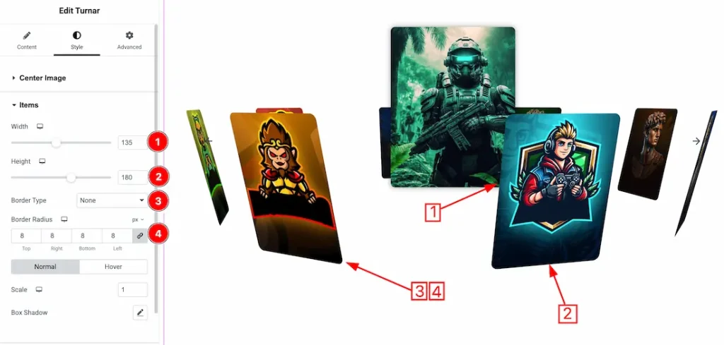
1. Width: This option lets you set the item width.
2. Height: This option lets you set the item height.
3. Border Type: You can set the Border Type to Default, None, Solid, Double, Dotted, Dashed, or Groove. We choose here the Border Type Solid.
4. Border Radius: Customizes the border corners for roundness.
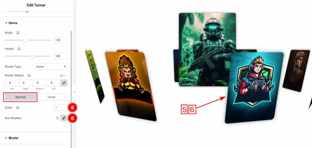
Here you will get the two tabs section; Normal and Hover. Let’s proceed with the Normal tab section.
5. Scale: You can adjust the item normal scale from here.
6. Box Shadow: You can set the item normal box shadow from here.
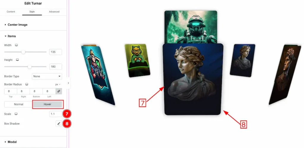
In the Hover tab section, you will get the below customization options-
7. Scale: You can adjust the item hover scale from here.
8. Box Shadow: You can set the item hover box shadow from here.
Modal Section
Go to Style > Modal
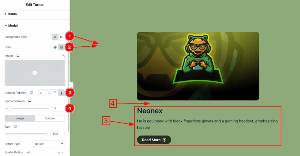
1. Background Type: you can change the modal background type to classic or gradient. Here we choose the Background type Classic.
2. Background Color: This lets you change themodal background color. If you want, you also can change an image to the Background.
3. Content Position: You can set the modal content position – Left, Right, Top, and Bottom.
4. Space Between: You can adjust the space between modal image and content from here.
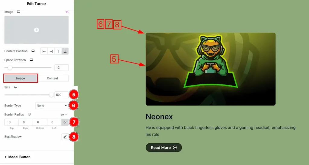
In this Section, we have two tabs. These are Image & Content. Let’s start with the Image Tab –
5. Size: You can adjust the modal image size from here.
6. Border Type: Here we set the modal border type – none.
7. Border Radius: You can adjust the modal image border radius from here.
8. Box Shadow: You can add the box shadow for the modal image.
Come to the modal Content section, you will get the below options-
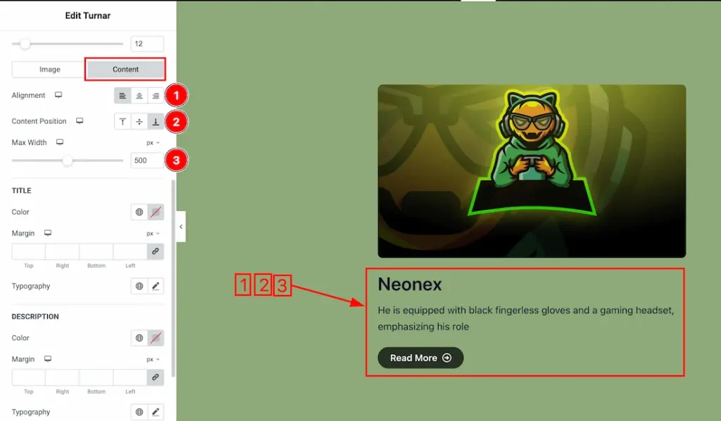
1. Alignment: You can set the content alignment – Left, Center, and Right.
2. Content Position: You can set the content position – Top, Center and Bottom.
3. Max Width: This option lets you set the content max width.
Modal Title
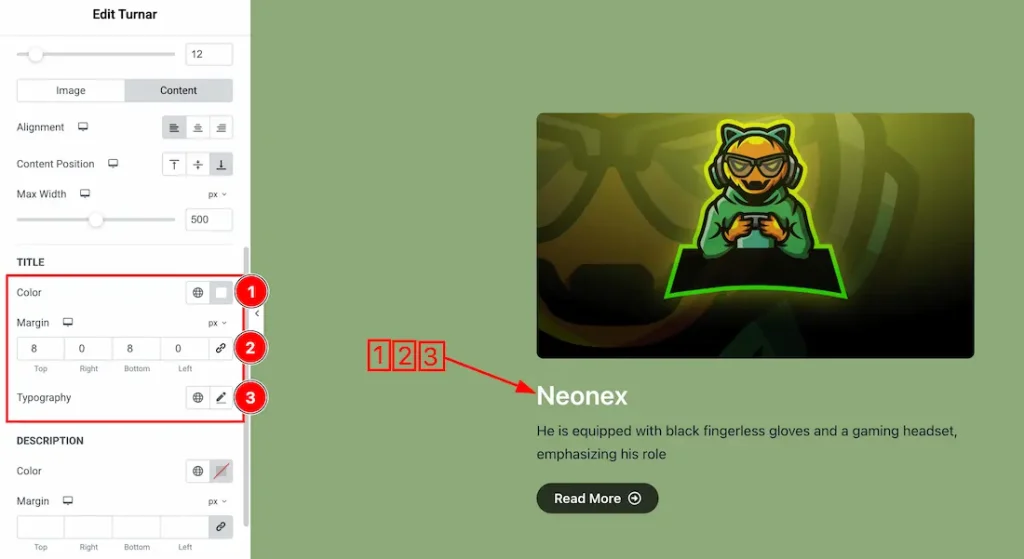
1. Color: This option lets you change the modal title color.
2. Margin: Adjusts the margin of the modal title.
3. Typography: Change the font family, size, weight, style, transform, decoration, line height, letter spacing, and word spacing from here.
Modal Description
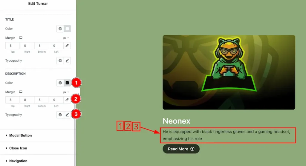
1. Color: This option lets you change the modal description text color.
2. Margin: Adjusts the margin of the modal description.
3. Typography: Change the font family, size, weight, style, transform, decoration, line height, letter spacing, and word spacing from here.
Modal Button Section
Go to Style > Modal Button
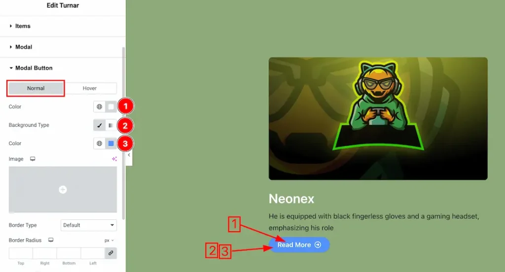
In this Section, we have two tabs. These are Normal & Hover. Let’s start with the Normal Tab –
1. Color: You can change the modal button normal color with this option.
2. Background Type: You can select the background type to Classic or Gradient from here. Here we selected Classic.
3. Color: You can change the background normal color with this option.
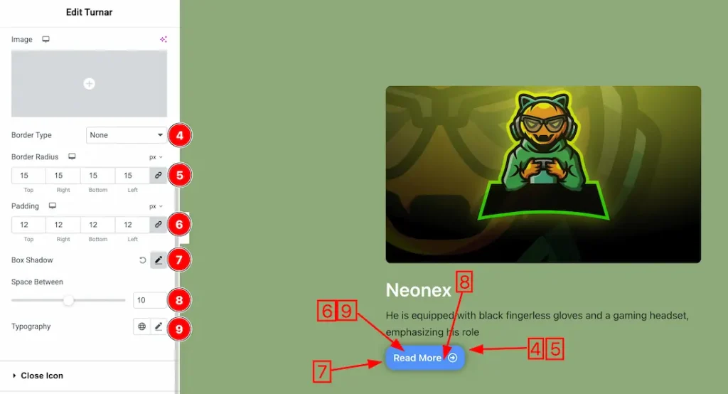
4. Border Type: you can set the Border Type to Default, None, Solid, Double, Dotted, Dashed, or Groove. We choose here the Border Type Solid.
5. Border Radius: Customizes the border corners for roundness.
6. Padding: Add spaces around an object to increase the inner area. Padding allows you to control the internal space within an element.
7. Box Shadow: You can add the box shadow for the modal button.
8. Space Between: You can add the space between button text and icon.
9. Typography: Change the font family, size, weight, style, transform, decoration, line height, letter spacing, and word spacing from here.
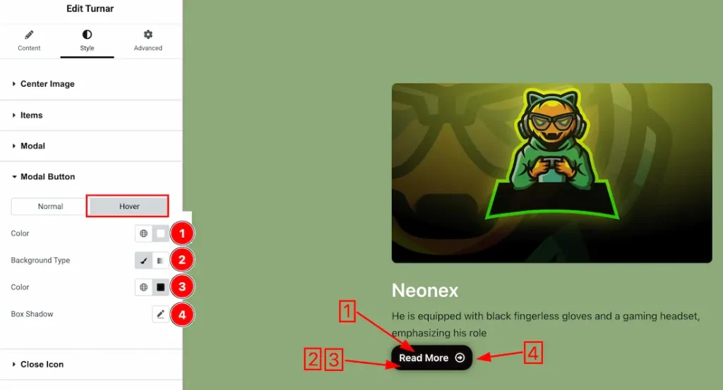
Now, let’s proceed to the Hover Tab –
1. Color: You can change the button text hover color with this option.
2. Background Type: You can select the background type to Classic or Gradient from here. Here we selected the Classic.
3. Color: You can change the background hover color with this option. If you want then you can set an image instead of background color.
4. Box Shadow: You can add the button hover box shadow from here.
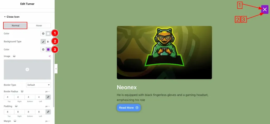
Close Icon Section
Go to Style > Close Icon
In this Section, we have two tabs. These are Normal & Hover. Let’s start with the Normal Tab –
1. Color: You can change the close button normal color with this option.
2. Background Type: You can select the background type to Classic or Gradient from here. Here we selected Classic.
3. Color: You can change the close button background normal color with this option.
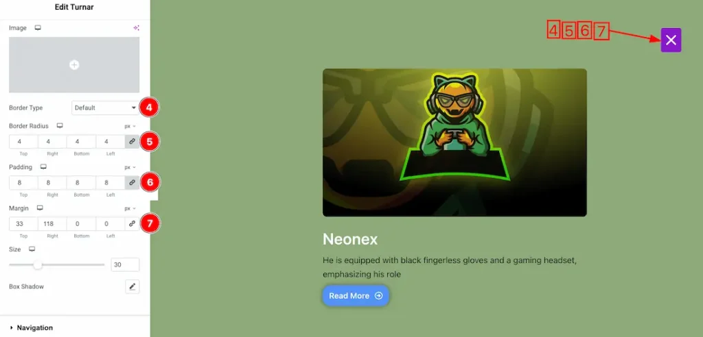
4. Border Type: you can set the Border Type to Default, None, Solid, Double, Dotted, Dashed, or Groove. We choose here the Border Type Solid.
5. Border Radius: Customizes the border corners for roundness.
6. Padding: Add spaces around an object to increase the inner area. Padding allows you to control the internal space within an element.
7. Margin: Adjusts the position of an object over the canvas.
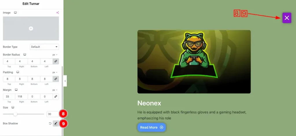
8. Size: This option lets you set the close button size.
9. Box Shadow: You can add the box shadow for the close button from here.
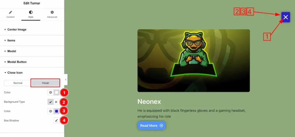
Now, let’s proceed to the Hover Tab –
1. Color: You can change the close button hover color with this option.
2. Background Type: You can select the background type to Classic or Gradient from here. Here we selected the Classic.
3. Color: You can change the close button background hover color with this option. If you want then you can set an image instead of background color.
4. Box Shadow: You can add the hover Box shadow for the close button.
Navigation Section
Go to Style > Navigation
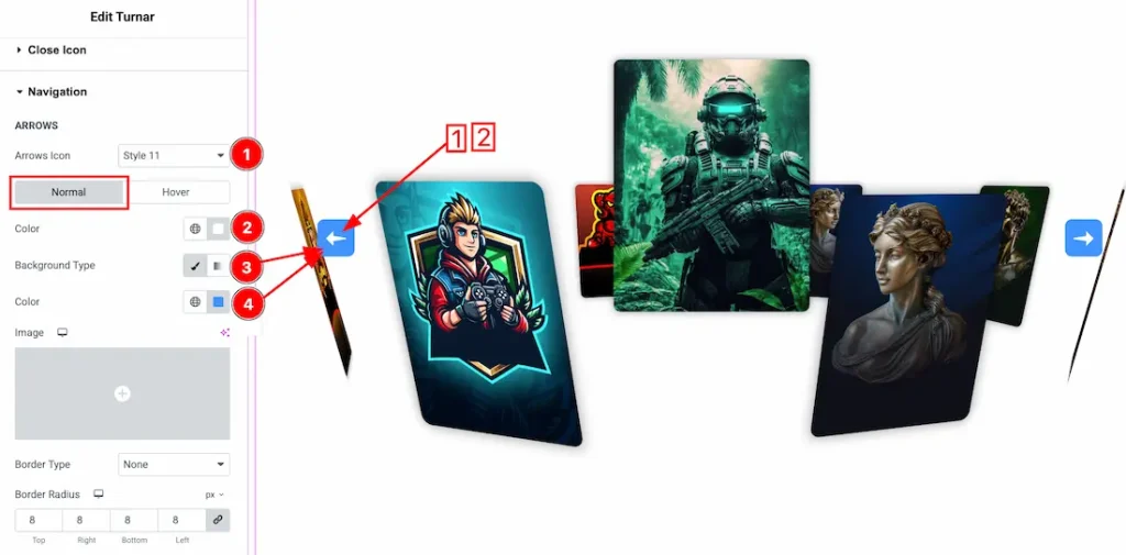
In this Section, we have two tabs. These are Normal & Hover. Let’s start with the Normal Tab –
1. Arrows Style: Here you will get 1 to 23 unique arrows style and can choose one of them.
2. Color: You can change the arrow normal color with this option.
3. Background Type: You can select the background type to Classic or Gradient from here. Here we selected Classic.
4. Color: You can change the arrows background normal color with this option.
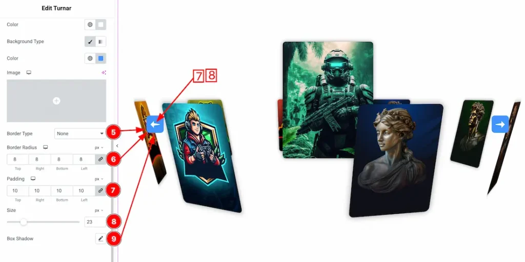
5. Border Type: you can set the Border Type to Default, None, Solid, Double, Dotted, Dashed, or Groove. We choose here the Border Type Solid.
6. Border Radius: Customizes the border corners for roundness.
7. Padding: Add spaces around an object to increase the inner area. Padding allows you to control the internal space within an element.
8. Size: You can set the arrows size from here.
9. Box Shadow: You can add the box shadow for the arrows.
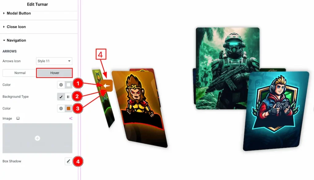
Now, let’s proceed to the Hover Tab –
1. Color: You can change the arrows hover color with this option.
2. Background Type: You can select the background type to Classic or Gradient from here. Here we selected the Classic.
3. Color: You can change the arrows background hover color with this option. If you want then you can set an image instead of background color.
4. Box Shadow: You can set the arrows hover box shadow from here.
All done! You have successfully customized the Turnar Slider on your website.
Video Assist
You can also watch the video tutorial to learn more about the Turnar Slider widget. Please visit the demo page for examples.
Thanks for being with us.