In this documentation, we will discuss the customization of the Prism slider widget, brought to you by the Prime Slider addon for Elementor.
Enable The Prism Slider
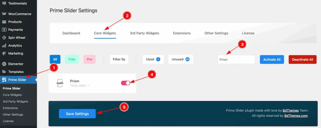
To use the Prism Slider from Prime Slider, first, you have to enable the widget.
- Go to WordPress dashboard > Prime Slider Plugin dashboard.
- Then, Click the Core Widgets Tab.
- Search the Prism Slider Name.
- Enable the Prism Slider.
- Hit the Save Settings Button.
Inserting The Prism Slider
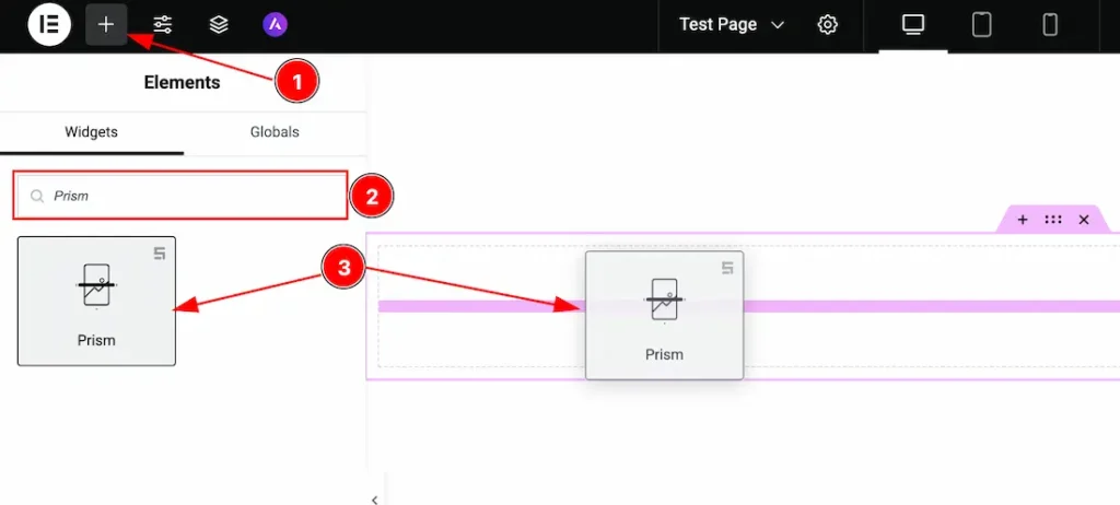
1. Go to the Elementor Editor Page and hit the “+” icon Button.
2. Search the Prism Slider.
3. Drag the widget and drop it on the editor page.
Work With The Content Tab
Layout Section
Go to Content > Layout
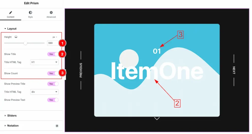
1. Height: This option lets you set the slider height.
2. Show Title: Enable or disable the show title swicther button to show/hide the title from slider. From here you can set the title html tag.
3. Show Count: Enable or disable the show count swicther button to show/hide the count from slider.
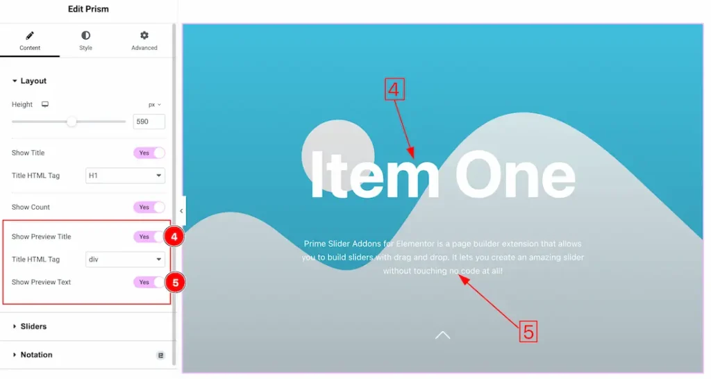
3. Show Preview Title: Enable or disable the show preview title swicther button to show/hide the preview title from slider. From here you can set the title html tag.
4. Show Preview Text: Enable or disable the show preview text swicther button to show/hide the preview text from slider.
Sliders Section
Go to Content > Sliders
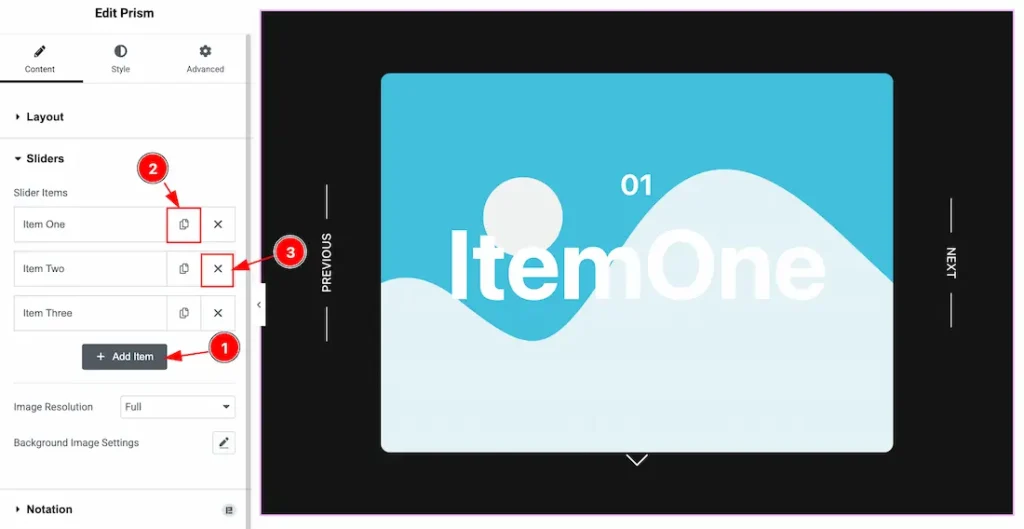
1. Add Item: You can add a new item by clicking the “+”Add Item button.
2. Copy Item: This option lets you copy the same item.
3. Close Item: You can delete the Slider item by clicking the Close icon button.
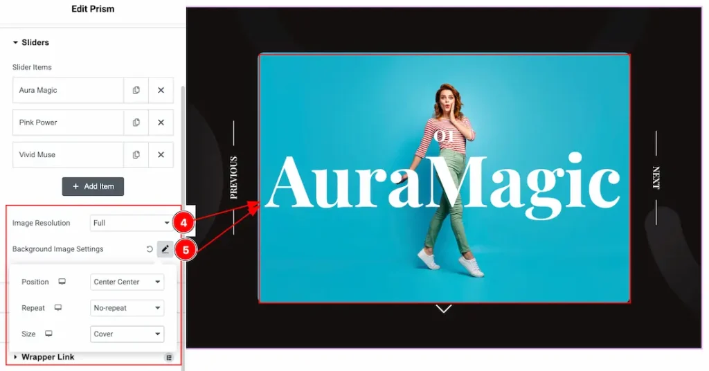
4. Image Resolution: You can change the image resolution with this option.
5. Background Image Settings: This option lets you set the background image position, repeat and size.
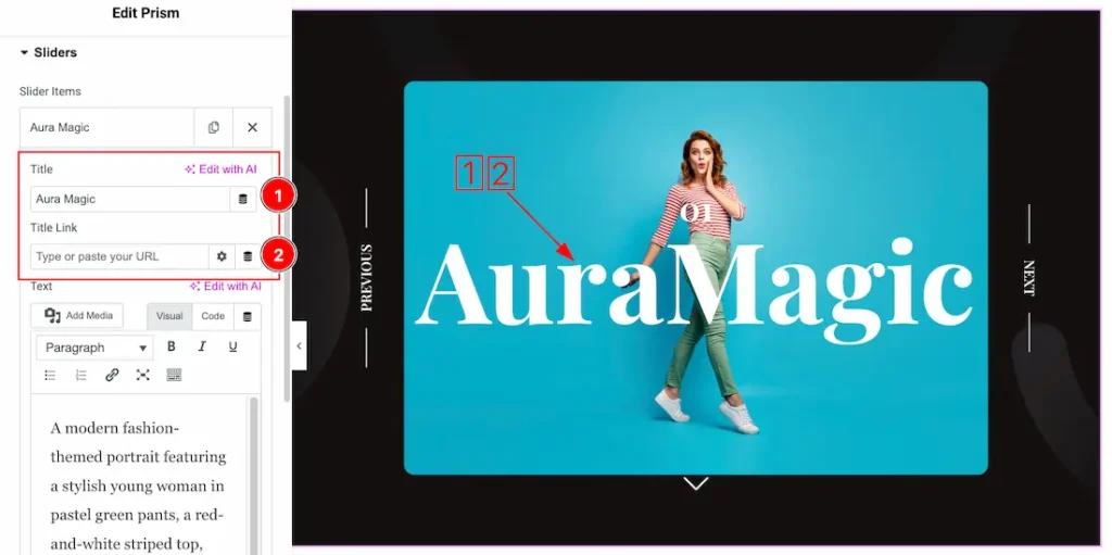
Come to the each slider item, you will get the below customization options-
1. Title: This option lets you change the title.
2. Title Link: You can set a link under the title.
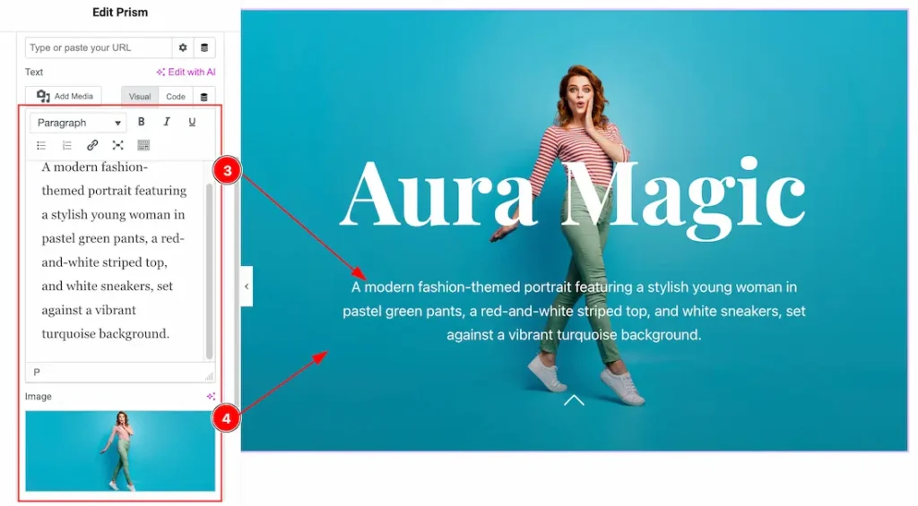
3. Text: This option lets you change the slider item text.
4. Image: You can set the slider item image from here.
Work with The Style Tab
Sliders Section
Go to Style > Sliders
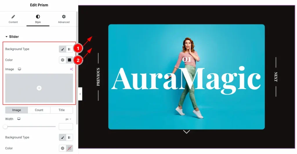
1. Background Type: You can change the color of any object background to classic or gradient. Here we choose the Background type Classic.
2. Background Color: This lets you change the Background color. If you want, you also can change an image to the Background.
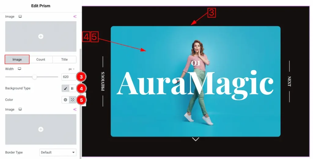
Come to the sliders section, you will get three sub sections; Image, Count and Title.
Lets explore one by one. Come to the image subsections, you will get the below options-
3. Width: This option lets you set the slider image width.
4. Background Type: You can change the color of image background to classic or gradient. Here we choose the Background type Classic.
5. Background Color: You can change the image background color.
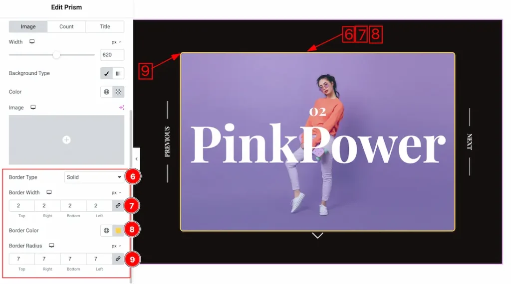
6. Border Type: you can set the Border Type to Default, None, Solid, Double, Dotted, Dashed, or Groove. We choose here the Border Type Solid.
7. Border Width: The border width property allows you to control how thick or thin the border is.
8. Border Color: This lets you change the Border color.
9. Border Radius: Customizes the border corners for roundness.
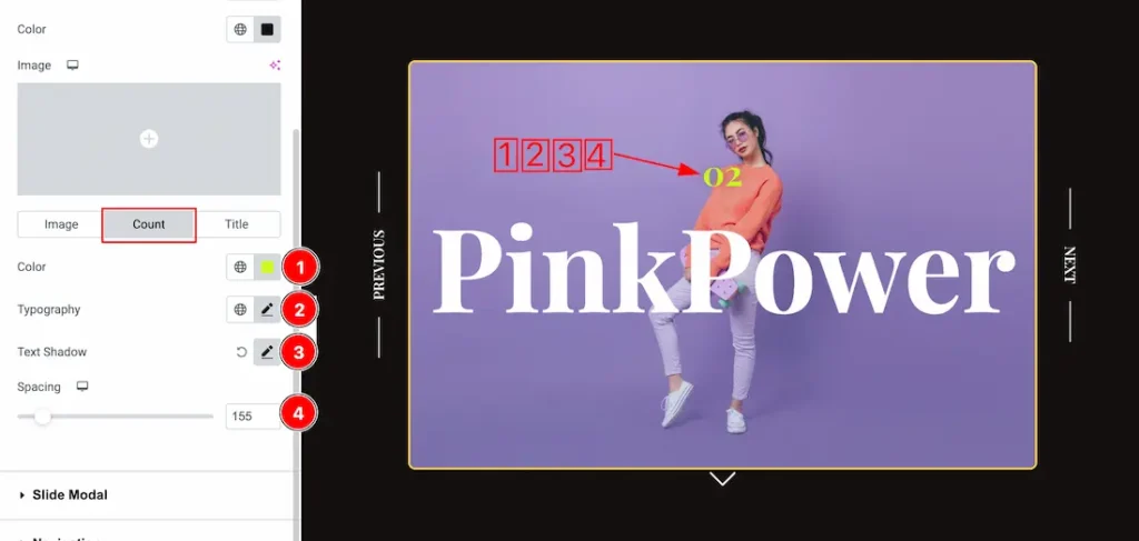
Come to the Count subsection, you will get the below options-
1. Color: This option lets you set the count text color.
2. Typography: Change the font family, size, weight, style, transform, decoration, line height, letter spacing, and word spacing from here.
3. Text Shadow: The Text Shadow property is used to create the shadow around the text. It takes three values: horizontal offset, vertical offset, and blur radius. Here you also can change the Text Shadow Color.
4. Spacing: You can adjust the text spacing from here.
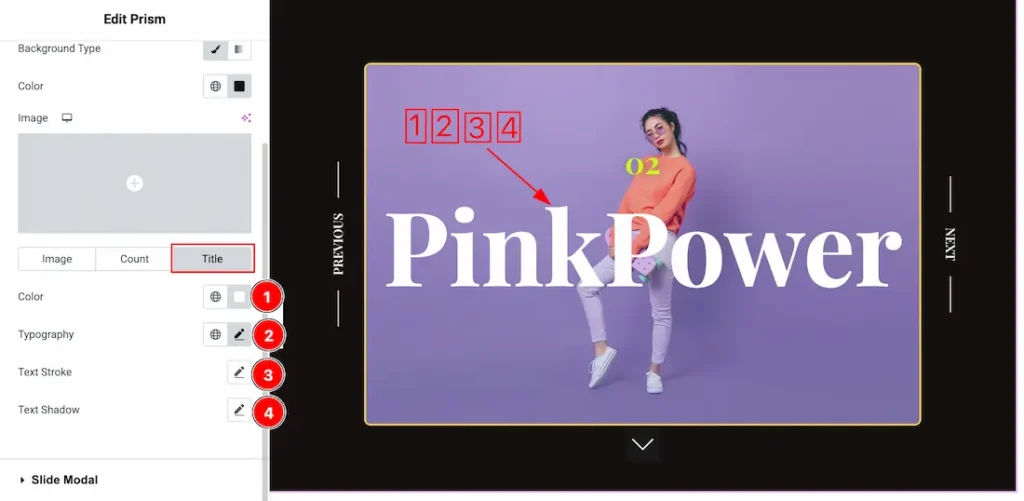
Come to the Title subsection, you will get the below options-
1. Color: This option lets you set the Title color.
2. Typography: Change the font family, size, weight, style, transform, decoration, line height, letter spacing, and word spacing from here.
3. Text Stroke: If you want to add a stroke (outline) around the text, you can use the Text Stroke property. you also can change the Text Stroke Color as your working demand.
4. Text Shadow: The Text Shadow property is used to create the shadow around the text. It takes three values: horizontal offset, vertical offset, and blur radius. Here you also can change the Text Shadow Color.
Slide Modal Section
Go to Style > Slide Modal
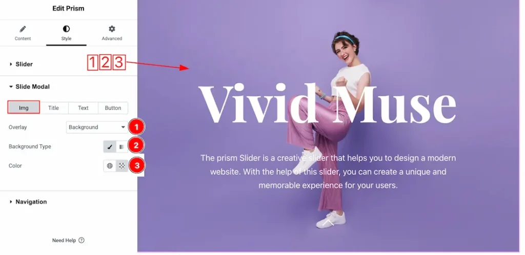
Come to the slide modal section, you will get four sub sections; Img, Title, Text, and Button. Lets explore the img sub sections-
1. Overlay: You can set the overlay type- None, Background, and Blend. Here we select the overlay type Background.
2. Background Type: You can change the color of any object background to classic or gradient. Here we choose the Background type Classic.
3. Background Color: This lets you change the modal image Background color.
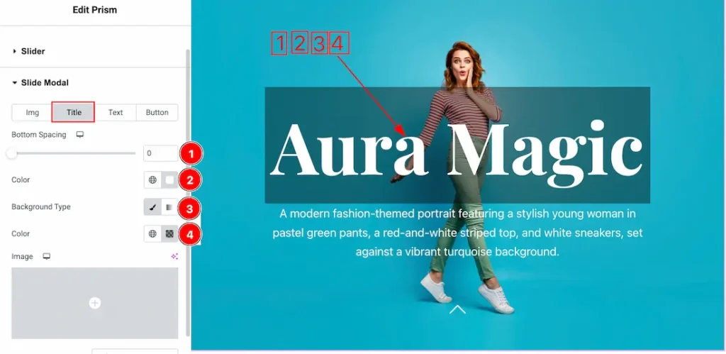
Come to the Title subsection, you will get the below options-
1. Bottom Spacing: You can adjust the modal title bottom spacing from here.
2. Color: This option lets you set the modal title color.
3. Background Type: You can change the color of any object background to classic or gradient. Here we choose the Background type Classic.
4. Background Color: This lets you change the modal title Background color.
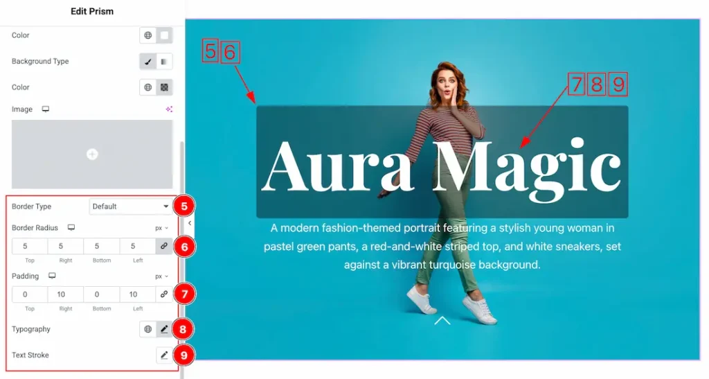
5. Border Type: you can set the Border Type to Default, None, Solid, Double, Dotted, Dashed, or Groove. We choose here the Border Type Solid.
6. Border Radius: Customizes the border corners for roundness.
7. Padding: Add spaces around an object to increase the inner area. Padding allows you to control the internal space within an element.
8. Typography: Change the font family, size, weight, style, transform, decoration, line height, letter spacing, and word spacing from here.
9. Text Stroke: If you want to add a stroke (outline) around the text, you can use the Text Stroke property. you also can change the Text Stroke Color as your working demand.
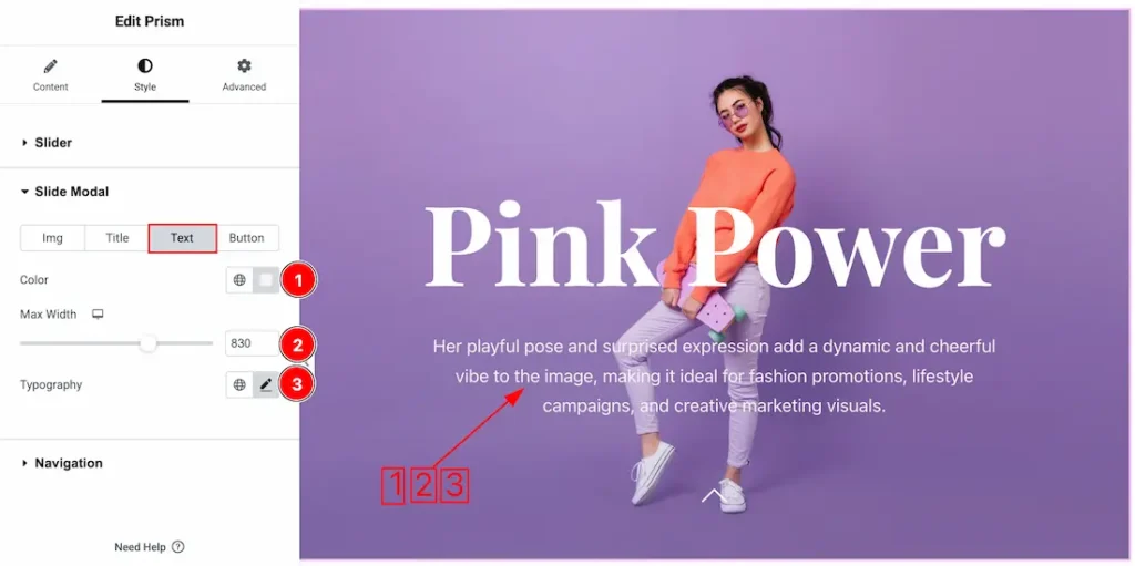
Come to the Text subsection, you will get the below options-
1. Color: This option lets you change the modal text color.
2. Max Width: You can set the modal text max width from here.
3. Typography: Change the font family, size, weight, style, transform, decoration, line height, letter spacing, and word spacing from here.
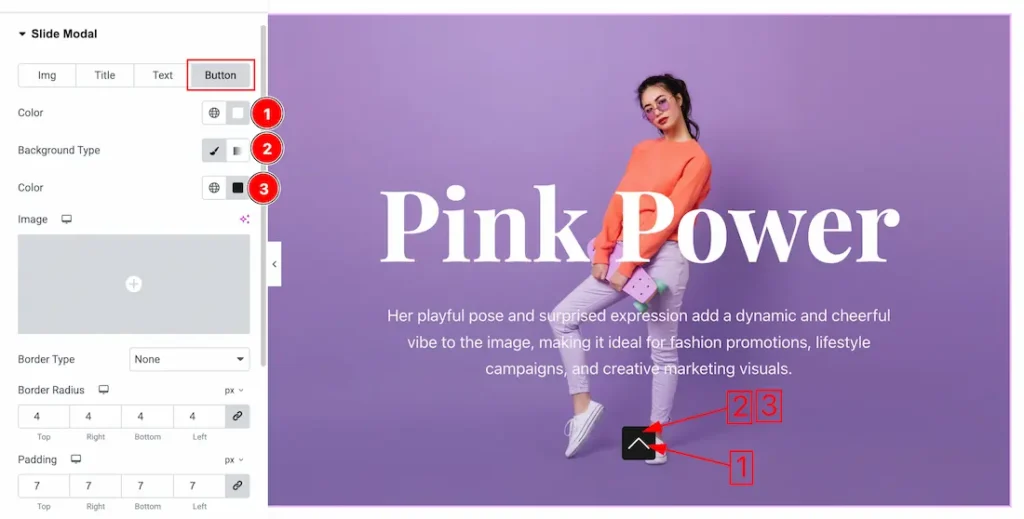
Come to the Button section, you will get the below customizations options-
1. Color: This option lets you set the button color.
2. Background Type: You can change the color of any object background to classic or gradient. Here we choose the Background type Classic.
3. Background Color: This lets you change the button Background color.
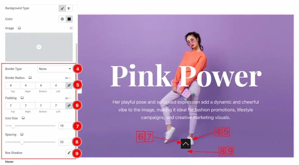
4. Border Type: you can set the Border Type to Default, None, Solid, Double, Dotted, Dashed, or Groove. We choose here the Border Type None.
5. Border Radius: Customizes the border corners for roundness.
6. Padding: Add spaces around an object to increase the inner area. Padding allows you to control the internal space within an element.
7. Icon Size: This options lets you set the button icon size.
8. Spacing: You can adjust the spacing from here for the button.
9. Box Shadow: You can add the button box shadow from here.
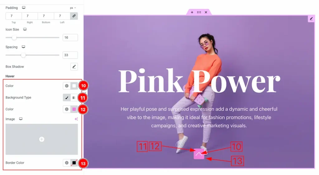
In the Hover mode, you can change the below options-
10. Color: This option lets you set the button hover color.
11. Background Type: You can change the color of any object background to classic or gradient. Here we choose the Background type Classic.
12. Background Color: This lets you change the button hover background color.
13. Border Color: This option lets you set the button hover border color.
Navigation Section
Go to Style > Navigation
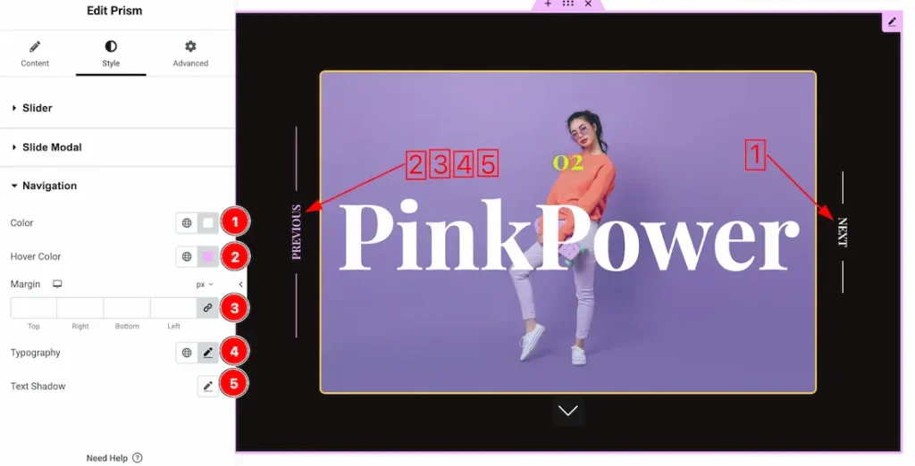
1. Color: You can change the navigation normal color with this option.
2. Hover Color: You can change the navigation hover color with this option.
3. Margin: Adjusts the position of an object over the canvas.
4. Typography: Change the font family, size, weight, transform, style, decoration, line height, letter spacing, and word spacing from here.
5. Text Shadow: The Text Shadow property is used to create the shadow around the text. It takes three values: horizontal offset, vertical offset, and blur radius. Here you also can change the Text Shadow Color.
All done! You have successfully customized the Prism Slider on your website.
Video Assist
You can also watch the video tutorial to learn more about the Prism Slider. Please visit the demo page for examples.
Thanks for being with us.