In this documentation, we will discuss the customization of the Flexure slider widget, brought to you by the Prime Slider addon for Elementor.
Enable The Flexure Slider
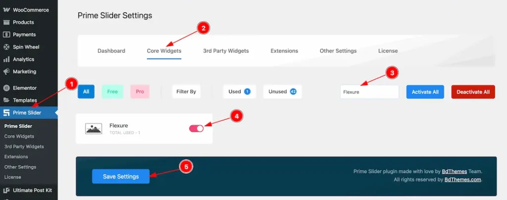
To use the Flexure Slider from Prime Slider, first, you have to enable the widget.
- Go to WordPress dashboard > Prime Slider Plugin dashboard.
- Then, Click the Core Widgets Tab.
- Search the Flexure Slider Name.
- Enable the Flexure Slider.
- Hit the Save Settings Button.
Inserting The Flexure Slider
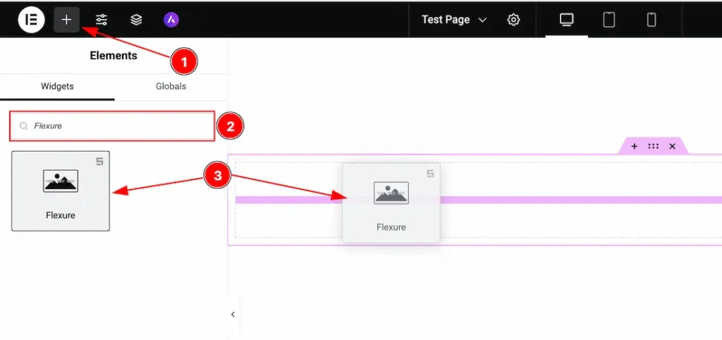
1. Go to the Elementor Editor Page and hit the “+” icon Button.
2. Search the Flexure Slider.
3. Drag the widget and drop it on the editor page.
Work With The Content Tab
Sliders Section
Go to Content > Sliders
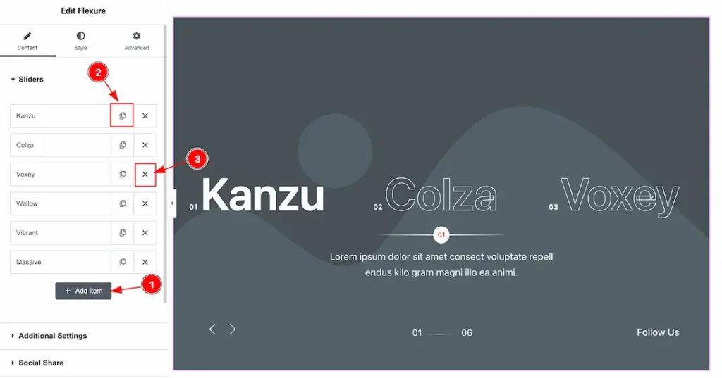
1. Add Item: You can add a new item by clicking the “+”Add Item button.
2. Copy Item: This option lets you copy the same item.
3. Close Item: You can delete the Slider item by clicking the Close icon button.
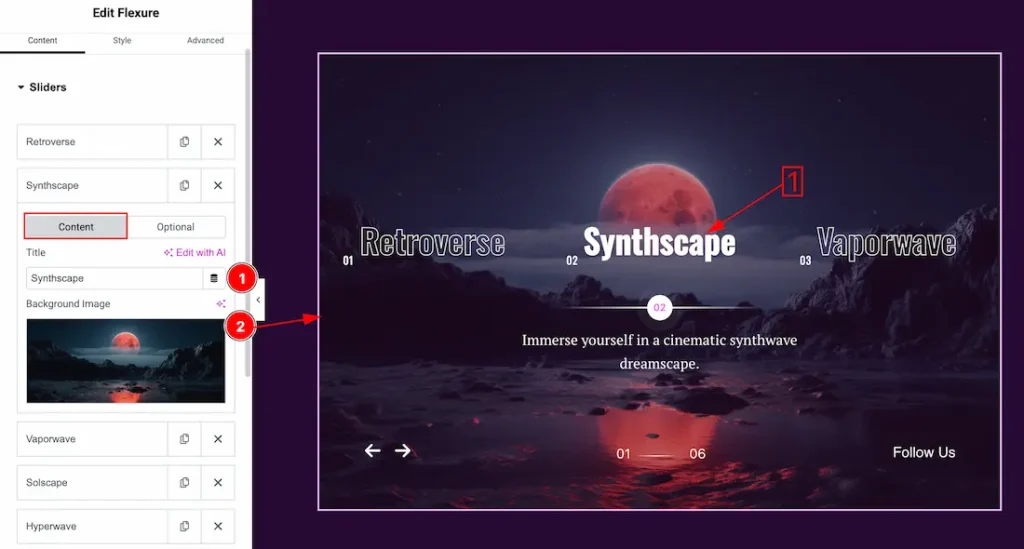
1. Title: You can add a title text with this option.
2. Image: You can add and change an image with this option.
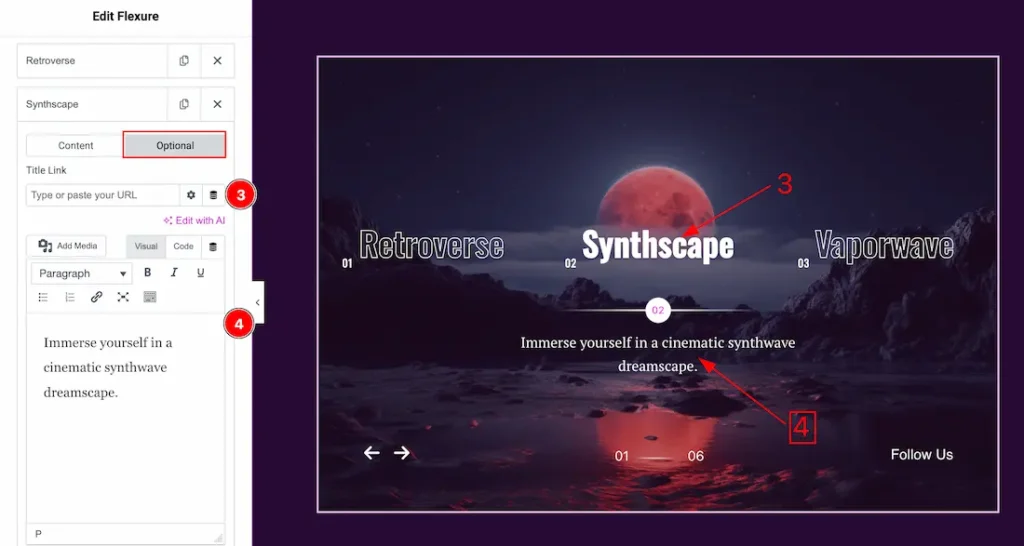
3. Title Link: This option allows you to add a link under the title.
4. Text: This option allows you to add a short summary and customize the description.
Additional Settings Section
Go to Content > Additional Settings
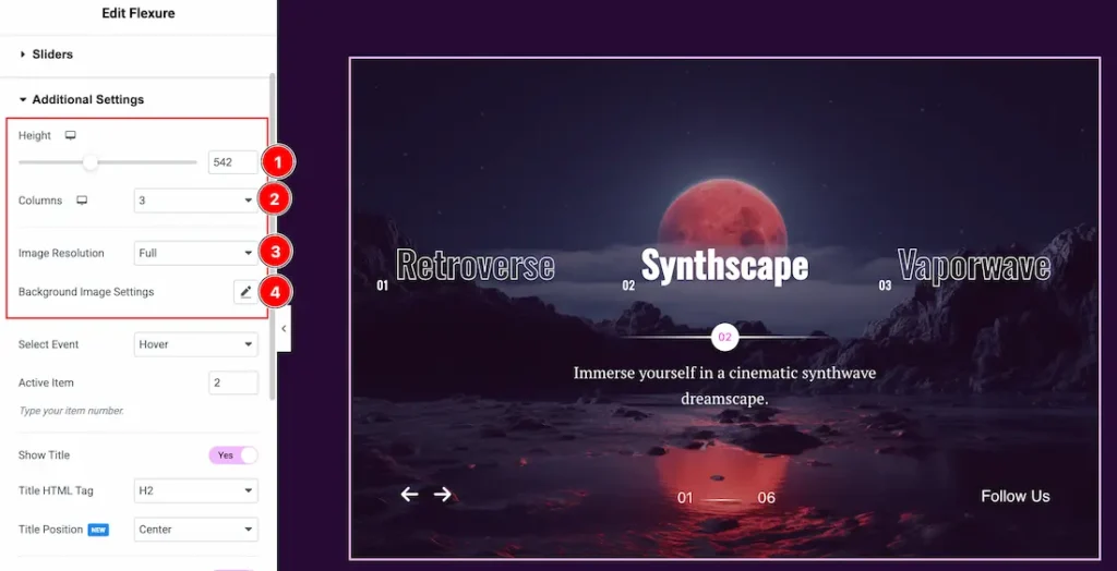
1. Height: You can adjust the slider height with this option.
2. Columns: You can set columns that you want to show on the slide with this option.
3. Image Resolution: You can change the image resolution with this option.
4. Background Image Setting: You can make changes to the background image with this option. Here you will get position, repeat & size options to set up the background image.
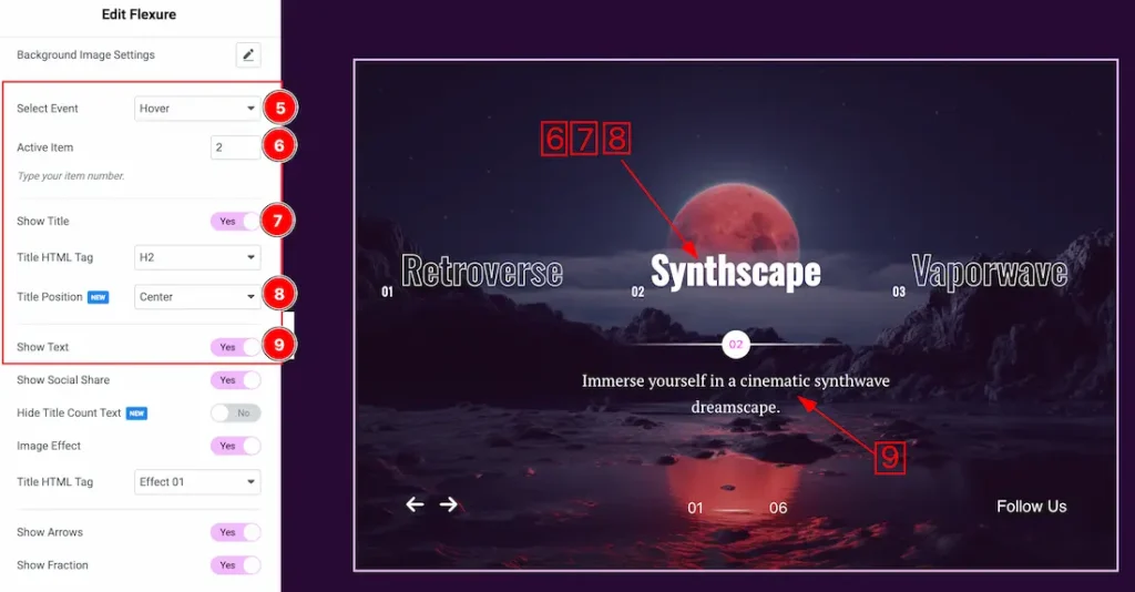
5. Select Event: You can set the slider event as – Hover and Click.
6. Active Item: You can set the slider active item from here.
7. Show Title: Enable or disable the show title switcher button to show or hide the title from slider.
8. Title Position: This option lets you set the title position.
9. Show Text: Enable or disable the show text switcher button to show or hide the text from slider.
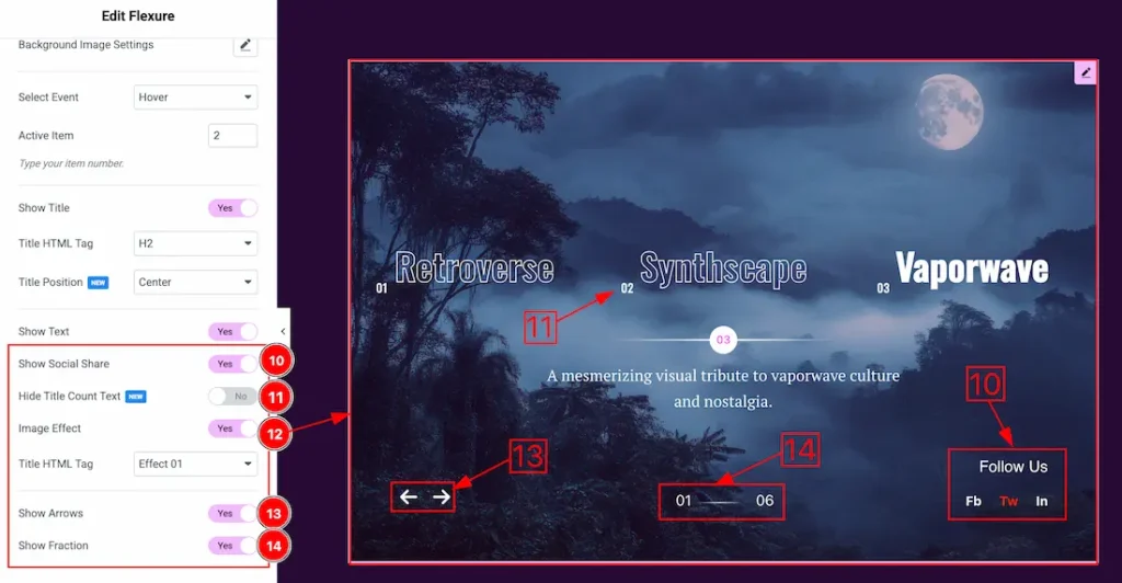
10. Show Social Share: Enable or disable the show social share switcher button to show or hide the social share from slider.
11. Hide Title Count Text: If you enable the swicther button then the title count text will disappear from the slider.
12. Image Effect: By enabling the image effect switcher button, the slider image effects dropdown will appear and you can choose one of effects.
13. Show Arrows: Enable or disable the show arrow switcher button to show or hide the navigation arrow from slider.
14. Show Fraction: Enable or disable the show fraction switcher button to show or hide the fraction from slider.
Social Share Section
Go to Content > Social share
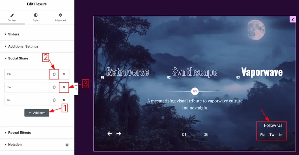
1. Add Item: You can add a new item by clicking the “+” Add Item button.
2. Copy Item: This option lets you copy the same item.
1. Close Item: You can delete the Slider item by clicking the Close icon button.
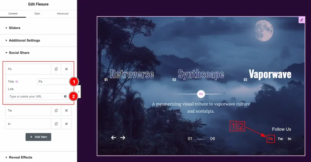
Now, let’s proceed to the inner options of the social share –
4. Title: You can add a title to your social share with this option.
5. Link: This option allows you to add a link to the social share text.
Work with The Style Tab
Wrapper Section
Go to Style > Wrapper
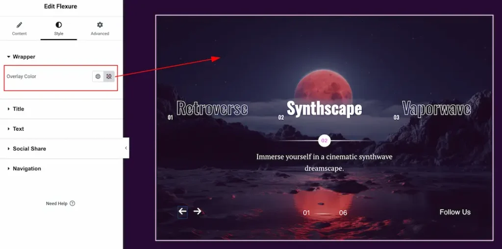
Overlay Color: You can set the slider overlay color from here.
Title Section
Go to Style > Title
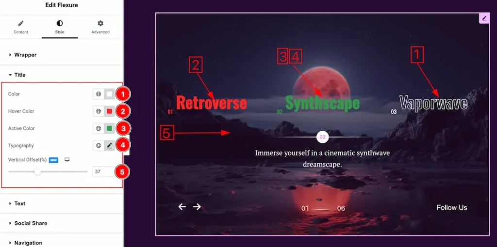
1. Color: You can change the title color with this option.
2. Hover Color: You can change the title hover color with this option.
2. Active Color: You can change the title active color with this option.
4. Typography: Change the font family, size, weight, transform, style, decoration, line height, letter spacing, and word spacing from here.
5. Vertical Offset: You can set the title vertical offset from here.
Text Section
Go to Style > Text
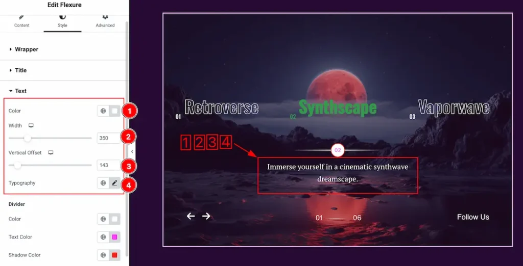
1. Color: You can change the text color with this option.
2. Width: This option lets you set the text width.
3. Vertical Offset: You can set the text vertical offset from here.
4. Typography: Change the font family, size, weight, transform, style, decoration, line height, letter spacing, and word spacing from here.
Divider
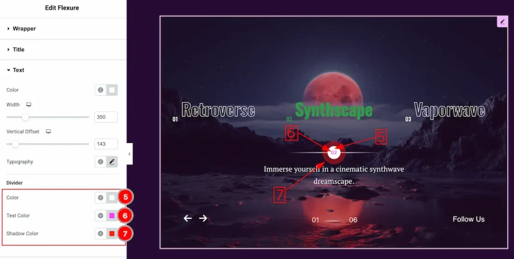
1. Color: This option lets you set the divider color.
2. Text Color: This option lets you set the divider text color.
3. Shadow Color: This option lets you set the divider shadow color.
Social Share Section
Go to Style > Social Share
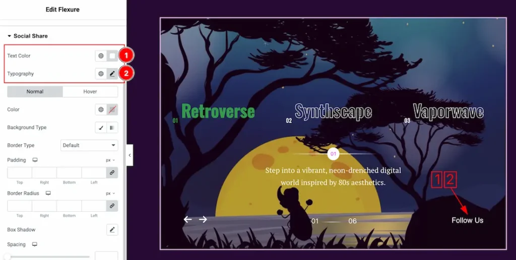
1. Text Color: This option lets you change the social share text color.
2. Typography: Change the font family, size, weight, transform, style, decoration, line height, letter spacing, and word spacing from here.
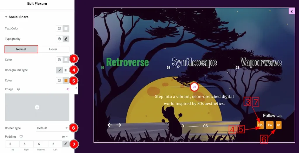
In this Section, we have two tabs. These are Normal & Hover. Let’s start with the Normal Tab –
3. Color: You can change the social icon color with this option.
4. Background Type: You can select the background type to Classic or Gradient from here. Here we selected Classic.
5. Color: You can change the background normal color with this option.
6. Border Type: you can set the Border Type to Default, None, Solid, Double, Dotted, Dashed, or Groove. We choose here the Border Type Solid.
7. Padding: Add spaces around an object to increase the inner area. Padding allows you to control the internal space within an element.
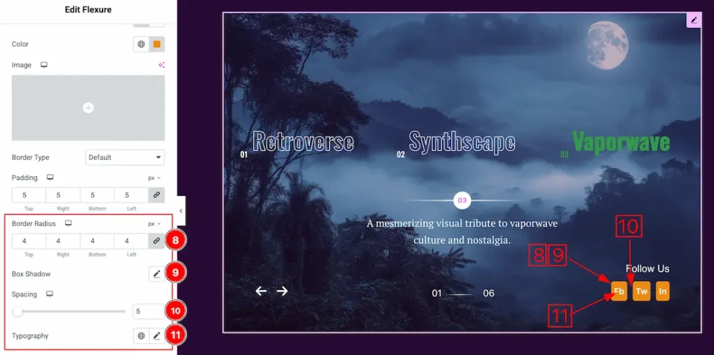
8. Border Radius: Customizes the border corners for roundness.
9. Box Shadow: The Box Shadow property is used to create the shadow around the Category Button. It takes Four values: Horizontal offset, Vertical offset, blur, and Spread to customize the Box shadow.
Position: you can set the Box Shadow position Outline and Inset. Here we set the Box Shadow position Outline.
Box Shadow Color: This lets you change the Box Shadow color.
10. Spacing: You can adjust the spacing between social share.
11. Typography: Change the font family, size, weight, transform, style, decoration, line height, letter spacing, and word spacing from here.
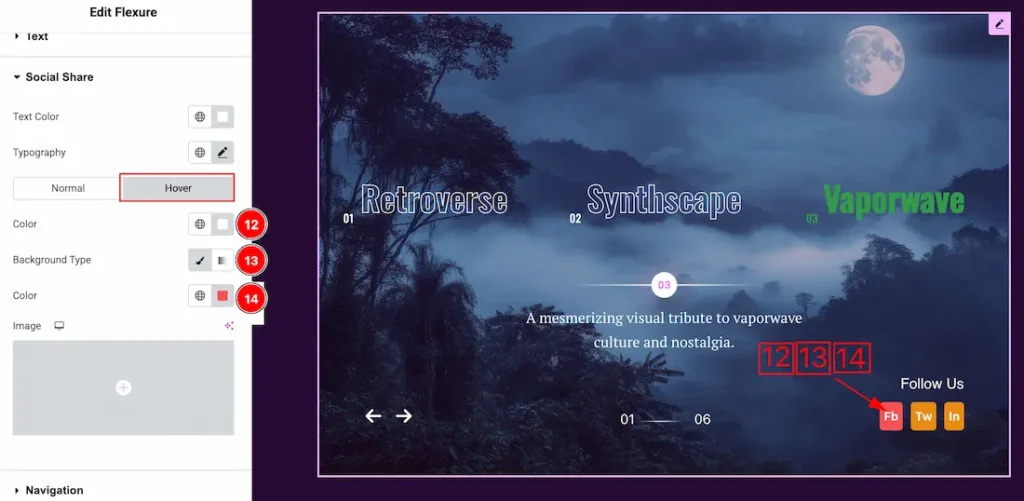
Now, let’s proceed to the Hover Tab –
13. Color: You can change the social share text hover color with this option.
14. Background Type: You can select the background type to Classic or Gradient from here. Here we selected the Classic.
15. Color: You can change the background hover color with this option.
Navigation Section
Go to Style > Navigation
Fraction
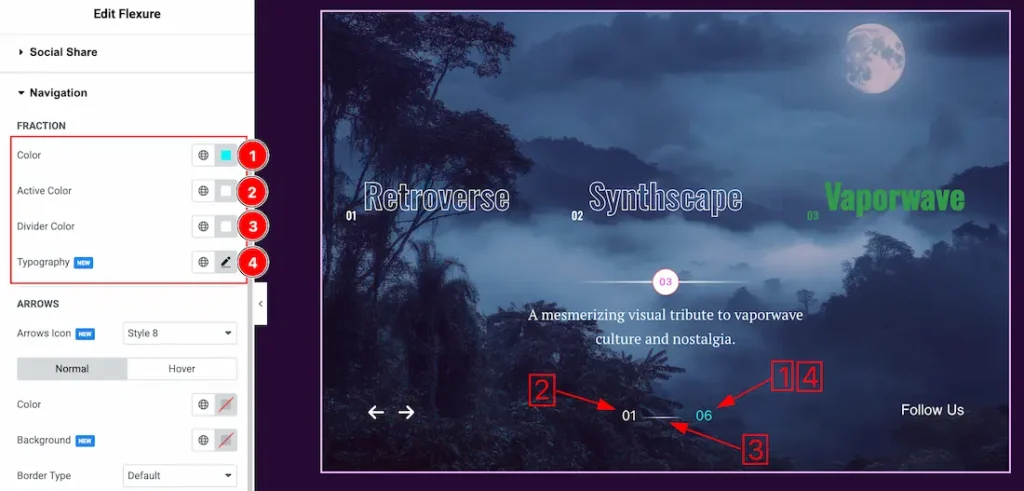
1. Color: You can change the Fraction color with this option.
2. Active Color: You can change the fraction active color with this option.
3. Divider Color: You can change the fraction divider color with this option.
4. Typography: Change the font family, size, weight, transform, style, decoration, line height, letter spacing, and word spacing from here.
Arrows
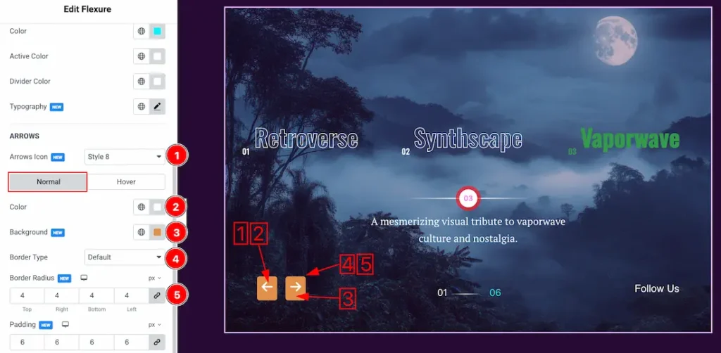
1. Arrows Icon: You can set arrows icon style from here.
In this Section, we have two tabs. These are Normal & Hover. Let’s start with the Normal Tab –
2. Color: You can change the arrows normal color with this option.
3. Background Color: You can change the background normal color with this option.
4. Border Type: you can set the Border Type to Default, None, Solid, Double, Dotted, Dashed, or Groove. We choose here the Border Type Solid.
5. Border Radius: Customizes the border corners for roundness.
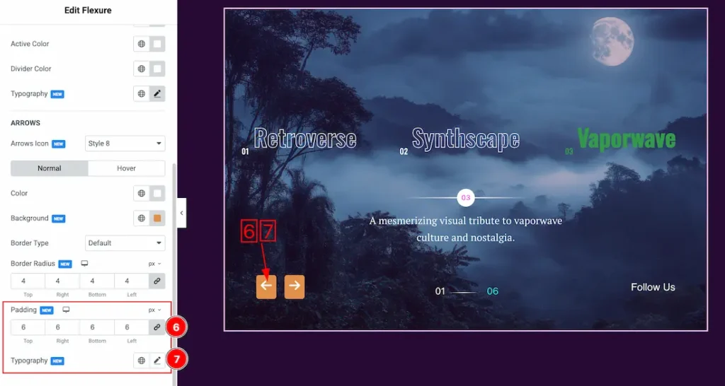
6. Padding: Add spaces around an object to increase the inner area. Padding allows you to control the internal space within an element.
7. Typography: Change the font family, size, weight, transform, style, decoration, line height, letter spacing, and word spacing from here.
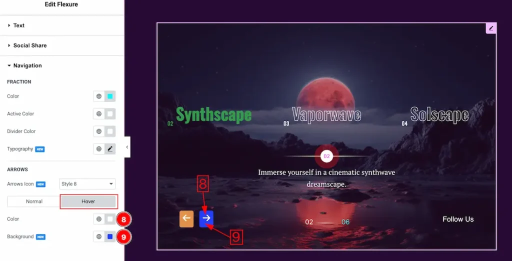
Now, let’s proceed to the Hover Tab –
8. Color: You can change the arrows hover color with this option.
9. Background Color: You can change the arrows hover color with this option.
All done! You have successfully customized the Flexure Slider on your website.
Video Assist
You can also watch the video tutorial to learn more about the Flexure Slider. Please visit the demo page for examples.
Thanks for being with us.