In this document, we will demonstrate the use of the Draggable widget. The Draggable Gallery widget allows you to showcase images in an interactive, drag-to-scroll gallery layout. Instead of traditional navigation or pagination, users can smoothly drag the gallery items horizontally or vertically, creating a modern and engaging browsing experience.
Key Features
- Drag-to-Navigate Gallery – Users can drag images using mouse or touch gestures for smooth navigation.
- Responsive & Touch-Friendly – Works seamlessly on desktop, tablet, and mobile devices.
- Flexible Layout Options – Supports horizontal and vertical gallery directions.
- Smooth Animation & Performance – Optimized for smooth dragging with fluid motion effects.
- Custom Spacing & Alignment – Control image spacing, alignment, and sizing for a polished layout.
- Lightweight & Fast – Optimized code ensures minimal performance impact.
- Easy Elementor Integration – Simple drag-and-drop setup with Elementor controls.
- Creative Use Cases – Perfect for portfolios, photography, product highlights, and visual storytelling.
Enable the Draggable Widget
Go to WP Dashboard Pixel Gallery > Core Widgets
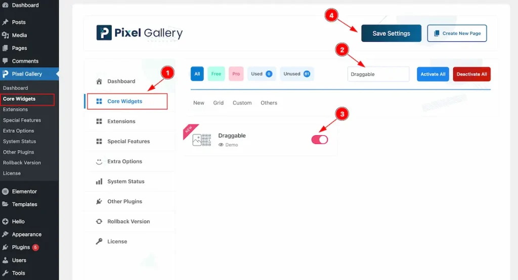
To use the Draggable widget from Pixel Gallery, first, you have to enable the Core Widgets. Navigate to the WordPress Dashboard.
- Go to Pixel Gallery > Core Widgets section.
- Search by the Widget Name ” Draggable ” and it will appear the.
- Now Enable the Switcher of the Draggable Widget.
- Hit the Save Settings button.
Insert Draggable Widget
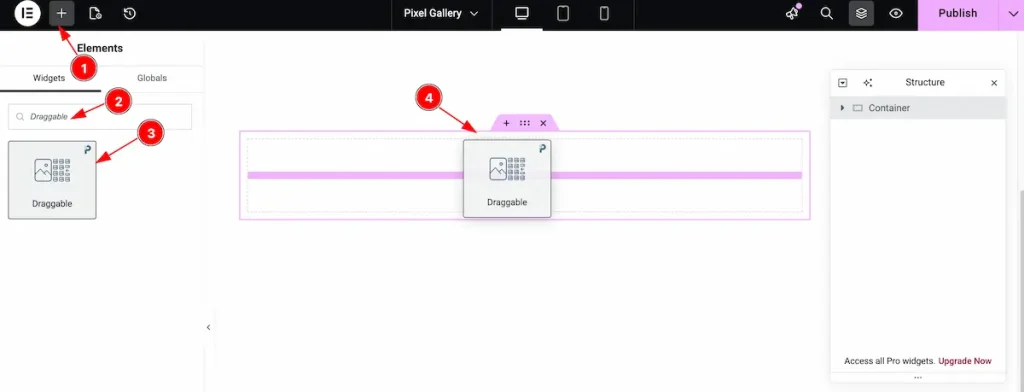
- Go to the Elementor Editor page and click the Add Element “+” icon.
- Search for the Draggable widget by name.
- The widget will appear — you can check the Pixel Gallery logo on the top-right corner.
- Select the widget, then drag and drop it onto the editor page.
Content Tab Customization
Items Section
Go to Content > Items
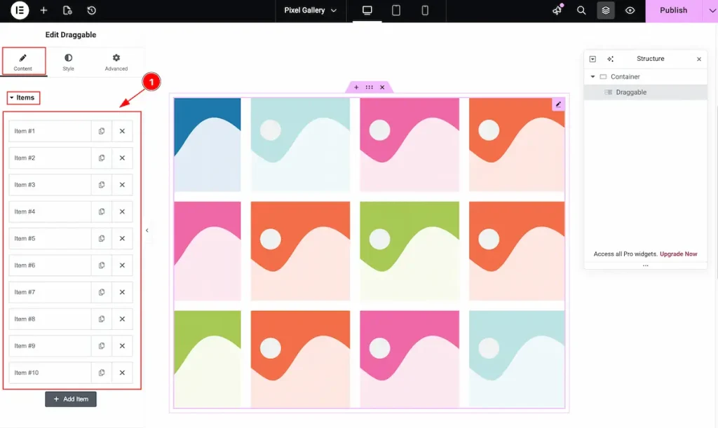
- It demonstrate all the items. Select any single item and click on it. It will open item accordion and select it.
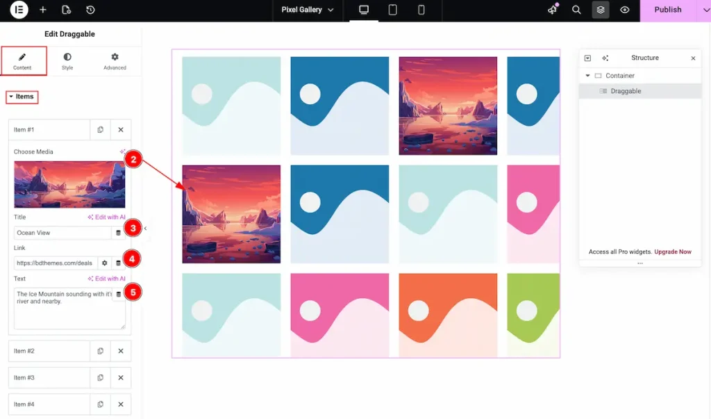
- Choose Media: Select the media from the library section.
- Title: Set the title for the image.
- Link: Set the link for this. It will navigate to the link.
- Text: Set the text of the Image.
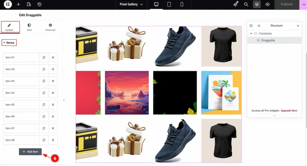
- Add as more as item you want , Just click on the ” + Add Item ” button.
Additional Options Section
Go to Content > Additional Options
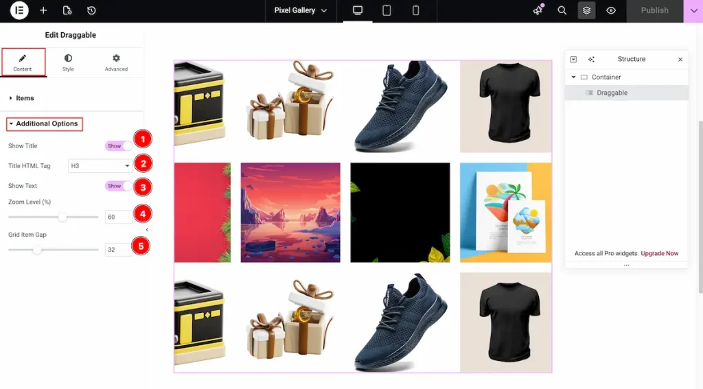
- Show Title: Enable the switcher to demonstrate the Title of the item.
- Title HTML Tag: Set any HTML Tag for Title ( H1, H2, H3, H4, H5, H6, p, span ). The title tag is essential for both user experience and search engine optimization (SEO).
- Show Text: Enable the switcher to demonstrate the Text of the item.
- Zoom Level ( % ): Set the Zoom Level of the image.
- Grid Item Gap: Set the grid gap between the items.
Designing with the Style Tab
The Style Tab offers a range of options to enhance the visual appearance of elements, enabling precise adjustments and creative design possibilities. It helps create polished and engaging layouts effortlessly.
Title Section
Go to Style > Title
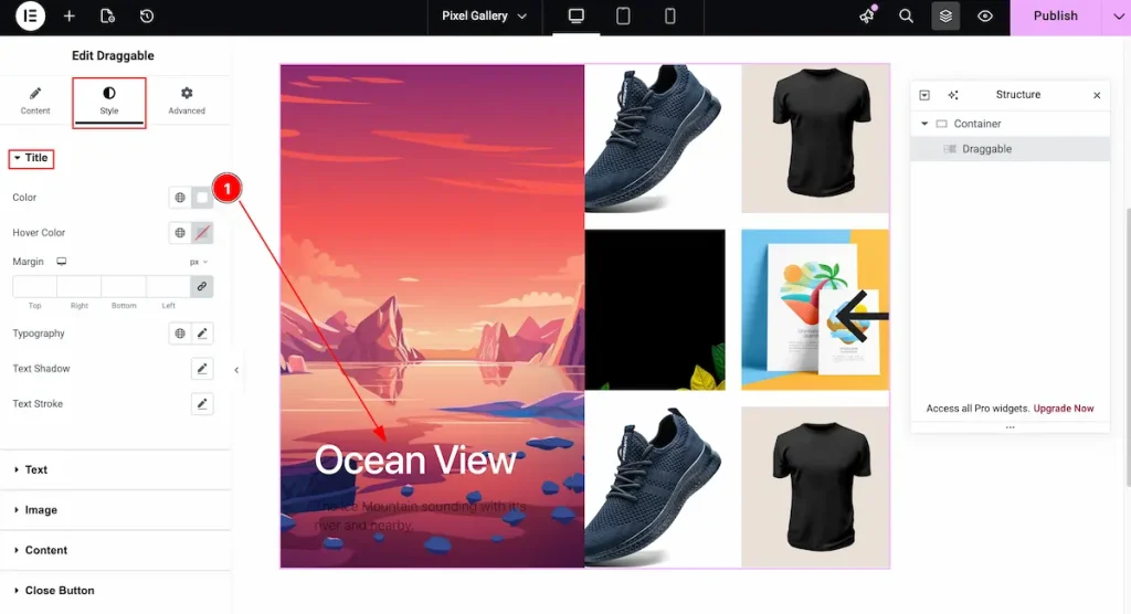
- Color: Set the color for the Image title.
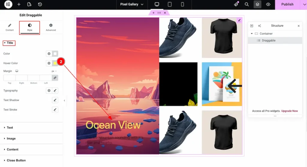
- Hover Color: Set the hover color for the Title.
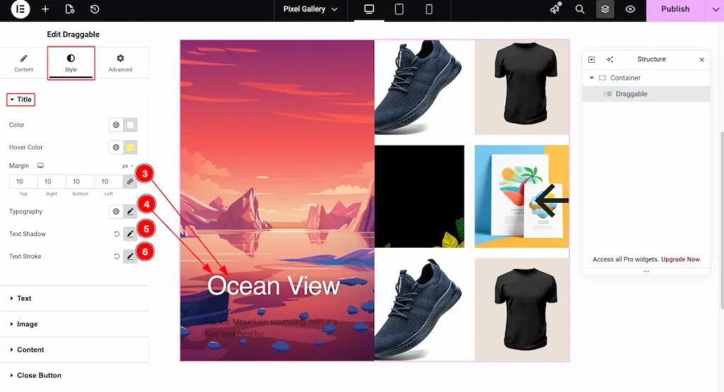
- Margin: Set the margin for the Title.
- Typography: Choose the best typography for Title. Different typography options are available, like Font size, font weight, etc.
- Text Shadow: Set the shadow for the Text. It appear the shadow effect for the Text.
- Text Stroke: It’s beautiful way to demonstrate the Text. Set the Stroke for the Title.
Text Section
Go to Style > Text

- Color: Click on the color plate and choose any color for the Text.
- Margin: It’s set the outer space for the text. Adjust the room by setting the Margin.
- Typography: Select the typography best for the Text.
Image Section
Go to Style > Image
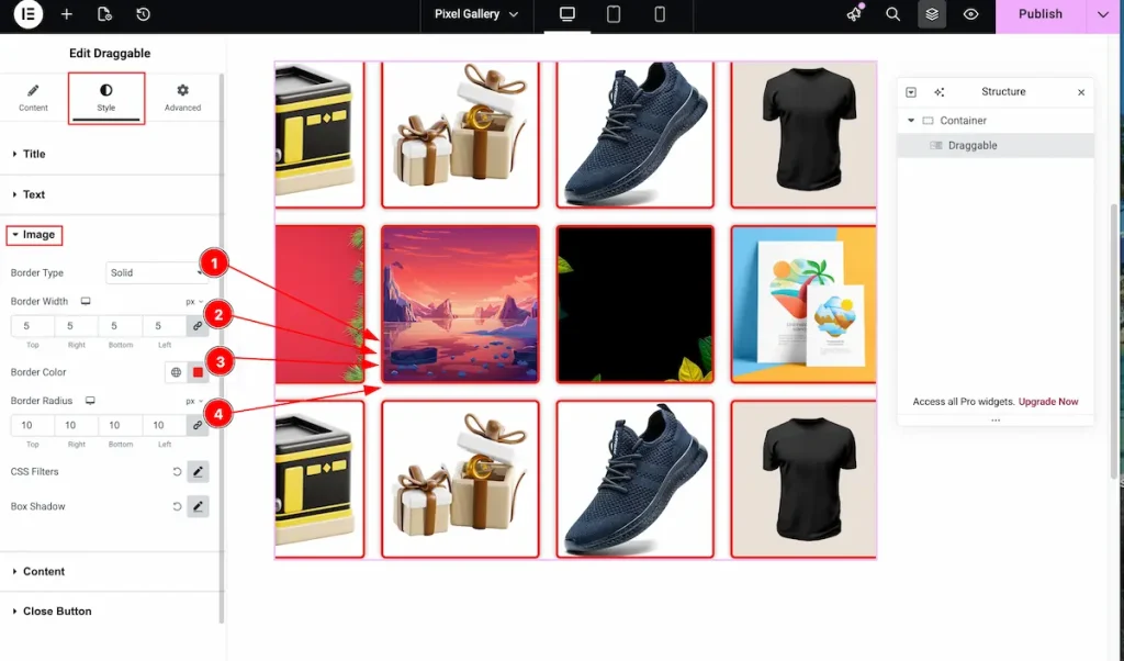
- Border Type: Choose the border type for the Image, Different types are Solid, Dashed, Dotted etc.
- Border Width: Set the thickness of the Border.
- Border Color: Choose the color for the border. Click on the color plate and select it.
- Border Radius: Make the border corner edges rounded by setting the border radius.
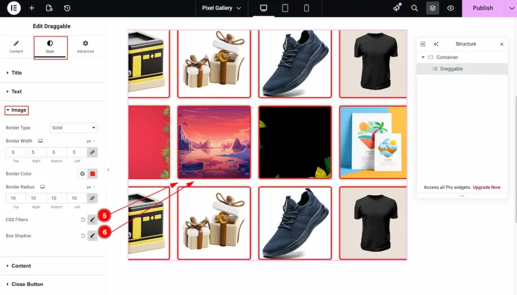
- CSS Filters: Filter image in different shades by using the CSS Filters. It’s an interactive feature for demonstrating the image according to your need.
- Box Shadow: Make shadow for the box items.
Content Section
Go to Style > Content
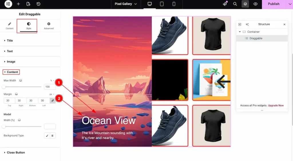
- Max Width: Set the width for the content. The content is based on the Modal area.
- Margin: Make room for the content area by setting the margin.
Modal
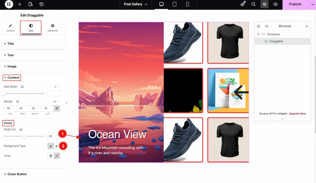
- Width: Set the width for the modal. Adjust the width according to your needs.
- Background Type: Set the type color for modal. It will appear the selected color only. No image will be visible if you set the Background.
Close Button Section
Go to Style > Close Button
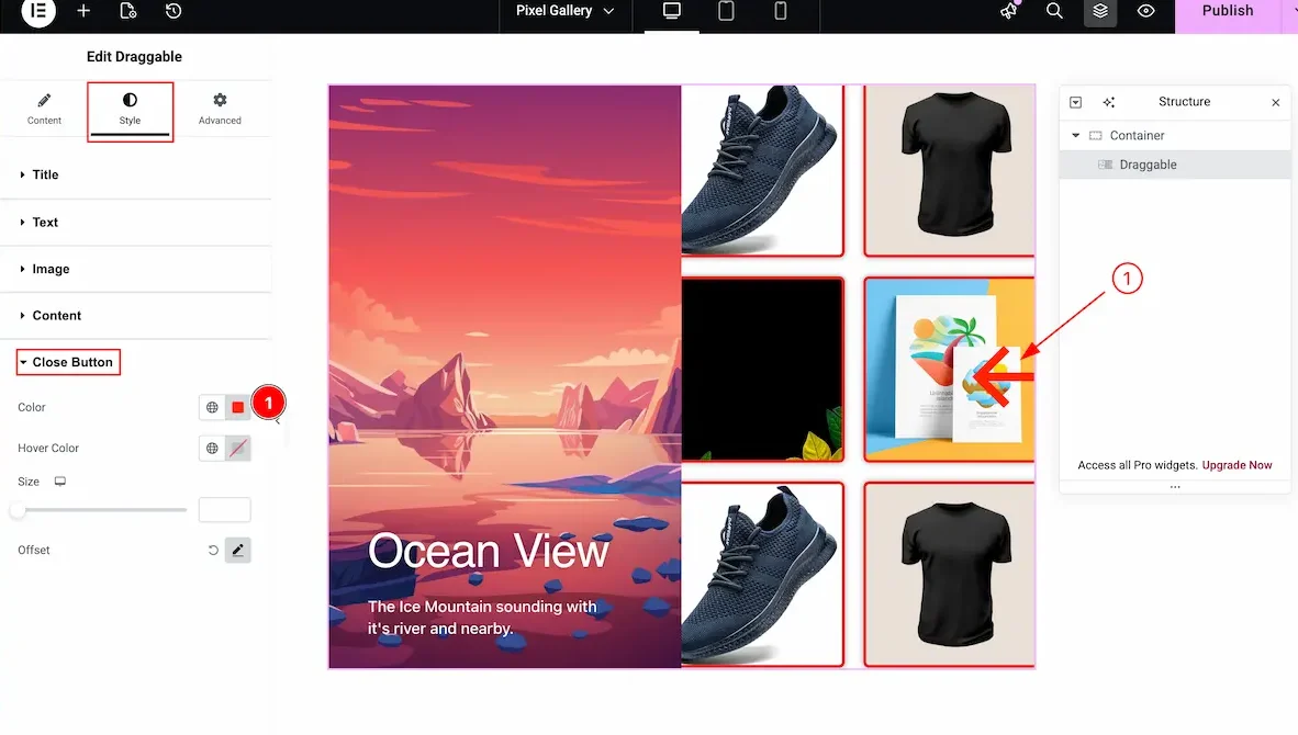
- Color: Choose the color for the Close Button.
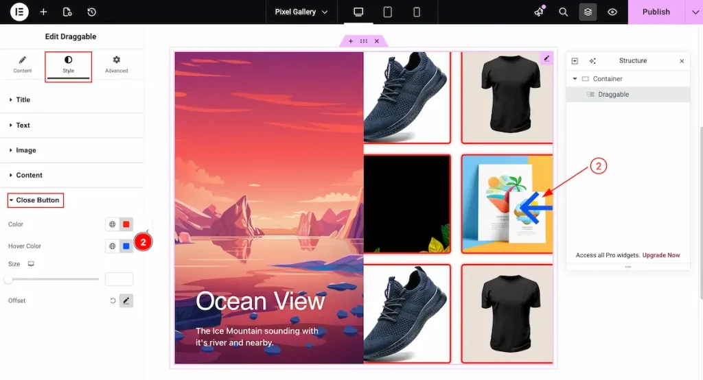
- Hover Color: Select the Hover color for the close button. It will demonstrate on mouse hover over the Close button.
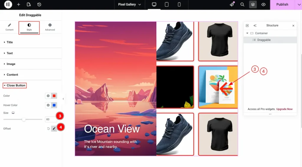
- Size: Set the size for the close button. Different size can be applied to different devices.
- Offset: Set the offset for the close button. Adjust position in horizontally or vertically.
All done! You have successfully customized The Draggable Widget on your website.
Video Assistant
You can also watch the tutorial video about the Draggable Widget. Please visit the demo page for examples.
Thanks for staying with us.