In this documentation, we will show you how to customize the Navbar widget presented by the Element Pack.
Enable the Navbar widget
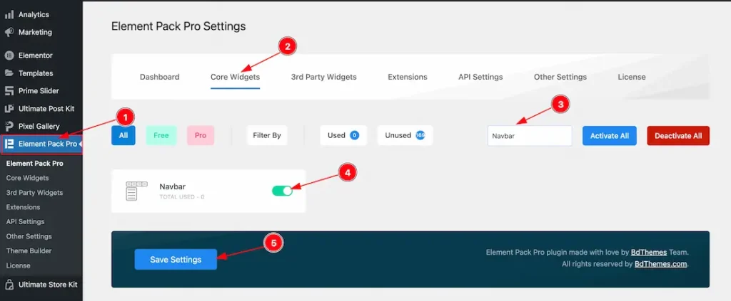
To use the Elementor Navbar widget from Element Pack, first, you have to enable the widget.
- Go to WordPress dashboard > Element Pack Plugin dashboard.
- Then, Click the Core Widgets Tab.
- Search the Navbar Widget Name.
- Enable the Navbar Widget.
- Hit the Save Settings Button.
Insert Navbar Widget
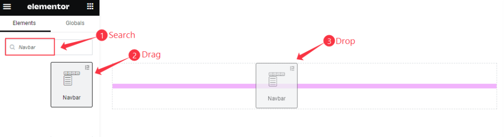
- Search by the Navbar widget name.
- The widget will appear, Check the Element Pack Pro logo on top right corner.
- Select the widget then Drag and Drop it on the editor page.
The default view of Navbar
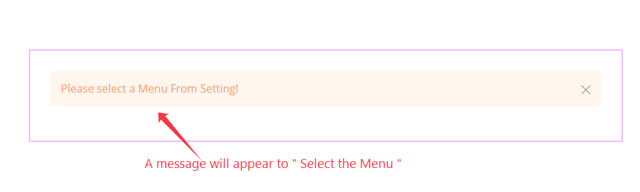
The Navbar displays a message to ” select a Navbar “.
Content Tab Customization
Navbar Section
Go to Content > Navbar
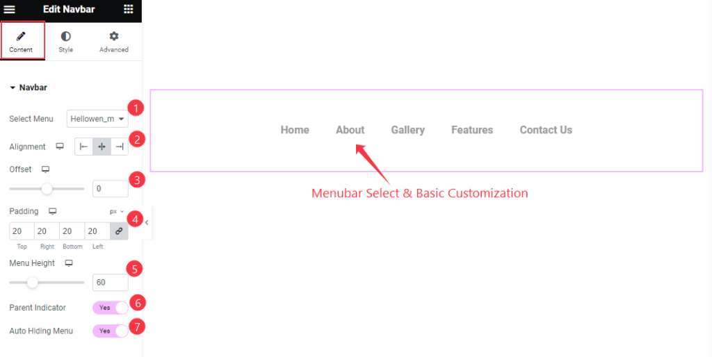
- Select Menu: Choose the Menu for the Navbar. All the customize menu are will appear here.
- Alignment: Set the alignment of the Navbar adjust the position Left Center, Right.
- Offset: Set the offset for the navbar.
- Padding: Choose the padding for the inner space.
- Menu Height: Set the height of the Menu.
- Parent Indicator: Enable the toggle switcher to show the parent indicator for the sub menu.
- Auto Heading Menu: Enable the switcher for the auto heading menu.
Dropbar Section
Go to Content > Dropbar
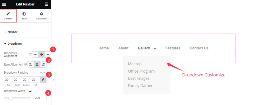
- Dropdown Alignment: Set the alignment for the Dropdown items, Adjust the position Left, Center, Right.
- Item Alignment: Set the alignment of the Item position to Left Center and Right.
- Dropdown Padding: Set the padding the dropdown items.
- Dropdown Width: Set the width for the Dropdown menu items.
Additional Section
Go to Content > Additional
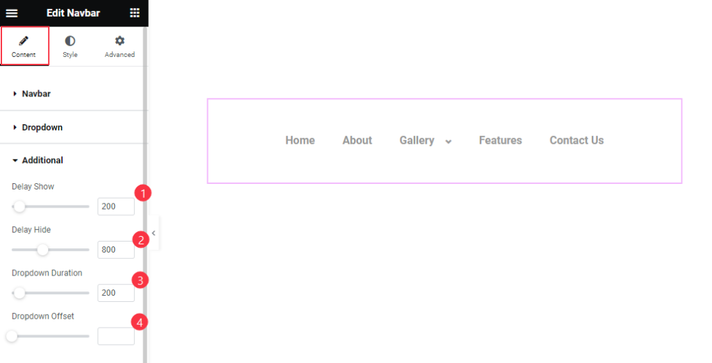
- Delay Show: Set the time for showing the delay.
- Delay Hide: Set the time for the delay hide.
- Dropdown Duration: Set the Dropdown duration.
- Dropdown Offset: Set the duration for the offset dropdown.
Style Tab Customization
Navbar Section
Go to Style > Navbar
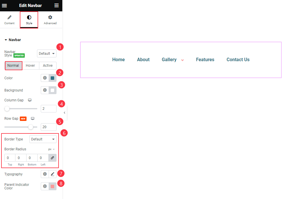
- Navbar Style: Choose the preset style for the navbar.
Normal
- Color: Choose the Color for the Navbar.
- Background: Set the background color for the Nav items.
- Columns Gap: Set the Columns Gap.
- Row Gap: Set the Row Gap.
- Border
- Border Type: Choose the border type for the navbar.
- Border Radius: Choose the border radius.
- Typography: Set the typography of the nav items.
- Parent Indicator Color: Choose the Parent Indicator Color.
Hover
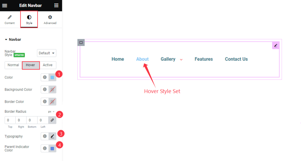
- Color: Choose the Color for the Hover item.
- Background Color: Set the background Color.
- Border Color: Choose the Border Color.
- Border Radius: Make the border radius.
- Typography: Choose the Typography for the navbar.
- Parent Indicator Color: Set the Parent indicator color.
Active
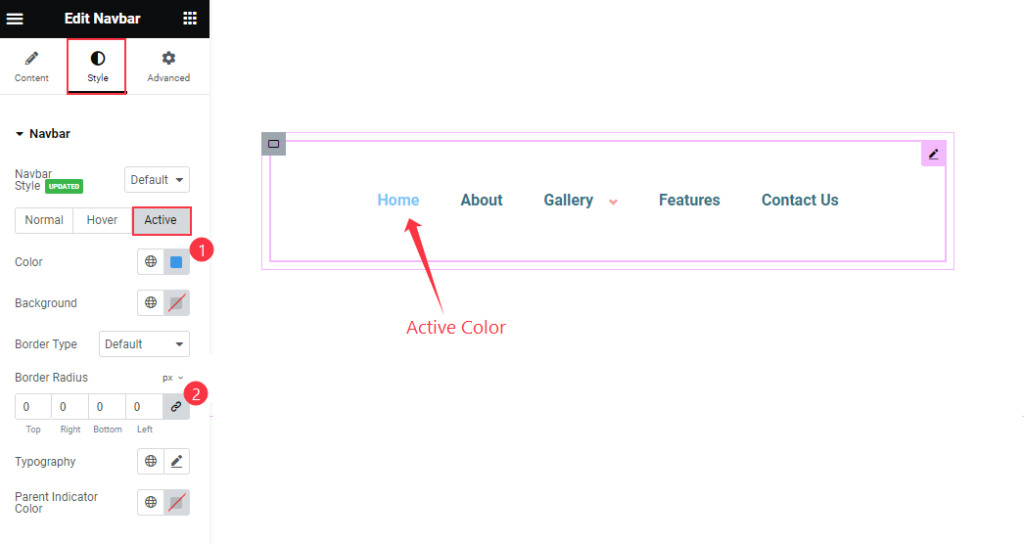
- Color: Choose the Color for the Active item.
- Background: Set the background Color.
- Border Color: Choose the Border Color.
- Border Radius: Make the border radius.
- Typography: Choose the Typography for the navbar.
- Parent Indicator Color: Set the Parent indicator color.
Individual Menu Style
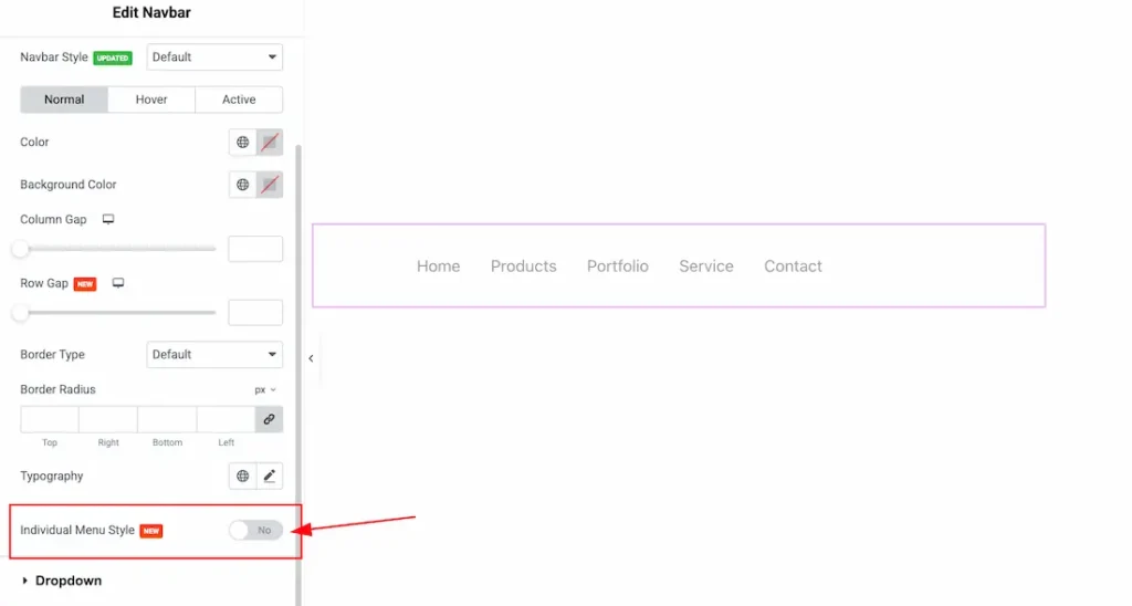
The Individual Menu Style feature is a new feature of the Navbar widget. You will get the Individual Menu Style option under the Navbar section.
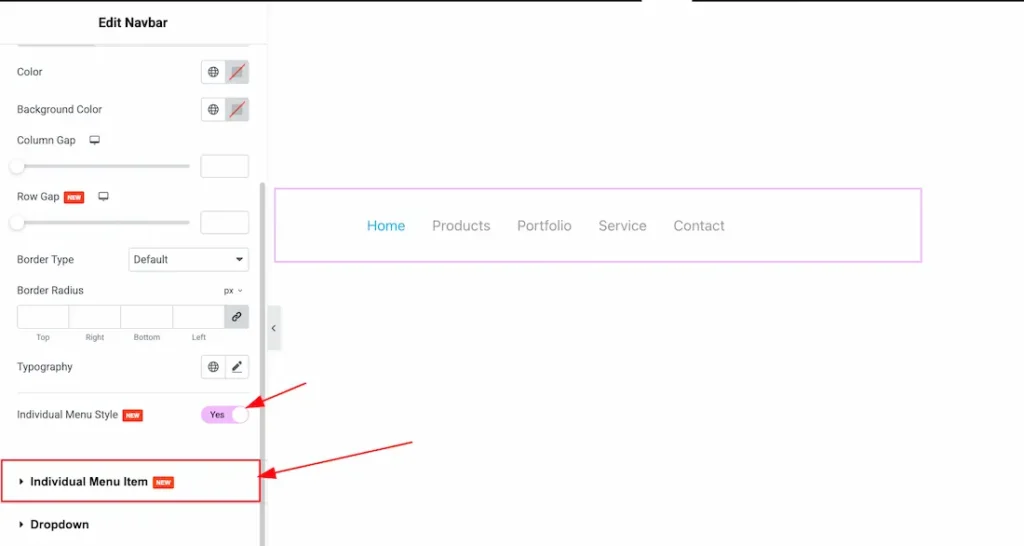
To use the feature, just enable the Individual Menu Style switcher button and after enabling the swicher button, the Individual Menu item sub section will appear.
Individual Menu Item Section
Go to Style > Individual Menu Item
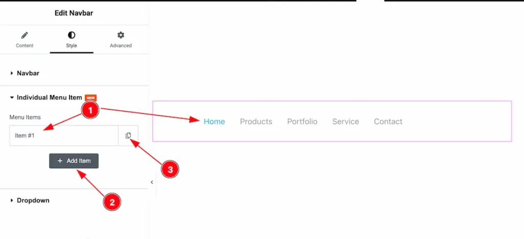
Come to the Individual Menu item section, you will get the below cuatomization options to customize the Individual Menu item.
1. Menu Items: Come to the Individual Menu item section, by default select the first menu item.
2. Add Item: You can add other menu items by click the “Add Item” button.
3. Copy Item: If you want then you can copy the same item and also customize it.
Normal
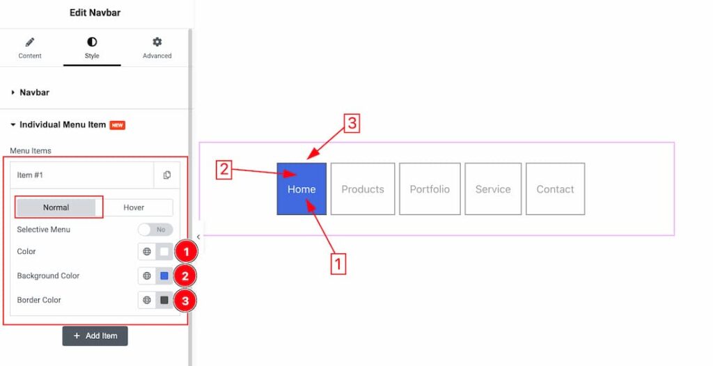
Inside the menu item, you will get two tab sections; Normal and Hover. In the normal tabs section, you will get the below options-
1. Color: This option lets you change the Menu item normal text color.
2. Background Color: This option lets you change the Menu item normal text background color.
3. Border Color: This option lets you change the Menu item normal border color.
Hover
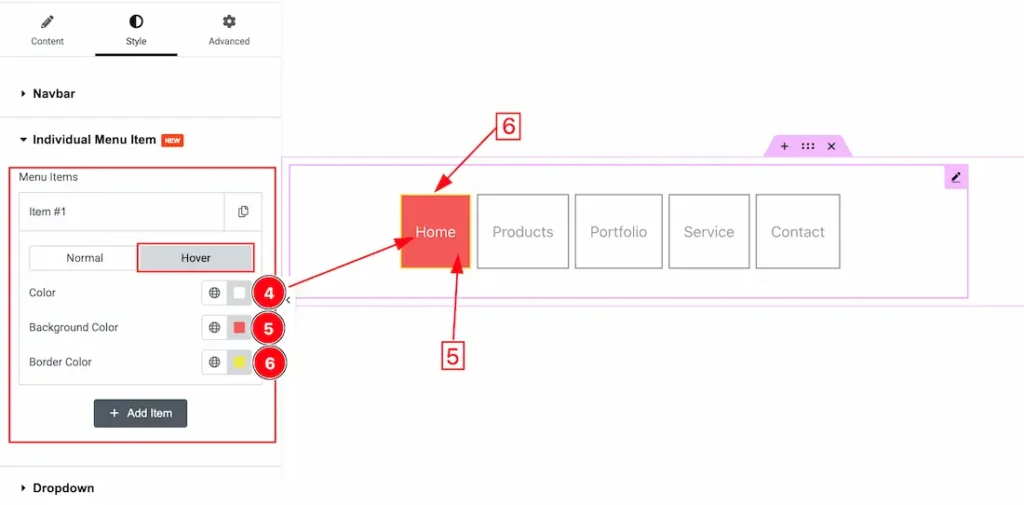
In the Hover tabs section, you will get the below options-
1. Color: This option lets you change the Menu item hover text color.
2. Background Color: This option lets you change the Menu item hover text background color.
3. Border Color: This option lets you change the Menu item hover border color.
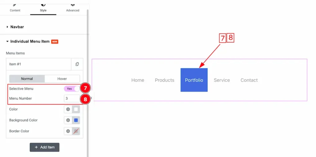
In the normal tabs section, you will also get the below options-
7. Selective Menu: The selective menu option gives you the opertunity to select the induvisual menu to customize it. Here we select the number 3 menu item.
8. Menu Number: This option lets you select the specific menu item. Here we set the number 3 that’s why the number 3 menu item is selected. If you want then you can select any number of your menu item to customize the specific menu item.
Dropdown Section
Go to Style > Dropdown
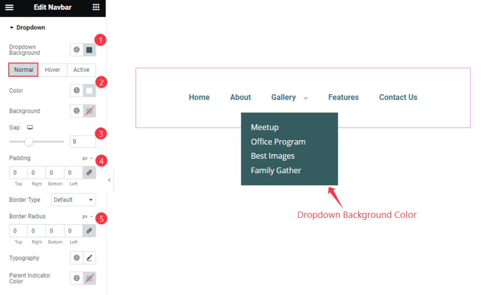
- Dropdown Background: Set the dropdown background color.
Normal
- Color: Set the color or the text color.
- Background: Set the background color.
- Gap: Set the gap between the items.
- Padding: Set the inner space of the Dropdown menu.
- Border Type: Choose the border type.
- Border Radius: Make the border radius.
- Typography: Set the typography for the Dropdown.
- Parent Indicator Color: Set the color for the parent indicator.
Hover
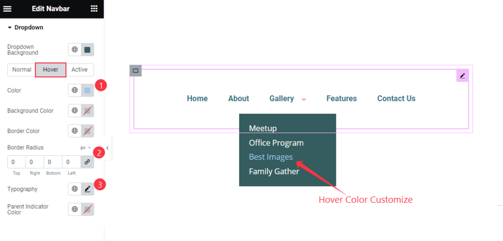
- Color: Set the color for the hover navbar.
- Background Color: Set the background color.
- Border Color: Choose the border type.
- Border Radius: Make the border radius.
- Typography: Set the typography for the Dropdown.
- Parent Indicator Color: Set the color for the parent indicator.
Active
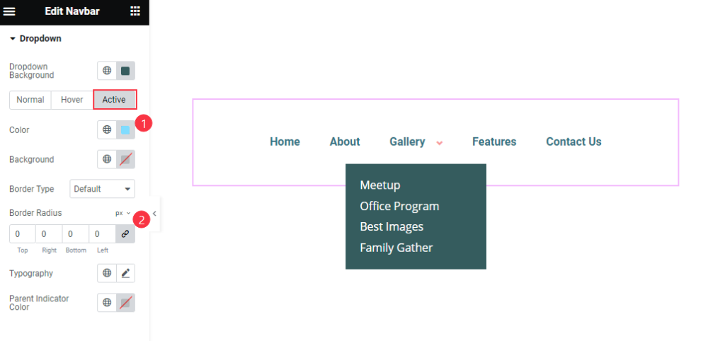
- Color: Set the color for the Active navbar.
- Background Color: Set the background color.
- Border Color: Choose the border type.
- Border Radius: Make the border radius.
- Typography: Set the typography for the Dropdown.
- Parent Indicator Color: Set the color for the parent indicator.
Video Assist
Thanks for Watching the Navbar Video Tutorial. Please visit the demo page for examples.
Thanks for being with us.