In this documentation, we will show you how to customize the LearnPress Carousel widget presented by the Element Pack Pro addon for Elementor.
How to insert the LearnPress Carousel widget
Step-1
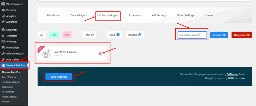
LearnPress Carousel is a 3rd party widget of Element Pack Pro.
Go to Dashboard > Element Pack Pro > 3rd Party Widgets
There, find the LearnPress Carousel widget, click on the plugin icon there to Install it, and then Activate it.
Step-2
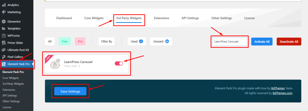
Then turn on the widget switcher and hit the Save Changes button.
Inserting The LearnPress Carousel Widget
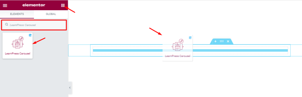
Inside the Elementor editor page, search for the LearnPress Carousel widget name and then drag and drop it on the page.
Please note that you need both Elementor and Element Pack Pro installed to use this widget.
Work With Content Tab
Layout Section Customizations
Go to Content > Layout.
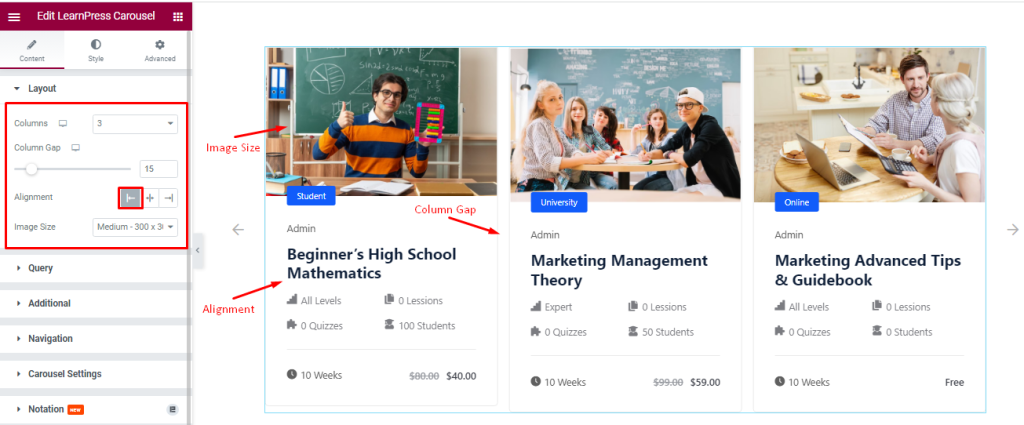
Find the Columns, Column Gap, Alignment, and Image Size options.
Query Section Customizations
Go to Content > Query.
Step-1
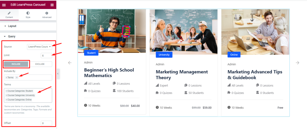
Find the Source (LearnPress Course, Manual Selection, Current Query, Related, etc.), Limit, Include / Exclude filters, and Offset options.
Step-2
Include filter shows only specified posts on display while Exclude filter hides only specified posts from display.
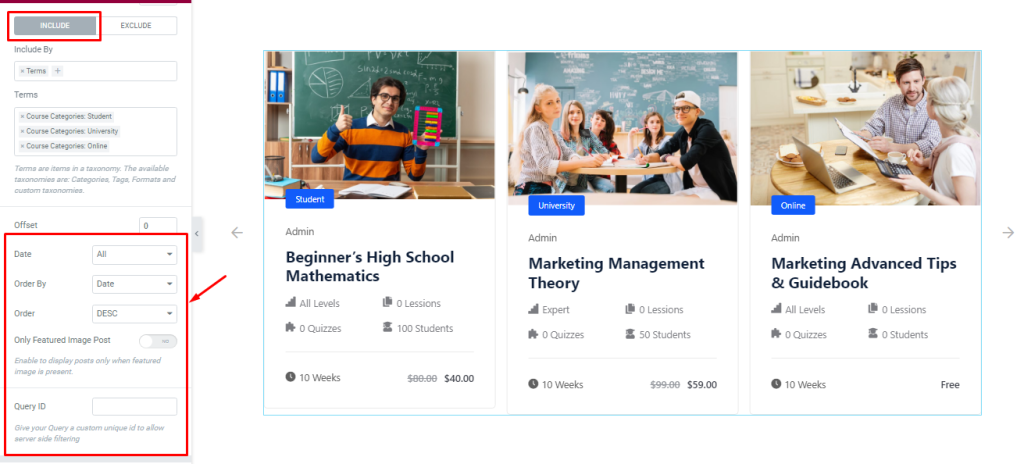
Also find the Date, Order By, and Order sorting, Only Featured Image Posts switcher, and Query ID (to apply custom coded query) options.
Customizations of Additional Section
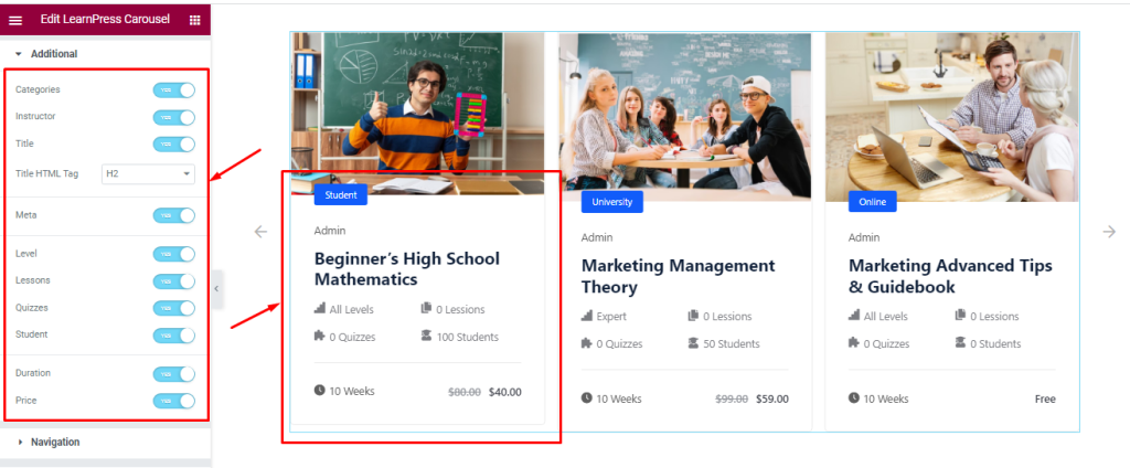
Go to Content > Additional.
Find the Categories, Instructor, Title, Title HTML Tag, Meta, Level, Lessons, Quizzes, Student, Duration, and Price switcher options.
Navigation Section Customizations
Go to Content > Navigation.
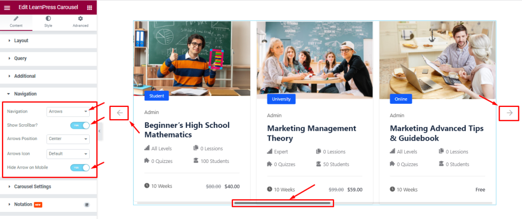
Find the Navigation style (Arrows and Dots, Arrows and Fraction, Arrows, Dots, Progress, and None), Arrows Icon (23 icon styles), Show Scrollbar, Arrows Position, and Hide Arrows On Mobile options.
Work With the Carousel Settings Section
Go to Content > Carousel Settings.
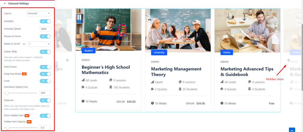
Find the Layout, Auto Play, Auto Play Speed, Pause on Hover, Slides to Scroll, Center Slide, Grab Cursor, Drag Free Mode, Loop, Animation Speed, Observer, Show Hidden Item, and Hidden Item Opacity options.
Layout: Select the slider Layout (Carousel, and Coverflow).
Autoplay switcher: Slider will slide Auto play and you can set the Autoplay Speed as your wish.
pause on Hover: When you Hover your mouse cursor on the slider then your slider will Hold, otherwise your slider slide Autoplay.
Slides to scroll: Determines how many sliders will slide after a single mouse/navigation scroll.
Center Slide: Active slider will be in the center.
Grab Cursor: Able to grab the slider with your mouse pointer and your mouse pointer icon will be changed.
Loop: The slider will loop at a certain time interval. You also set up the loop animation speed here.
Observer: Use the carousel in any hidden places (such as in tabs, Accordion, etc).
Show Hidden Item: Hidden Carousel Sliders will appear on your page and you also set the Opacity.
Work With The Style Tab
Style The Item Section
Go to Style > Item.
Step-1
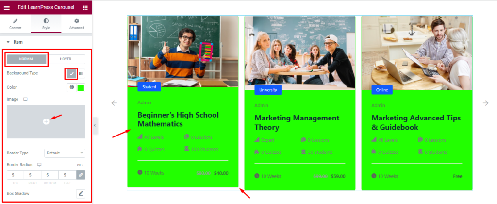
In this section, you will see two subsections; Normal and Hover.
In Normal mode, find the Background type (Classic, And Gradient), Color, Border Type, Border Radius, and Box Shadow options.
Step-2
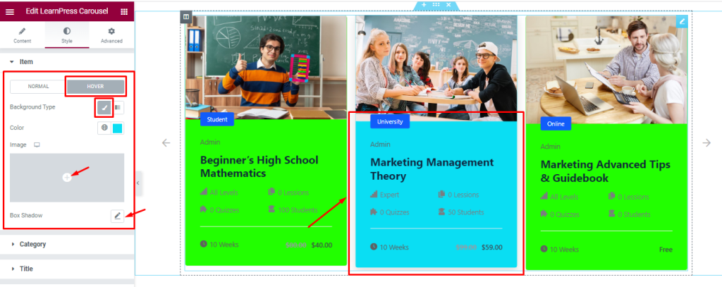
In Hover Mode, find the Background Type (Classic, And Gradient) and Box shadow options.
Step-3
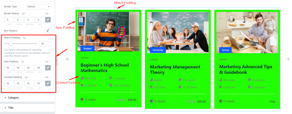
Also in Normal mode, find the Match Padding, Item Padding, and Content Padding options.
Category Section Customizations
Go to Style > Category
Step-1
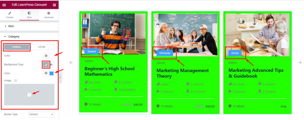
In this section, you will see two Tabs; Normal and Hover.
In Normal mode, find the Background type (Classic and Gradient) and Background Color options.
Step-2
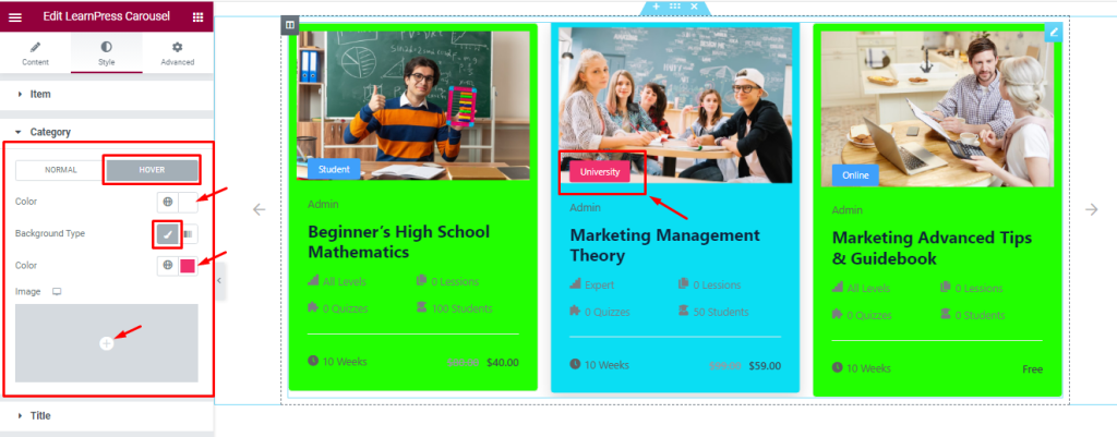
In Hover mode, find the Background Type (Classic and Gradient) and Background Color options.
Step-3
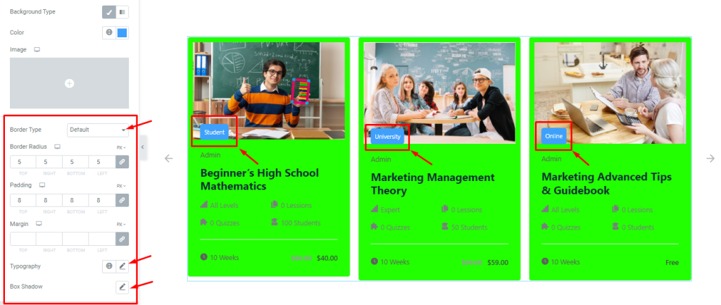
Also in Normal mode, find the Border Type, Border Radius, Padding, Margin, Typography, and Box Shadow options.
Title Section Customizations
Go to Style > Title
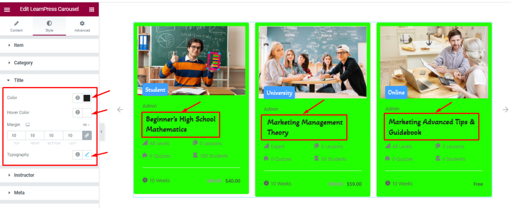
Find the title Color, Hover Color, Margin, and Typography options.
Style The Instructor Section
Go to Style > Instructor
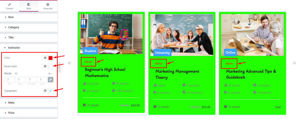
Find the instructor Color, Hover Color, Margin, and Typography options.
Style The Meta Section
Go to Style > Meta
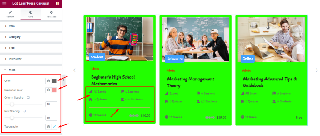
Find the meta Color, Separator Color, Column Spacing, Row Spacing, and Typography options.
Style The Price Section
Go to Style > Price
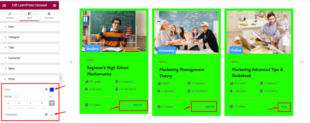
Find the price Color, Margin, and Typography options.
Style The Navigation Section
Step-1
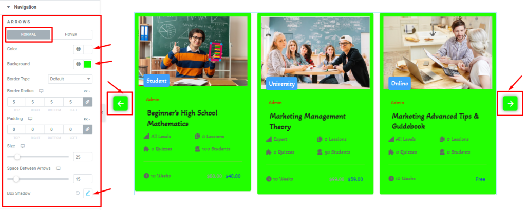
Go to the Style Tab > Navigation
Here, you will see two subsections Normal and Hover.
In Normal Mode, find the arrows Color, Background Color, Border Type, Border Radius, Padding, arrow Size, Space Between Arrows, and Box Shadow options.
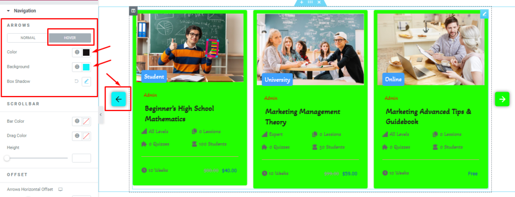
In Hover Mode, find the arrows Color, Background Color, and Box Shadow options.
Step-2
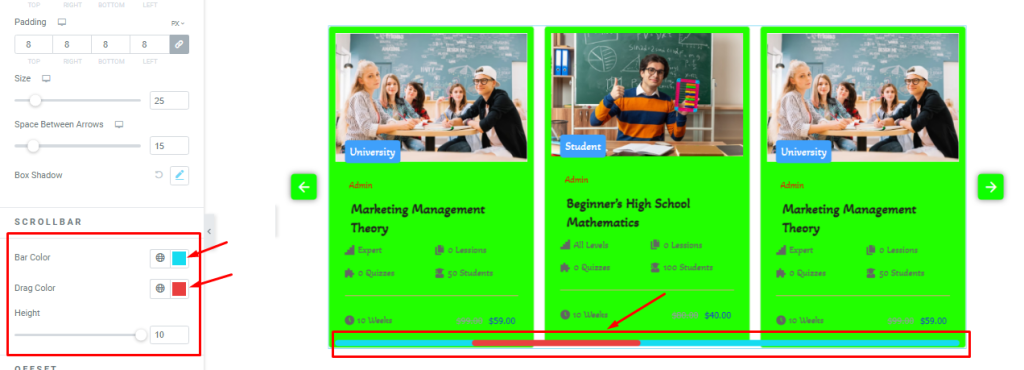
For Scrollbar, find the Bar Color, Drag Color, and Height options.
Step-3
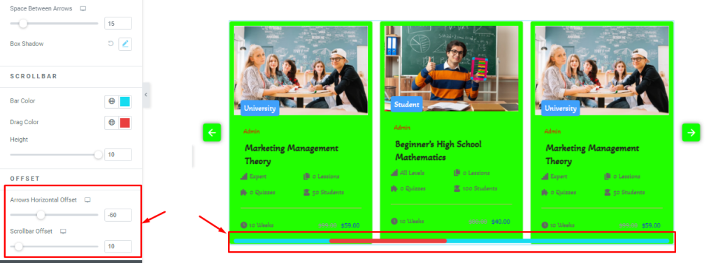
For Offset, find the Arrows Horizontal Offset and ScrollBar Offset options.
All done! You have successfully customized the LearnPress Carousel widget on your website.
Video Assist
LearnPress Carousel widget video tutorial coming soon. Please visit the demo page for more examples and designs with this feature.
Thanks for staying with us.