In this documentation, we will show you how to customize the Interactive Tabs widget presented by Element Pack Pro.
Inserting The Interactive Tabs Widget
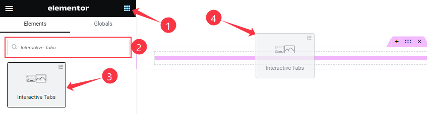
On the Elementor editor page, search by the Interactive Tabs widget name, then drag and drop it on the page.
Note: You need both Elementor and Element Pack Pro installed to use this widget.
Content Tab Customizations
Tabs Item section
Go to Content > Tabs Item
Step-1
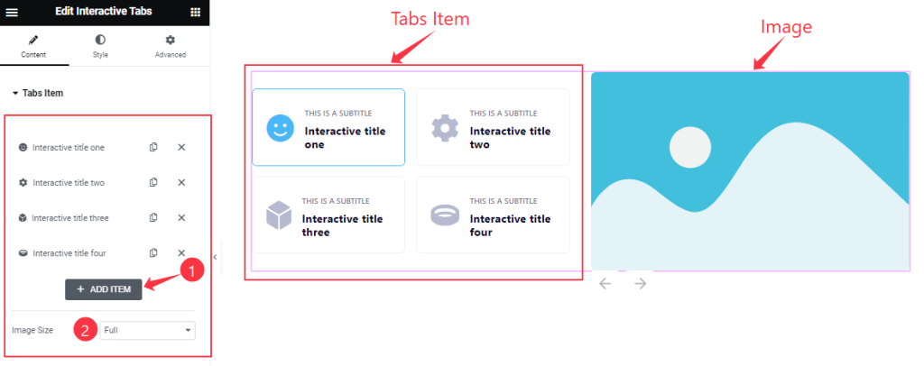
Come to the Tabs Item section and find the Image Size options, and Interactive Tabs widget items here (with the Add Item button).
Step-2
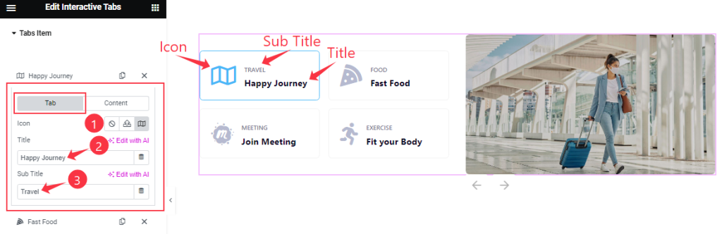
Click on the Interactive Tabs items, you will find two sub-sections; Tab and Content.
In Tab Mode, find the Icon, Title, and Sub Title options.
Step-3
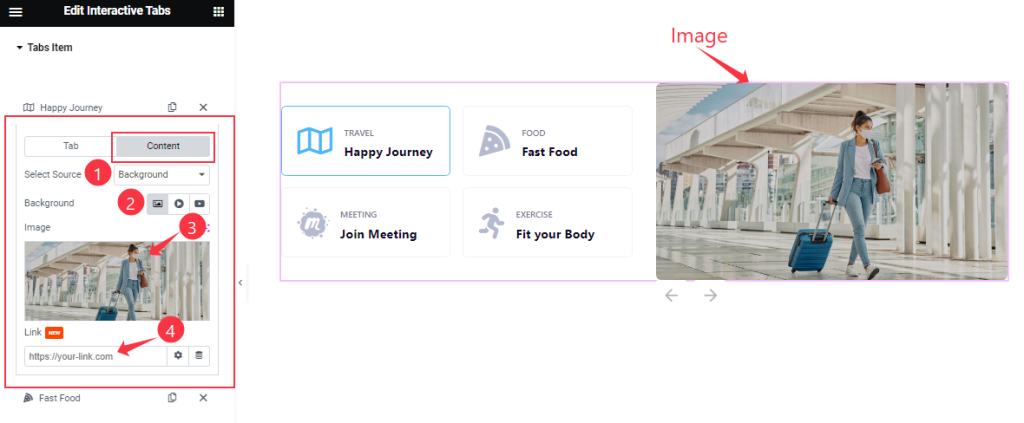
In Content mode, find the Select Source (Background, Elementor Template), Background, Image, and Image Link options.
Additional Settings section
Go to Content > Additional Settings
Step-1
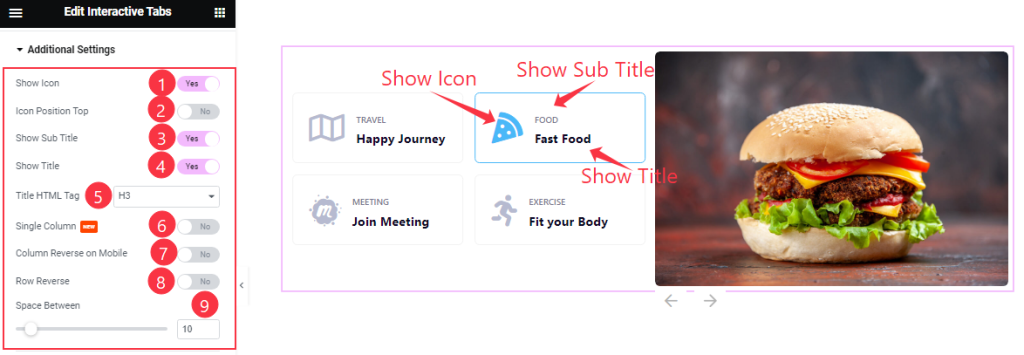
Here find the Show Icon, Icon Position Top, Show Sub Title, Show Title, Single Column, Column Reverse On Mobile, and Row Reverse switchers.
Also, find the Title HTML Tag and Space Between options.
Step-2
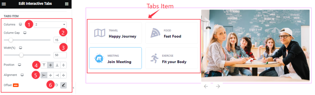
In this section, find the Columns, Columns Gap, Width, Position, Alignment, and Offset options.
Navigation section
Go to Content > Navigation
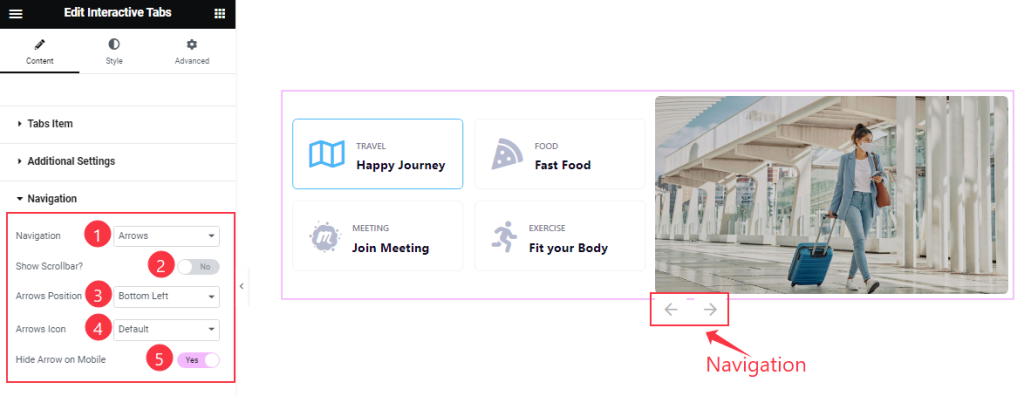
Find the Navigation Type, Arrows Position, and Arrows Icon options.
Also, find the Show Scrollbar and Hide Arrows on Mobile switchers.
Slider Settings section
Go to Content > Slider Settings
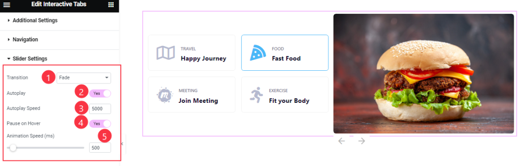
Find the Transition Style, Autoplay Speed, and Animation Speed options.
Also, find the Autoplay, and Pause On Hover switchers.
Work with The Style Tab
Tabs Item section
Go to Style > Tabs Item
Step-1
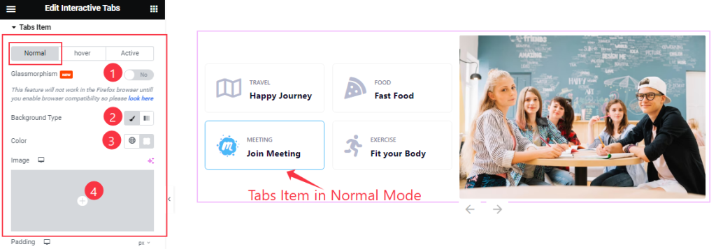
Come to the Tabs Item section, you will find three sub-sections; Normal, Hover, and Active.
In Normal Mode, find the Glassmorphism switcher at the top. Find the Background Type( Classic, Gradient), Background Color, and Image options.
Step-2
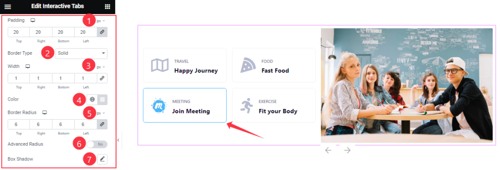
In Normal mode, Also find the Padding, Border Type, Width, Color, Border Radius, Box Shadow options, and Advanced Radius switcher.
Step-3
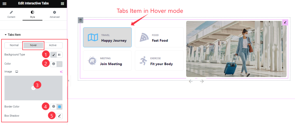
In Hover mode, you will get similar customization options in this section as in the Normal mode.
Step-4
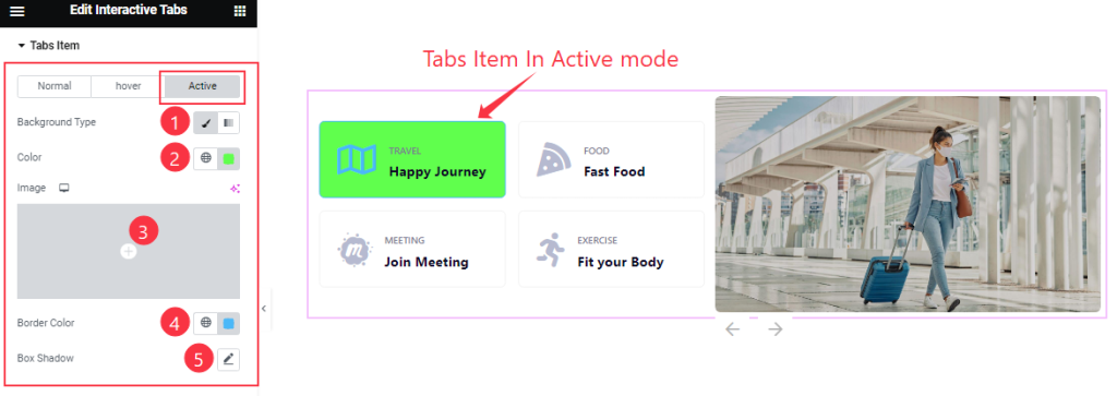
In Active mode, you also find similar customization options in this section as the Normal or Hover mode.
Tabs Content section
Go to Style > Tabs Content
Step-1
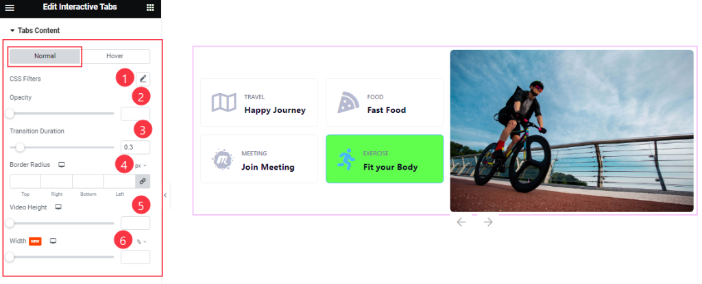
Come to the Tabs Item section, you will find two sub-sections; Normal, and Hover.
In Normal Mode, Find the CSS Filters, Opacity, Transition Duration, Border Radius, Video Height, and Width options.
Step-2
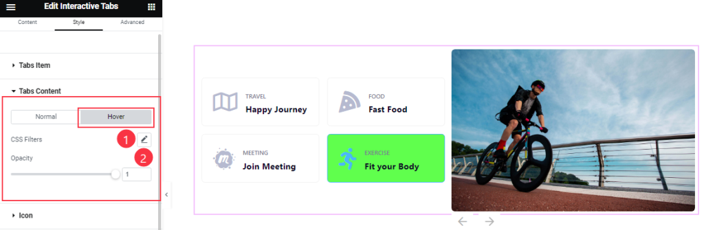
In Hover mode, find The CSS Filters and Opacity options.
Icon Content section
Go to Style > Icon
Step-1
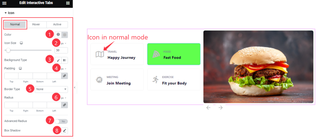
Come to the Icon section, you will find three sub-sections; Normal, Hover, and Active.
In Normal Mode, Find the icon Color, Icon Size, Background Type (Classic, Gradient), Background Color, Padding, Border Type, Raidus, and Box Shadow options.
Also, find the Advanced Radius switcher.
Step-2
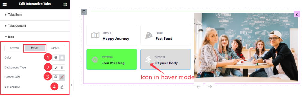
In Hover mode, Find the Icon Color, Background Type, Background Color, and Box Shadow options.
Step-3
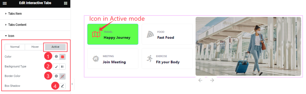
In Active mode, you also find similar customization options in this section as the Hover mode.
Title section
Go to Style > Title
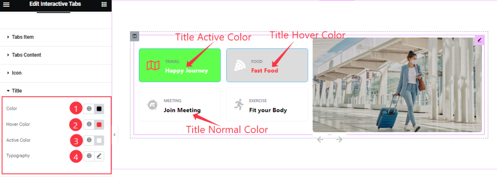
Find the Title Color, Hover Color, Active Color, and Typography options.
Sub Title section
Go to Style > Sub Title
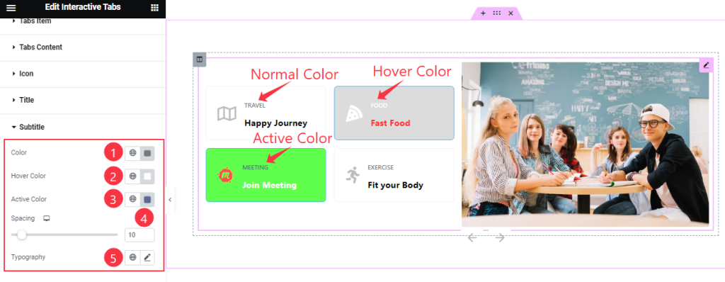
Come to the Subtitle section, find the Color, Hover Color, Active Color, Spacing, and Typography options.
Navigation section
Go to Style > Navigation
Step-1
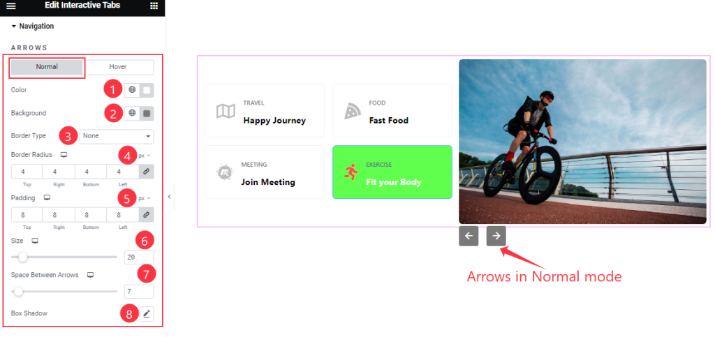
Come to the Navigation section, you will find two sub-sections; Normal, and Hover.
In Normal Mode, Find the Arrows Color, Background Color, Border Type, Border Radius, Padding, Size, Space Between, and Box Shadow options.
Step-2
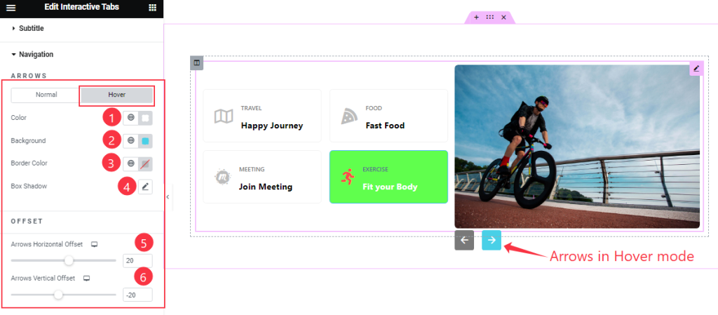
In Hover mode, Find the Arrows Color, Background Color, Border Color, and Box Shadow options like in the Normal mode.
Here, also find the Arrows Horizontal Offset and Arrows Vertical Offset options.
All done! You have successfully customized the Interactive Tabs widget on your website.
Video Assist
You can also watch the tutorial video about the Interactive Tabs widget. Please visit the demo page for examples.
Thanks for staying with us.