The Elementor Grid Line Extension is an innovative feature presented by your favorite Element Pack Pro plugin. This extension enables you to add a dynamic gridline to your current page without affecting any widget or background design.
BdThemes has developed this feature in order to put a seamless background grid design throughout the whole page. It will be the perfect setting for adding a monochrome grid design on your homepage that is both dynamic and responsive. Also, it’s the perfect tool for web designers to measure the design layouts using the grids as rulers, just like Adobe Photoshop or Figma.
Let us show you ins and outs of this grid line extension.
Enabling the Elementor Grid Line Extension
As the grid layout CSS is an extension of Element Pack Pro, you will find it inside the Extensions tab inside Element Pack Pro under your WordPress dashboard.
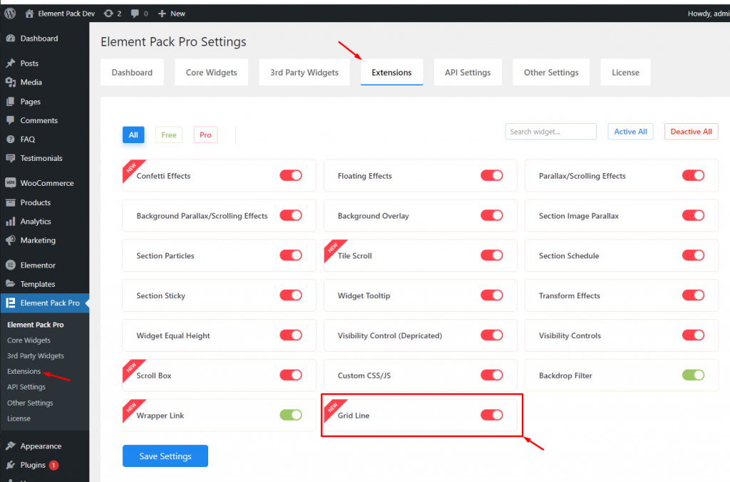
Just click on the tiny button beside the extension name and hit the Save Changes button. Now, you will be able to access the feature from the Elementor editor page.
Start with any widget or design
To start with the feature, let’s first take an existing design or widget inside the page. This is for a better understanding of the functions of this feature. However, you can activate gridlines on a blank page as well, there will be no problem.
Let’s go with a widget for a detailed view.
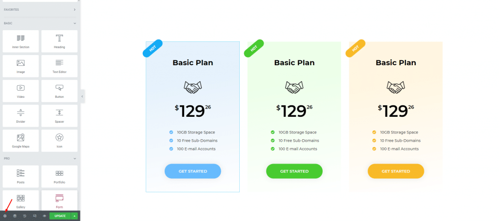
On the page, opened with Elementor page editor, go for the page settings menu. It’s at the bottom-left corner of the page.
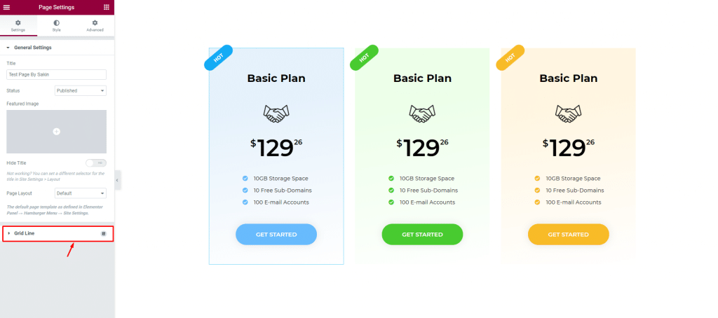
Once you go there, you will find the Grid Line option right below the General Settings section. Click on it to reveal the options.
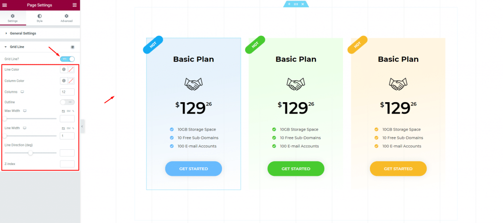
By turning on the Grid Line switcher, you will discover a batch of grid lines on your page background as well as a bunch of options right below the switcher for the grid design layout. These barely visible gridlines cover the whole page from top to bottom.
Customizing the Grid Lines
This simple grid line extension can be used both ways-
- Rulers for better web designing assistant
- Unique grid design for the site itself
Let us show both options.
Rulers for better web design-
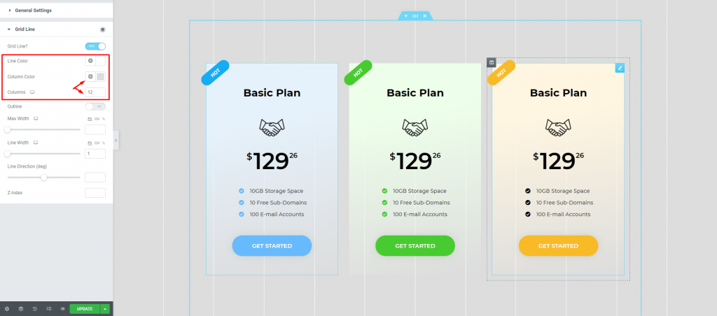
Let’s set the gridline color and column color in the right proportions to make the background resemble sketch paper. You can set a maximum of 12 grid lines and a minimum of 1 line.
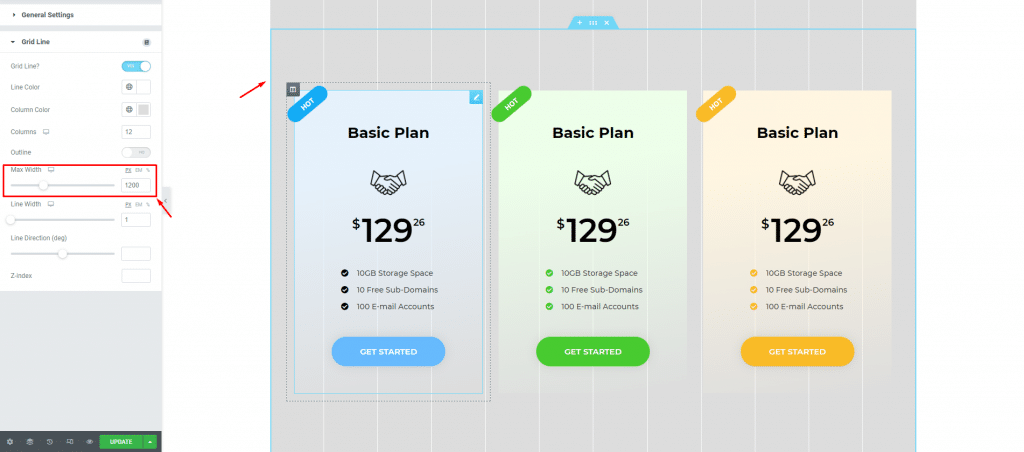
By adjusting the max-width of the grid, you can set the canvas size where you will be designing your page using the Elementor Grid Line Extension. In the image above, we adjusted the grid max-width to 1200px to resemble our Elementor canvas size.
There’s a switcher here caller “Outline” that creates another pair of gridlines besides the current grid layout. It’s for catching any overflow in the design and helps you keep everything inside the template area.
Like this, you can manipulate the grid width and number of lines to create your own design-assist.
Unique Grid design for your website
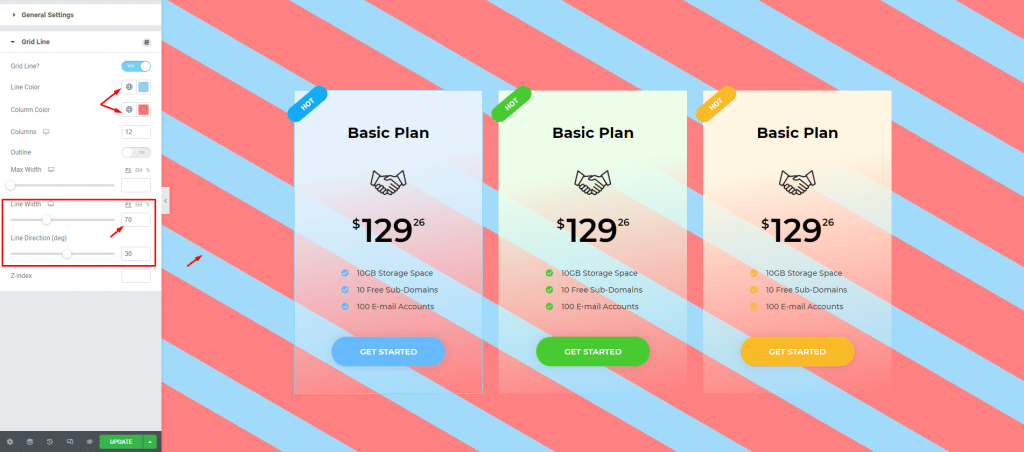
First, change the line color and column color into something you are comfortable with. Then simply increase the Line Width and change the Line Direction (deg) to create a rotated stripe pattern on the background.
This is just an example. You can go with straight stripes, flipped, rotated, single color, etc. using these options.
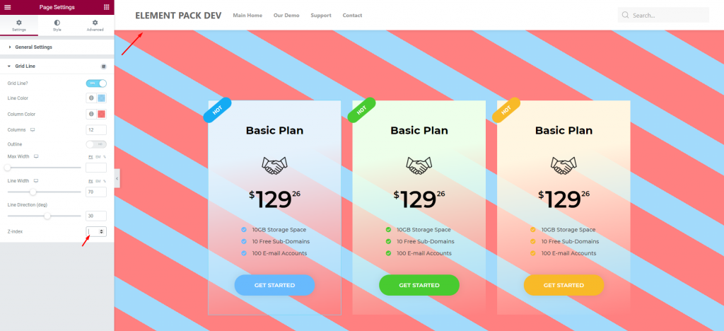
Notice that the grid lines didn’t cover the header part of the page. To make it go above the header area, you will need the help of the Z-index option here.
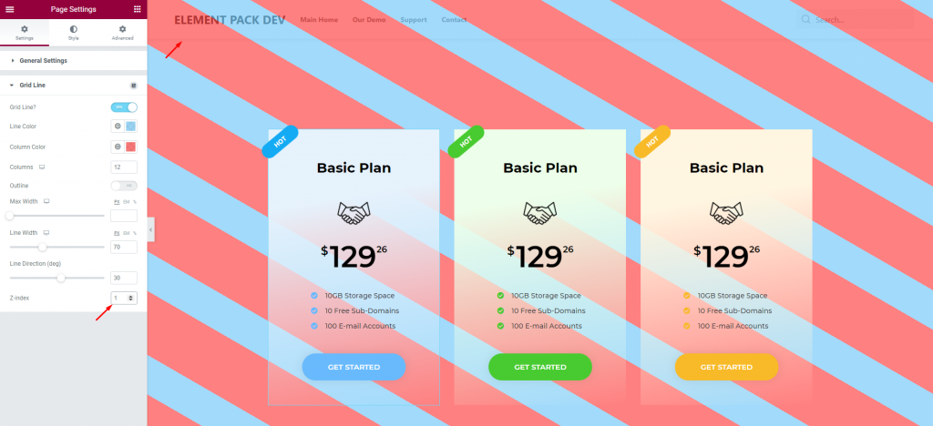
Just insert a value higher than the header and the grid line extension will cover it too. Simple yet innovative.
Conclusion
You can watch this video featuring the usage of the Elementor Grid Line Extension. Don’t forget to visit the demo page for more examples and designs with this feature.

