In this documentation, we will discuss the customization of the Gravity Forms widget, brought to you by the Element Pack Pro addon for Elementor.
Enable The Gravity Forms Widget
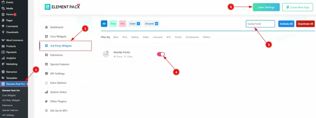
To use the Gravity Forms widget from Element Pack Pro, first, you have to enable the widget.
- Go to WordPress dashboard > Element Pack Pro Plugin dashboard.
- Then, Click the 3rd Party Widgets Tab.
- Search the Gravity Forms Widget Name.
- Enable the Gravity Forms Widget.
- Hit the Save Settings Button.
Note: To use this widget in the Elementor editor, you need to install the Gravity Forms Plugin separately.
Inserting the Gravity Forms widget
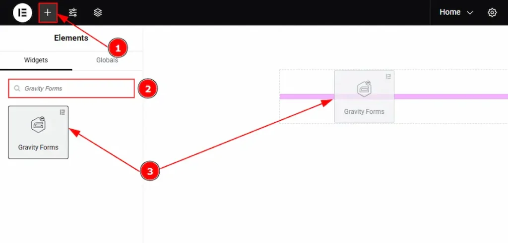
1. Go to the Elementor Editor Page and Hit the “+” icon Button.
2. Search the Gravity Forms widget.
3. Drag the widget and drop it on the editor page.
Work With The Content Tab
Layout Section
Go to Content > Layout
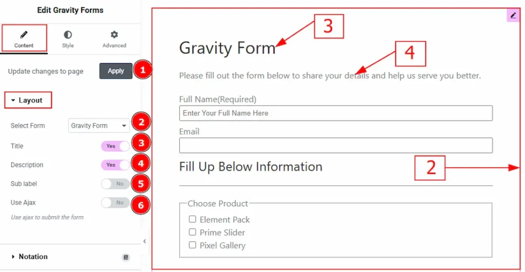
1. Update change to Page: Click on the apply button to automate the update of the forms.
2. Select Form: You can select the form that you have already created. Here, we have created a form named Gravity Form and selected it.
3. Title: Displays the title of the selected Gravity Form. It can be toggled on or off from the widget settings.
4. Description: Provides a short introduction or instruction for users, explaining the purpose of the form.
5. Sub Label: Toggles the visibility of sub-labels that appear under field labels for additional guidance.
6. Use Ajax: Enables Ajax form submission, allowing users to submit the form without reloading the page.
(Note: To customize the form in the editor, create a form first in the Gravity Forms dashboard that includes the information you want to collect from your audience.)
Work with The Style Tab
Label Section
Go to Style > Label
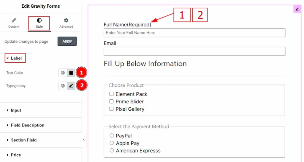
1. Text Color: You can change the text color with this option.
2. Typography: Change the font family, size, weight, transform, style, decoration, line height, letter spacing, and word spacing from here.
Input Section
Go to Style > Input
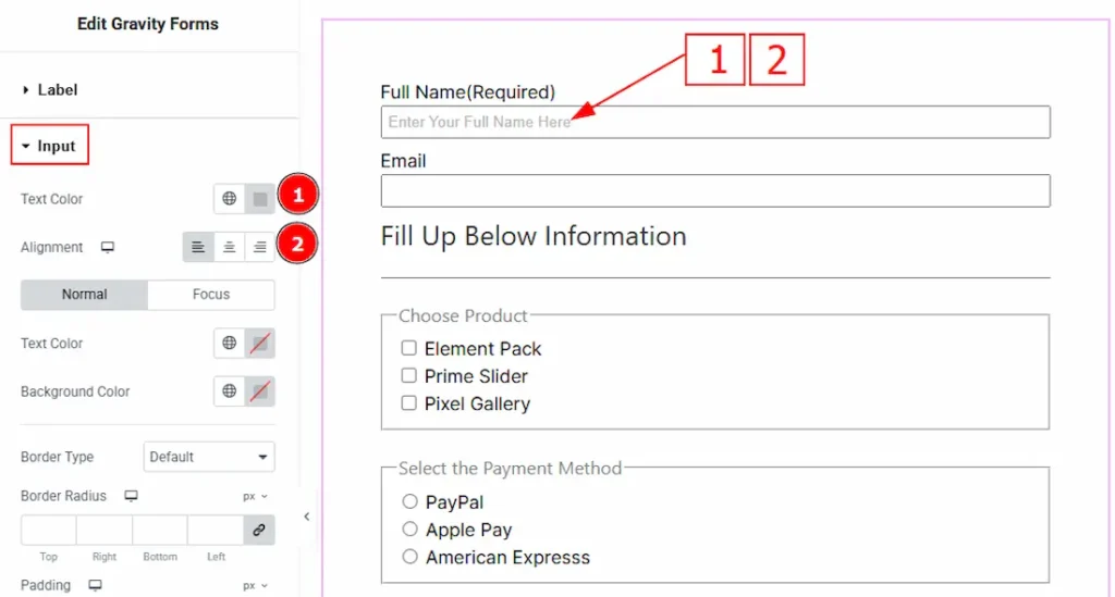
1. Text Color: You can change the placeholder text color with this option.
2. Alignment: You can set the placeholder text position to left, center or right with this option.
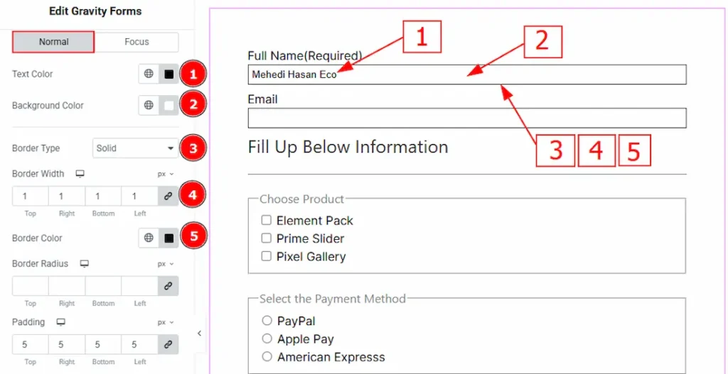
In this section, we have two more tabs. These are Normal & Focus. Let’s start with the customization of Normal Tab –
1. Text Color: You can change the input text color with this option.
2. Background Color: You can change the background color with this option.
3. Border Type: You can add or change the border type with this option.
4. Border Width: Set the thickness of the border with this option.
5. Border Color: You can change the border color with this option.
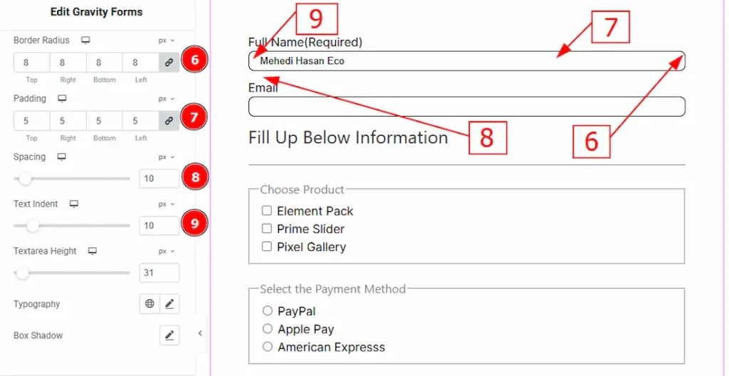
6. Border Radius: This option controls the roundness of the border.
7. Padding: This option allows you to adjust the inner space of the input field.
8. Spacing: You can adjust the space between the input items with this option.
9. Text Indent: You can adjust the space before the input text with this option.
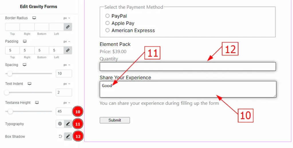
10. Textarea Height: You can adjust the height of the textarea field with this option.
11. Typography: Change the font family, size, weight, transform, style, decoration, line height, letter spacing, and word spacing from here.
12. Box Shadow: You can add a shadow effect to the input fields with this option.
Now, let’s proceed to the Focus Tab –
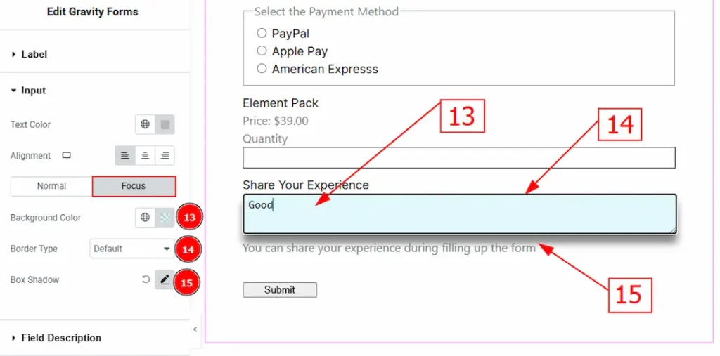
13. Background Color: You can change the input’s focus background color with this option.
14. Border Type: You can change the border type with this option.
15. Color: You can change the background color with this option.
Field Description Section
Go to Style > Field Description
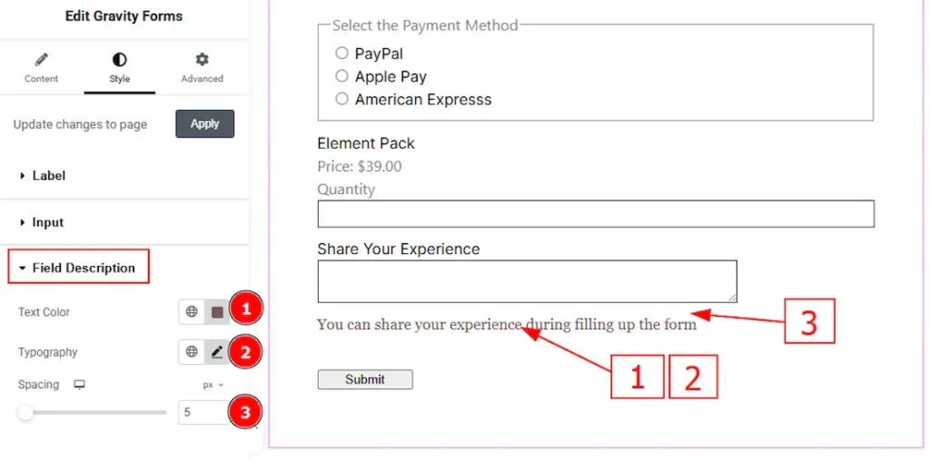
1. Text Color: You can change the description text color with this option.
2. Typography: Change the font family, size, weight, transform, style, decoration, line height, letter spacing, and word spacing from here.
3. Spacing: You can adjust the space between the input field and the description with this option.
Section Field Section
Go to Style > Section Field
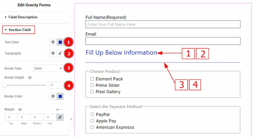
1. Text Color: You can change the section break text color with this option.
2. Typography: Change the font family, size, weight, transform, style, decoration, line height, letter spacing, and word spacing from here.
3. Border Type: You can add or change the border type with this option.
4. Border Height: You can adjust the thickness of the border with this option.
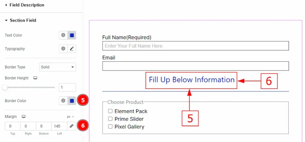
5. Border Color: You can change the border color with this option.
6. Margin: You can adjust the space around the section break wth this option.
Price Section
Go to Style > Price
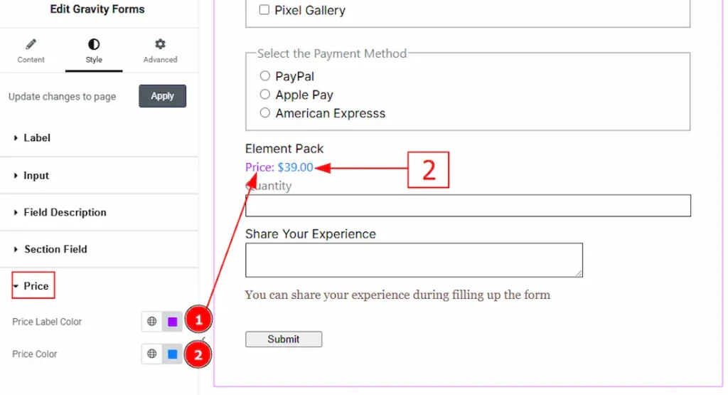
1. Price Label Color: You can change the price label text color with this option.
2. Price Color: You can change the price amount color with this option.
Radio & Checkbox Section
Go to Style > Radio & Checkbox
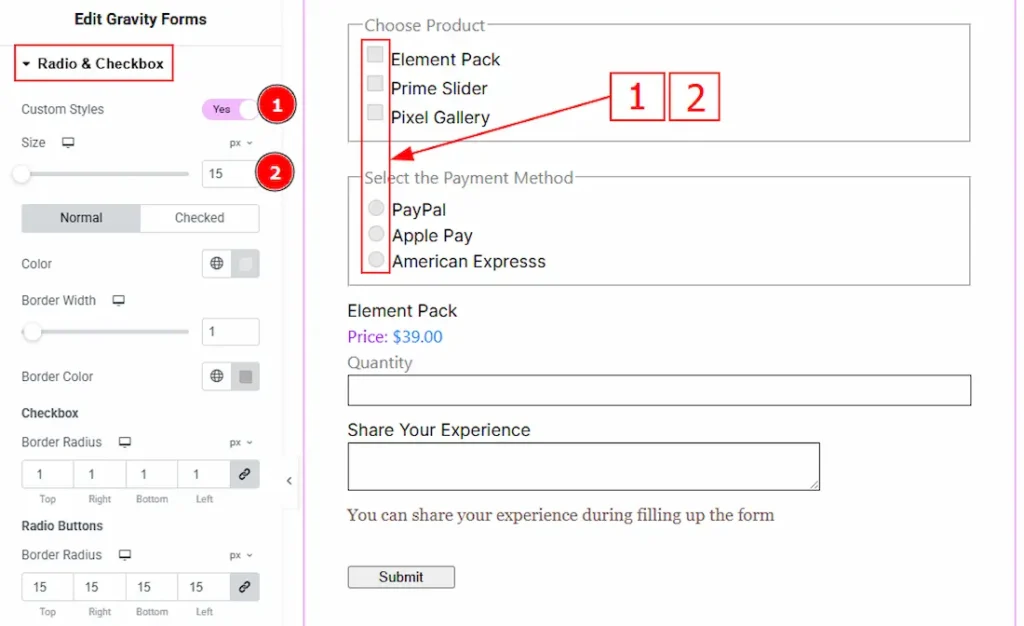
1. Custom Styles: Enable the switcher to get more options to customize the radio & checkbox fields.
2. Size: You can make changes to the radio & checkboxes icon size with this option.
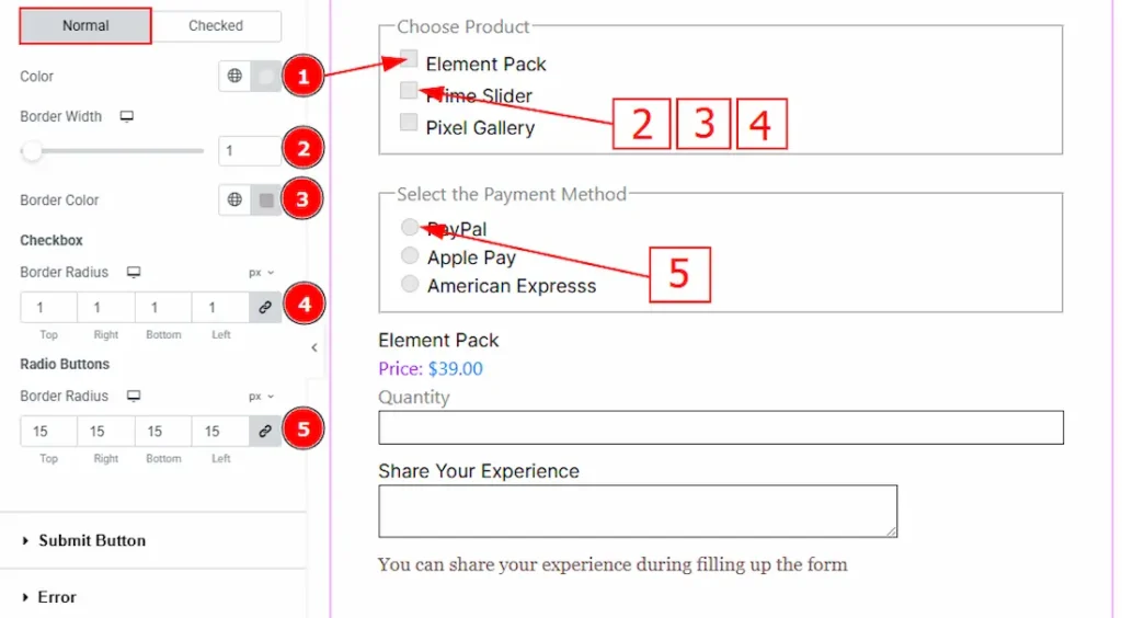
In this section, we have two more tabs. These are Normal & Checked. Let’s start with the Normal Tab –
1. Color: You can change the radio & checkbox icon background color with this option.
2. Border Width: Set the thickness of the border with this option.
3. Border Color: You can change the border color with this option.
4. (Checkbox) Border Radius: This option controls the roundness of the checkbox’s border.
5. (Radio Buttons) Border Radius: This option controls the roundness of the radio buttons border.
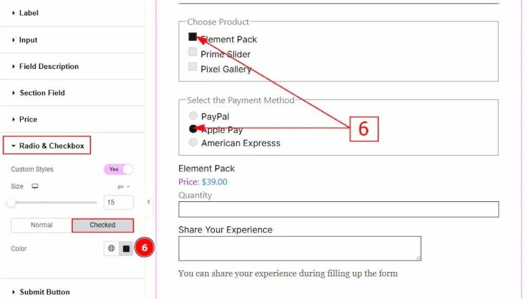
Now, let’s proceed to the Checked Tab –
6. Color: You can change the checked color of the checkboxes and radio buttons with this option.
Submit Button Section
Go to Style > Submit Button
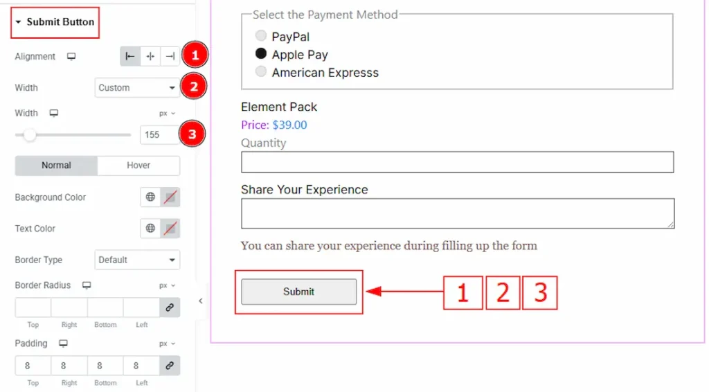
1. Alignment: You can set the submit button position to left, center or right with this option.
2. Width: You can adjust the submit button width with this option.
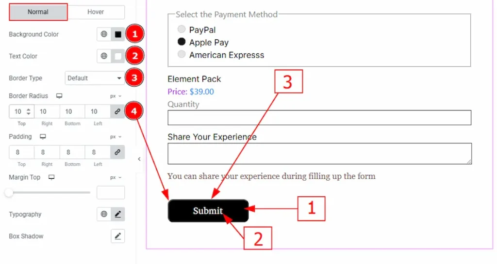
In this section, we have two more tabs. These are Normal & Hover. Let’s start with the Normal Tab –
1. Background Color: You can change the submit button background color with this option.
2. Text Color: You can change the submit button text color with this option.
3. Border Type: You can add and change the border types with this option.
4. Border Radius: This option controls the roundness of the border.
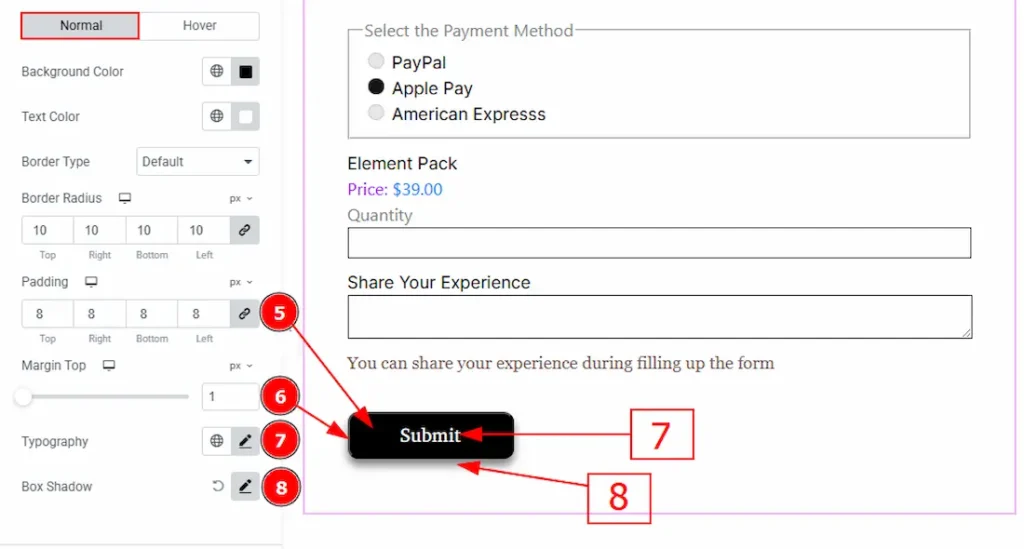
5. Padding: You can adjust the inner space of the submit button with this option.
6. Margin Top: You can adjust the space between the button and the input field with this option.
7. Typography: Change the font family, size, weight, transform, style, decoration, line height, letter spacing, and word spacing from here.
8. Box Shadow: You can add a shadow effect to the submit button with this option.
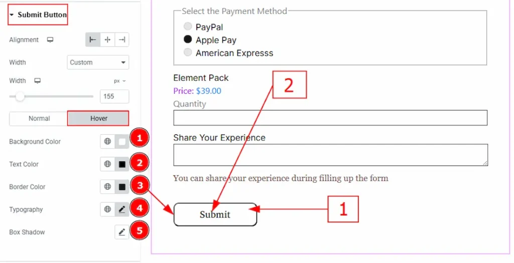
Now let’s proceed to the Hover Tab –
1. Background Color: You can change the submit button background hover color with this option.
2. Text Color: You can change the submit button text hover color with this option.
3. Border Color: You can change the border hover color with this option.
4. Typography: Change the font family, size, weight, transform, style, decoration, line height, letter spacing, and word spacing from here.
5. Box Shadow: You can add a shadow effect to the submit button with this option.
Error Section
Go to Style > Error
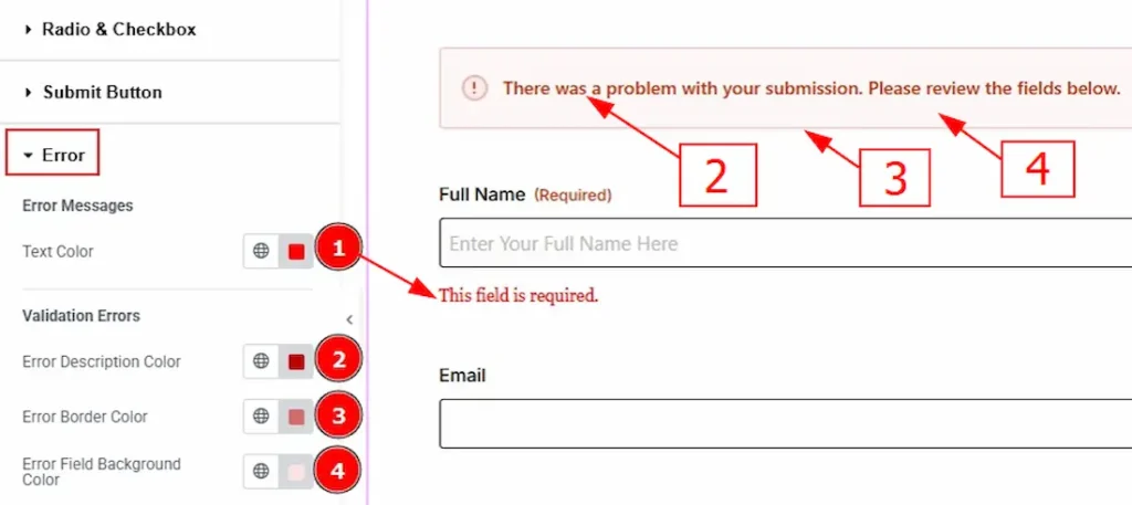
1. Text Color: You can change the error message text color with this option.
2. Error Description Color: You can change the error description text color with this option.
3. Error Border Color: You can change the error border color with this option.
4. Error Field Background Color: You can change the error field background color with this option.
Additional Option Section
Go to Style > Additional Option
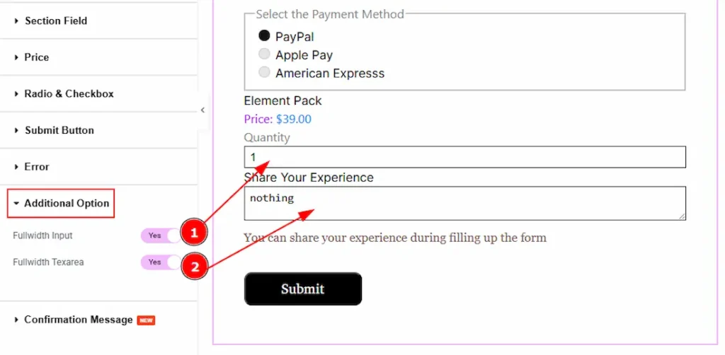
1. Fullwidth Input: Enable the switcher to get the input field full width.
2. Fullwidth Textarea: Enable the switcher to get the textarea full width.
Confirmation Message Section
Go to Style > Confirmation Message
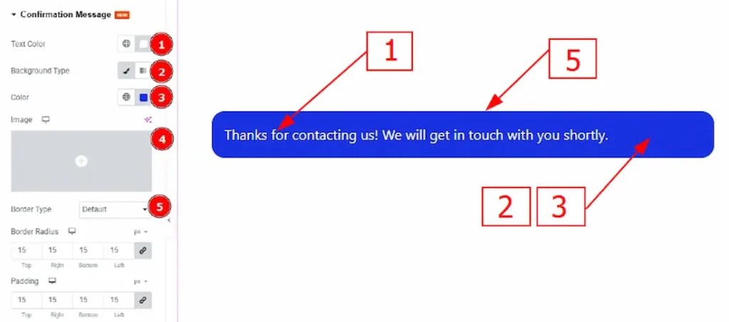
1. Text Color: You can change the text color of the confirmation message with this option.
2. Background Type: You can change the background type to classic or gradient with this option.
3. Color: You can change the background color with this option.
4. Image: You can change the background image with this option.
5. Border Type: You can add and change the border types with this option.
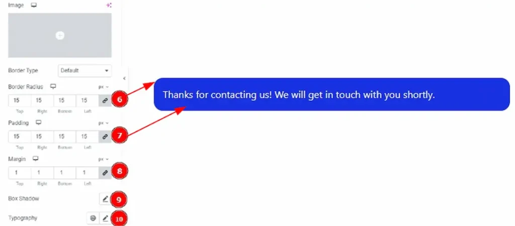
6. Border Radius: This option controls the roundness of the border.
7. Padding: You can adjust the inner space of the confirmation message with this option.
8. Margin: You can adjust the outer space of the confirmation message with this option.
9. Box Shadow: You can add a shadow overlay to the confirmation message bos with this option.
10. Typography: Change the font family, size, weight, transform, style, decoration, line height, letter spacing, and word spacing from here.
All done! You have successfully customized the Gravity Forms widget on your website.
Video Assist
You can also watch the video tutorial to learn more about the Gravity Forms widget. Please visit the demo page for examples.
Thanks for being with us.