Another cool newly updated widget is the Featured Box widget. Brought you by Element Pack Pro, this widget showcases your featured product, information, or donation with a featured box. A very useful widget for WooCommerce websites, online markets and Donation Clubs!
Now, to use this brilliant widget proficiently, you need to know how it works. Let’s get you to know it!
To Insert Widget

Inserting widget is just a matter of drag and drop. However, click and hold on the Elementor Featured Box widget icon from the menu and drag it to the drop point. Follow the picture above.
Content Tab
The Content tab is the basic options tab of the Featured Box widget. This tab is divided into 3 sections. However, the Read More Button and the Badge section can be turned on/off with switchers. Let get into more details.
Layout
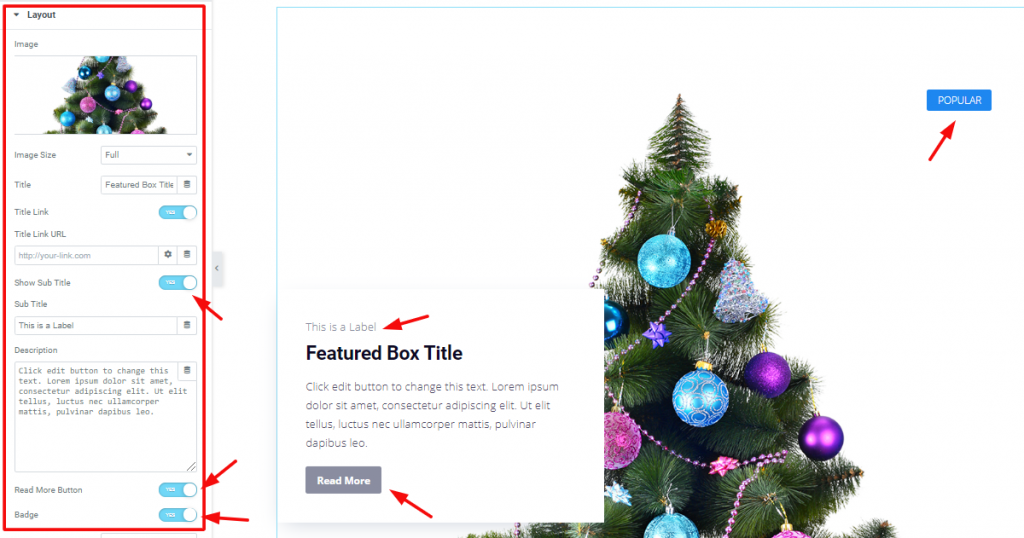
Go to Content Tab> Layout.
After you drag and drop the widget in a new section, you will see this section on the screen. From here, you can put your featured image, adjust image size, add a title and subtitle, and description of your featured product for the WordPress Featured box. Currently, the Read More Button and Badge switchers are turned on.
Skin Split:
Go to the Content tab > Layout > and select Split screen with default one. See the example below.

Read More
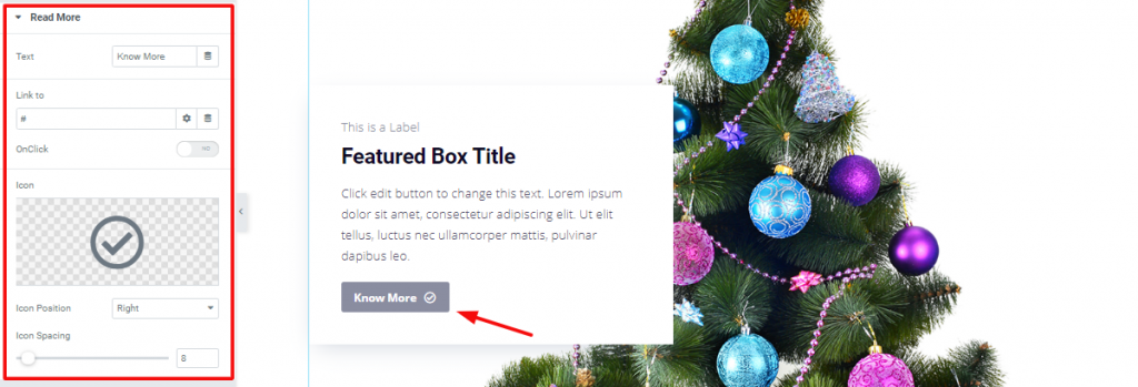
You can name the Read More – Button anything you want from this section. You can insert a link that will redirect the user to the link upon clicking the button. Also, you can add an Icon and change its position as well.
Go to Content tab> Read More> and customize it.
Badge
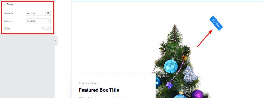
Go to Content Tab> Badge
It is the last part section of the Content tab. This section shows the options to edit the text of the Badge of your featured info box. However, you can reposition it as well as set offset values to bring it anywhere you want.
Style Tab
Now, time for some style. In this Style tab, you will have more options to create your unique Featured Box widget as you like. This tab has a good number of sections. Let’s have a look.
Image
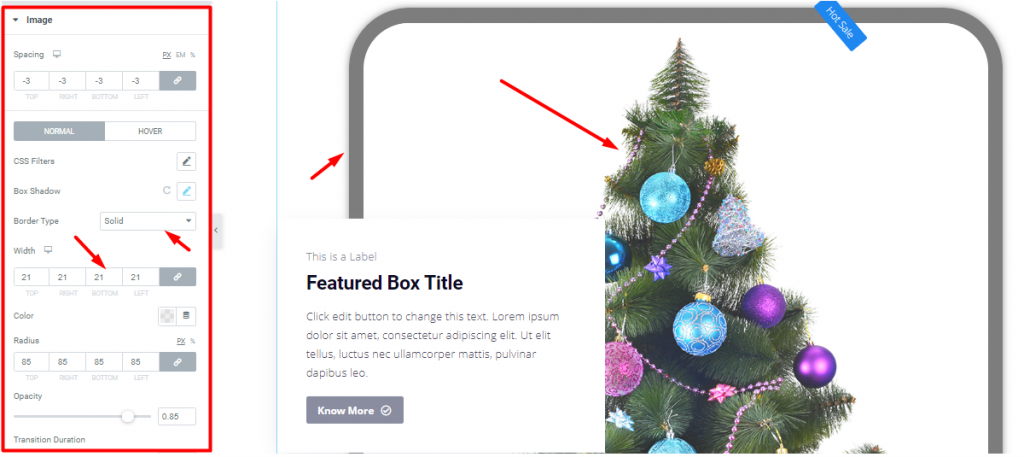
Go to Style Tab> Image
The Image section has options for the image of the product that was inserted from the content tab. With these options, you can adjust the height-width of the image box, radius, and opacity. Also, you have the CSS Filter option which further customizes the image color properties for the Featured Box widget.
Title

Go to Style Tab> Title
Form this section; you can edit the title of the information box of your Feature Box widget. With typography and color option, you can make a stylish title easily.
Sub Title

Go to Style Tab> Sub Title
The Sub Title section lets you add a subtitle above the main title of the information box.
Description
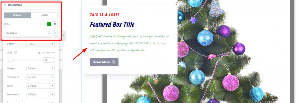
Go to Style Tab> Description
You can change the description of your Featured Box from this section. Basically, the color and typography. Also, you can add a hover effect on it.
Read More
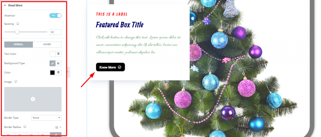
The next section is Read More. Here, you can change the look of the Read More button with these bunch of options. However, you can apply any color or even add any image as the background of the button for the Featured Box widget.
Go to Style tab> Read More> and see the options.
Badge
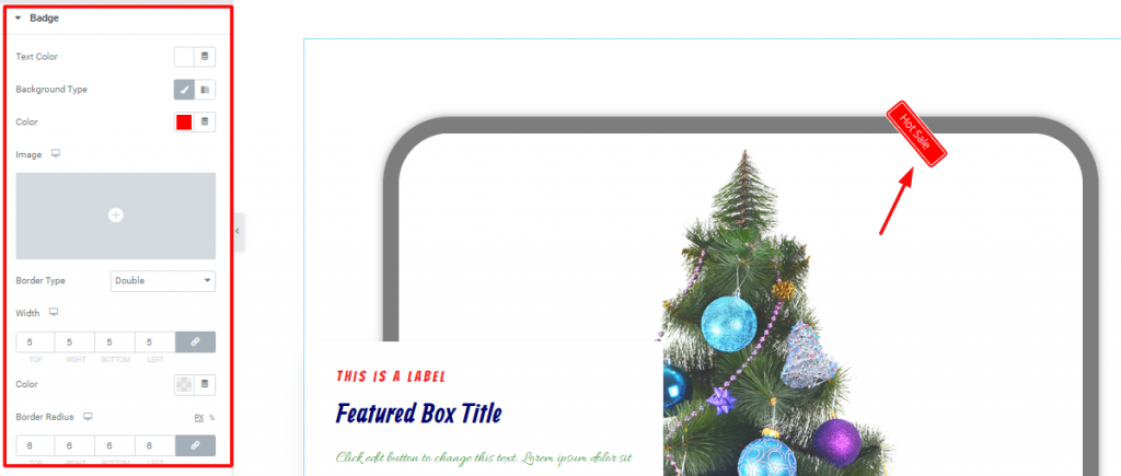
Go to Style Tab> Badge
In this section, you can customize the Badge of your Featured Box widget. You can change its position as you like as well as its shape. Make a unique badge with color, border, and text color options on your own.
Additional
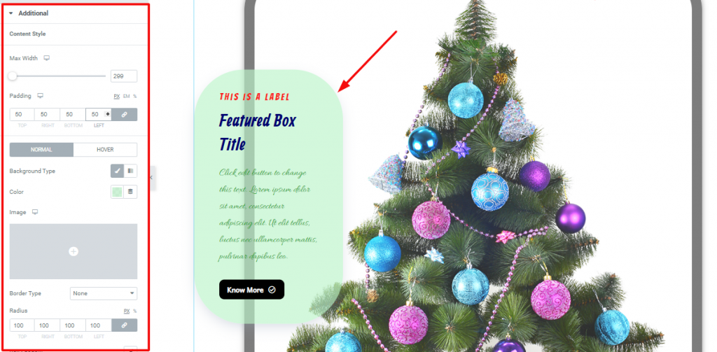
Go to Style Tab> Additional
Lastly, after all these sections, you have the Additional options section. This part controls the appearance of the information box of the widget. Set the height/width, customize the background with colors or images, add more padding, or make the box round using radius- you can do all these actions from this section.
Video Assist
Well done. It seems you have learned the whole thing and how it works. It is easy and fun. Watch Video Assist and to get more in-depth ideas about the usage of the Featured Box widget, by Bdthemes, take a tour to the demo page.

