In this documentation, we will show you how to customize the Fancy Tabs widget presented by Element Pack Pro.
Inserting The Fancy Tabs Widget
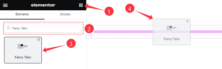
Open your page in the Elementor editor, search by the widget name, then drag and drop it on the page.
Content Tab Customizations
Fancy Tabs Items Section
Go to Content > Fancy Tabs Items
Step-1
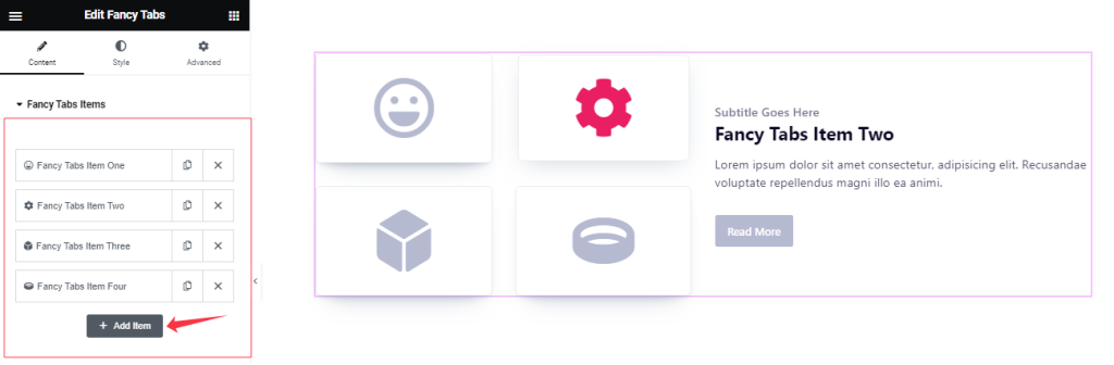
Come to the Fancy Tabs Items section, Here you can add Fancy Tabs widget items (with the Add Item button).
Step-2
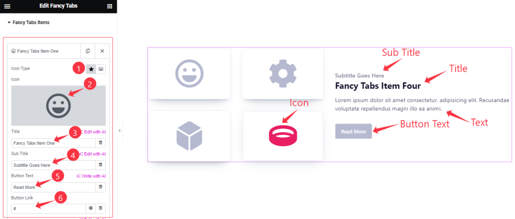
For Each Fancy Tabs item, Find the Icon Type (Icon, Image), Icon, Title, Sub Title, Button Text, And Button Link options.
Step-3
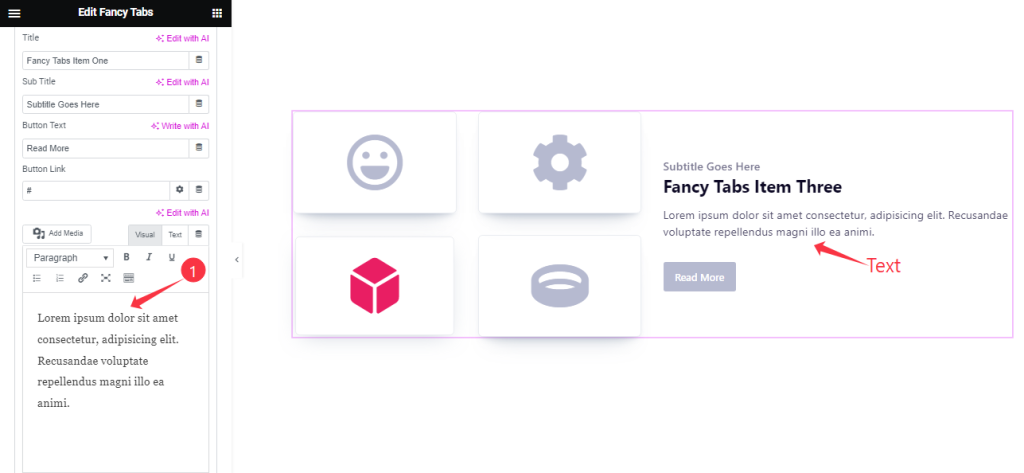
For Each Fancy Tabs item, Also Find the Text option.
Additional Settings Section
Go to Content > Additional Settings
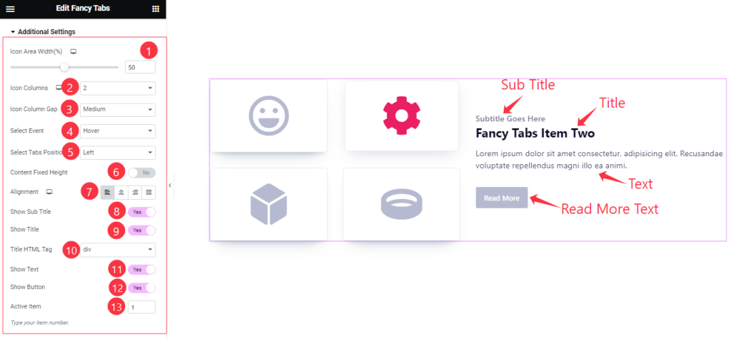
Here Find the Icon Area Width, Icon Columns ( 1 to 6 ), Icon Column Gap ( Small, Medium, Large, Collapse), Select Event ( Hover, Click ), Select Tabs Position ( Left, Right), Alignment, Title HTML Tag, and Active Item options.
Also Find the Content Fixed Height, Show Title, Show Sub Title, Show Text, and Show Button switchers.
Work with The Style Tab
Style The Fancy Tabs Section
Go to Style > Fancy Tabs
Step-1
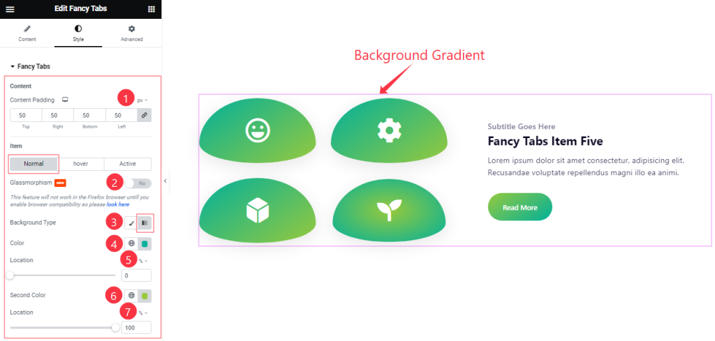
Come to the Fancy Tabs section, you will find three sub-section; Normal, Hover, and Active.
In the Normal Mode, Find the Content Padding, Glassmorphism, Background Type ( Classic, Gradient), First Color, First Location, Second Color, and Second Location options.
Step-2
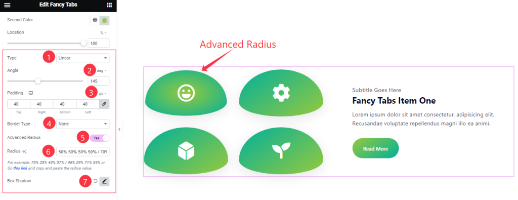
In the Normal Mode, Also Find the Type ( Linear, Radial), Angle, Padding, Border Type, Advanced Radius, Radius, and Box Shadow options.
Step-3
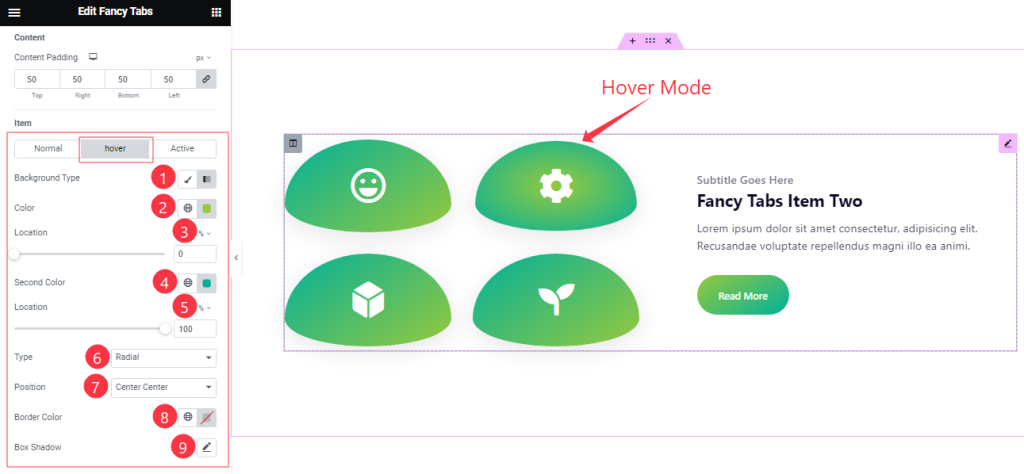
In the Hover Mode, Find the Background Type ( Classic, and Gradient), First Color, First Location, Second Color, Second Location, Type ( Linear, Radial), Position, Border Color, and Box Shadow options.
Step-4
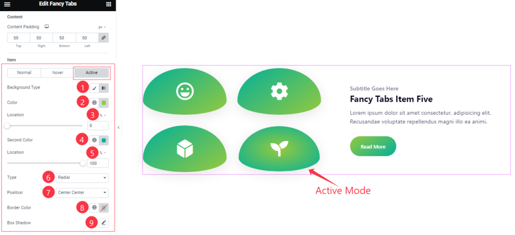
In the Active mode, you will get a similar customization option as in the Hover Mode. So please try it yourself.
Icon/ Image Section
Go to Style > Icon/Image
Step-1
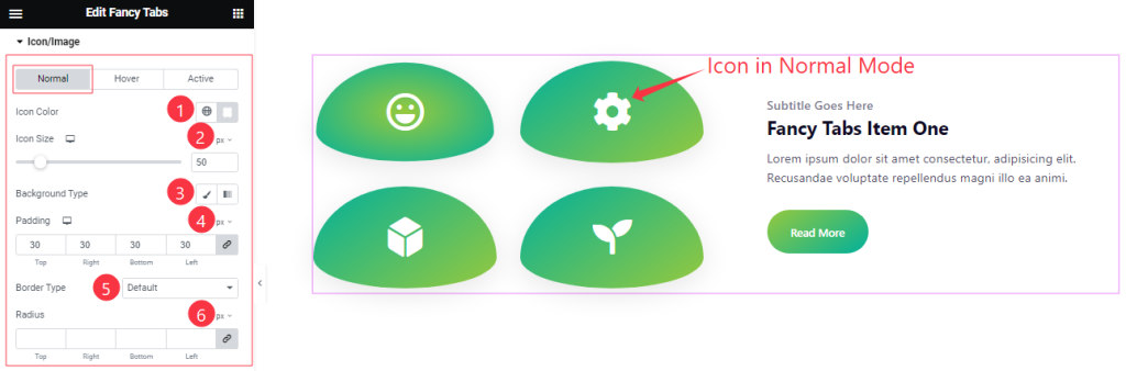
Come to the Icon/Image section, you will find three sub-section; Normal, Hover, and Active.
In the Normal Mode, Find the Icon Color, Icon Size, Background Type( Classic, Gradient), Padding, Border Type, and Radius options.
Step-2
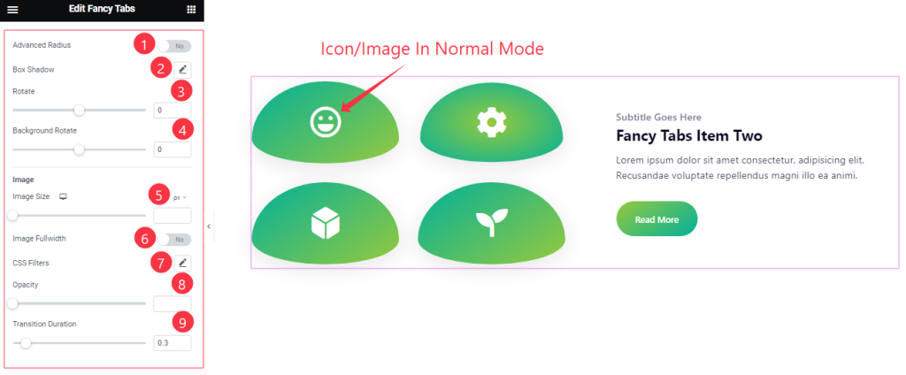
In the Normal mode, also find the Advanced Radius, Box Shadow, Rotate, Background Rotate, Image Size, Image Fullwidth, CSS Filters, Opacity, and Transition Duration options.
Step-3
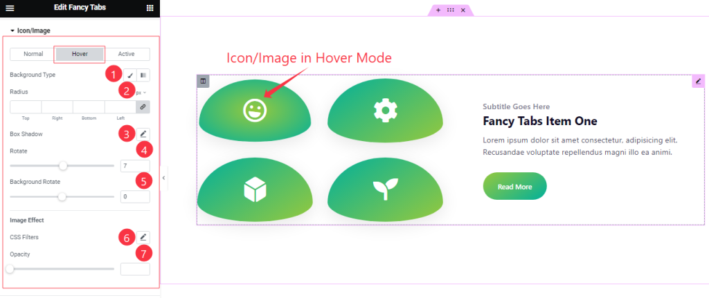
In the Hover mode, you will get a similar customization option as in the Normal Mode. So please try it yourself.
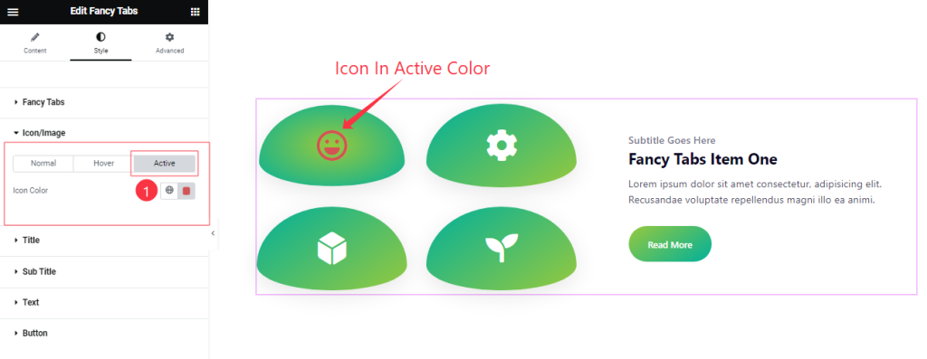
Step-4
In the Active mode, Find the Icon Color options.
Style The Title Section
Go to Style > Title
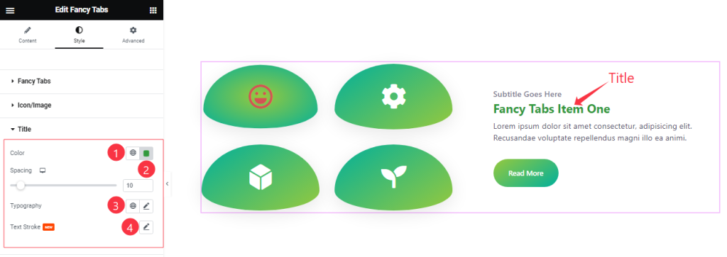
Here Find the Title Color, Spacing, Typography, and Text Stroke options.
Style The Sub Title Section
Go to Style > Sub Title
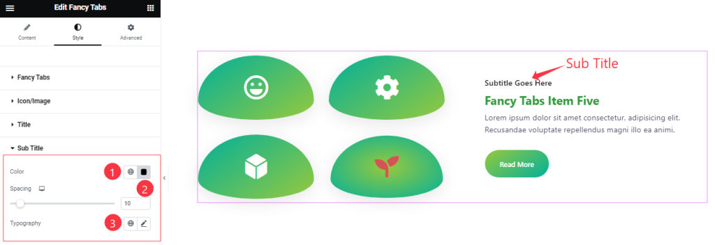
Here you will get a similar customization option to modify the appearance of the Sub Title section as in the Title section.
Text Section Customization
Go to Style > Text
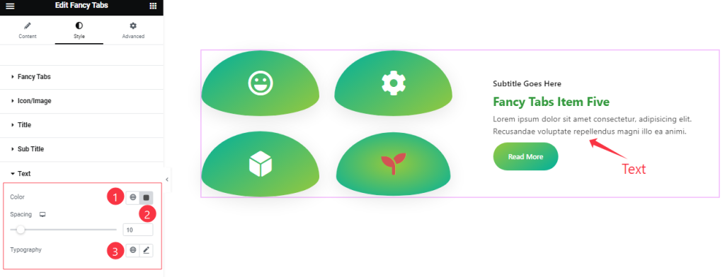
Come to the Text section, you will get a similar customization option to modify the appearance of the Text section as in the Title/Sub Title section.
Button Section
Go to Style > Button
Step-1
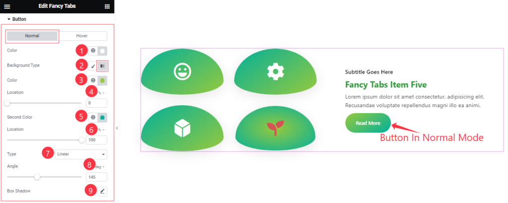
Come to the Button section, you will find two sub-section; Normal, and Hover.
In the Normal Mode, Find the Button Text Color, Background Type( Classic, Gradient), Background First Color, First Location, Second Color, Second Location, Type( Linear, Radial), Angle, and Box Shadow options.
Step-2
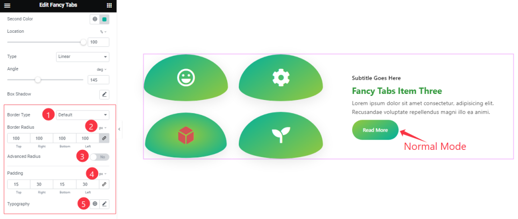
In the Normal mode, also find the Border Type, Border Radius, Advanced Radius, Padding, and Typography options.
Step-3
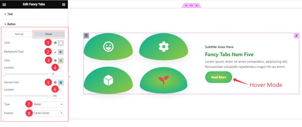
In the Hover Mode, Find the Button Text Color, Background Type( Classic, Gradient), Background First Color, First Location, Second Color, Second Location, Type( Linear, Radial), and Position options.
All done! You have successfully customized the Fancy Tabs widget on your website.
Video Assist
You can also watch the tutorial video about the Fancy Tabs widget. Please visit the demo page for examples.
Thanks for staying with us.