
In the documentation, we will provide comprehensive guidance on the Element Pack Pro WooCommerce Carousel widget for Elementor. This widget adds a dynamic and visually engaging carousel to your WooCommerce website, allowing you to showcase products in an interactive sliding layout. It is designed to improve product visibility, enhance user experience, and drive sales by presenting products in an attractive, scrollable format. The WooCommerce Carousel widget is highly versatile and suitable for highlighting featured products, new arrivals, bestsellers, or promotional items across your online store
WooCommerce Carousel – Key Features
- Multiple Layout Styles
Display products in various carousel layouts including horizontal, vertical, and grid sliders. - Customizable Navigation
Add arrows, dots, or both for easy navigation and improve user interaction. - Responsive & Mobile Friendly
Automatically adjusts to all screen sizes, ensuring smooth performance on desktops, tablets, and mobiles. - Product Filters & Categories
Show products by categories, tags, or custom filters to highlight specific collections. - Autoplay & Loop Options
Enable autoplay with adjustable speed and looping for continuous product display. - Customizable Styling
Control colors, fonts, spacing, borders, and background to match your website design. - Hover Effects & Animations
Add interactive hover effects to product images, titles, and buttons to enhance engagement. - Dynamic Content Support
Fetch live WooCommerce product data, including price, title, and featured images automatically. - Call-to-Action Buttons
Include “Add to Cart,” “View Product,” or custom buttons within each carousel item. - Highly Versatile
Ideal for featured products, bestsellers, new arrivals, or promotional campaigns to boost sales and conversions.
Activate the WooCommerce Carousel
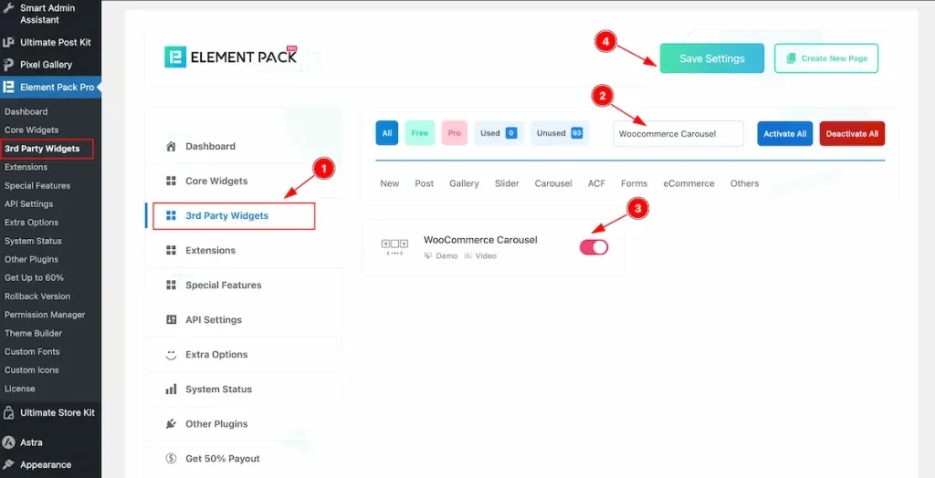
To use the Woocommerce Carousel widget from Element Pack Pro, first, you have to enable the Core Widgets. Navigate to the WordPress Dashboard.
- Go to Element Pack Pro > Core Widgets section.
- Search by the Widget Name ” Woocommerce Carousel ” and it will appear the.
- Now Enable the Switcher of the Woocommerce Carousel Widget.
- Hit the Save Settings button.
How to insert WooCommerce carousel
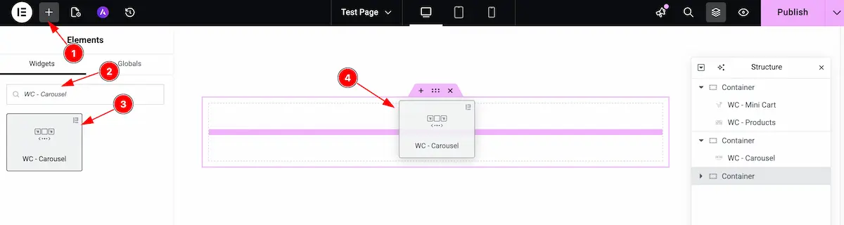
- Go to the Elementor Editor page and click the Add Element “+” icon.
- Search for the WC – Carousel widget by name.
- The widget will appear — you can check the Element Pack Pro logo on the top-right corner.
- Select the widget, then drag and drop it onto the editor page.
Customize the layout under the Content tab
For almost all widgets, the Content tab holds all the base settings that will help your shift the content layout of this cost calculator widget. This is where we put all the required adjustments that you need to make variations to the default setup and make unique content out of it.
Let us briefly describe everything inside the content tab.
Layout section
Go to Content > Layout
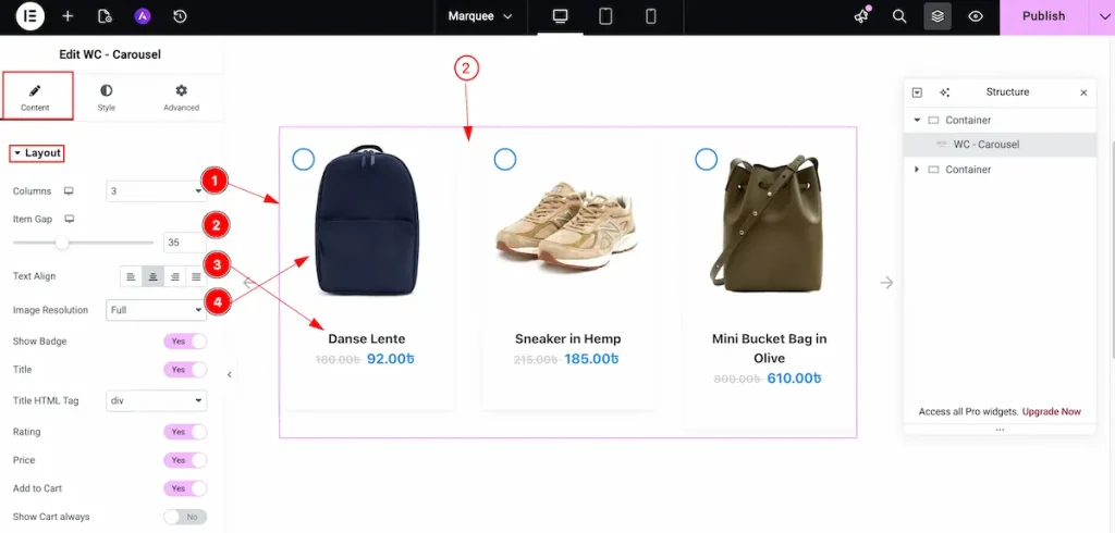
- Columns: Choose the columns layout for the carousel.
- Item Gap: Set the gap between the columns.
- Tex Align: Set the position for the text, Left, Center, Right, and Justified.
- Image Resolution: Choose the resolution for the Images. Set the full image for the images.
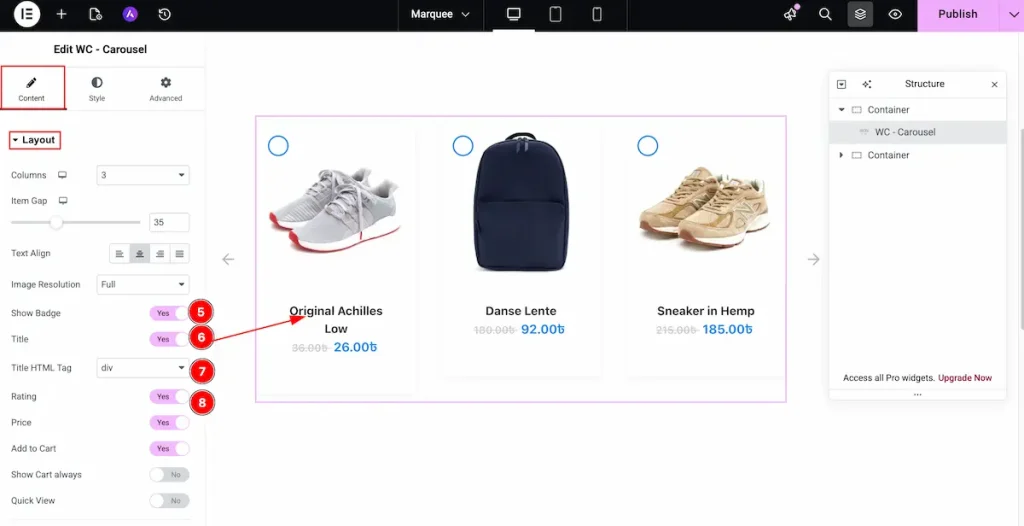
- Show Badge: Enable the switcher to show the badge of this products.
- Title: Enable the switcher to show the Title of the product.
- Title HTML Tag: Set any HTML Tag for Title ( H1, H2, H3, H4, H5, H6, p, span ). The title tag is essential for both user experience and search engine optimization (SEO).
- Rating: Enable the switcher to show the rating of the product.
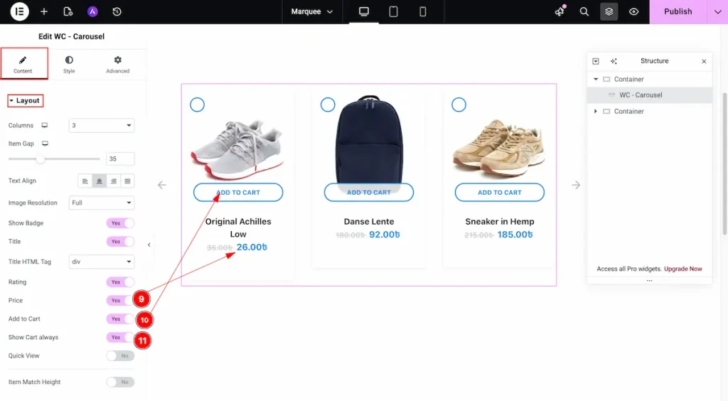
- Price: Enable the switcher to show the Price for the Title.
- Add to Cart: Enable the switcher to show the Cart.
- Show Cart Always: Enable the switcher to show the show the cart.
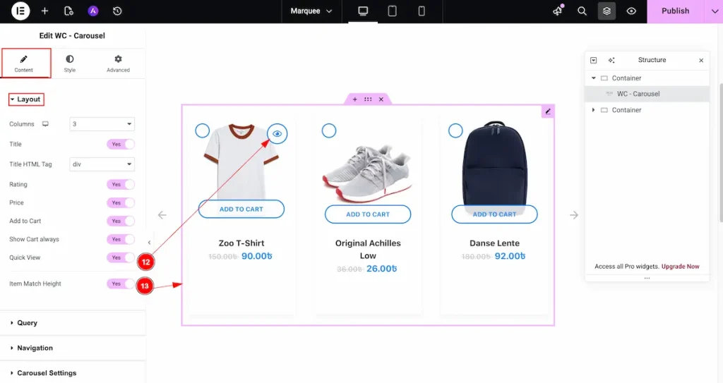
- Quick View: Enable the switcher to show the quick view button. It will appear while hover over the item.
- Item Match Height: Enable the switcher to match all the height of the content.
Query section
Go to Content > Query
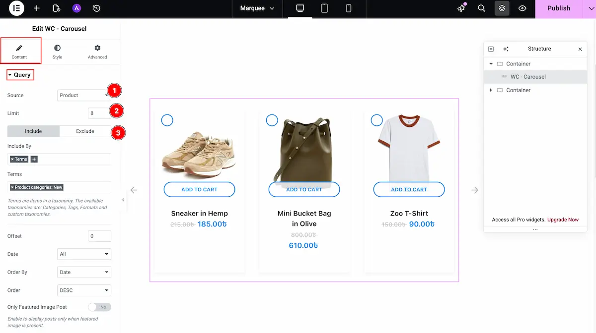
- Source: Choose the source for the query.
- Limit: Set the limitation for the source.
- Include: Choose the included for different type of this content.
Navigation section
Go to Content > Navigation
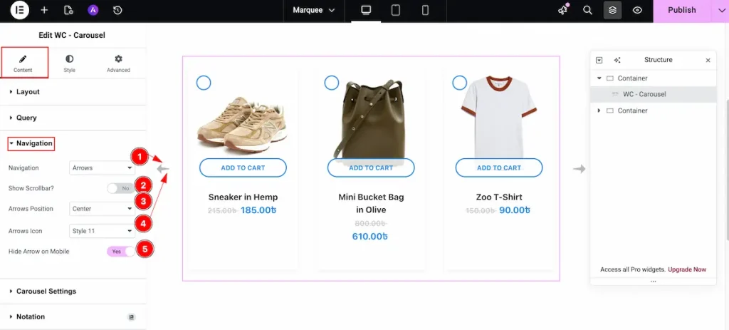
- Navigation: Choose the navigation for the carousel. Select the Arrows as icon.
- Show Scrollbar?: To demonstrate the scrollbar enable the switcher.
- Arrows Position: Set the position for the arrows.
- Arrows Icon: Select the icon for the arrows. Different type of icon available now.
- Hide Arrow on Mobile: Enable the switcher to hide the arrow on Mobile.
Carousel Settings section
Go to Content > Carousel Settings
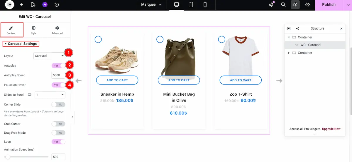
- Layout: Select the layout for the carousel.
- Autoplay: Enable the switcher to make it autoplay.
- Autoplay Speed: Now set the speed for the autoplay of this carousel.
- Pause on Hover: Enable the switcher to pause the carousel on hover over the carousel.
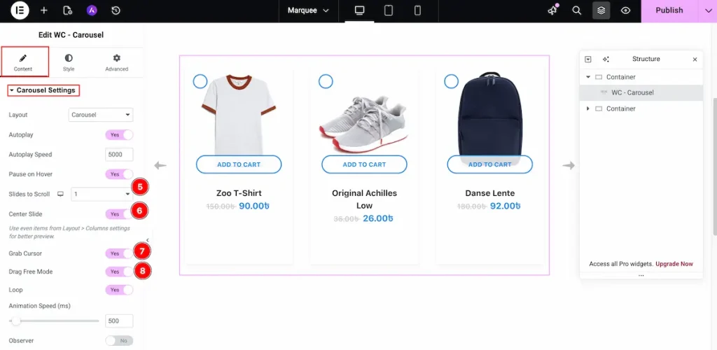
- Slides to Scroll: Choose how many slide will scroll at a time. Select the position for this.
- Center Slide: Enable the slider for the centre slide.
- Grab Cursor: Enable slider to grab the slider using the cursor.
- Drag Free Mode: It drag the carousel easily.
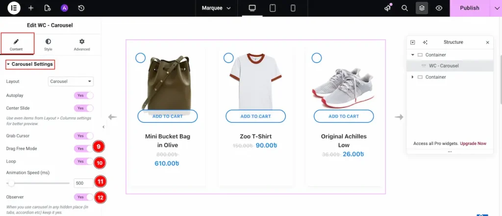
- Loop: Enable the switcher to loop the carousel item.
- Animation ( Speed ms ): Choose the speed in ms. It will demonstrate the speed of this.
- Observer: Choose the observer Auto refresh when layout changes. Enable this to demonstrate the beautiful design.
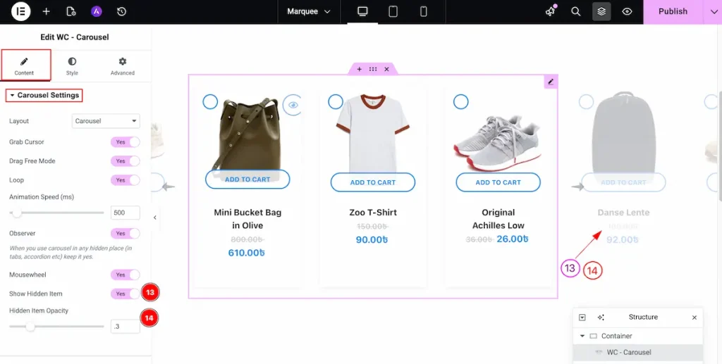
- Show Hidden Item: Enable the switcher to demonstrate the hidden items of the carousel. It will appear the hidden item excluding the selected grid columns item.
- Hidden Item Opacity: Set the opacity of the hidden items. The Opacity range is 0 – 1 and step is .1
Style tab customizations
Item section
Go to Style > Item
Normal Tab
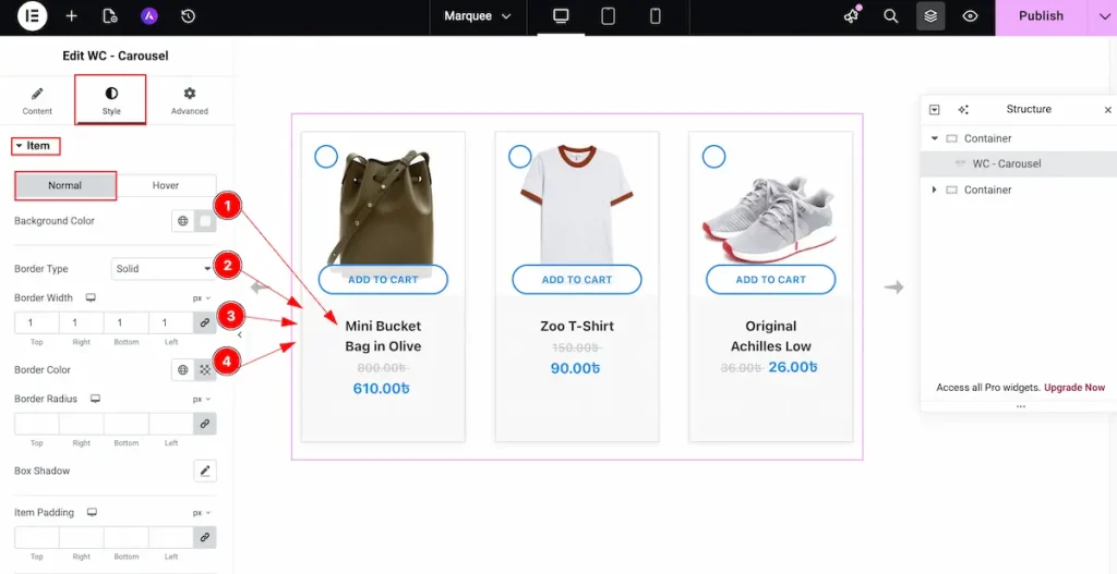
- Background Color: Choose the color for the Item background. It demonstrate the beautiful visibility for the Items.
- Border Type: Choose the type of the border. Border Types are Solid, Dashed, Dotted etc.
- Border Width: Set the thickness of the border.
- Border Color: Choose the color for the border. It displays beautiful design for the border.
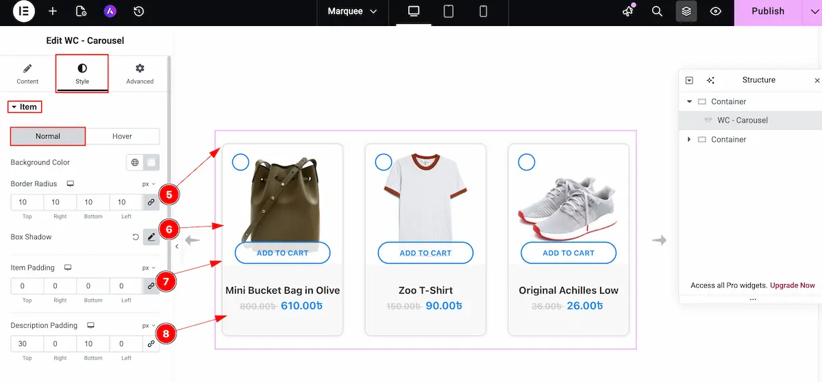
- Border Radius: Choose the border corner edges rounded by selecting the radius.
- Box Shadow: Set a shadow for the box.
- Item Padding: Choose the padding for the Item. It demonstrate the inner space of the Items.
- Description Padding: Set the description padding for content item inner spaces.

Hover
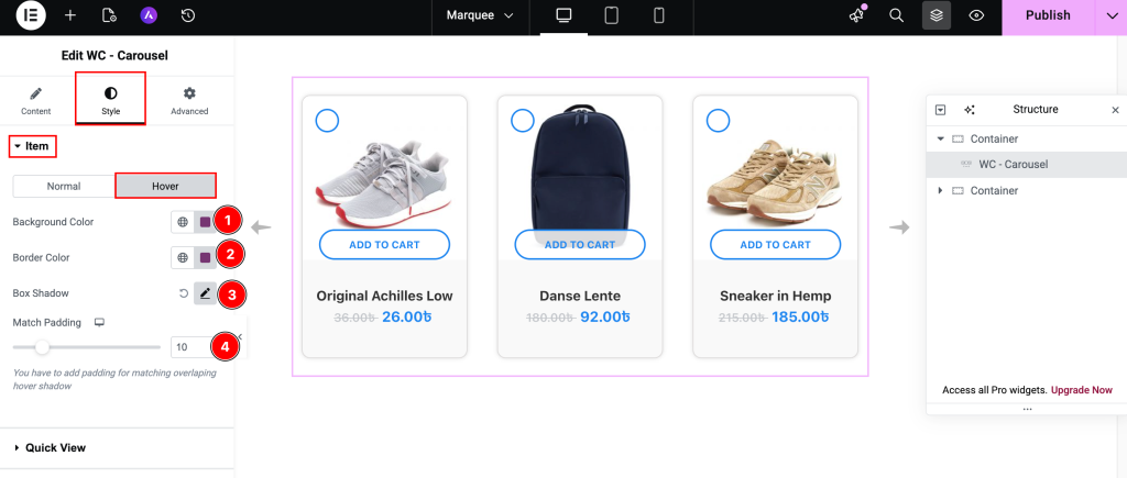
- Background Color: Set the background for the Items. It will demonstrate on hover over the Item.
- Border Color: Choose the border color of the items.
- Box Shadow: Set the shadow of the Box.
- Match Padding: Select the padding for the match items.
Title section
Go to Style > Title
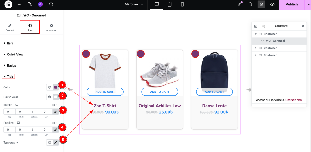
- Color: Choose the color for the Title of Item.
- Hover Color: Select the hover color of this. It will demonstrate after hover over it.
- Margin: Set the margin for the Title.
- Padding: Choose the padding for the Title. It refer the inner space of the Title.
- Typography: Set the typography for the Title. It will appear all the items for the Title.
Price section
Go to Style > Price
Old Price
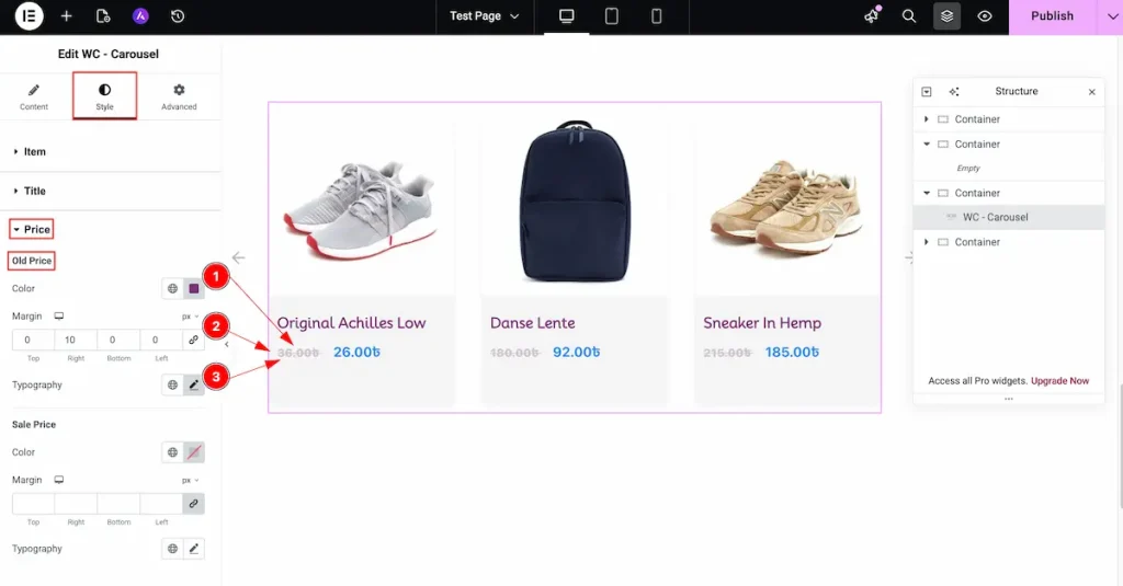
- Color: Select the color for the old price. Highlighting it can compare easily.
- Margin: Set the outer space for the margin.
- Typography: Choose the typography for the Price section.
Sale Price
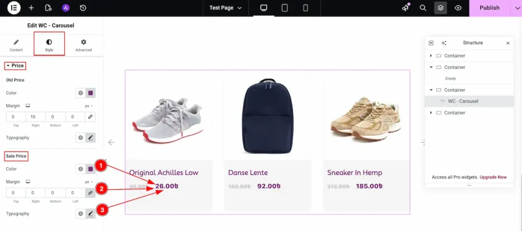
- Color: Select the color for the Sale price. It refer the current price of this product.
- Margin: Set the outer space for the margin.
- Typography: Choose the typography for the Sale Price section.
Add to Cart Button section
Go to Style > Add to Cart Button
Normal Tab
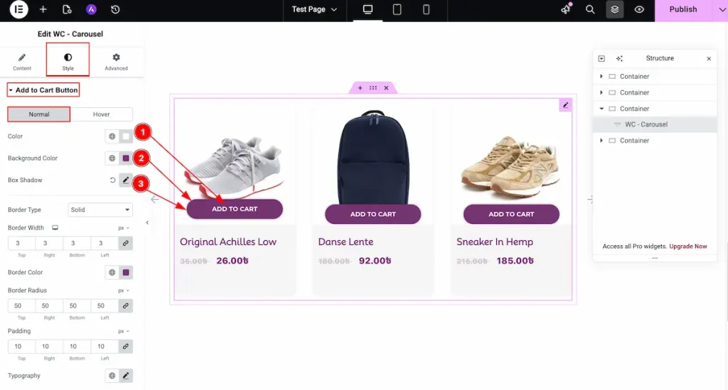
- Color: Choose the color for the Button text.
- Background Color: Select the background color for the button. It represent the beauty of this button.
- Box Shadow: Set a shadow for the button.
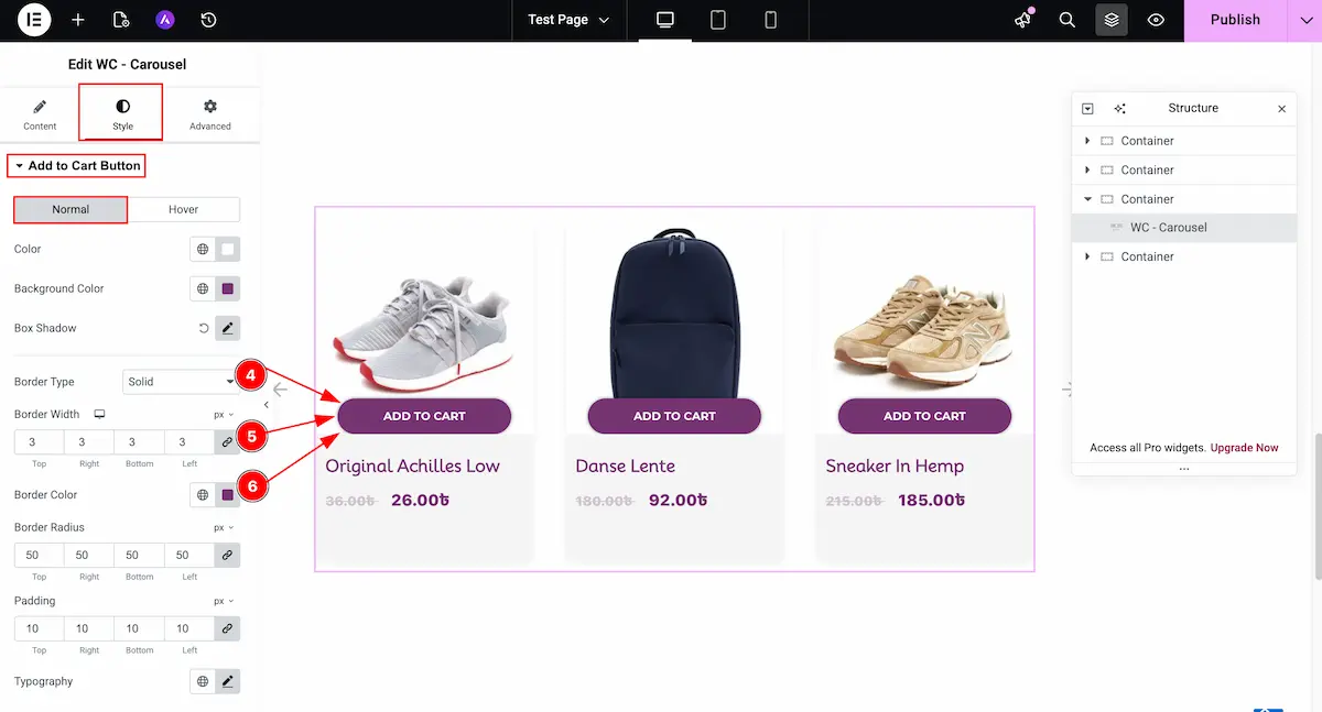
- Border Type: Select the type for the border. Different types are available for the button.
- Border Width: Set the thickness for the border.
- Border Color: Select the color for the Border.
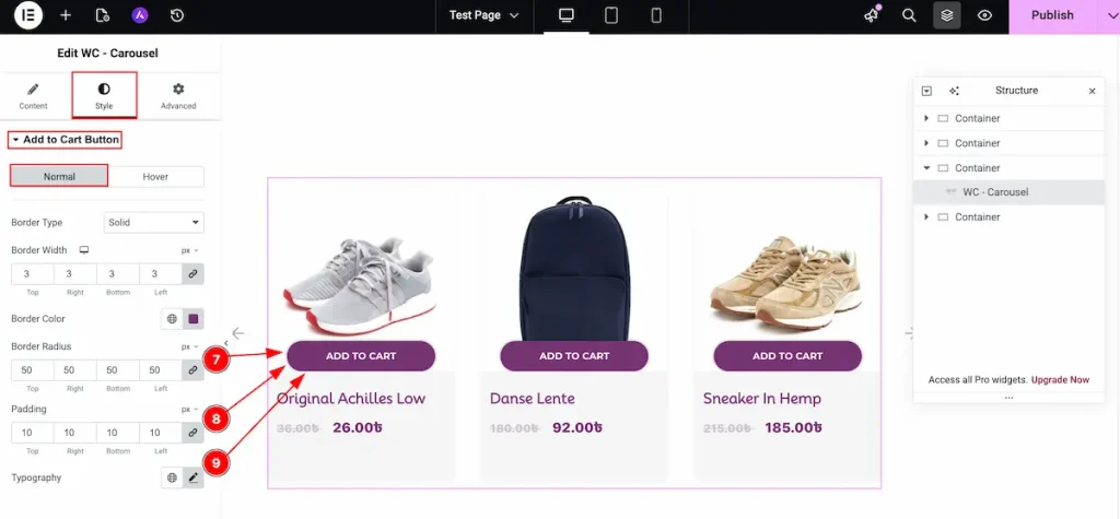
- Border Radius: Make the border corner edges rounded by selecting the border.
- Padding: Choose the padding for the button. It works as inner space.
- Typography: Select the typography for the button.
Hover Tab
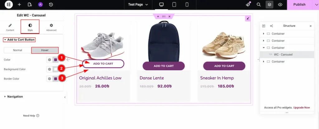
- Color: Choose the color for the text.
- Background Color: Set the background color for the button.
- Border Color: Choose the color for the border.
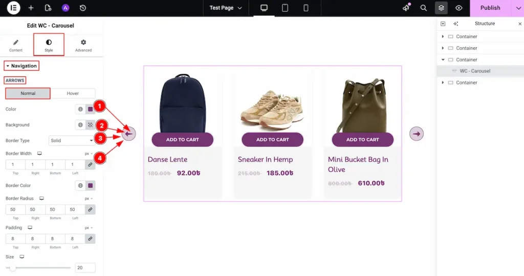
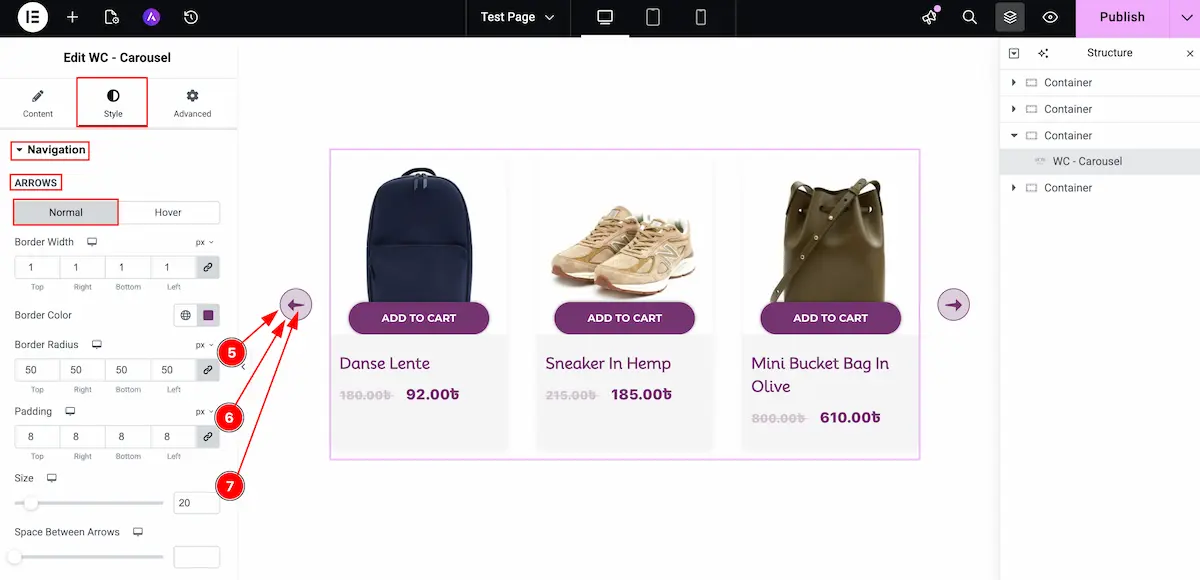
Navigation section
Go to Style > Navigation
Normal Tab
- Color: Choose the color for the arrows.
- Background: Set the background color for the arrows area.
- Border Type: Choose the border type from Dashed, dotted, double etc.
- Border Width: Set the thickness for the border.
- Border Radius: Set the radius for the border. It will rounded the corner edges.
- Padding: Set the padding for the border.
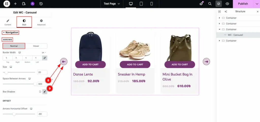
- Size: Choose the size for arrows.
- Space Between Arrows: Select the space between the arrows. It represent the gap between them.
- Box Shadow: Make a shadow for the edges for the background.
Hover Tab
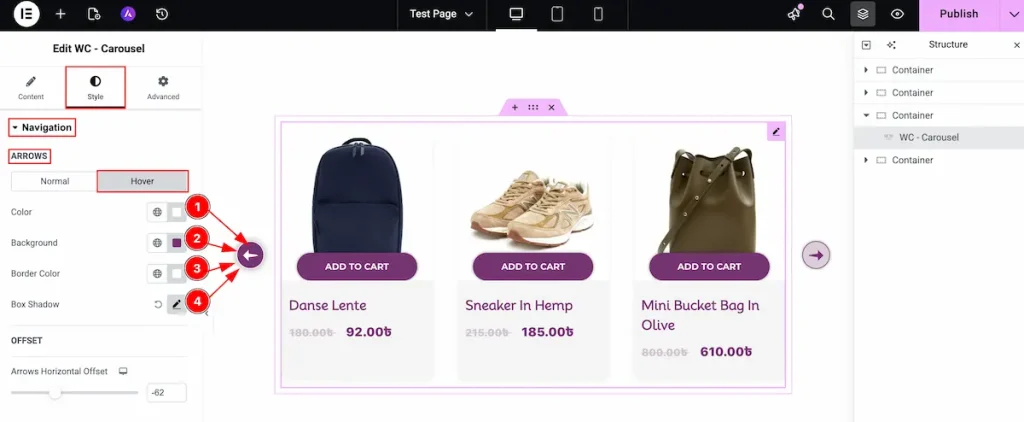
- Color: Choose the color for the arrows. The color will appear on hover over it.
- Background: Select the background color.
- Border Color: Choose the border color for the hover tab.
- Box Shadow: Make a shadow for the box.
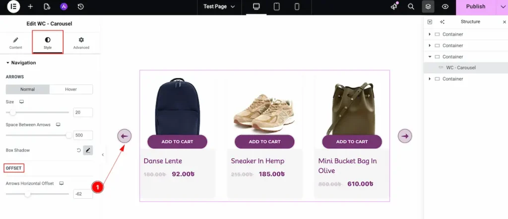
OFFSET
- Arrows Horizontal Offset: Set the offset between the arrows in horizontal line.
Video Assist
Watch this video to learn more about the WooCommerce Carousel widget. Please visit the demo page for examples.
Thanks for being with us.