In this documentation, we will discuss the customization of the Timeline widget, brought to you by the Element Pack Pro addon for Elementor.
Enable The Timeline Widget
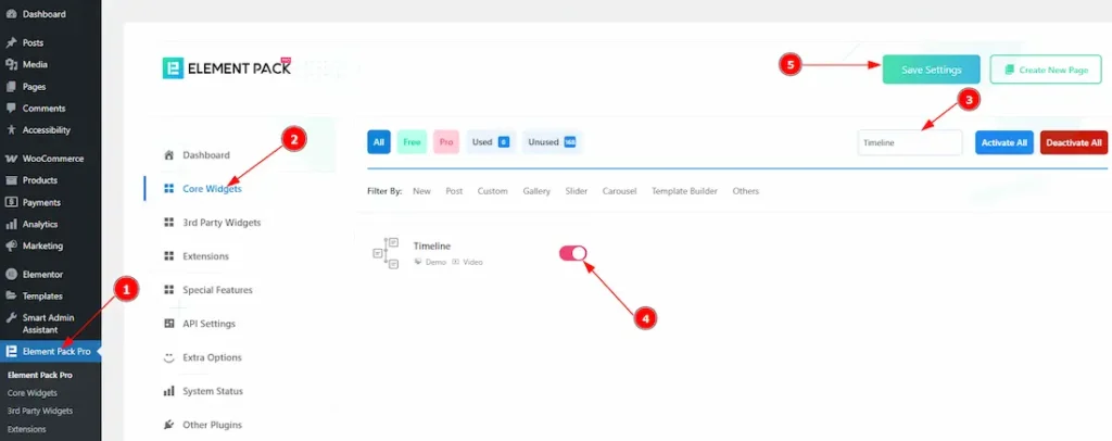
To use the Timeline widget from Element Pack Pro, first, you have to enable the widget.
- Go to WordPress dashboard > Element Pack Pro Plugin dashboard.
- Then, Click the Core Widgets Tab.
- Search the Timeline Widget Name.
- Enable the Timeline Widget.
- Hit the Save Settings Button.
Inserting The Timeline widget
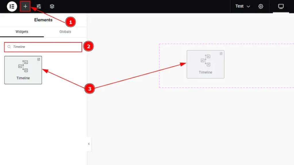
1. Go to the Elementor Editor Page and Hit the “+” icon Button.
2. Search the Timeline widget.
3. Drag the widget and Drop it on the editor page.
Work With The Content Tab
Layout Section
Go to Content > Layout
When you select the skin type Default:
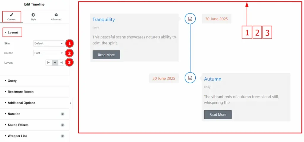
1. Skin: This option allows you to change the skin type. Here, we selected the skin type as Default.
2. Source: You can select the timeline content source as Post or Custom Content with this option. Below, we will discuss both Post & Custom Content customization separately.
3. Layout: You can adjust the timeline content layout to left, center or right with this option. Here we selected the layout as center.
When you select the skin type as Olivier:
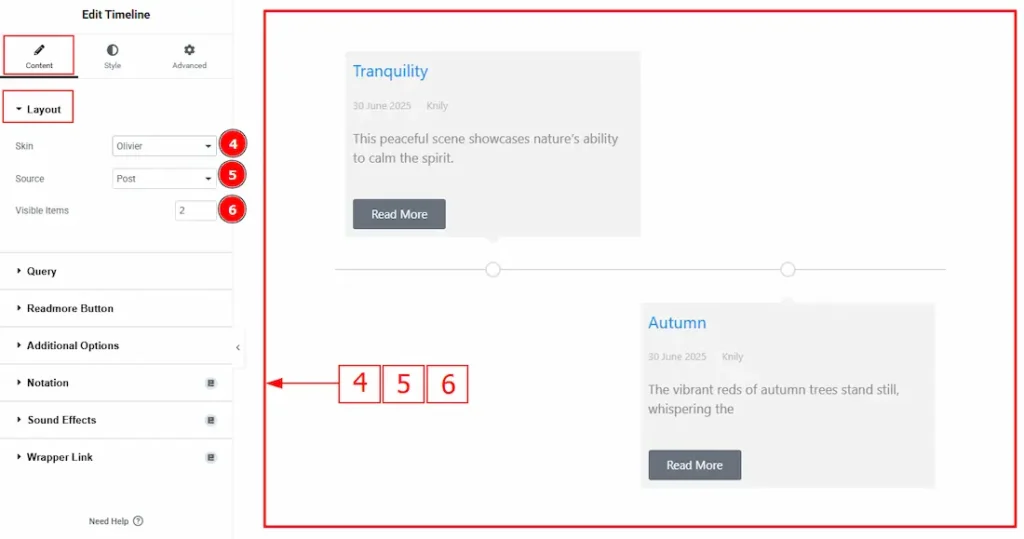
4. Skin: This option allows you to change the skin type. Here, we selected the skin type as Default.
5. Source: You can select the timeline content source as Post or Custom Content with this option.
6. Visible Items: You can manage the item’s number that you want to show to your audience with this option.
Query Section
Go to Content > Query
If you select the source as Post:
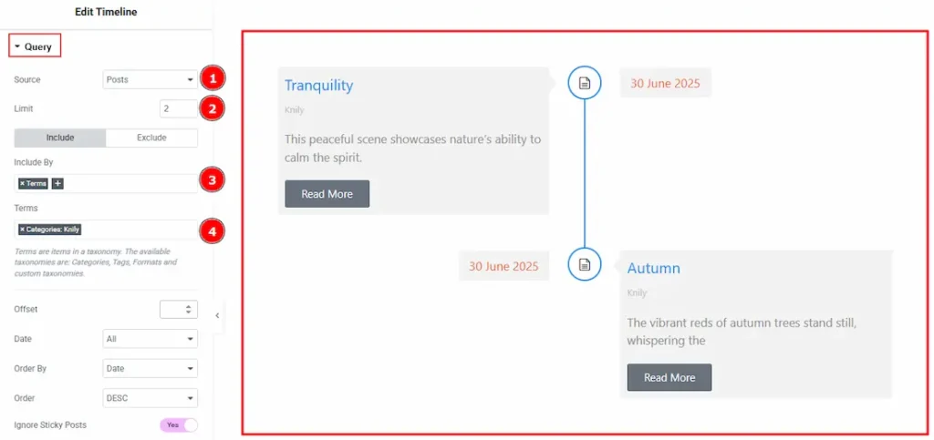
1. Source: Select the source for the timeline from here. The types of sources are – Posts, Pages, Floating Elements,Testimonials, Downloads, Products, Events, Mega Menu Items, Template Items, Manual Selection, Current Query, Related. Here we selected the type as posts.
2. Limit: You can adjust the limit here of how many posts you want to show in the timeline.
3. Include/Exclude Selection: Select the Include / Exclude filter to show/hide specific posts by Terms (Tags/Categories) or Authors. Here, we selected the include field as Terms.
4. Terms: You can select the categories with this option.
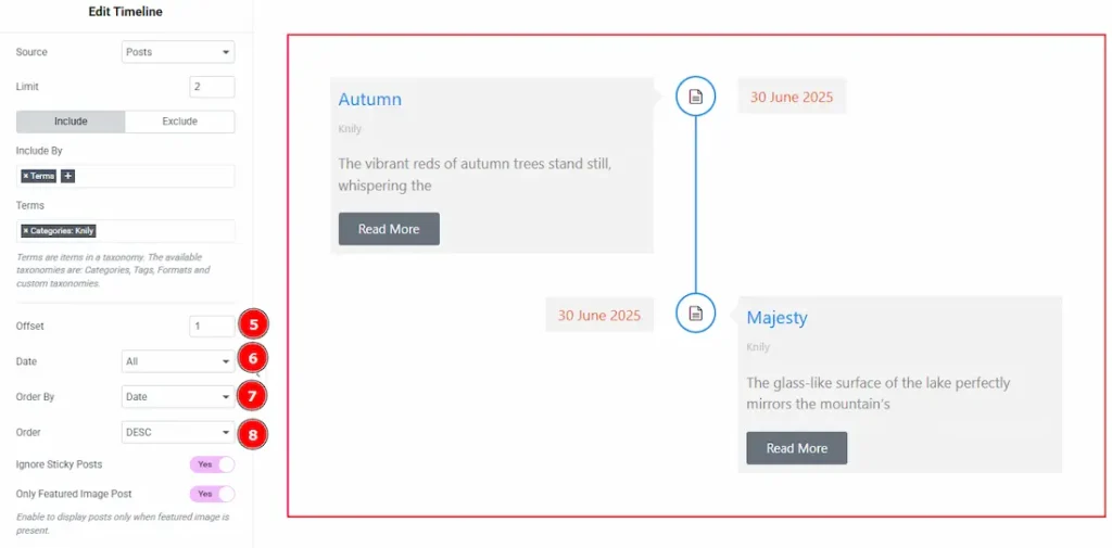
5. Offset: This option allows you to skips a set number of posts from the beginning before displaying the results.
6. Date: You can select the post as per the date of creation with this option.
7. Order By: It controls the data you want to display through title, id, date, author, comment count, menu order & random. Here we selected the order as date.
8. Order: This option controls the order by which data is arranged. There are two types of order. Ascending Order (Starts from the smallest or lowest value and goes to the largest or highest.) & Descending Order (Starts from the largest or highest value and goes to the smallest or lowest.)
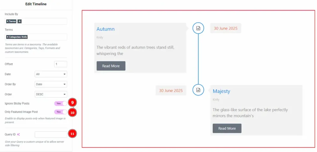
9. Ignore Sticky Posts: Enable or Disable the switcher to hide or show the sticky posts.
10. Only Featured Image Post: Enable or disable the switcher to show or hide the featured image post.
11. Query ID: Give your query a custom, unique ID to allow server-side filtering. Learn more about the Query.
Custom Content Section
Go to Content > Custom Content
If you select the source as Custom Content:
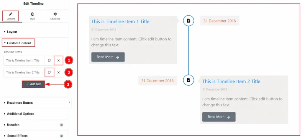
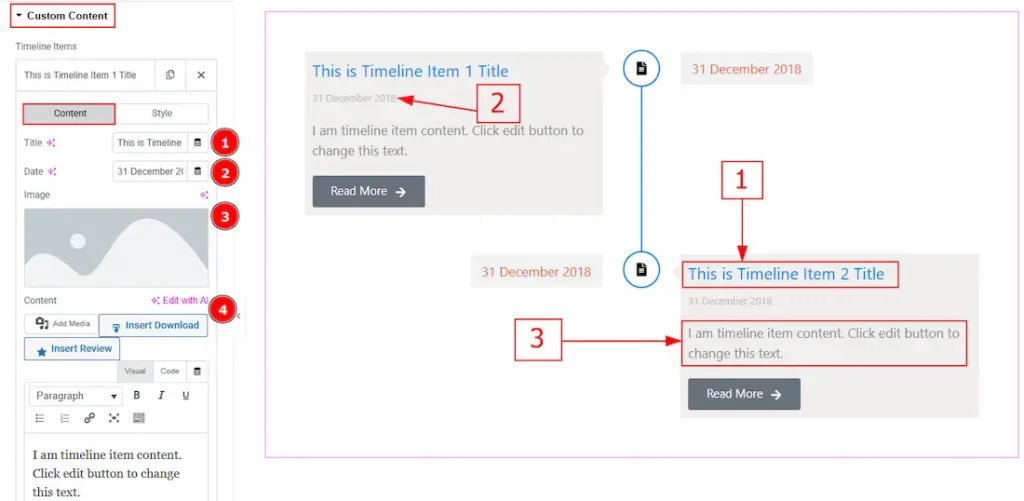
1. Close Item: You can delete the Slider item by clicking the Close icon button.
2. Copy Item: This option lets you copy the same item.
3. Add Item: You can add a new item by clicking the “+” Add Item button.
Now, let’s proceed to the inner options of the custom content. Here we have two tabs. These are Content & Style. Let’s start with the Content tab –
1. Title: You can add a title to your content with this option.
2. Date: You can make changes to the content date with this option.
3. Image: This option allows you to add an image to the content.
4. Content: You can add and customize content with this option.
Now, let’s proceed to the Style tab –
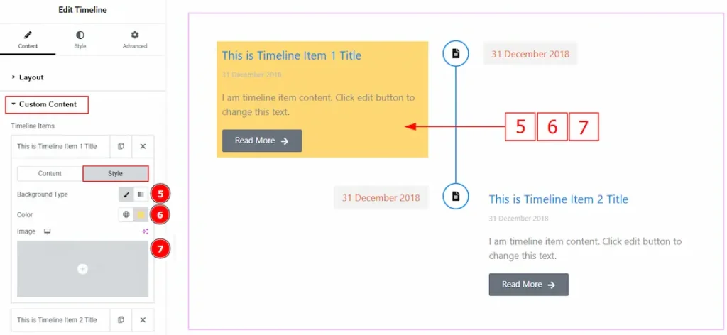
5. Background Type: You can change the background type to classic or gradient with this option. Here, we selected the background type as classic.
6. Color: You can change the background color with this option.
7. Image: You can change the background image with this option.
Readmore Button Section
Go to Content > Readmore Button
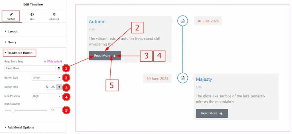
1. Read More Text: You can add the read more button text with this option.
2. Button Size: You can adjust the readmore button size with this option.
3. Button Icon: You can add icon to the button with this option.
4. Icon Position: You can adjust the icon position to left or right of the button with this option.
5. Icon Spacing: You can adjust the space between the text and the icon of the button with this option.
Additional Options Section
Go to Content > Additional Options
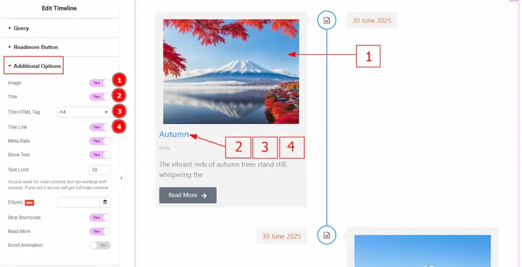
1. Image: Enable the switcher to show image to the audience.
2. Title: Enable the switcher to show the title to the audience.
3. Title HTML Tag: This option lets you select the heading for the title.
4. Title Link: Enable the switcher to link up the title with this option.
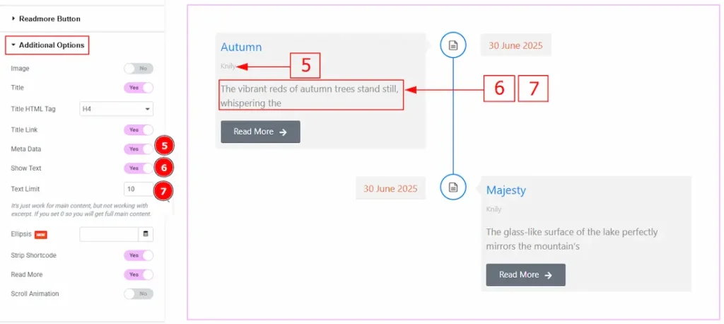
5. Meta Data: Enable the switcher to visible the meta text to the audience.
6. Show Text: Enable the switcher to visible text to the audience.
7. Text Limit: This option allows you to adjust the text’s word limit.
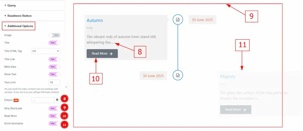
8. Ellipsis: This option let’s you add symbol that appears after truncated text.
9. Strip Shortcode: Enable the switcher to remove any shortcode from the content.
10. Read More: Enable the switcher to add button below the content, linking to the full post.
11. Scroll Animation: Enable the switcher to add animation while scrolling with this option.
Work with The Style Tab
Item Section
Go to Style > Item
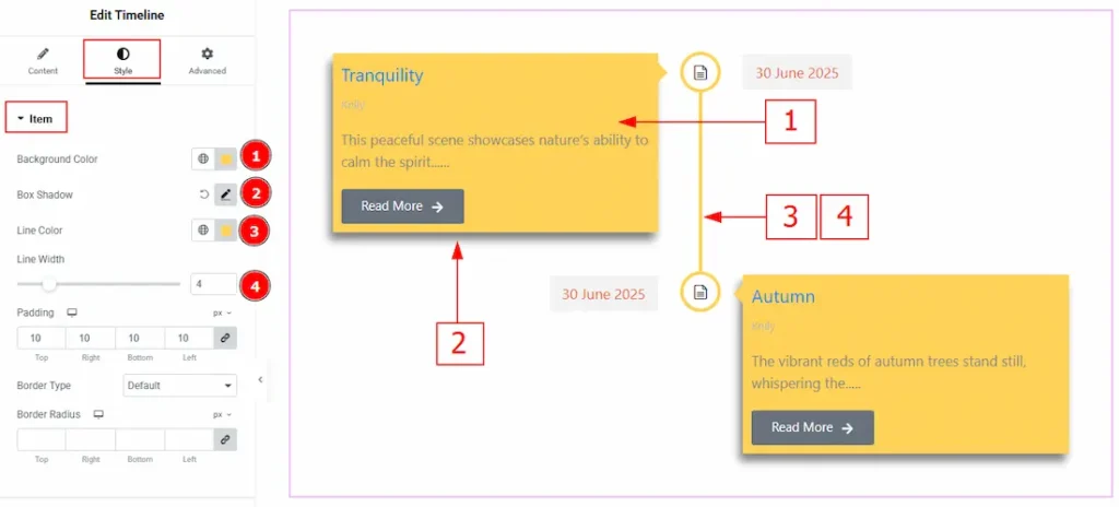
1. Background Color: You can change the ackground color with this option.
2. Box Shadow: You can add a shadow to the items with this option.
3. Line Color: You can change the line color with this option.
4. Line Width: Set the thickness of the line with this option.
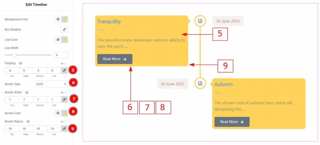
5. Padding: Add spaces around an object to increase the inner area. Padding allows you to control the internal space within an element.
6. Border Type: This option allows you to add borders to your items. You can select various border types from this option. Such as Solid, Double, Dotted, Dashed, Groove.
7. Border Width: Set the thickness of the border with this option.
8. Border Color: You can change the border color with this option.
9. Border Radius: This option controls the roundness of the border with this option.
Icon Section
Go to Style > Icon
In this section, we have two more tabs. One is Normal and the other is Hover. Let’s start with the Normal Tab –
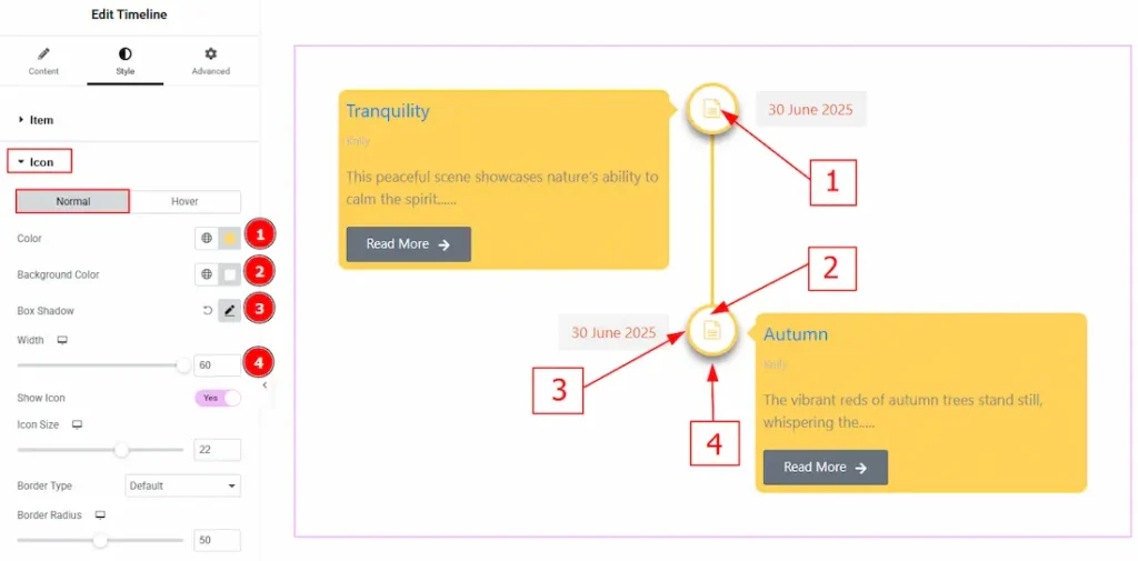
1. Color: You can change the icon color with this option.
2. Background Color: You can change the background color with this option.
3. Box Shadow: You can add the shadow effect to the button with this option.
4. Width: Set the thickness of the border with this option.
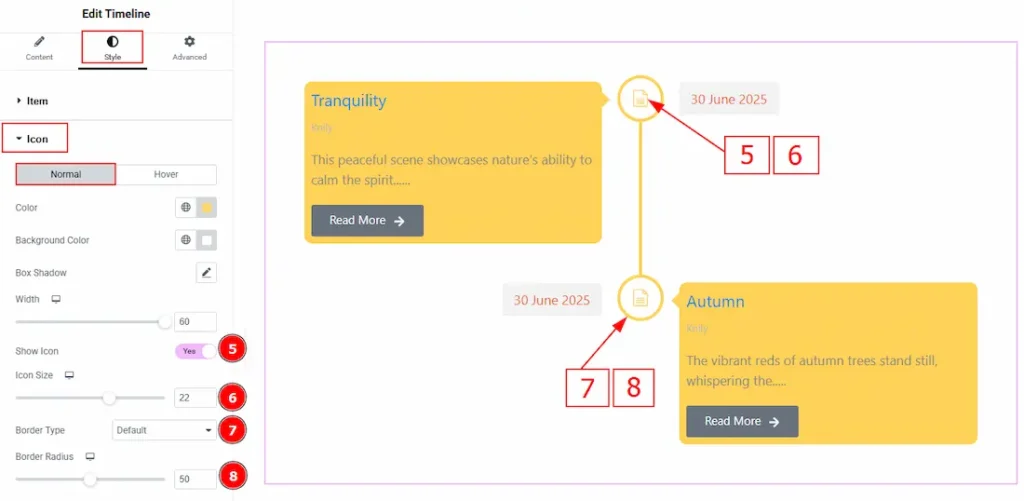
5. Show Icon: Enable the switcher to make the icon visible to the audience.
6. Icon Size: You can make changes to the icon size with this option.
7. Border Type: You can select and add a border to the icon with this option.
8. Border Radius: This option controls the roundness of the border.
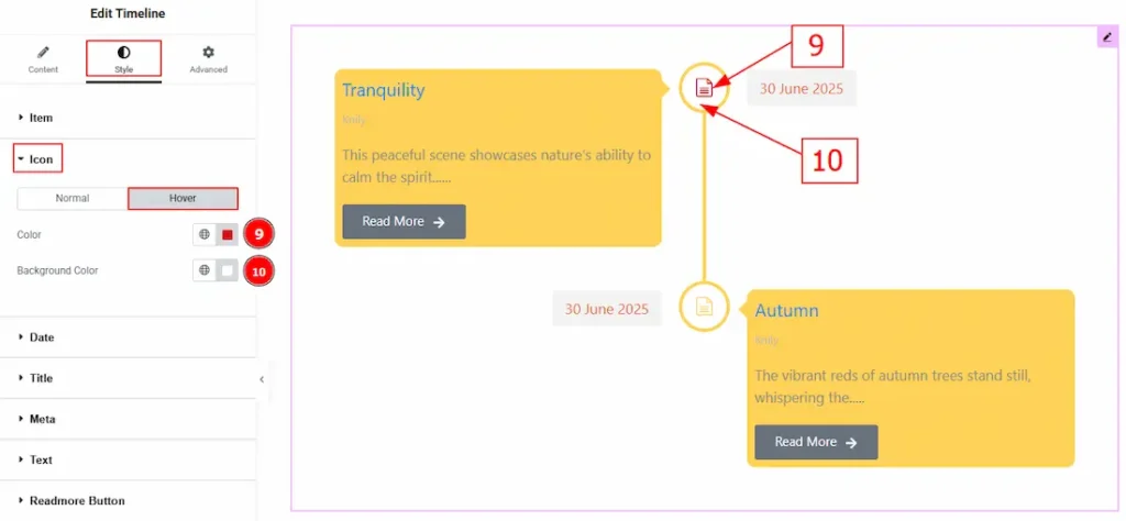
Now, Let’s Proceed to the Hover Tab –
9. Color: You can change the icon hover color with this option.
10. Background Color: You can change the background hover color with this option.
Date Section
Go to Style > Date
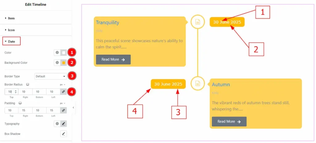
1. Color: You can change the date text color with this option.
2. Background Color: You can change the background color with this option.
3. Border Type: You can add a border to the date with this option.
4. Border Radius: This option controls the roundness of the border with this option.
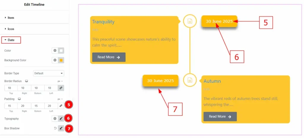
5. Padding: You can adjust the inner space of the social icon with this option.
6. Typography: Change the font family, size, weight, transform, style, decoration, line height, letter spacing, and word spacing from here.
7. Box Shadow: You can add a shadow effect around the date with this option.
Title Section
Go to Style > Title
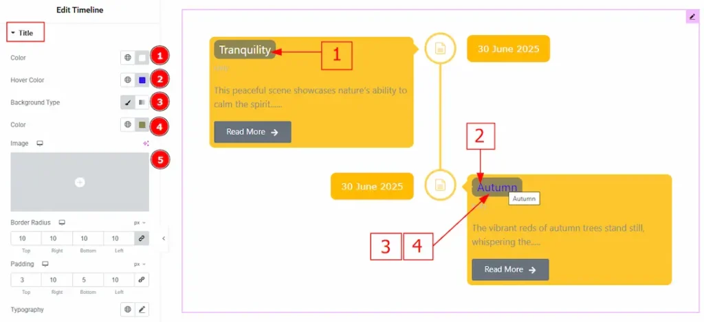
1. Color: You can change the title color with this option.
2. Hover Color: You can change the title hover color with this option.
3. Background Type: This option allows you to select the background type to classic or gradient. Here we selected the background type as classic.
4. Color: You can change the background type with this option.
5. Image: You can add or change background image with this option.
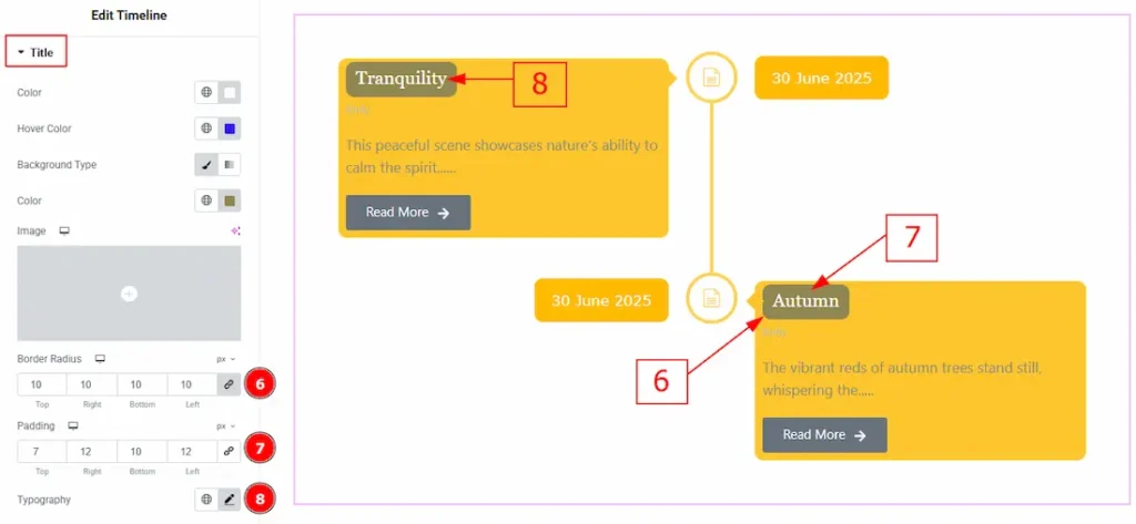
6. Border Radius: This option controls the roundness of the border.
7. Padding: You can adjust the inner space of the title field with this option.
8. Typography: Change the font family, size, weight, transform, style, decoration, line height, letter spacing, and word spacing from here.
Meta Section
Go to Style > Meta
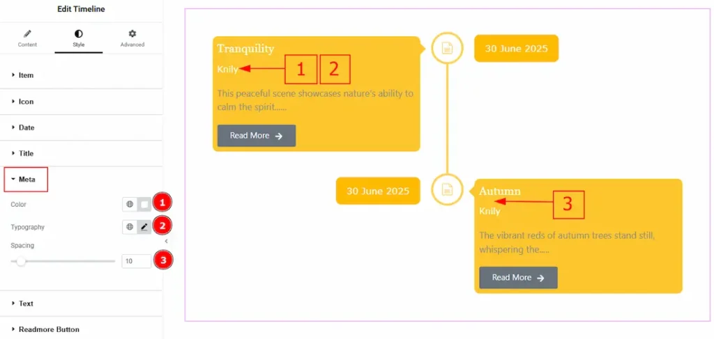
1. Color: You can change the meta text color with this option.
2. Typography: Change the font family, size, weight, transform, style, decoration, line height, letter spacing, and word spacing from here.
3. Spacing: You can adjust the space between the title and the meta with this option.
Text Section
Go to Style > Text
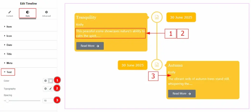
1. Color: You can change the text color with this option.
2. Typography: Change the font family, size, weight, transform, style, decoration, line height, letter spacing, and word spacing from here.
3. Spacing: You can adjust the space between the meta and the text with this option.
Readmore Button Section
Go to Style > Readmore Button
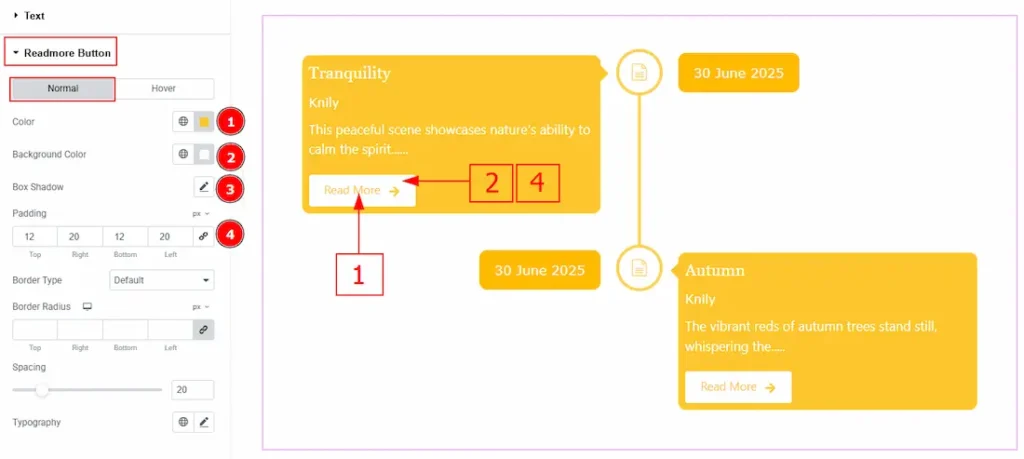
In this Section, we have two tabs. These are Normal & Hover. Let’s start with the Normal Tab –
1. Color: You can change the readmore button text color with this option.
2. Background Color: You can change the background color with this option.
3. Box Shadow: You can add a shadow effect to the readmore button with this option.
4. Padding: You can adjust the inner space of the button with this option.
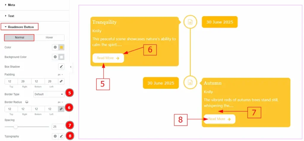
5. Border Type: This option allows you to add a border.
6. Border Radius: This option controls the roundness of the border.
7. Spacing: You can adjust the space between the text and the button with this option.
8. Typography: Change the font family, size, weight, transform, style, decoration, line height, letter spacing, and word spacing from here.
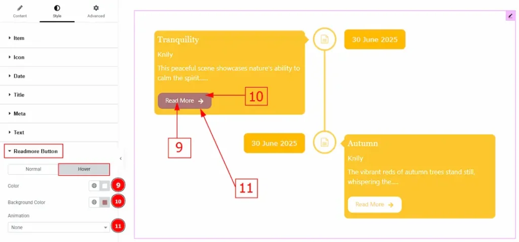
Now, let’s proceed to the Hover Tab –
9. Color: You can change the button text hover color with this option.
10. Background Color: You can change the background hover color with this option.
11. Animation: This option allows you to add various types of animation styles to the readmore button.
All done! You have successfully customized the Timeline Widget on your website.
Video Assist
You can also watch the video tutorial to learn more about the Timeline widget. Please visit the demo page for examples.
Thanks for being with us.