The Tags Cloud widget is a flexible and visually appealing way to display post tags on your website, fully integrated into Element Pack Pro. It helps organize and highlight your content by presenting tags in a customizable cloud layout, making navigation easier for visitors. In this documentation, we will explore the customization options of the Tags Cloud widget provided by Element Pack Pro for Elementor.
Enable The Tags Cloud Widget
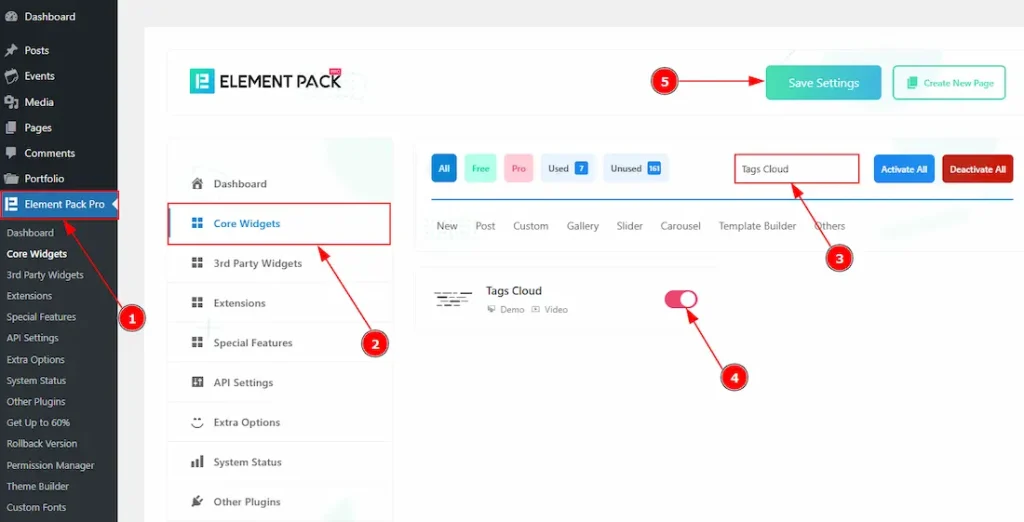
To use the Tags Cloud widget from Element Pack Pro, first, you have to enable the widget.
- Go to WordPress dashboard → Element Pack Pro Plugin dashboard.
- Then, Click the Core Widgets Tab.
- Search the Tags Cloud Widget Name.
- Enable the Tags Cloud Widget.
- Hit the Save Settings Button.
Inserting The Tags Cloud Widget
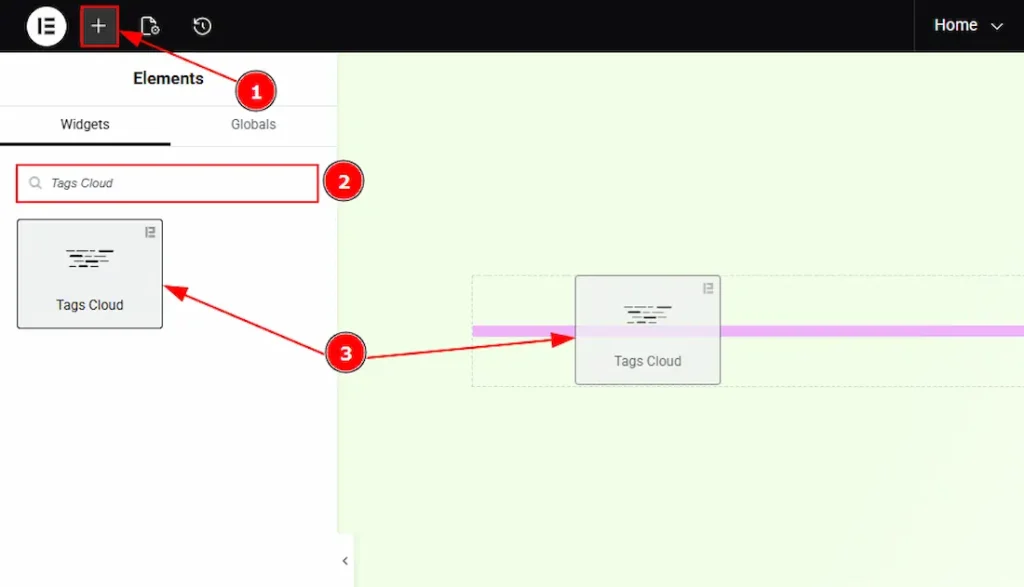
1. Go to the Elementor Editor Page and hit the “+” icon Button.
2. Search the Tags Cloud name.
3. Drag the widget and drop it on the editor page.
Work With The Content Tab
Tags Cloud Section
Go to Content → Tags Cloud
The Tags Cloud widget offers three skin types for displaying post or product tags: Default, Animated, and Typography. Each skin provides a unique visual style and interaction. Let us describe one by one, how each skin works and how it displays tags to your audience.
Default Skin
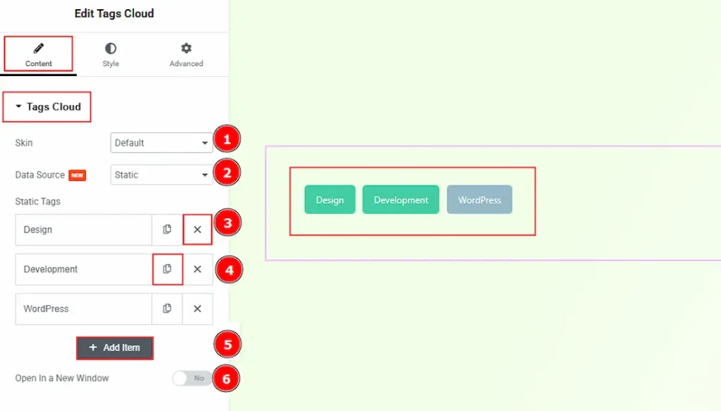
1. Skin: Among the three provided skins, we have selected the default skin. You will get to see this outlook when you select the default skin.
2. Data Source: The Source option allows you to choose how data is collected and displayed. Two data source types are available: Static and Dynamic. The Static source enables you to manually add custom data, while the Dynamic source retrieves data automatically from post or product tags. Since the Static data source is selected, the following options are available for adding tags.
3. Close Item: You can delete the Slider item by clicking the Close icon button.
4. Copy Item: This option lets you copy the same item.
5. Add Item: You can add a new item by clicking the “+” Add Item button.
6. Open In a New Window: Enable the switcher to open in a new window when someone clicks on the tags. (For this, you need to add links to your tags when you are in the static data source.)
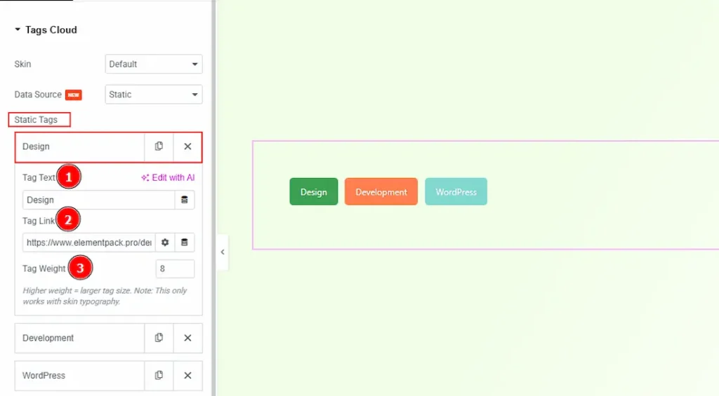
In the Static tags Items, each item contains more options. These are –
1. Tag Text: You can add the tag name in this field.
2. Tag Link: You can add the tag link in this field.
3. Tag Weight: This option controls the size of the tag. The higher weight means the larger tag size. (Note: This option only works with the Typography Skin.)
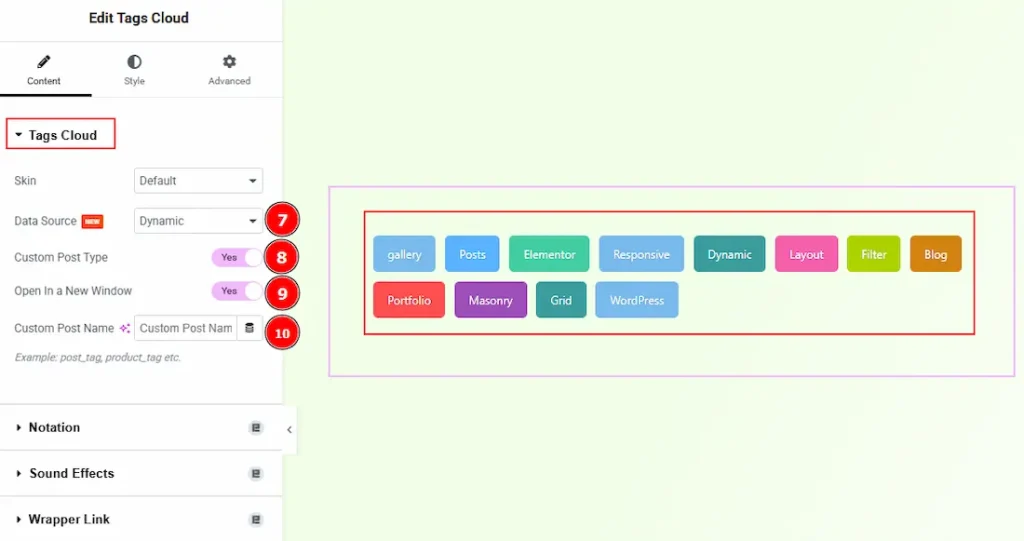
If you have selected the Data Source Dynamic instead of Static, then you will get the following options –
1. Data Source: When the Data Source is set to Dynamic, the Tags Cloud widget retrieves and displays tags automatically from WordPress content.
2. Custom Post Type: Enable the switcher to retrieve tags from a specific custom post type instead of default posts.
3. Open In a New Window: Enable the switcher to open in a new window when someone clicks on the tags.
4. Custom Post Name: This option lets you define which type of tags the widget should display. You need to enter the taxonomy name from which the tags will be collected.
For example, use post_tag to display blog post tags, or product_tag to display WooCommerce product tags. The entered value must match an existing taxonomy in WordPress; otherwise, no tags will be shown.
Animated Skin
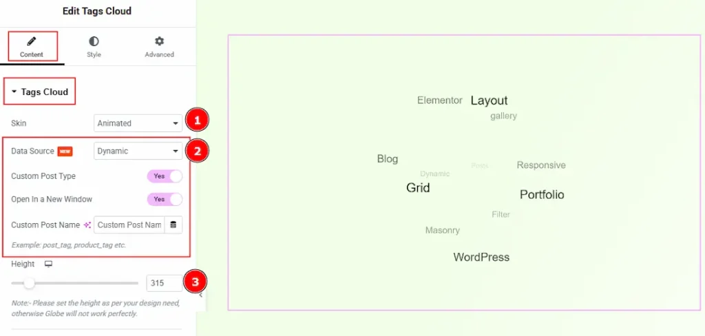
1. Skin: Here, you can select the skin type of the tags cloud as Animated.
2. Data Source: You can select the data source between static & dynamic with this option. We have described all the options of static & dynamic in the default skin. Please check above.
3. Height: You can make changes to the animated globe height with this option. Please set the height as per your design needs. Otherwise, Globe will not work perfectly.
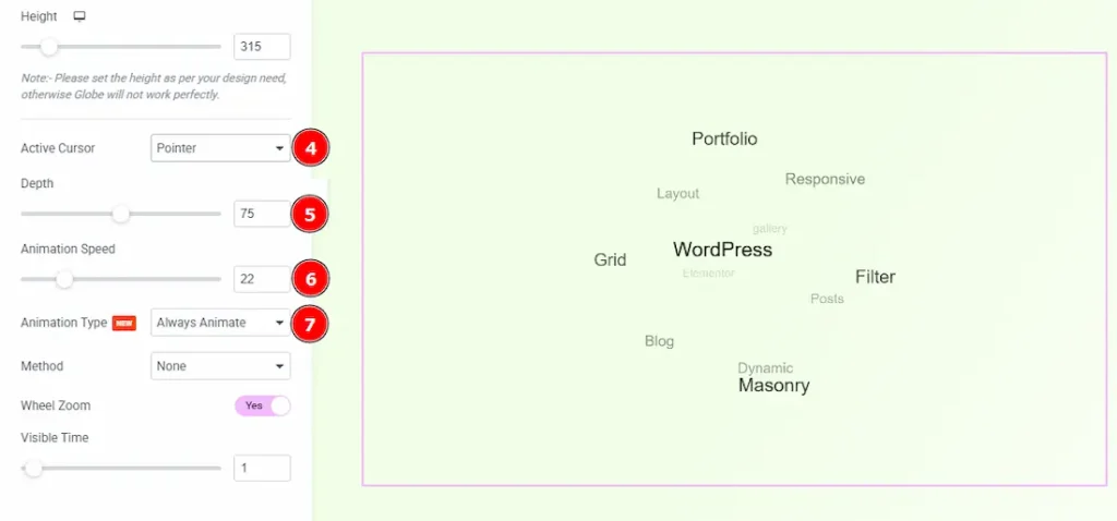
4. Active Cursor: You can select how you want to show your active cursor while hovering over the tag cloud with this option. You can choose between Pointer, Crosshair, Cursor, Text, Wait, Progress & Help.
5. Depth: You can adjust the depth of the animated tags cloud globe with this option.
6. Animation Speed: You can control the speed of the animation of the globe with this option.
7. Animation Type: There are two types of animations. One is On Hover and the other is Always Animate. By choosing the Always Animate option, the globe will be rotated continuously.
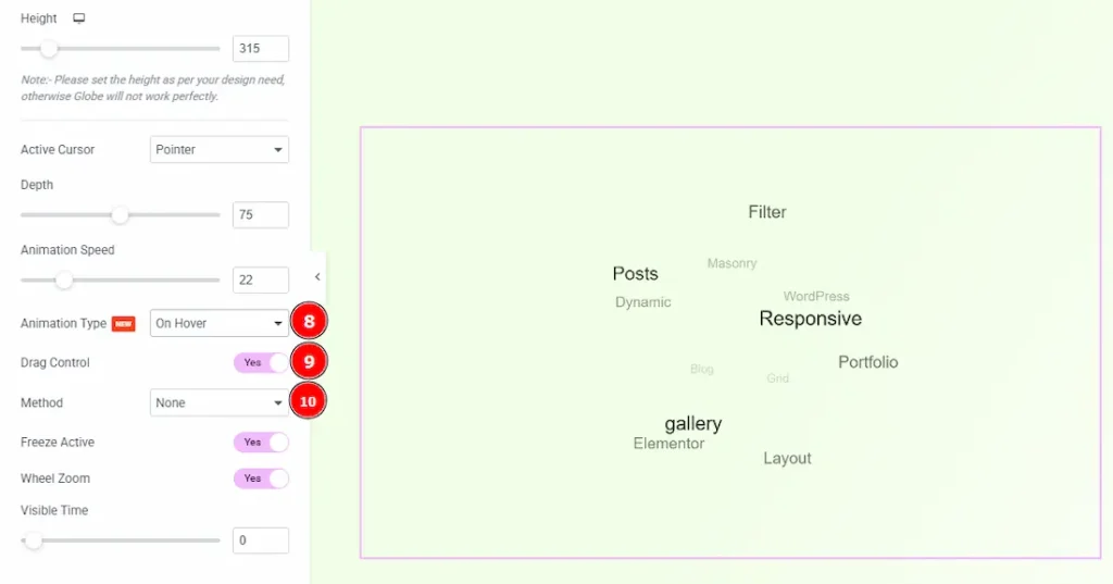
8. Animation Type: By choosing the animation type on hover, the globe will be animated while hovering on it.
9. Drag Control: Enable the switcher to easily drag and rotate the globe.
10. Method: You can select the method by which the tag will be displayed on the globe with this option. The available methods are – outline, classic, block, colour, size & none.
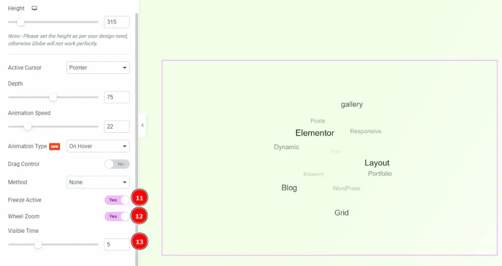
11. Freeze Active: Enable the switcher to freeze the rotation/animation when hovering on the tag.
12. Wheel Zoom: Enable the switcher to zoom the globe with your mouse wheel.
13. Visible Time: You can set how long each tag remains visible on screen before the animation moves to the next one.
Typography Skin
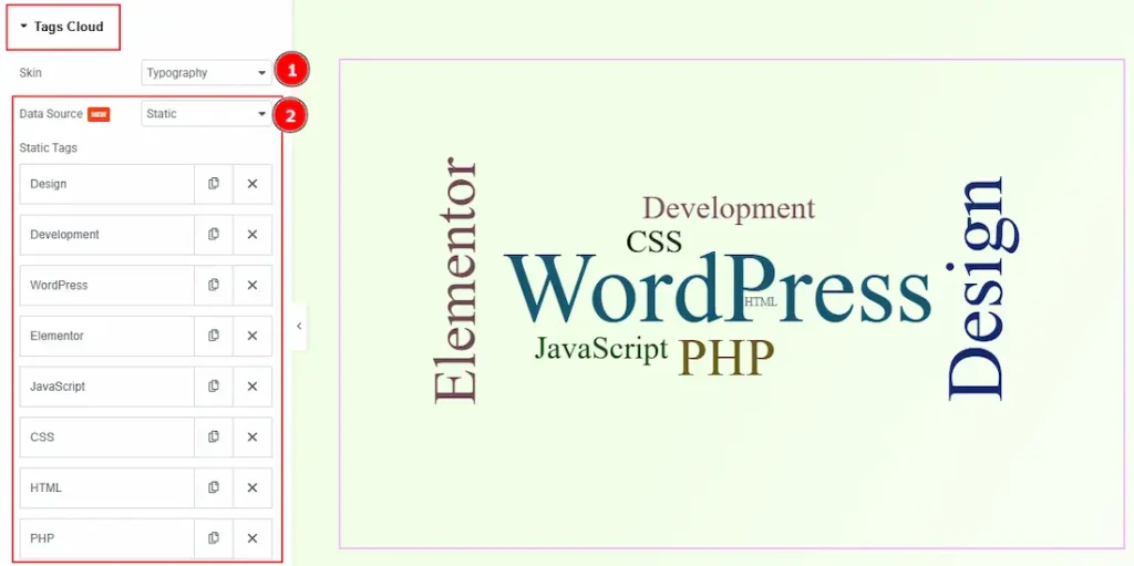
1. Skin: You can choose the tags cloud skin type as Typography with this option.
2. Data Source: You can select the data source between static & dynamic with this option. We have described all the options of static & dynamic in the default skin. Please check above. (Note: As the inner options of the item have an option to adjust the tags weight so we prefer to use the static data source for typography skin.)
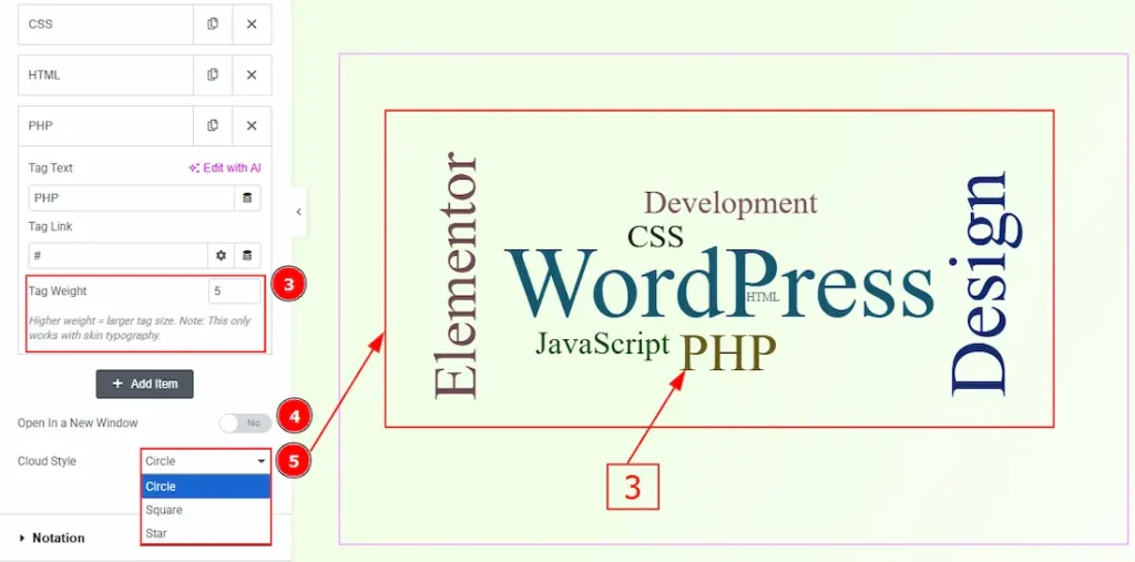
3. Tag Weight: This option controls the size of the tag. The higher weight means the larger tag size.
4. Open In a New Window: Enable the switcher to open the preview in a new tab when a tag is clicked.
5. Cloud Style: You can make changes to the cloud visible style to circle, square, or star with this option.
Work with The Style Tab
Each skin includes its own set of styling controls to match its visual behavior. The following sections describe the available style settings for each skin and how they affect the appearance of tags on the frontend.
Default Skin
Basic Tags
Go to Style → Basic Tags
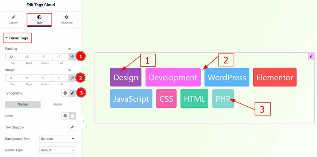
1. Padding: You can adjust the inner space of the tags field with this option.
2. Margin: You can adjust the space around the tags field with this option.
3. Typography: Change the font family, size, weight, transform, style, decoration, line height, letter spacing, and word spacing from here.
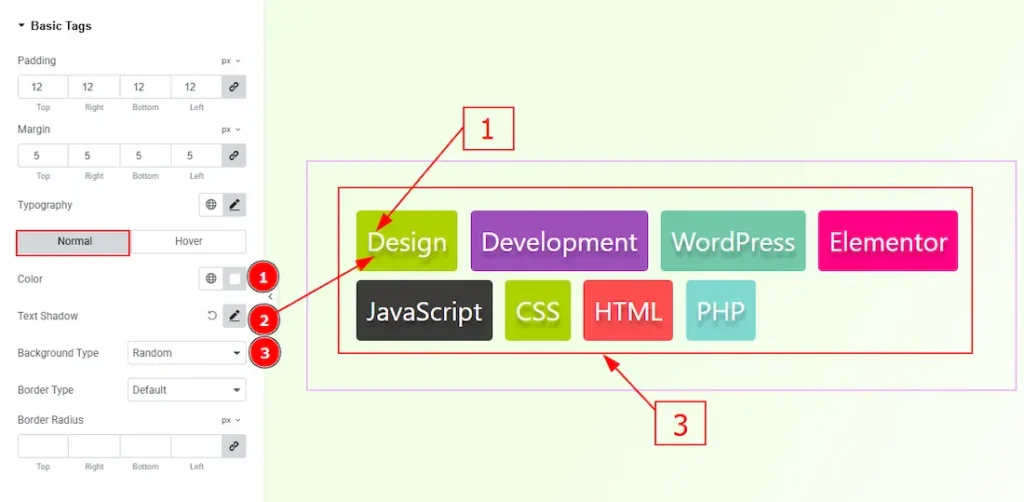
In this section, we have two more tabs. These are Normal & Hover. Let’s start describing the Normal Tab first –
1. Color: You can change the tags text color with this option.
2. Text Shadow: You can add a shadow effect to the tag’s text with this option.
3. Background Type: You can select the background type to be random or solid with this option. By keeping random, you can keep multiple background colors for the tags.
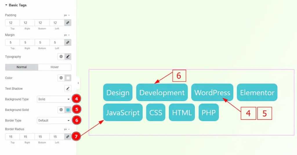
4. Background Type: By selecting the background type solid, you can make the same background for all tags.
5. Background Solid: You can change the background color with this option.
6. Border Type: You can add and change border types with this option.
7. Border Radius: You can control the roundness of the border with this option.
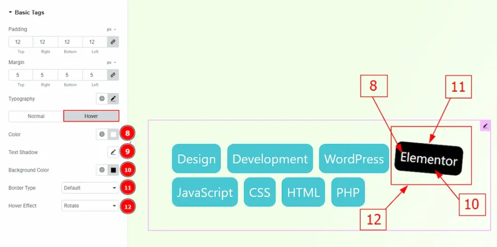
Now, let’s proceed to the Hover Tab –
8. Color: You can change tags text hover color with this option.
9. Text Shadow: You can add a shadow effect to the tags text with this option.
10. Background Color: You can change the background hover color with this option.
11. Border Type: You can add and change the tags border with this option.
12. Hover Effect: You can add a hover animation effect to the tags with this option. You can choose between Basic, Rotate, Rotate 1x, Rotate 2x, Rotate 360, Translate & Skew.
Animated Skin
Go to Style → Animated Tags
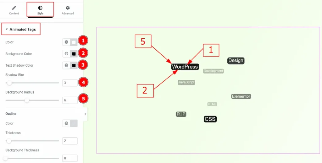
1. Color: You can change the tags’ text color with this option.
2. Background Color: You can change the tags’ background color with this option.
3. Text Shadow Color: You can add a text shadow effect to tags’ text with this option.
4. Shadow Blur: You can adjust the blur effect with this option.
5. Background Radius: You can control the roundness of the background with this option.
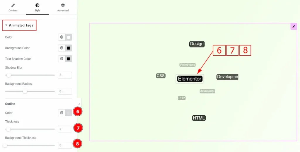
6. Color: You can make changes to the animated tags outline border color with this option.
7. Thickness: You can adjust the thickness of the outline border with this option.
8. Background: You can adjust the background thickness with this option.
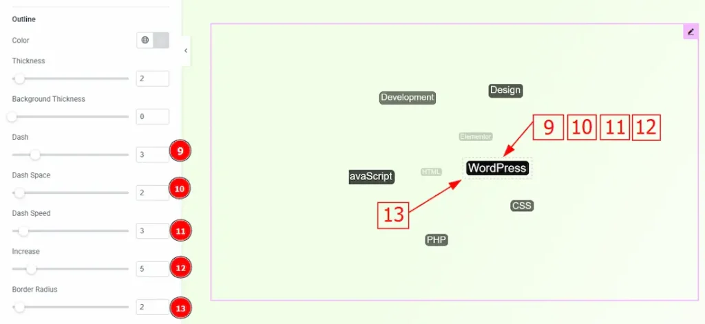
9. Dash: You can make changes to the border and make it dashed with this option.
10. Dash Space: You can adjust the space between the dash border with this option.
11. Dash Speed: You can adjust the animation speed of the dashed border with this option.
12. Increase: You can control how much the animated outline (dashed border) expands or grows during the animation with this option.
13. Border Radius: You can control the roundness of the dashed border with this option.
Typography Skin
Go to Style > Cloud Tags
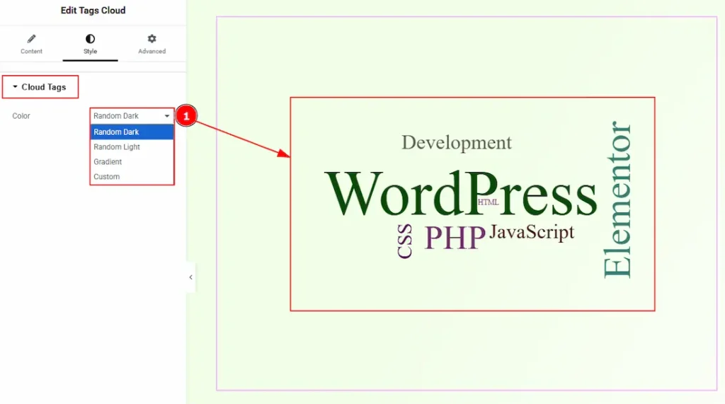
1. Color: You can make changes to the tags’ test color with this option. The provided options are Random Dark, Random Light, Gradient & Custom. With the custom option, you can select the text color.
All done! You have successfully customized the Tags Cloud widget on your website.
Video Assist
You can also watch the video tutorial to learn more about the Tags Cloud. Please visit the demo page for examples.
Thanks for being with us.