The Price List widget from Element Pack Pro lets you display items, descriptions, and prices in a clean and organized layout. It is ideal for menus, service pricing, and product listings. With flexible styling and layout controls, you can easily create professional and visually appealing price sections in Elementor. In this documentation, we will guide you through how to use and customize the Price List widget provided by Element Pack Pro for Elementor.
Enable The Price List Widget
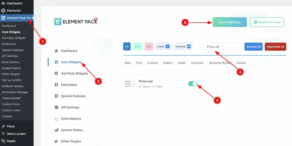
To use the Price List widget from Element Pack, first, you have to enable the widget.
- Go to WordPress dashboard → Element Pack Plugin dashboard.
- Then, Click the Core Widgets Tab.
- Search the Price List Widget Name.
- Enable the Price List Widget.
- Hit the Save Settings Button.
Inserting The Price List Widget
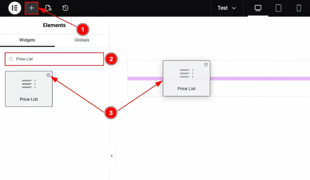
1. Go to the Elementor Editor Page and hit the “+” icon Button.
2. Search the Price List name.
3. Drag the widget and drop it on the editor page.
Work With The Content Tab
List Section
Go to Content → List
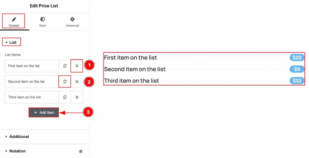
1. Close Item: You can delete the Price List item by clicking the Close icon button.
2. Copy Item: This option lets you copy the same item.
3. Add Item: You can add a new item by clicking the “+” Add Item button.
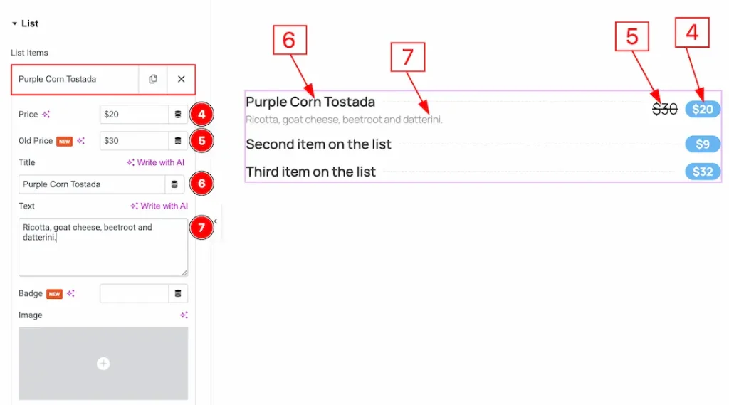
In the Price List Items, each item contains more options. Let’s explore those options below –
4. Price: You can add and make changes to the price with this option.
5. Old Price: You can add and make changes to the old price with this option.
6. Title: You can add and make changes to the title with this option.
7. Text: You can add a description of your product in this field.
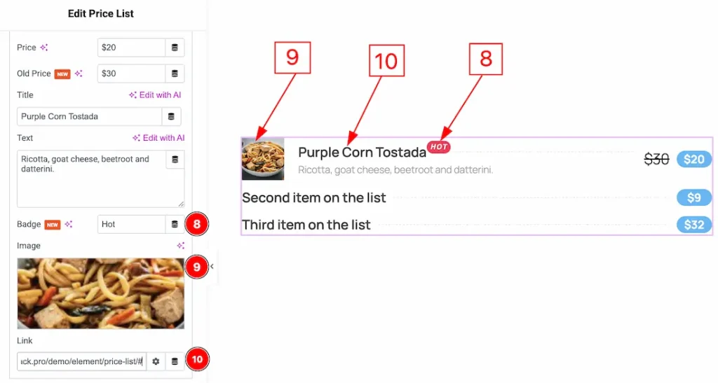
8. Badge: You can add and make changes to the badge text with this option.
9. Image: You can add an image to the price list item with this option.
10. Link: You can add a link to the price list product with this option.
Additional Section
Go to Content → Additional
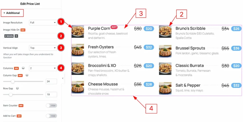
1. Image Resolution: You can adjust the image quality with this option.
2. Image Hide On: You can select the device’s name here where you want to hide the images of the price list.
3. Vertical Align: You can set the vertical align position to top, bottom or middle with this option.
4. Columns: You can set the columns of the price list with this option.
5. Column Gap: You can adjust the gap between the columns with this option.
6. Row Gap: You can adjust the gap between rows with this option.
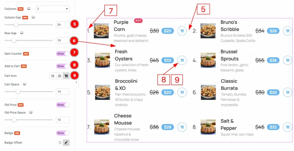
7. Item Counter: Enable the switcher to show the counter to the price list items with this option.
8. Add to Cart: Enable the switcher to show the cart icon to your audience.
9. Cart Icon: You can make changes to the cart icon with this option.
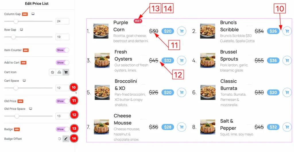
10. Cart Space: You can adjust the space between the cart icon and the price with this option.
11. Old Price: Enable the switcher to show the old price to your audience.
12. Old Price Space: You can adjust the space between the old price and the new price with this option.
13. Badge: Enable the switcher to show the badge in the price list with this option.
14. Badge Offset: You can adjust the badge position vertically and horizontally, and also rotate the badge with this option.
Work with The Style Tab
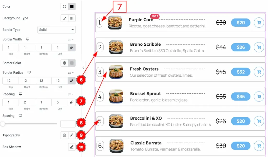
Items Section
Go to Style → Items
In this section, we have two more tabs. These are Normal &Hover. Let’s start with the Normal tab first –
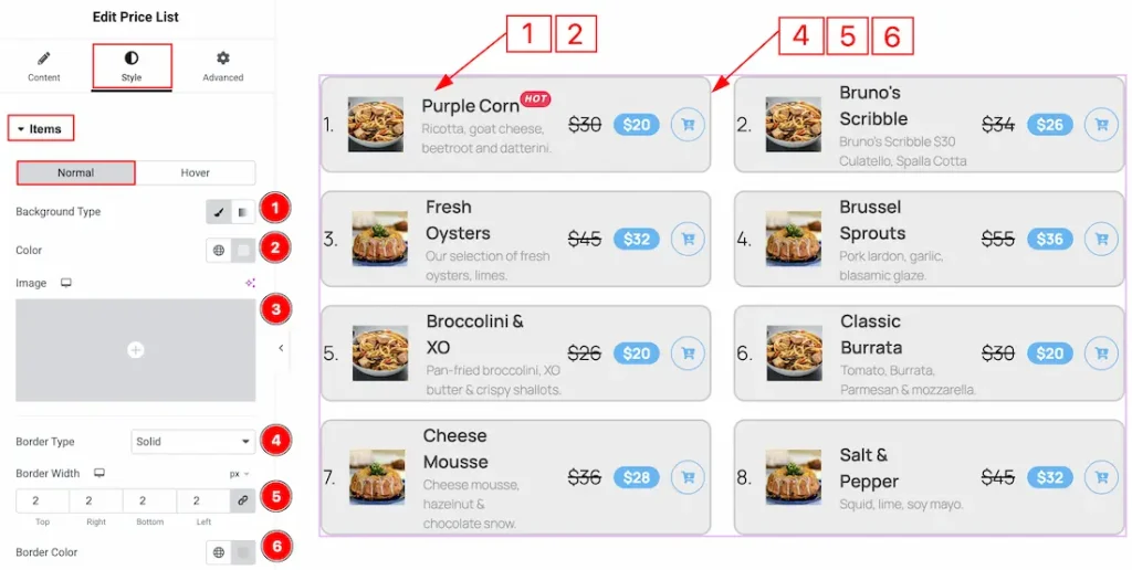
1. Background Type: You can choose the background type between the classic or gradient style with this option. Here, we have selected the background type as classic.
2. Color: You can change the background color of the price list item with this option.
3. Image: You can change the background image with this option.
4. Border type: You can add or change the border types between default, none, solid, dashed, groove & dotted with this option.
5. Border Width: You can set the thickness of the border with this option.
6. Border Color: You can change the border color with this option.
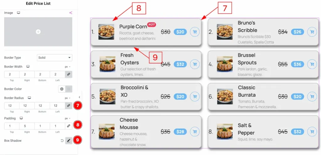
7. Border Radius: You can control the roundness of the border with this option.
8. Padding: You can adjust the inner space of the price list items with this option.
9. Box Shadow: You can add a shadow effect to the price list items with this option.
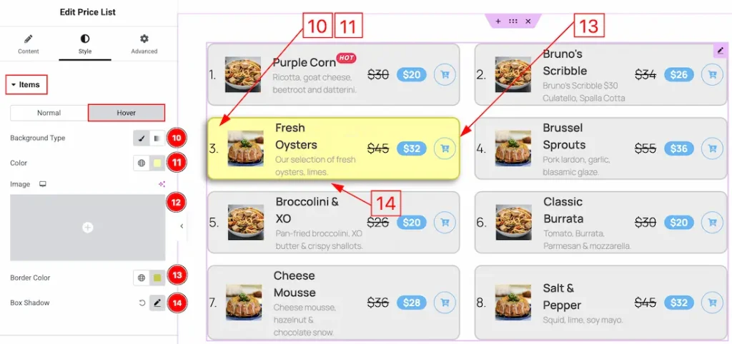
Now, let’s proceed to the Hover Tab –
10. Background Type: You can change the hover background type to be classic or gradient with this option.
11. Color: You can change the background hover color with this option.
12. Image: You can change the background image with this option.
13. Border Color: You can change the hover border color with this option.
14. Box Shadow: You can add a hover shadow effect to the price items with this option.
Title Section
Go to Style → Title
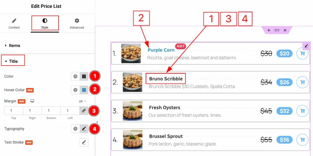
1. Color: You can make changes to the title text color with this option.
2. Hover Color: You can make changes to the title text hover color with this option.
3. Margin: You can adjust the outer space of the title text field with this option.
4. Typography: Change the font family, size, weight, transform, style, decoration, line height, letter spacing, and word spacing from here.
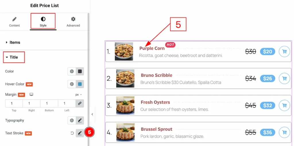
5. Text Stroke: You can adjust the text stroke and change the stroke color with this option.
Price Section
Go to Style → Price
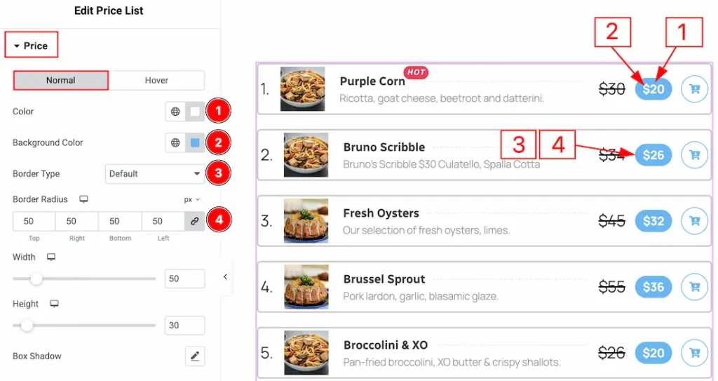
In this section, we have two more tabs. These are Normal & Hover. Let’s start with describing the Normal Tab first –
1. Color: You can make changes to the price text color with this option.
2. Background Color: You can make changes to the price background color with this option.
3. Border Type: You can add and change the border type with this option.
4. Border Radius: You can control the roundness of the border with this option.
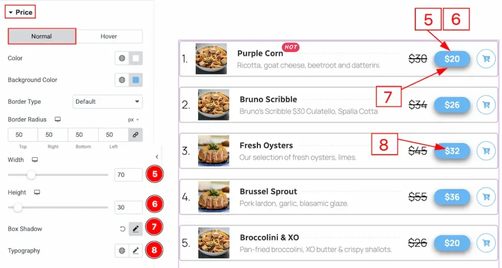
5. Width: You can adjust the width of the price field with this option.
6. Height: You can adjust the height of the price field with this option.
7. Box Shadow: You can add a shadow effect the price field with this option.
8. Typography: Change the font family, size, weight, transform, style, decoration, line height, letter spacing, and word spacing from here.
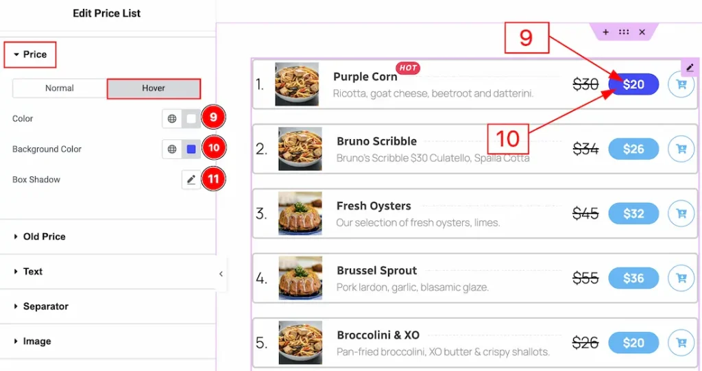
Now let’s proceed to the Hover Tab –
9. Color: You can change the hover color of the price number with this option.
10. Background Color: You can change the price field background hover color with this option.
11. Box Shadow: You can add a hover shadow effect to the price with this option.
Old Price Section
Go to Style → Old Price
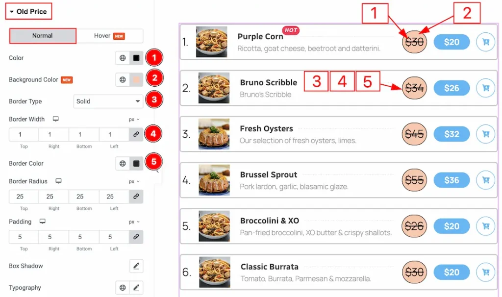
In this section, we have two more tabs. These are Normal & Hover. Let’s start with describing the Normal Tab first –
1. Color: You can make changes to the old price text color with this option.
2. Background Color: You can make changes to the old price background color with this option.
3. Border Type: You can add and change the border type with this option.
4. Border Width: You can set the thickness of the border with this option.
5. Border Color: You can change the border color with this option.
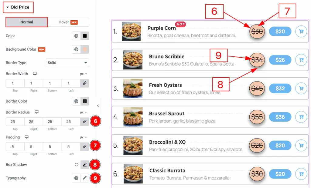
6. Border Radius: You can control the roundness of the border with this option.
7. Padding: You can adjust the inner space of the old price field with this option.
8. Box Shadow: You can add a shadow effect and customize it with this option.
9. Typography: Change the font family, size, weight, transform, style, decoration, line height, letter spacing, and word spacing from here.
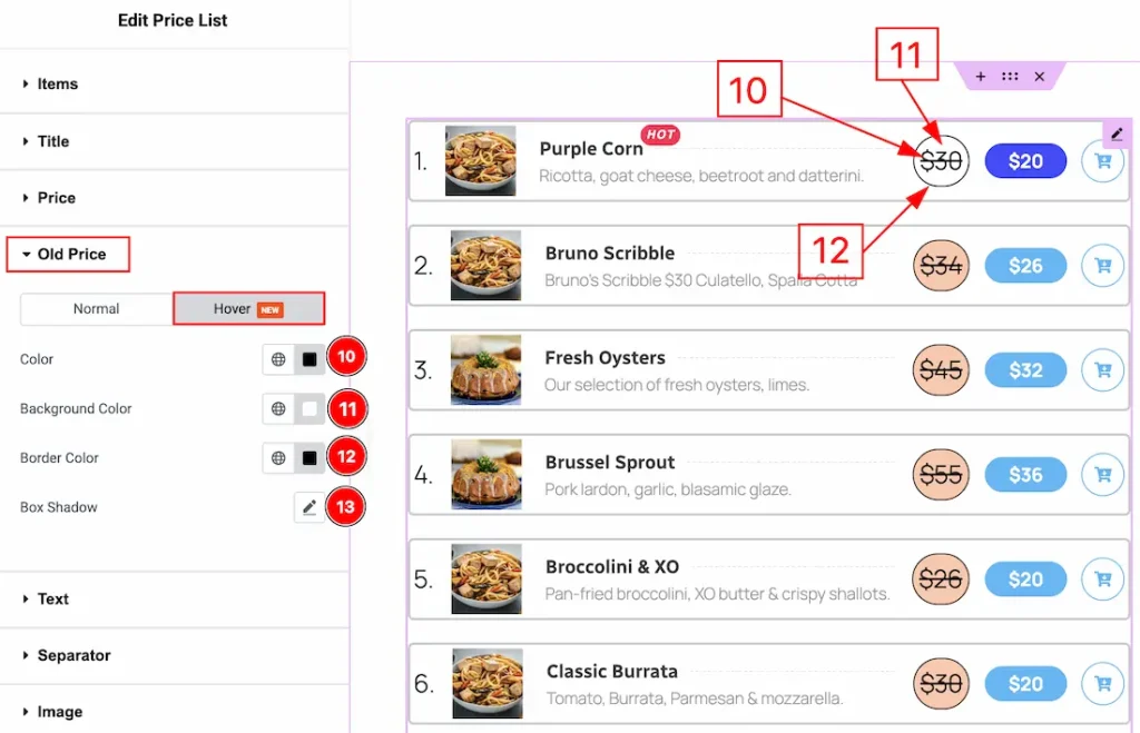
Now, let’s proceed to the Hover Tab –
10. Color: You can change the hover old price number color with this option.
11. Background Color: You can change the hover background color with this option.
12. Border Color: You can change the hover border color with this option.
13. Box Shadow: You can add a hover shadow effect to the old price field with this option.
Text Section
Go to Style → Text
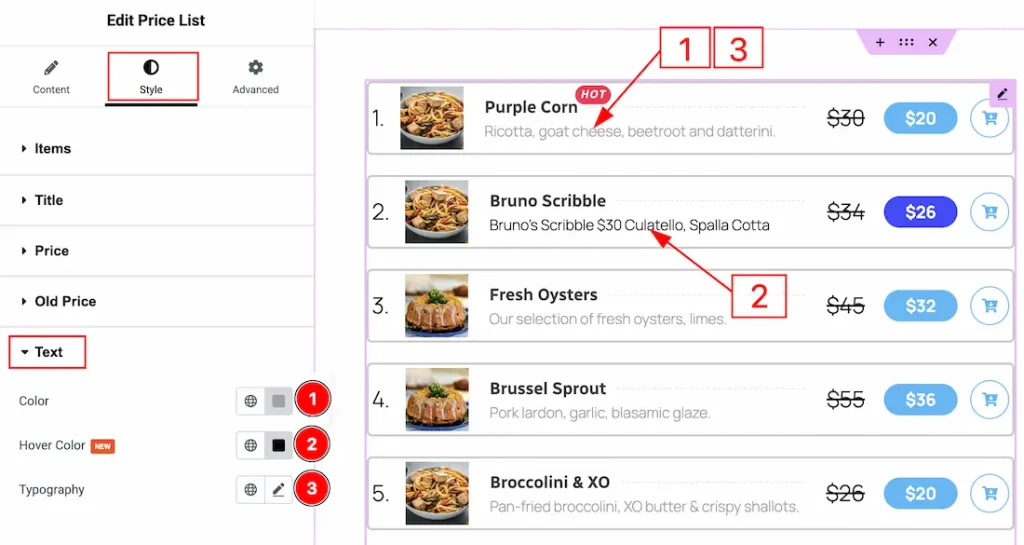
1. Color: You can make changes to the text color with this option.
2. Hover Color: You can make changes to the hover color with this option.
3. Typography: Change the font family, size, weight, transform, style, decoration, line height, letter spacing, and word spacing from here.
Separator Section
Go to Style → Separator
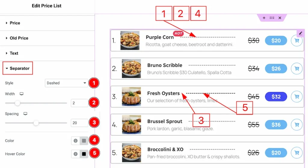
1. Style: You can change the separator style with this option. You can choose between solid, dashed, doubled, dotted & none.
2. Width: You can adjust the width of the separator with this option.
3. Spacing: You can adjust the spacing between the title and the old price with this option.
4. Color: You can make changes to the separator color with this option.
5. Hover Color: You can change the separator icon hover color with this option.
Image Section
Go to Style → Image
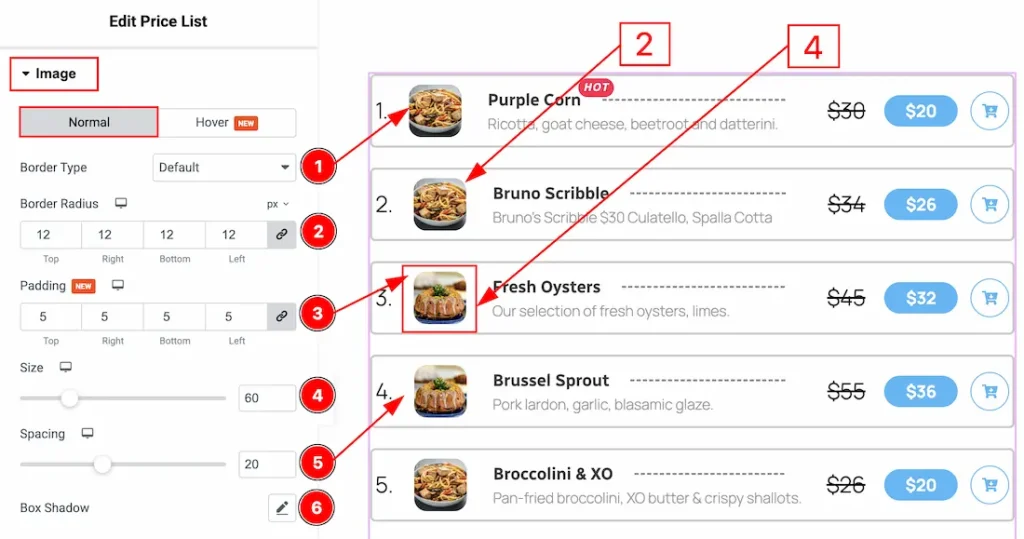
In this section, we have two more tabs. These are Normal & Hover. Let’s start describing the Normal Tab first –
1. Border Type: You can add a border around the image and change it’s types with this option.
2. Border Radius: You can control the roundness of the border with this option.
3. Padding: You can adjust the inner space of the image field with this option.
4. Size: You can adjust the size of the image with this option.
5. Spacing: You can adjust the space between the title and the image with this option.
6. Box Shadow: You can add a shadow effect to the image with this option.
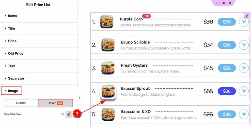
Now, let’s proceed to the Hover Tab –
7. Box Shadow: You can add a hover shadow effect to the image with this option.
Counter Section
Go to Style → Counter
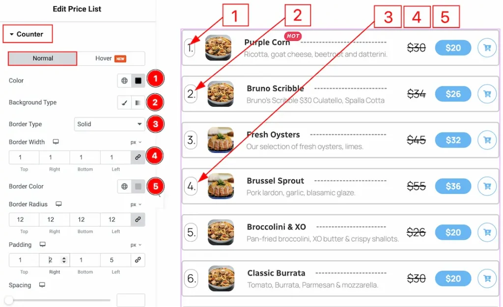
In this section, we have two more tabs. These are Normal & Hover. Let’s start describing the Normal Tab first –
1. Color: You can make changes to the counter number color with this option.
2. Background Type: You can choose the background type between the classic or gradient style with this option. Here, we have selected the background type as classic.
3. Border type: You can add or change the border types between default, none, solid, dashed, groove & dotted with this option.
4. Border Width: You can set the thickness of the border with this option.
5. Border Color: You can change the border color with this option.
6. Border Radius: This option controls the roundness of the border.
7. Padding: You can adjust the inner space of the counter field with this option.
8. Spacing: You can adjust the space between the counter and the image with this option.
9. Typography: Change the font family, size, weight, transform, style, decoration, line height, letter spacing, and word spacing from here.
10. Box Shadow: You can add a shadow effect and customize it with this option.
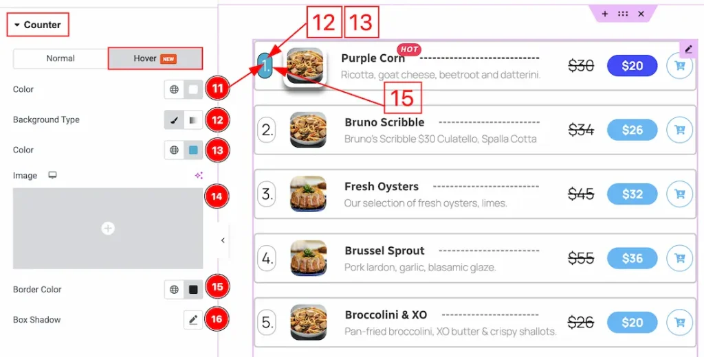
Now, let’s proceed to the Hover tab –
11. Color: You can change the counter number hover color with this option.
12. Background Type: You can change the background type to be classic or gradient with this option.
13. Color: You can make changes to the background hover color with this option.
14. Image: You can add a background image in this field.
15. Border Color: You can change the border hover color with this option.
16. Box Shadow: You can add a hover shadow effect to the counter with this option.
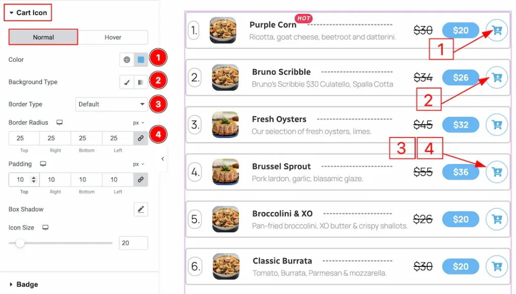
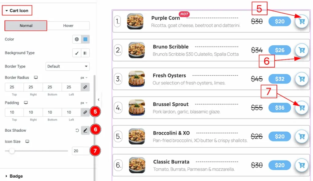
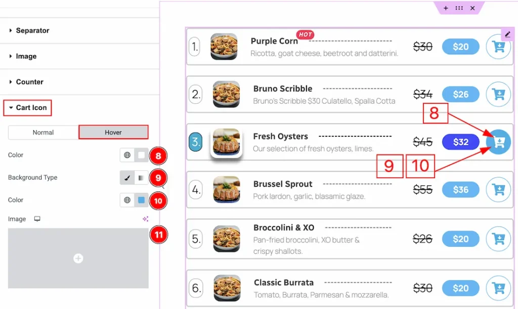
Cart Icon Section
Go to Style → Cart Icon
In this section, we have two more tabs. These are Normal & Hover. Let’s start describing the Normal Tab first –
1. Color: You can make changes to the cart icon color with this option.
2. Background Type: You can change the background type to be classic or gradient with this option.
3. Border Type: You can add and change the border type with this option.
4. Border Radius: You can make changes to the border roundness with this option.
5. Padding: You can adjust the inner space of the cart icon field with this option.
6. Box Shadow: You can add a shadow effect to the cart icon with this option.
7. Size: You can adjust the size of the cart icon with this option.
Now let’s proceed to the Hover tab –
8. Color: You can make changes to the cart icon hover color with this option.
9. Background Type: You can change the background type to be classic or gradient with this option.
10. Color: You can change the background hover color with this option.
11. Image: You can add a hover background image with this option.
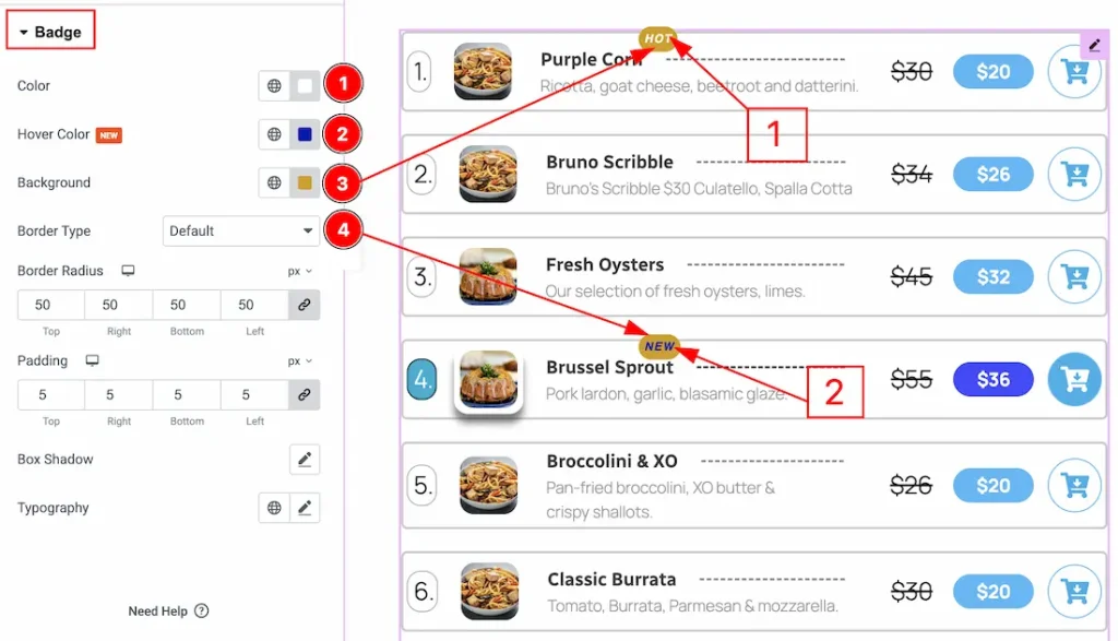
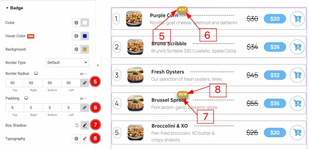
Badge Section
Go to Style → Badge
1. Color: You can make changes to the badge text color with this option.
2. Hover Color: You can make changes to the badge text hover color with this option.
3. Background: You can change the background color with this option.
4. Border Type: You can add or change the border types with this option.
5. Border Radius: You can control the roundness of the border with this option.
6. Padding: You can adjust the inner space of the badge with this option.
7. Box Shadow: You can add a shadow effect to the badge with this option.
8. Typography: Change the font family, size, weight, transform, style, decoration, line height, letter spacing, and word spacing from here.
All done! You have successfully customized the Price List widget on your website.
Video Assist
You can also watch the video tutorial to learn more about the Price List widget. Please visit the demo page for examples.
Thanks for being with us.