In this documentation, we will show you how to customize the Price Table widget presented by Element Pack Pro.
Inserting The Price Button Widget

Inserting the widget by following this,
- Search by the Price Table widget name.
- Then select the appear widget ( with Element Pack Pro logo T.R corner).
- After Drag and Drop it on the Elmentor Editor page.
Content Tab
The Content tab controller displayed here offers the flexibility to adjust the layout of the widget according to your preferences.
Layout Section
Go to Content > Layout
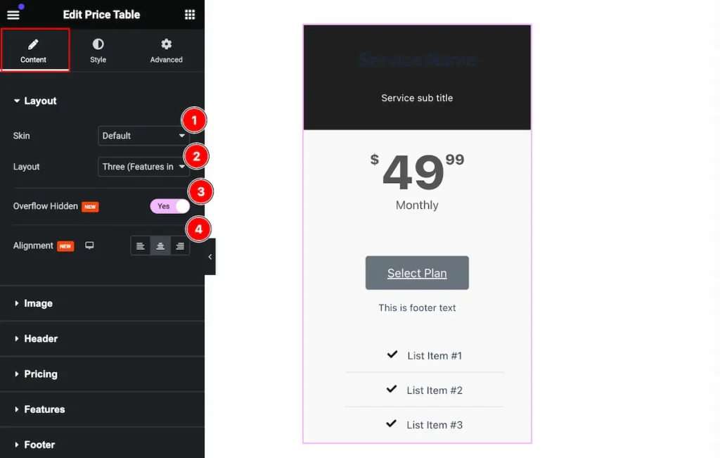
This section provides control to customize the layout,
- Skin: Set the skin for price table (e.g.: Default, Pertain, Erect).
- Layout: Set the layout, here are available (e.g.: One, Two, Three, Four etc).
- Overflow Hidden: Enable the switcher to hide the overflow.
- Alignment: Set the alignment for layout.
Image Section
Go to Content > Image
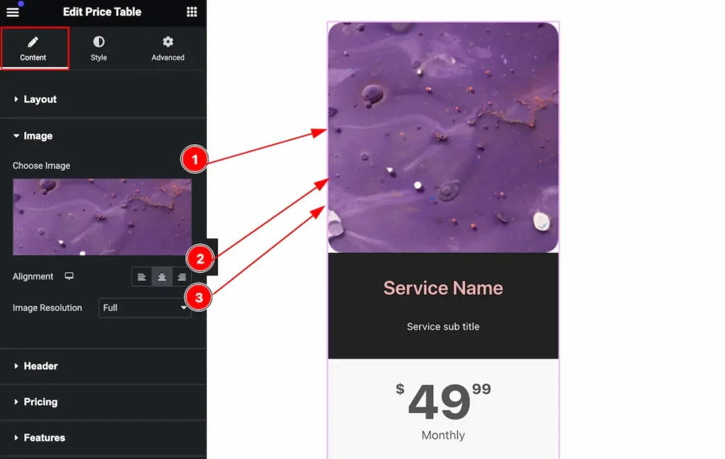
Make the image customize by following,
- Choose Image: Choose from the media library.
- Alignment: Set the alignment of the image.
- Image Resolution: Set resolution for the image.
Header Section
Go to Content > Header
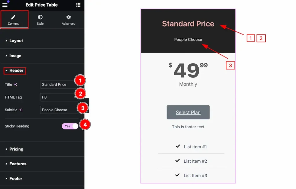
Make the header by following it,
- Title: Set the title for the header.
- HTML Tag: Set any HTML Tag for Title ( H1, H2, H3, H4, H5, H6, p, span ). The title tag is essential for both user experience and search engine optimization (SEO).
- Subtitle: Set the subtitle for the header.
- Sticky Heading: Enable the switcher to make it sticky.
Pricing Section
Go to Content > Pricing
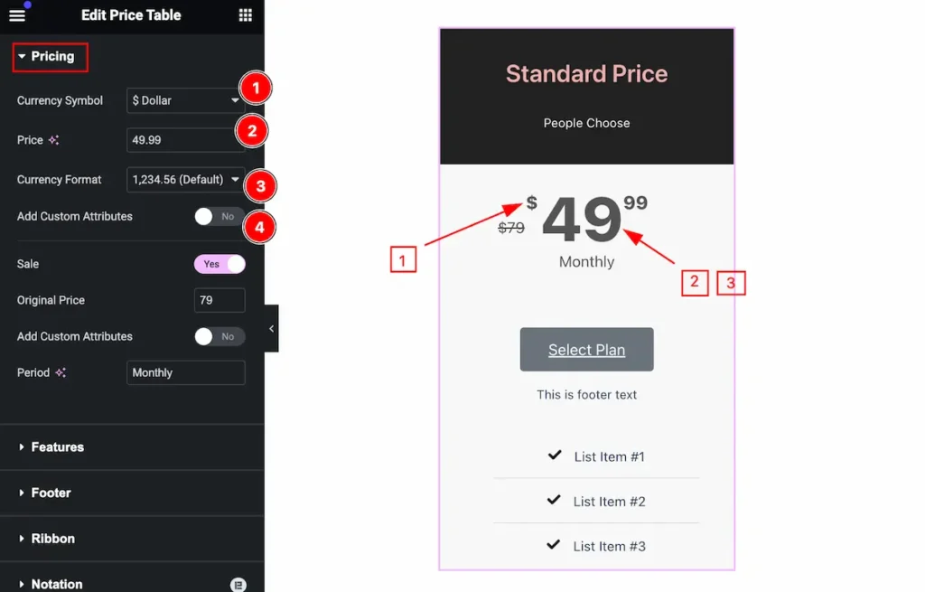
Make the price section customizable by following,
- Currency Symbol: Set the currency symbol for the price.
- Price: Set the price.
- Currency Format: Set the format of the currency.
- Add Custom Attributes: Enable the switcher to add custom attributes.
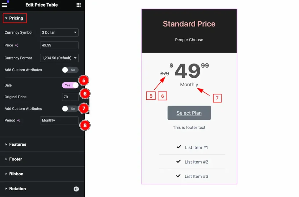
- Sale: Enable the switcher to show the sale price.
- Original Price: Set the original price.
- Add Custom Attributes: Enable the switcher to show the custom attributes.
- Period: Set the period for it.
Features Section
Go to Content > Features
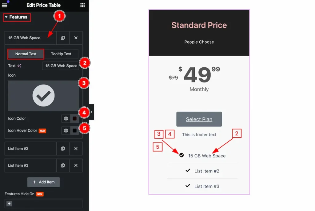
Set the feature content by following,
- Click on the Feature item and it will open a toggle where all the options are available.
- Text: Set the text for the feature item.
- Icon: Select the icon from the icon library.
- Icon Color: Set the color for the icon.
- Icon Hover Color: Set the Icon Hover color.
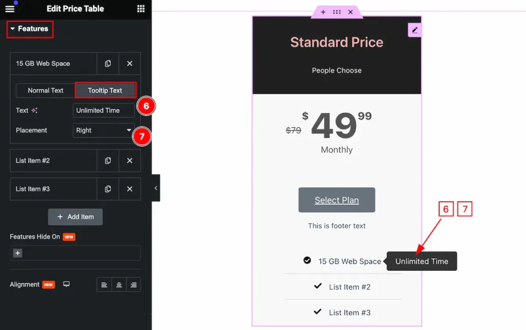
- Text: Set the text for the tooltip.
- Placement: Set the placement for the
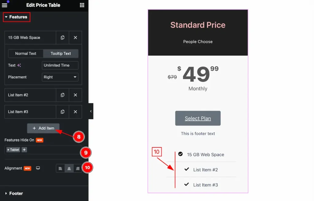
- ” +Add Item ” : Click on the item to add new item.
- Featured Hide On: You can hide featured hide for several devices (e.g.: Tablet, Phone).
- Alignment: Set the content align (e.g.: Left, Center, Right ).
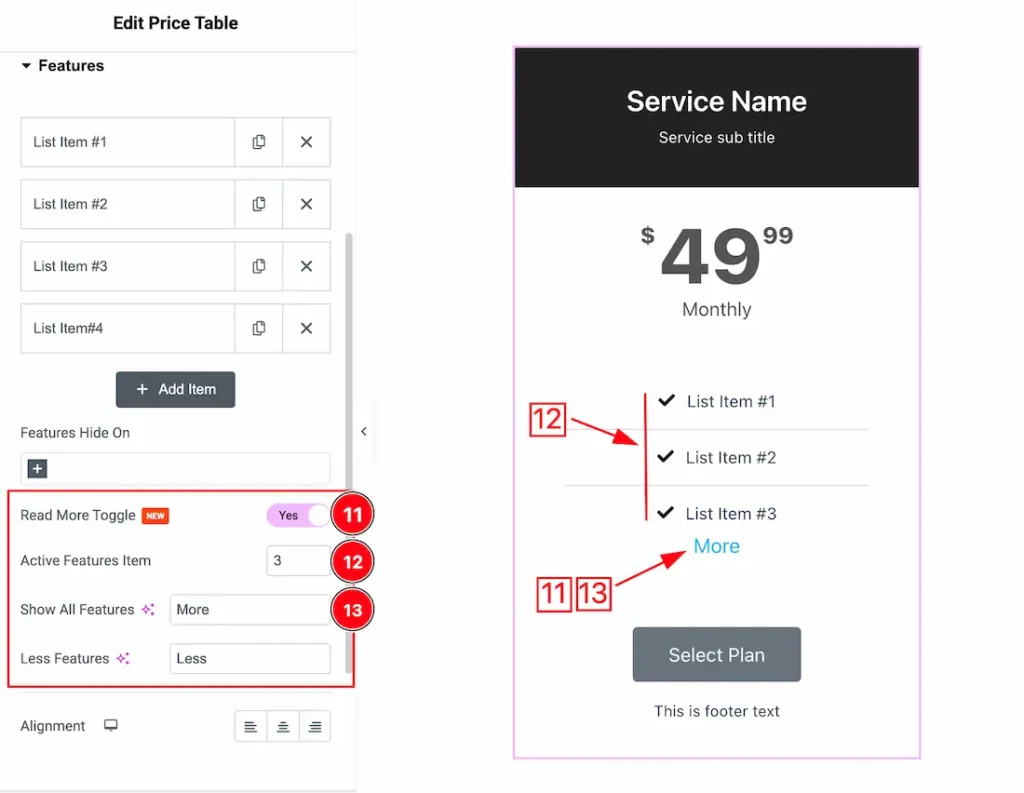
Come to the Features section, you will get a new Read More Toggle option to showcase your pricing table items.
11. Read More Toggle: Enable/disable the Read More Toggle switcher button to show/hide the read more toggle from the price table.
12. Active Features Item: You can set the activate features item number from here. Here we set the active number 3 that’s why the price table shows 3 items.
13. Show All Features: You can set the Read More Toggle text to your working demand. Here we set the name – More. This option lets you show the other items when you click on the more text.
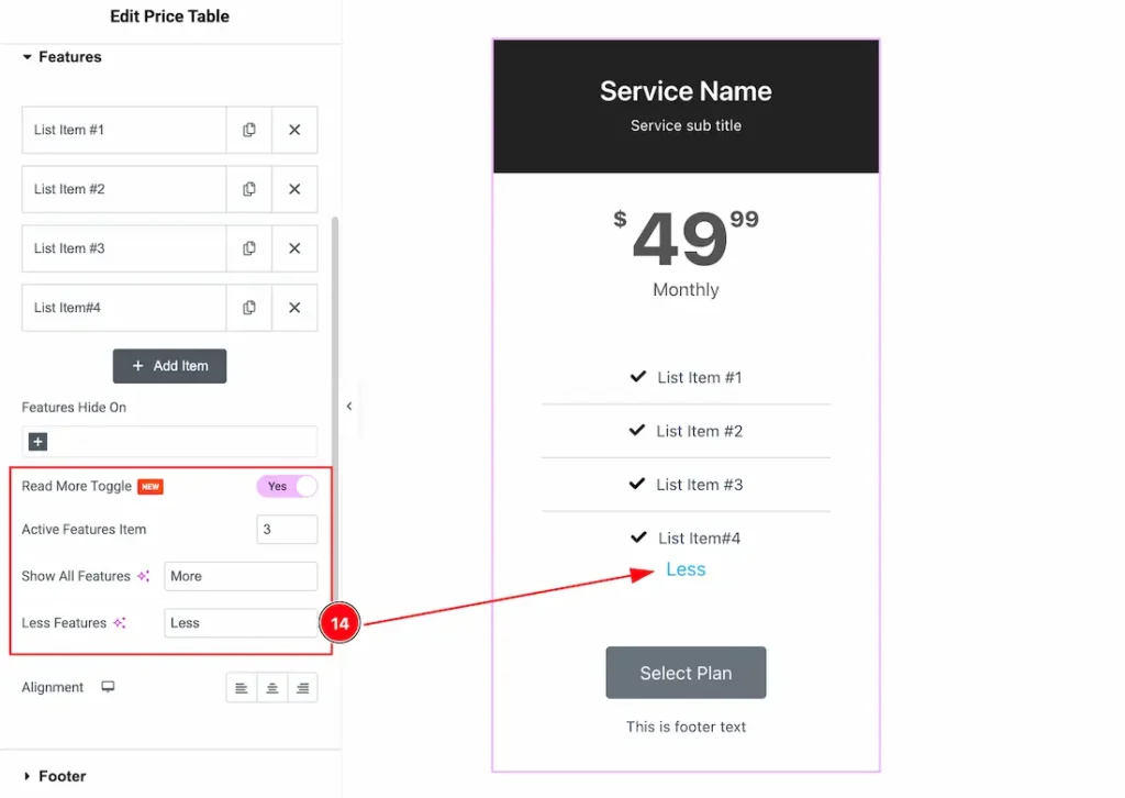
14. Less Features: You can change the Less Features text as your wish. This feature lets you hide the items when you click on the less text. Here we set the Text- Less.
Footer Section
Go to Content > Footer
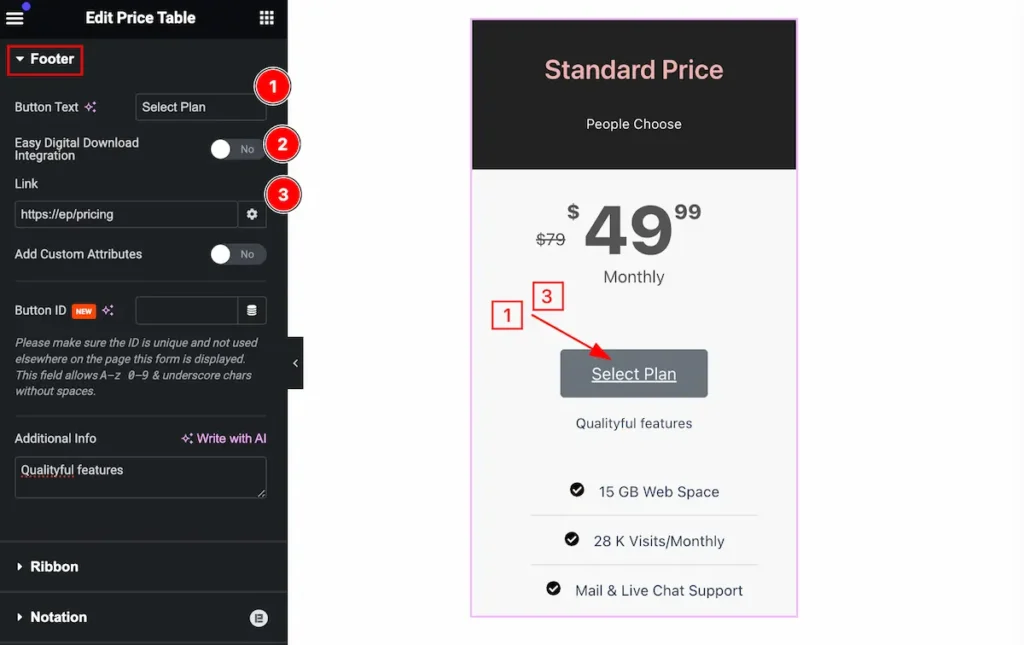
Make the footer by following it,
- Button Text: Set the button for the text.
- Easy Digital Download Integration: Enable it the set the digital integration.
- Link: Set the link for the button.
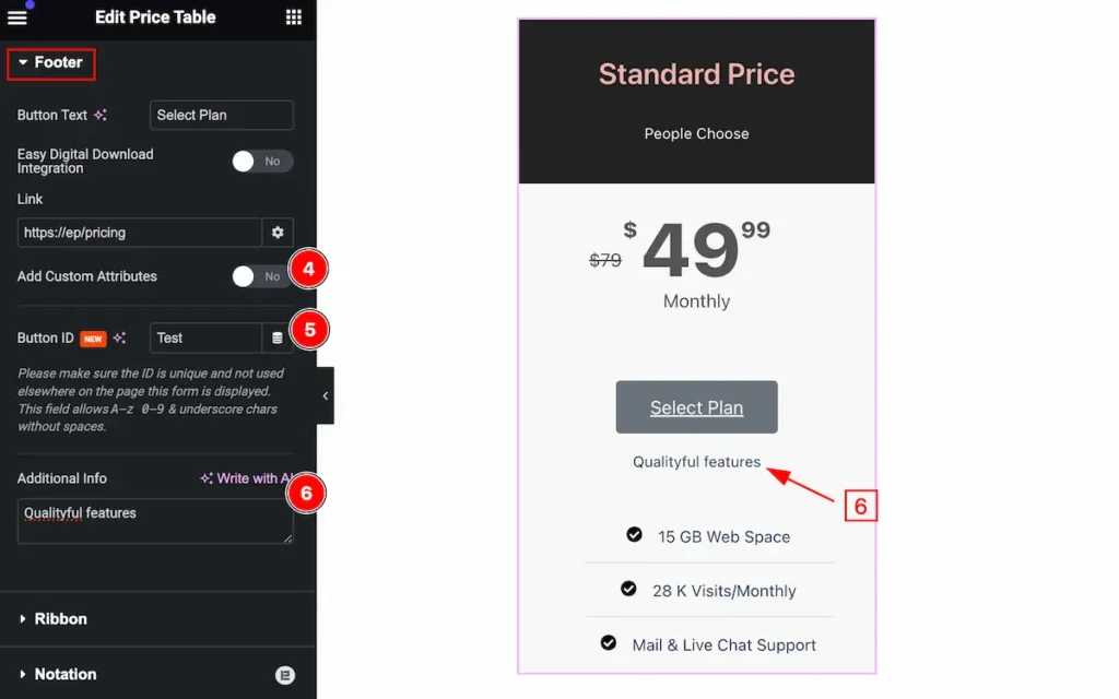
- Add Custom Attributes: Enable the switcher to add custom attributes.
- Button ID: Set the id for the button.
- Additional Info: Set the additional info.
Style Tab
Provide the controller to make the visual appearance or presentation of the tabs. This includes aspects that are visually appealing and cohesive with the overall design of the interface.
Header Section
Go to Style > Header
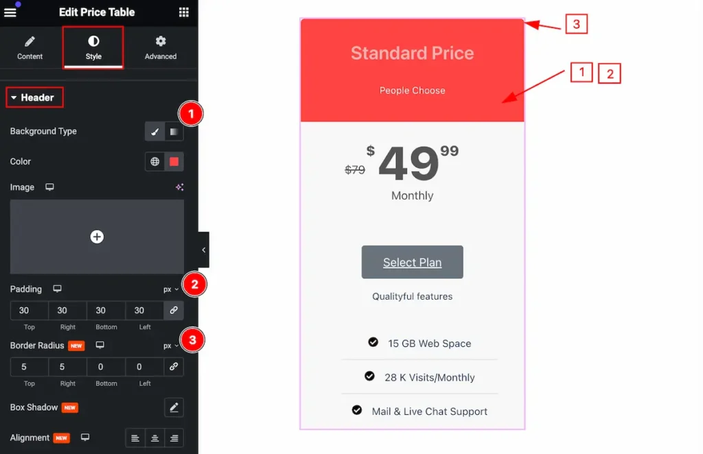
Make the header section more stylish by following this,
- Background Type: Set the background for the header section.
- Color: Set the text color.
- Padding: Set the padding for the header.
- Border Radius: Set the border radius.
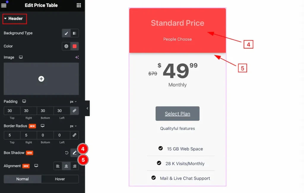
- Box Shadow: Set the shadow for the header.
- Alignment: Set the alignment for the header content.
Normal Sate for the Header
Title
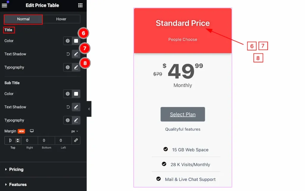
- Color: Set the color for the title.
- Text Shadow: Set the shadow for the text.
- Typography: Set the typography.
Sub Title
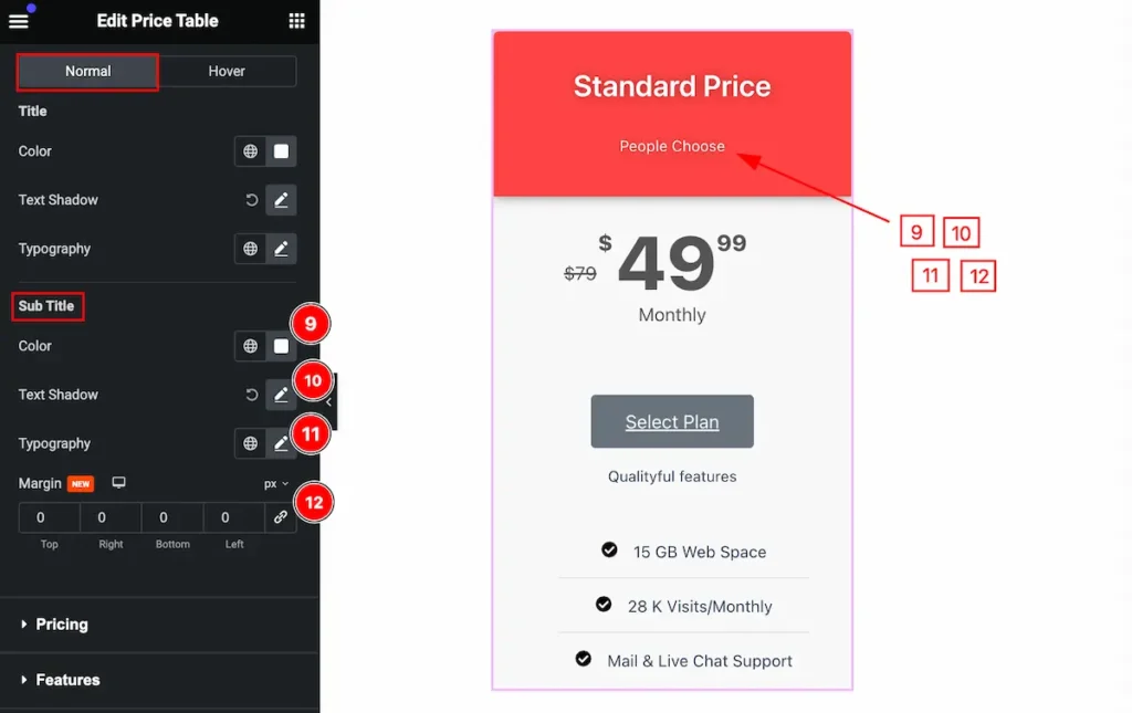
- Color: Set the color for the sub title.
- Text Shadow: Set the shadow for the text.
- Typography: Set the typography.
- Margin: Set the margin for the sub title.
Hover Sate for the Header
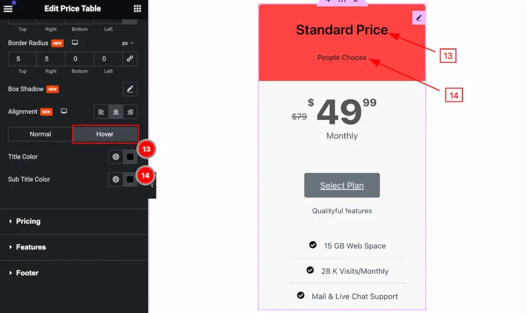
- Title Color: Set the color for the title.
- Sub Title Color: Set the color for the sub title.
Pricing Section
Go to Style > Footer
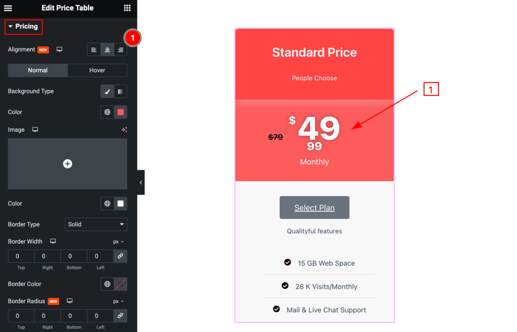
Make the price section customizable by following,
- Alignment: Set the alignment by following.
Normal State for Pricing
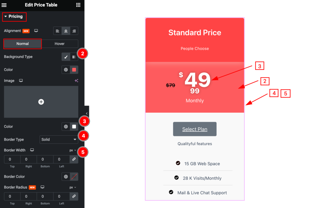
- Background Type: Set the backgroud for the normal state.
- Color: Set the color for the price.
- Border Type: Set the type for the border.
- Border Width: Set width for the border.
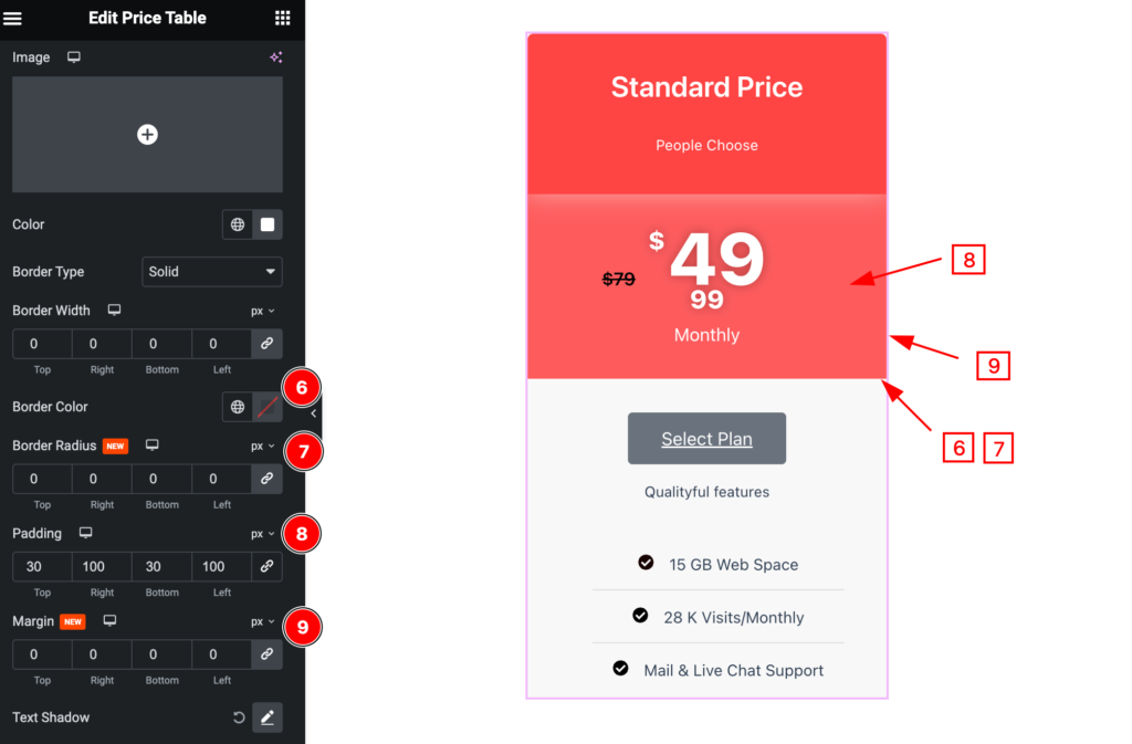
- Border Color: Set the border color.
- Border Radius: Set the border radius.
- Padding: Set the padding for the price section.
- Margin: Set the margin for the price.
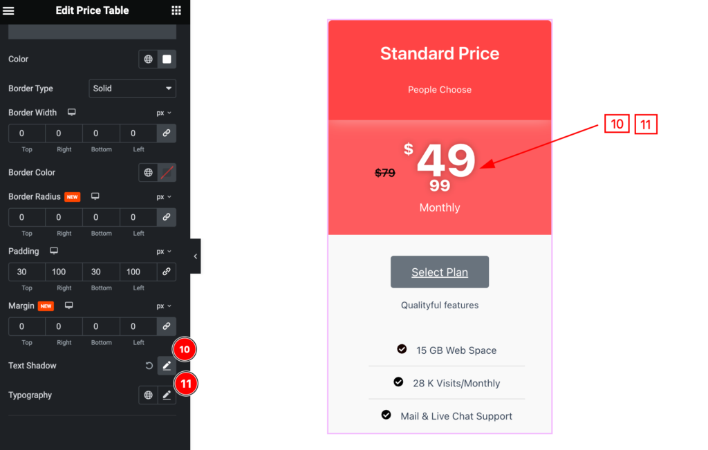
- Text Shadow: Set the text shadow for the price section.
- Typography: Set the typography for the price.
Currency Symbol
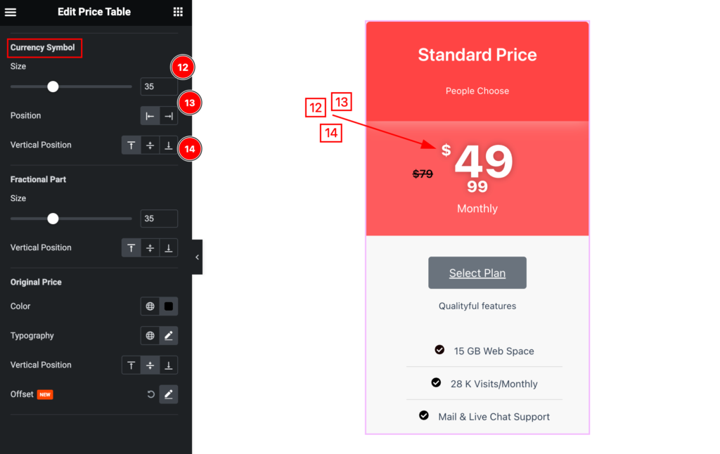
- Size: Set the size for the currency symbol.
- Position: Set the position for it.
- Vertical Position: Set the vertical position.
Fractional Part
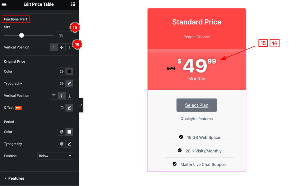
- Size: Set the size for fractional part.
- Vertical Position: Set the vertical position.
Original Price
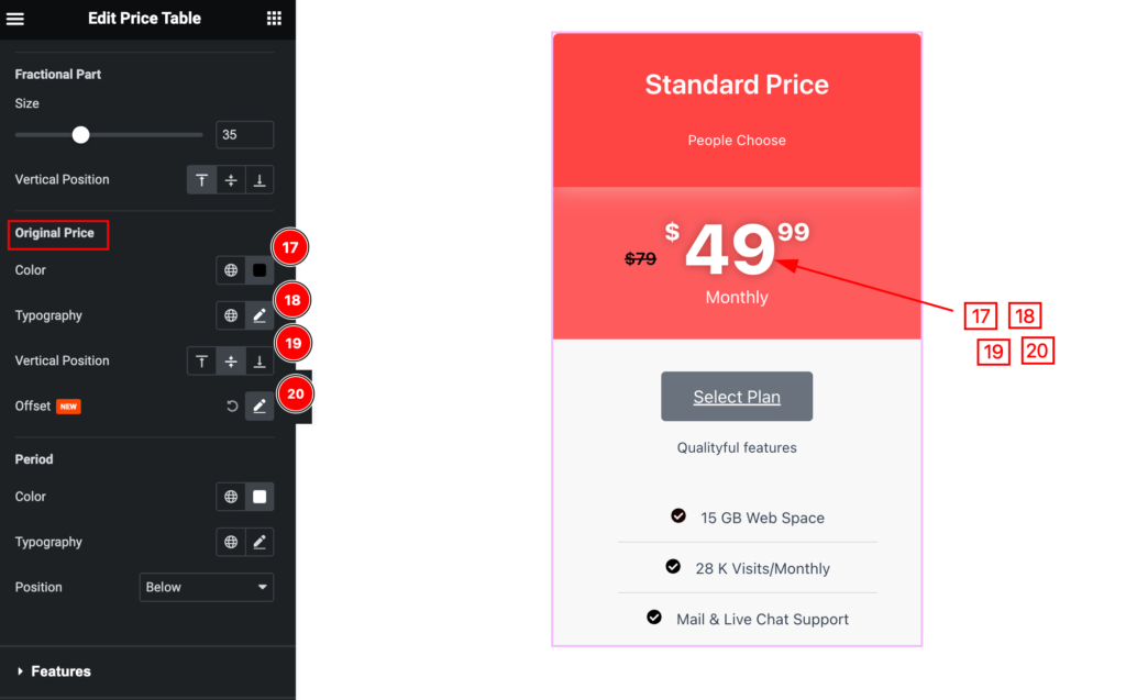
- Color: Set the color for the original price.
- Typography: Set the typography for it.
- Vertical Position: Set the vertical position for it.
- Offset: Set the offset of it.
Period
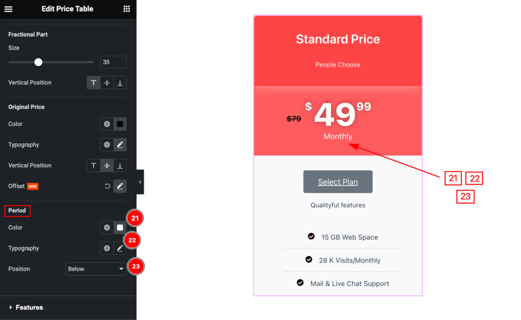
- Color: Set the color for the period.
- Typography: Set the typography for the period.
- Position: Set the position for it.
Hover State for Pricing
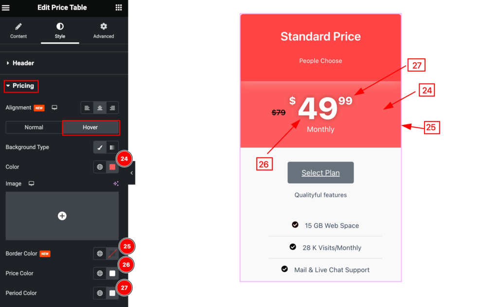
The changes will appear on the hover state,
- Background Color: Set the background color for pricing.
- Border Color: Set the border color.
- Price Color: Set the price color.
- Period Color: Set the period color.
Features Section
Go to Style > Features
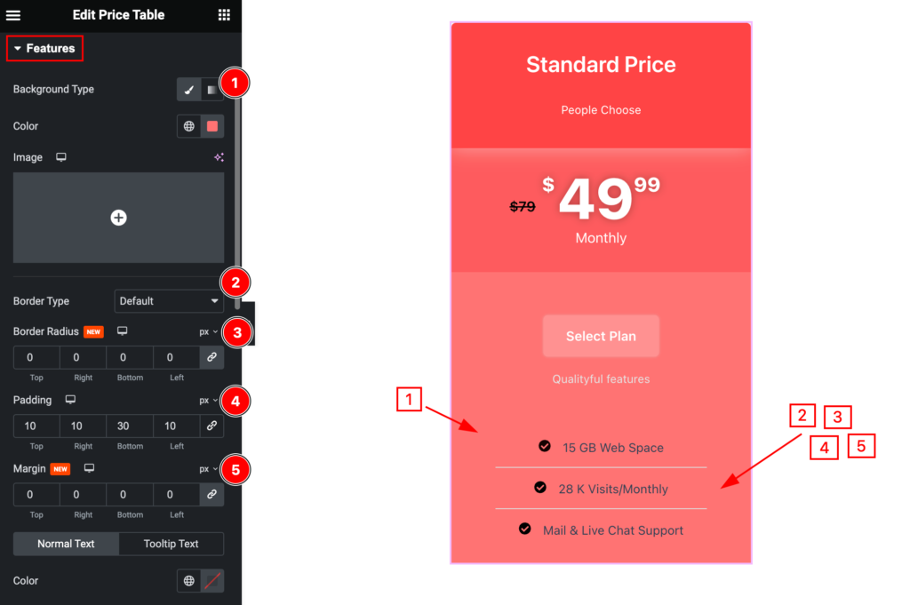
Make the feature section more customizable by following it.
- Background Type: Set the background for the features.
- Border Type: Set the border type.
- Border Radius: Set the border radius.
- Padding: Set the padding.
- Margin: Set the margin.
Normal Text
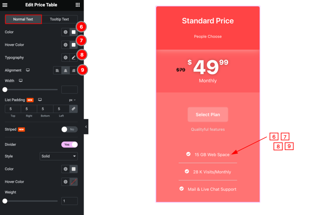
- Color: Set the color for the normal text.
- Hover Color: Set the hover color.
- Typography: Set the typography.
- Alignment: Set the alignment for the text.
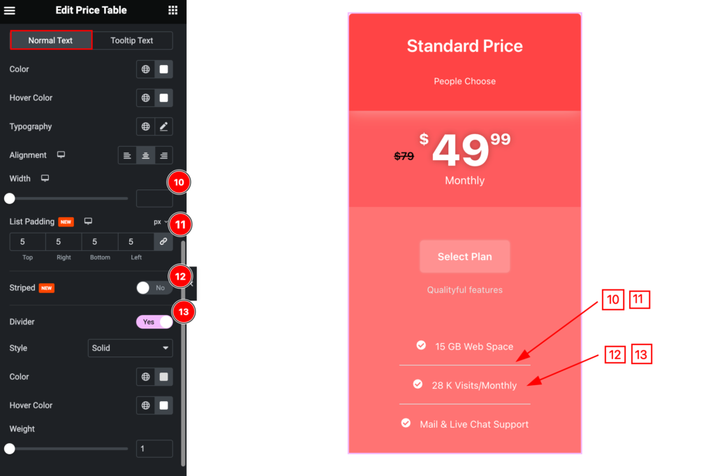
- Width: Set the width for the normal text.
- List Padding: Set the list padding.
- Striped: Enable it to show the striped.
- Divider: Enable the switcher to show the divider.
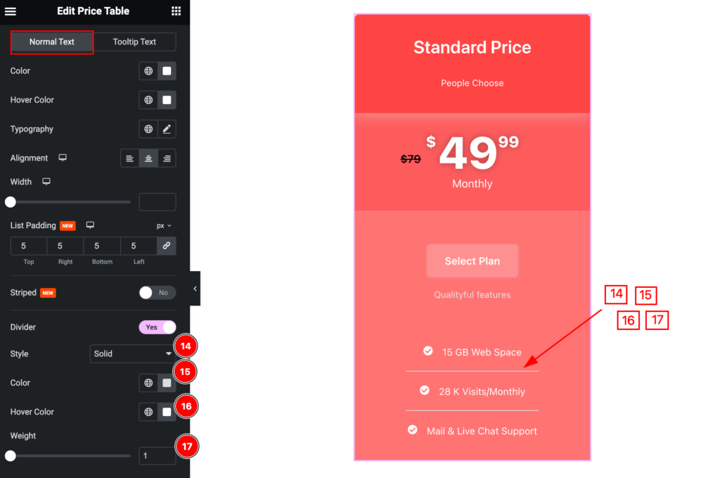
- Style: Set the style for it.
- Color: Set the color for the normal text.
- Hover Color: Set the hover color for it.
- Weight: Set the weight for the normal text.
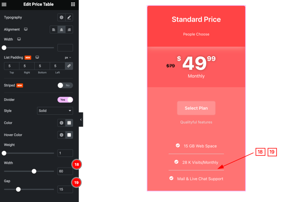
- Width: Set the width for the divider.
- Gap: Set the gap between the features.
Tooltip Text
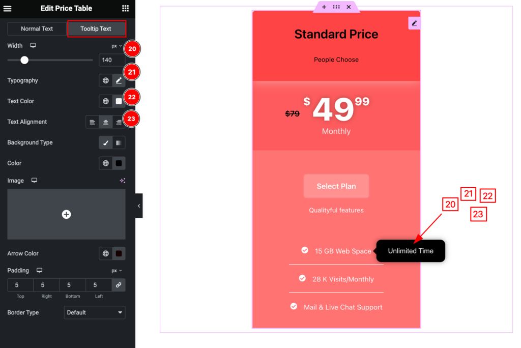
- Width: Set the width for the tooltip.
- Typography: Set the typography for it.
- Text Color: Set the text color.
- Text Alignment: Set the text alignment.
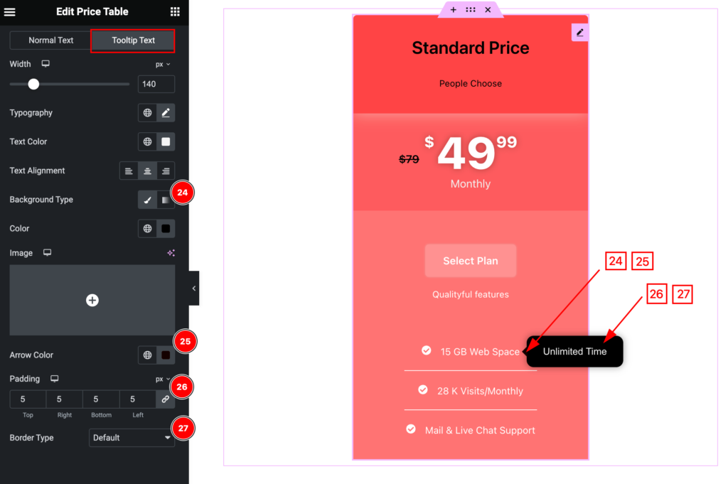
- Background Type: Set the background for the tooltip.
- Arrow Color: Set the arrrow color.
- Padding: Set the padding.
- Border Type: Set the border type.
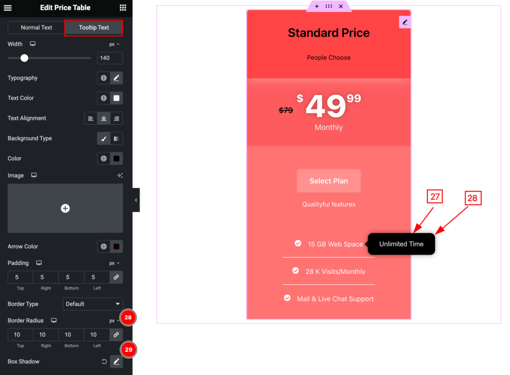
- Border Radius: Set the border radius.
- Box Shadow: Set the box shadow.
Footer Section
Go to Style > Footer
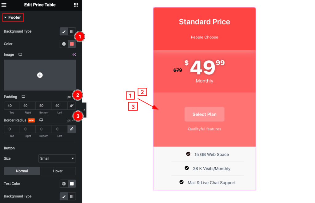
Make the footer section stylish by following,
- Background Type: Set the background type.
- Padding: Set the padding.
- Border Radius: Set the border radius.
Button
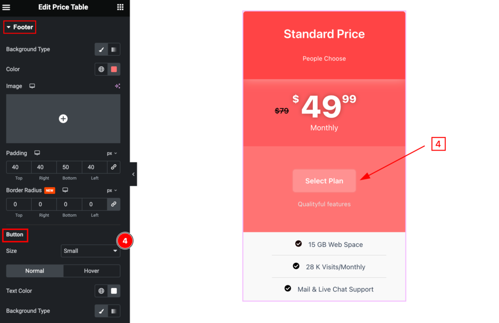
- Size: Set the size for the button.
Normal Sate for Footer
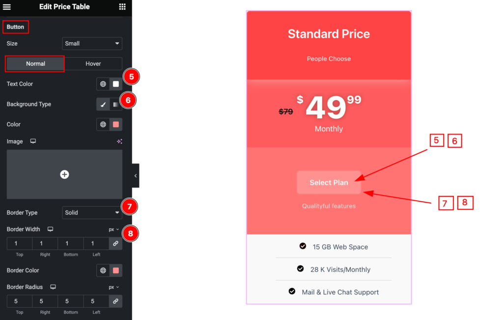
- Text Color: Set the text for the button
- Background Type: Set the background type for the button
- Border Type: Set the border type.
- Border Width: Set the width for the border.
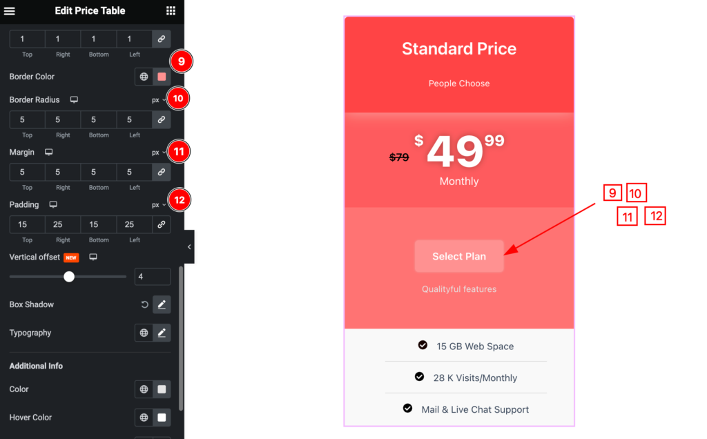
- Border Color: Set the color for the border.
- Border Radius: Set the border radius.
- Margin: Set the margin for it.
- Padding: Se the padding.
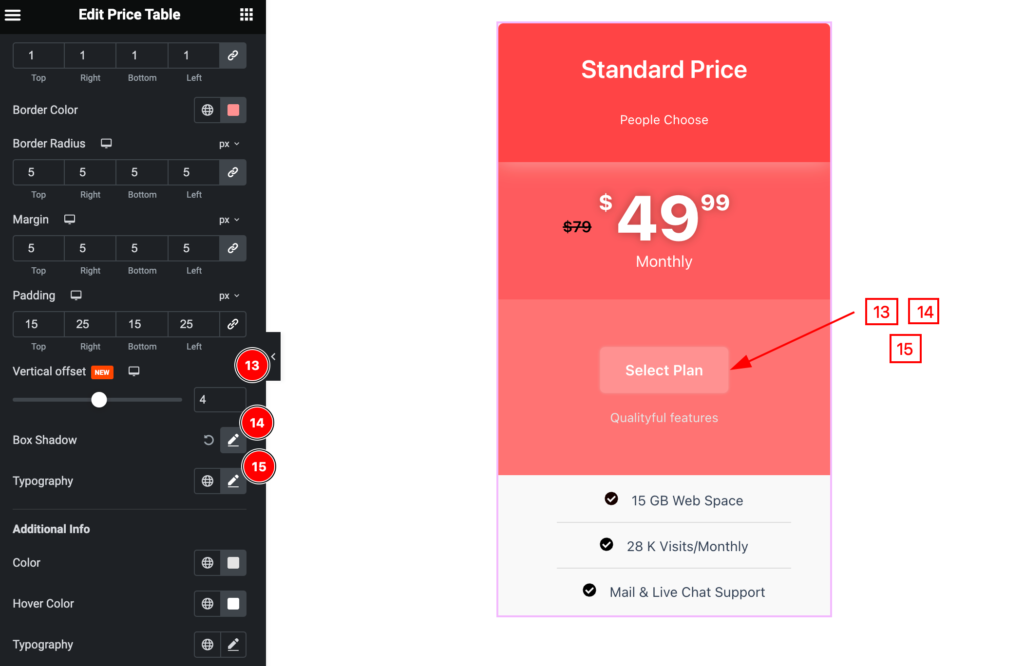
- Vertical offset: Set the vertical offset.
- Box Shadow: Set the shadow for the box
- Typography: Se the typography for it.
Additional Info
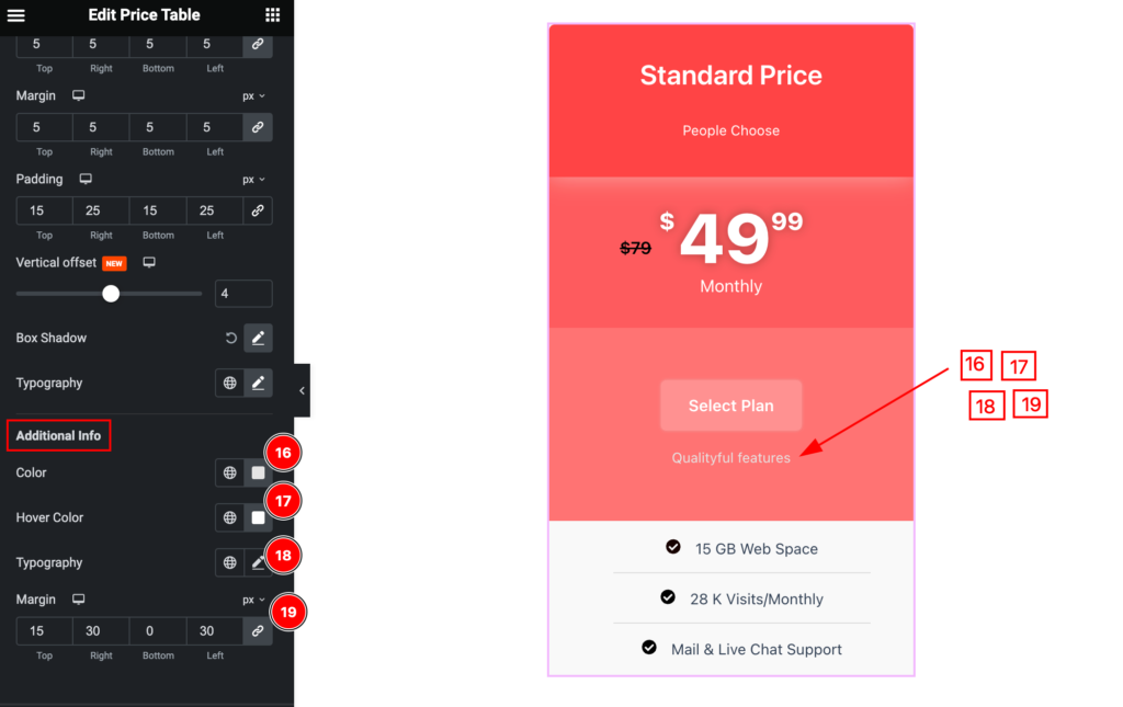
- Color: Set the for the additional info.
- Hover Color: Set the hover color.
- Typography: Set the typography.
- Margin: Set the margin for it.
Hover Sate for Footer
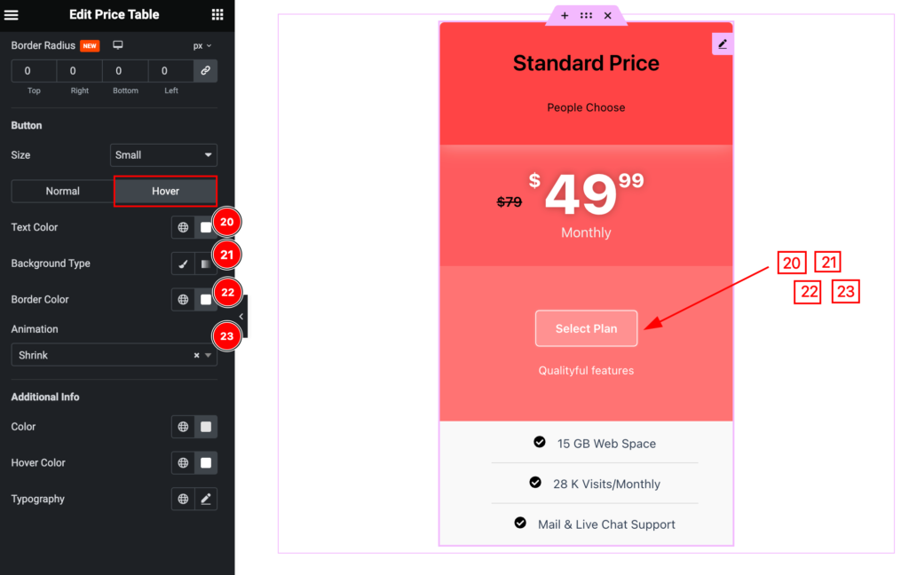
- Text Color: Set the text folor
- Background Type: Set the background type.
- Border Color: Set border color.
- Animation: Set the animation for the button.
Video Assist
You can watch the video above to learn about the Pricing Table widget.
Please visit the demo page for examples.
Thanks for staying with us.
