In this documentation, we will discuss the customization of the Post gallery widget, brought to you by the Element Pack Pro addon for Elementor.
Enable The Post Gallery Widget
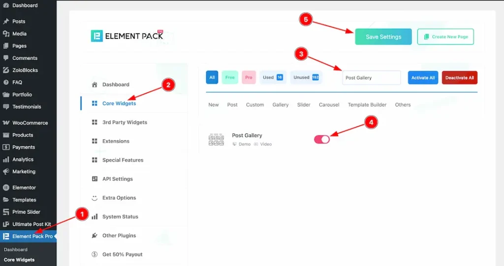
To use the post gallery widget from Element Pack Pro, first, you have to enable the widget.
- Go to WordPress dashboard → Element Pack Pro Plugin dashboard.
- Then, Click the Core Widgets Tab.
- Search the Post Gallery Widget Name.
- Enable the Post Gallery Widget.
- Hit the Save Settings Button.
Inserting the post gallery widget
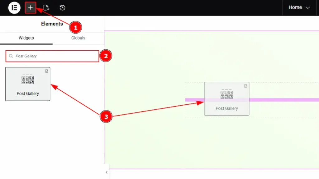
1. Go to the Elementor Editor Page and hit the “+” icon Button.
2. Search the Post Gallery widget.
3. Drag the widget and drop it on the editor page.
Work With The Content Tab
Layout Section
Go to Content → Layout
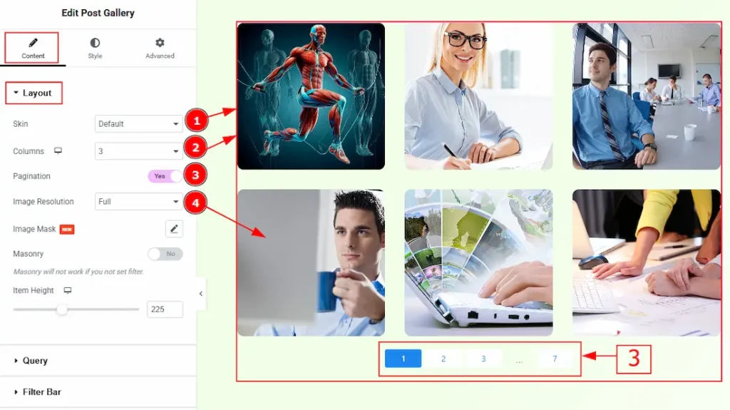
1. Skin: This option allows you to change the gallery skin to Default, Abetis, Fedara, or Trosia. Here, we selected the skin type as Default. You can choose any skin that meets your preference.
2. Column: Select the desired column count to define how the gallery is displayed to customers.
3. Pagination: Enable the switcher to show the pagination for your large post gallery.
4 Image Resolution: You can change the image resolution with this option.
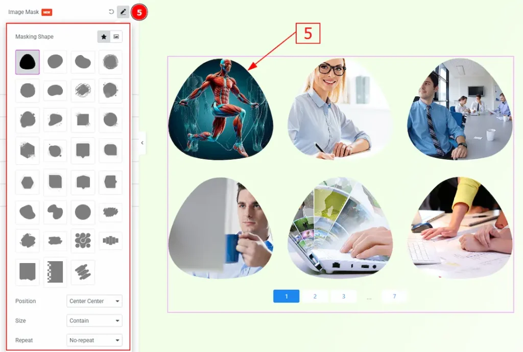
5. Image Mask: You can add a masking shape to your gallery with this option. You will find two types of shapes here: 1. Default Shape (Here, some shapes are provided; choose any and make changes to your gallery) & 2. Custom Shape (You can manually add any masking shape as per your preference)
Also, you will have 3 more options to customize the masking shape. These are –
- Position: You can move the shape position over the image with this option.
- Size: You can make changes to the masking shape size with this option. The provided sizes are – Auto, Cover, Contain & Custom. With the custom, you can make changes to the shape size manually.
Repeat: This option controls how a selected mask shape is applied and repeated across each post image in the gallery.
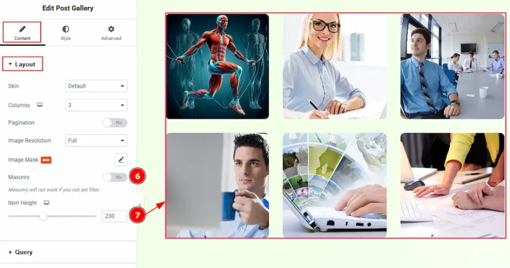
6. Masonry: Enable the switcher to arrange posts in uneven, brick-like columns where items automatically fit together based on their height. Please note that it won’t work if you haven’t set the filter.
7. Item Height: You can make changes to the item’s height with this option.
Query Section
Go to Content → Query
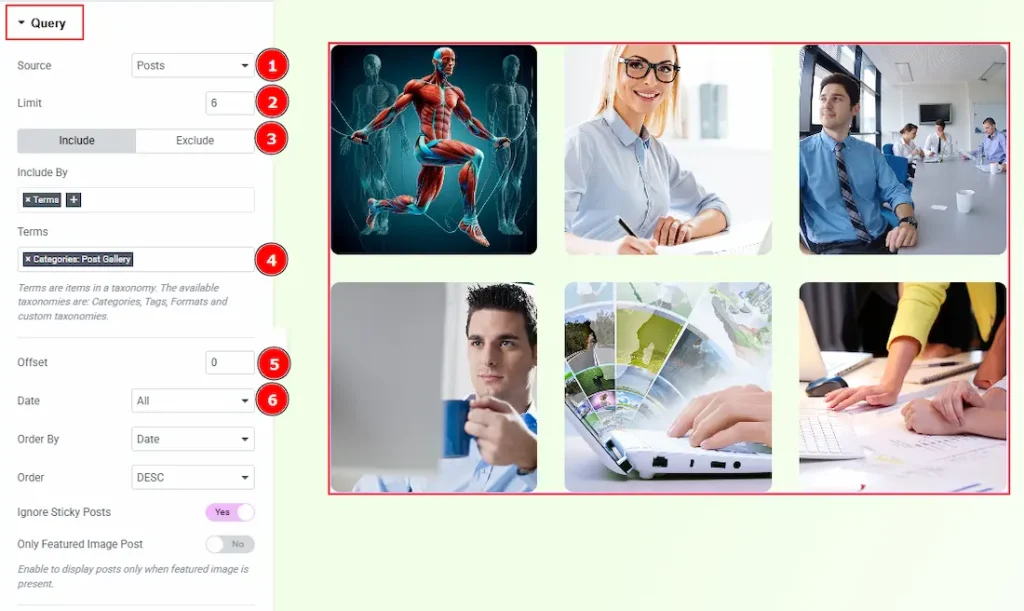
1. Source: Select the source for the gallery from here. The types of sources are – Posts, Pages, Floating Elements, Downloads, Products, Mega Menu Items, Template Items, Manual Selection, Current Query, and Related. Here, we selected the type as posts.
2. Limit: You can adjust the limit here of how many posts you want to show in the gallery.
3. Include/Exclude Selection: Select the Include / Exclude filter to show/hide specific posts by Terms (Tags/Categories) or Authors. Here, we selected the include field as Terms.
4. Terms: This option lets you select the categories/tags’ names that belong to posts you want to add to the gallery.
5. Offset: This option determines how many items are skipped from the beginning of the result set before displaying the remaining items.
6. Date: You can select the post as per the date of creation with this option.
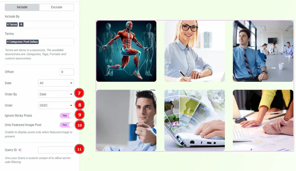
7. Order By: It controls the data you want to display through title, id, date, author, comment count, menu order & random. Here we selected the order as date.
8. Order: This option controls the order by which data is arranged. There are two types of order. Ascending Order (Starts from the smallest or lowest value and goes to the largest or highest.) & Descending Order (Starts from the largest or highest value and goes to the smallest or lowest.)
9. Ignore Sticky Posts: Enable or Disable the switcher to hide or show the sticky posts.
10. Only Featured Image Post: Enable or disable the switcher to show or hide the featured image post.
11. Query ID: Give your query a custom, unique ID to allow server-side filtering. Learn more about the Query.
Filter Bar Section
Go to Content → Filter Bar
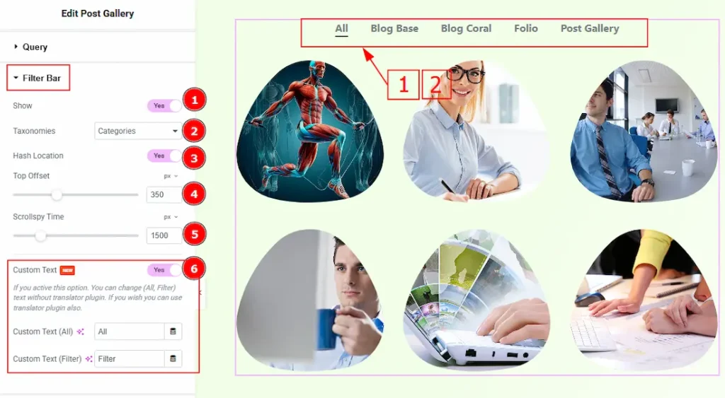
1. Show: Enable the switcher to show the filter bar and to get more options to customize the filter bar.
2. Taxonomies: You can select the taxonomies as categories or format with this option.
3. Hash Location: Enable the switcher to add the selected filter to the URL hash, allowing direct linking and browser navigation support.
4. Top Offset: It defines the vertical scroll offset (in pixels) applied when a filter is selected, useful for fixed or sticky headers.
5. Scrollspy Time: You can set the scroll animation duration (in milliseconds) when navigating to the filtered content.
6. Custom Text: Enable the switcher to allow customization of default filter labels such as “All” and “Filter”, for branding or localization purposes.
Note: The Custom Text Filter only shows on the responsive purpose. You can see it on a mobile or tablet device.
Additional Section
Go to Content → Scroll Down
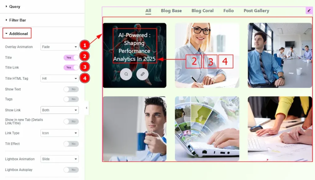
1. Overlay Animation: You can set an overlay animation to the gallery images with this option. There are many options listed; select as per your own preference.
2. Title: Enable the switcher to show the title to the customer.
3. Title Link: Enable the switcher to link up the title.
4. Title HTML Tag: You can make changes to the title HTML tag with this option.
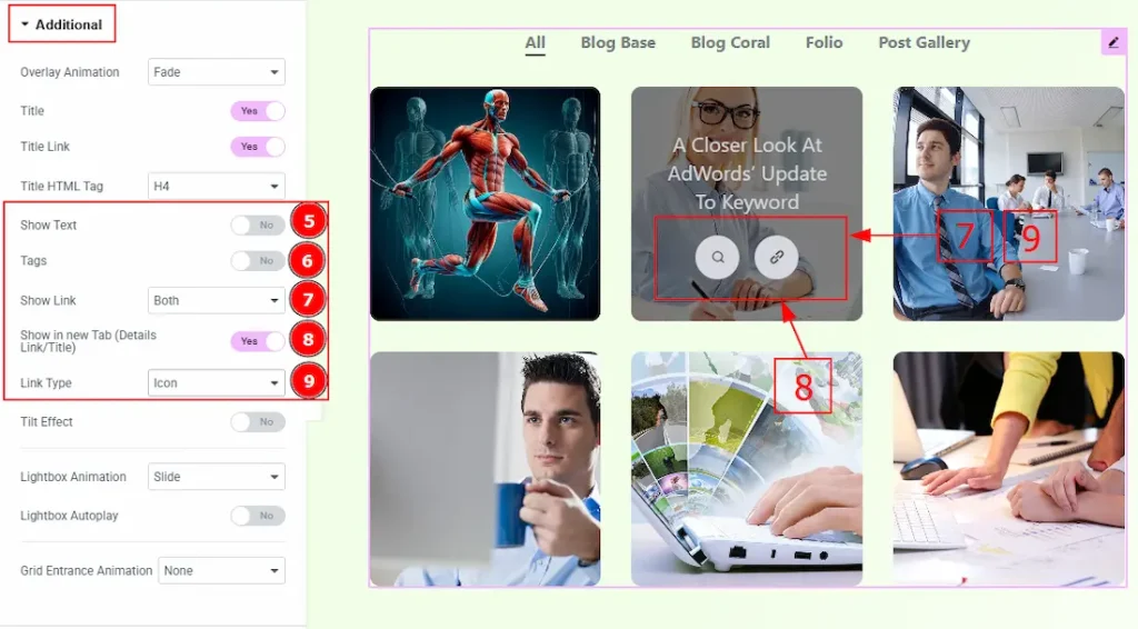
5. Show Text: Enable the switcher to show the text to your audience.
6. Tags: Enable the switcher to show the tags over the image to your audience.
7. Show Link: You can select if you want to show the lightbox link & details link over the image. You can choose any of those two or both with this option.
8. Show in New Rab (Details Link/Title): Enable the switcher to redirect the post to another new tab when clicked on the detail link or title.
9. Link Type: You can select how you want to show the link type to your audience. You can select the link type between icon & text. Here, we have selected the link type as icon.
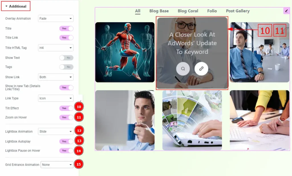
10. Tilt Effect: Enable the switcher to apply the tilt effect to the gallery image while hovering on it.
11. Zoom on Hover: Enable the switcher to apply a zoom effect when hovering over the image.
12. Lightbox Animation: You can set the lightbox animation to slide, fade, or scale with this option.
13. Lightbox Autoplay: Enable the switcher to start playing the video automatically when opened.
14. Lightbox Pause on Hover: Enable the switcher to pause the lightbox autoplay when the user hovers over the content and resumes playback when the cursor leaves.
15. Grid Entrance Animation: You can set an entrance animation to your post gallery with this option.
Work with The Style Tab
Items Section
Go to Style → Items
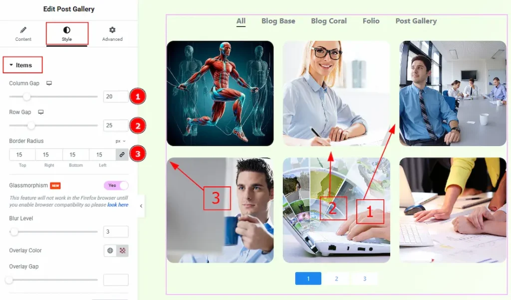
1. Column Gap: You can adjust the space between the items columns with this option.
2. Row Gap: You can adjust the space between the items row with this option.
3. Border Radius: This option controls the roundness of the border with this option.
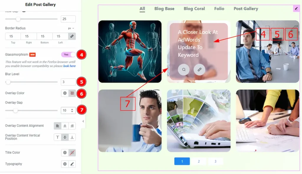
4. Glassmorphism: Enable the switcher to add a frosted, semi-transparent background with blur to Post Gallery items, creating a glass-like visual effect over the content.
5. Blur Level: You can adjust the blur level of the glassmorphism with this option.
6. Overlay Color: You can change the overlay color with this option.
7. Overlay Gap: You can adjust the space of the overlay over the image with this option.
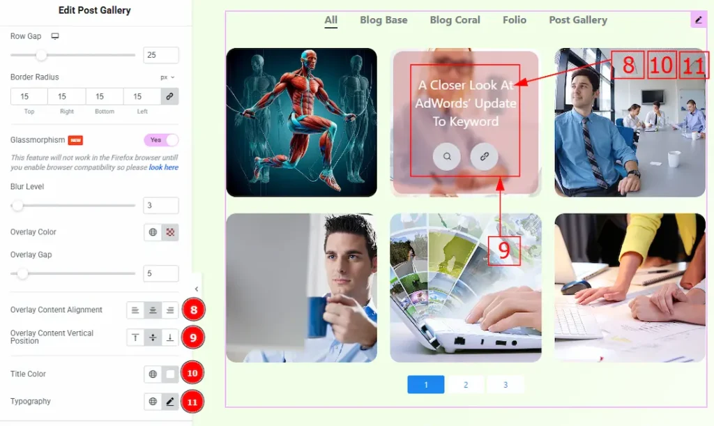
8. Overlay Content Alignment: You can set the position of the content in the overlay to left, center, or right with this option.
9. Overlay Content Vertical Position: You can set the overlay content position to top, middle & bottom with this option.
10. Title: You can change the title color with this option.
11. Typography: Change the font family, size, weight, transform, style, decoration, line height, letter spacing, and word spacing from here.
Button Section
Go to Style → Button
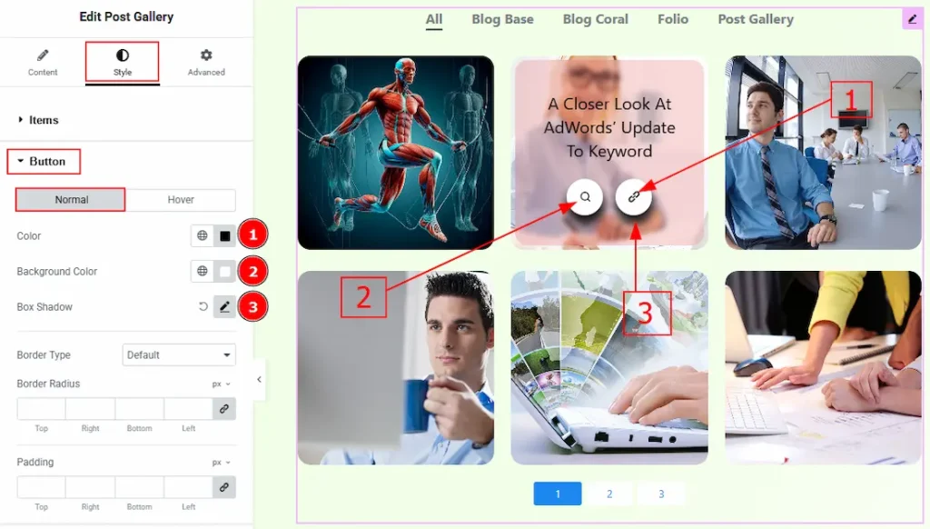
In this section, we have two more tabs. These are Normal & Hover. Let’s start describing the Normal Tab first –
1. Color: You can change the button icon color with this option.
2. Background Color: You can change the button background color with this option.
3. Box Shadow: You can add a shadow effect and customize it with this option.
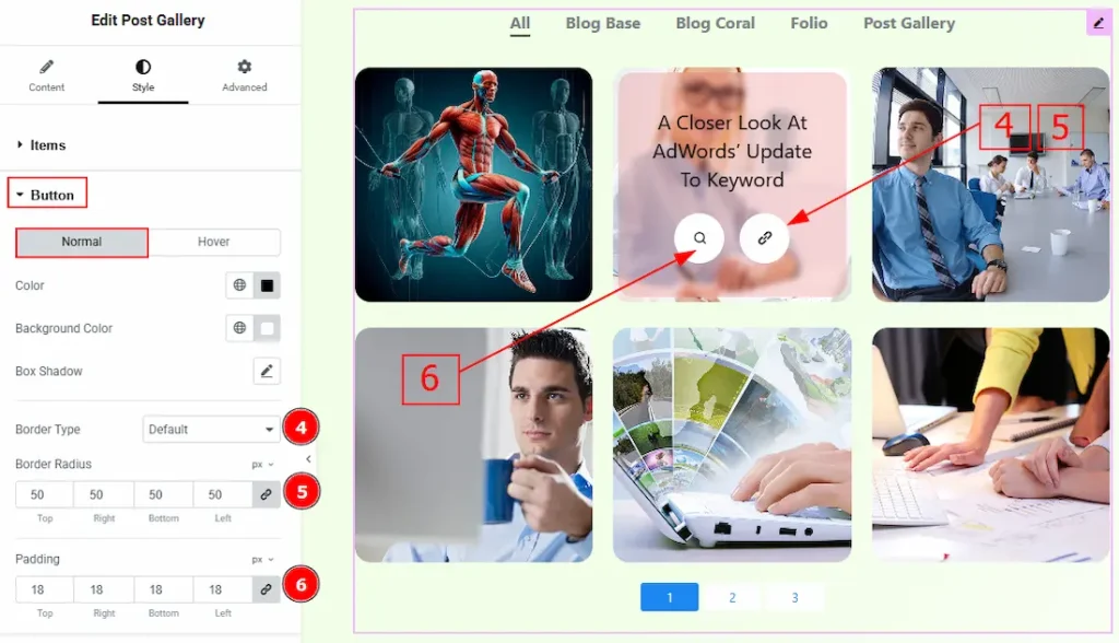
4. Border Type: You can add a border around the button and change its type with this option.
5. Border Radius: This option controls the roundness of the border.
6. Padding: You can adjust the inner space of the button with this option.
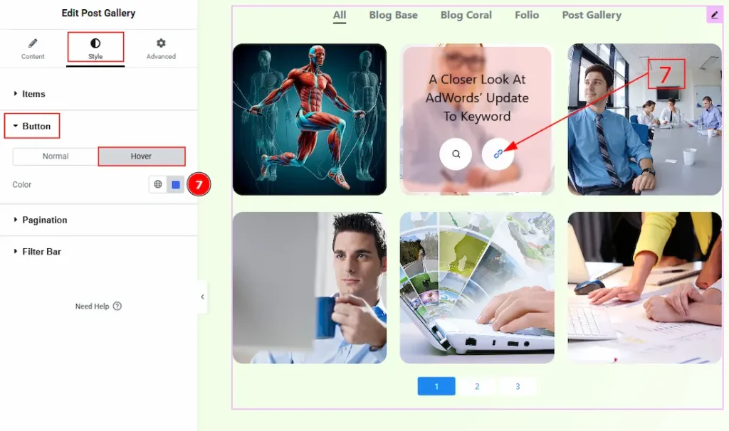
Now let’s proceed to the Hover tab –
7. Color: You can change the button icon hover color with this option.
Pagination Section
Go to Style → Pagination
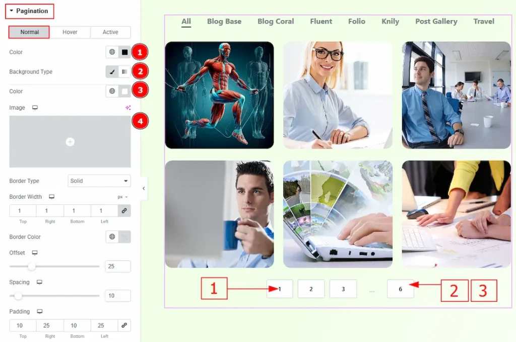
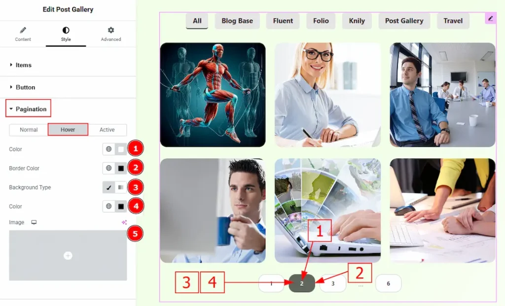
In this section, we have three tabs. These are Normal, Hover, and Active. Let’s explore those one by one by starting with the Normal Tab –
1. Color: You can change the pagination number color with this option.
2. Background Type: You can set the background type to classic or gradient with this option. Here, we have selected the background type as classic.
3. Color: You can change the background color with this option.
4. Image: You can change the background image with this option.
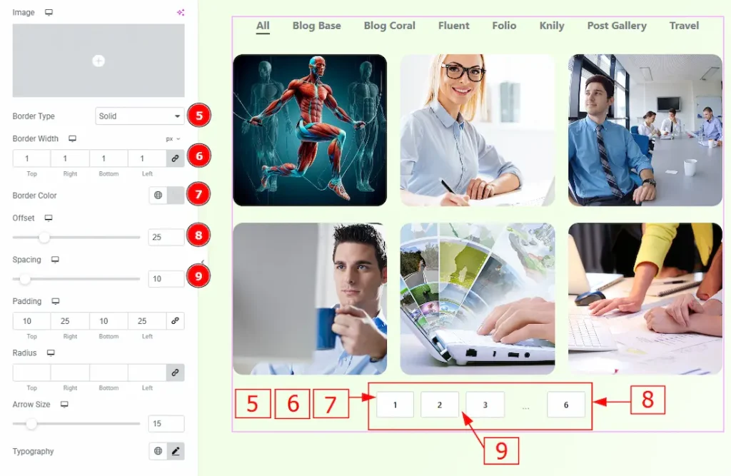
5. Border Type: You can add and change the border type with this option.
6. Border Width: You can set the thickness of the border with this option.
7. Border Color: You can change the border color with this option.
8. Offset: You can move the pagination field vertically with this option.
9. Spacing: You can adjust the space between the pagination fields with this option.
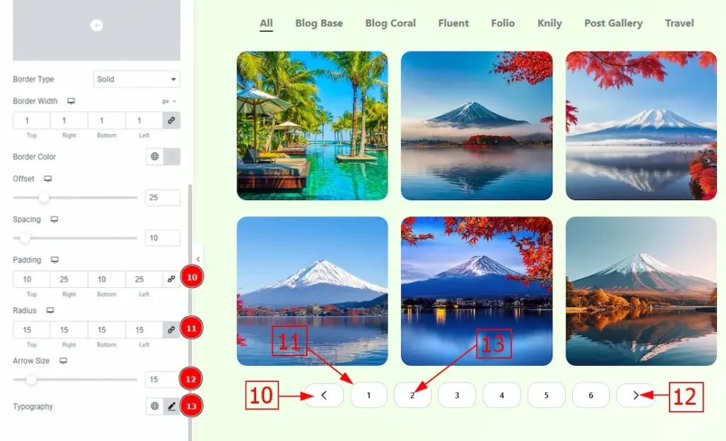
10. Padding: You can adjust the inner space of the pagination numeric button with this option.
11. Radius: You can control the roundness of the border with this option.
12. Arrow Size: You can adjust the size of the arrows with this option.
13. Typography: Change the font family, size, weight, transform, style, decoration, line height, letter spacing, and word spacing from here.
Now, let’s proceed to the Hover Tab –
1. Color: You can change the number’s hover color with this option.
2. Border Color: You can change the border hover color with this option.
3. Background Type: You can choose the background as classic or gradient with this option.
4. Color: You can change the background hover color with this option.
5. Image: You can change the background hover image with this option.
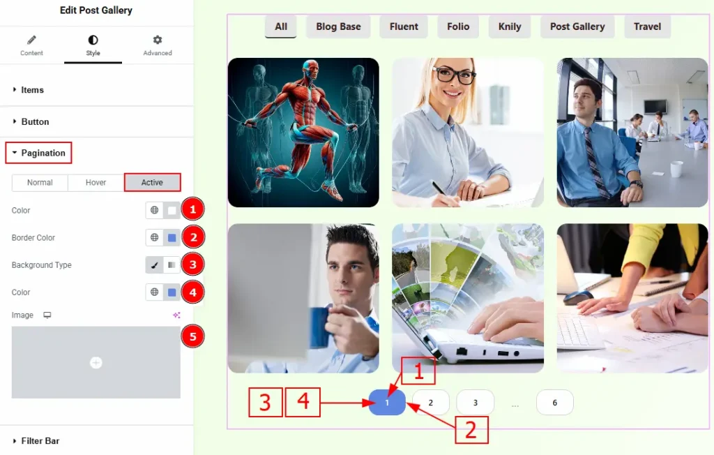
Now let’s describe the customization of Active Tab –
1. Color: You can change the page’s active number color with this option.
2. Border Color: You can change the border active color with this option.
3. Background Type: You can choose the background type as classic or gradient with this option.
4. Color: You can change the background color with this option.
5. Image: You can change the background image with this option.
Filter Bar Section
Go to Style → Filter Bar
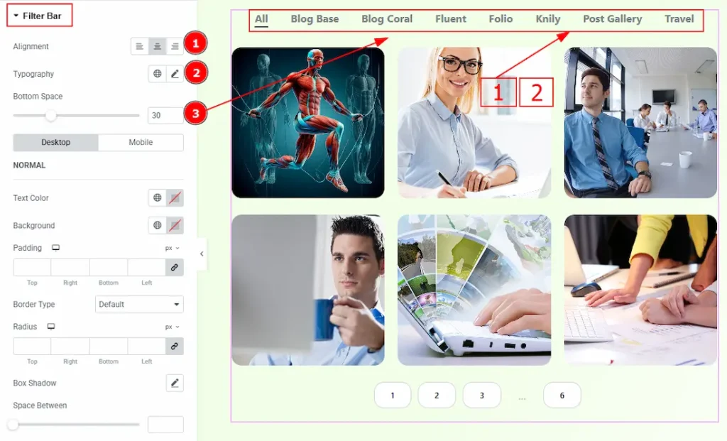
1. Alignment: You can set the position of the filter bar to left, center or right with this option.
2. Typography: Change the font family, size, weight, transform, style, decoration, line height, letter spacing, and word spacing from here.
3. Bottom Space: You can adjust the space between the filter bar and the gallery with this option.
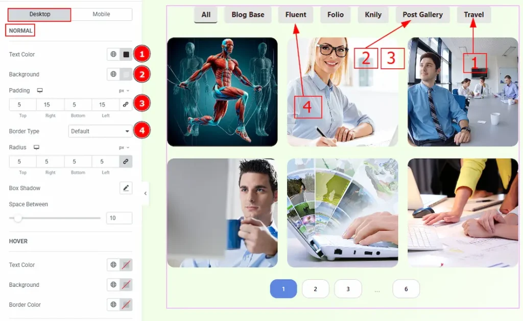
In this section, you’ll find two additional tabs: Desktop and Mobile. We’ll begin by exploring the Desktop tab. The Desktop tab includes three subsections named Normal, Hover, and Active. Let’s go through each of them one by one.
1. Text Color: You can change the filter bar text color with this option.
2. Background Color: You can change the filter bar background color with this option.
3. Padding: You can adjust the inner space of the filter bar with this option.
4. Border Type: You can select a border and change its type with this option.
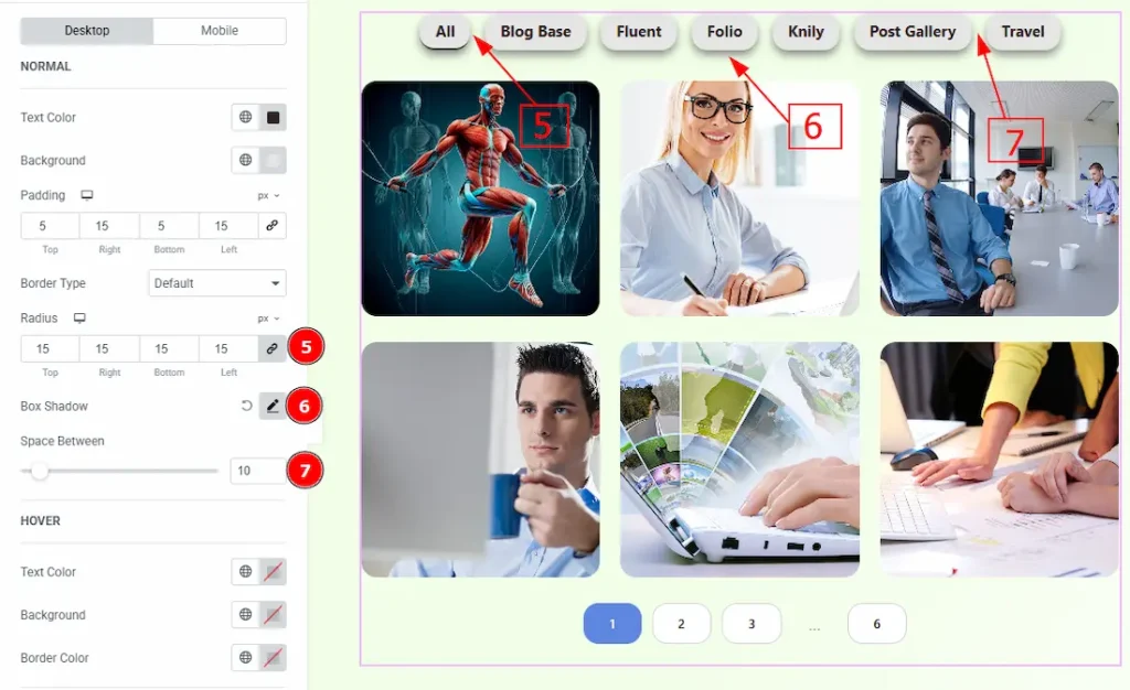
5. Radius: This option controls the roundness of the border.
6. Box Shadow: You can add a shadow effect to the filter bar category fields with this option.
7. Space Between: You can adjust the space between the filter bar category field with this option.
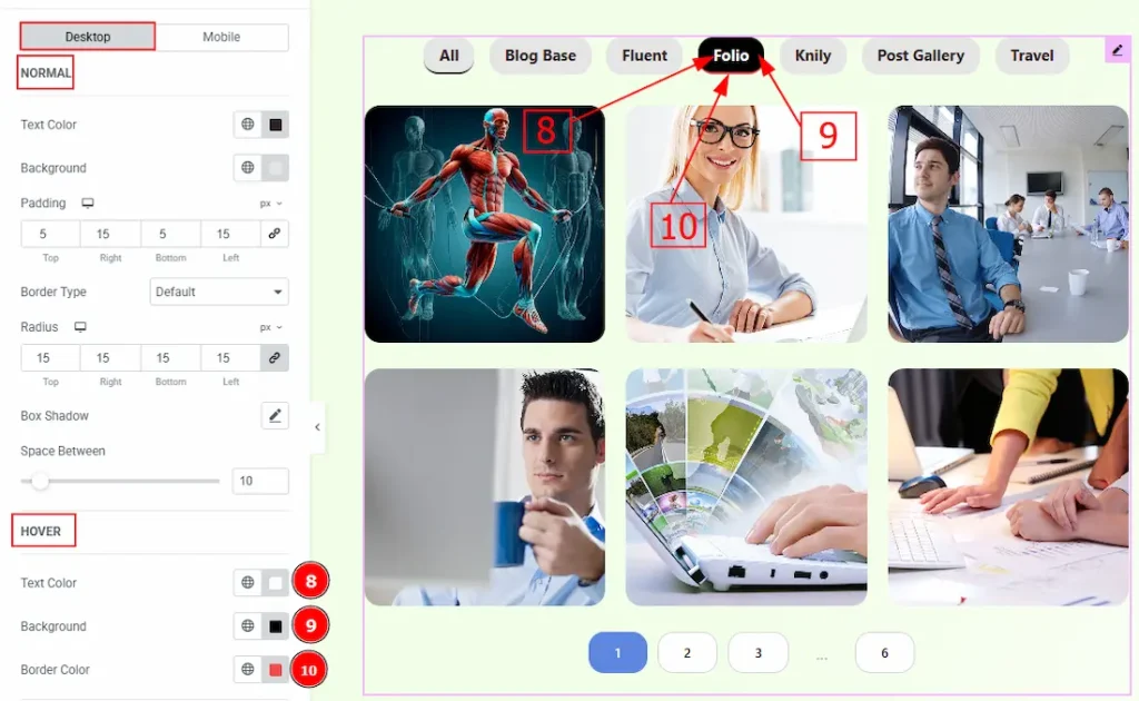
8. Text Color: You can change the filter bar text hover color with this option.
9. Background: You can change the filter bar background hover color with this option.
10. Border Color: You can change the border hover color with this option.
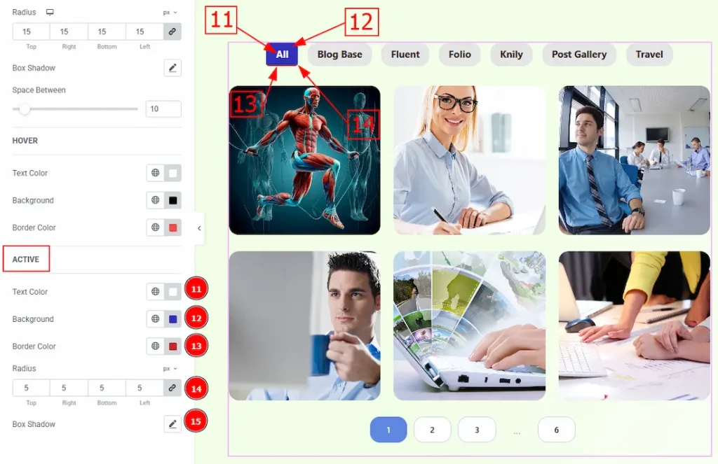
11. Text Color: You can change the filter bar text active color with this option.
12. Background: You can change the filter bar background active color with this option.
13. Border Color: You can change the active border color with this option.
14. Radius: You can control the roundness of the border with this option.
15. Box Shadow: You can add an active shadow effect to the filter bar with this option.
Now, let’s move to the Mobile Tab –
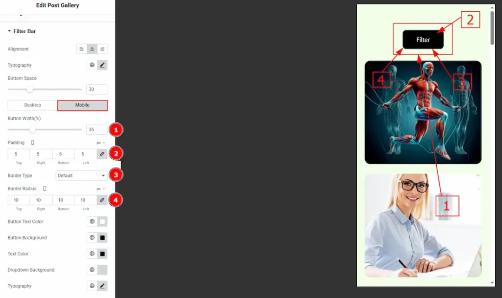
1. Button Width: You can adjust the width of the filter button with this option.
2. Padding: You can adjust the inner space of the filter button with this option.
3. Border Type: You can select a border and change its type with this option.
4. Border Radius: You can control the roundness of the border with this option.
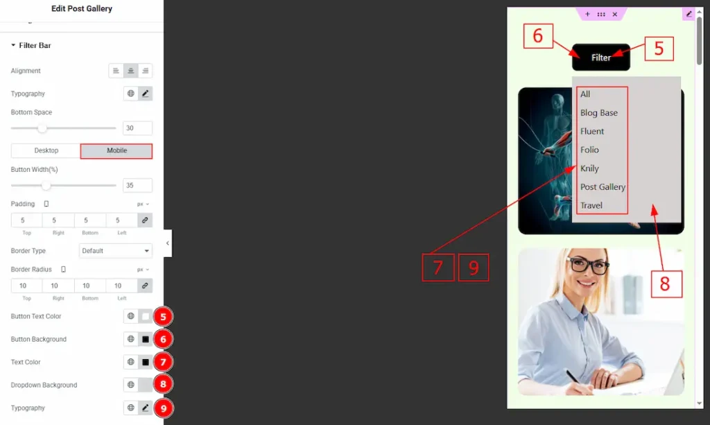
5. Button Text Color: You can change the button text color with this option.
6. Button Background: You can change the button background color with this option.
7. Text Color: You can change the dropdown categories text color with this option.
8. Dropdown Background: You can change the dropdown background color with this option.
9. Typography: Change the font family, size, weight, transform, style, decoration, line height, letter spacing, and word spacing from here.
All done! You have successfully customized the Post Gallery Widget on your website.
Video Assist
You can also watch the video tutorial to learn more about the Post Gallery widget. Please visit the demo page for examples.
Thanks for being with us.