In this documentation, we will discuss the customization of the Portfolio Carousel Widget, brought to you by the Element Pack Pro for Elementor.
Enable The Portfolio Carousel
To use the Portfolio Carousel from Element Pack Pro, first, you have to enable the slider.
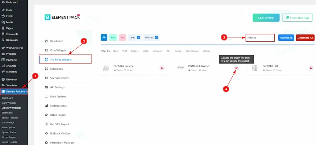
- Go to WordPress dashboard > Element Pack Pro Plugin dashboard.
- Then, Click the 3rd Party Widgets Tab.
- Search the Portfolio Carousel Name.
Enable the Portfolio Carousel to use this feature. Since it’s a third-party widget, the required plugin must be installed. Click the icon to download it automatically, or visit https://account.bdthemes.com/, locate under your purchased product, and download the plugin manually.
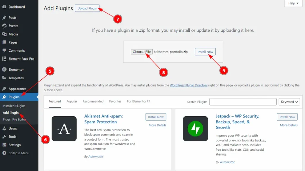
After downloading the plugin –
5. Go to WP Dashboard → Plugins.
6. Click on Add Plugin option to add the portfolio plugin.
7. Click on the upload plugin to upload the plugin file.
8. Click on the Choose File button to choose the plugin file from your local storage.
9. After the plugin is uploaded, click on the Install Now button to install the plugin.
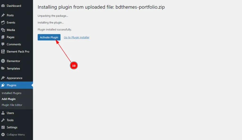
10. After clicking on the Install Now button, the plugin will install and it will ask for your permission to activate the plugin. Click on the Activate Plugin button to activate the plugin.
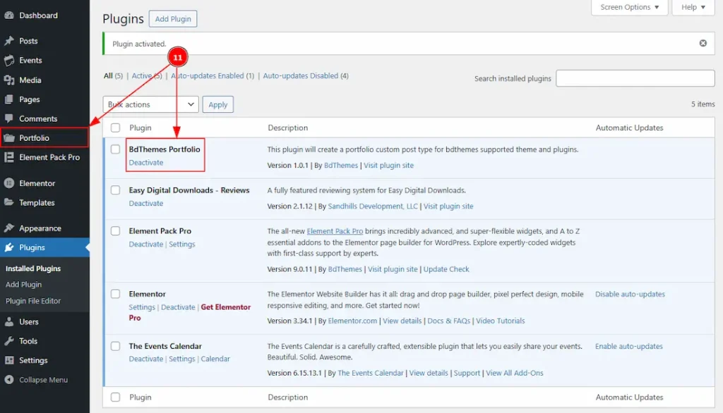
11. Go to the Plugins page to check if the plugin is activated successfully, and a separate dashboard is created for the Portfolio Plugin.
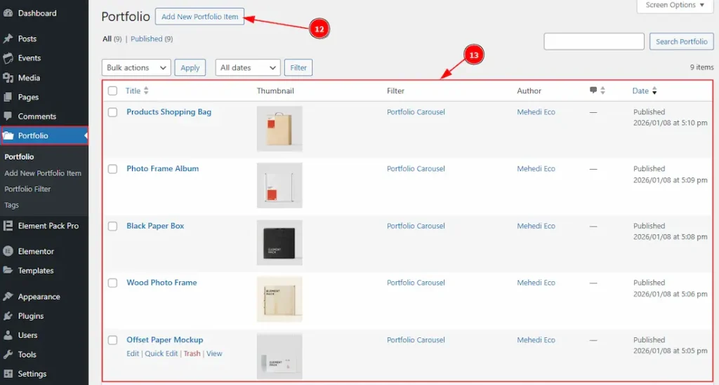
12. Go to WP Dashboard → Portfolio, then click on the Add New Portfolio Item to create the portfolios for your clients.
13. Here, you will see the list of the portfolios that you have created.
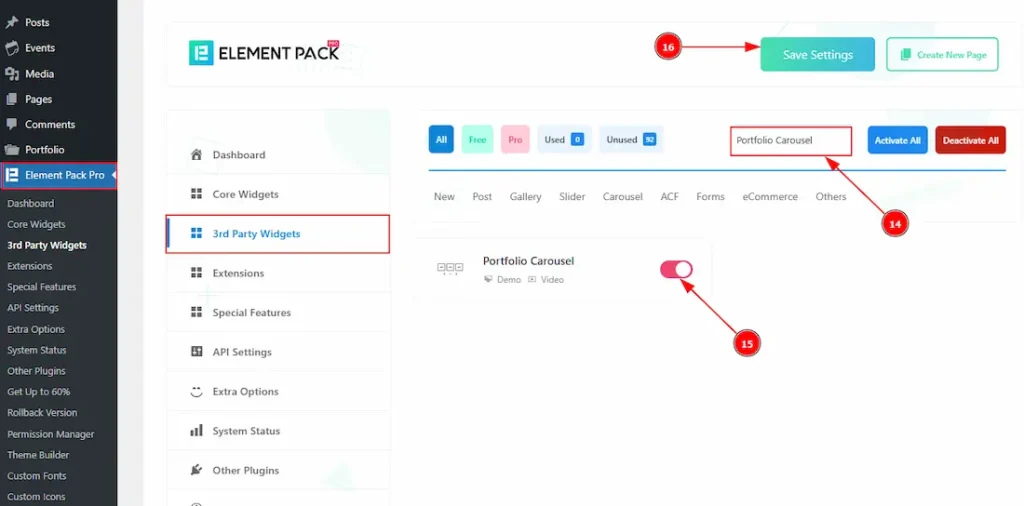
14. Then again, go to WP Dashboard → Element Pack Pro Dashboard → 3rd Party Widgets and then search for the name of Portfolio Carousel.
15. Enable the Portfolio Carousel widget.
16. Click on the save settings button to save the changes that you have made.
Inserting The Portfolio Carousel
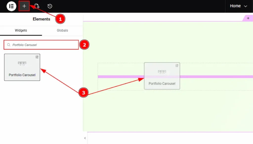
1. Go to the Elementor Editor Page and hit the “+” icon Button.
2. Search the Portfolio Carousel name.
3. Drag the widget and drop it on the editor page.
(Note: Since this is a third-party widget, you’ll need to install the required plugin and create the portfolio you want to display. Otherwise, the carousel will appear blank.)
Work With The Content Tab
Layout Section
Go to Content → Layout
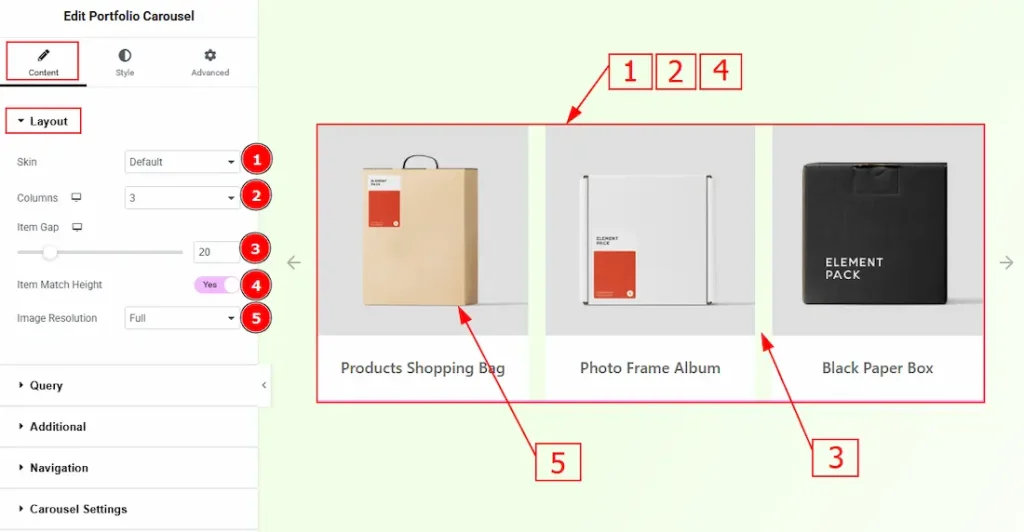
1. Skin: You can select the portfolio skin type from here. We have a total of five skin layouts. These are Default, Abetis, Fedara, Trosia & Janes. If you select the default skin, you will get to see this layout.
2. Columns: You can select the number of columns that you want to show with this option.
3. Item Gap: You can adjust the space between the items with this option.
4. Item Match Height: Enable the switcher to make all the items equal height.
5. Image Resolution: You can select the image resolution with this option.
Query Section
Go to Content → Query
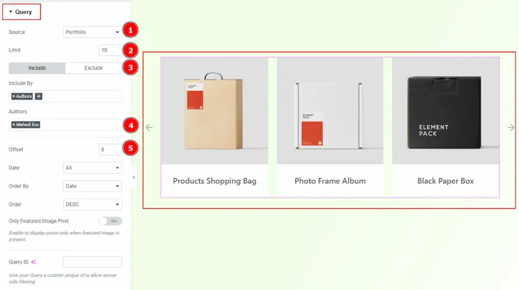
1. Source: Select the source for the slider from here. The types of sources are – Posts, Pages, Floating Elements, Portfolio, Events, Mega Menu Items, Template Items, Manual Selection, Current Query & Related. Here, we selected the type as Portfolio.
2. Limit: You can adjust the limit here of how many portfolios you want to show.
3. Include/Exclude Selection: Select the Include / Exclude filter to show/hide specific portfolios by Terms (Tags/Categories) or Authors. Here, we selected the include field as Author.
4. Author: This option lets you select the author’s name whose portfolio you want to add to the carousel.
5. Offset: This option determines how many items are skipped from the beginning of the result set before displaying the remaining items.
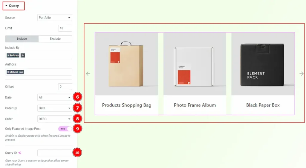
6. Date: You can select the post as per the date of creation with this option. Keep it all to show all the portfolios.
7. Order By: It controls the data you want to display through event date, title, category & random. Here, we selected the order by portfolio date.
8. Order: This option controls the order in which data is arranged. There are two types of order. Ascending Order (Starts from the smallest or lowest value and goes to the largest or highest.) & Descending Order (Starts from the largest or highest value and goes to the smallest or lowest.)
9. Only Featured Image Post: Enable or disable the switcher to show or hide the featured image portfolio.
10. Query ID: Give your query a custom, unique ID to allow server-side filtering. Learn more about the Query.
Additional Section
Go to Content → Additional
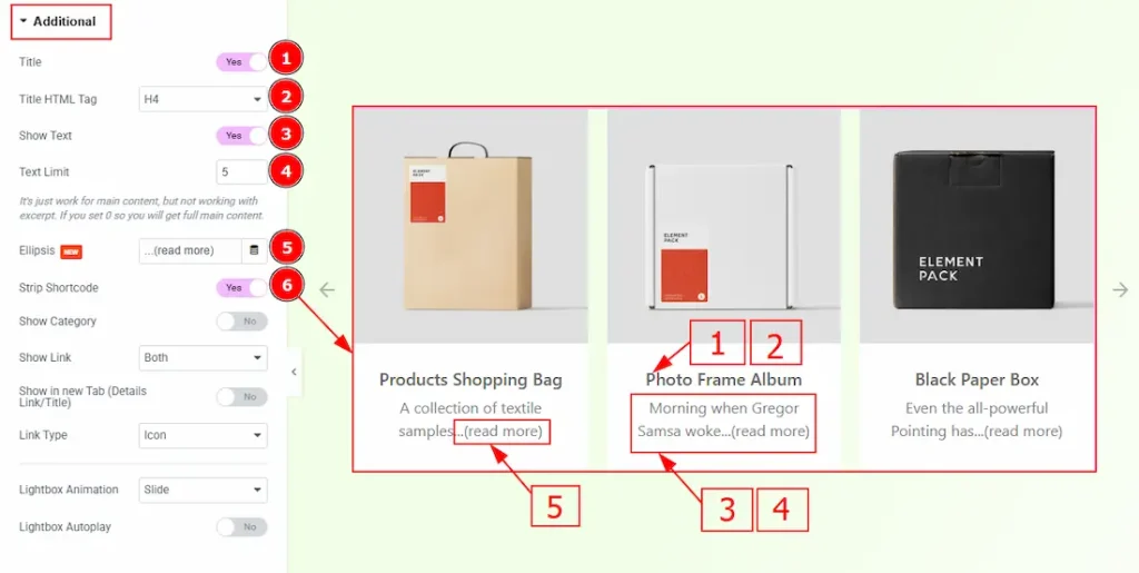
1. Title: Enable the switcher to show the title to your audience
2. Title HTML Tag: You can make changes to the title HTML tag with this option.
3. Show Text: Enable the switcher to show the text to your audience.
4. Text Limit: You can set the limit of the text that you want to show to your audience.
5. Ellipsis: You can add customized text after the text with this option.
6. Strip Shortcode: This option removes any shortcodes from the blog’s main content.
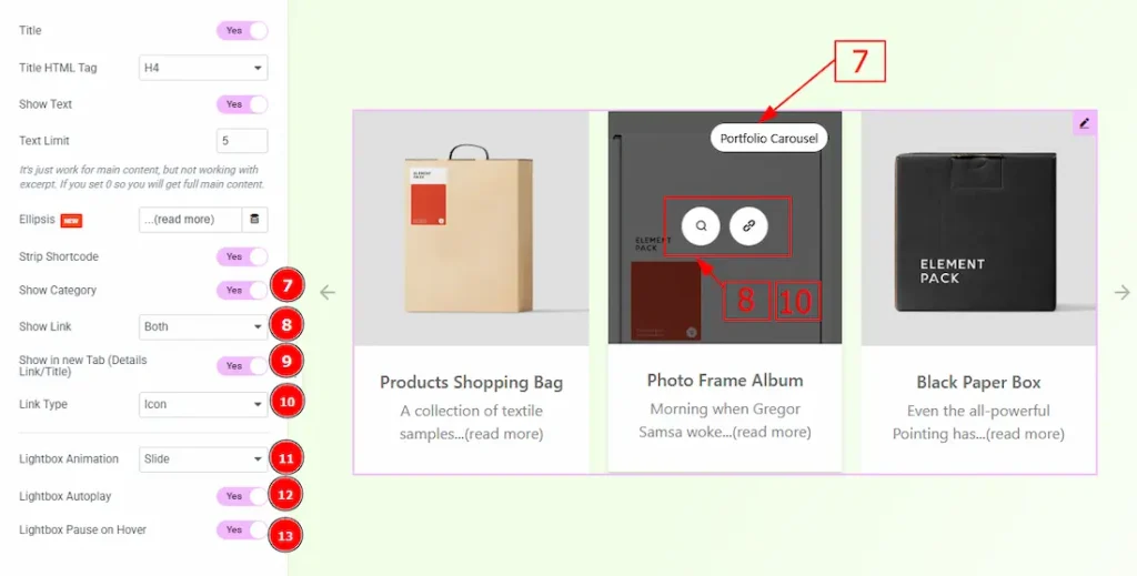
7. Show Category: Enable the switcher to show the category to your audience.
8. Show Link: You can select if you want to show the lightbox link & details link over the image. You can choose any of those two or both with this option.
9. Show in New Rab (Details Link/Title): Enable the switcher to redirect the post to another new tab when clicked on the detail link or title.
10. Link Type: You can select how you want to show the link type to your audience. You can select the link type between icon & text. Here, we have selected the link type as icon.
11. Lightbox Animation: You can set the lightbox animation to slide, fade or scale with this option.
12. Lightbox Autoplay: Enable the switcher to start playing the video automatically when opened.
13. Lightbox Pause on Hover: Enable the switcher to pause the lightbox autoplay when the user hovers over the content and resumes playback when the cursor leaves.
Navigation Section
Go to Content → Navigation
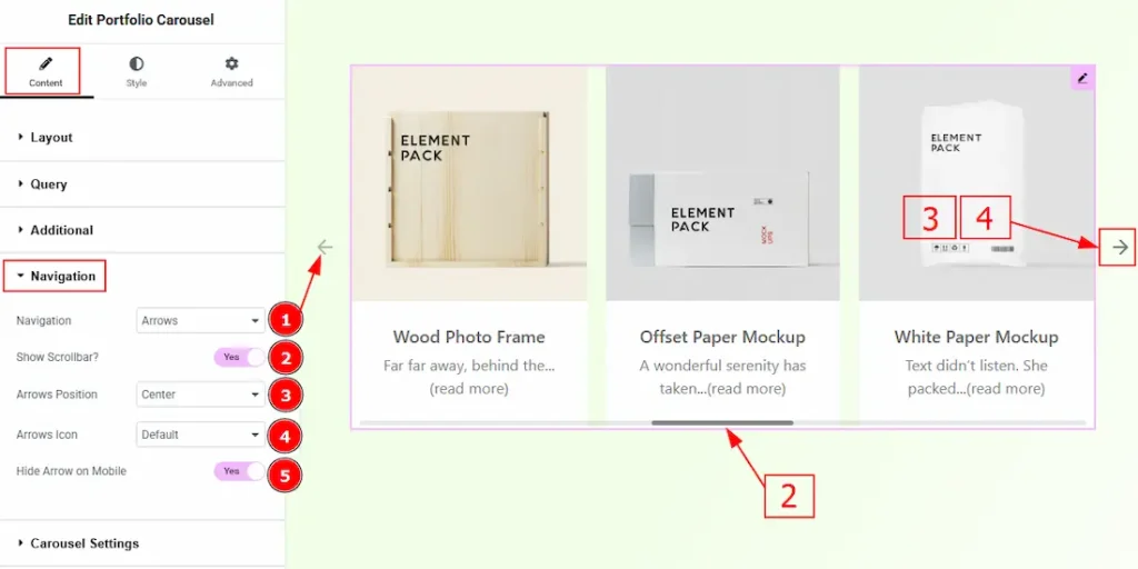
1. Navigation: You can select the navigation type to arrows & Dots, arrows, dots, or none with this option. Here, we selected the navigation type as arrows.
2. Show Scrollbar: Enable the switcher to show the scrollbar to the audience.
3. Arrows Position: You can adjust the arrows’ position with this option.
4. Arrows Icon: You can select the arrows icon type from 22 icon styles with this option.
5. Hide Arrows on Mobile: Enable the switcher to hide arrows on mobile devices.
Carousel Settings Section
Go to Content → Carousel Settings
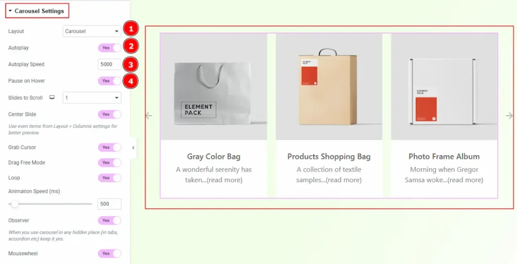
1. Layout: You can select the Layout type to Carousel & Coverflow. Here, we select the layout type as Carousel.
2. Autoplay: If you enable the Autoplay switcher button, your slider will slide into Autoplay mode.
3. Autoplay Speed: This option allows you to set the speed for automatically playing the carousel.
4. Pause on Hover: If you activate the pause on Hover button, when visitors hover the mouse cursor on the slider, then your slider will Hold, otherwise your slider slide Autoplay.
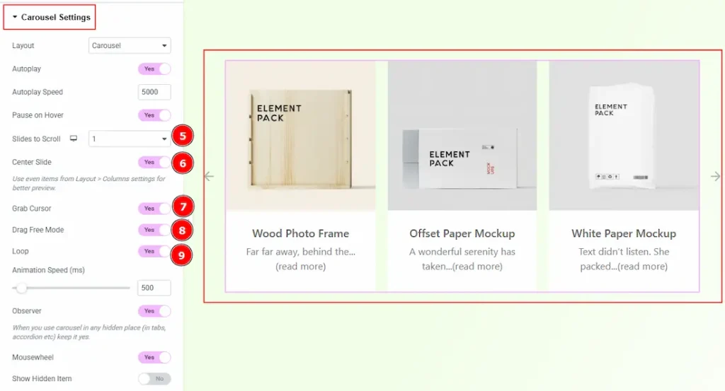
5. Slides to Scroll: It represents how many slides will slide at once.
6. Center Slide: If you enable the Switcher option, then your Active slider will show the center (depending on your widget style).
7. Grab Cursor: Your mouse pointer icon will be changed into a grab cursor. Visitors can slide the slider manually with their mouse cursor.
8. Drag Free Mode: Enable the switcher to scroll the carousel smoothly without snapping to a fixed slide, making navigation feel more fluid.
9. Loop: Enable the switcher to go back to the first automatically after the last slide.
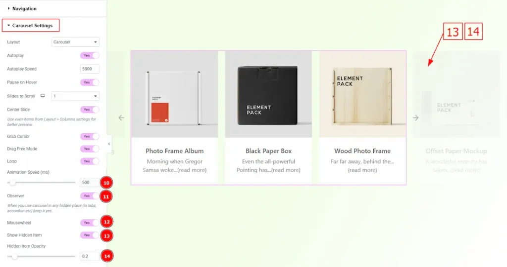
10. Animation Speed (ms): This option controls how fast the transition animation occurs between slides.
11. Observer: Enabling this option helps the slider function correctly when it’s initially hidden.
12. Mousewheel: This option lets visitors scroll through the carousel items using their mouse wheel instead of just clicking arrows or dragging.
13. Show Hidden Item: Enable the switcher to make the hidden items visible.
14. Hidden Item Opacity: You can adjust the hidden item opacity with this option.
Work with The Style Tab
Items Section
Go to Style → Items
In this section, we have three sub-sections. These are Overlay, Content & Item. Let’s start exploring those one by one.
Overlay Sub-Section
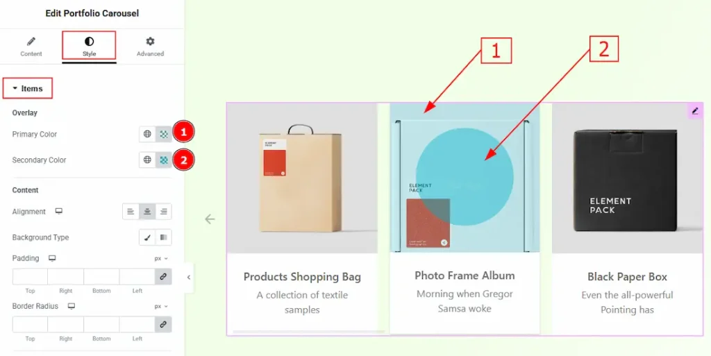
1. Primary Color: You can make changes to the primary overlay color with this option.
2. Secondary Color: You can make changes to the secondary overlay color with this option.
Content Sub-Section
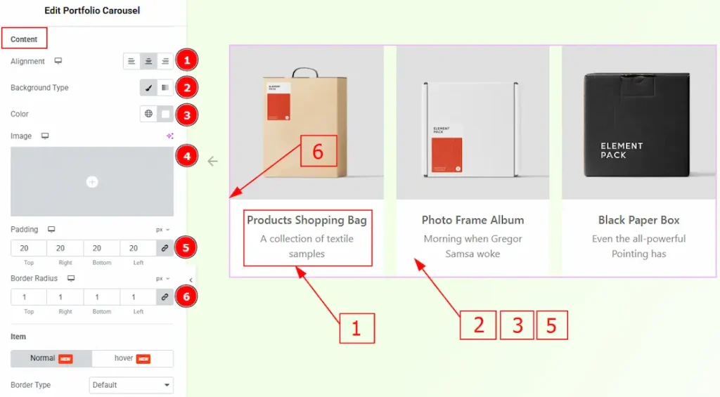
1. Alignment: You can set the position of the content to left, center or right with this option.
2. Background Type: You can select the background type to be classic or gradient with this option. Here, we have selected the background type as Classic.
3. Color: You can change the background color with this option.
4. Image: You can change the background image with this option.
5. Padding: You can adjust the inner space of the content area with this option.
6. Border Radius: This option controls the roundness of the border.
Item Sub-Section
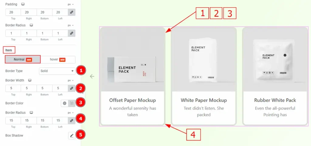
In this sub-section, we have two more tabs. These are Normal & Hover. Let’s start describing the Normal Tab first –
1. Border Type: You can add and change the border types with this option.
2. Border Width: You can set the thickness of the border with this option.
3. Border Color: You can change the border color with this option.
4. Border Radius: You can control the roundness of the border with this option.
5. Box Shadow: This option allows you to add a shadow effect to the items.
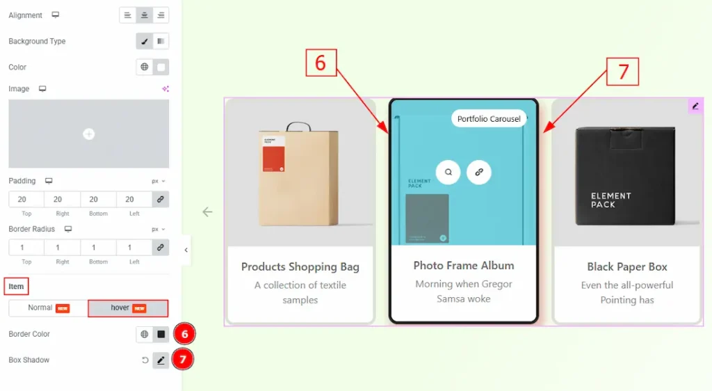
6. Border Color: You can change the hover border color with this option.
7. Box Shadow: You can add a hover shadow effect to the items that are active when hovering on those, with this option.
Title Section
Go to Style → Title
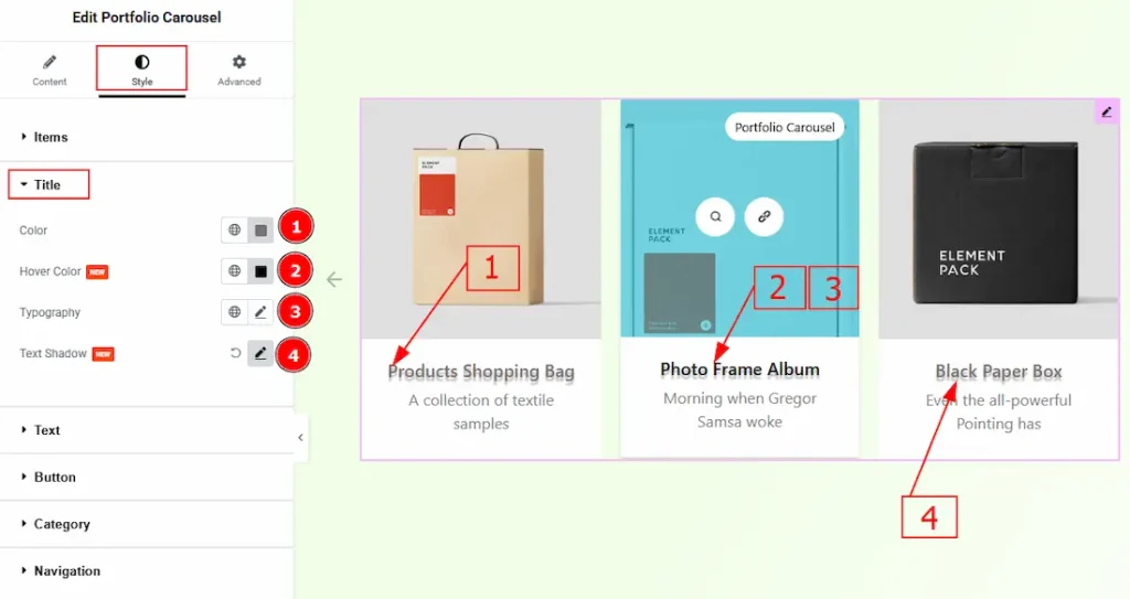
1. Color: You can change the title color with this option.
2. Hover Color: You can change the title hover color with this option.
3. Typography: Change the font family, size, weight, transform, style, decoration, line height, letter spacing, and word spacing from here.
4. Text Shadow: You can create a shadow effect of the text & customize it with this option.
Text Section
Go to Style → Text
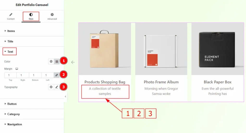
1. Color: You can change the excerpt text color with this option.
2. Margin: You can add space around the text field with this option.
3. Typography: Change the font family, size, weight, transform, style, decoration, line height, letter spacing, and word spacing from here.
Button Section
Go to Style → Button
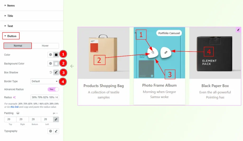
In this section, we have two more tabs. These are Normal & Hover. Let’s start describing the Normal Tab first –
1. Color: You can change the button’s icon color with this option.
2. Icon Color: You can change the button’s background color with this option.
3. Box Shadow: You can add a shadow effect to the buttons with this option.
4. Border Type: You can add and change the border types with this option.
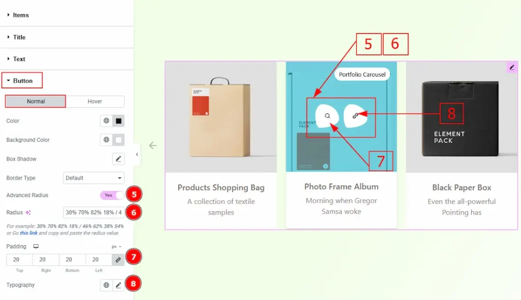
5. Advanced Radius: Enable the switcher to show more options to customize the border radius.
6. Radius: Here, you customize your own radius style and apply it to the button. Click on the provided link and customize the radius as per your preference.
7. Padding: You can adjust the inner space of the button with this option.
8. Typography: Change the font family, size, weight, transform, style, decoration, line height, letter spacing, and word spacing from here.
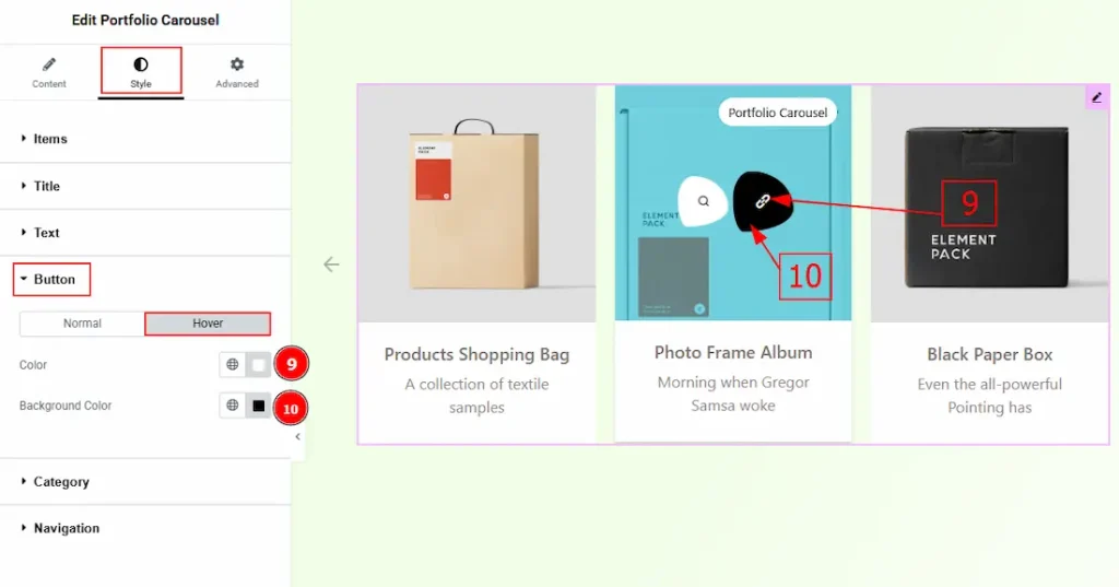
Now, let’s proceed to the Hover tab –
9. Color: You can change the button’s icon hover color with this option.
10. Background Color: You can change the button’s background hover color with this option.
Category Section
Go to Style → Category
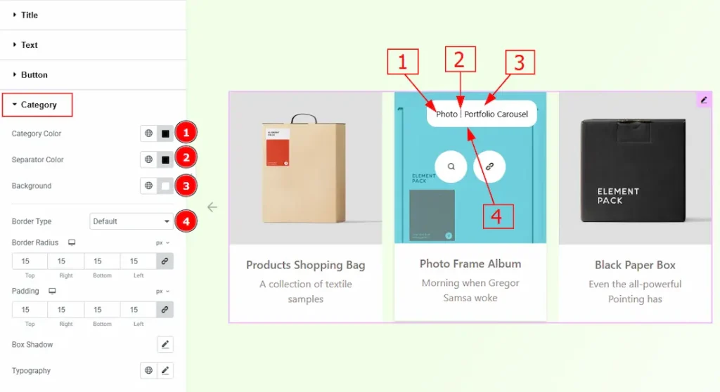
1. Category Color: You can change the category’s text color with this option.
2. Separator Color: You can change the separator color with this option.
3. Background: You can change the category’s background color with this option.
4. Border Type: You can add and change the border type with this option.
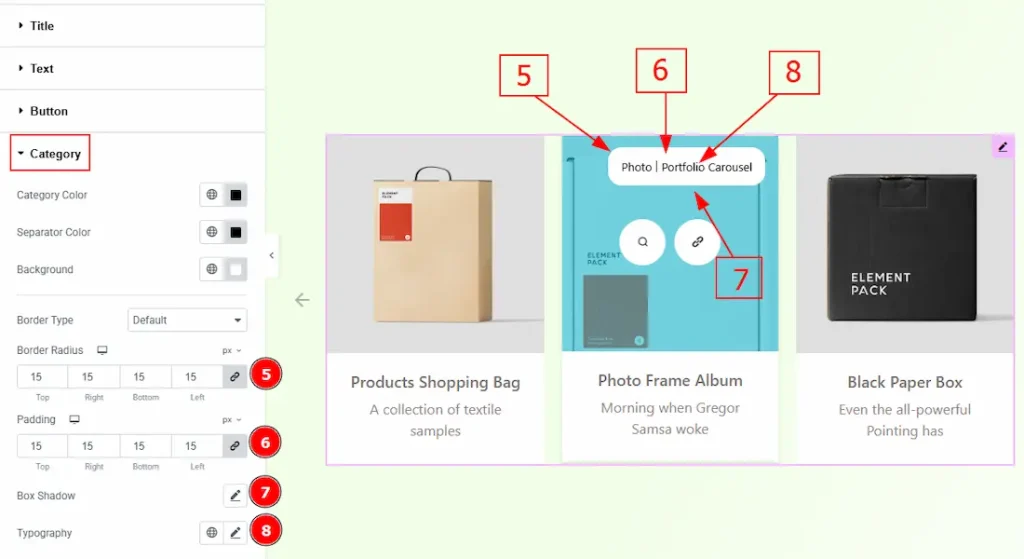
5. Border Radius: You can control the roundness of the border with this option.
6. Padding: You can adjust the inner space of the category field with this option.
7. Box Shadow: You can add a shadow effect to the category field with this option.
8. Typography: Change the font family, size, weight, transform, style, decoration, line height, letter spacing, and word spacing from here.
Navigation Section
Go to Style > Navigation
Arrows Subsection
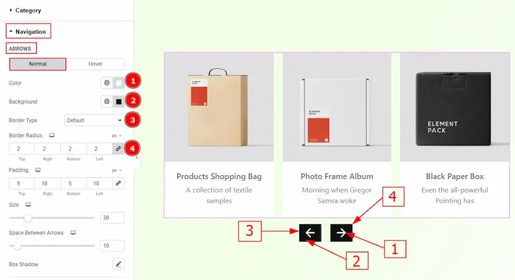
In this sub-section, we have two more tabs. These are Normal & Hover. Let’s start with the Normal Tab –
1. Color: You can change the arrow icon color with this option.
2. Background Color: You can change the arrow’s background color with this option.
3. Border Type: This option allows you to add borders to your items. You can select various border types from this option. Such as Solid, Double, Dotted, Dashed, Groove.
4. Border Radius: This option controls the roundness of the border.
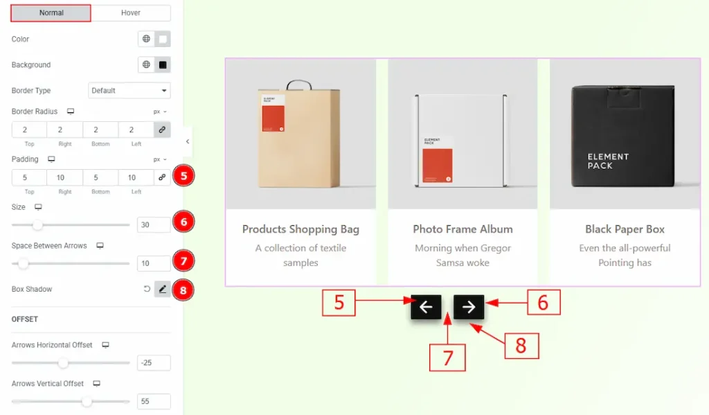
5. Padding: You can adjust the inner space and gaps of the arrow field with this option.
6. Size: You can make changes to the arrows’ size with this option.
7. Space Between Arrows: You can adjust the space between arrows with this option.
8. Box Shadow: You can add a shadow effect to the arrows with this option
Now, let’s proceed to the Hover Tab –
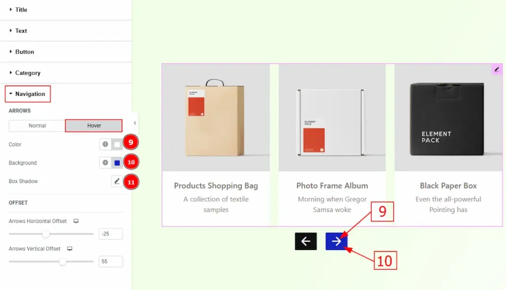
9. Color: You can change the arrow’s hover color with this option.
10. Background: You can change the arrow’s background hover color with this option.
11. Box Shadow: You can add a hover shadow effect to the arrows with this option.
Offset Subsection
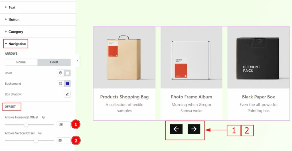
1. Arrows Horizontal Offset: This option allows you to move the arrows’ position horizontally.
2. Arrows Vertical Offset: You can move the arrows’ position vertically with this option.
All done! You have successfully customized the Portfolio Carousel widget on your website.
Video Assist
You can also watch the video tutorial to learn more about the Portfolio Carousel. Please visit the demo page for examples.
Thanks for being with us.