The Notification widget is a powerful tool for displaying important messages, alerts, and updates on your website, fully integrated into Element Pack Pro. It lets you create customizable notification messages with flexible styling and behavior options, helping you communicate effectively with your visitors. In this documentation, we will cover how to customize and use the Notification widget provided by Element Pack Pro for Elementor.
Enable The Notification Widget
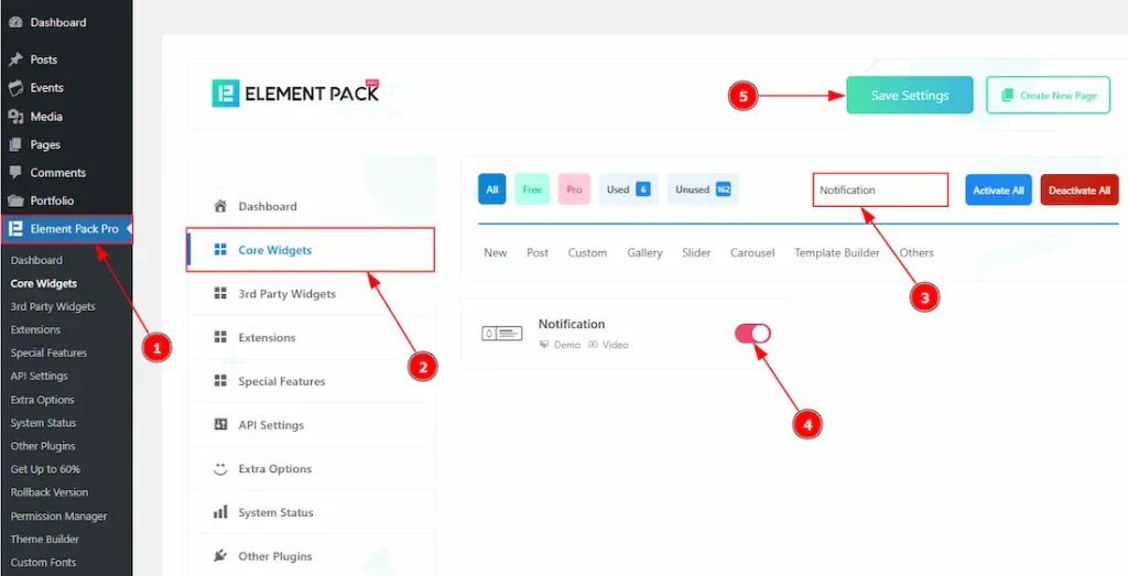
To use the Notification widget from Element Pack Pro, first, you have to enable the widget.
- Go to WordPress dashboard → Element Pack Pro Plugin dashboard.
- Then, Click the Core Widgets Tab.
- Search the Notification Widget Name.
- Enable the Notification Widget.
- Hit the Save Settings Button.
Inserting The Notification Widget
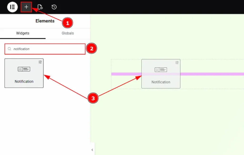
1. Go to the Elementor Editor Page and hit the “+” icon Button.
2. Search the Notification name.
3. Drag the widget and drop it on the editor page.
Work With The Content Tab
Notification Section
Go to Content → Notification
The Notification widget allows you to display messages to your audience in two different ways: as a pop-up notification or as a fixed-position notification. Below, we describe each type in detail.
Popup Type Notification
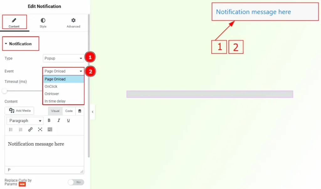
1. Type: You can select the type of notification, how it will appear to your audience. You can choose between the pop-up and fixed with this option.
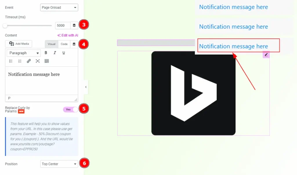
2. Event: You can select the way of the notification appears with this option. The provided events are – Page Onload, OnClick, OnHover & In Time Delay.
Selecting an event changes the notification’s customization settings and reveals additional options; therefore, the event options are described below one by one.
Page Onload
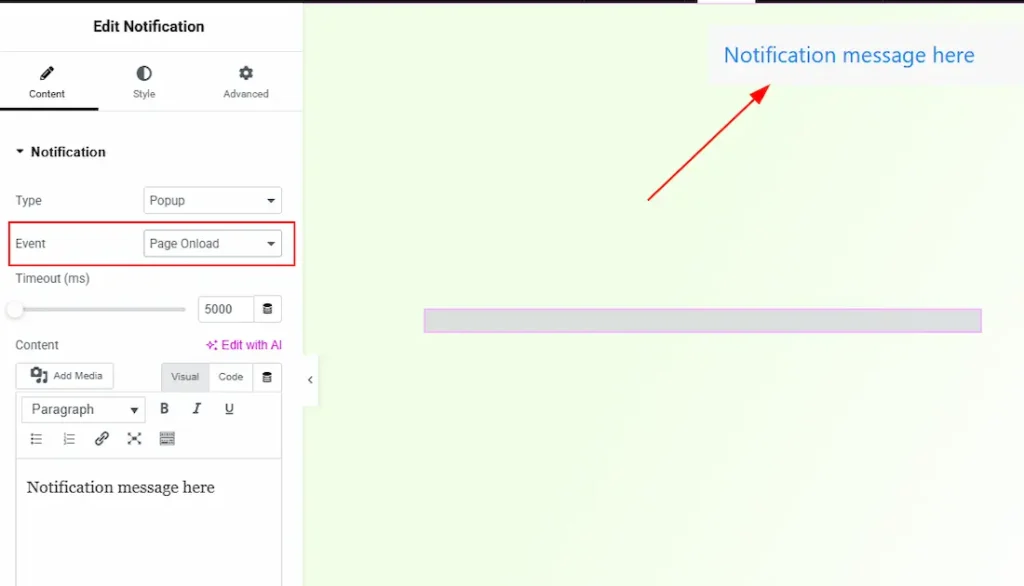
By selecting the Page Onload option, the notification will display when the page loads.
OnClick
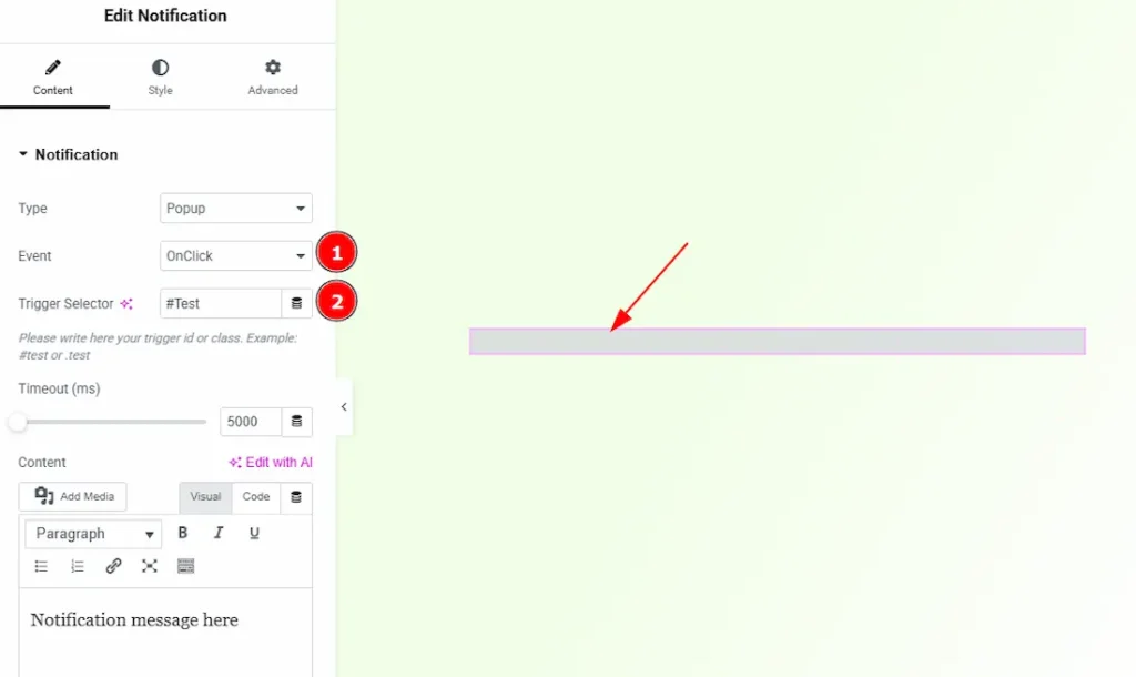
1. OnClick: You can click on a selected object to display the notification by selecting this option. (Note: For this, you need to add an object where you want to connect the notification.)
2. Trigger Selector: This is where you have to write your trigger id or class (for example: #test or.test) to connect with the object. Let’s see how you have to connect with an object. We are taking an image object as an example.
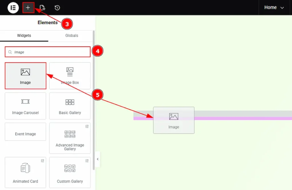
3. Go to the Elementor Editor Page and hit the “+” icon Button.
4. Search the Image widget name.
5. Drag the widget and drop it on the editor page & after that, add an image as per your preference.
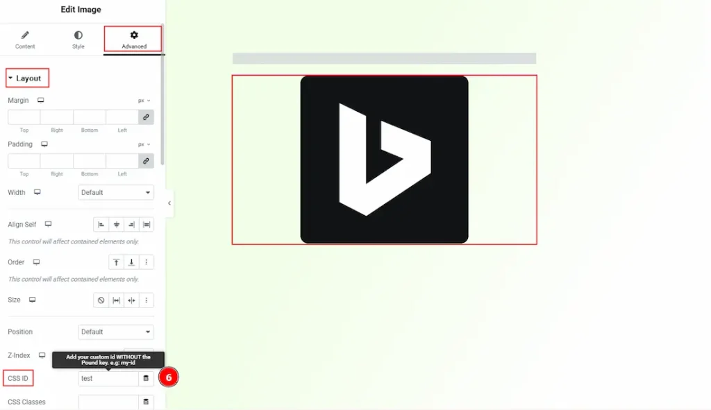
6. Select the image → go to Advanced → Layout, and below you will see the CSS ID & CSS Classes option. If you use (#) in the trigger selector of notification, then copy and paste the same content without the pound key (#) in CSS ID, and if you use (.) in the trigger selector of notification, then copy and paste the same content without the pound key (.) in CSS Classes.
After that, publish the page and go to preview mode, click on the image, and instantly a notification will display as pop up.
OnHover
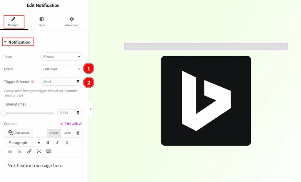
1. OnHover: You can hover on a selected object to display the notification by selecting this option. (Note: For this, you need to add an object where you want to connect the notification.)
2. Trigger Selector: This is where you have to write your trigger id or class (for example: #test or.test) to connect with the object.
Note: As it’s the same process as OnClick, please check and follow the above steps described on OnClick type.
In Time Delay
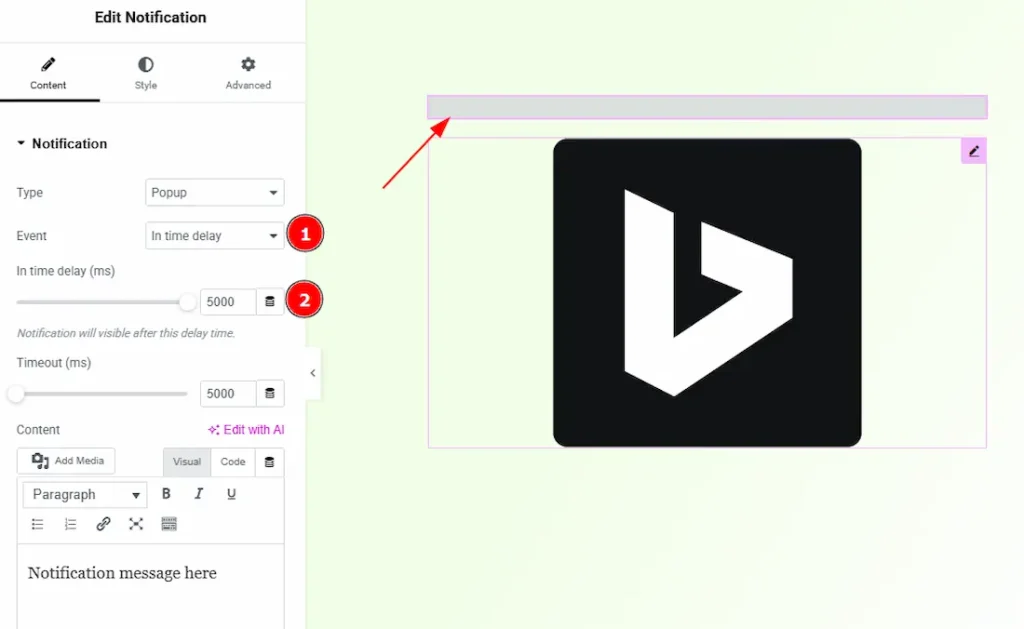
1. In Time Delay: By selecting this option, a notification will appear after the selected delay time passed.
2. In Time Delay (ms): You can adjust the delay time with this option.
Now, let’s get back to pop-up type notification customization –
3. Timeout (ms): You can adjust the time to make the pop-up disappear after the selected time passed.
4. Content: You can make changes to the notification text with this option.
5. Replace Curly by Params: Enable the switcher to show values from your URL. In this case, you need to use get params. Example: 50% discount coupon for you {{coupon}} & in the coupon place you can add the URL like – www.yoursite.com/yourpage?coupon=EPPRO50
6. Position: You can set the displayed notification position with this option.
Popup Type Notification
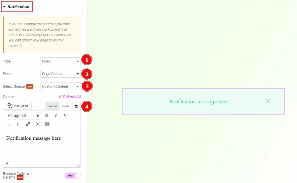
1. Type: You can select the notification display type as fixed with this option.
2. Event: You can select the way of the notification appears with this option. The provided events are – Page Onload, OnClick, OnHover & In Time Delay.
3. Select Source: You can choose custom content or an Elementor template to define what message will be shown with this option.
4. Content: This option allows you to add and format the notification message using the built-in editor, including text, media, and basic styling.
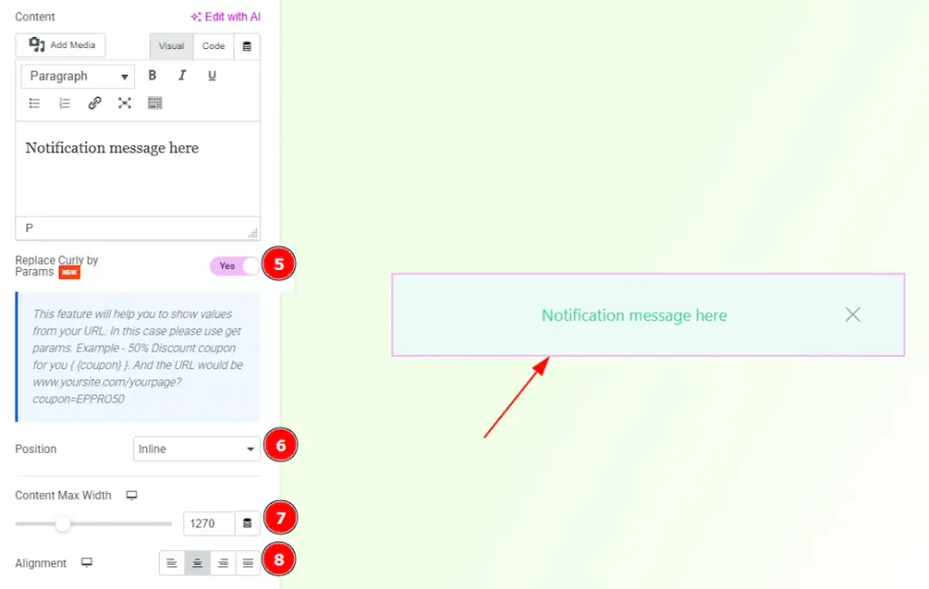
5. Replace Curly by Params: Enables dynamic replacement of values wrapped in curly braces { } with URL parameters, allowing personalized or dynamic notification messages.
6. Position: You can set the fixed notification position to inline, static, top, or bottom with this option.
7. Content Max Width: You can set the notification content max width with this option.
8. Alignment: You can set the notification text alignment to left, center, right, or justify with this option.
Additional Section
Go to Content → Additional
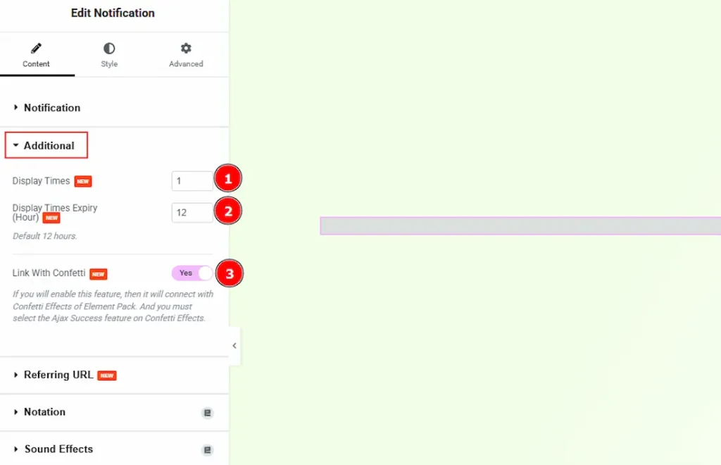
1. Display Times: This option defines how many times the notification will be shown to a user. Once the specified limit is reached, the notification will no longer appear for that user.
2. Display Times Expiry (Hour): You can set the number of hours after which the display count resets, allowing the notification to appear again based on the defined display limit.
3. Link With Confetti: Enable this option to link the notification with Element Pack’s Confetti Effects. Please remember the Ajax Success feature must be enabled in the Confetti Effects settings.
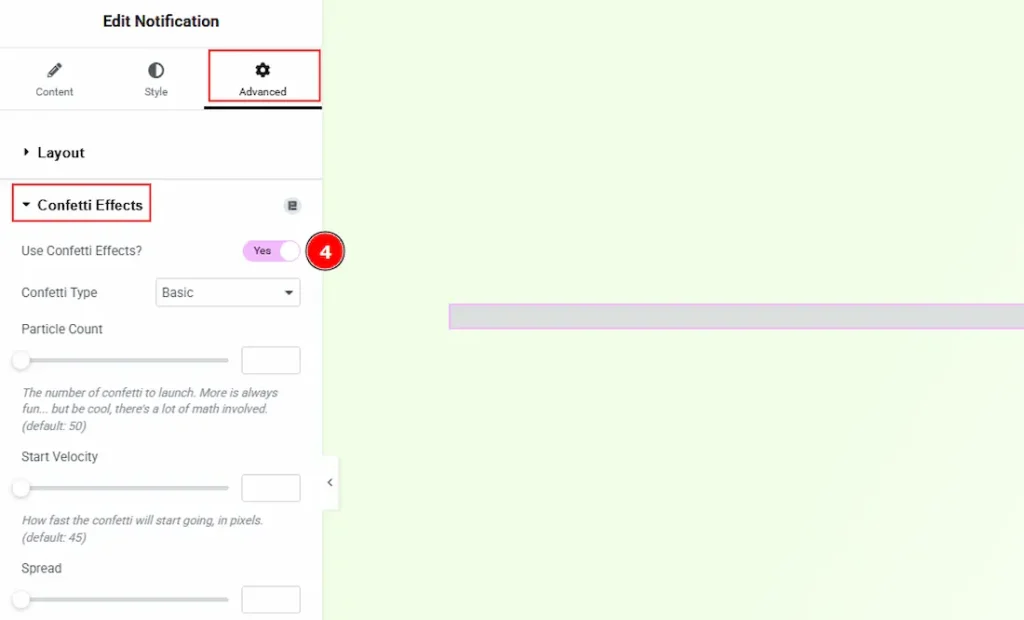
If you enable the link with the confetti feature, then you must need to enable the confetti effects as well.
4. Select the notification widget → go to Advanced Tab → Confetti effects and enable the use of the confetti effects switcher.
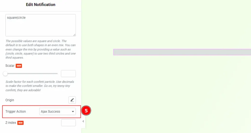
5. Trigger Action: After enabling the confetti effects feature, scroll below and in this option select Ajax Success as it is recommended.
Referring URL Section
Go to Content → Referring URL
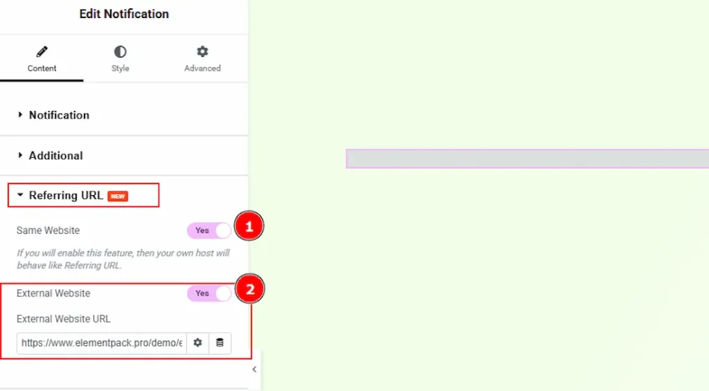
1. Same Website: When enabled, the notification is shown to visitors who come from pages within your own website.
2. External Website: When enabled, the notification is shown only to visitors coming from a specific external website. You can set the source by entering the external website URL.
Work with The Style Tab
Notification Section
Go to Style → Notification
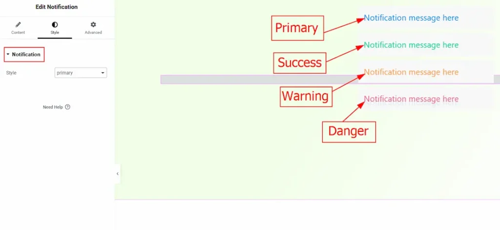
You can select one notification style from four (Primary, Success, Warning & Danger) with this option. The outlook of these four style in provided in the above screenshot.
All done! You have successfully customized the Notification widget on your website.
Video Assist
You can also watch the video tutorial to learn more about the Notification widget. Please visit the demo page for examples.
Thanks for being with us.