In this documentation, we will show you how to customize the Lightbox widget presented by the Element Pack Pro add-on.
Enable Lightbox widget
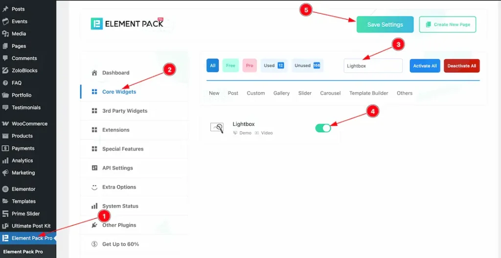
To use the Lightbox widget from Element Pack Pro, first, you have to enable the widget.
- Go to WordPress dashboard > Element Pack Pro Plugin dashboard.
- Then, Click the Core Widgets Tab.
- Search the Lightbox Widget Name.
- Enable the Lightbox Widget.
- Hit the Save Settings Button.
Insert Lightbox widget
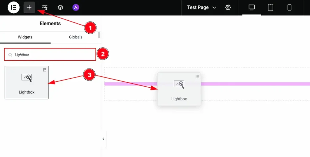
1. Go to the Elementor Editor Page and Hit the “+” icon Button.
2. Search the Lightbox widget.
3. Drag the widget and drop it on the editor page.
Toggler
Go to Content > Toggler
Toggler Type- Poster
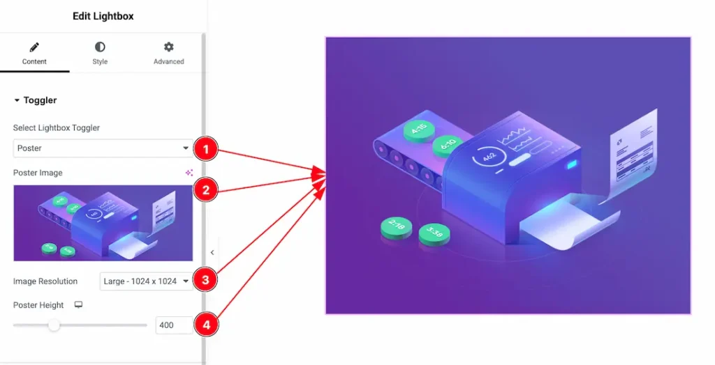
1. Select Lightbox Toggler: This option lets you select the Toggler type- Poster, Button, and Icon. Here we select the loggler type- Poster first to demonstrate the option.
2. Poster Image: You can change the Poster image from here.
3. Image Resolution: You can set the Poster image resolution from here.
4. Poster Height: This option lets you set the poster image height.
Toggler Type- Button
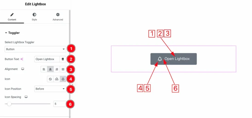
1. Select Lightbox Toggler: Select the toggler type- Button to demonstrate the feature.
2. Button Text: This option lets you change the button text.
3. Alignment: You can set the button alignment as – Left, Center, Right, and Justify.
4. Icon: This option lets you change the icon for the button.
5. Icon Position: You can set the icon position before and after.
6. Icon Spacing: You can adjust the icon spacing from here.
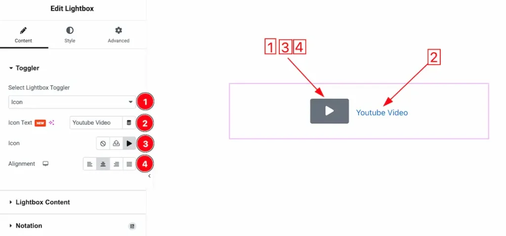
Toggler Type- Icon
1. Select Lightbox Toggler: Select the toggler type- icon to demonstrate the feature.
2. Icon Text: This option lets you change the icon text.
3. Icon: You can change the icon as – none, svg, and upload the icon from icon library.
4. Alignment: You can set the icon alignment as – Left, Center, Right, and Justify.
Lightbox Content
Go to Content > Lightbox Content
Lightbox Content Type- Image
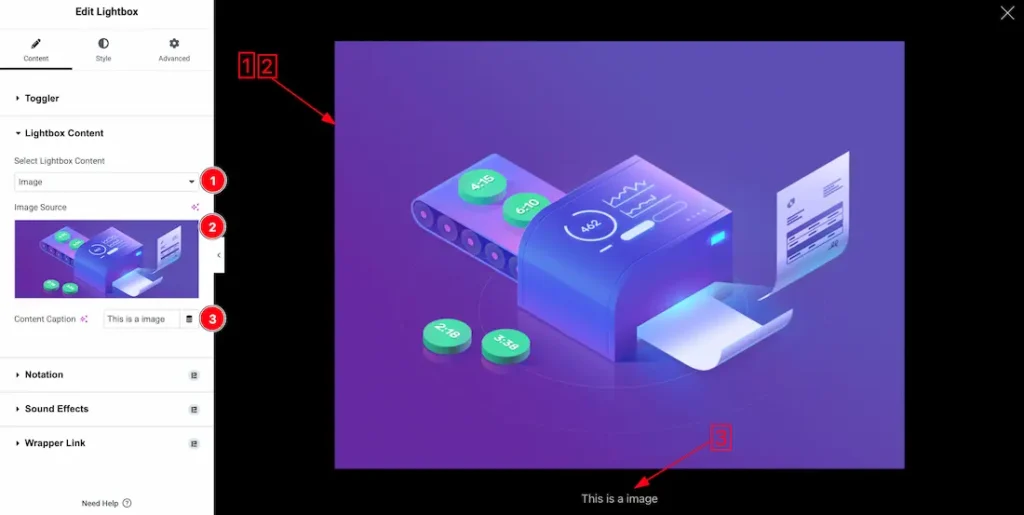
1. Select Lightbox Content: This option lets you select the Lightbox Conetent type- Image, Video, Youtube, Vimeo, and Google Map. Here we select the Lightbox Conetent type- Image first to demonstrate the option.
2. Image Source: You can choose your prefer image from here.
3. Content Caption: This option allows you set the content caption from here.
Lightbox Content Type- Video
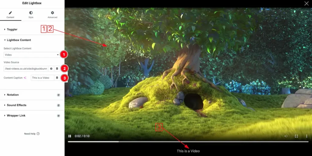
1. Select Lightbox Content: Select the Lightbox Conetent type- video to demonstrate the option.
2. Video Source: This option lets you set your local video url here.
3. Content Caption: This option allows you set the content caption from here.
Lightbox Content Type- Youtube
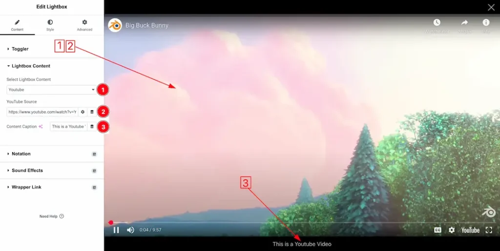
1. Select Lightbox Content: Select the Lightbox Conetent type- Youtube video to demonstrate the option.
2. Video Source: This option lets you set your Youtube video url here.
3. Content Caption: This option allows you set the content caption from here.
Lightbox Content Type- Vimeo
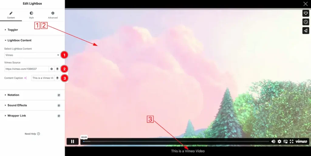
1. Select Lightbox Content: Select the Lightbox Conetent type- Vimeo video to demonstrate the option.
2. Video Source: This option lets you set your Vimeo video url here.
3. Content Caption: This option allows you set the content caption from here.
Lightbox Content Type- Google Map
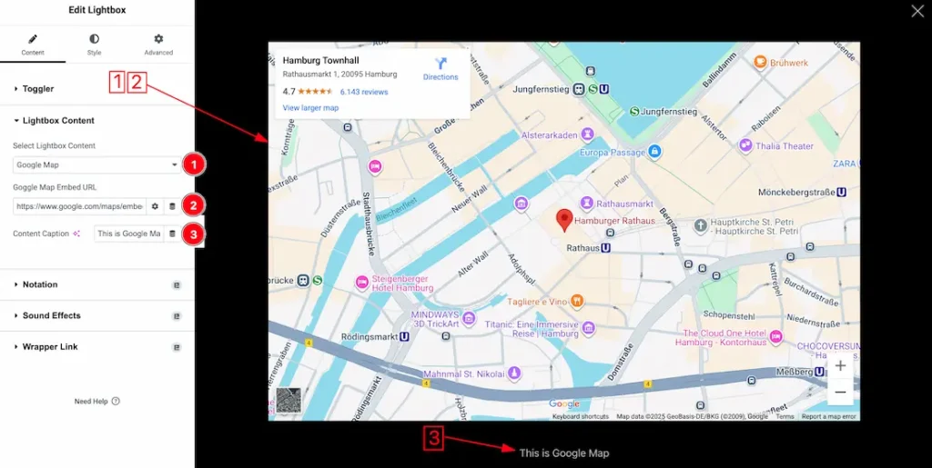
1. Select Lightbox Content: Select the Lightbox Conetent type- Google Map.
2. Google Map Embed URL: This option lets you set your Google Map Embed url here.
3. Content Caption: This option allows you set the content caption from here.
Style Tab Customization
Toggle Button Section
Go to Style > Toggle Button
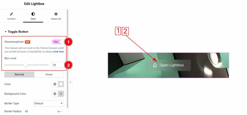
1. Glassmorphism: Actually, the Glassmorphism is used to blur the Button background. That we shown in the above screenshot. you can easily enable or disable the Glassmorphism switcher button to show or hide the effect on your button.
2. Blur Label: You can adjust the Glassmorphism blur label from here.
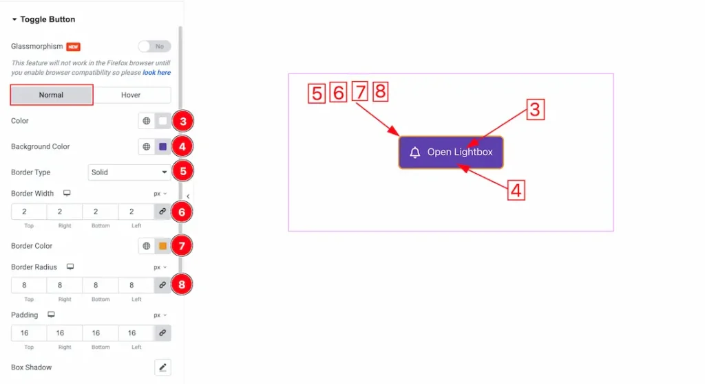
Come to the Toogle button section, you will get two tabs sections; Normal and Hover. Lets proceed with the Normal tab section-
3. Color: This option lets you change the button text normal color.
4. Background Color: This option lets you change the button text background normal color.
5. Border Type: You can set the Border Type to Default, None, Solid, Double, Dotted, Dashed, or Groove. We choose here the Border Type Solid.
6. Border Width: The border width property allows you to control how thick or thin the border is.
7. Border Color: This lets you change the Border color
8. Border Radius: Customizes the border corners for roundness.
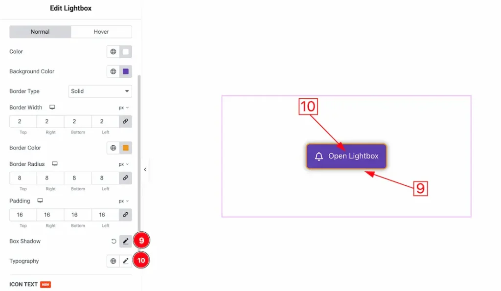
9. Box Shadow: The Box Shadow property is used to create the shadow around the Category Button. It takes Four values: Horizontal offset, Vertical offset, blur, and Spread to customize the Box shadow.
Position: you can set the Box Shadow position Outline and Inset. Here we set the Box Shadow position Outline.
Box Shadow Color: This lets you change the Box Shadow color.
10. Typography: Change the font family, size, weight, style, transform, decoration, line height, letter spacing, and word spacing from here.
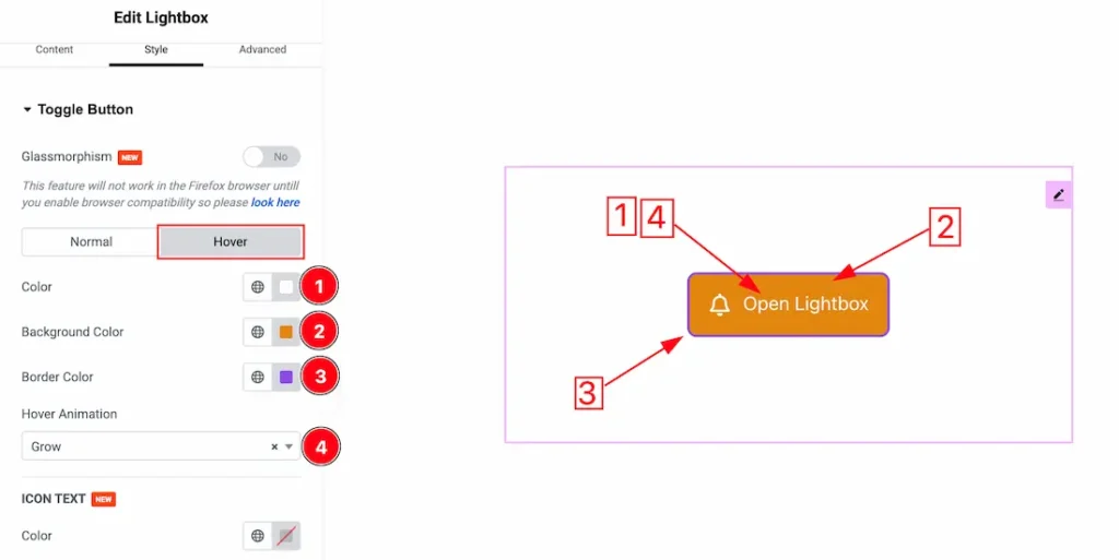
In the Hover tab section, you will get the below customization options-
1. Color: This option lets you change the button text hover color.
2. Background Color: This option lets you change the button text background hover color.
3. Border Color: This lets you change the hover Border color.
4. Hover Animation: From here you can choose the button hover animation.
Icon Text section
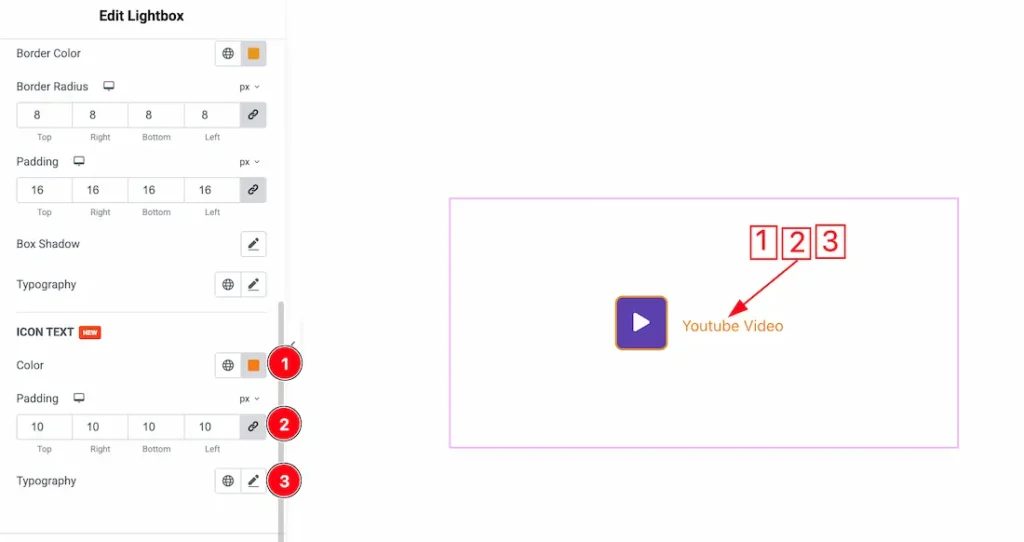
1. Color: This option lets you change the icon text color.
2. Padding: You can adjust the icon text padding from here.
3. Typography: Change the font family, size, weight, style, transform, decoration, line height, letter spacing, and word spacing from here.
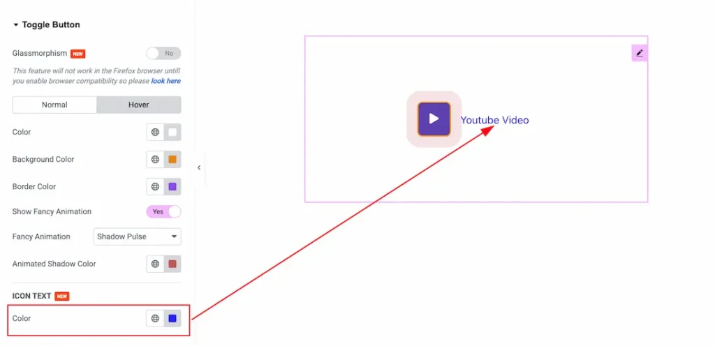
Color: In the hover mode, you can change the icon text hover color from here.
Lightbox Section
Go to Style > Lightbox
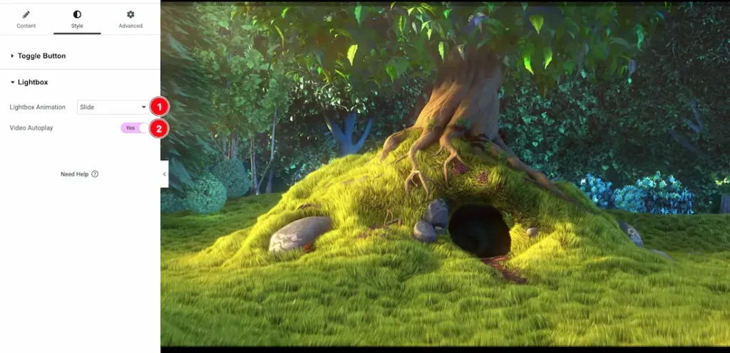
1. Lightbox Animation: You can choose a lightbox animation from here. Here you will get these type of animations – Slide, Fade, and scale.
2. Video Autoplay: Enable the video autoplay switcher button to play the lightbox video automatically.
You have successfully customized the Lightbox widget on your site.
Video Assist
You can watch the video tutorial to learn more about the widget. Also, can visit the demo page from here.
Thanks for staying with us.