

The Flip Box is a very handy and fun tool. This widget is designed to showcase your pieces of information in a unique way. The most amazing thing is that Flip Box flips whenever you hover something over it!
Hence, I’ll be giving you a full tour of how this widget works for you. Note that, this widget is developed by Element Pack.
To Insert Widget
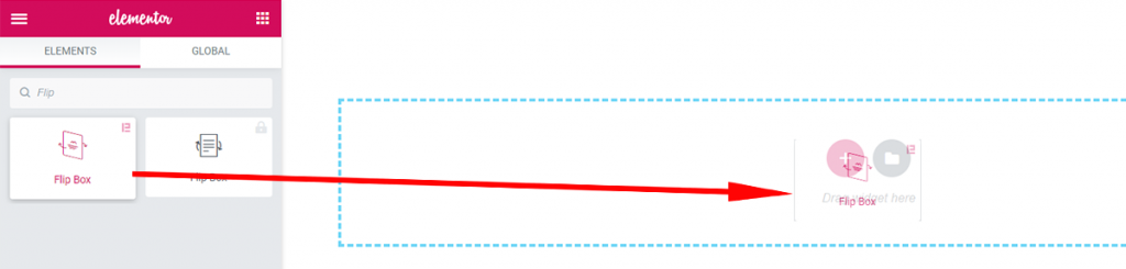
Inserting widget is just a piece of cake. However, take a look at the screenshot and you can do it too.
Content Tab
Using the Content tab, you can basically make a layout of a particular part of the website.
Front
Front Items
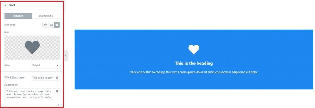
Go to Content Tab> Front
After you drag and drop the widget in a new section, you will see the Front section and some options in it. From there, you have the option to choose a logo or an image or you can choose to keep it blank as well (marked blue).
Go Front> Content> Icon Type> None / Image / Icon.
You can make your logo visible with 3 different styles and still have more options to customize further. Simply Go View> Default / Stacked / Framed.
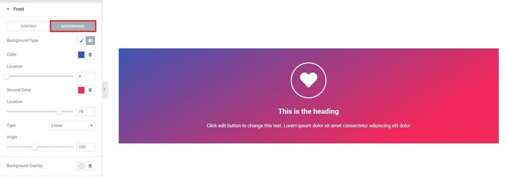
In the Background option, you can choose any image and set it as the background of the front side of Flip Box. However, you can also choose a gradient color as well. Meanwhile, you may want to tweak around this menu.
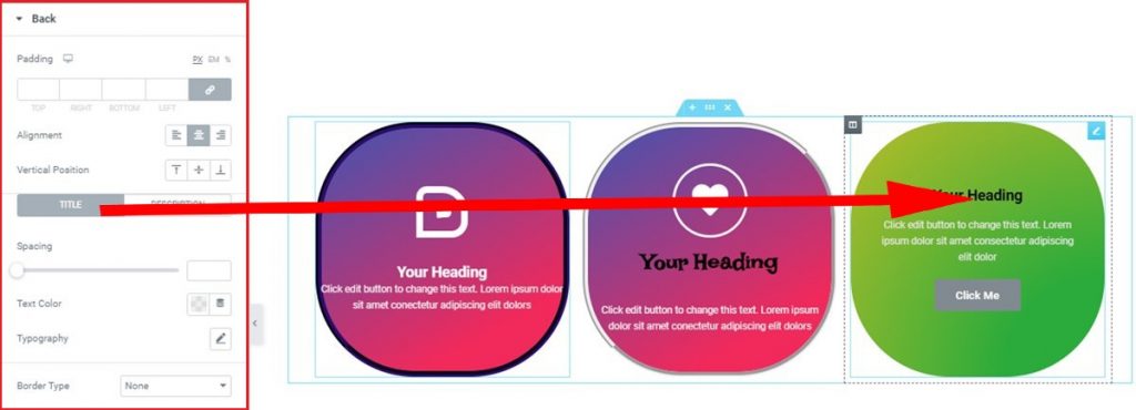
Back
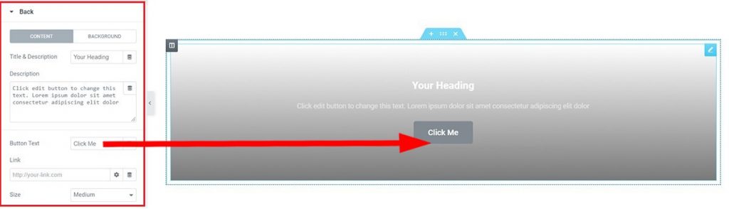
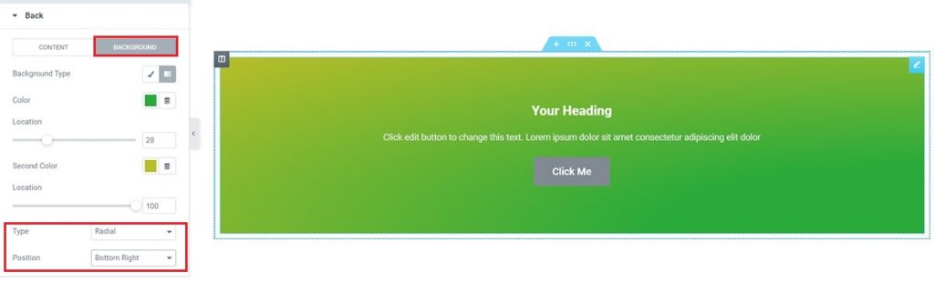
Go to Content Tab> Back
As for the Back part, there you will find a Button Text option and a box to put Link. You can put your link in the Link box. Therefore, anyone Clicking that button will redirect to wherever the Link goes. However, the Background option has similar settings as previously.
Settings
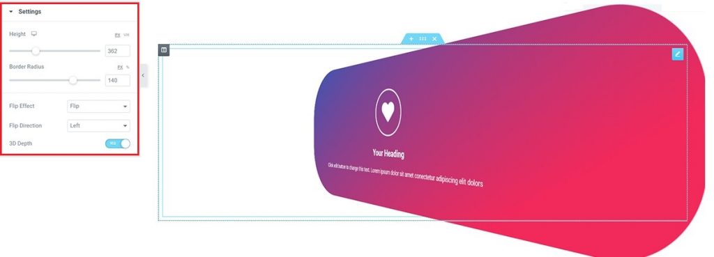
In the Settings section, you have the option to change the height or border-radius of your Flip Box.
Hence, Go to the Content tab >Settings >and check additional options.
Style Tab
Now, time for some Style. In this Style tab, you will be given more options to make your Flip Box look more like what you expect.
In other words, Styling with the Style tab in the Elementor will always give you a fantastic experience. Let’s have a look.
Front
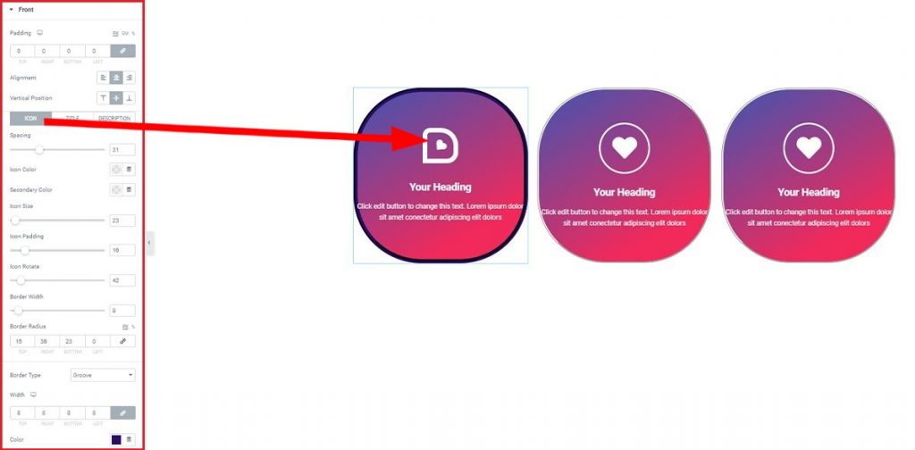
Go to Style Tab> Front
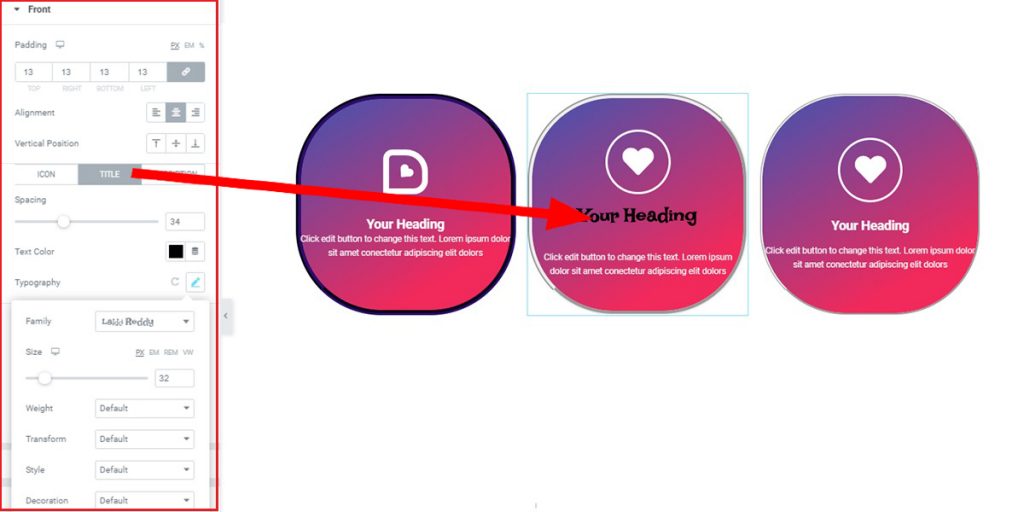
In the Front section under the Style tab, you will find some specific options. However, you can Customize Padding, Vertical Position, Border Type from here. Also, you can add spacing, colors, size, padding, or add a border to the Icon, Title, and Description. Also, you can rotate the icon.
Back
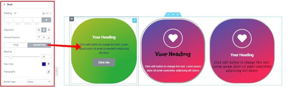
Go to the Style tab >Back >and check the options (similar to Front).
Make sure to check Typography. It has cool stuff inside. And you can apply these settings to both the Title and the Description.
Button
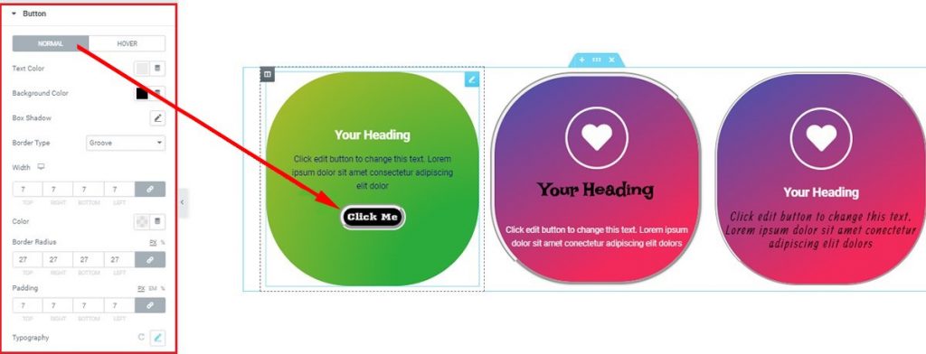
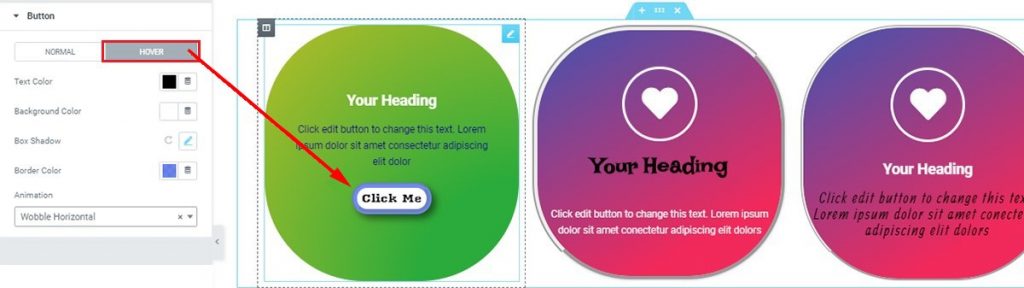
Go to Style Tab> Button
Lastly, with this Button section, you can give a unique look to the click-box. Note that, you can add a gradient color or mix color and drop a shadow on the box. Pretty simple right?