

The Animated Card widget is the next special feature for WooCommerce stores to display your products in a dynamic slider animation style that creates a flashy appearance. Presented by BdThemes, the widget works with the latest Element Pack Pro version 6.0.
Let’s see how it works.
Insert the widget in Elementor Page Editor
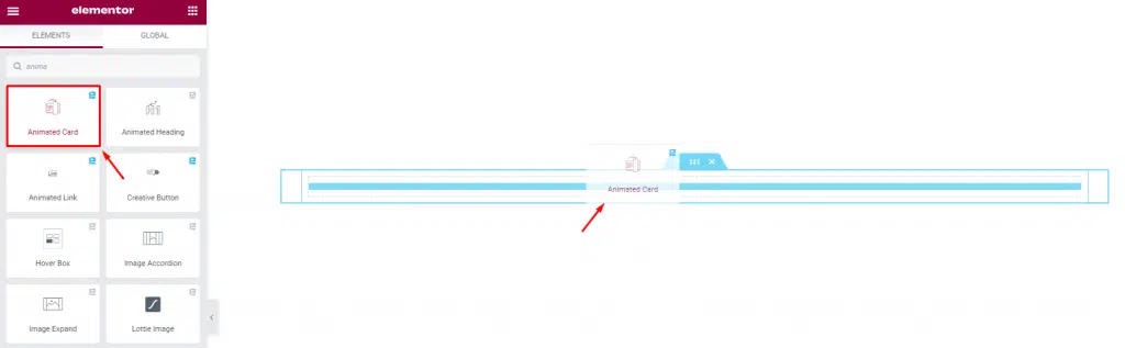
It is very easy to place the Animated Card widget. Just go to the Elementor panel, search Animated Card in the search bar. After that, drag and drop the widget in the section you prefer. See the image below.
Change Layout Using the Content Tab
Using the Content tab, you can basically make changes to the default layout of the widget and make a unique interface that meets your requirements. It’s where all the base layout settings are listed.
Animated Card tab Customization
Go to Content> Animated Card
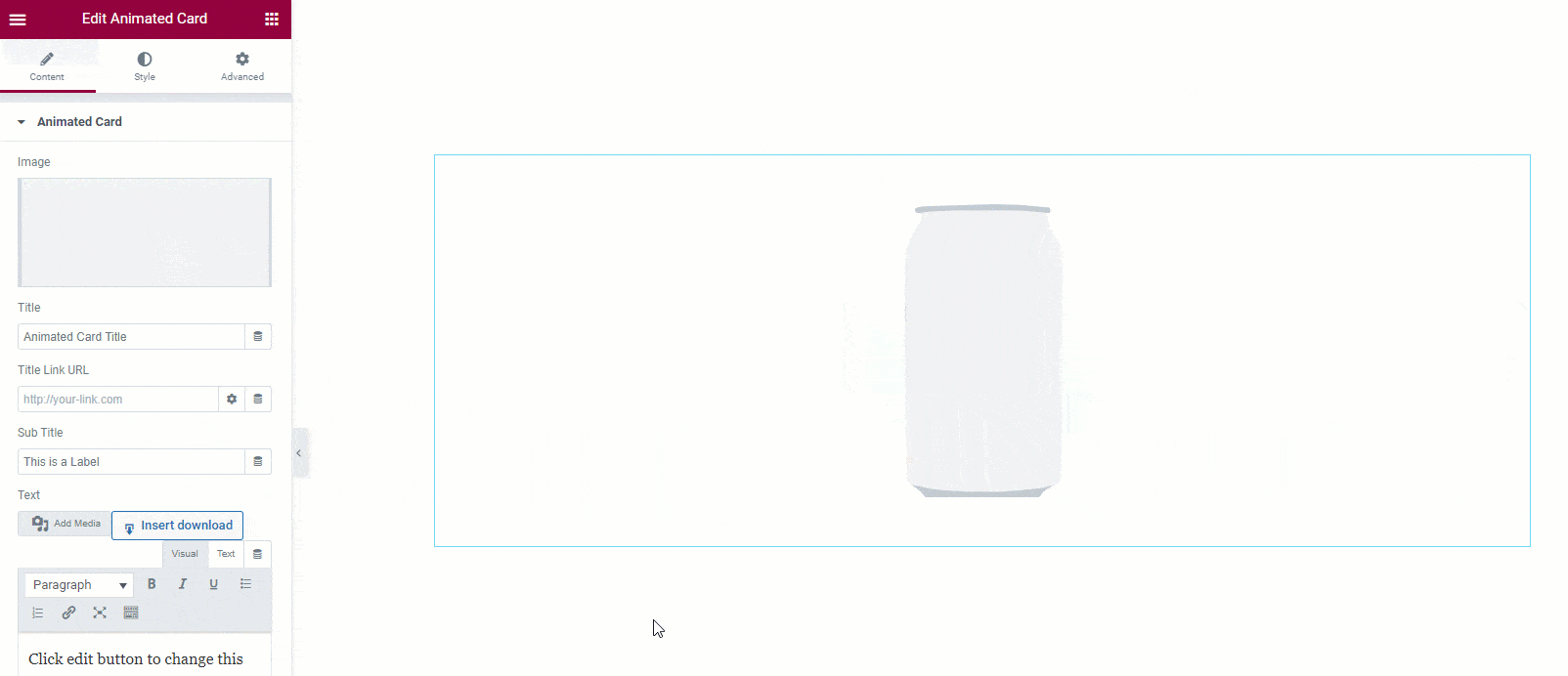
This is the default appearance of the Animated Card widget. It shows an image on top that moves a bit further and reveals a slider in the background with a popping animation. The background holds all the info about the item or product.
The Animated Card section helps you to create a nice structure for the Animated Card widget. It includes image, title, Title link URL, Sub Title, Text, etc options that you can customize.
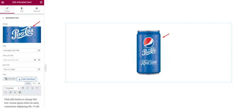
For example, we can put anything like the image for the Animated Card widget as long as the image extends more to its height. Here, click on the image field and select the image you want to put here.
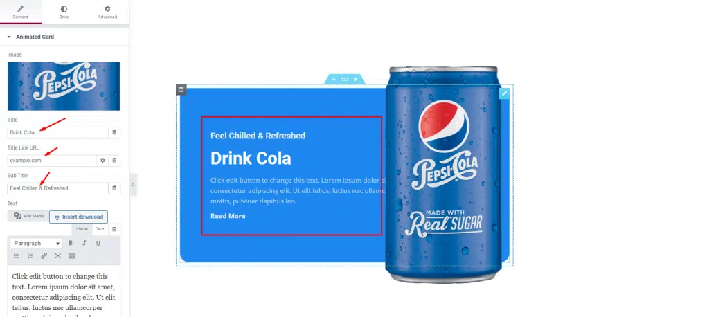
Next, you can change the Title, Title Link URL, Sub Title using these fields. They will show up in the popping slider part of the widget.
Additional Settings Section for More Layout Changes
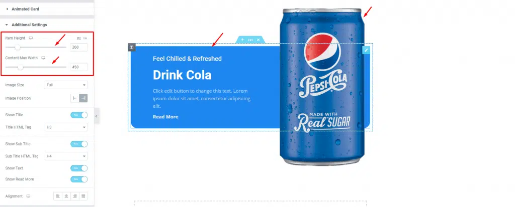
Go to Content> Additional Settings
In the Additional Settings section, you get to change the Item Height and set the Content Max Width using the scrollbars on top.
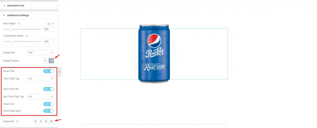
After that, you can set the Image Position on the left or right using the arrow-marked option. Note that depending on the image position, the background content will move in the opposite direction.
There are also some switchers below the section. Using the switchers, you can show or hide Title, Sub Title, Text, and Read More on the Animated Card widget. Also, you can set the text alignment as the last option in the Additional Settings section.
Read More Button Customization
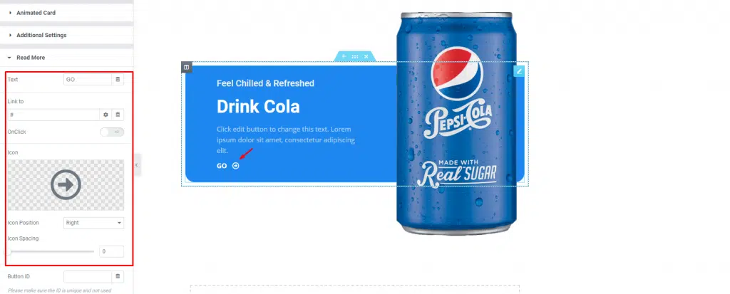
Go to Content> Read More
In the Read More section, you can change the button Text, set an Icon, Icon Position, and Icon Spacing. Just do everything to make the read more button seem appealing to your visitors.
Customize Animated Card Widget Appearance With the Style Tab
In this Style tab, you will have more options to customize and beautify your unique Animated Card widget as you like. Let’s have a look.
Edit the Whole Content
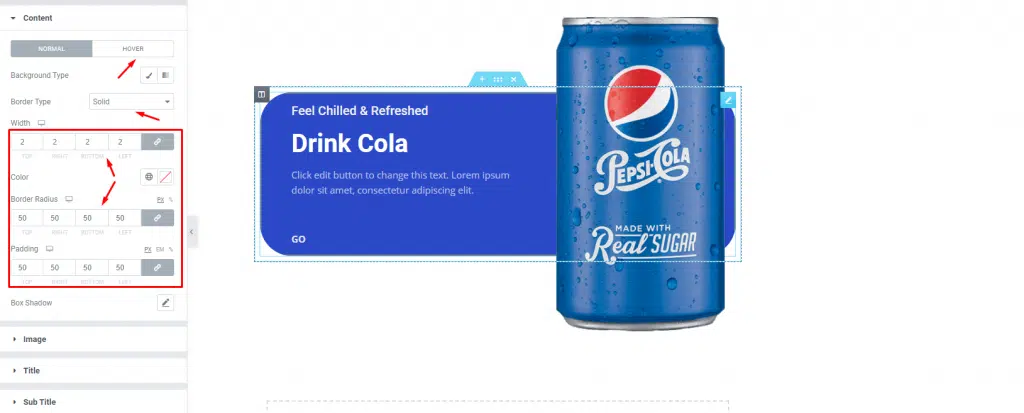
Go to Style> Content
In the Content section, the options allow you to change the appearance of the whole content part using background, border, padding, and border radius.
The background color option works on both the Normal and Hover modes. Let’s add a deeper hover background color, then a thin border, some border radius, and padding to finish it off.
Customize the Image Appearance
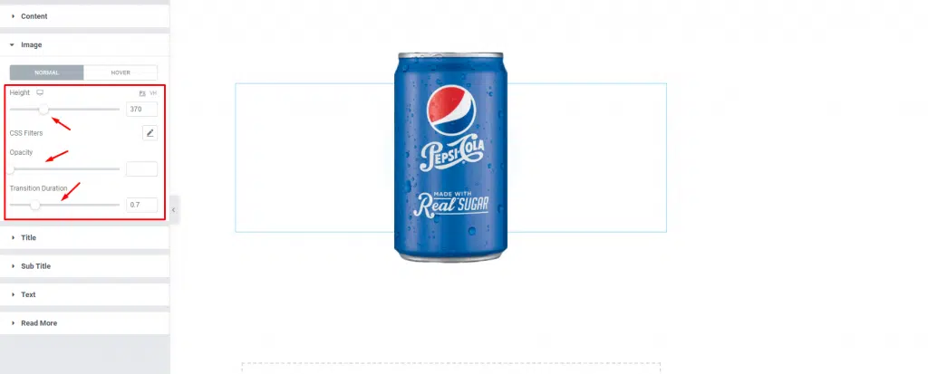
Go to Style> Image
From the Image section, you can set the height, Opacity, and transition Duration for both Normal and Hover modes. For the hover mode, you will get an offset scrollbar in order to move the image to the desired position when hovered as well as change the hover mode height for cool motion graphics.
Change the Animated Card Widget Title
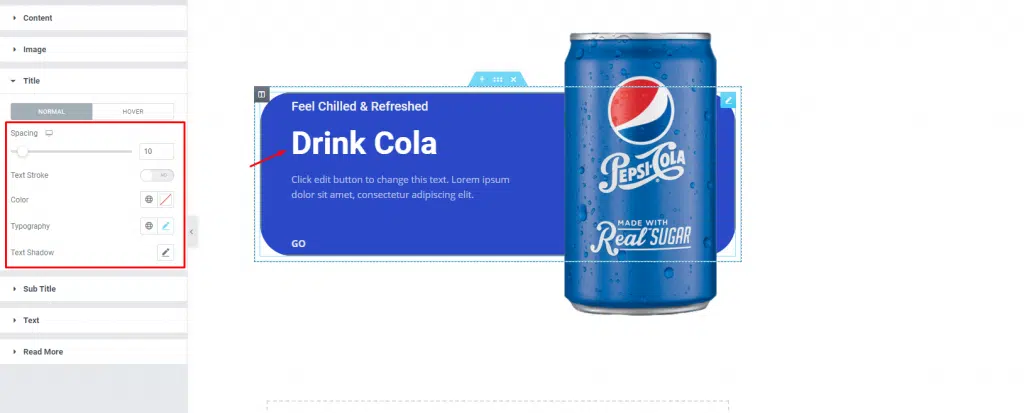
Go to Style> Title
Here, you can change the Spacing, Color, Typography, and add Text Shadow to the title of the widget. Using the typography option, you may customize the font by size, weight, etc.
The Text Stroke option creates a text outline with customizable width and color. Just use it and see how it fits.
Customize the Sub Title
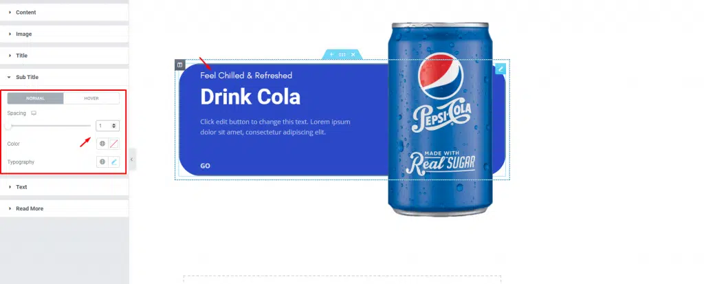
Go to Style> Sub Title
Change the Spacing, Color, and Typography of the Sub Title for both Normal and Hover mode.
Animated Card Widget Text Style
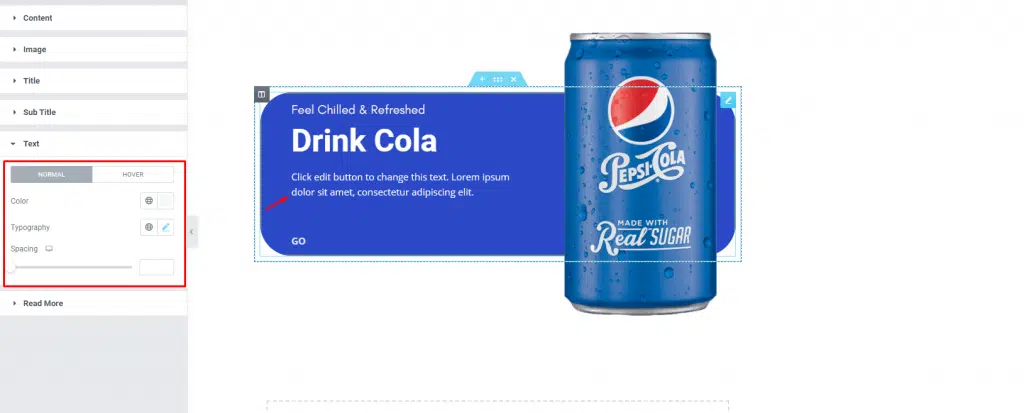
Go to Style> Text
Same as before, now change the color, Typography, and Spacing of the Text for both Normal and Hover mode.
Read More Button Customization
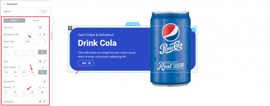
Go to Style> Read More
Lastly, you will get a Read More section to customize the button at the bottom of the description. Let’s change the Text Color, Background Type, Border Type, Border Radius, Box Shadow, Padding, etc for both Normal and Hover mode. For the records, we went and added a thin border around the button, added some border-radius, and padding to make the button look unique.
That’s all.
Video Assist
In the conclusion, hopefully, you have learned about what is the Animated Card widget developed by Bdthemes, and how to use it. See this tutorial video and visit the demo page to have more insight into the widget.