In this documentation, we will discuss the customization of the Facebook Feed widget, brought to you by the Element Pack Pro addon for Elementor.
Enable The Facebook Feed Widget
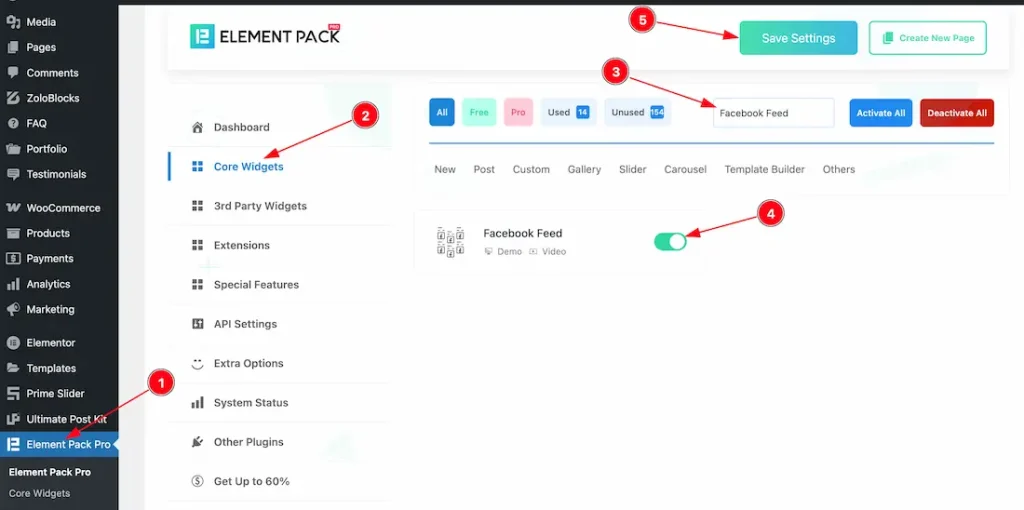
To use the Facebook Feed widget from Element Pack Pro, first, you have to enable the widget.
- Go to WordPress dashboard > Element Pack Pro Plugin dashboard.
- Then, Click the Core Widgets Tab.
- Search the Facebook Feed Widget Name.
- Enable the Facebook Feed Widget.
- Hit the Save Settings Button.
Inserting the Facebook Feed widget
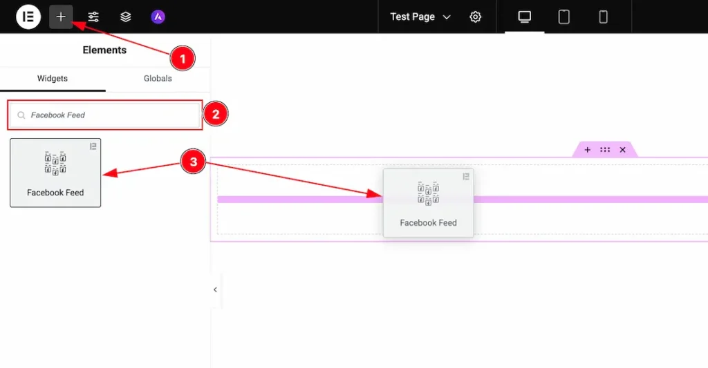
1. Go to the Elementor Editor Page and hit the “+” icon Button.
2. Search the Facebook Feed widget.
3. Drag the widget and drop it on the editor page.
Set The Facebook Social Access Settings
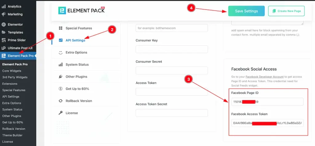
To use the Facebook Feed widget, first follow the instructions below to set the Facebook Social Access settings-
- Go to the Element Pack Pro plugin dashboard.
- Click the API settings tab section.
- Scroll the page and go to the Facebook Social Access section, and keep your Facebook Page ID and Facebook Access Token.
- Click on the Save button.
After doing that, you will be able to use the Facebook Feed widget on your site.
Work With The Content Tab
Facebook Feed Section
Go to Content > Facebook Feed
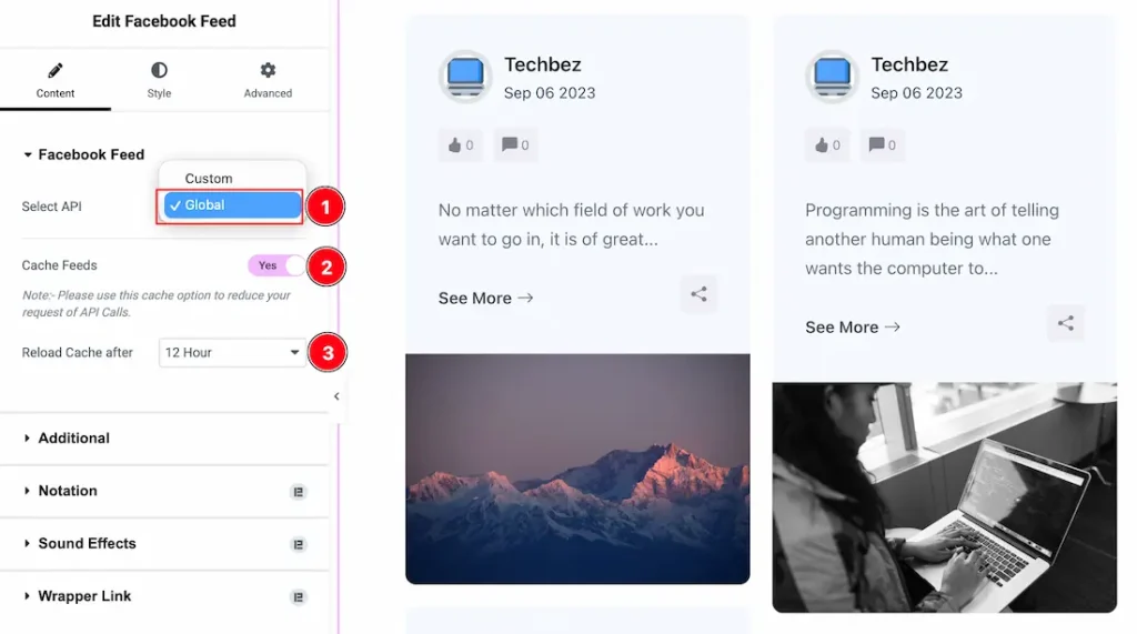
1. Select API: After inserting the widget, you need to select the API. From here, you can select the API type- Custom and Global. First, we select the API type – Global to show the feature.
2. Cache Feeds: If you want, you can enable the cache feeds switcher button, and this feature helps you to reduce your request of API Calls and cache your feed data.
3. Reload Cache After: This option lets you reload the cache. IF you set the reload cache after 12 hour then the cache will reload after 12 hours.
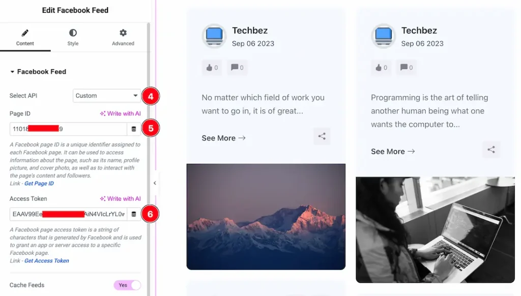
4. Select API: If you want, then you can select the API type- Custom. If you select the API type custom, then you will get the following customization options.
5. Page ID: You can keep your Facebook Page ID manually inside the page id field.
6. Access Token: You can keep your Facebook Access Token manually inside the Access Token field.
Additional Option Section
Go to Content > Additional Option
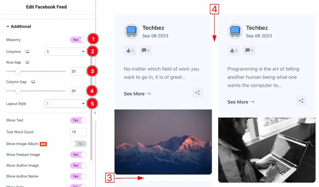
1. Masonry: If you enable the masonry switcher button, then the grid layout shows as a masonry layout.
2. Columns: You can set the grid columns to your required needs.
3. Row Gap: Adjust the row gap from here.
4. Column Gap: Adjust the column gap from here.
5. Layout Style: Here, you will get two layouts- layout 1 and layout 2. You can choose one of them.
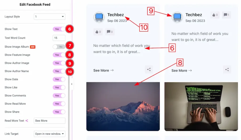
6. Show Text: Enable or disable the Show Text switcher button to show/hide the text from the Grid. From here, you can also set the text word limit.
7. Show Image Album: This option allows you to show multiple images if you have on the Facebook feed.
8. Show Feature Image: Enable or disable the Show Feature Image switcher button to show/hide the feature image from the Grid.
9. Show Author Image: Enable or disable the Show author image switcher button to show/hide the author image from the Grid.
10. Show Author Name: Enable or disable the Show author name switcher button to show/hide the author name from the Grid.
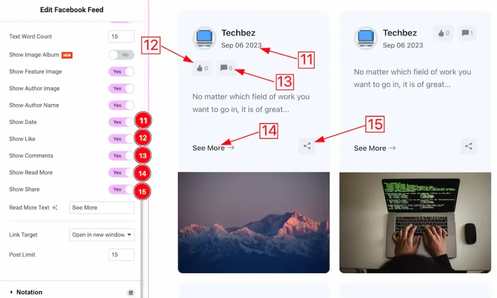
11. Show Date: Enable or disable the Show date switcher button to show/hide the Date from the Grid.
12. Show Like: Enable or disable the Show Like switcher button to show/hide the Like from the Grid.
13. Show Comments: Enable or disable the Show Comments switcher button to show/hide the Comments from the Grid.
14. Show Read More: Enable or disable the Show Read More switcher button to show/hide the Read More from the Grid.
15. Show Share: Enable or disable the Show share switcher button to show/hide the share from the Grid.
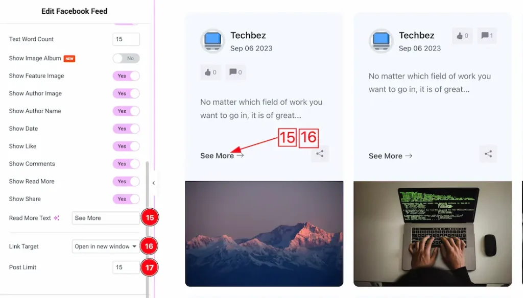
15. Read More Text: This option lets you change the read more text.
16. Link Target: You can set the link target type- Open in same window, or Open in new window.
17. Post Limit: You can set the display post limit to your required need from here.
Work with The Style Tab
Item Section
Go to Style > Item
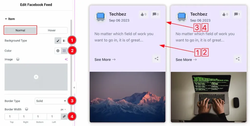
In this section, we have two more tabs. These are Normal & Hover. Let’s start with the Normal Tab –
1. Background Type: you can change the color of any object background to classic or gradient. Here we choose the Background type Classic.
2. Background Color: This lets you change the Background color. If you want, you also can change an image to the Background.
3. Border Type: you can set the Border Type to Default, None, Solid, Double, Dotted, Dashed, or Groove. We choose here the Border Type Solid.
4. Border Width: The border width property allows you to control how thick or thin the border is.
5. Border Color: This lets you change the Border color.
6. Border Radius: Customizes the border corners for roundness.
7. Padding: Add spaces around an object to increase the inner area. Padding allows you to control the internal space within an element.
8. Box Shadow: The Box Shadow property is used to create the shadow around the Category Button. It takes Four values: Horizontal offset, Vertical offset, blur, and Spread to customize the Box shadow.
Position: you can set the Box Shadow position Outline and Inset. Here we set the Box Shadow position Outline.
Box Shadow Color: This lets you change the Box Shadow color.
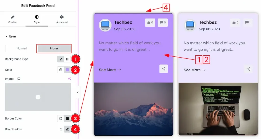
Now let’s proceed to the Hover Tab –
1. Background Type: you can change the hover background to classic or gradient. Here we choose the Background type Classic.
2. Background Color: This lets you change the hover Background color. If you want, you also can change an image to the Background.
3. Border Color: You can change the border hover color with this option.
4. Box Shadow: You can set the hover box shadow from here.
Author Section
Go to Style > Author
Author Name Sub Section
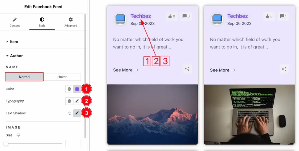
Come to the Author Name Sub Section, you will get two another subsections; Normal and Hover.
Lets proceed with the normal sub section-
1. Color: This option lets you change the normal author name text color.
2. Typography: Change the font family, size, weight, style, transform, decoration, line height, letter spacing, and word spacing from here.
3. Text Shadow: You can add the author name text shadow from here.
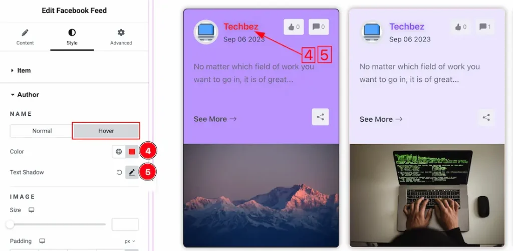
Now let’s proceed to the Hover Tab –
4. Color: This option lets you change the author name text hover color.
5. Text Shadow: This option lets you add the author name hover text shadow.
Author Image Sub Section
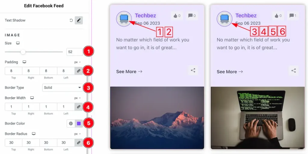
1. Size: This option lets you change the author image size.
2. Padding: You can adjust the author image padding from here.
3. Border Type: you can set the Border Type to Default, None, Solid, Double, Dotted, Dashed, or Groove. We choose here the Border Type Solid.
4. Border Width: You can set the author image border width from here.
5. Border Color: You can set the author image border color from here.
6. Border Radius: You can adjust the author image border radius from here.
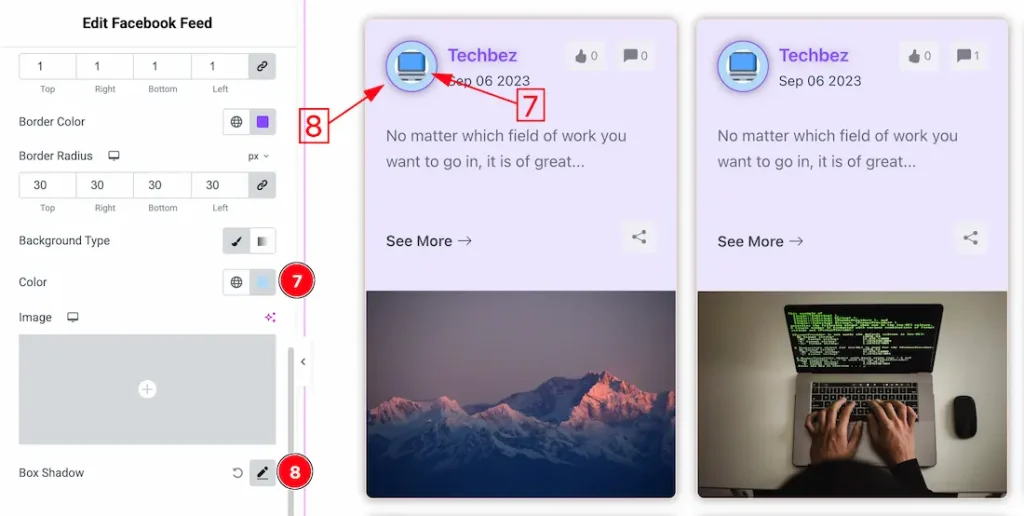
7. Background color: This option lets you change the author image background color.
8. Box Shadow: If you want, you can set the author image box shadow from here.
Date Section
Go to Style > Date
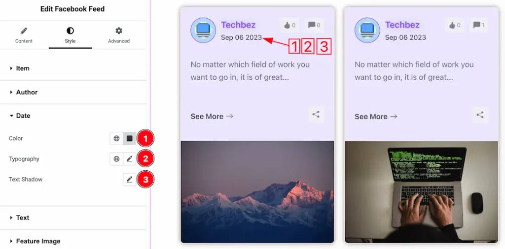
1. Color: You can set the date text color from here.
2. Typography: Change the font family, size, weight, style, transform, decoration, line height, letter spacing, and word spacing from here.
3. Text Shadow: From here, you can set the text shadow for the date.
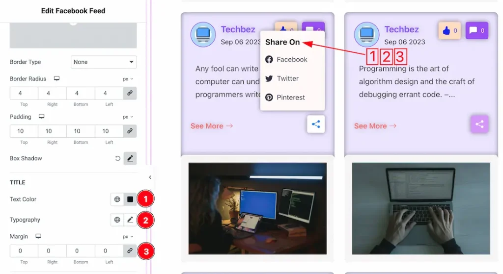
Text Section
Go to Style > Text
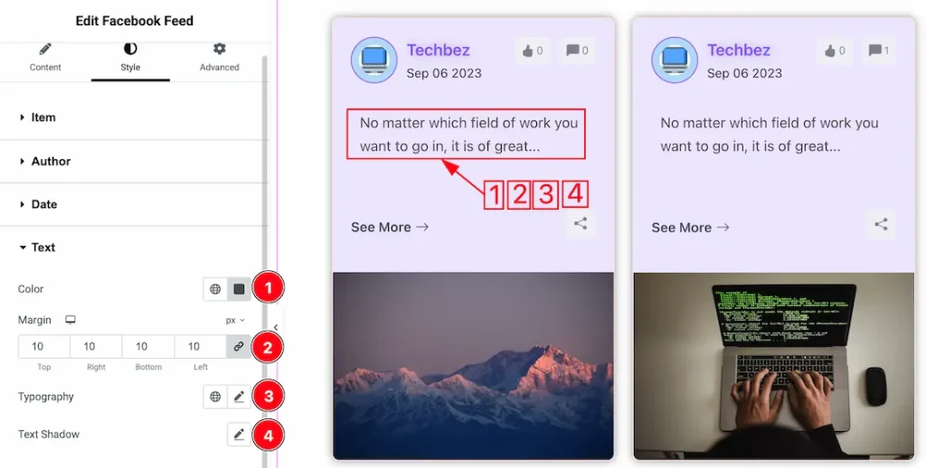
1. Color: This option lets you change the text color.
2. Margin: Adjusts the position of an object over the canvas.
3. Typography: Change the font family, size, weight, style, transform, decoration, line height, letter spacing, and word spacing from here.
4. Text Shadow: You can set the text shadow from here.
Feature Image Section
Go to Style > Feature Image
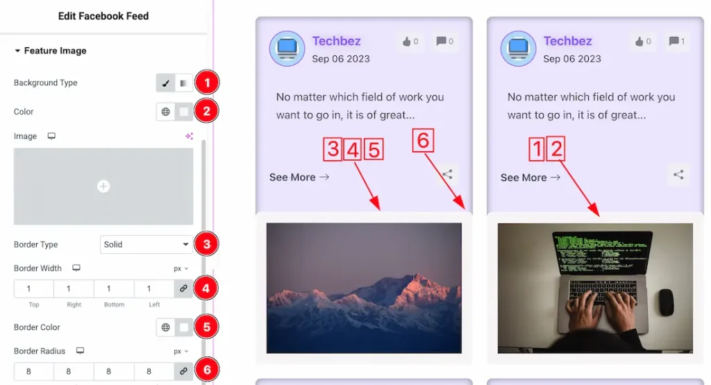
1. Background Type: you can change the color of any object background to classic or gradient. Here we choose the Background type Classic.
2. Background Color: This lets you change the Background color of the feature image. If you want, you also can change an image to the Background.
3. Border Type: you can set the Border Type to Default, None, Solid, Double, Dotted, Dashed, or Groove. We choose here the Border Type Solid.
4. Border Width: The border width property allows you to control how thick or thin the border is.
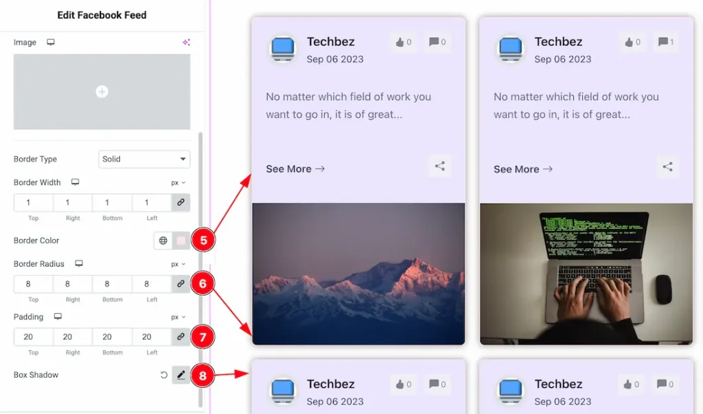
5. Border Color: This lets you change the feature image Border color.
6. Border Radius: Customizes the border corners for roundness.
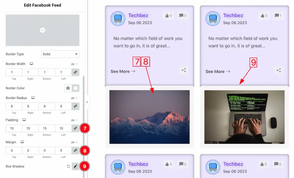
7. Padding: You can adjust the feature image padding from here.
8. Margin: Adjusts the position of an object over the canvas.
9. Box Shadow: You can set the feature image box shadow from here.
Read More Section
Go to Style > Read More
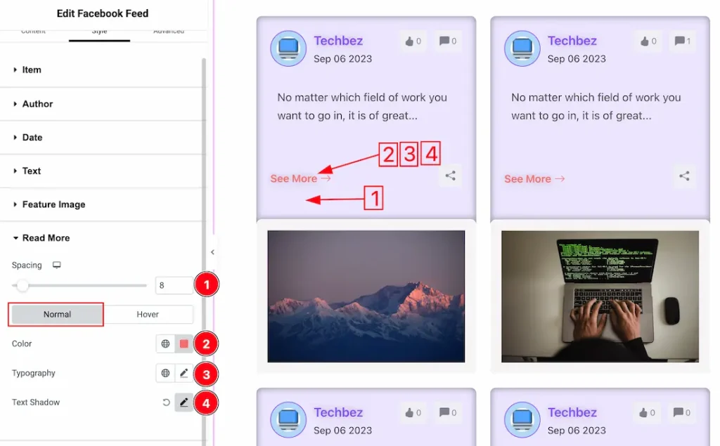
In this section, we have two more tabs. These are Normal, and Hover. Let’s start with the Normal Tab first –
1. Spacing: You can adjust the read more text spacing from here.
2. Color: This option lets you change the normal text color of the read more text.
3. Typography: Change the font family, size, weight, style, transform, decoration, line height, letter spacing, and word spacing from here.
4. Text Shadow: You can add the normal text shadow for the Read More button.
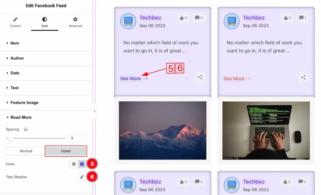
Now, let’s proceed to the Hover Tab –
5. Color: This option lets you change the hover text color of the read more text.
6. Text Shadow: You can add the hover text shadow for the Read More button.
Like / Comments Section
Go to Style > Like / Comments
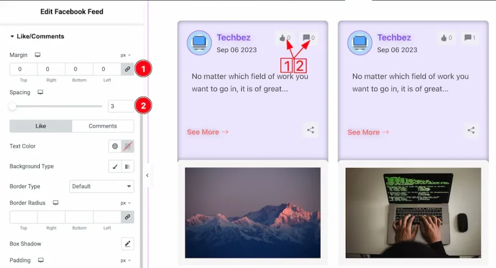
1. Margin: You can adjust the like/comments margin from here.
2. Spacing: You can adjust the like/comments spacing from here.
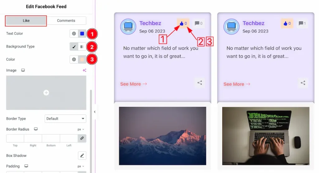
Come to the like/comments section, you will get two tabs sections; Like and Comments. Let proceed with the Like tab-
1. Text Color: This option lets you change the like icon/text color.
2. Background Type: You can select the background type to be classic or gradient with this option. Here, we have selected the background type as classic.
3. Background Color: You can change the like background color with this option.
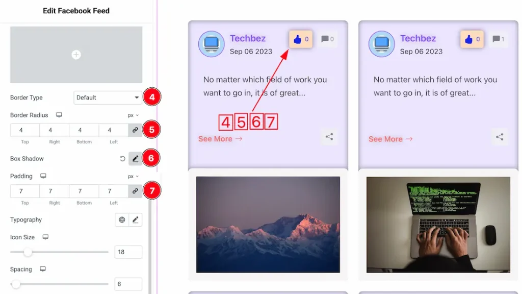
4. Border Type: You can set the Border Type to Default, None, Solid, Double, Dotted, Dashed, or Groove. We choose here the Border Type Solid.
5. Border Radius: Customizes the border corners for roundness.
6. Box Shadow: The Box Shadow property is used to create the shadow around the Category Button. It takes Four values: Horizontal offset, Vertical offset, blur, and Spread to customize the Box shadow.
Position: you can set the Box Shadow position Outline and Inset. Here we set the Box Shadow position Outline.
Box Shadow Color: This lets you change the Box Shadow color.
7. Padding: Add spaces around an object to increase the inner area. Padding allows you to control the internal space within an element.
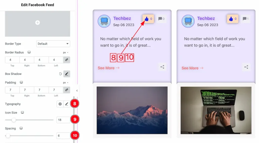
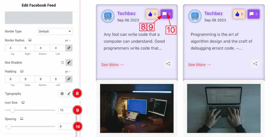
8. Typography: Change the font family, size, weight, style, transform, decoration, line height, letter spacing, and word spacing from here.
9. Icon Size: This can set the like icon size from here.
10. Spacing: You can adjust the like icon spacing from here.
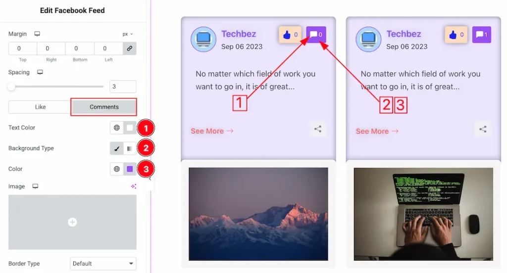
Let proceed with the Comments tab-
1. Text Color: This option lets you change the comments icon/text color.
2. Background Type: You can select the comments background type to be classic or gradient with this option. Here, we have selected the background type as classic.
3. Background Color: You can change the comments background color with this option.
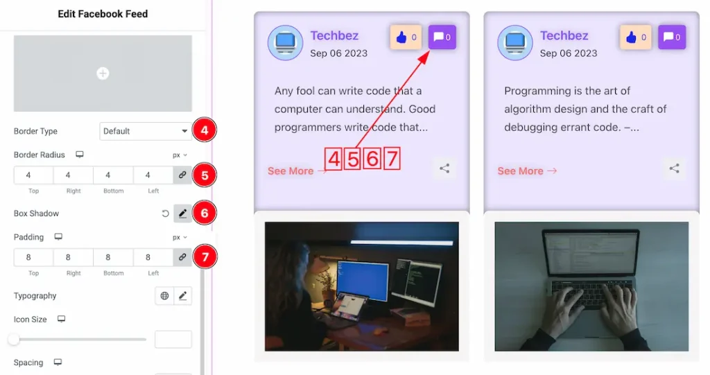
4. Border Type: You can set the commnets Border Type to Default, None, Solid, Double, Dotted, Dashed, or Groove. We choose here the Border Type Solid.
5. Border Radius: Customizes the comments border corners for roundness.
6. Box Shadow: If you want, you can add the comments box shadow from here.
7. Padding: Adjust the comments padding from here.
8. Typography: Change the font family, size, weight, style, transform, decoration, line height, letter spacing, and word spacing from here.
9. Icon Size: This can set the comments icon size from here.
10. Spacing: You can adjust the comments icon spacing from here.
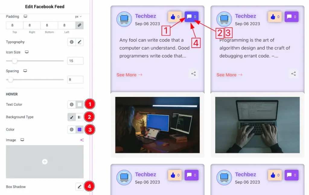
1. Text Color: This option lets you change the comments icon/text hover color.
2. Background Type: You can select the hover background type to be classic or gradient with this option. Here, we have selected the background type as classic.
3. Background Color: You can change the comments hover background color with this option.
4. Box Shadow: You can add the comments hover box shadow from here.
Share Section
Go to Style > Share
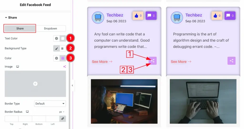
In this section, we have two more tabs. These are Share, and Dropdown. Let’s start with the Share Tab first –
1. Text Color: This option lets you change the share icon/text color.
2. Background Type: You can select the share background type to be classic or gradient with this option. Here, we have selected the background type as classic.
3. Background Color: You can change the share background color with this option.
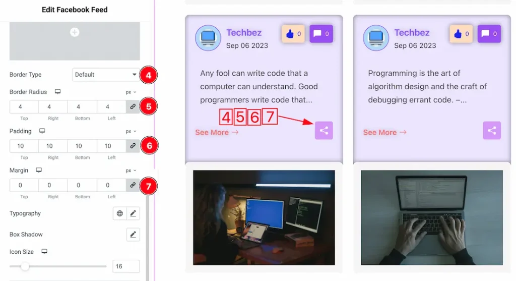
4. Border Type: You can set the share Border Type to Default, None, Solid, Double, Dotted, Dashed, or Groove. We choose here the Border Type Solid.
5. Border Radius: Customizes the share border corners for roundness.
6. Padding: Adjust the share button padding from here.
7. Margin: Adjusts the position of an object over the canvas.
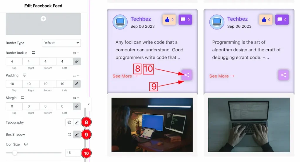
8. Typography: Change the font family, size, weight, style, transform, decoration, line height, letter spacing, and word spacing from here.
9. Box Shadow: You can add the Box shadow for the Share button from here.
10. Icon Size: This option lets you set share button icon size from here.
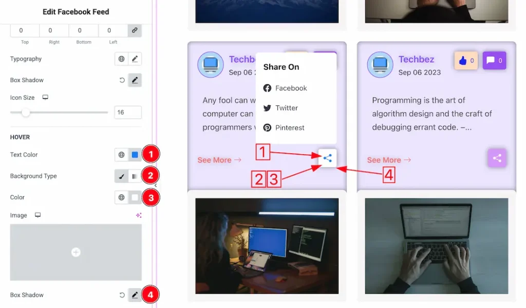
Lets proceed with the Hover section-
1. Text Color: This option lets you change the share button icon hover color.
2. Background Type: You can change hover background type from here.
3. Color: You can change the hover share button background color from here.
4. Box Shadow: You can add share button hover box shadaw from here.
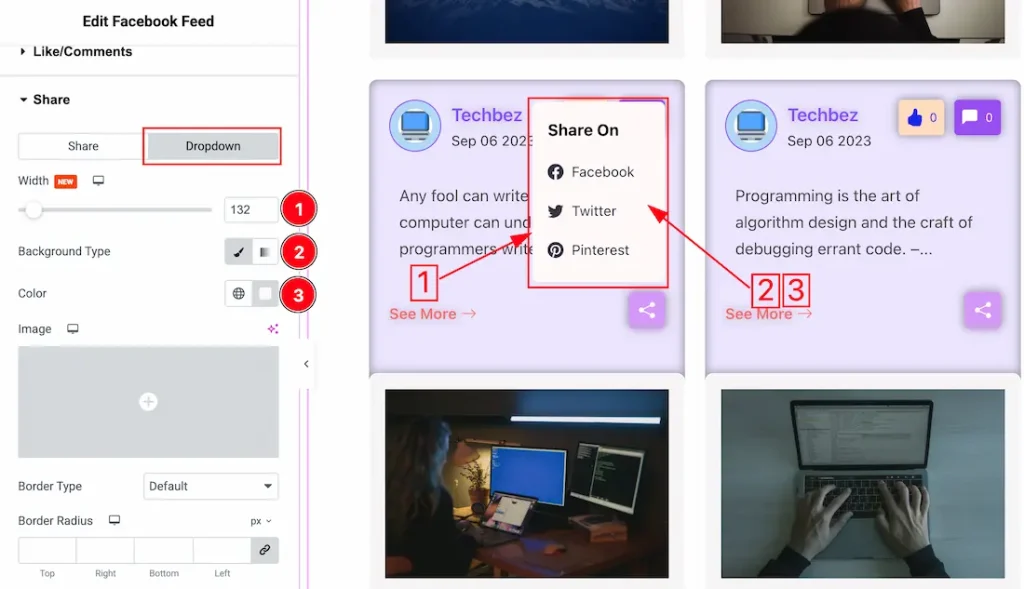
Lets proceed with the dropdown tab section-
1. Width: You can set the dropdown width to your required need from here.
2. Background Type: You can change the color of the dropdown background to classic or gradient. Here we choose the Background type Classic.
3. Color: You can change the dropdown background color from here.
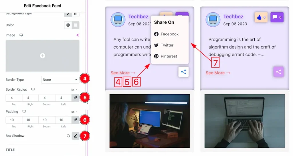
4. Border Type: you can set the dropdown Border Type to Default, None, Solid, Double, Dotted, Dashed, or Groove. We choose here the Border Type Solid.
5. Border Radius: Customizes the dropdown border corners for roundness.
6. Padding: Adjust the dropdown padding from here.
7. Box Shadow: You can add the dropdown box shadow from here.
Dropdown Title
1. Text Color: This option lets you change the Dropdown Title text color.
2. Typography: Change the font family, size, weight, style, transform, decoration, line height, letter spacing, and word spacing from here.
3. Margin: Adjust the dropdown Title margin from here.
Dropdown List
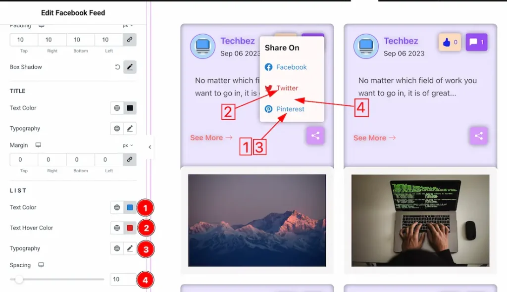
1. Text Color: This option lets you set the dropdown list text normal color.
2. Text Hover Color: This option lets you set the dropdown list text hover color.
3. Typography: Change the font family, size, weight, style, transform, decoration, line height, letter spacing, and word spacing from here.
4. Spacing: You can adjust the dropdown list spacing from here.
All done! You have successfully customized the Facebook Feed widget on your website.
Video Assist
The video help you to use the widget. Please visit the demo page for more examples. Thanks for staying with us.