The Circle Info widget from Element Pack Pro is an interactive and visually engaging tool for presenting key information, features, or highlights in a circular layout on your website. It allows you to showcase content with icons, titles, and descriptions arranged in an attractive circular structure, helping you draw attention to important details in a unique way. With flexible layout controls, animation effects, and extensive styling options, the Circle Info widget enables you to create modern and eye-catching information sections easily using Elementor. In this documentation, we will cover how to customize and use the Circle Info widget provided by Element Pack Pro for Elementor.
Enable The Circle Info Widget
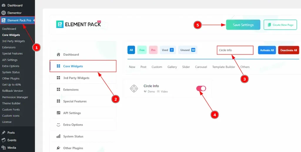
To use the Circle Info widget from Element Pack Pro, first, you have to enable the widget.
- Go to WordPress dashboard → Element Pack Pro Plugin dashboard.
- Then, Click the Core Widgets Tab.
- Search the Circle Info Widget Name.
- Enable the Circle Info Widget.
- Hit the Save Settings Button.
Inserting The Circle Info Widget
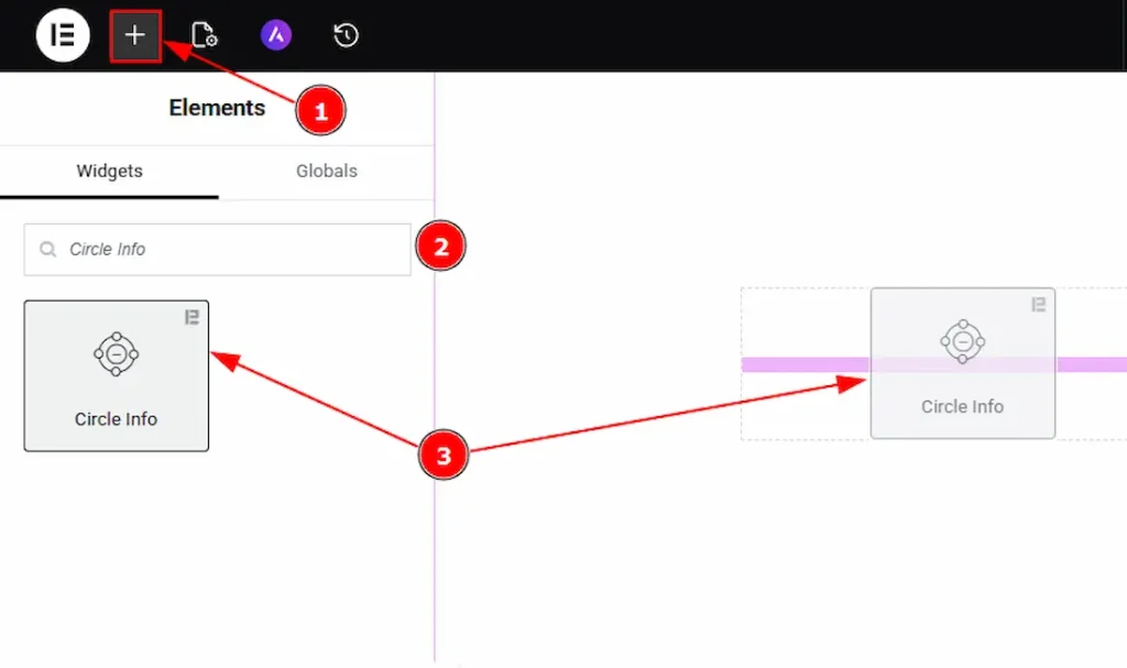
1. Go to the Elementor Editor Page and hit the “+” icon Button.
2. Search the Circle Info name.
3. Drag the widget and drop it on the editor page.
Work With The Content Tab
Circle Info Section
Go to Content → Circle Info
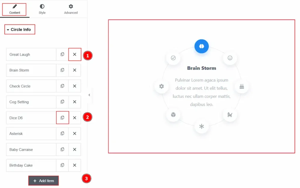
1. Close Item: You can delete the Circle Info item by clicking the Close icon button.
2. Copy Item: This option lets you copy the same item.
3. Add Item: You can add a new item by clicking the “+” Add Item button.
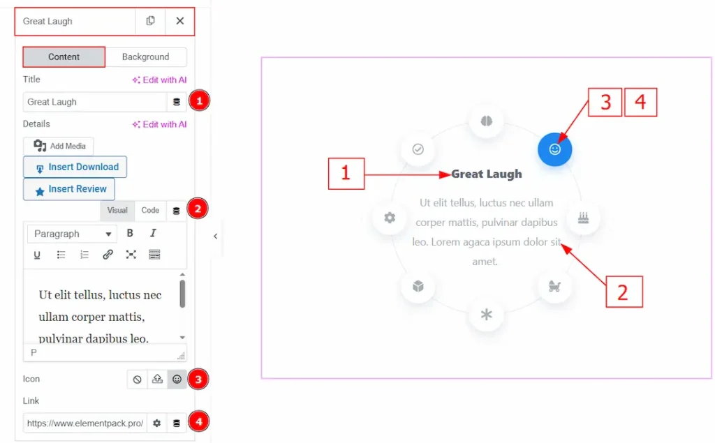
In the Circle Info Items, each item contains more options. There are two tabs that present those options. These are Content & Background. Let’s start with the Content Tab –
1. Title: You can add and make changes to the title text of the circle info item with this option.
2. Details: You can add a description to the circle info item with this option.
3. Icon: You can add an icon to the info item with this option.
4. Link: You can add a link to the icon with this option.
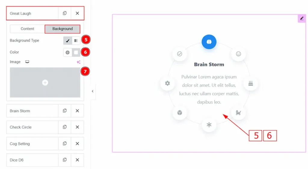
Now, let’s proceed to the Background Tab –
5. Background Type: You can choose background type between the classic or gradient wth this option.
6. Color: You can change the background color with this option.
7. Image: You can change the background image with this option.
Additional Info Section
Go to Content → Additional Info
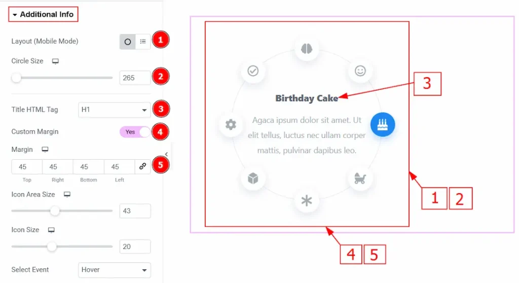
1. Layout (Mobile Mode): You can choose the layout of the circle info as a circle or a list with this option. (This option only works for mobile devices.)
2. Circle Size: You can make changes to the circle size with this option.
3. Title HTML Tag: You can select the title HTML Tag with this option.
4. Custom Margin: Enable the switcher to get the option to adjust the space around the circle with this option.
5. Margin: You will get this option to adjust the space around the circle by enabling the above custom margin option.
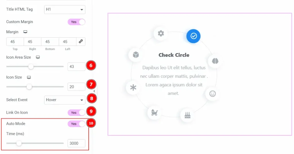
6. Icon Area Size: You can make changes to the icon area size with this option.
7. Icon Size: You can make changes to the icon size with this option.
8. Select Event: This option determines the interaction trigger used to activate a Circle Info item. You can choose between the Hover & Click option.
9. Link On Icon: Enable the switcher to add a link on icon with this option.
10. Auto Mode: Enable the switcher to automatically rotate the active Circle Info items without requiring user interaction, and also controls the delay duration between automatic transitions.
Work with The Style Tab
Content Section
Go to Style → Content
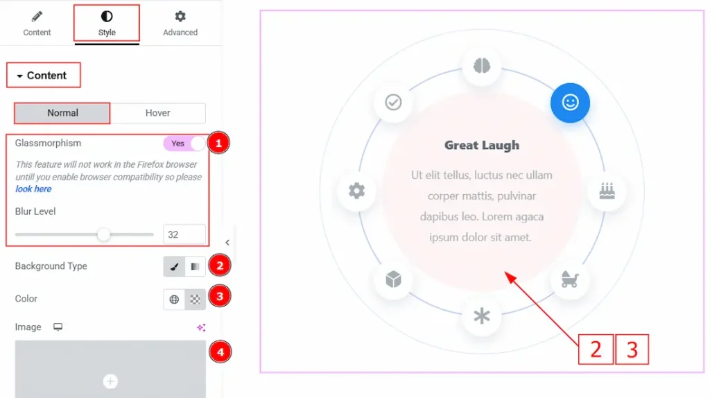
In this section, we have two more tabs. These are Normal and Hover. Let’s start with the Title tab first –
1. Glassmorphism: The Glassmorphism option adds a semi-transparent, blurry glass-like effect to the Circle Info design, allowing the background to softly appear through the element for a modern UI look. You can also get the option to adjust the blur level by enabling this option.
2. Background Type: You can choose the background type between the classic or gradient styles with this option. Here, we have selected the background type as classic.
3. Color: You can change the background color with this option.
4. Image: You can change the background image with this option.
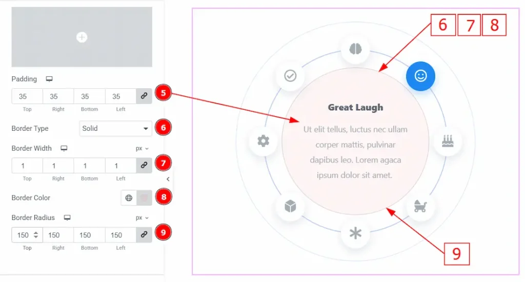
5. Padding: You can adjust the inner space of the circle info content field with this option.
6. Border Type: This option allows you to add borders to your items. You can select various border types from this option. Such as Solid, Double, Dotted, Dashed, Groove.
7. Border Width: You can adjust the thickness of the border with this option.
8. Border Color: You can change the border color with this option.
9. Border Radius: This option controls the roundness of the border.
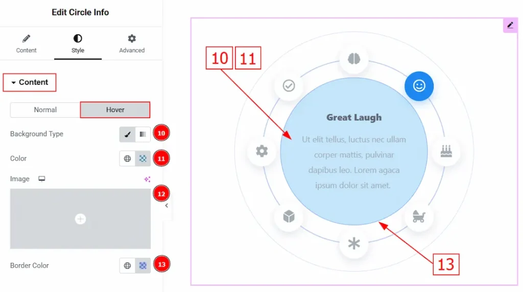
Now, let’s proceed to the Hover Tab –
10. Background Type: You can choose the background type between the classic or gradient with this option. Here, we have selected the background type as classic.
11. Color: You can change the background hover color with this option.
12. Image: You can change the background image with this option.
13. Border Color: You can change the hover color of the border with this option.
Icon Section
Go to Style → Icon
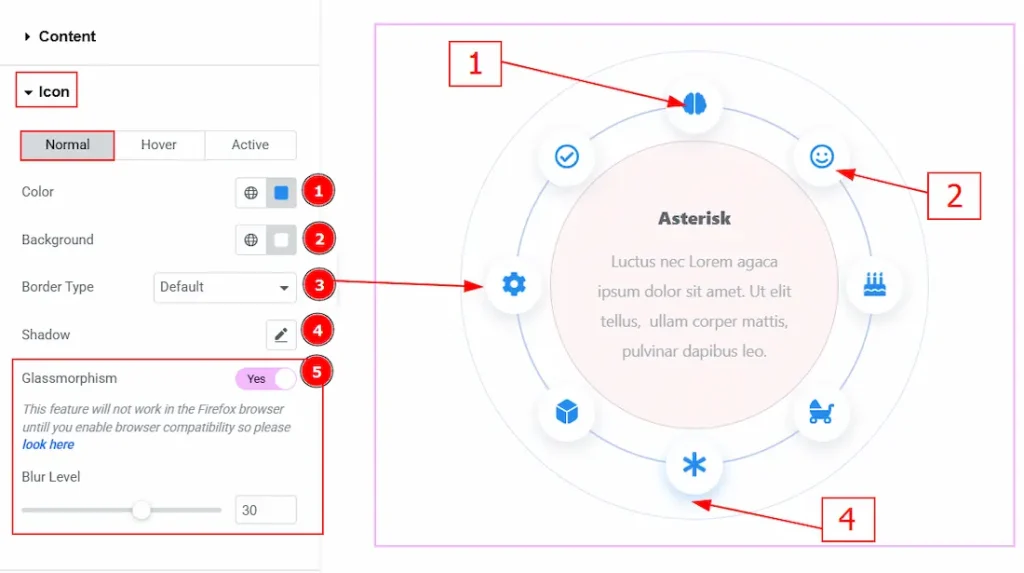
In this section, we have three more tabs. These are Normal, Hover & Active. Let’s start with the customization of the Normal Tab first –
1. Color: You can change the icon color with this option.
2. Background: You can change the icon background color with this option.
3. Border Type: You can add and change the border type of the icon with this option.
4. Shadow: You can add a shadow effect to the icons with this option.
5. Glassmorphism: Enable the switcher to add and adjust the blur effect to the icons.
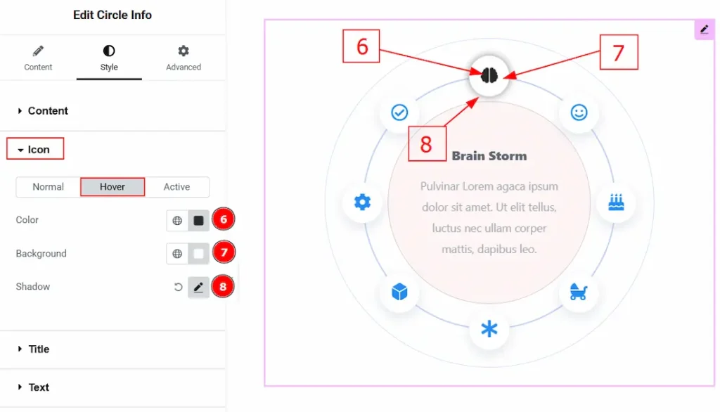
Now, let’s proceed to the Hover Tab –
6. Color: You can change the icon’s hover color with this option.
7. Background: You can change the icon’s background hover color with this option.
8. Shadow: You can add a hover shadow effect to the icons with this option.
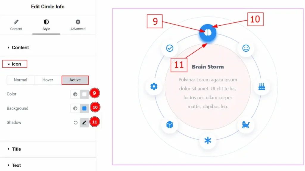
Now, let’s proceed to the Active Tab –
9. Color: You can change the icon’s active color with this option.
10. Background: You can change the icon’s active background color with this option.
11. Shadow: You can customize the active shadow effect of the icon with this option.
Title Section
Go to Style → Title
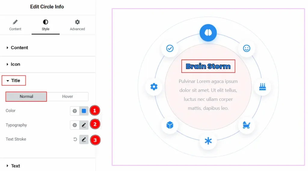
In this section, we have two more tabs to customize. These are Normal & Hover. Let’s start with the Normal Tab first –
1. Color: You can make changes to the title text color with this option.
2. Typography: Change the font family, size, weight, transform, style, decoration, line height, letter spacing, and word spacing from here.
3. Text Stroke: This option adds an outline around the text characters, allowing you to control the stroke color and thickness to make the text more highlighted and visually distinct.
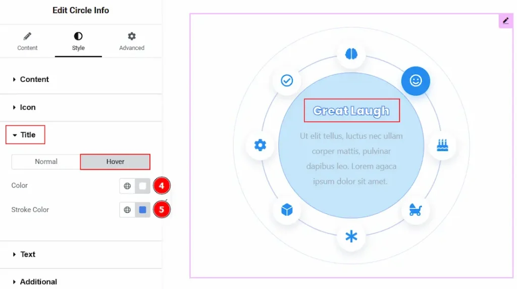
Now, let’s proceed to the Hover Tab –
4. Color: You can change the title hover color with this option.
5. Stroke Color: You can change the title outline border stroke hover color with this
Text Section
Go to Style → Text
In this section, we have two more tabs. These are Normal & Hover. Let’s start describing those one by one.
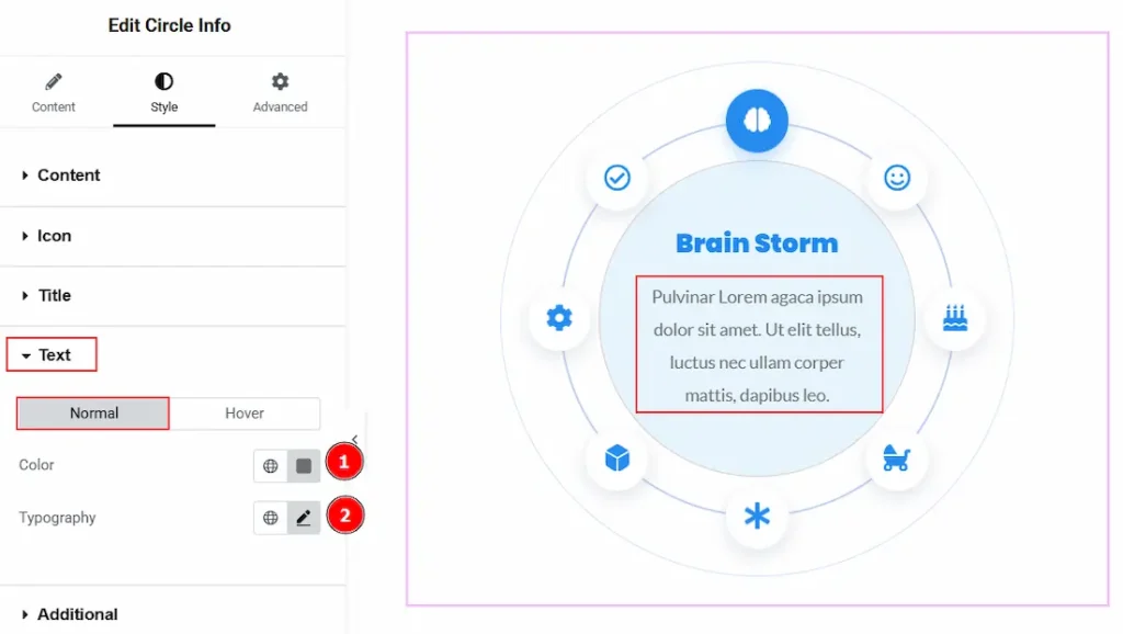
1. Color: You can make changes to the text color with this option.
2. Typography: Change the font family, size, weight, transform, style, decoration, line height, letter spacing, and word spacing from here.
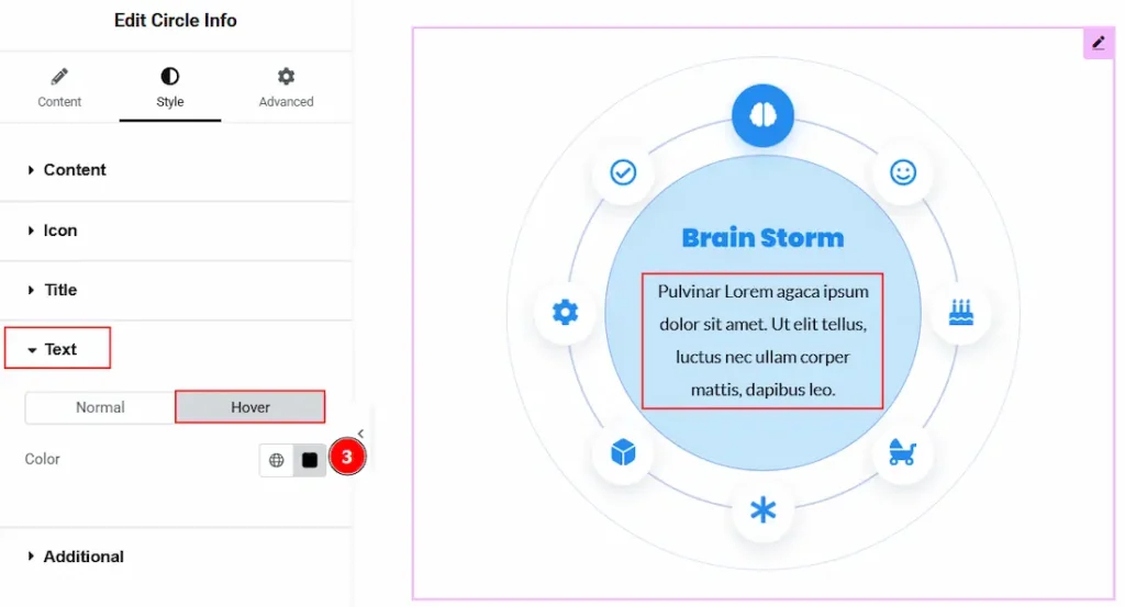
3. Color: You can change the text’s hover color with this option.
Additional Section
Go to Style → Additional
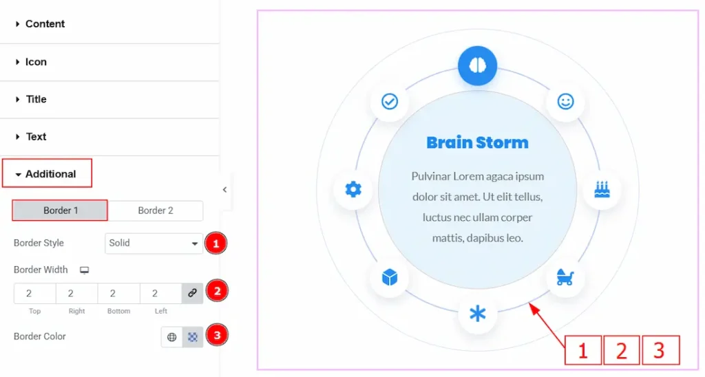
In this section, we have two more tabs. These are Border 1 & Border 2. Let’s start describing what the border 1 tab has –
1. Border Type: You can add or select the border style between none, solid, dotted, dashed, double & groove with this option.
2. Border Width: You can set the thickness of the border with this option.
3. Border Color: You can change the border color with this option.
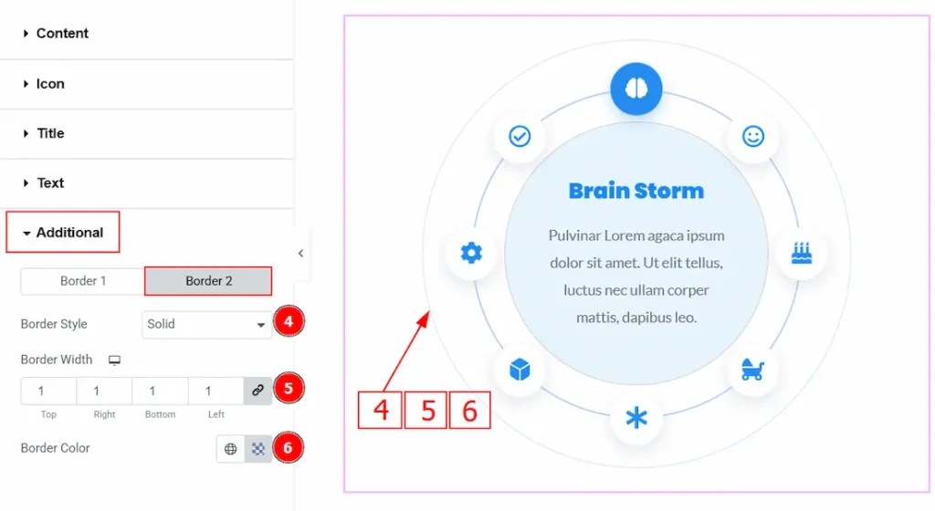
Now, let’s proceed to customize the Border 2 Tab –
4. Border Style: You can add or select the border style between none, solid, dotted, dashed, double & groove with this option.
5. Border width: You can set the thickness of the border with this option.
6. Border color: You can make changes to the border color with this option.
All done! You have successfully customized the Circle Info widget on your website.
Video Assist
You can also watch the video tutorial to learn more about the Circle Info widget. Please visit the demo page for examples.
Thanks for being with us.