
In the documentation, we will provide comprehensive guidance on the Element Pack Pro Chart widget for Elementor. This widget brings a new dimension to your website by enabling you to present data visually through interactive and customizable charts directly on your pages. It is a powerful and flexible widget designed for displaying statistics, comparisons, reports, and insights in a clear and engaging way. Suitable for a wide range of applications, the Chart widget helps you transform complex data into easy-to-understand visuals for business, analytics, educational, and marketing purposes.
Let’s see how to properly use this widget.
Chart Widget – Key Features
- Multiple Chart Types
Create various chart styles including bar, line, pie, doughnut, radar, and more to visualize your data effectively. - Easy Data Input
Add and manage chart data directly from the widget panel with a simple and user-friendly interface. - Real-Time Preview
Instantly see chart updates as you modify labels, values, or settings inside the editor. - Fully Customizable Design
Control colors, fonts, grid lines, legends, tooltips, and backgrounds to match your website branding. - Responsive & Mobile Ready
Charts automatically adapt to different screen sizes for a consistent experience across devices. - Dynamic Data Support
Use dynamic content to populate charts from custom fields or other dynamic sources. - Interactive Tooltips
Display detailed information on hover for better user understanding and engagement. - Animation Effects
Enable smooth chart animations on load to make data presentation more engaging. - Legend & Label Controls
Show, hide, and style chart legends, axis labels, and values with flexible options. - No Coding Required
Build and customize professional charts visually without writing any code.
Activate the Chart Widget
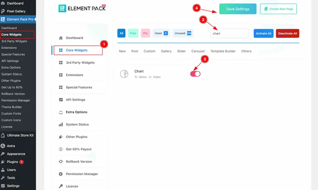
To use the Chart widget from Element Pack Pro, first, you have to enable the Core Widgets. Navigate to the WordPress Dashboard.
- Go to Element Pack Pro > Core Widgets section.
- Search by the Widget Name ” Chart ” and it will appear the.
- Now Enable the Switcher of the Chart Widget.
- Hit the Save Settings button.
Inserting The Chart Widget
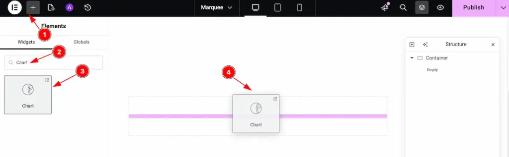
- Go to the Elementor Editor page and click the Add Element “+” icon.
- Search for the Chart widget by name.
- The widget will appear — you can check the Element Pack Pro logo on the top-right corner.
- Select the widget, then drag and drop it onto the editor page.
Customize the layout under the Content tab
For almost all widgets, the Content tab holds all the base settings that will help your shift the content layout of this cost calculator widget. This is where we put all the required adjustments that you need to make variations to the default setup and make unique content out of it.
Let us briefly describe everything inside the content tab.
Chart Section
Go to Content > Chart
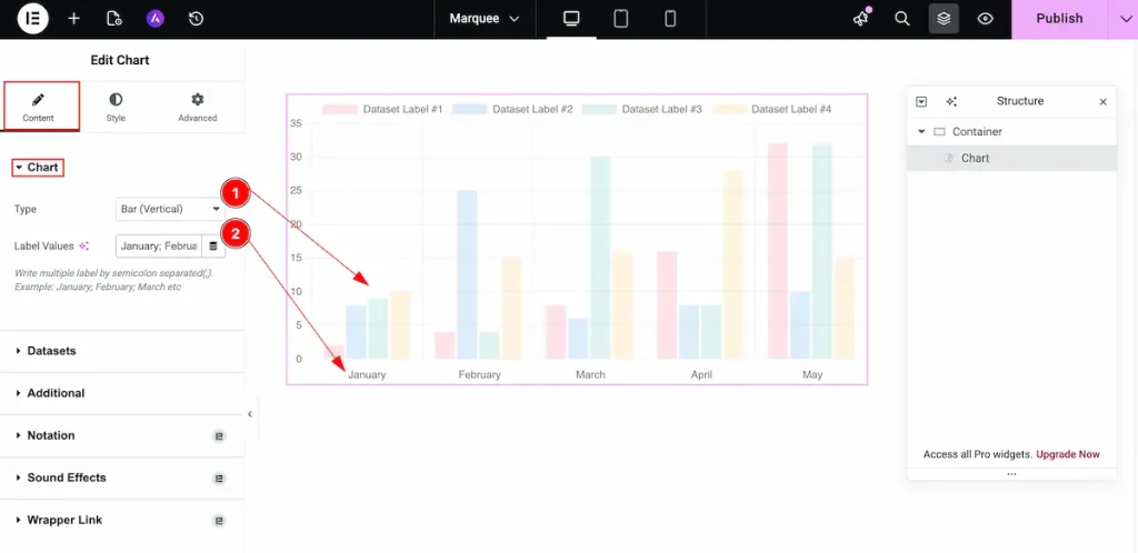
- Type: Choose the type for the chart. Different type of chart are available.
- Label Values: Set the value for the labels. e.g.: Jan, Feb, 1, 2, or any
Different type of Chart Demonstration
Bar ( Vertical )
It demonstrates the chart bars in a vertical layout, allowing you to present data clearly through vertically aligned bar columns.
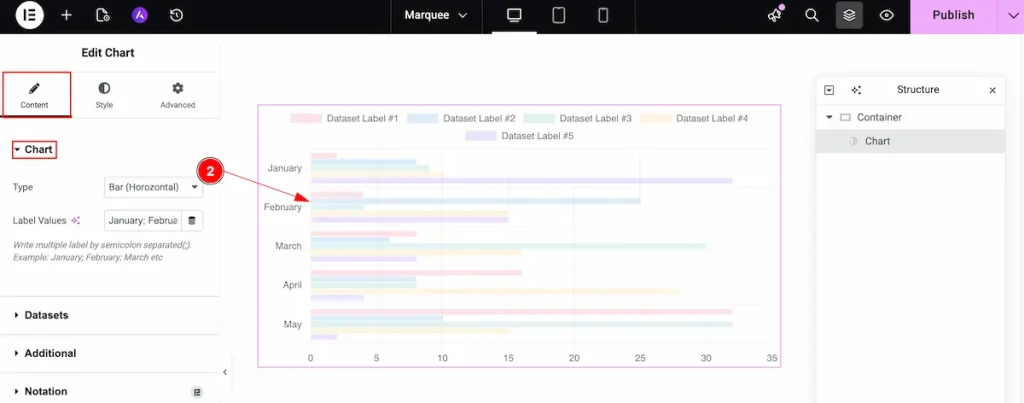
Bar ( Horizontal )
It demonstrates the chart bars in a horizontal layout, allowing you to display data clearly using horizontally aligned bar rows.
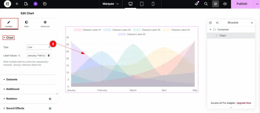
Line
Displays the data in a line chart format, connecting values with lines to show trends and changes over time.
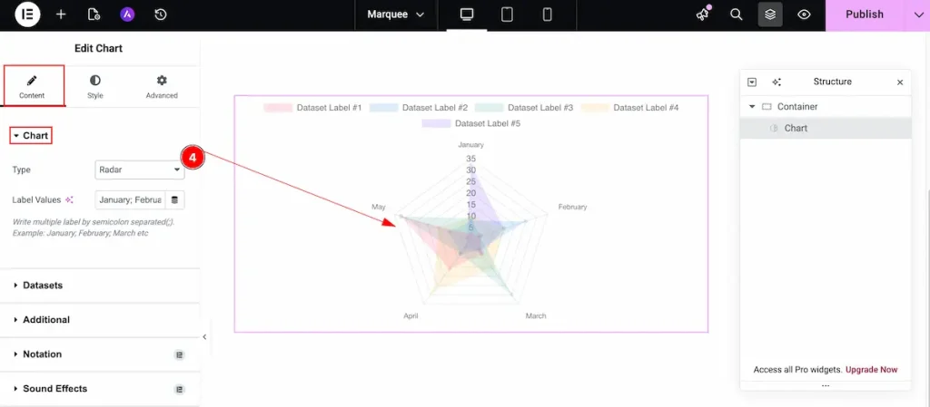
Radar
Displays the data in a radar chart format, showing values across multiple categories in a circular layout for easy comparison.
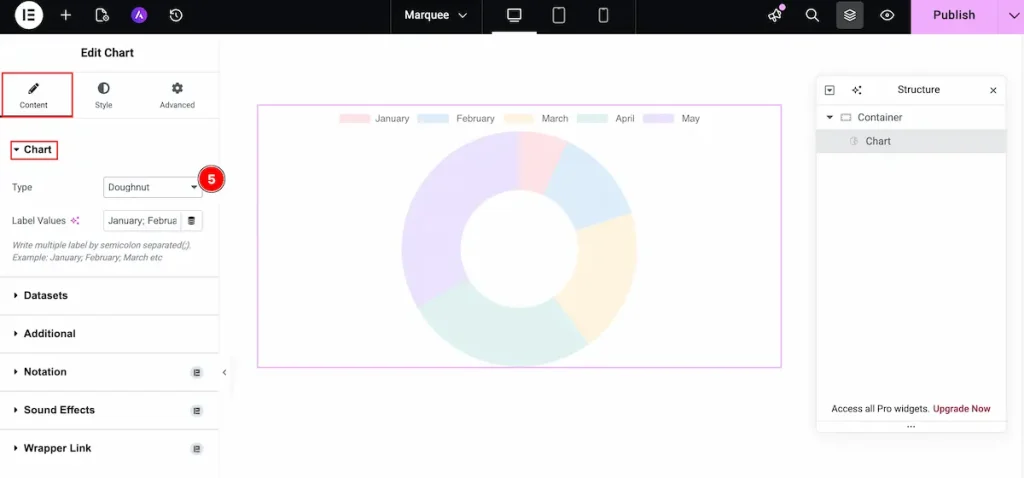
Doughunt
It demonstrates the data in a doughnut chart format, displaying values as proportional segments within a circular ring for easy comparison.
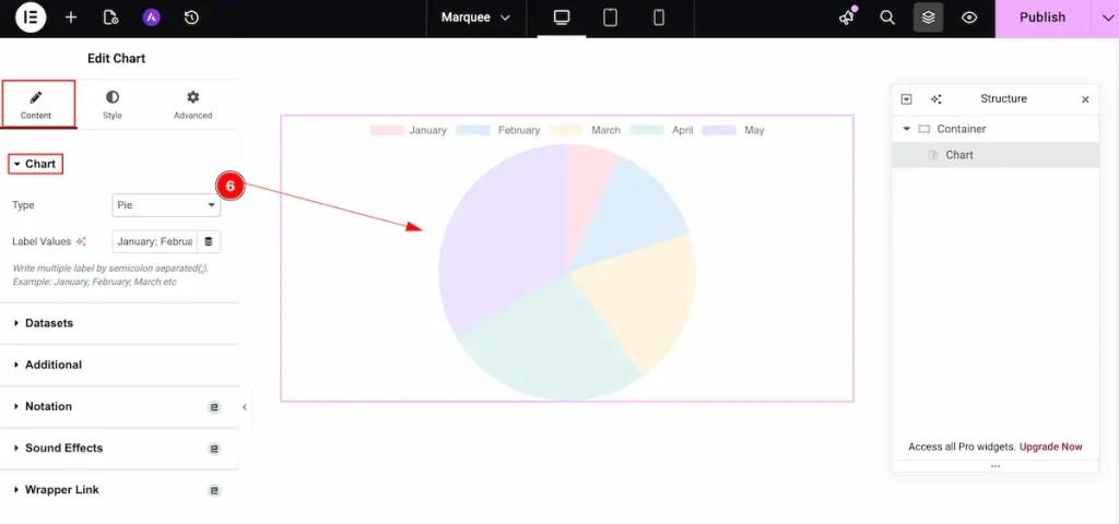
Pie
Demonstrates the data in a pie chart format, showing values as proportional slices of a circle for clear comparison.
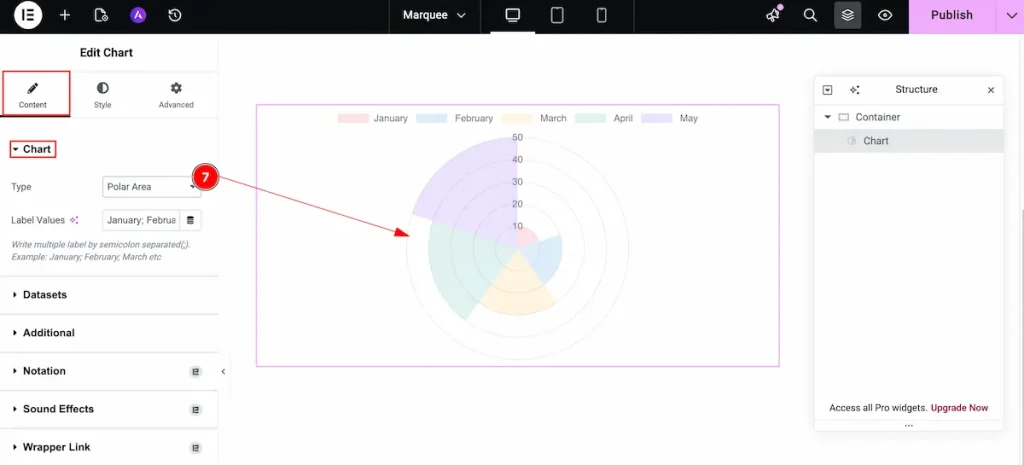
Polar Area
Displays the data in a polar area chart format, showing values as segments arranged around a circle to compare multiple categories.
Bubble
Displays the data in a bubble chart format, using circles of varying sizes to represent and compare multiple data values visually.

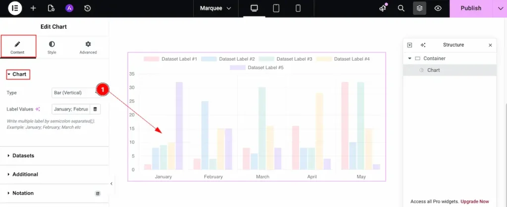
Datasets
Go to Content> Datasets
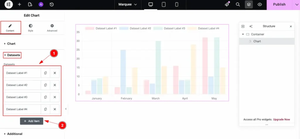
Here, you can create variables, labeled as datasets, for the chart values. By default, there are 4 entries. You can add or reduce as much as you want.
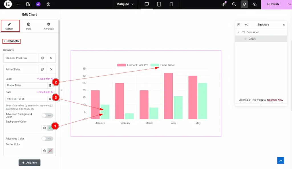
- Datasets: This section lists all available datasets. By default, there are 4 entries.
- To add a new dataset, click the “+ Add Item” button. Each dataset can have its own label, data, and background color.
Set content on the Dataset
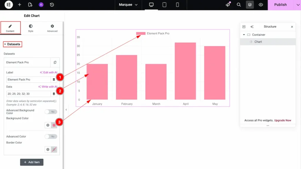
- Label: Set the label for the dataset. The label will appear above the chart to identify the data series.
- Data: Enter the values for the dataset. The chart will display these values visually according to the data provided.
- Background Color: Choose the background color for the dataset to make it visually distinct and easily identifiable in the chart.
Advanced Background
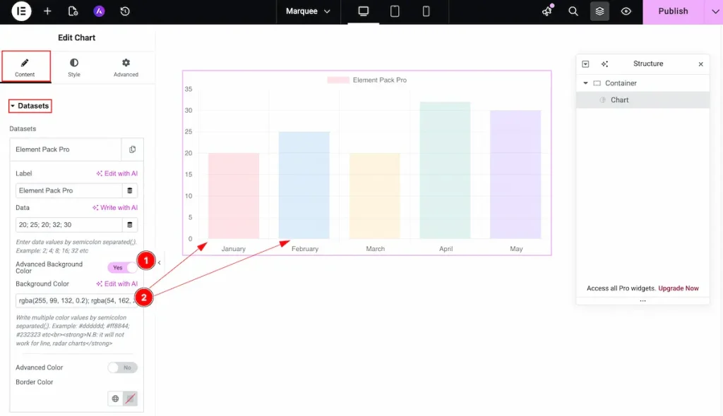
- Advanced Background Color: Enable this option to use multiple or gradient background colors for the dataset, allowing more advanced styling.
- Background Color: Set the background colors in any format you like (hex, RGB, etc.) and separate each color with a semicolon.
Example:#ff0099; #99b300; #0099ff;
Another Content Background
- Background Color: Set the background color for each data segment or area. The color will correspond to the specific data item for clear visual distinction.
- Label: Enter the label for each data item. The label will appear alongside the corresponding background color in the chart for easy identification.
- Data: Input the numeric or textual data associated with each label. This is the value that will be represented visually in the chart.
Additional
Go to Content> Additional
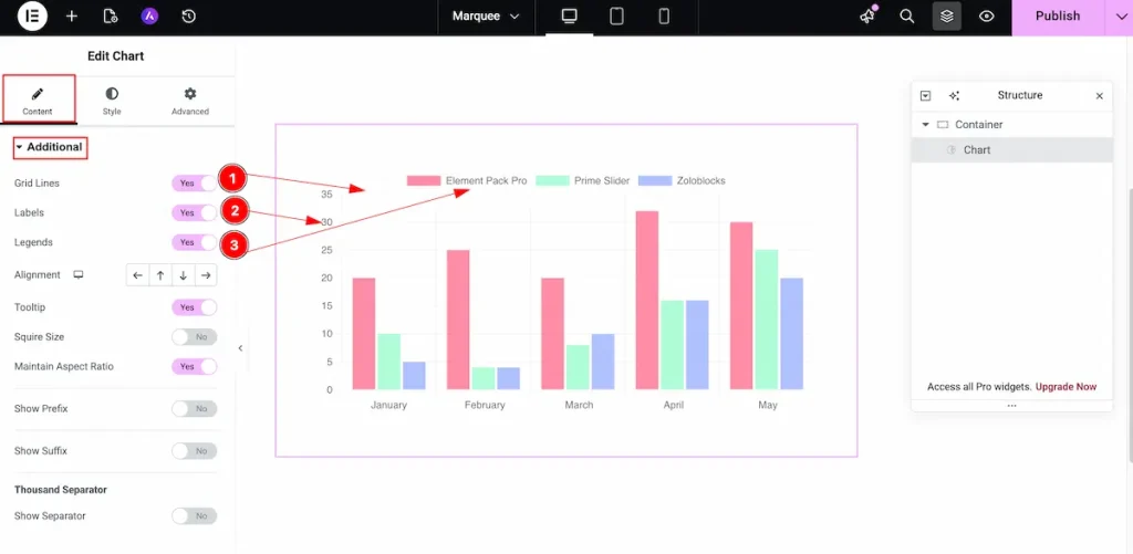
- Grid Lines: Enable this option to display grid lines on the chart, improving data visibility and making it easier to read values accurately.
- Labels: Enable this switcher to show labels on the chart, providing clear identification of each data point.
- Legends: Enable this option to display the chart legend, helping users understand the meaning of different colors or data series.
Alignment
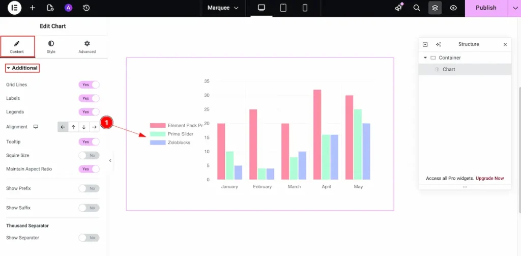
- Alignment: Set the position of the chart or its elements within the container. You can align content to the Left, Right, Top, or Bottom section as needed.
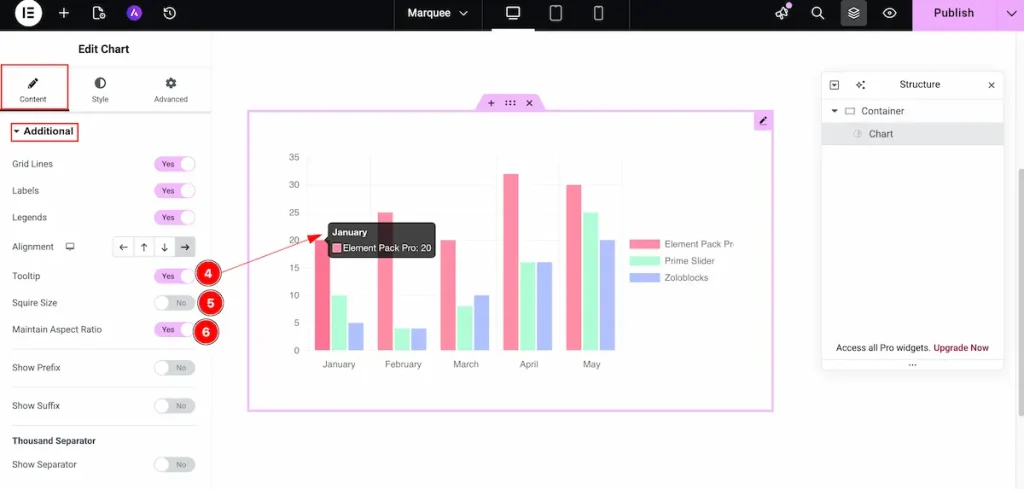
- Tooltip: Enable this option to show a tooltip when hovering over chart elements, providing additional information about the data.
- Square Size: Enable this option to make the chart display in a square shape, maintaining equal width and height.
- Maintain Aspect Ratio: Enable this option to preserve the chart’s original aspect ratio, ensuring it scales proportionally on different screen sizes.
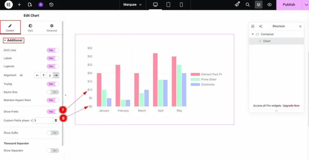
- Show Prefix: Enable this option to display a prefix on Y-axis values, such as a currency symbol or unit.
- Custom Prefix Y-Axes: Set the text for the Y-axis prefix. This will appear before the number, for example:
$,₹, or€.
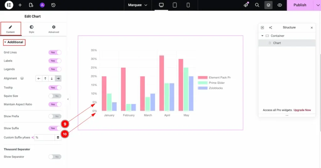
- Show Suffix: Enable this option to display a suffix on Y-axis values, such as units or symbols.
- Custom Suffix Y-Axes: Set the text for the Y-axis suffix. This will appear after the number, for example:
%,$, orkg.
Thousand Separator
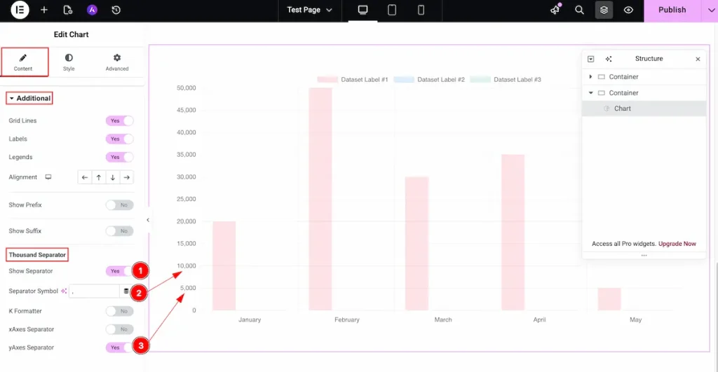
- Show Separator: Enable this option to display a thousands separator in numbers, improving readability for large values.
- Separator Symbol: Choose the symbol to use as the thousands separator (e.g., comma
,or period.). - Y-Axes Separator: Enable this to apply the separator specifically to numbers on the Y-axis for better clarity in vertical data.
K Formatter
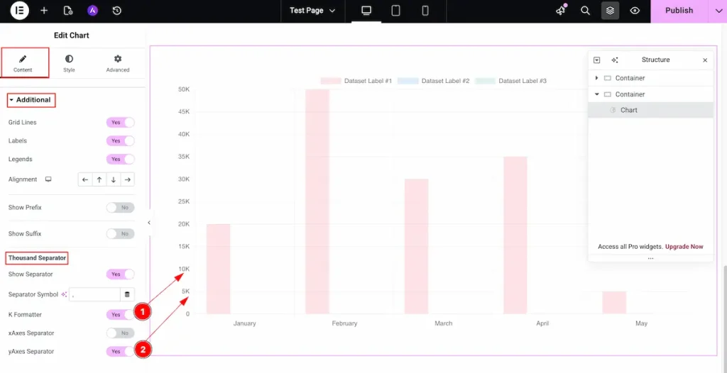
- K Formatter: Enable this option to display large numbers in a concise “K” format (e.g., 1,500 → 1.5K), making the chart cleaner and easier to read.
- Y-Axes Separator: Enable this to apply the K formatter specifically to the Y-axis, so large values are displayed in the shortened format on the vertical axis.
Designing with the Style Tab
The Style Tab offers a range of options to enhance the visual appearance of elements, enabling precise adjustments and creative design possibilities. It helps create polished and engaging layouts effortlessly.
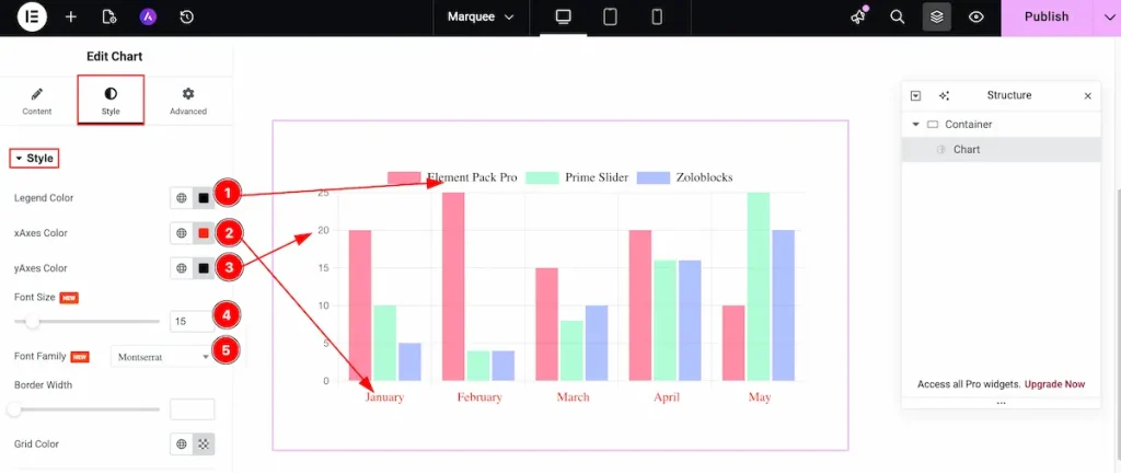
- Legend Color: Set the color of the chart legend to match your design and improve readability.
- X-Axes Color: Set the color for the X-axis (horizontal axis) lines and labels.
- Y-Axes Color: Set the color for the Y-axis (vertical axis) lines and labels.
- Font Size: Adjust the size of the chart text, including labels, legends, and tooltips, for better clarity.
- Font Family: Choose the font family to style all chart text consistently with your website design.
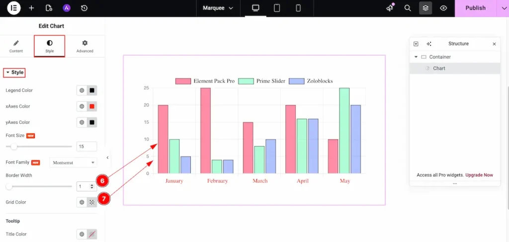
- Border Width: Set the thickness of the border. It will be applied to the chart content area.
- Grid Color: Set the color of the grid lines displayed within the chart.
Tooltip
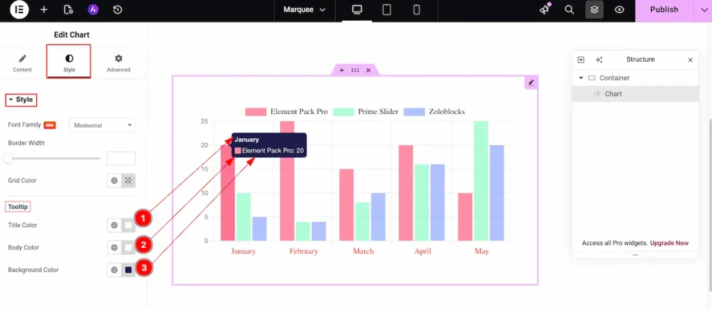
- Title Color: Set the color of the tooltip title text to make it stand out and match your design.
- Body Color: Set the color of the tooltip body text for better readability and visual consistency.
- Background Color: Choose the background color for the tooltip to enhance visibility and complement the chart style.
Conclusion
Watch this video for more visuals and visit the Chart widget’s demo page here, provided by Bdthemes.