The Call Out widget from Element Pack Pro lets you highlight important messages, announcements, or featured content in a visually noticeable way. It is ideal for drawing attention to key information using customizable layouts and styling. In this documentation, we will guide you through how to use and customize the Call Out widget in Elementor.
Enable The Call Out Widget
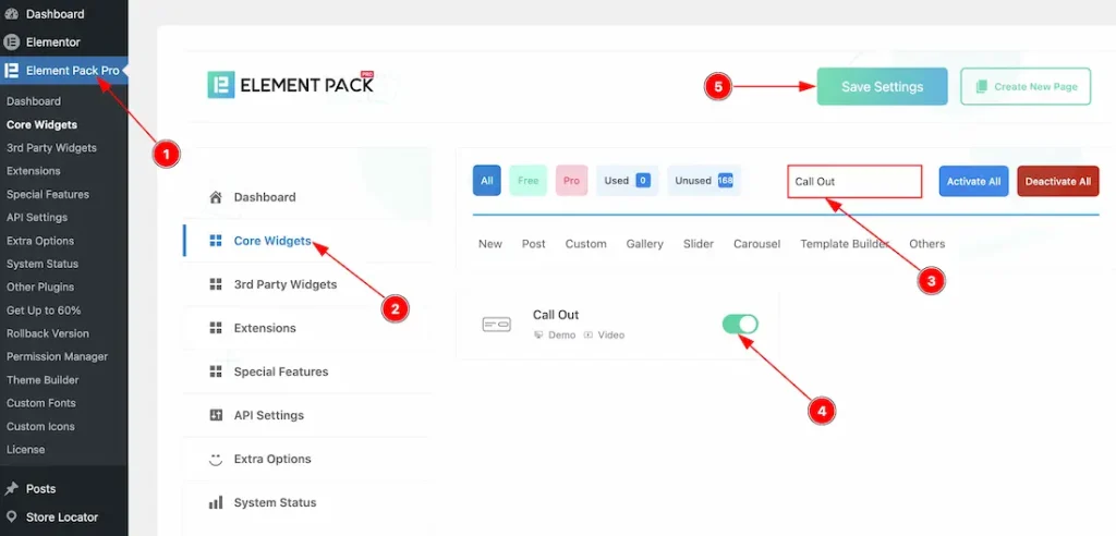
To use the Call Out widget from Element Pack, first, you have to enable the widget.
- Go to WordPress dashboard → Element Pack Plugin dashboard.
- Then, Click the Core Widgets Tab.
- Search the Call Out Widget Name.
- Enable the Call Out Widget.
- Hit the Save Settings Button.
Inserting The Call Out Widget
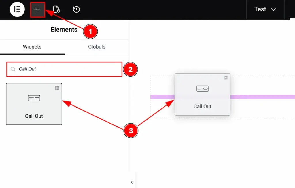
1. Go to the Elementor Editor Page and hit the “+” icon Button.
2. Search the Call Out name.
3. Drag the widget and drop it on the editor page.
Work With The Content Tab
Layout Section
Go to Content → Layout
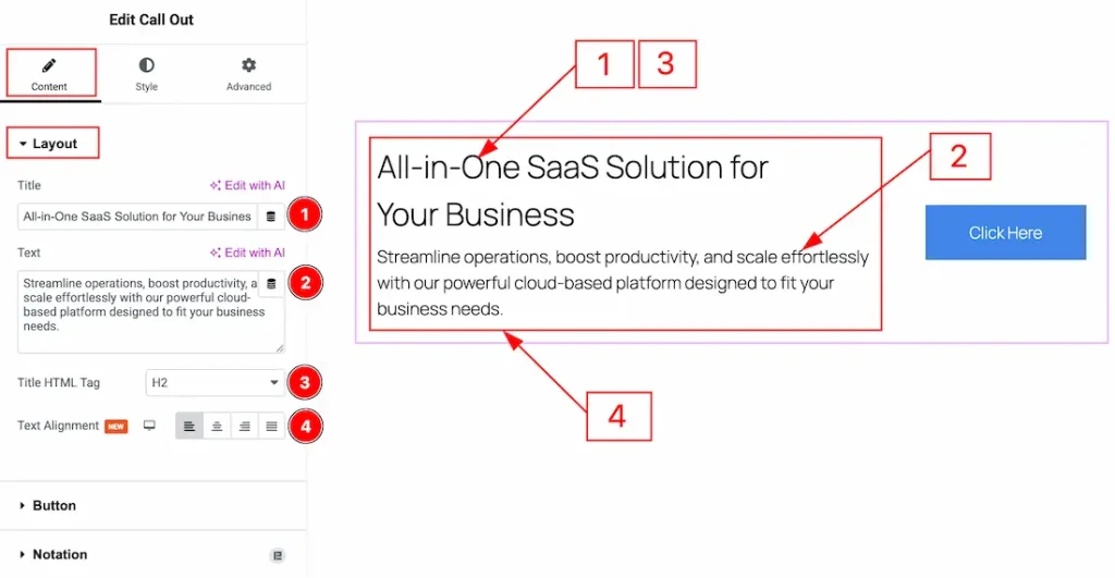
1. Title: You can add & make changes to the title text with this option.
2. Text: You can add & make changes to the text or description with this option.
3. Title HTML Tag: You can adjust the title HTML tag with this option.
4. Text Alignment: You can set the position of the content to left, center, right or justified with this option.
Button Section
Go to Content → Additional
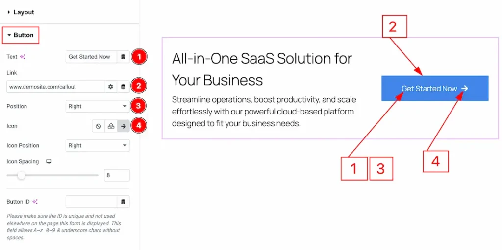
1. Text: You can add and make changes to the button text with this option.
2. Link: You can add a link to the button with this option.
3. Position: You can set the position of the button to left, right or center with this option.
4. Icon: You can add an icon to the button with this option.
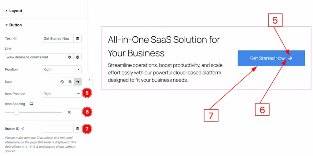
5. Icon Position: You can set the icon position to left or right of the button text with this option.
6. Icon Spacing: You can adjust the space between button text and the icon with this option.
7. Button ID: You can add a button ID and connect to a section with this option.
Work with The Style Tab
Title Section
Go to Style → Title
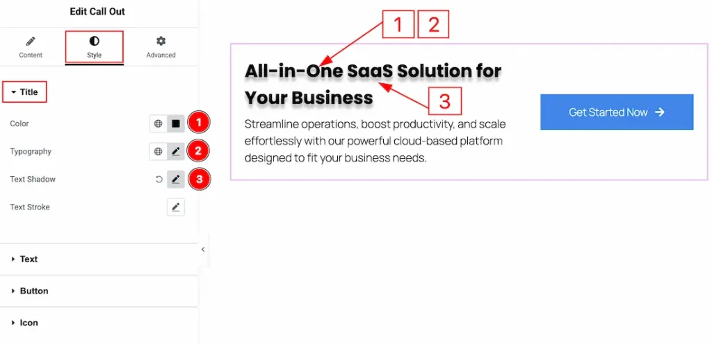
1. Color: You can make changes to the title text color with this option.
2. Typography: Change the font family, size, weight, transform, style, decoration, line height, letter spacing, and word spacing from here.
3. Text Shadow: You can add a shadow effect to the title text with this option.
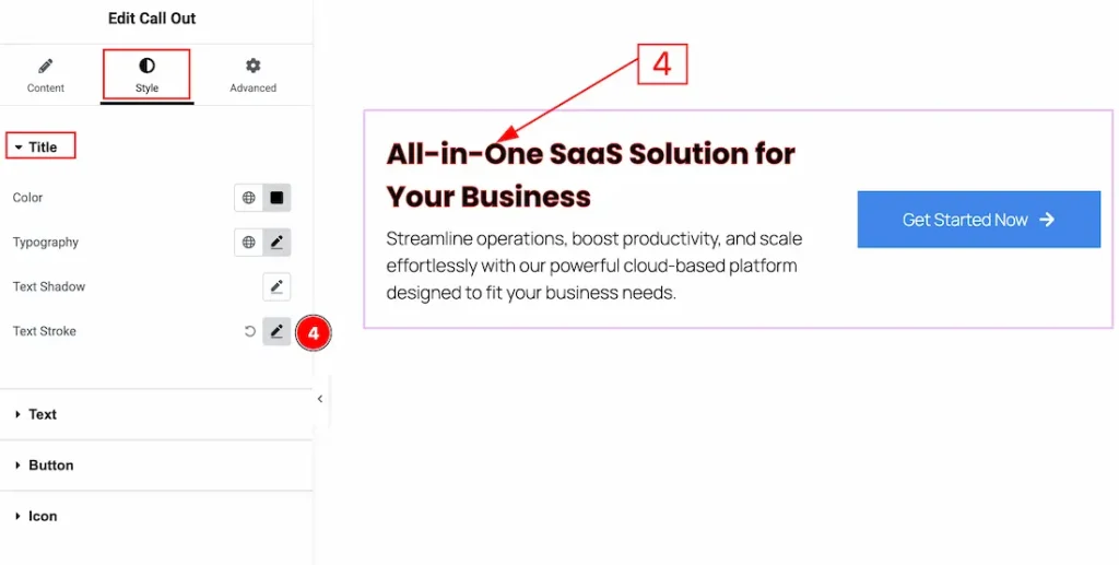
4. Text Stroke: You can add and customize the text stroke with this option.
Text Section
Go to Style → Text
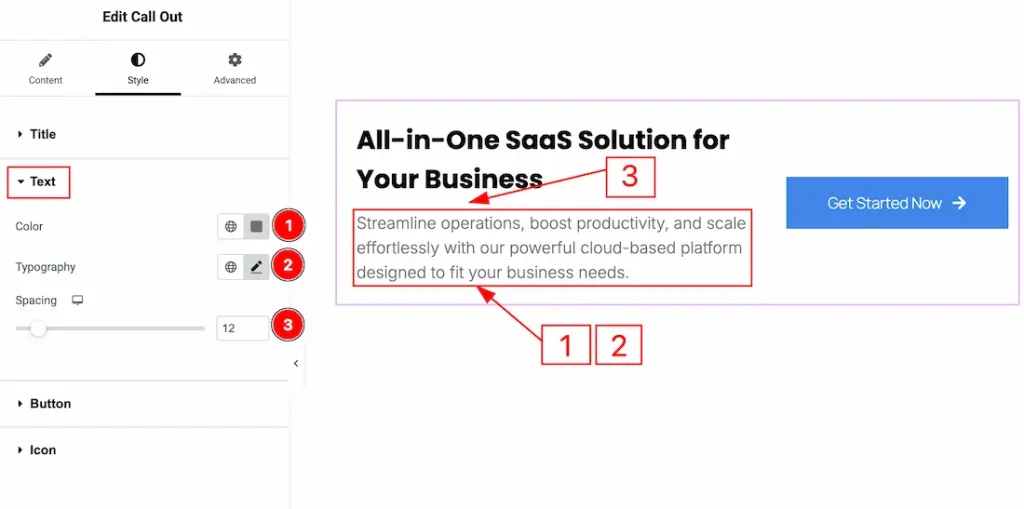
1. Color: You can make changes to the text color with this option.
2. Typography: Change the font family, size, weight, transform, style, decoration, line height, letter spacing, and word spacing from here.
3. Spacing: You can adjust the space between the text and the title with this option.
Button Section
Go to Style → Button
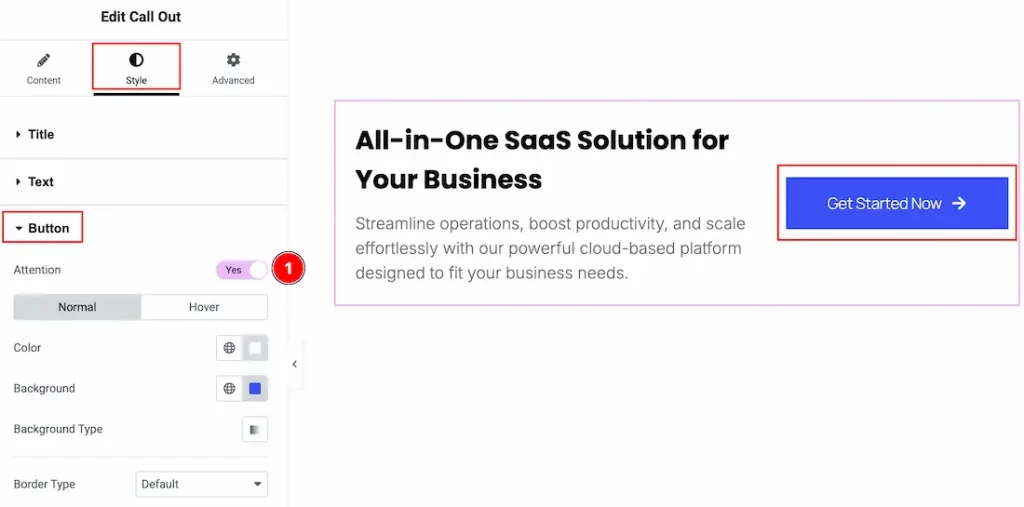
1. Attention: You can enable the switcher to make the button shake after some time with this option.
In this section, we have two more tabs. These are Normal & Hover. Let’s start with the Normal Tab first –
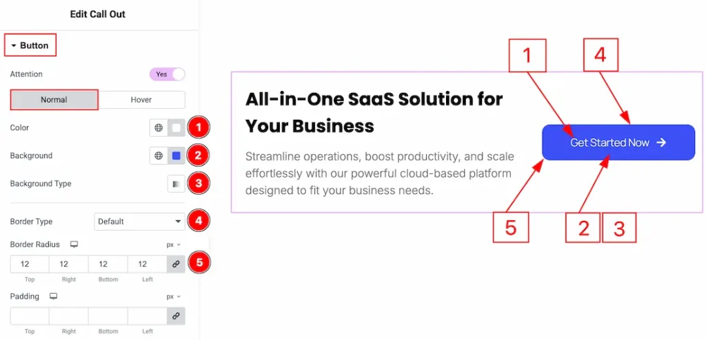
1. Color: You can make changes to the button text color with this option.
2. Background: You can change the button’s background color with this option.
3. Background Type: You can change the background type to be Gradient with this option.
4. Border Type: You can add and change the border types with this option.
5. Border Radius: You can control the roundness of the border with this option.
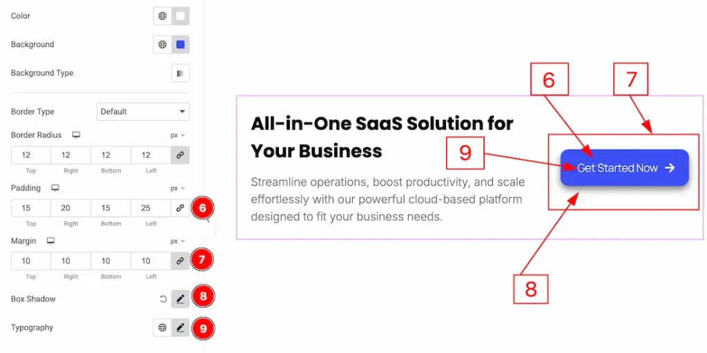
6. Padding: You can adjust the inner space of the button with this option.
7. Margin: You can adjust the outer space of the button with this option.
8. Box Shadow: You can add a shadow effect to the button with this option.
9. Typography: Change the font family, size, weight, transform, style, decoration, line height, letter spacing, and word spacing from here.
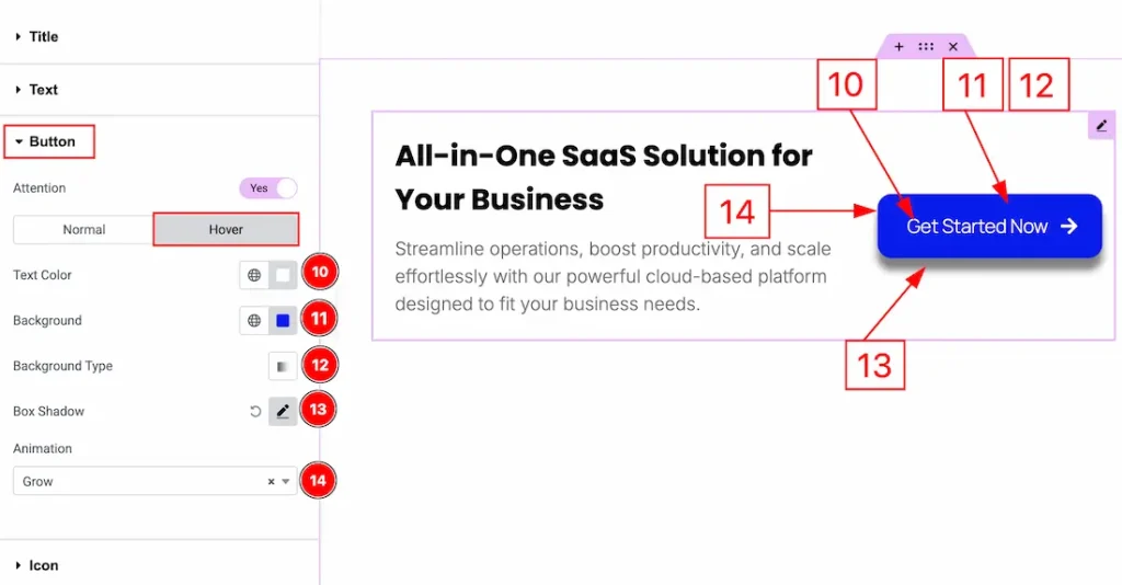
Now let’s proceed to the Hover Tab –
10. Text Color: You can make changes to the button text hover color with this option.
11. Background: You can make changes to the button’s hover background color with this option.
12. Background Type: You can change the background type to be Gradient with this option.
13. Box Shadow: You can add a hover shadow effect to the button with this option.
14. Animation: You can set animation to the button with this option.
Icon Section
Go to Style → Icon
In this section, we have two more tabs. These are Normal & Hover. Let’s start with the Normal tab first –
1. Color: You can make changes to the icon color with this option.
2. Background Type: You can change the background type to be classic or gradient with this option. Here, we have selected the background type as classic.
3. Color: You can change the icon background color with this option.
4. Image: You can change the background image with this option.
5. Border Type: You can add and change the border types with this option.
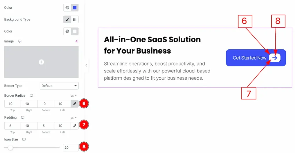
6. Border Radius: You can control the roundness of the border with this option.
7. Padding: You can adjust the inner space of the icon with this option.
8. Icon Size: You can adjust the icon size with this option.
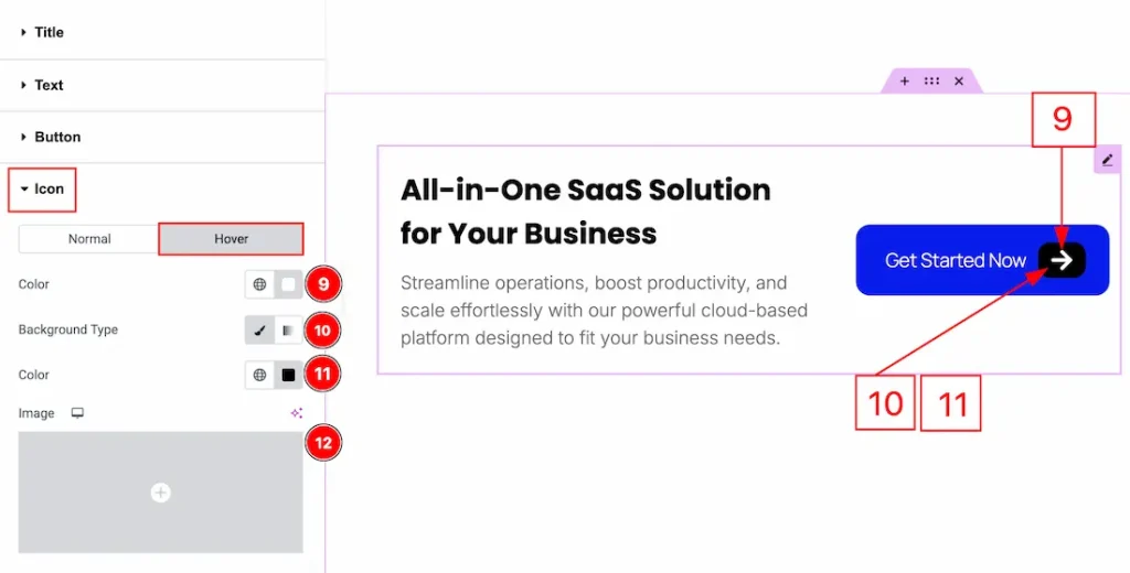
Now let’s proceed to the Hover Tab –
9. Color: You can make changes to the icon hover color with this option.
10. Background Type: You can change the background type to be classic or gradient with this option. Here, we have selected the background type as classic.
11. Color: You can change the background hover color with this option.
12. Image: You can change the background image with this option.
All done! You have successfully customized the Call Out widget on your website.
Video Assist
You can also watch the video tutorial to learn more about the Call Out. Please visit the demo page for examples.
Thanks for being with us.