In this document, we’ll learn how to use the Breadcrumbs widget in Element Pack Pro to display a clear navigation path and help users easily understand and navigate your website’s structure. The Breadcrumbs widget in Element Pack helps users understand their current location within your website by displaying a clear navigation path. It allows visitors to easily navigate back to parent pages, improving usability, navigation flow, and overall site structure.
Enable the Breadcrumbs Widget
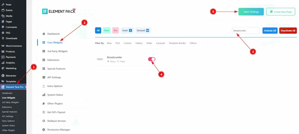
To use the Breadcrumbs by Element Pack, first, you have to enable the widget.
- Go to WordPress > Element Pack Plugin dashboard.
- Then Click the Core Widgets Tab.
- Search the Breadcrumbs Widget Name.
- Enable the Breadcrumbs Widget.
- Hit the Save Settings Button.
How to Structure Pages Hierarchically to Display Breadcrumbs
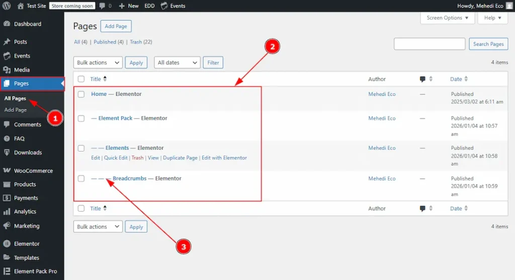
1. Go to Pages > All pages to see the pages that you have created. If you haven’t created any pages yet, then click on the add page above and then create the pages.
2. Here you can see the pages that you have created.
3. The icons represent the page hierarchy. For example, the Home page is the parent page, under which the Element Pack page is placed. Similarly, the Elements page is nested under Element Pack, and the Breadcrumbs page is nested under Elements. Now, let’s see how you can place those easily –
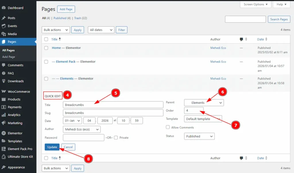
4. Click on the Quick Edit to get some options to quickly make changes to the page’s options.
5. In this title field, you will get to see the page title.
6. This is the place where you can easily change the placement. You can change the page into sub page with this option.
7. You can change the page order number with this option.
8. Click on the update button to apply the changes that you have made to the page.
Inserting the Breadcrumbs widget
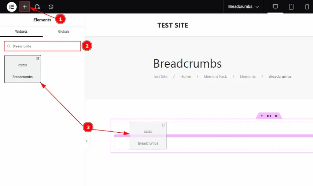
- Go to the Elementor Editor Page and hit the “+” (Add Element) icon button.
- Search the Breadcrumbs widget.
- Drag the widget and drop it on the editor page
Work With The Content Tab
Breadcrumbs Section
Go to Content > Breadcrumbs
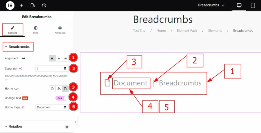
1. Alignment: You can adjust the breadcrumb position to left, center, or right with this option.
2. Separator: You can change the default separator icon with this option and use any special character for the separator.
3. Home Icon: You can add an icon to the homepage with this option.
4. Change Text: Enable the switcher to get the option to change the home page text.
5. Home Page: You can make changes to the home page text with this option.
Work with the Style Tab
Breadcrumbs Section
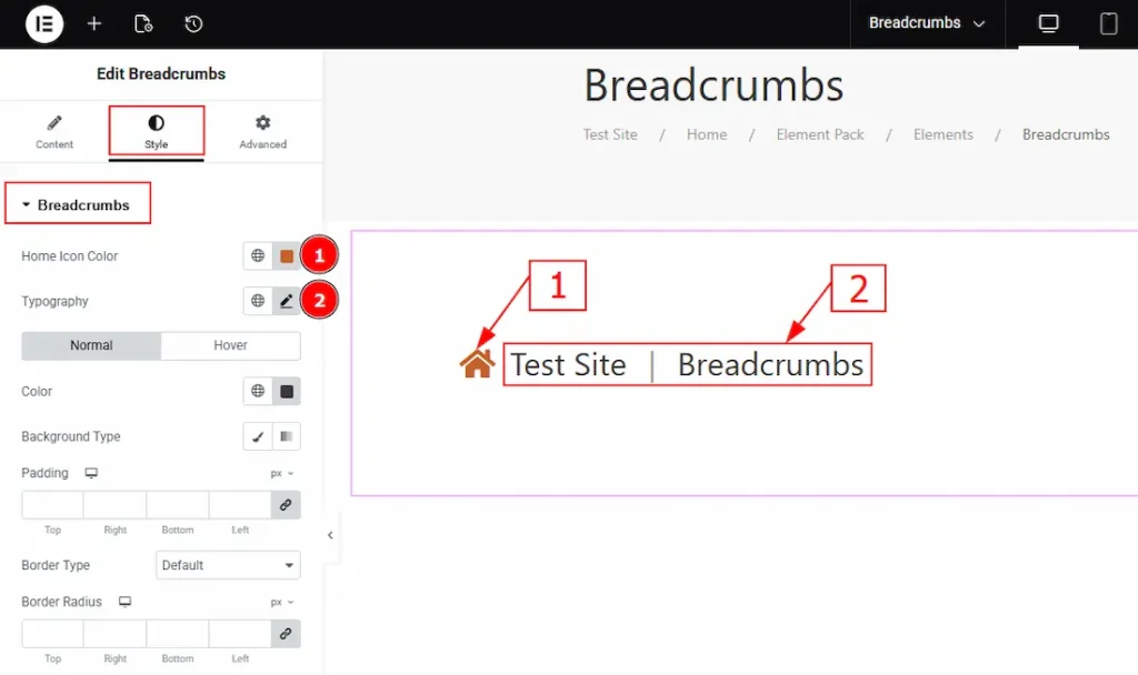
1. Home Icon Color: You can change the home icon color with this option.
2. Typography: Change the font family, size, weight, transform, style, decoration, line height, letter spacing, and word spacing from here.
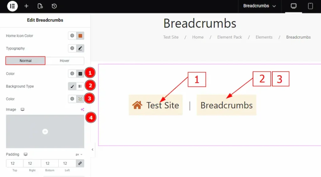
In this section, we have two more tabs. These are Normal & Hover. Let’s start with the Normal Tab first –
1. Color: You can change the text color by using this option.
2. Background Type: You can change the background type here. There are two options for background type. These are Classic & Gradient.
- In Classic, you can change the background color and also set an image as the background.
- In the gradient option, you can also set background color along with locations and angle for each breakpoint to ensure the gradient adapts to different screen sizes. Also, you can change the gradient type (Radial & Linear) and positions.
3. Color: You can change the background color with this option.
4. Image: You can change the background image with this option.

5. Padding: Add spaces around an object to increase the inner area. Padding allows you to control the internal space within an element.
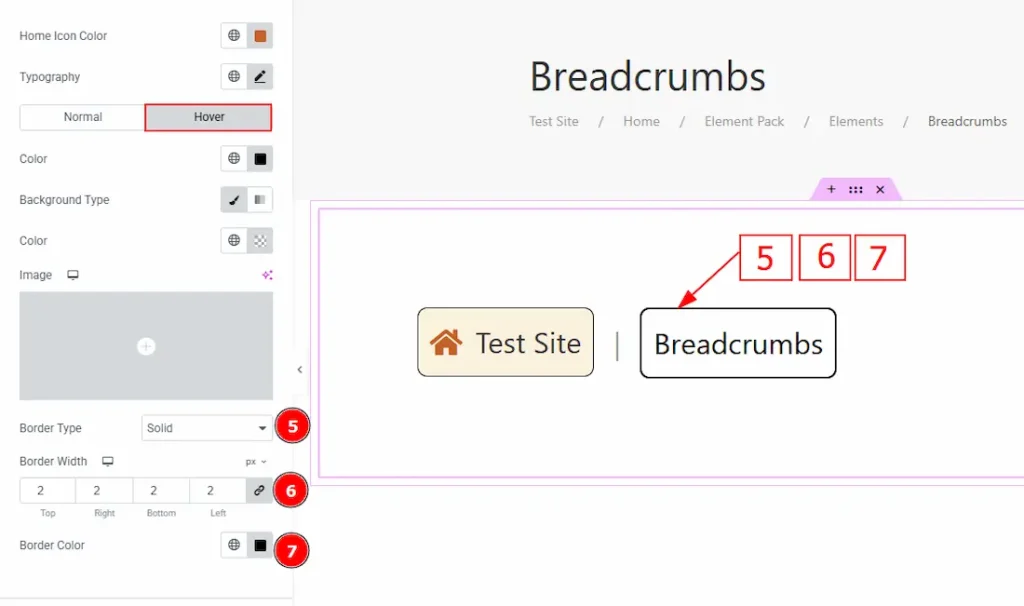
6. Border Type: This option allows you to add borders to your items. You can select various border types from this option. Such as Solid, Double, Dotted, Dashed, Groove.
7. Border Width: Set the thickness of the border with this option.
8. Border Color: You can change the border color with this option.
9. Border Radius: This option controls the roundness of the border.
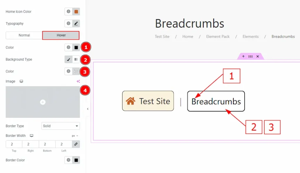
Now, let’s proceed to the Hover Tab –
1. Color: You can change the text hover color with this option.
2. Background Type: You can change the background type to classic or gradient with this option. Here we have selected the background type as classic.
3. Color: You can change the background hover color with this option.
4. Image: You can change the background hover image with this option.
5. Border Type: You can add and select the border type around the object with this option.
6. Border Width: Set the thickness of the border with this option.
7. Border Color: You can change the border hover color with this option.
Active Item Section
Go to Style > Active Item
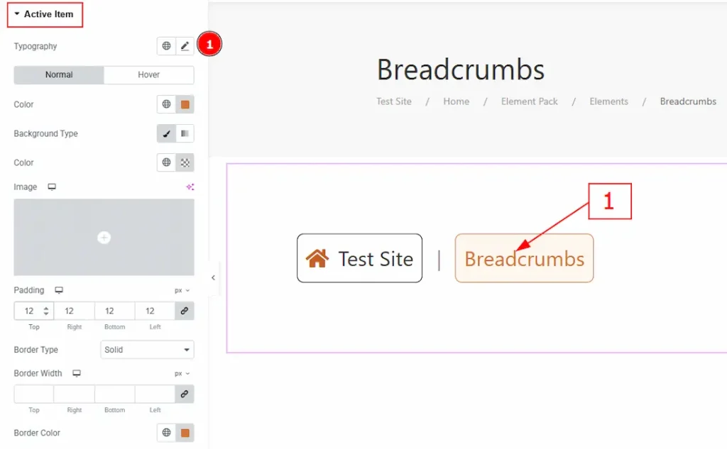
1. Typography: Change the font family, size, weight, transform, style, decoration, line height, letter spacing, and word spacing from here.
In this section, we have two more tabs. These are Normal & Hover. Let’s explore the Normal Tab –
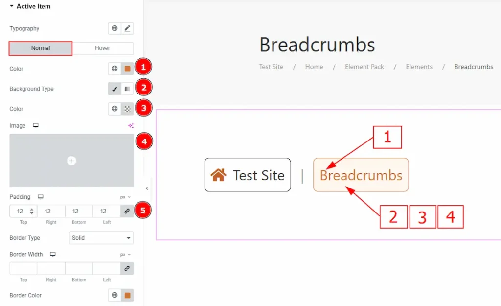
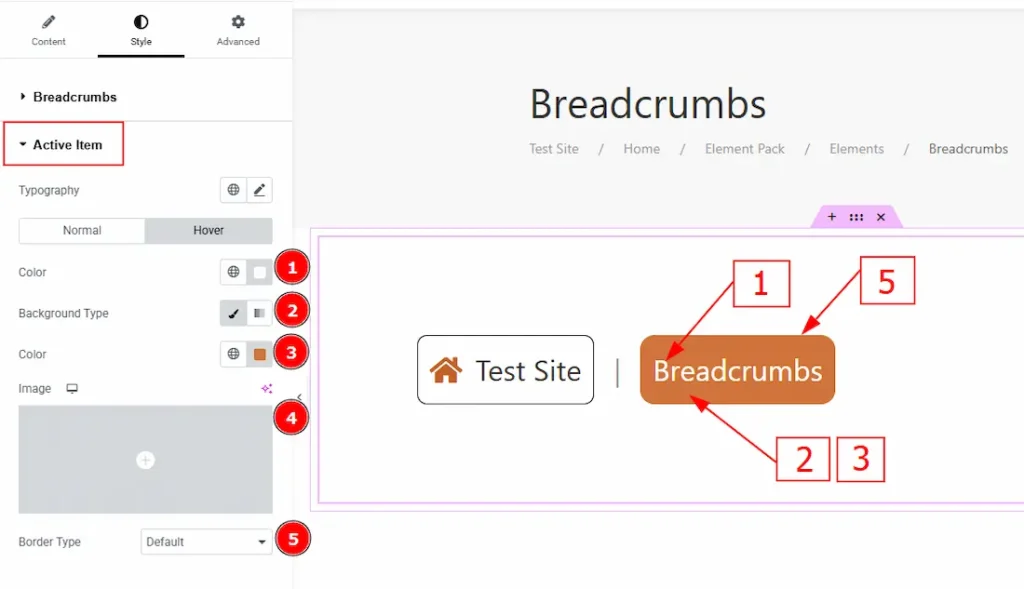
1. Color: You can change the text’s active color with this option.
2. Background Type: You can change the active background type to classic or gradient with this option.
3. Color: You can change the active background color with this option.
4. Image: You can make changes to the background image with this option.
5. Padding: You can adjust the inner space of the text object with this option.
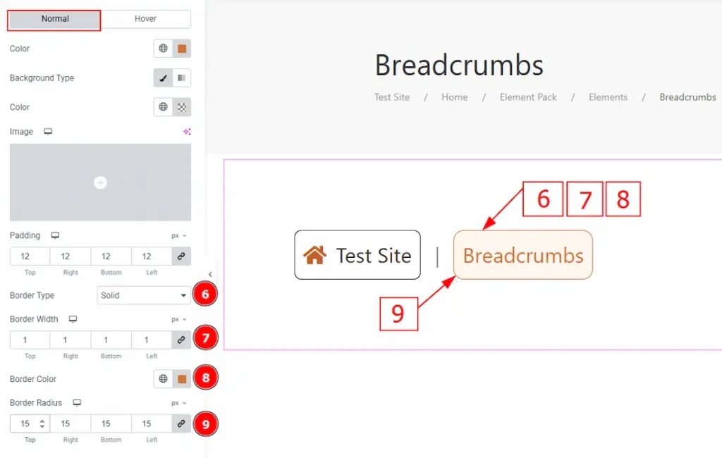
6. Border Type: You can add or change the active border with this option.
7. Border Width: You can set the thickness of the border with this option.
8. Border Color: You can change the border color with this option.
9. Border Radius: You can control the active roundness of the border with this option.
Now, let’s proceed to the Hover Tab –
1. Color: You can change the active text’s hover color with this option.
2. Background Type: You can change the background type to classic or gradient with this option.
3. Color: You can change the background color with this option.
4. Image: You can change the background image with this option.
5. Border Type: You can add or change the border type with this option.
Separator Section
Go to Style > Separator
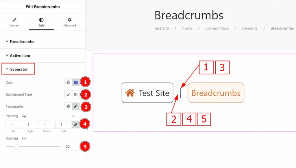
1. Color: You can make changes to the separator color with this option.
2. Background Type: You can add and select the background type with this option.
3. Typography: Change the font family, size, weight, transform, style, decoration, line height, letter spacing, and word spacing from here.
4. Padding: You can adjust the inner space of the separator with this option.
5. Spacing: You can adjust the space between the separator and the text with this option.
All done! You have successfully customized the Breadcrumbs widget on your website.
Video Assist
You can also watch the video tutorial to learn more about the Breadcrumbs Widget. Please visit the demo page for examples.
Thanks for being with us.