In this documentation, we will show you how to customize the Bbpress reply form widget presented by Element Pack Pro.
Activate the Bbpress Reply Form widget
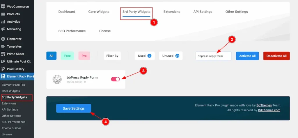
- Go to Element Pack Pro Dashboard > 3rd Party Widgets.
- Search by the ” bbpress reply form ” widget name.
- Activate the switcher of the bbpress reply form.
- Click on the ” Save Settings ” button to save the changes.
Inserting The Bbpress Reply Form Widget

Inserting the widget by following this,
- Search by the bbpress reply form widget name.
- Then select the appear widget ( with Element Pack Pro logo T.R corner).
- After Drag and Drop it on the Elmentor Editor page.
Content Tab
Note: All the controls by default and comes from the bbpress plugin so you don’t need to make any changes. Content tab is not available for this.
Style Tab
Provide the controller to make the visual appearance or presentation of the tabs. This includes aspects that are visually appealing and cohesive with the overall design of the interface.
Forum Form
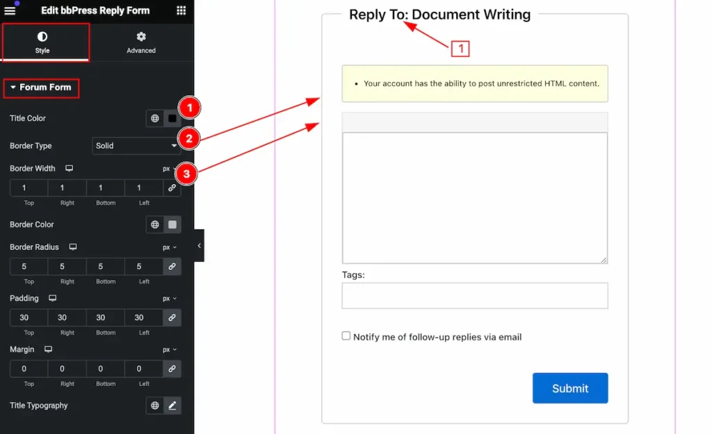
Make the forum form stylish by following,
- Title Color: Set the title color for the forum form.
- Border Type: Set the border type.
- Border Width: Set the width for the border.
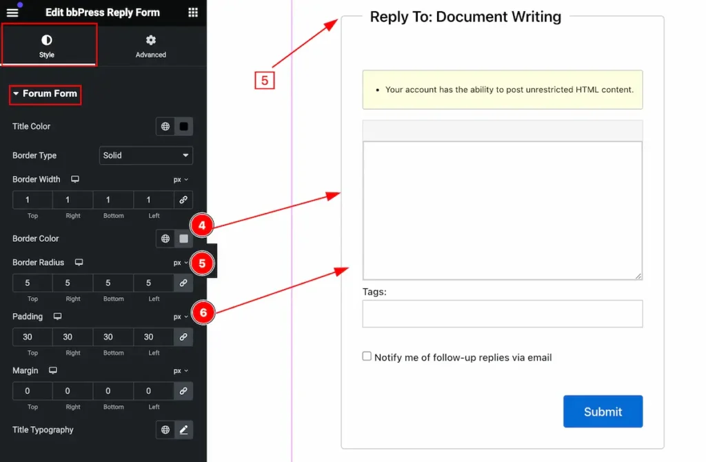
- Border Color: Set the border color.
- Border Radius: Set the border radius.
- Padding: Set the padding for it.
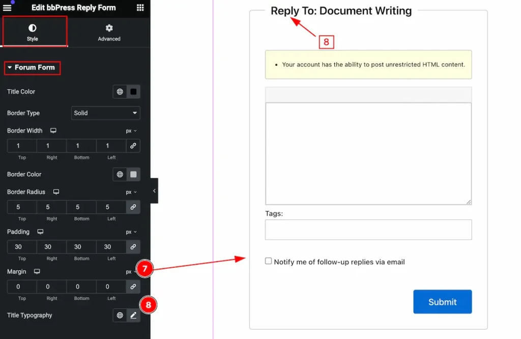
- Margin: Set the margin for the forum.
- Title Typography: Set the typography for the title.
Label Section
Go to Style > Label
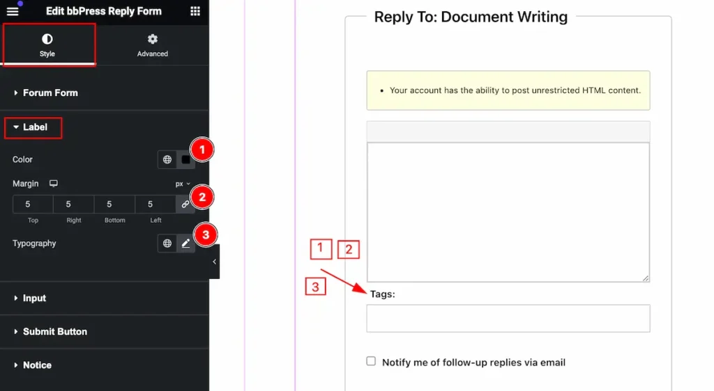
Make the label customization,
- Color: Set the color for the label.
- Margin: Set the margin for it.
- Typography: Set the typography for it.
Input Section
Go to Style > Input
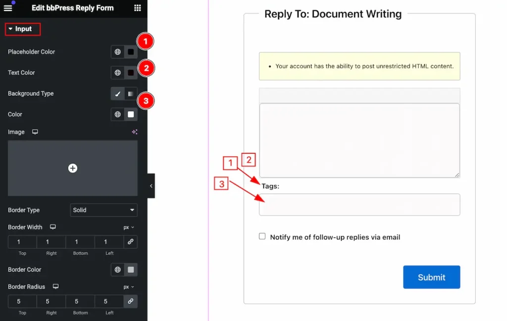
Make the input section good by following,
- Placeholder Color: Set the text for the placeholder color.
- Text Color: Set the text color.
- Background Type: Set the background for the input.
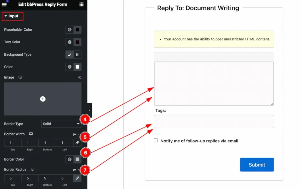
- Border Type: Set the border type for the input.
- Border Width: Set the width for the border.
- Border Color: Set the border color.
- Border Radius: Make the border radius.
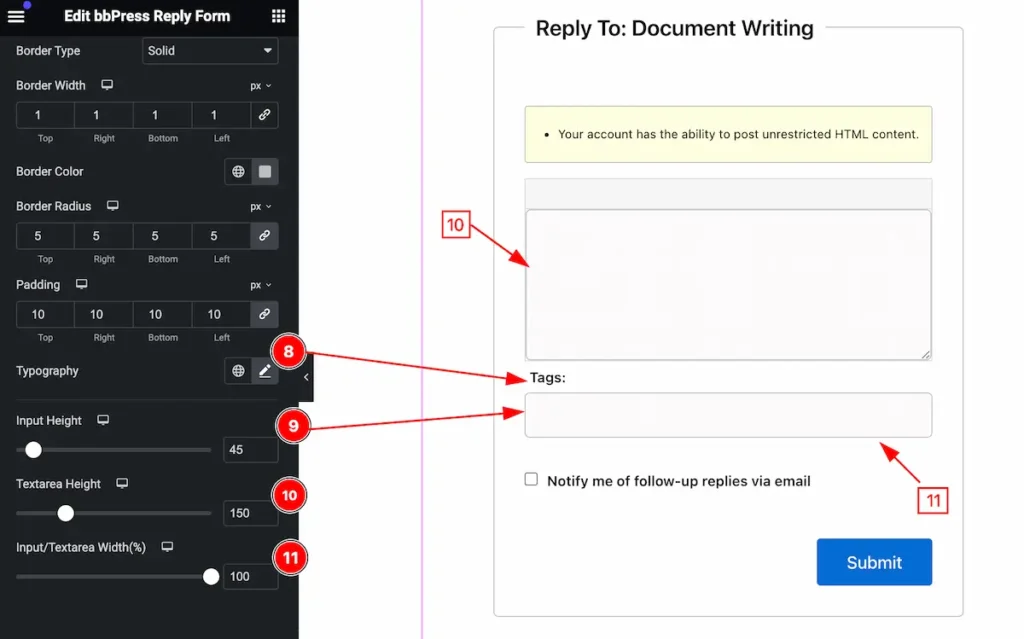
- Typography: Set the typography for the input text.
- Input Height: Set height for the input.
- Textarea Height: Set textarea height.
- Input/Textarea Width(%): Set the input/textarea width in percent.
Submit Button Section
Go to Style > Submit Button
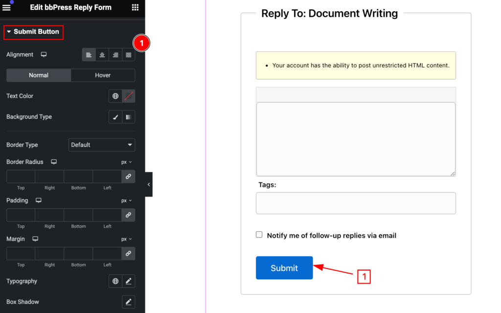
Make the submit button stylish by following the controls,
- Alignment: Set the alignment of the button.
Normal State for the Submit Button
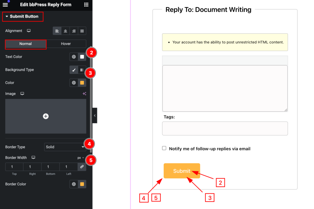
- Text color: Set the text color for the button.
- Background Color: Set the background color.
- Border Type: Set the border type.
- Border Width: Set the border width.
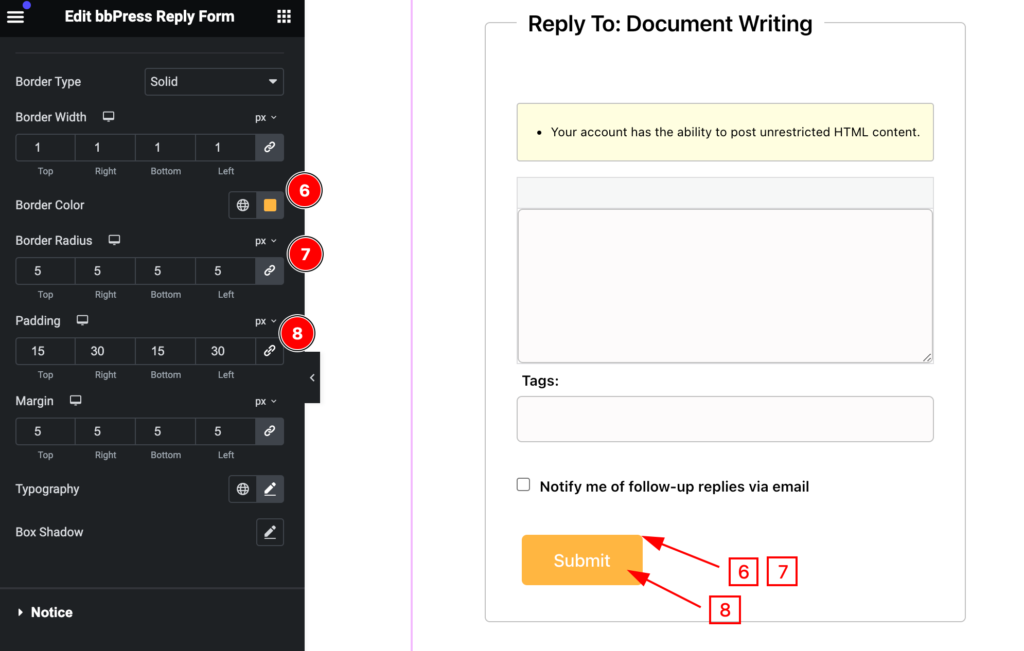
- Border Color: Set the border color for the button.
- Border Radius: Make the border radius.
- Padding: Set the padding for the button.
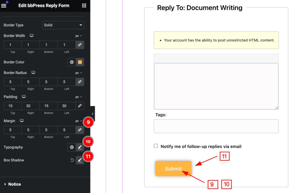
- Margin: Set margin for the button.
- Typography: Set typography for the text.
- Box Shadow: Set the box shadow.
Hover State for Submit button
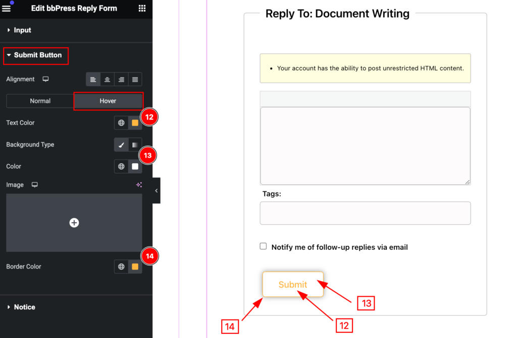
- Text Color: Set the text color.
- Background Type: Set the background color for it.
- Border Color: Set the border color.
Notice Section
Go to Style > Notice
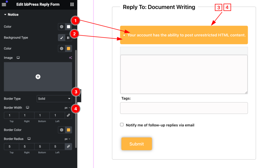
Make the notice section stylish by following,
- Color: Set the color for the notice.
- Background Type: Set the background color.
- Border Type: Set the border type.
- Border Width: Set the width of the border.
All the changes appear on the mouse hover.
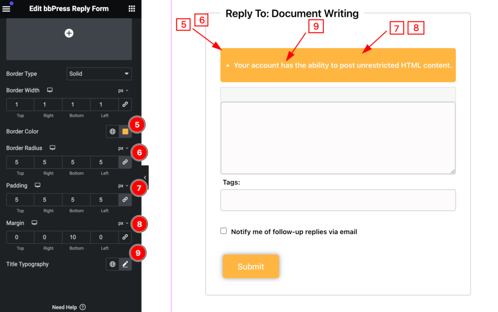
- Border Color: Set the border color.
- Border Radius: Set the border radius.
- Padding: Set the padding for the
- Margin: Set margin for the button.
- Title Typography: Set the typography for the title.
Video Assist
You can watch the video above to learn about the Search widget.
Please visit the demo page for examples.
Thanks for staying with us.
