The Advanced Heading widget from Element Pack Pro allows you to create stylish and customizable headings for your website. It offers flexible options for titles, subtitles, separators, and animations to enhance your content presentation. This documentation explains how to use and customize the Advanced Heading widget in Elementor.
Enable The Advanced Heading Widget
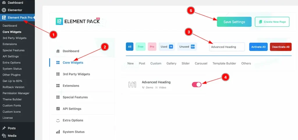
To use the Advanced Heading widget from Element Pack Pro, first, you have to enable the widget.
- Go to WordPress dashboard → Element Pack Pro Plugin dashboard.
- Then, Click the Core Widgets Tab.
- Search the Advanced Heading Widget Name.
- Enable the Advanced Heading Widget.
- Hit the Save Settings Button.
Inserting The Advanced Heading Widget
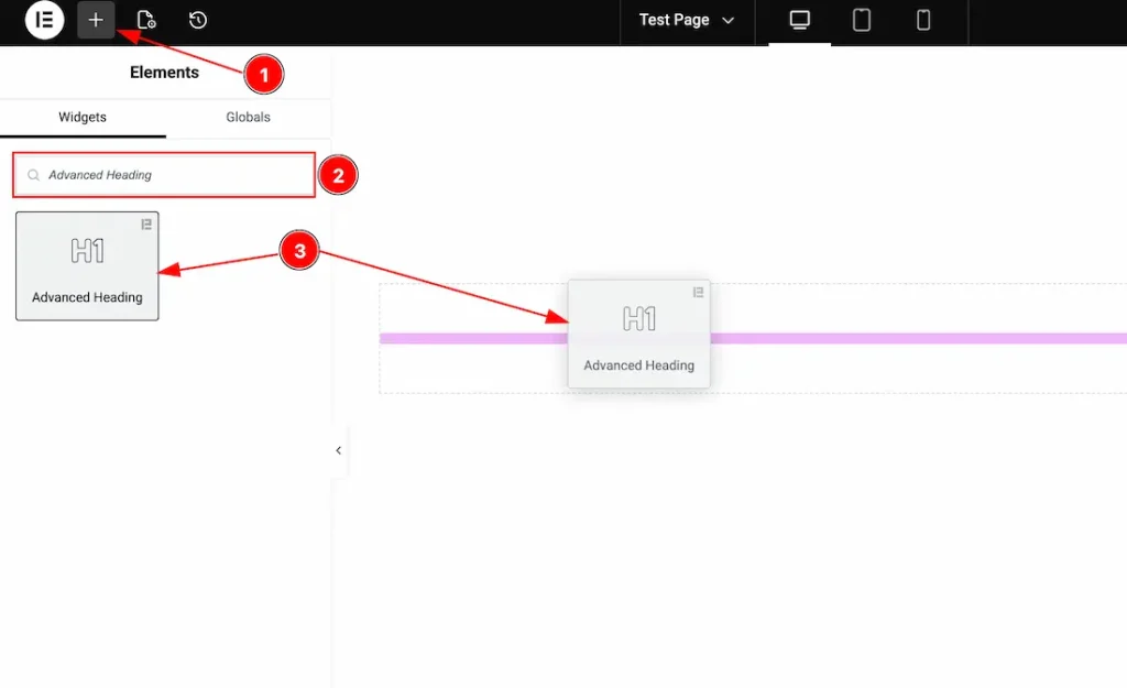
1. Go to the Elementor Editor Page and hit the “+” icon Button.
2. Search the Advanced Heading name.
3. Drag the widget and drop it on the editor page.
Work With The Content Tab
Heading Section
Go to Content → Heading
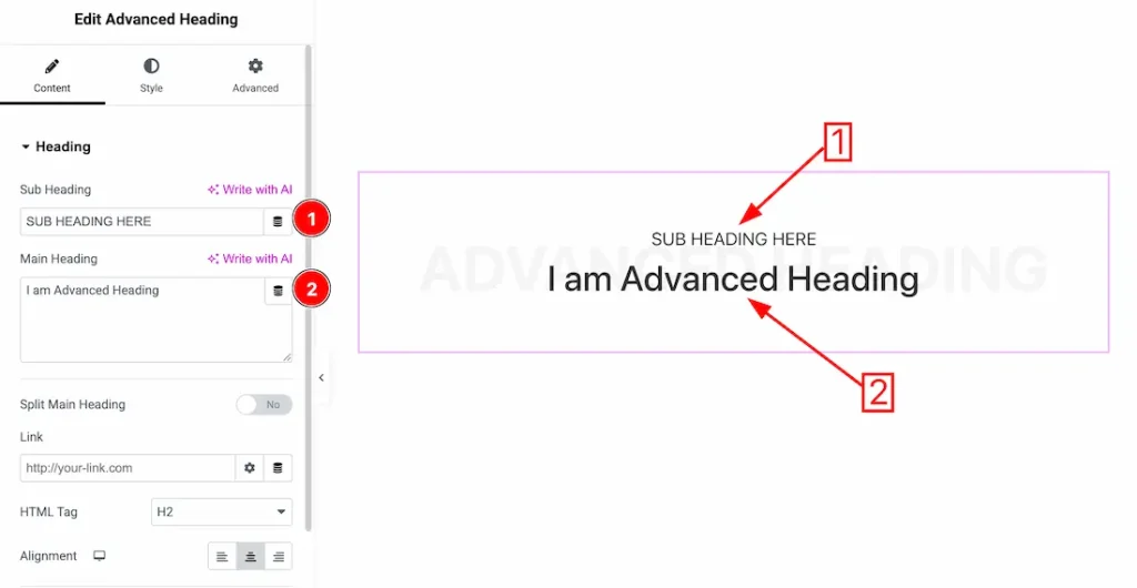
1. Sub Heading: This option lets you change the sub heading text.
2. Main Heading: This option lets you change the main heading text.
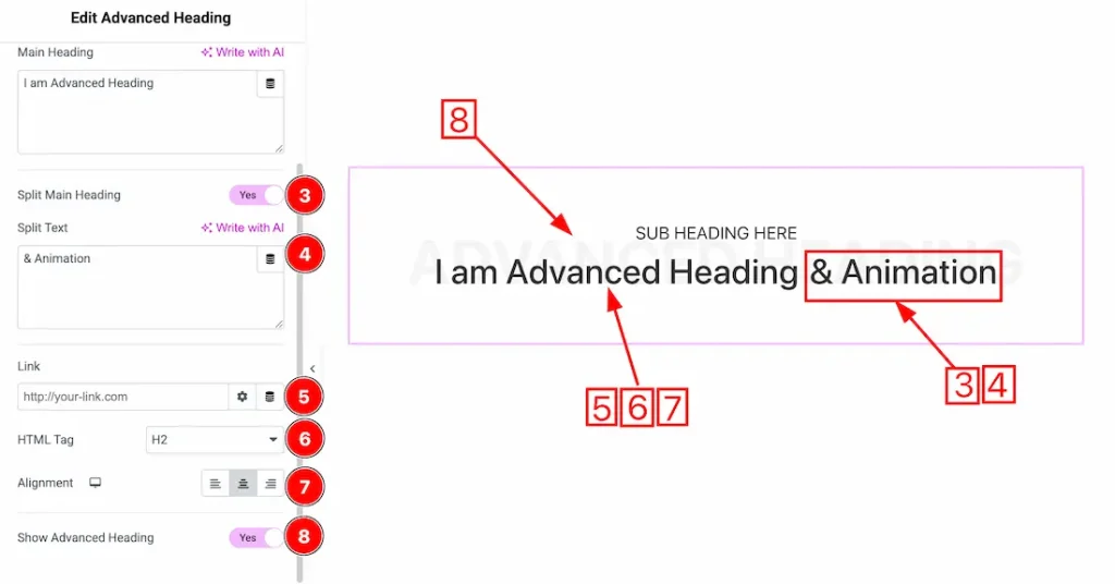
3. Split Main Heading: Enable/disable the split main heading switcher button to show/hide the split heading text.
4. Split Text: Input the split heading text inside the split text field.
5. Link: If you want, you can add a link under the main heading.
6. HTML Tag: You can set the title HTML tag H1 to H6 and Div, span, and P.
7. Alignment: You can set the heading Alignment- Left, Center, and Right.
8. Show Advanced Heading: Enable/disable the Show Advanced Heading switcher button to show/hide the advanced heading text.
Advanced Heading Section
Go to Content → Advanced Heading
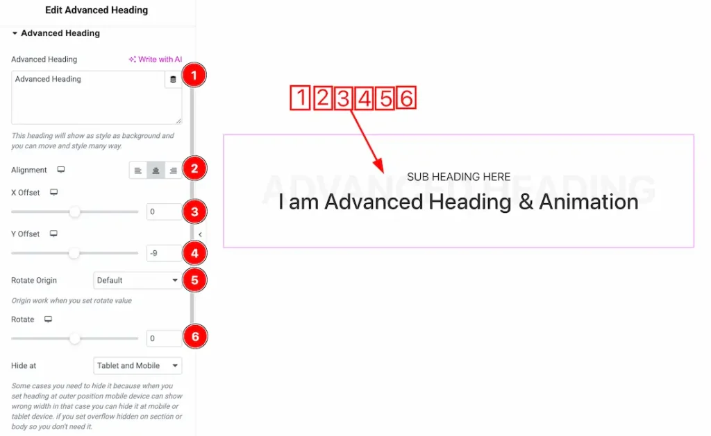
1. Advanced Heading: This option lets you change the advanced heading.
2. Alignment: You can set the advanced heading alignment – Left, center, and right.
3. X Offset: You can adjust the heading X Offset from here.
4. Y Offset: You can adjust the heading Y Offset from here.
5. Rotate Origin: You can set the rotate origin – Default, Top Left, Top Center, Top Right, Center, Center Left, Center Right, Bottom Left, Bottom Center, and Bottom Right.
6. Rotate: This option allows you to rotate the Advanced Heading.
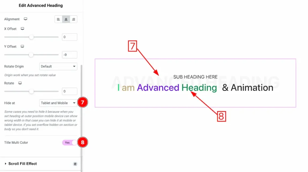
7. Hide At: You can hide the Advanced Heading for the tablet and mobile device from here.
8. Title Multi Color: If you enable the title multi color switcher button, then the advanced heading will appear multicolored.
Work with The Style Tab
Sub Heading Section
Go to Style → Sub Heading
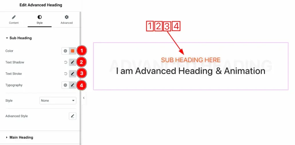
1. Color: This option lets you change the sub heading text color.
2. Text Shadow: You can add sub heading text shadow from here.
3. Text Stroke: You can add sub heading text stroke from here.
4. Typography: Change the font family, size, weight, style, transform, decoration, line height, letter spacing, and word spacing from here.
When Style Type- Line
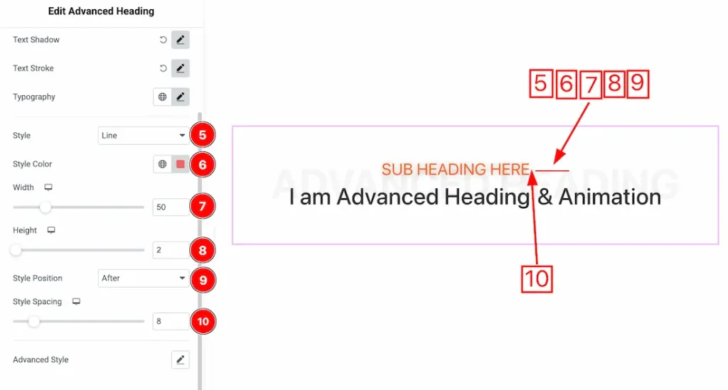
5. Style: You can set the style type- None, Line and Icon. Here we set the style type- Line.
6.Style Color: This option lets you change the Style color.
7. Wdith: You can set the line width from here.
8. Height: You can set the line Height from here.
9. Style Position: You can set the line position- After, Before, After and Before, and Bottom.
10. Style Spacing: You can adjust the line spacing from here.
When Style Type- Icon
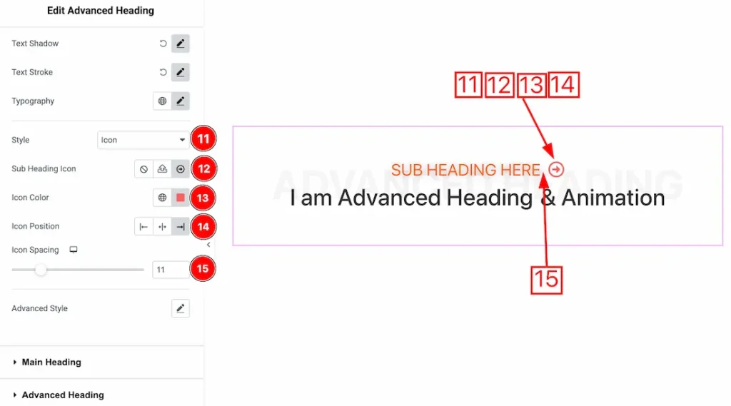
11. Style: Here we set the style type- Icon to desponstrate the feature.
12. Sub Heading Icon: This option allows you to choose your prefer icon for the sub heading.
13. Icon Color: This option lets you change the sub heading icon color.
14. Icon Position: You can set the icon position- Left, Center, and Right.
15. Icon Spacing: You can adjust the icon spacing from here.
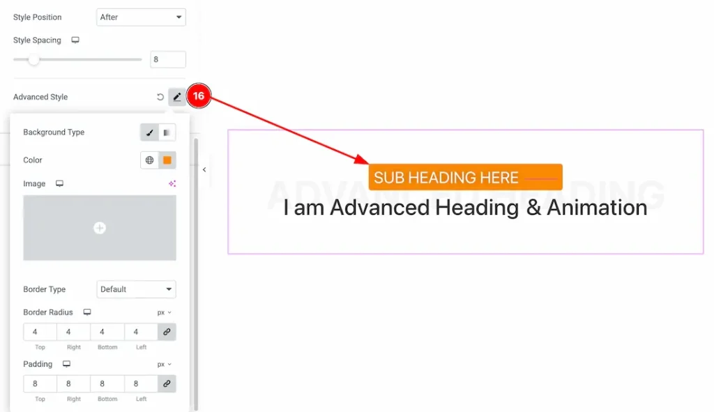
16. Advanced Style: After clicking on the Advanced Style option, you will get the Background Type, Background Color, Border Type, Border Color, Border Width, Border Radius, and padding option as like in the above screenshot.
Main Heading Section
Go to Style → Main Heading
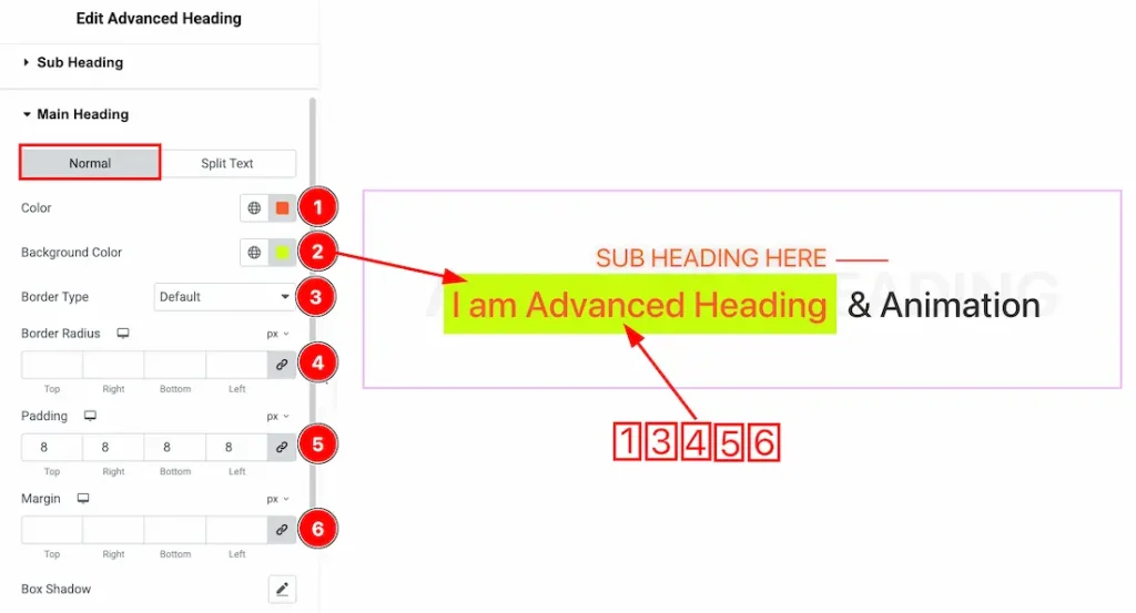
Come to the Main Heading section, you will get two tabs- Normal and Split Text. Let’s proceed with the Normal tab section-
1. Color: This option lets you change the main heading normal color.
2. Background Color: This option lets you change the main heading normal background color.
3. Border Type: You can change the main heading border type from here.
4. Border Radius: Adjust the main heading border radius from here.
5. Padding: Adjust the padding from here.
6. Margin: Adjust the margin from here.
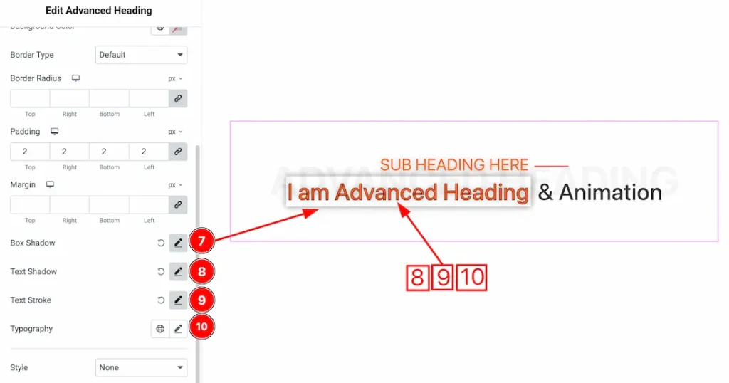
7. Box Shadow: You can add the box shadow for the main heading from here.
8. Text Shadow: You can add the text shadow for the main heading from here.
9. Text Stroke: You can add the text stroke for the main heading from here.
10. Typography: Change the font family, size, weight, style, transform, decoration, line height, letter spacing, and word spacing from here.
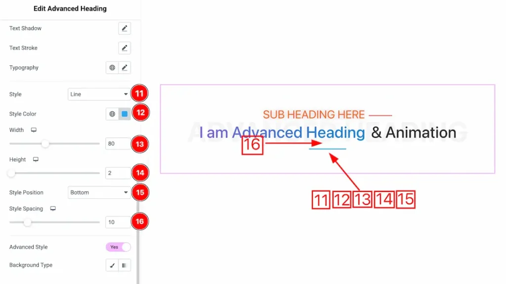
11. Style: You can select the style type- None and Line. Here, we select the style type- Line.
12. Style Color: This option lets you change the style color.
13. Width: This option lets you change the line width.
14. Height: This option lets you change the line height.
15. Style Position: This option lets you set the style position- After, Before, After and Before, and Bottom.
16. Style Spacing: You can adjust the style spacing from here.
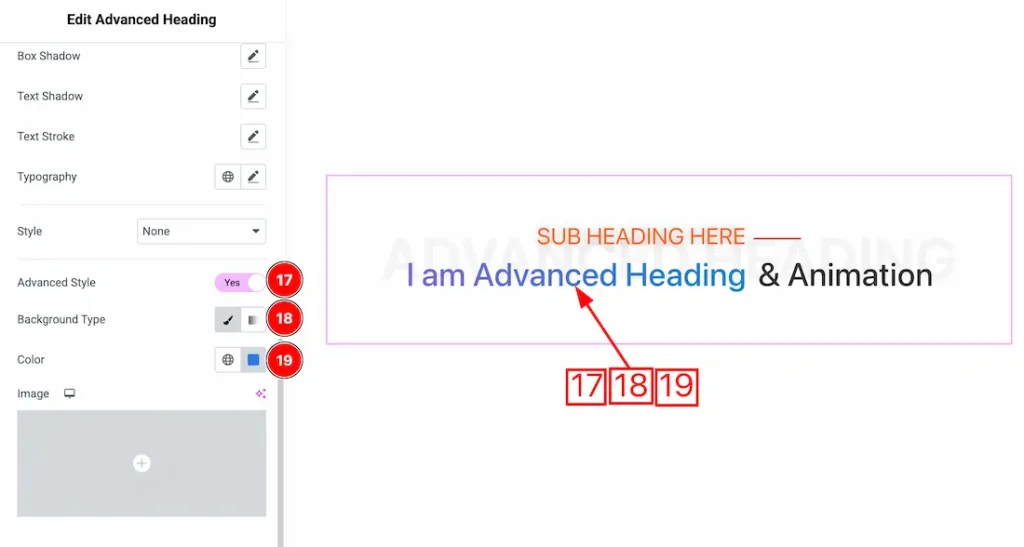
17. Advanced Style: After enabling the Advanced Style switcher button, you will get the below customization option.
18. Background Type: You can change the color of any object’s background to classic or gradient. Here we choose the Background type Classic.
19. Color: This option lets you change the main heading background color.
Let’s proceed with the Split Text tab section-
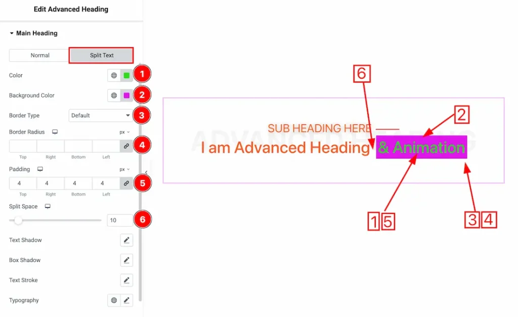
1. Color: This option lets you change the Split text normal color.
2. Background Color: This option lets you change the Split text Background color.
3. Border Type: You can set the Border Type to Default, None, Solid, Double, Dotted, Dashed, or Groove. We choose here the Border Type Solid.
4. Border Radius: Customizes the border corners for roundness.
5. Padding: Add spaces around an object to increase the inner area. Padding allows you to control the internal space within an element.
6. Split Space: You can adjust the Split Text from here.
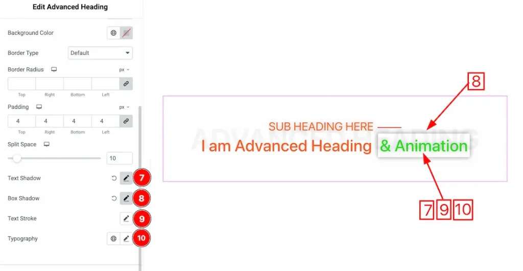
7. Text Shadow: This option lets you add a text shadow.
8. Box Shadow: You can add the Box shadow from here.
9. Text Stroke: This option lets you add the text stroke.
10. Typography: Change the font family, size, weight, style, transform, decoration, line height, letter spacing, and word spacing from here.
Advanced Heading Section
Go to Style → Advanced Heading
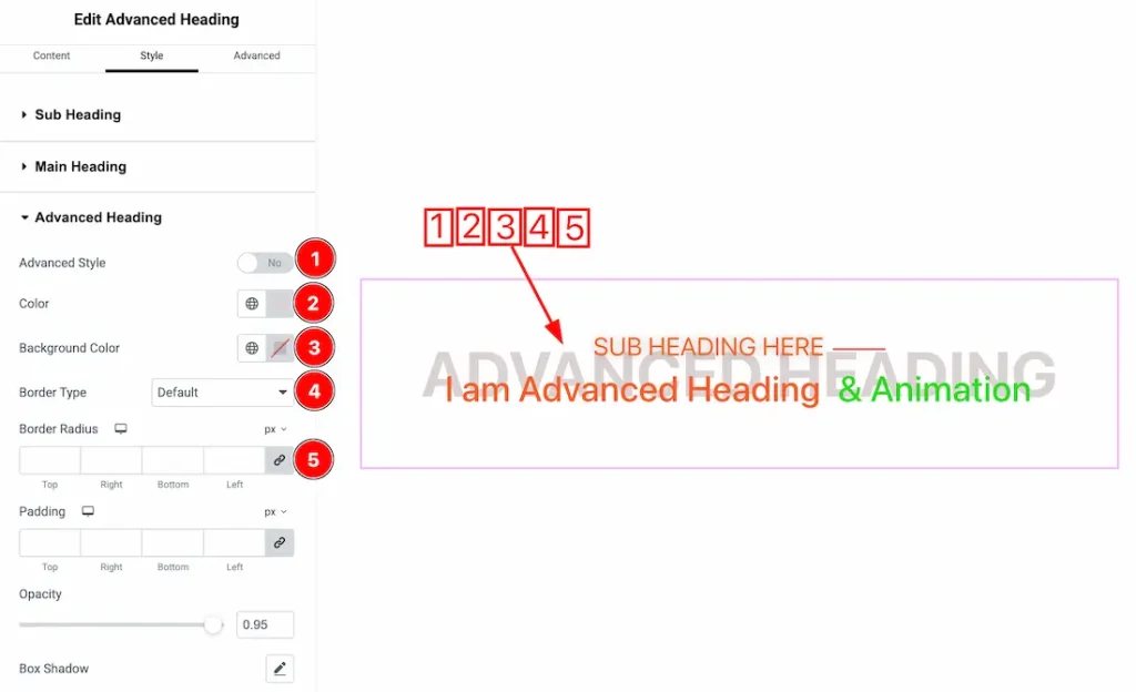
1. Advanced Style: After enabling the Advanced Style switcher button, you will get the following customization option as in the above section.
2. Color: This option lets you change the Advanced heading text color.
3. Background Color: This option lets you change the Advanced Heading Background color.
4. Border Type: You can set the Border Type to Default, None, Solid, Double, Dotted, Dashed, or Groove. We choose here the Border Type Solid.
5. Border Radius: Customizes the border corners for roundness.
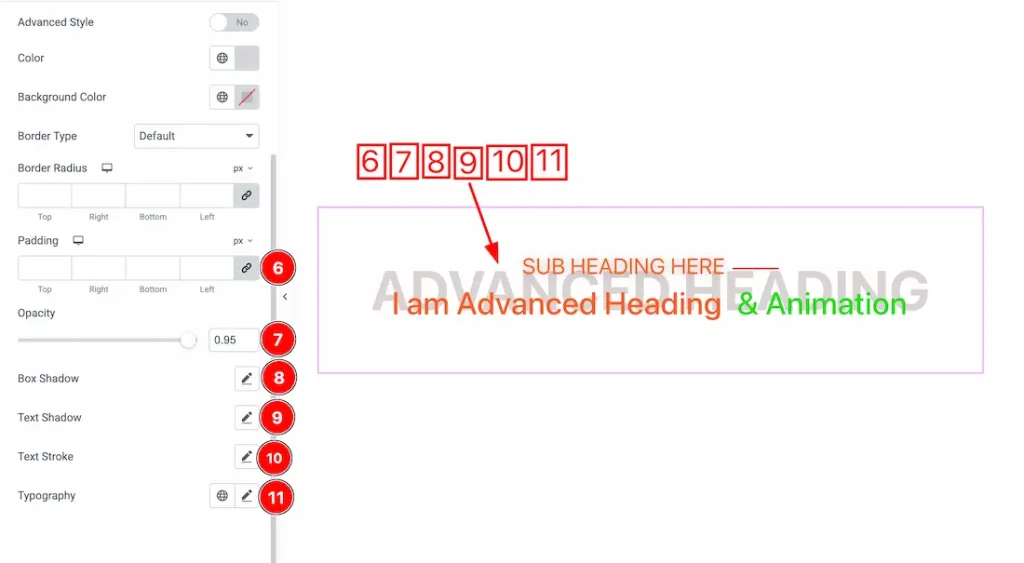
6. Padding: You can adjust the Advanced heading padding from here.
7. Opacity: You can set the Advanced Heading opacity label from here.
8. Box Shadow: You can add the Box shadow from here.
9. Text Shadow: This option lets you add a text shadow.
10. Text Stroke: This option lets you add the text stroke.
11. Typography: Change the font family, size, weight, style, transform, decoration, line height, letter spacing, and word spacing from here.
All done! You have successfully customized the Advanced Heading widget on your website.
Video Assist
You can also watch the video tutorial to use the Advanced Heading widget. Please visit the demo page for examples.
Thanks for being with us.