In this documentation, we will discuss the customization of the Advanced Button widget, brought to you by the Element Pack Pro addon for Elementor.
Enable The Advanced Button Widget
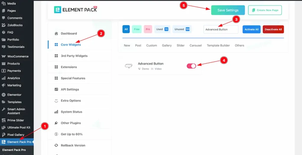
To use the Timeline widget from Element Pack Pro, first, you have to enable the widget.
- Go to WordPress dashboard > Element Pack Pro Plugin dashboard.
- Then, Click the Core Widgets Tab.
- Search the Advanced Button Widget Name.
- Enable the Advanced Button Widget.
- Hit the Save Settings Button.
Inserting The Advanced Button widget
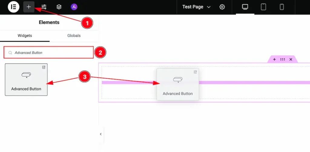
1. Go to the Elementor Editor Page and Hit the “+” icon Button.
2. Search the Advanced Button widget.
3. Drag the widget and Drop it on the editor page.
Work With The Content Tab
Button Section
Go to Content > Button
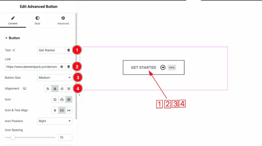
1. Text: This option lets you set the button text.
2. Link: This option lets you set a link under the button.
3. Button Size: You can set the button size as – Extra Small, Small, Medium, Large, and Extra Large.
4. Alignment: You can set the button alignment as – Left, Center, Right, and Justified.
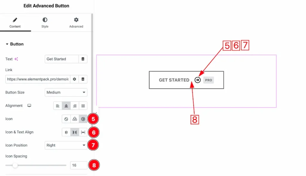
5. Icon: This option lets you set the button icon type- None, SVG, and Icon library.
6. Icon & Text Align: You can set the icon and text alignment as -Both Center, Space Between, and Icon Left/Right.
7. Icon Position: This option lets you set the icon position as- Left, Right, Top and Bottom.
8. Icon Spacing: You can adjust the icon space from here.
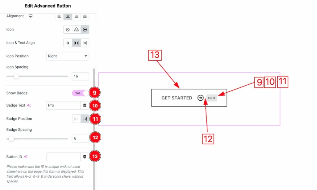
9. Show Badge: Enable or disable the show badge swicther button to show/hide the badge.
10. Badge Text: This option lets you set the badge text.
11. Badge Position: You can adjust the badge position using this option.
12. Badge Spacing: You can adjust the badge spacing from here.
13. Button ID: Button ID is used to uniquely identify a button on a webpage, making it easier to apply specific styles or attach JavaScript actions to that exact button.
Work with The Style Tab
Style Section
Go to Style Tab > Style
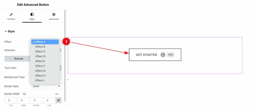
1. Effect: Inside the effect section, you will get button Effect A to Effect I and you can choose any one of them.
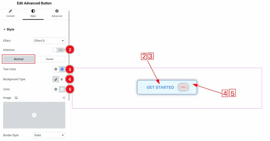
2. Attention: Enable or disable the attention switcher button to show/hide the attention effect.
Come to the Style section, you will get two subsections; Normal and Hover. Lets explore the normal tab section-
3. Text Color: This option lets you change the button normal text color.
4. Background Type: You can change the color of the button background to classic or gradient. Here we choose the Background type Classic. If you want then you also can set an image as background.
5. Color: This option lets you change the button normal background color.
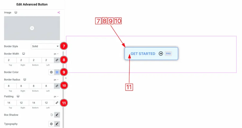
7. Border Style: You can set the Border Type to Default, None, Solid, Double, Dotted, Dashed, or Groove. We choose here the Border Type Solid.
8. Borer Width: The border width property allows you to control how thick or thin the border is.
9. Border Color: This lets you change the Border color.
10. Border Radius: Customizes the border corners for roundness.
11. Padding: You can set the button normal padding from here.
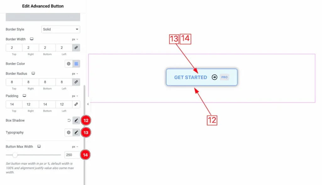
12. Box Shadow: The Box Shadow property is used to create the shadow around the Category Button. It takes Four values: Horizontal offset, Vertical offset, blur, and Spread to customize the Box shadow.
Position: you can set the Box Shadow position Outline and Inset. Here we set the Box Shadow position Outline.
Box Shadow Color: This lets you change the Box Shadow color.
13. Typography: Change the font family, size, weight, style, transform, decoration, line height, letter spacing, and word spacing from here.
14. Button Max Width: You can set the button max width from here.
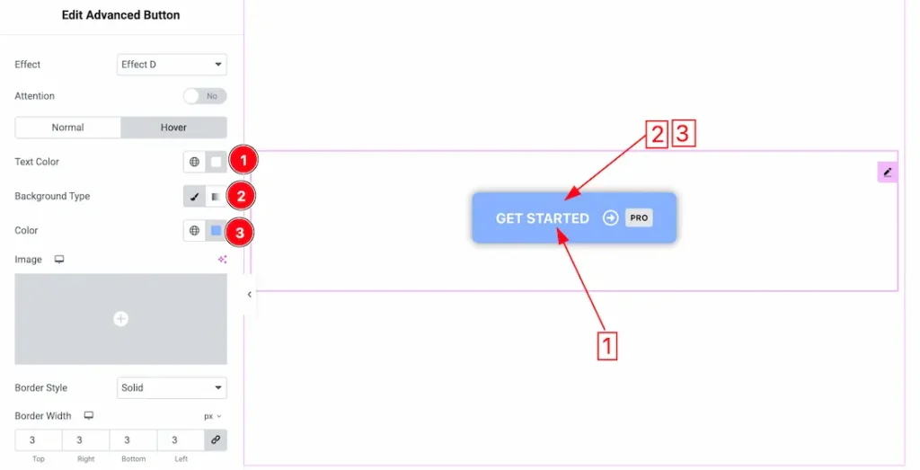
Come to the Hover tab section, you will get the below customization options-
1. Text Color: This option lets you change the button hover text color.
2. Background Type: You can change the color of the button background to classic or gradient. Here we choose the Background type Classic. If you want then you also can set an image as background.
3. Color: This option lets you change the button hover background color.
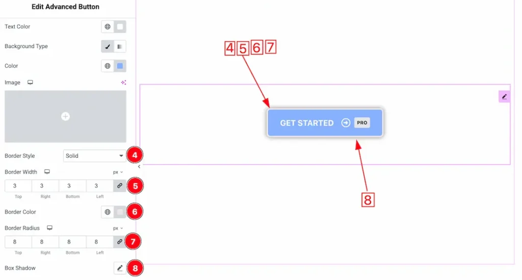
4. Border Style: You can set the Border Type to Default, None, Solid, Double, Dotted, Dashed, or Groove. We choose here the Border Type Solid.
5. Borer Width: The border width property allows you to control how thick or thin the border is.
6. Border Color: This lets you change the Border color.
7. Border Radius: Customizes the border corners for roundness.
8. Box Shadow: You can set the box shadow for the hover mode from here.
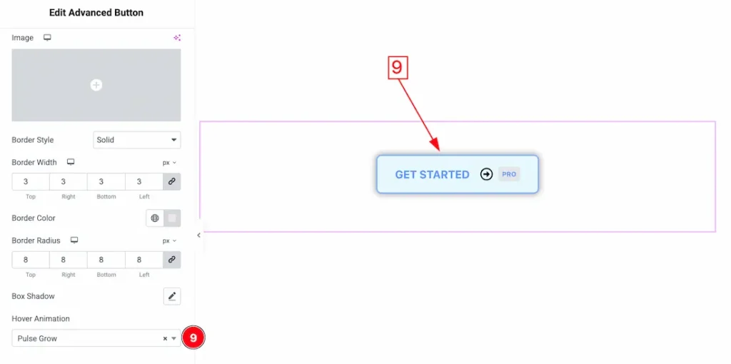
9. Hover Animation: Here you will get some button hover animation and you can choose one of them that you like for your button.
Icon Section
Go to Style > Icon
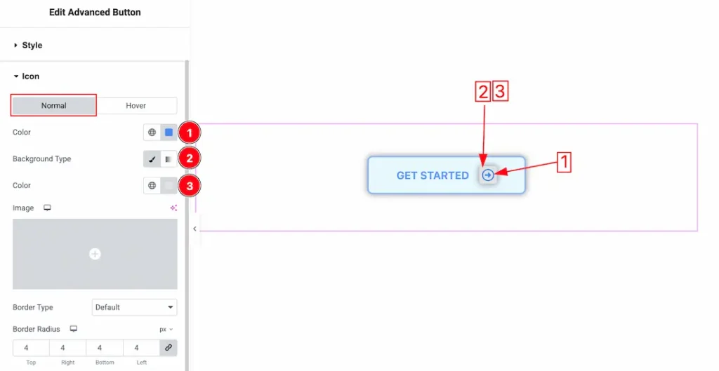
Come to the icon section, you will get two sub sections; Normal and hover. Lets proceed with the normal tab-
1. Color: This option lets you change the button normal icon color.
2. Background Type: You can change the color of the button icon background to classic or gradient. Here we choose the Background type Classic. If you want then you also can set an image as background.
3. Color: This option lets you change the button icon normal background color.
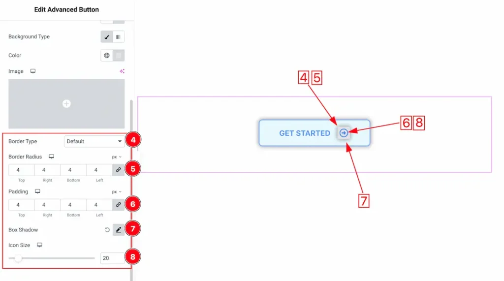
4. Border Type: you can set the Border Type of the icon to Default, None, Solid, Double, Dotted, Dashed, or Groove. We choose here the Border Type default.
5. Border Radius: Customizes the border corners for roundness.
6. Padding: You can adjust the icon padding from here.
7. Box Shadow: You can set the icon box shadow from here.
8. Icon Size: This option lets you set the button icon size.
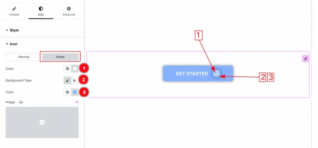
Come to the Hover tab section, you will get the below customization options-
1. Color: This option lets you change the icon hover text color.
2. Background Type: You can change the color of the button icon background to classic or gradient. Here we choose the Background type Classic. If you want then you also can set an image as background.
3. Color: This option lets you change the button icon hover background color. If you want then you can set an image as icon background.
Badge Section
Go to Style > Badge
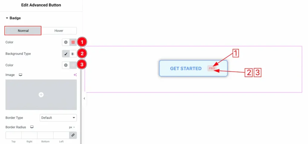
Come to the Badge section, you will get two sub sections; Normal and hover. Lets proceed with the normal tab-
1. Color: This option lets you change the badge normal text color.
2. Background Type: You can change the color of the badge background to classic or gradient. Here we choose the Background type Classic.
3. Color: This option lets you change the badge normal background color.
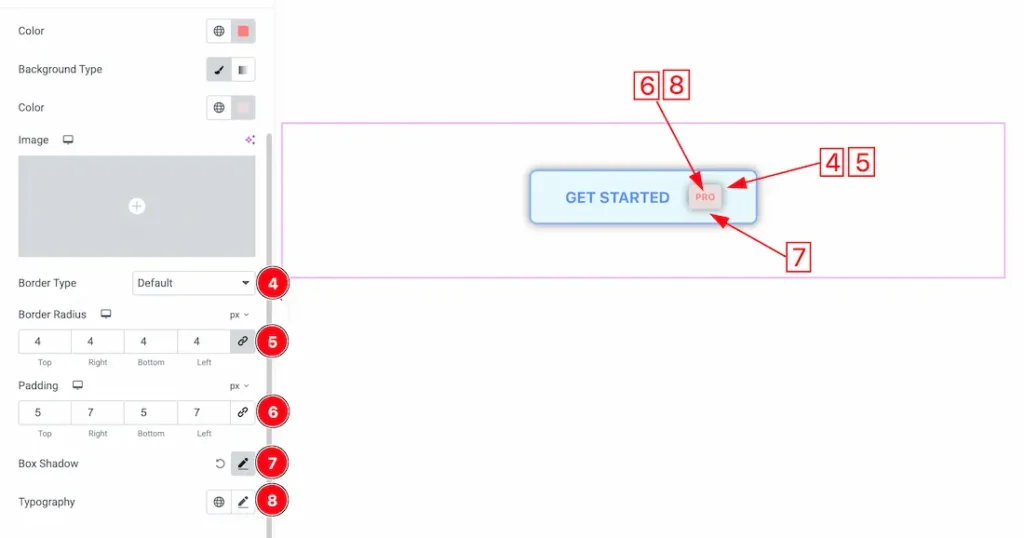
4. Border Type: you can set the Border Type of the badge to Default, None, Solid, Double, Dotted, Dashed, or Groove. We choose here the Border Type default.
5. Border Radius: Customizes the border corners for roundness.
6. Padding: You can adjust the badge padding from here.
7. Box Shadow: You can set the badge box shadow from here.
8. Typography: Change the font family, size, weight, style, transform, decoration, line height, letter spacing, and word spacing from here.
Come to the Hover tab section, you will get the below customization options-
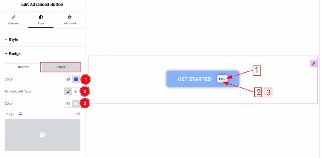
1. Color: This option lets you change the badge hover text color.
2. Background Type: You can change the color of the badge background to classic or gradient. Here we choose the Background type Classic.
3. Color: This option lets you change the badge hover background color. If you want then you can set an image as icon background.
All done! You have successfully customized the Advanced Button Widget on your website.
Video Assist
You can also watch the video tutorial to learn more about the Advanced Button widget. Please visit the demo page for examples.
Thanks for being with us.