
The Post Grid widget is a popular post interface to showcase featured or ongoing posts inside your landing page. This is one of the most feature-rich widgets from Element Pack.
Let’s explore the widget customizations.
Inserting Widgets
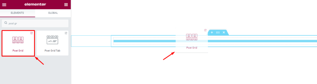
Please find the Post Grid widget from the widget panel and drag it inside the page editor. Note that you need both Element Pack and Elementor plugins installed in order to use this feature.
Content tab customizations
Layout section
Go to Content > Layout
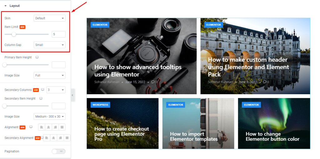
The first section is the layout section, and here you can customize the Skin of the post grid widget, along with determining the number of posts to display through the Item Limit option. You can configure the Column Gap to adjust the spaces between the grid items.
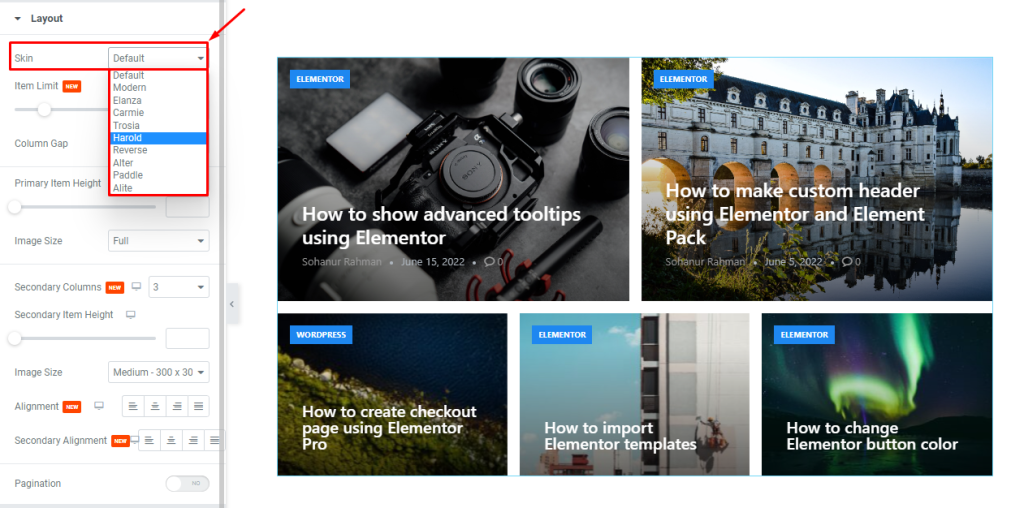
The Skin option lets you choose from 10 different post layouts. Each skin has unique presentations.
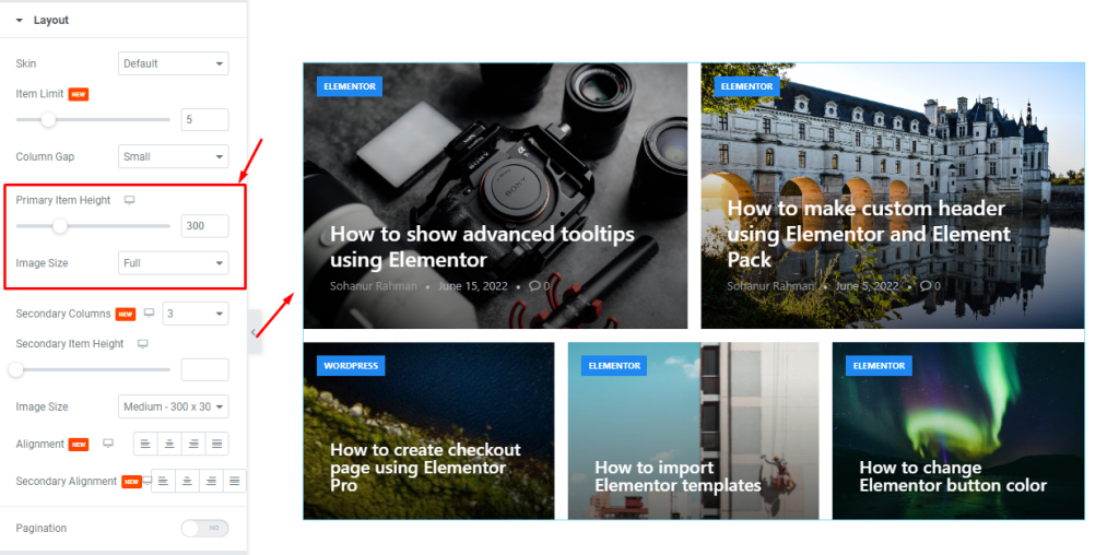
You can adjust the Primary Item Height scrollbar to change the height of the primary items (the two posts on the top). The Image Size option is also for the primary items to change the image dimensions.
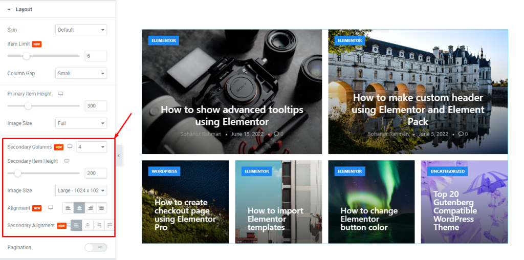
Then you can change the number of Columns for the secondary items, along with a custom Secondary Item Height scrollbar. There is another Image Size option available for the secondary items. Also, there is a content Alignment option that works on both primary and secondary items, plus an additional only Secondary Alignment option.
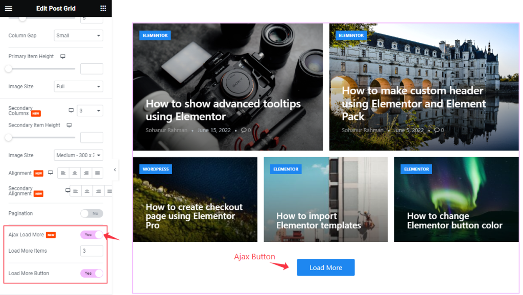
Ajax Load More Switcher added here to work on Ajax Feature. When you enable the switcher it will appear Load More Item Box and Load More Button. As you demonstrate in the screenshot above. When you click on the Load More Button it will show more items as you mention in the Item box.
Query section
Go to Content > Query
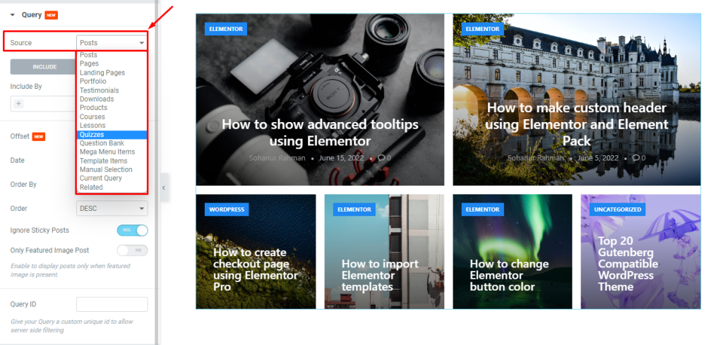
In this section, the first option lets you select a Source for the Post Grid widget to show content on display. The source could be posts, pages, portfolios, etc.
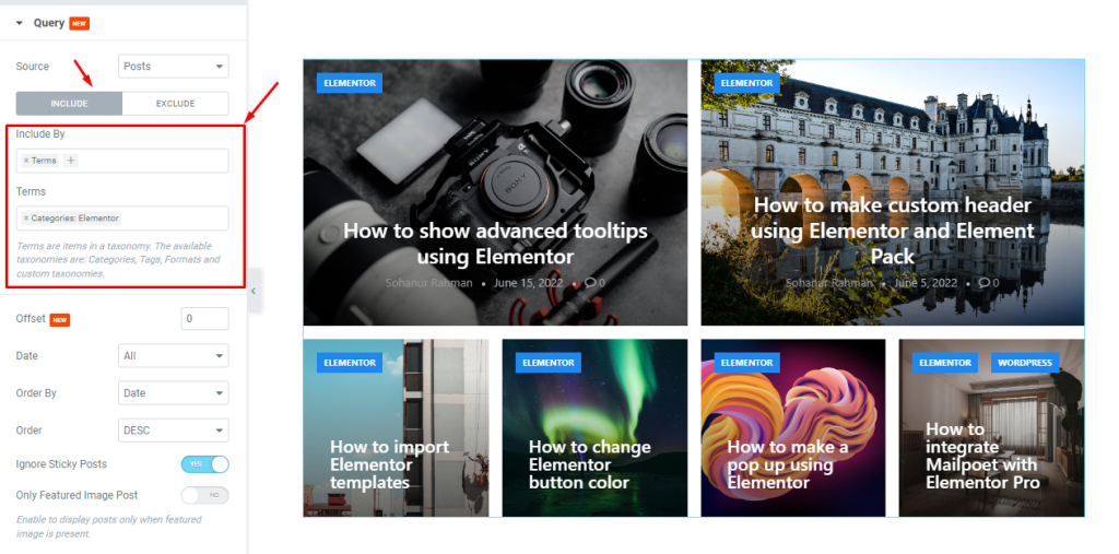
The Include and Exclude fields are filters that let you show or hide specific posts by Authors or by Terms. For instance, within the include subsection, you can select Terms and then select a category from the field below to show posts only belonging to that category.
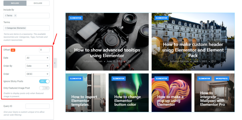
Then below, the Offset option lets you choose a post by the hierarchical order using simple numbers to exclude that post from displaying. Then there are some sorting options below, along with two switchers that can hide Sticky Posts and Posts without Featured Images.
Additional Section
Go to Content > Additional
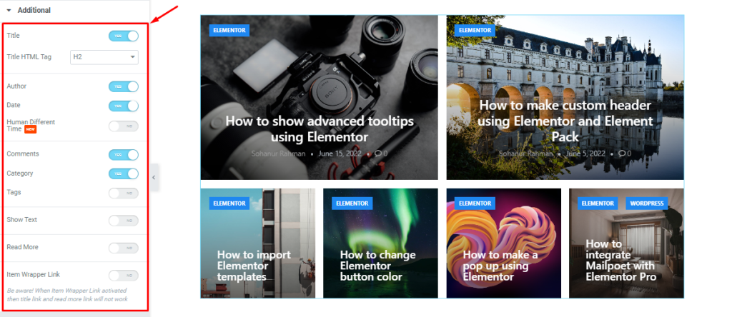
In this section, you will find a bunch of switchers that let you show/hide certain elements from the widget interface. For instance, you can turn off the Author switcher to hide author information from the post grid widget.
A couple of switchers are turned off by default: the Human Different Time, Tags, Show Text and Read More. Turning on these switchers will reveal those elements on the grid as well as generate styling options inside the Style tab.
Style tab customizations
The Style part of the Post Grid widget lets you customize the appearance to personalize the design according to your preferences.
Item section
Go to Style > Item
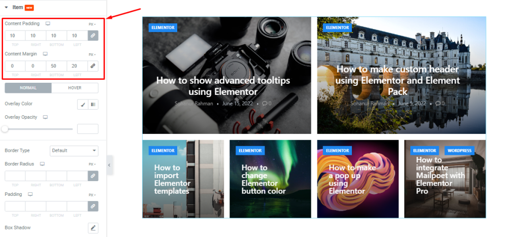
Here, you can adjust the content padding and content margin of the Post Grid. However, make sure to properly adjust the padding & margin values to avoid overlaps or line breaks.
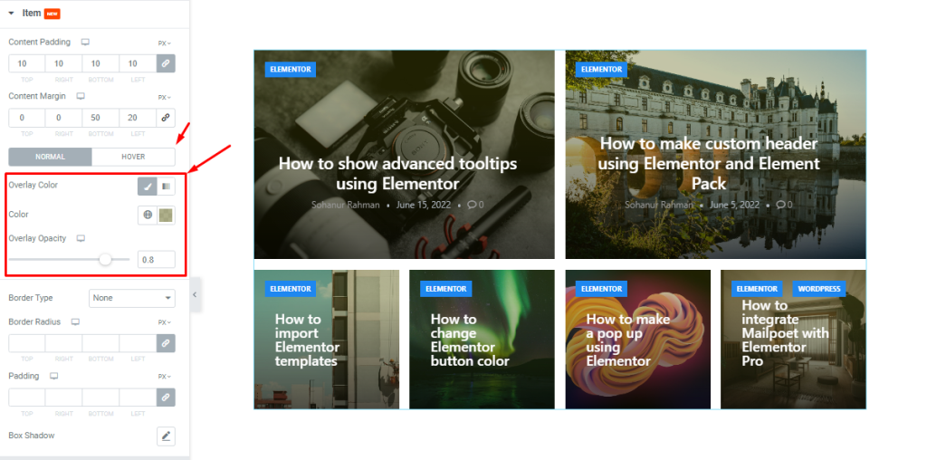
Then you can go for an overlay color to act on top of the images (or Post Grid backgrounds) while controlling the overlay opacity.
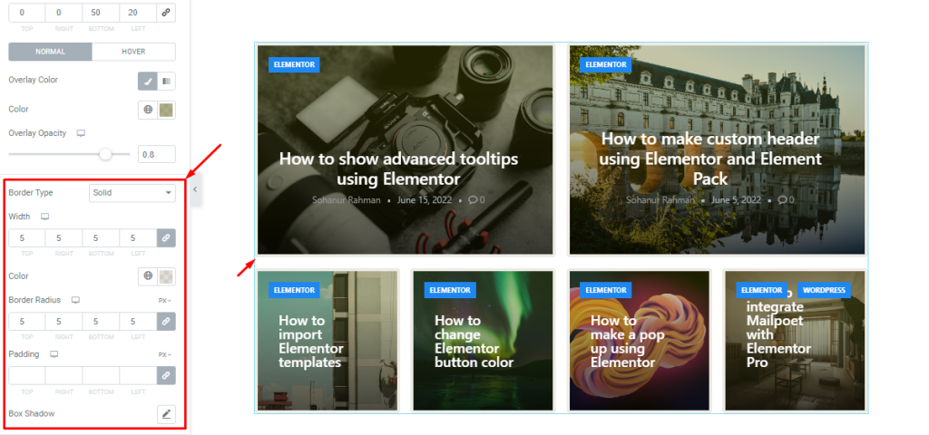
It is possible to set up a border around the grid items with a custom border width, color, and border radius. You can also use padding to adjust the area around the items or use box shadow to add 3D shadow effects.
Image section
Go to Style > Image
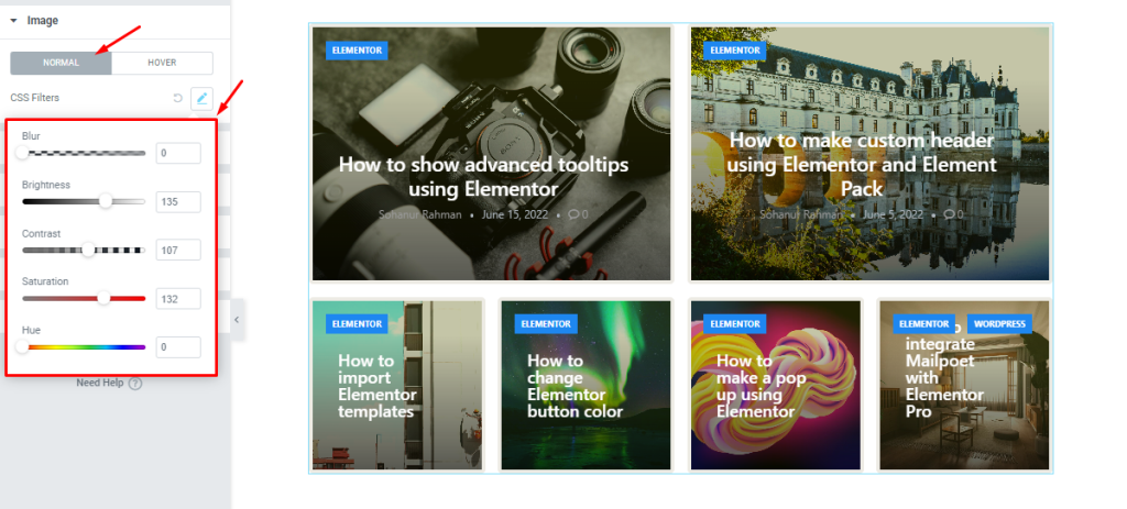
In the Image section, you are going to find the CSS Filters option that lets you configure the color, blur, brightness, and more properties to enhance the images.
Title section
Go to Style > Title
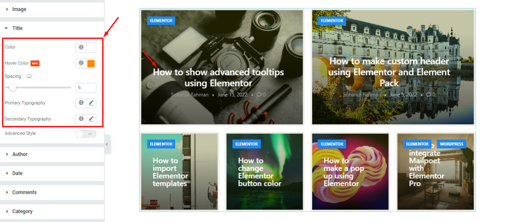
For the title part of the Post Grid widget, you can customize the color of the title text as well as its hover text color. The spacing scrollbar lets you adjust the gap between the title and meta.
Also, you will find different Typography options for the Primary items (the first two on top) and the secondary items.
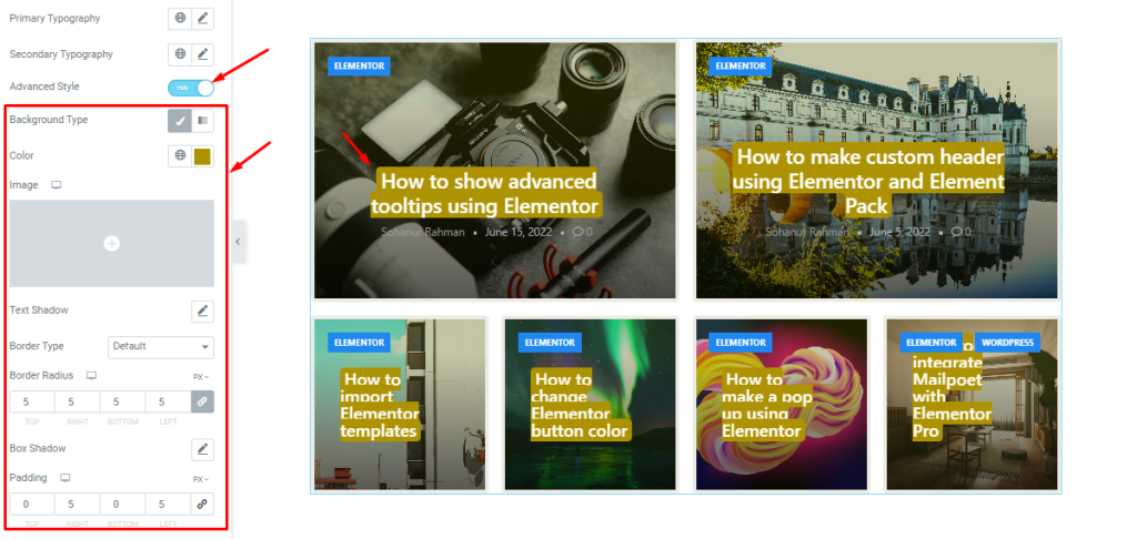
Then again, there is a switcher named Advanced Style within the Title section. Turning on this switcher will reveal more styling options like background type, text shadow, border, box shadow, and padding. By utilizing these options, you can generate more unique designs.
Author section
Go to Style > Author
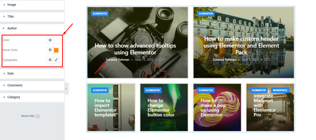
In this section, you can customize the author info text by changing the text color, hover color, and typography.
Date section
Go to Style > Date
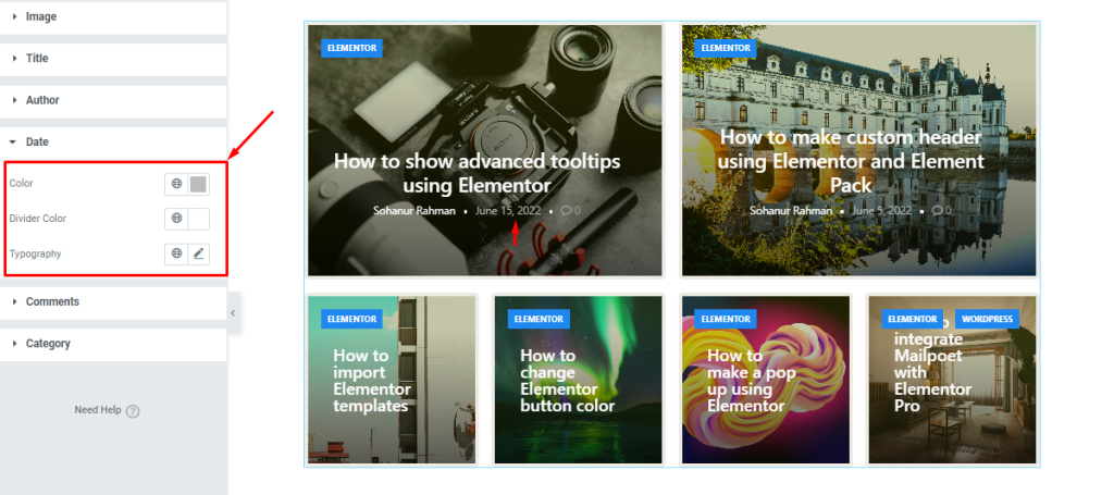
Here, you can change the color, divider color, and typography to customize the date text.
Comments section
Go to Style > Comments
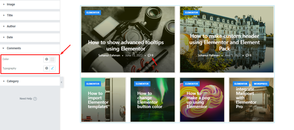
You can change the color and typography for the comments icon which is a part of the meta text.
Category section
Go to Style > Category
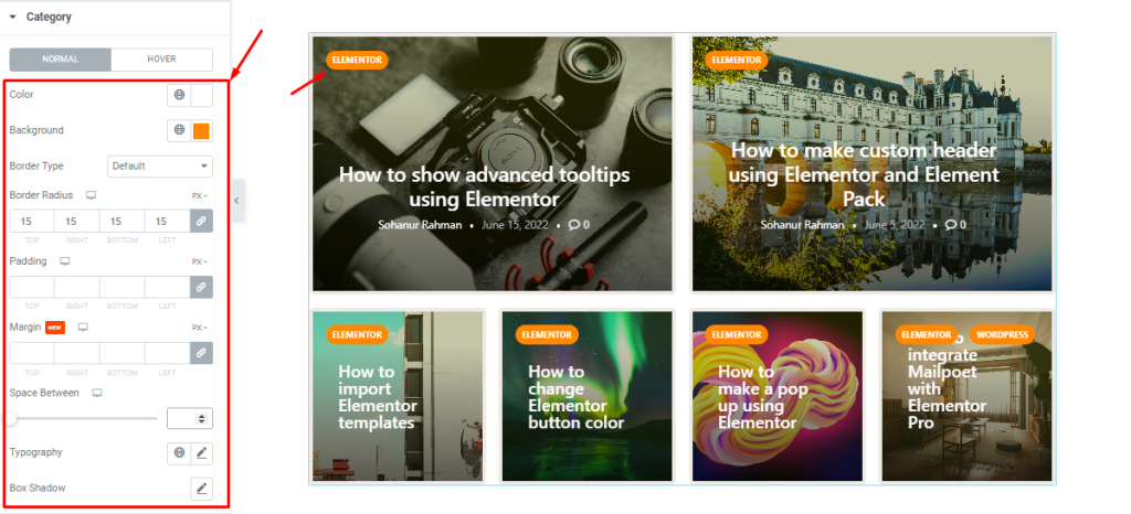
For the category of the Post Grid widget, you can easily customize the text color and background color with additional border, border radius, padding, and margin options.
Also, you can adjust the space between the categories (applicable for multiple category texts in a single post) as well as customize the typography and Box shadow for the category.
Note that the color options are available for hover also.
Video Assist
Please watch the videos to learn more about Post Grid widget. See the demo page to get more live examples.