
In this documentation, we will discuss the customization of the Dynamic Tabs widget, brought to you by the Ultimate Post Kit addon for Elementor.
Enable the Dynamic Tabs widget
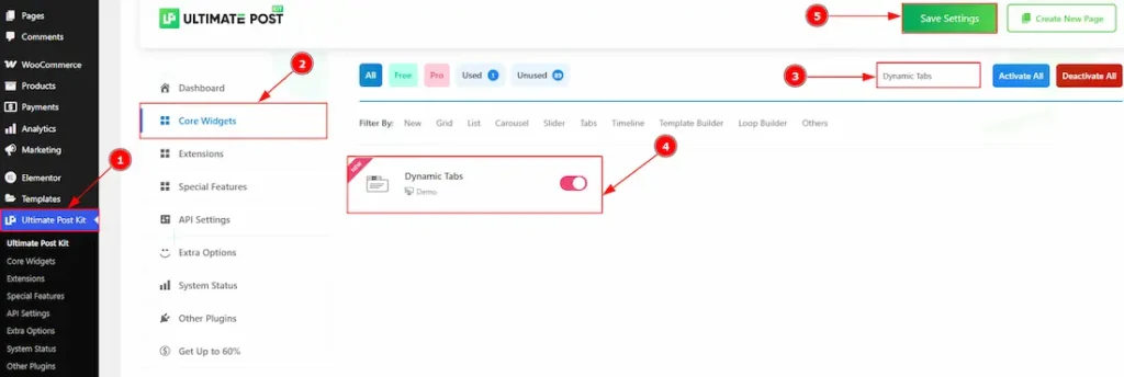
To use the Dynamic Tabs widget from Ultimate Post Kit, first, you have to enable the widget.
- Go to WordPress dashboard > Ultimate Post Kit Plugin dashboard.
- Then, Click the Core Widgets Tab.
- Search the Dynamic Tabs widget Name.
- Enable the Dynamic Tabs widget.
- Hit the Save Settings Button.
Note: To use the Dynamic Tabs widget, you first need to create and configure a template.
How to Build a Template To Use the Dynamic Widgets of the Ultimate Post Kit
To learn how to create a template using the Dynamic Widgets of Ultimate Post Kit, please follow the documentation here.
Inserting The Dynamic Tabs Widget
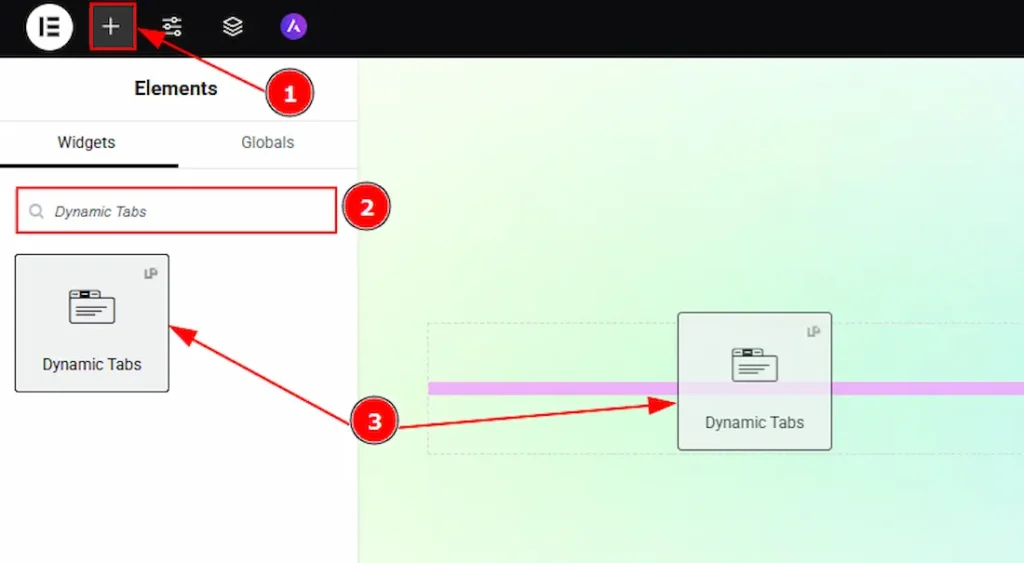
1. Go to the Elementor Editor Page and Hit the “+” icon Button.
2. Search the Dynamic Tabs widget.
3. Drag the widget and drop it on the editor page.
Work With The Content Tab
Layout Section
Go to Content > Layout
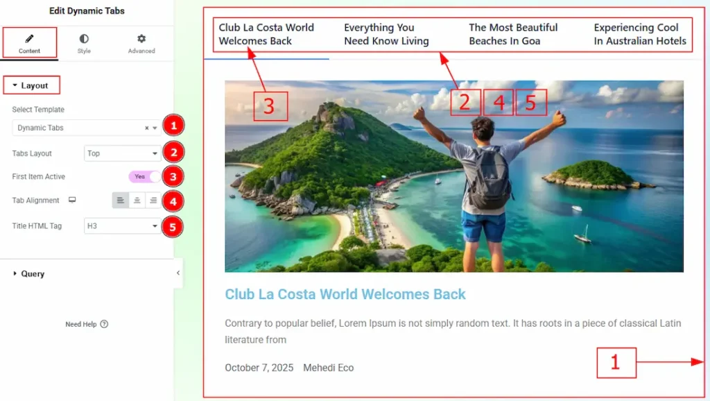
1. Select Template: You can select templates that you have already created to show your dynamic content through the dynamic tabs widget.
(To learn how to build a Template To Use the Dynamic Widgets of the Ultimate Post Kit, please see this document.)
2. Tabs Layout: You can set the position of the tabs to Top, Left, Right, or Bottom with this option.
3. First Item Active: Enable the switcher to get the first tab to open automatically by default when the page loads.
4. Tab Alignment: You can adjust the tab alignment to left, center or right with this option.
5. Title HTML Tag: You can set the title HTML tag with this option.
Query Section
Go to Content > Query
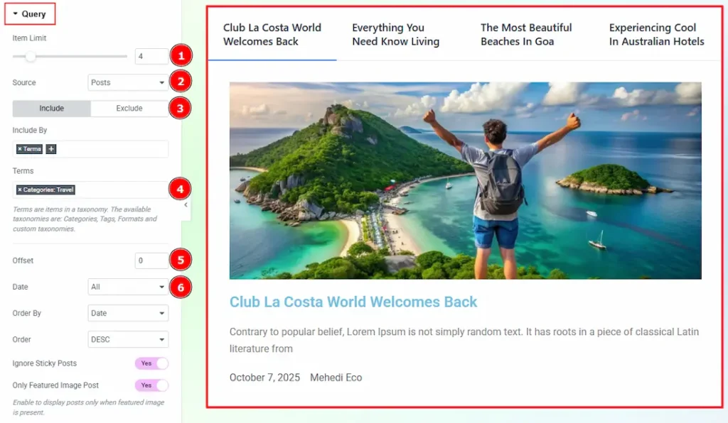
1. Limit: You can adjust the limit here of how many posts you want to show in the widget.
2. Source: Select the source for the widget from here. The types of sources are – Posts, Pages, Floating Elements, Downloads, Products, Mega Menu Items, Template Items, Manual Selection, Current Query, Related. Here we selected the type as posts.
3. Include/Exclude Selection: Select the Include / Exclude filter to show/hide specific posts by Terms (Tags/Categories) or Authors. Here, we selected the include field as Terms.
4. Terms: This option lets you select the categories that you want to add to the widget.
5. Offset: This option allows you to skips a selected number of posts before displaying results (useful for avoiding duplicates).
6. Date: You can select the post as on the date of creation with this option.
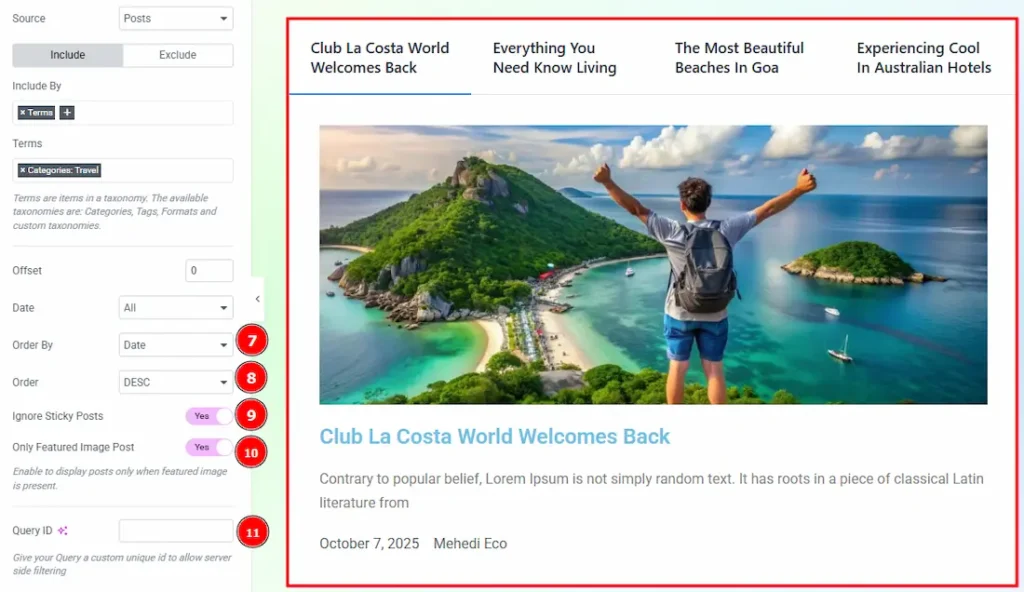
7. Order By: It controls the data you want to display through title, id, date, author, comment count, menu order & random. Here we selected the order as date.
8. Order: This option controls the order by which data is arranged. There are two types of order. Ascending Order (Starts from the smallest or lowest value and goes to the largest or highest.) & Descending Order (Starts from the largest or highest value and goes to the smallest or lowest.)
9. Ignore Sticky Posts: Enable or Disable the switcher to hide or show the sticky posts.
10. Only Featured Image Post: Enable or disable the switcher to show or hide the featured image post.
11. Query ID: Give your query a custom, unique ID to allow server-side filtering. Learn more about the Query.
Work with The Style Tab
Tabs Wrapper Section
Go to Style > Tabs Wrapper
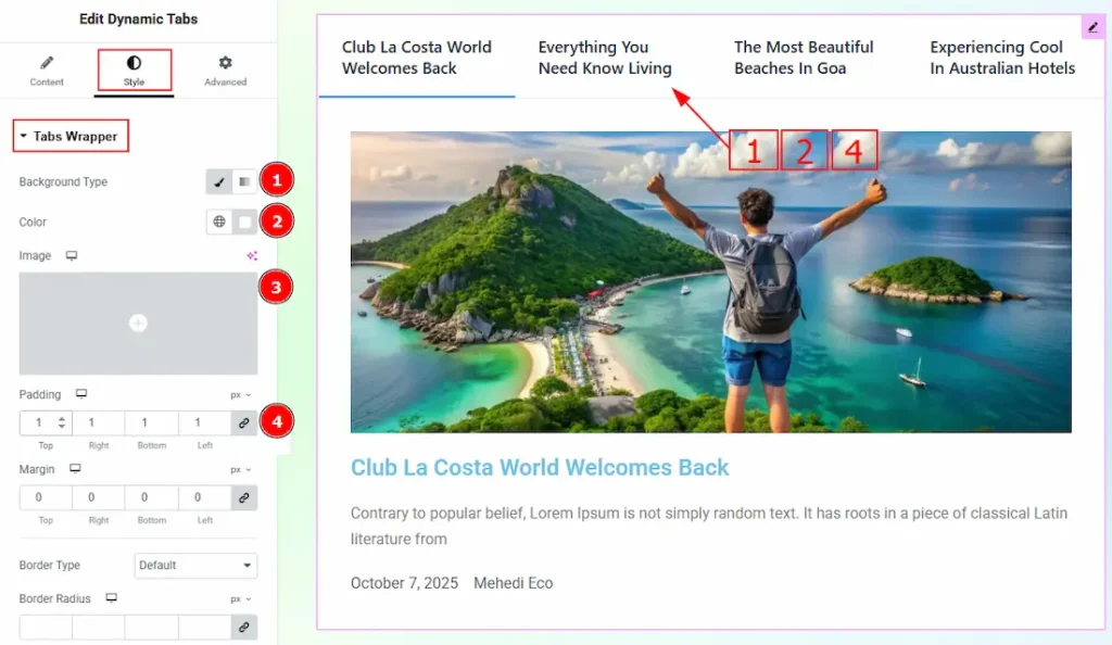
1. Background Type: You can select the background type to be classic or gradient with this option. Here, we have selected the background type as classic.
2. Color: You can change the background color with this option.
3. Image: You can change the background image with this option.
4. Padding: You can adjust the inner space of the tabs field with this option.
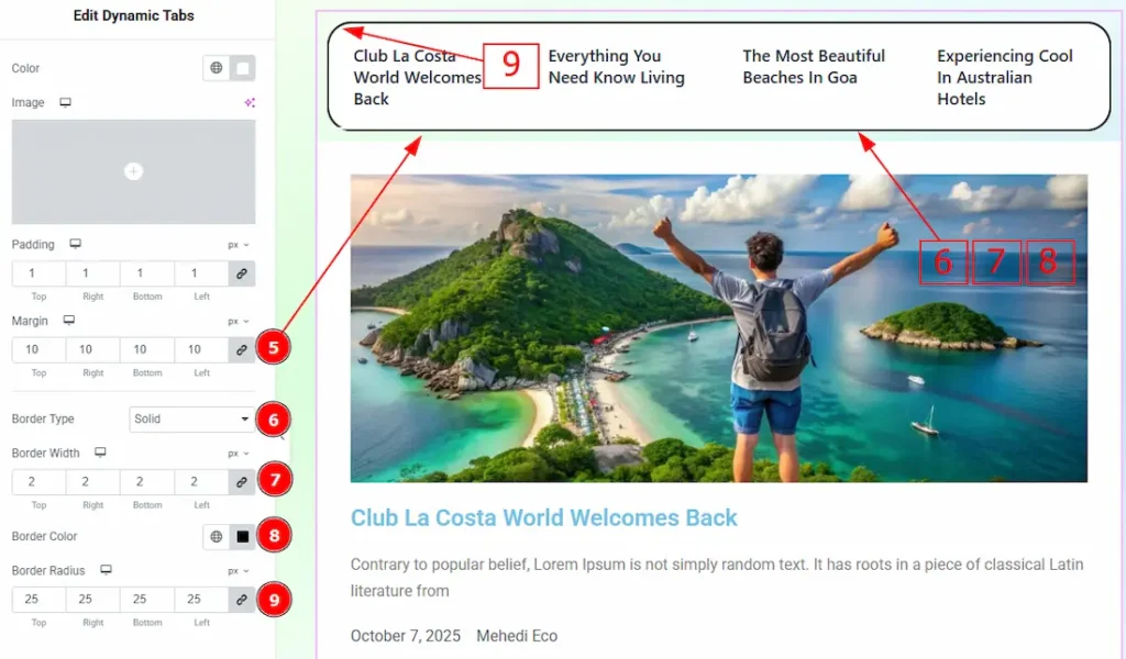
5. Margin: You can adjust the space around the tabs field with this option.
6. Border Type: This option allows you to add borders to your items. You can select various border types from this option. Such as Solid, Double, Dotted, Dashed, Groove.
7. Border Width: Set the thickness of the border with this option.
8. Border Color: You can change the border color with this option.
9. Border Radius: This option controls the roundness of the border.
Tabs Item Section
Go to Style > Tabs Item
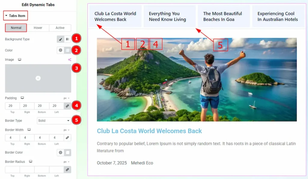
In this section, we have three more tabs. These are Normal, Hover and Active. Let’s start with the Normal Tab first –
1. Background Type: You can select the background type to be classic or gradient with this option. Here, we have selected the background type as classic.
2. Color: You can change the background color with this option.
3. Image: You can change the background image with this option.
4. Padding: You can adjust the inner space of the tab items field with this option.
5. Border Type: You can add a border and change its type with this option.
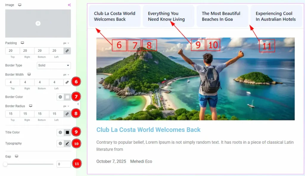
6. Border Width: Set the thickness of the border with this option.
7. Border Color: You can change the border color with this option.
8. Border Radius: This option controls the roundness of the border.
9. Title Color: You can change the tab title color with this option.
10. Typography: Change the font family, size, weight, transform, style, decoration, line height, letter spacing, and word spacing from here.
11. Gap: You can adjust the space between the tabs with this option.
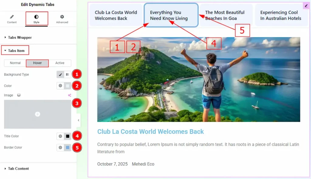
Now, let’s proceed to the Hover Tab –
1. Background Type: You can select the background type to be classic or gradient with this option. Here, we have selected the background type as classic.
2. Color: You can change the background hover color with this option.
3. Image: You can change the background image with this option.
4. Title Color: You can change the tab’s title hover color with this option.
5. Border Color: You can change the border hover color with this option.
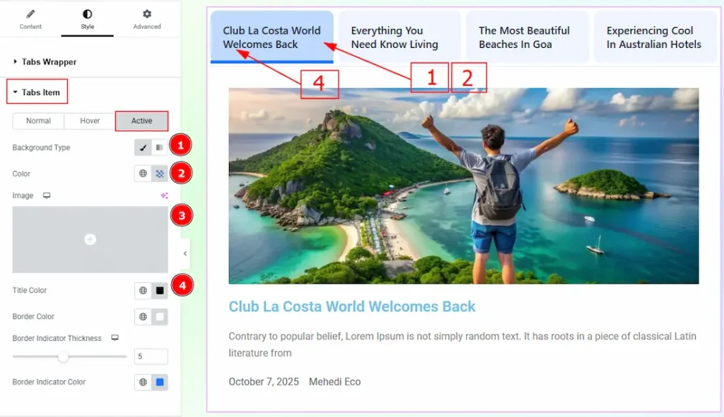
Now, let’s proceed to the Active Tab –
1. Background Type: You can select the background type to be classic or gradient with this option. Here, we have selected the background type as classic.
2. Color: You can change the active background color with this option.
3. Image: You can change the background image with this option.
4. Title Color: You can change the tab’s title active color with this option.
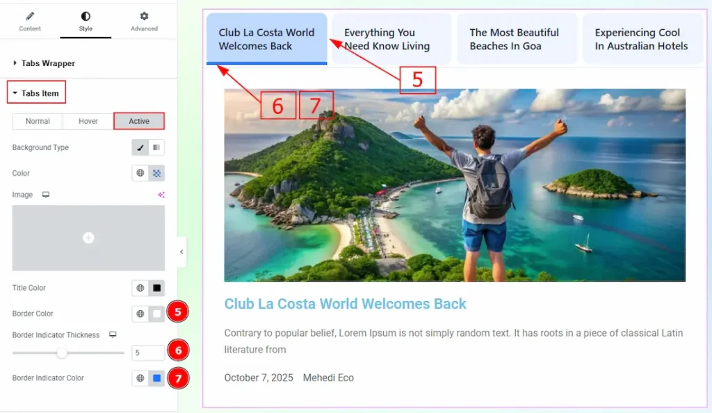
5. Border Color: You can change the active border color with this option.
6. Border Indicator Thickness: You can adjust the thickness of the border indicator with this option.
7. Border Indicator Color: You can change the border indicator color with this option.
Tab Content Section
Go to Style > Tab Content
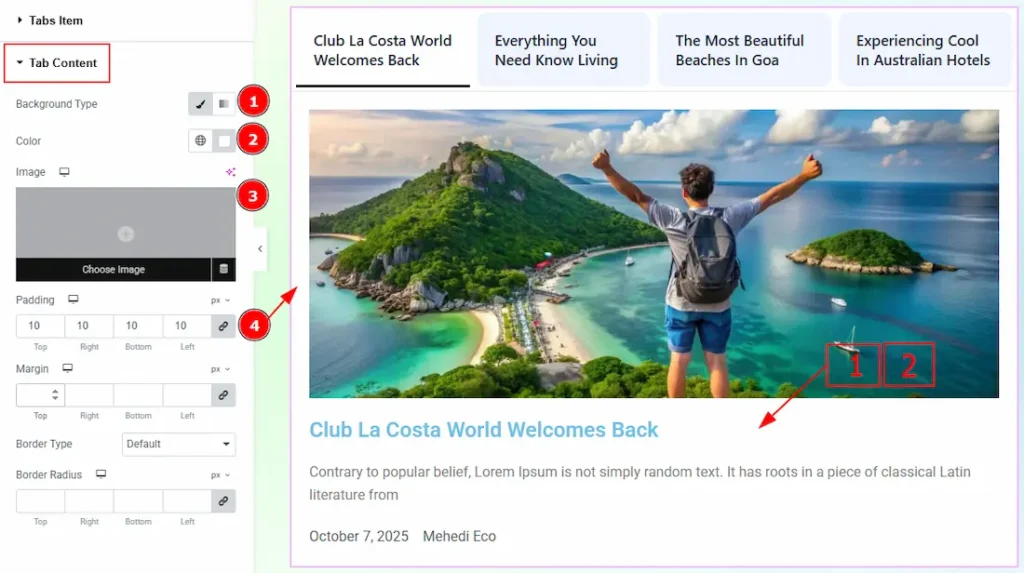
1. Background Type: You can select the background type to be classic or gradient with this option. Here, we have selected the background type as classic.
2. Color: You can change the background color with this option.
3. Image: You can change the background image with this option.
4. Padding: You can adjust the inner space of the tab content field with this option.
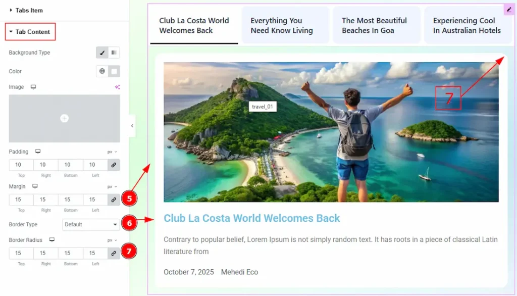
5. Margin: You can adjust the space around the tab content field with this option.
6. Border Type: You can add and change the border type with this option.
7. Border Radius: This option controls the roundness of the border.
All done! You have successfully customized the Dynamic Tabs widget on your website.
Video Assist
The video is coming soon. Please visit the demo page for more examples. Thanks for staying with us.