
In this documentation, we will discuss the customization of the Everest Forms widget, brought to you by the Element Pack Pro addon for Elementor.
Enable The Everest Forms Widget
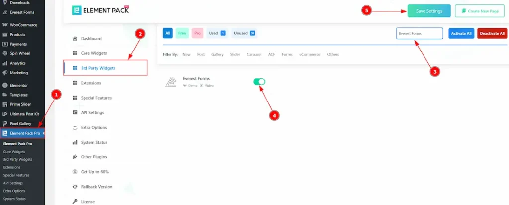
To use the Everest Forms widget from Element Pack, first, you have to enable the widget.
- Go to WordPress dashboard > Element Pack Pro Plugin dashboard.
- Then, Click the 3rd Party Widgets Tab.
- Search the Everest Forms Widget Name.
- Enable the Everest Forms Widget.
- Hit the Save Settings Button.
Note: To use this widget in the Elementor editor, you need to install the Everest Forms Plugin separately.
Inserting the Everest Forms widget
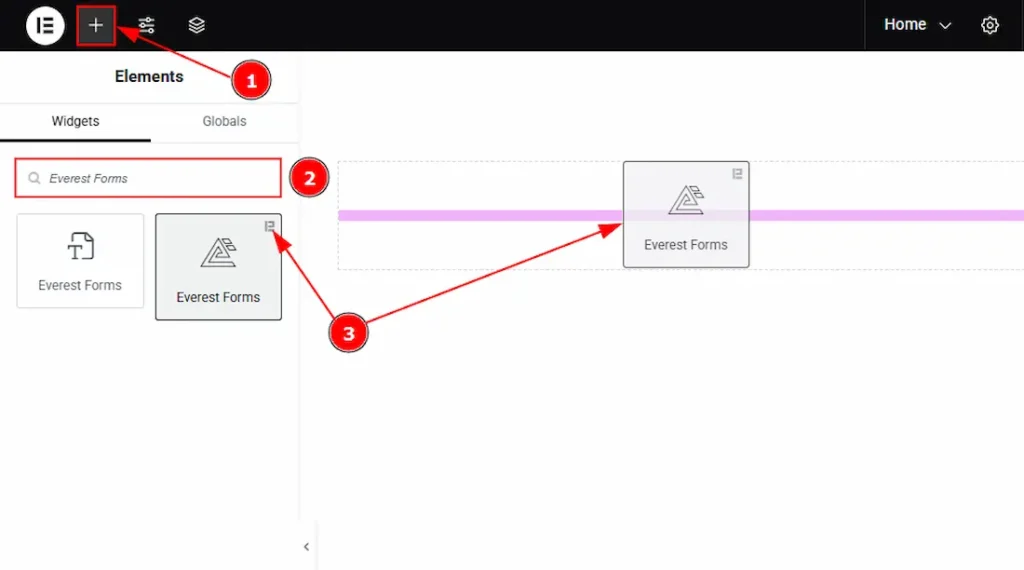
1. Go to the Elementor Editor Page and Hit the “+” icon Button.
2. Search the Everest Forms widget.
3. Drag the widget and drop it on the editor page.
Work With The Content Tab
Layout Section
Go to Content > Layout
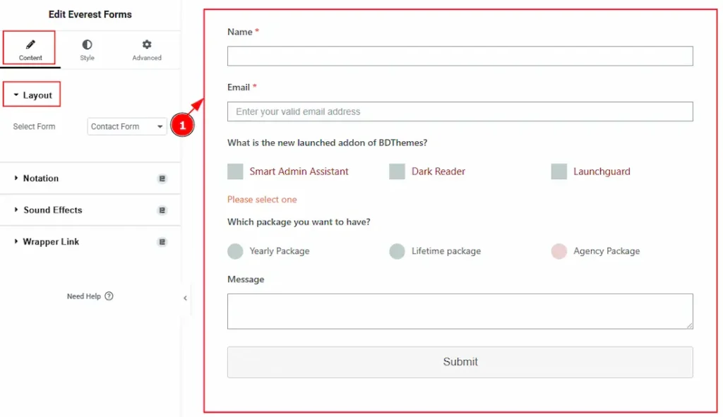
1. Select Form: You can select the form that you have already created. Here, we have created a form named Contact Form and selected it.
(Note: To customize the form in the editor, create a form first in the Everest Forms dashboard that includes the information you want to collect from your audience.)
Work with The Style Tab
Label Section
Go to Style > Label
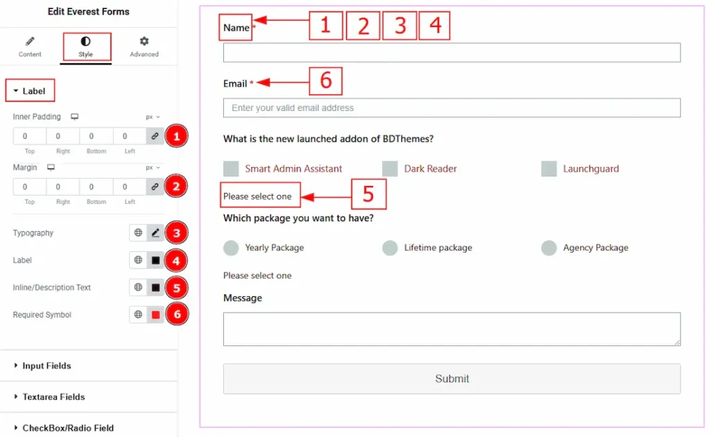
1. Inner Padding: You can adjust the inner space of the label with this option.
2. Margin: You can adjust the outer space of the label with this option.
3. Typography: Change the font family, size, weight, transform, style, decoration, line height, letter spacing, and word spacing from here.
4. Label: You can change the label text color with this option.
5. Inline/Description Text: You can change the inline/description text color with this option.
6. Required Symbol: You can change the required symbol color with this option.
Input Fields Section
Go to Style > Input Fields
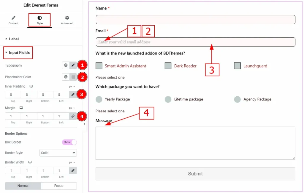
1. Typography: Change the font family, size, weight, transform, style, decoration, line height, letter spacing, and word spacing from here.
2. Placeholder Color: You can make changes to the placeholder text color with this option.
3. Inner Padding: You can adjust the inner space of the input field with this option.
4. Margin: You can adjust the space around the input field with this option.
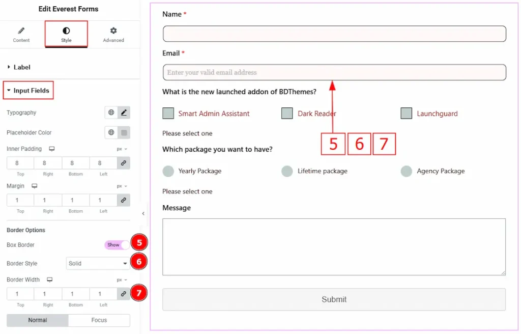
5. Box Border: Enable the switcher to get more options to customize the border.
6. Border Style: You can make changes to the border and change its style with this option.
7. Border Width: Set the thickness of the border with this option.
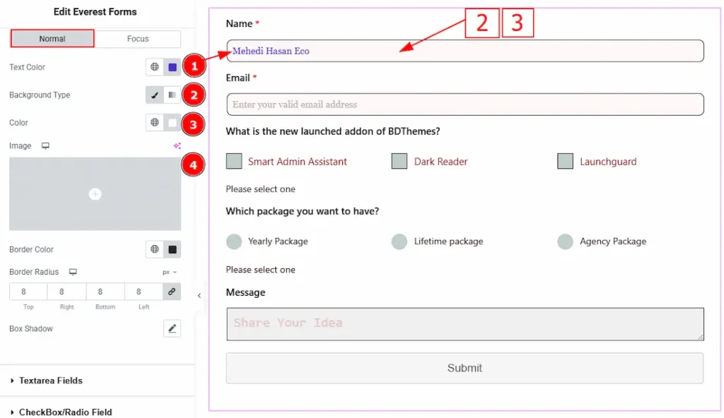
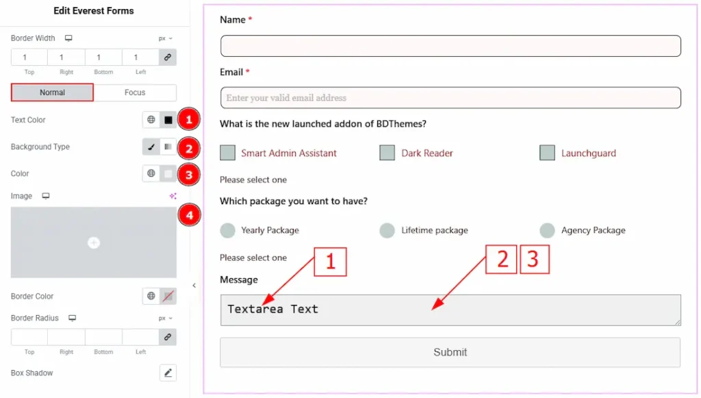
In this section, we have two more tabs. These are Normal & Focus. Let’s start with the Normal Tab first –
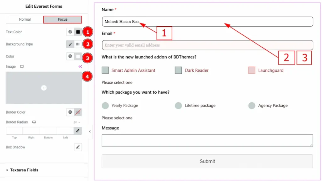
1. Text Color: You can change the input field text color with this option.
2. Background Type: This option allows you to change the background type to classic or gradient. Here, we have selected the background type as classic.
3. Color: You can change the background color with this option.
4. Image: You can change the background image with this option.
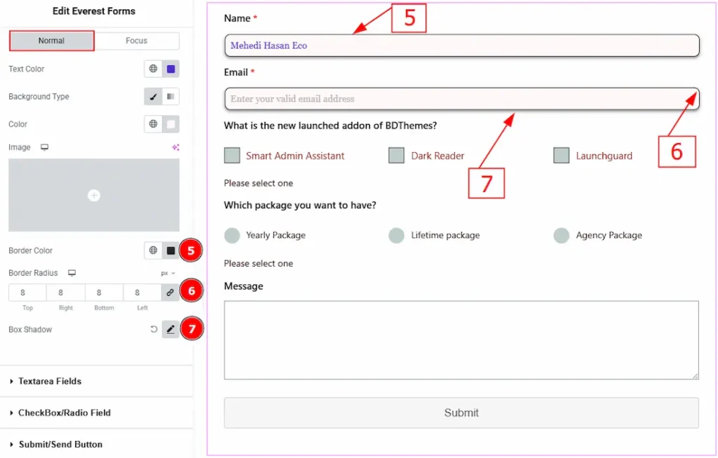
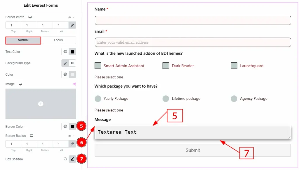
5. Border Color: You can change the input field border color with this option.
6. Border Radius: This option controls the roundness of the border.
7. Box Shadow: You can add a shadow effect to the input field with this option.
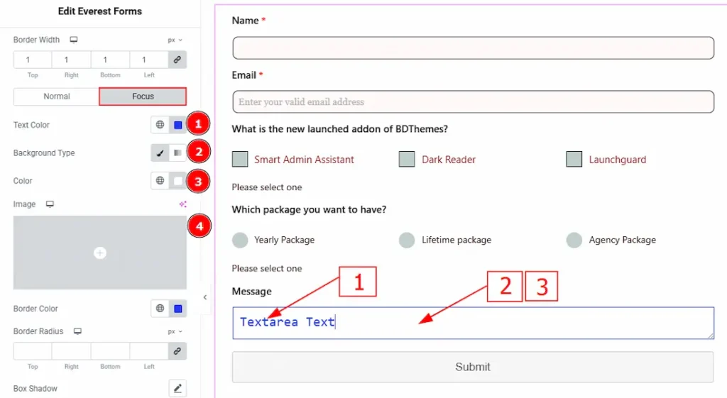
Now, let’s proceed to the Focus Tab –
1. Text Color: You can change the input focus color with this option.
2. Background Type: You can change the background type to classic or gradient with this option. Here, we have selected the background as classic.
3. Color: You can change the background color with this option.
4. Image: You can change the background image with this option.
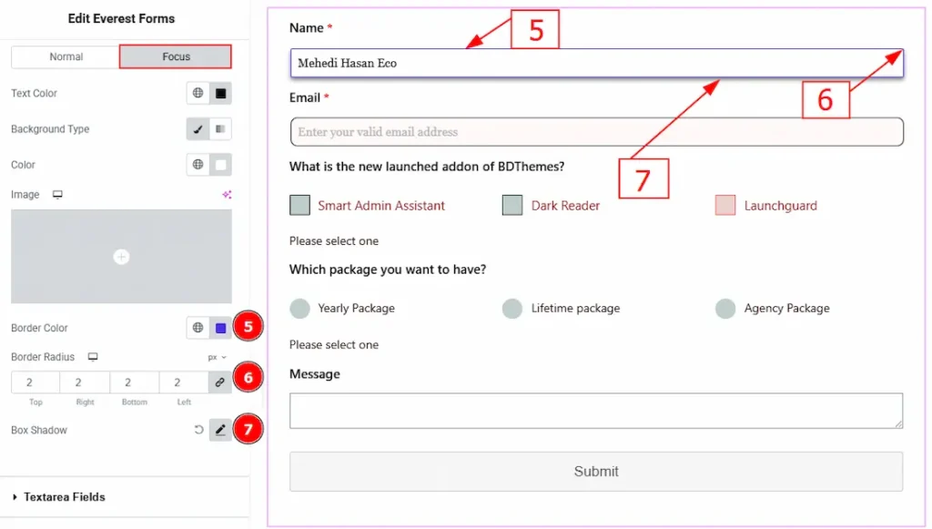
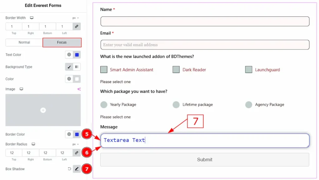
5. Border Color: You can change the input field focus border color with this option.
6. Border Radius: This option controls the roundness of the border.
7. Box Shadow: You can add a shadow effect to the focus input field with this option.
Textarea Fields Section
Go to Style > Textarea Fields
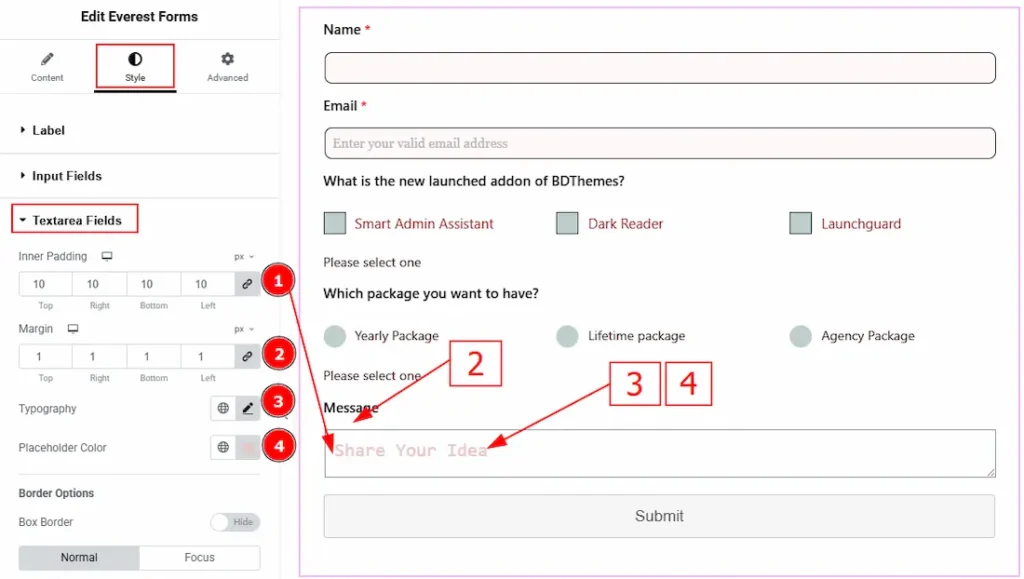
1. Inner Padding: You can adjust the inner space of the textarea field’s text with this option.
2. Margin: You can adjust the space around the textarea field box with this option.
3. Typography: Change the font family, size, weight, transform, style, decoration, line height, letter spacing, and word spacing from here.
4. Placeholder Color: You can change the placeholder text color with this option.
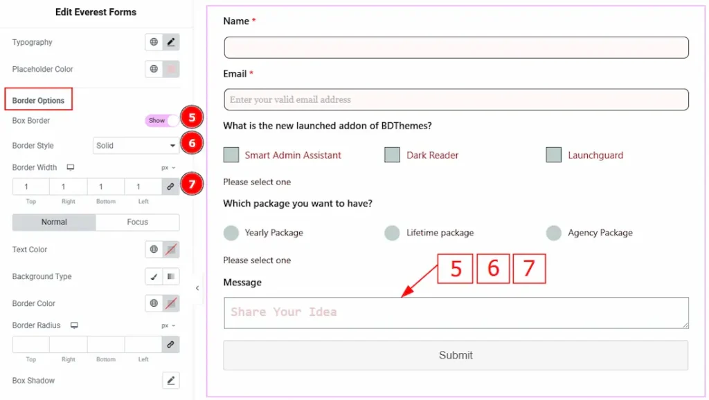
5. Box Border: Enable the switcher to get more options to customize the border.
6. Border Style: You can make changes to the border and change its style with this option.
7. Border Width: Set the thickness of the border with this option.
In this section, we have two more tabs. These are Normal & Focus. Let’s start with the Normal Tab –
1. Text Color: You can change the textarea field text color with this option.
2. Background Type: This option allows you to change the background type to classic or gradient. Here, we have selected the background type as classic.
3. Color: You can change the background color with this option.
4. Image: You can change the background image with this option.
5. Border Color: You can change the textarea field border color with this option.
6. Border Radius: This option controls the roundness of the border.
7. Box Shadow: You can add a shadow effect to the focus input field with this option.
Now, let’s proceed to the Focus Tab –
1. Text Color: You can change the testare field’s focus text color with this option.
2. Background Type: You can change the background type to classic or gradient with this option. Here, we have selected the background as classic.
3. Color: You can change the background color with this option.
4. Image: You can change the background image with this option.
5. Border Color: You can change the textarea field focus border color with this option.
6. Border Radius: This option controls the roundness of the border.
7. Box Shadow: You can add a shadow effect to the focus input field with this option.
CheckBox/Radio Field Section
Go to Style > CheckBox/Radio Field
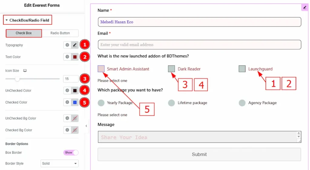
In this section, we have two more tabs. These are Check Box & Radio Field. Let’s start with the Check Box Tab –
1. Typography: Change the options font family, size, weight, transform, style, decoration, line height, letter spacing, and word spacing from here.
2. Text Color: You can change the options text color with this option.
3. Icon Size: You can change the checkbox icon size with this option.
4. Unchecked Color: You can change the checkbox’s unchecked color with this option.
5. Checked Color: You can change the checkbox’s checked color with this option.
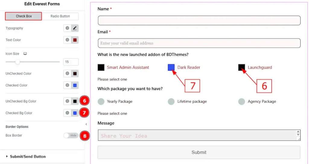
6. Unchecked Bg Color: You can change the checkbox’s unchecked background color with this option.
7. Unchecked Bg Color: You can change the checkbox’s checked background color with this option.
8. Box Order: Enable the switcher to get more options to customize the border.
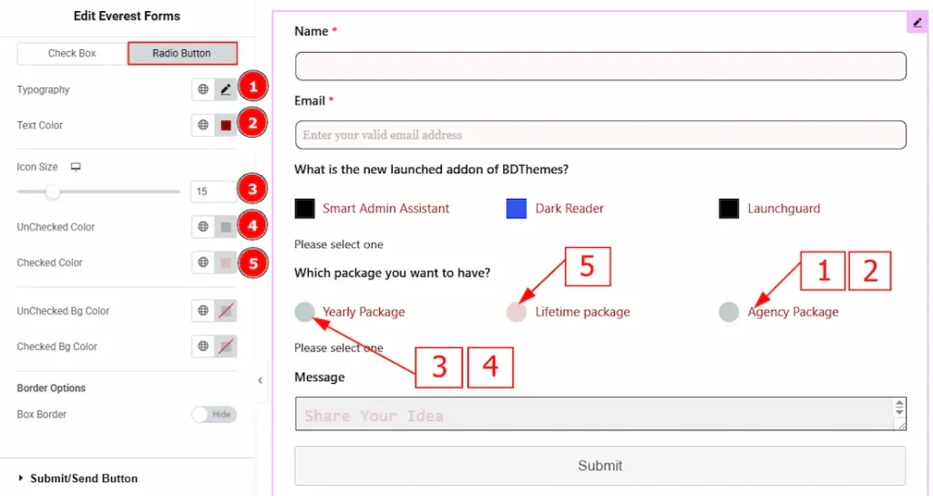
Now, let’s proceed to the Radio Button Tab –
1. Typography: Change the options font family, size, weight, transform, style, decoration, line height, letter spacing, and word spacing from here.
2. Text Color: You can change the options text color with this option.
3. Icon Size: You can change the radio button’s icon size with this option.
4. Unchecked Color: You can change the radio button’s unchecked color with this option.
5. Checked Color: You can change the radio button’s checked color with this option.
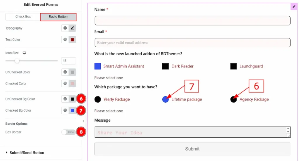
6. Unchecked Bg Color: You can change the radio button’s unchecked background color with this option.
7. Unchecked Bg Color: You can change the radio button’s checked background color with this option.
8. Box Order: Enable the switcher to get more options to customize the border.
Submit Button Section
Go to Style > Submit Button
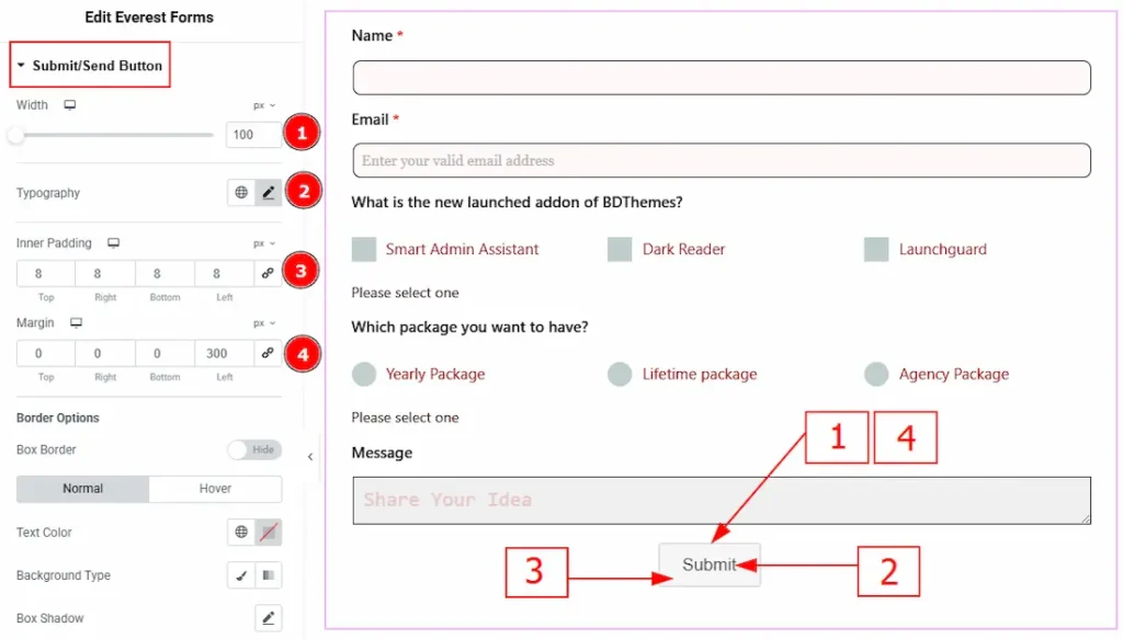
1. Width: You can adjust the submit button width with this option.
2. Typography: Change the font family, size, weight, transform, style, decoration, line height, letter spacing, and word spacing from here.
3. Inner Padding: You can adjust the inner space of the submit button with this option.
4. Margin: This option allows you to adjust the space around the submit button.
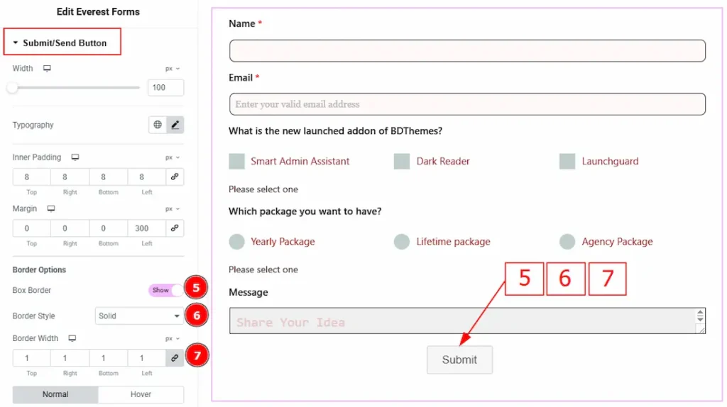
5. Box Border: Enable the switcher to get more options to customize the border.
6. Border Style: You can make changes to the border and change its style with this option.
7. Border Width: Set the thickness of the border with this option.
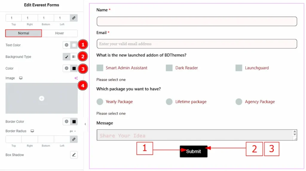
In this section, we have two more tabs. These are Normal & Hover. Let’s start with the Normal Tab –
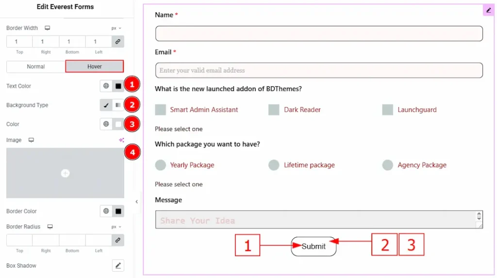
1. Text Color: You can change the submit button text color with this option.
2. Background Type: This option allows you to change the background type to classic or gradient. Here, we have selected the background type as classic.
3. Color: You can change the background color with this option.
4. Image: You can change the background image with this option.
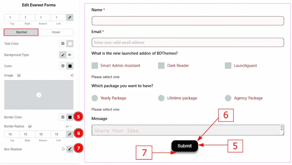
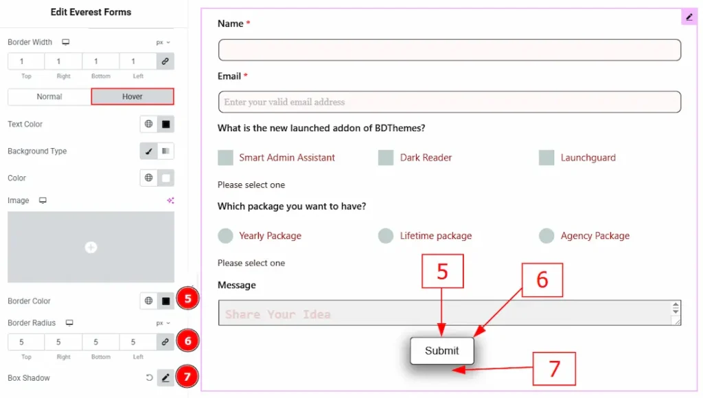
5. Border Color: You can change the border color with this option.
6. Border Radius: This option controls the roundness of the border.
7. Box Shadow: You can add a shadow effect to the submit button with this option.
Now let’s proceed to the Hover Tab –
1. Text Color: You can change the submit button text hover color with this option.
2. Background Type: This option allows you to change the background type to classic or gradient. Here, we have selected the background type as classic.
3. Color: You can change the background hover color with this option.
4. Image: You can change the background image with this option.
5. Border Color: You can change the border hover color with this option.
6. Border Radius: This option controls the roundness of the border.
7. Box Shadow: You can add a hover shadow effect to the submit button with this option.
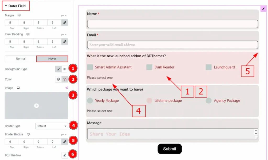
Outer Field Section
Go to Style > Outer Field
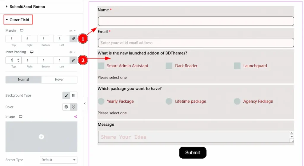
1. Margin: You can adjust the space around the forms outer field with this option.
2. Inner Padding: You can adjust the inner space of the forms outer field with this option.
In this section, we have two more tabs. These are Normal & Hover. Let’s start with the Normal Tab first –
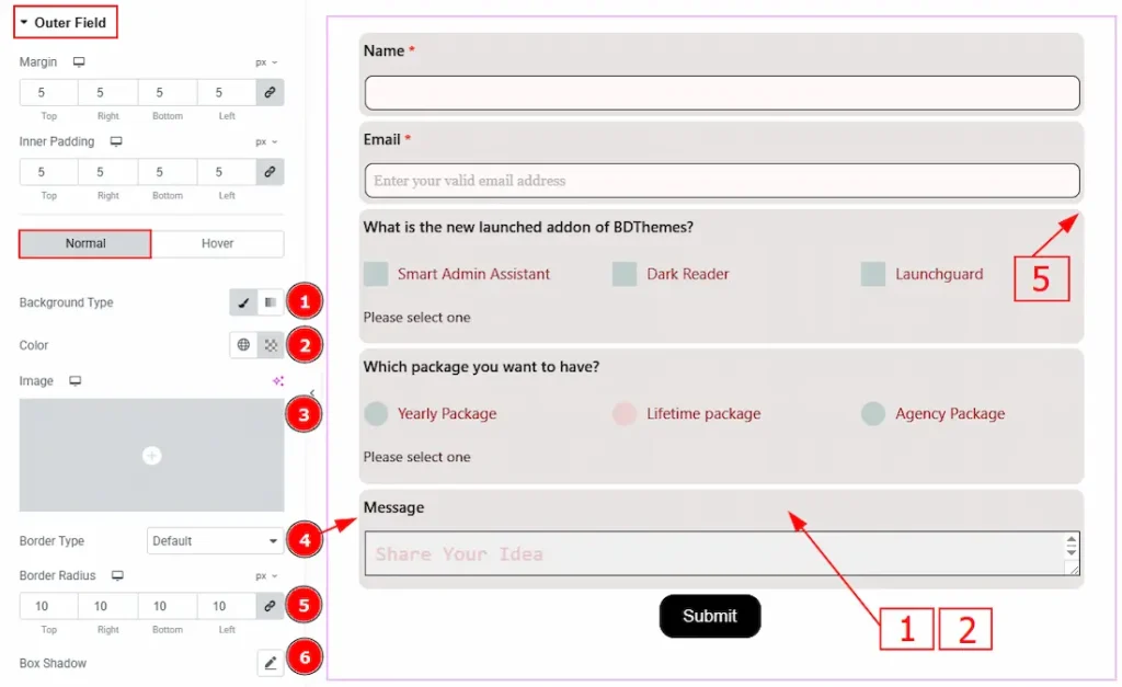
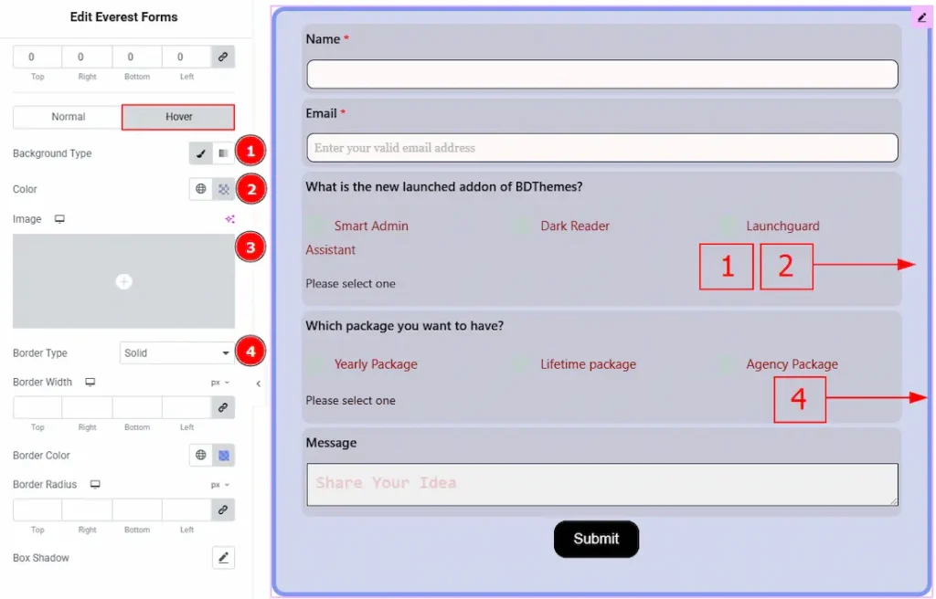
1. Background Type: There are two types of background. One is Classic and the other is Gradient. Here we have selected the background type as classic.
2. Color: You can change the background color with this option.
3. Image: You can change the background image with this option.
4. Border Type: You can add and select the border type with this option.
5. Border Radius: This option controls the roundness of the border.
6. Box Shadow: You can add a shadow effect to the outer field with this option.
Now, let’s proceed to the Hover Tab –
1. Background Type: There are two types of background. One is Classic and the other is Gradient. Here we have selected the background type as classic.
2. Color: You can change the background hover color with this option.
3. Image: You can change the background image with this option.
4. Border Type: You can add and select the border type with this option.
5. Border Radius: This option controls the roundness of the border.
6. Box Shadow: You can add a hover shadow effect to the outer field with this option.
Form Container Section
Go to Style > Form Container
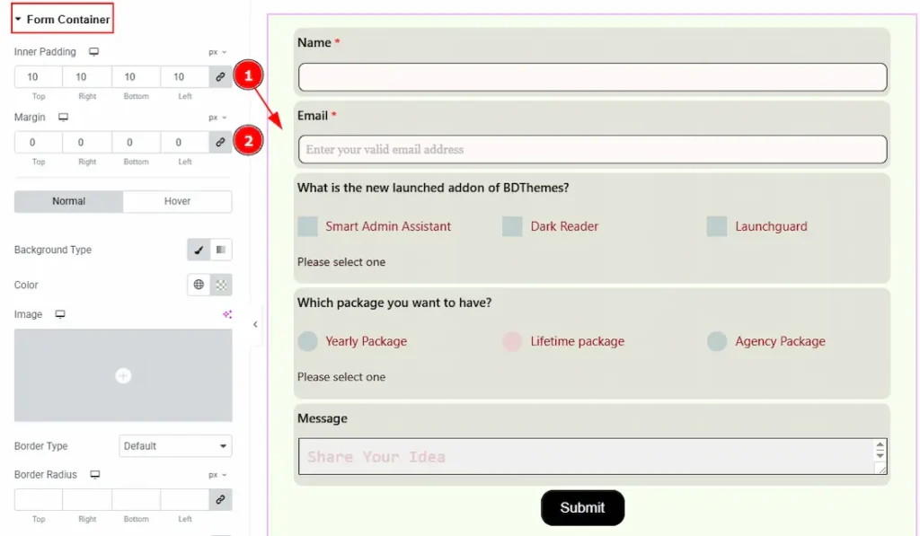
1. Inner Padding: You can adjust the inner space of the form container with this option.
2. Margin: You can adjust the space around the form container with this option.
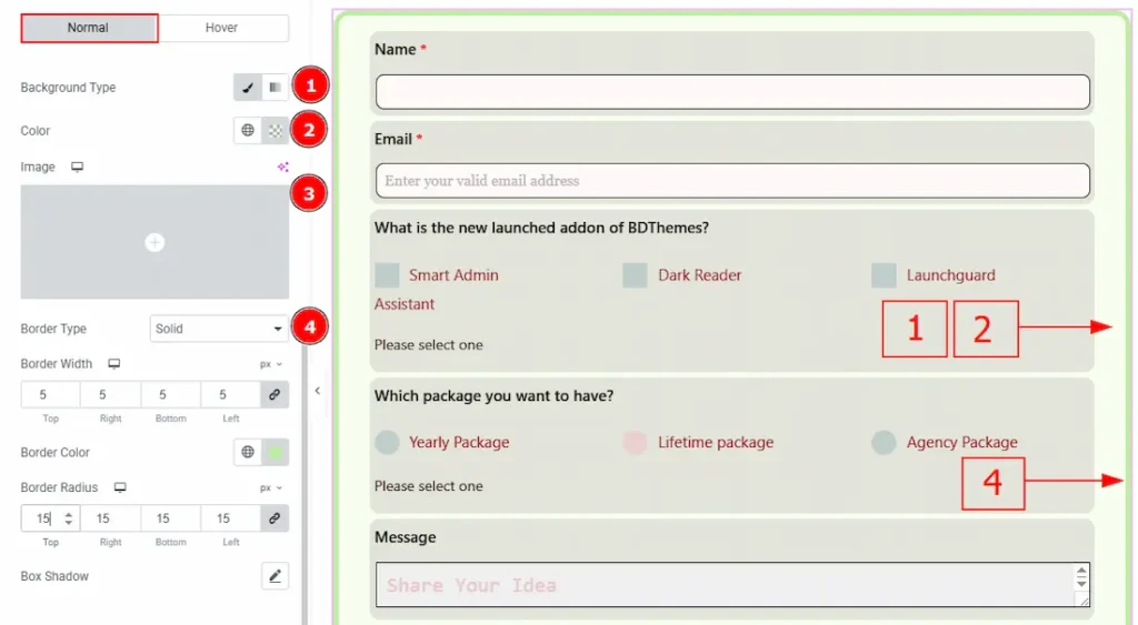
In this section, we have two more tabs. These are Normal & Hover. Let’s start with the Normal Tab –
1. Background Type: There are two types of background. One is Classic and the other is Gradient. Here we have selected the background type as classic.
2. Color: You can change the background color with this option.
3. Image: You can change the background image with this option.
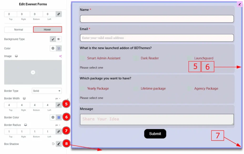
4. Border Type: You can add and select the border type with this option.
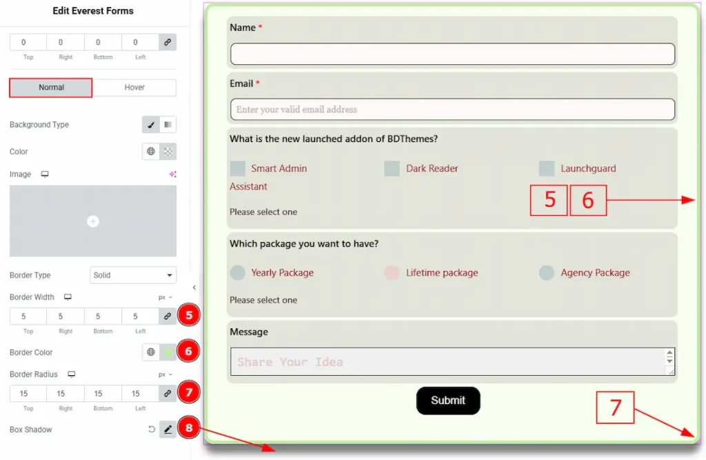
5. Border Width: Set the thickness of the border with this option.
6. Border Color: You can change the border color with this option.
7. Border Radius: This option controls the roundness of the border.
8. Box Shadow: You can add a shadow effect to the form container with this option.
Now, let’s proceed to the Hover Tab –
1. Background Type: There are two types of background. One is Classic and the other is Gradient. Here we have selected the background type as classic.
2. Color: You can change the background hover color with this option.
3. Image: You can change the background image with this option.
4. Border Type: You can add and select the border type with this option.
5. Border Width: Set the thickness of the border with this option.
6. Border Color: You can change the border hover color with this option.
7. Border Radius: This option controls the roundness of the border.
8. Box Shadow: You can add a hover shadow effect to the form container with this option.
Response Message Section
Go to Style > Response Message
In this section, we have two more tabs. These are Success and Validation/Error. Let’s start with the Success Tab first –
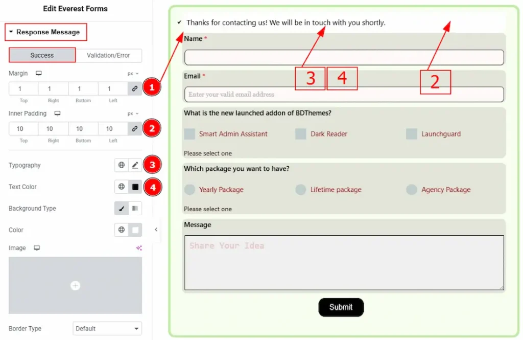
1. Margin: You can adjust the space around the success message with this option.
2. Inner Padding: You can adjust the inner space of the success message field with this option.
3.Typography: Change the font family, size, weight, transform, style, decoration, line height, letter spacing, and word spacing from here.
4. Text Color: You can change the success message text color with this option.
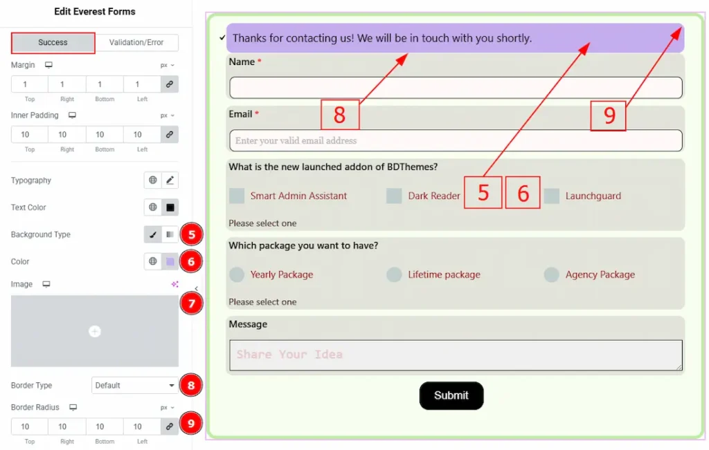
5. Background Type: There are two types of background. One is Classic and the other is Gradient. Here we have selected the background type as classic.
6. Color: You can change the background color with this option.
7. Image: You can change the background image with this option.
8. Border Type: You can add and select the border type with this option.
9. Border Radius: This option controls the roundness of the border.
Now, let’s proceed to the Validation/Error Tab –
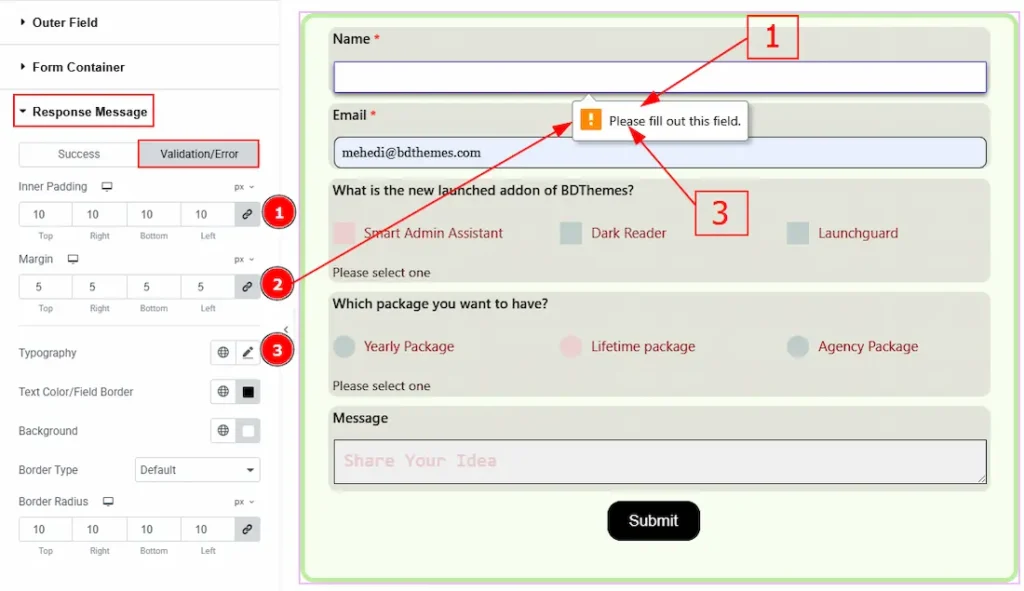
1. Margin: You can adjust the space around the Validation/Error message with this option.
2. Inner Padding: You can adjust the inner space of the Validation/Error message field with this option.
3.Typography: Change the font family, size, weight, transform, style, decoration, line height, letter spacing, and word spacing from here.
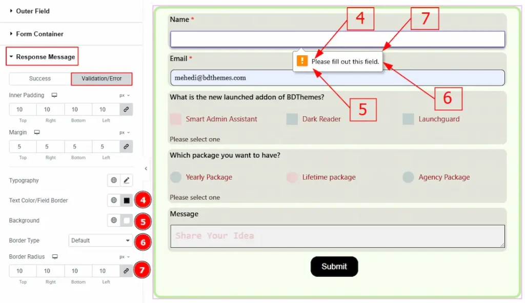
4. Text Color/Field Color: You can change the success message text color with this option.
5. Background: You can change the background color with this option.
6. Border Type: You can add or change the border types with this option.
7. Border Radius: This option controls the roundness of the border.
Extra Option Section
Go to Style > Extra Option
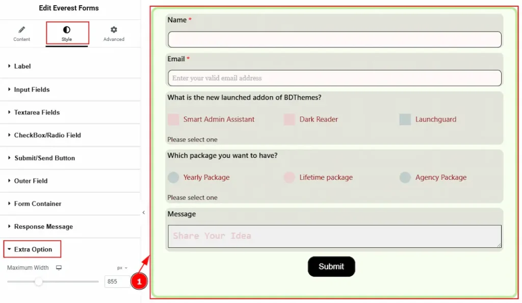
1. Maximum Width: You can adjust the form’s width with this option.
All done! You have successfully customized the Everest Forms widget on your website.
Video Assist

You can also watch the video tutorial to learn more about the Everest Forms widget. Please visit the demo page for examples.
Thanks for being with us.