
This documentation provides comprehensive insights using the Website Accessibility for Complete Action.
Download From WordPress
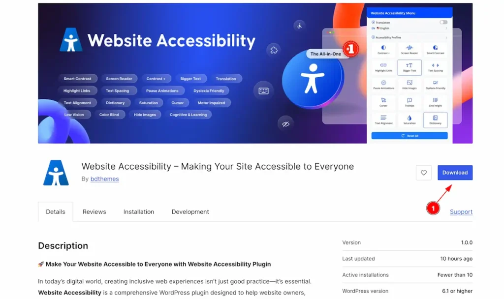
- Navigate to the WordPress.org or and Download the Website Accessibility Plugin.
Install and Activate Website Accessibility Plugin
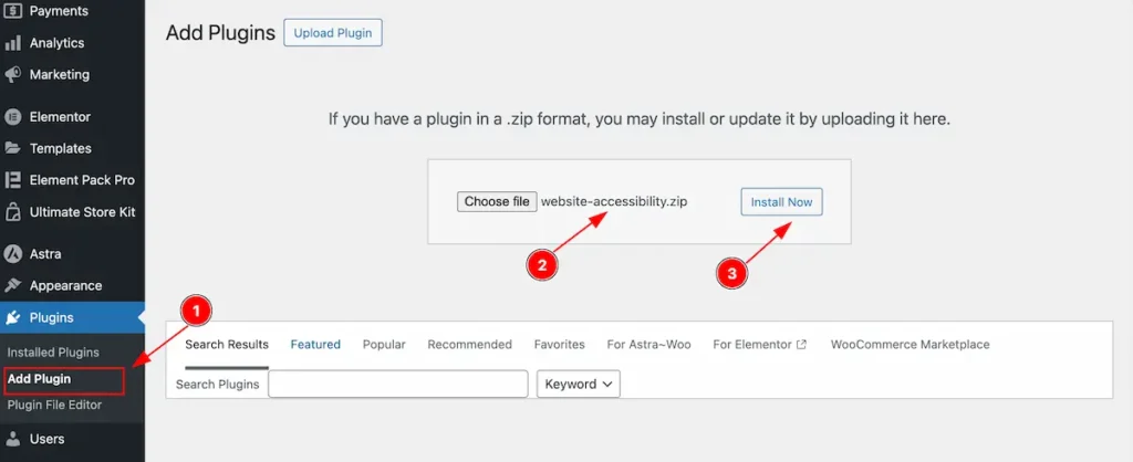
- Navigate to the Plugin Dashboard and Click on the ” Add Plugin ” section.
- Choose file from the local file and Select It.
- Click on the Install Now Button to install the Plugin.
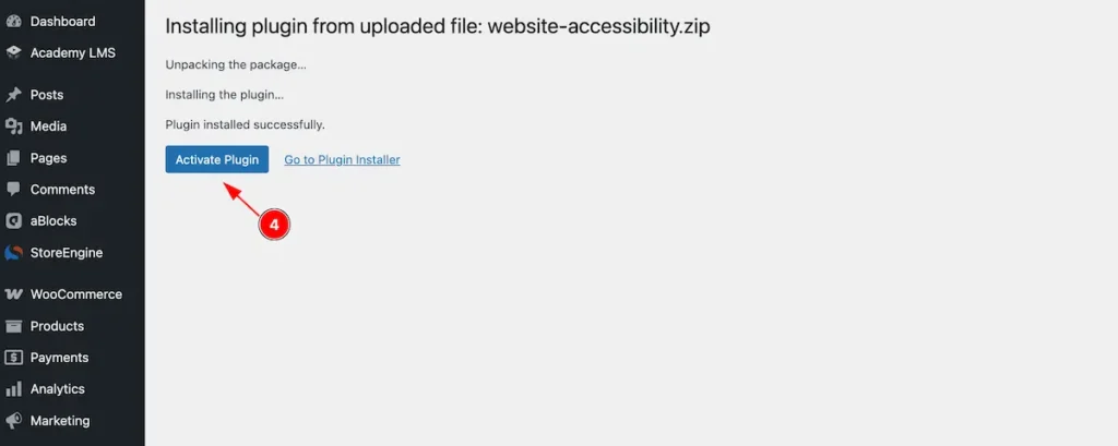
- After unzipping the plugin the “ Activate Plugin ” will appear Now click on it and it will activate.
Check Installed Plugin
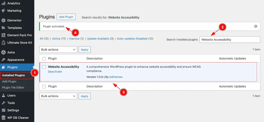
- Navigate to the Installed Plugins section.
- Search by the ” Website Accessibility ” plugin and it will appear.
- The Installed plugin appear activated.
- The Activation notification will appear here.
Website Accessibility Dashboard
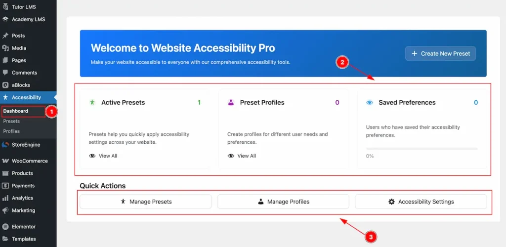
- Navigate to the Accessibility > Dashboard Tab. The accessibility dashboard will appear.
- The Controls will appear on the there.
- Active Presets: It will appear how many presets are available.
- Preset Profiles: The Profiles presets are created.
- Save Preferences: Status of how many preferences are saved.
- Quick Actions: This button for creating quickly action to Manage Presets, Manage Profile or Accessibility Settings.
Creating New Presets
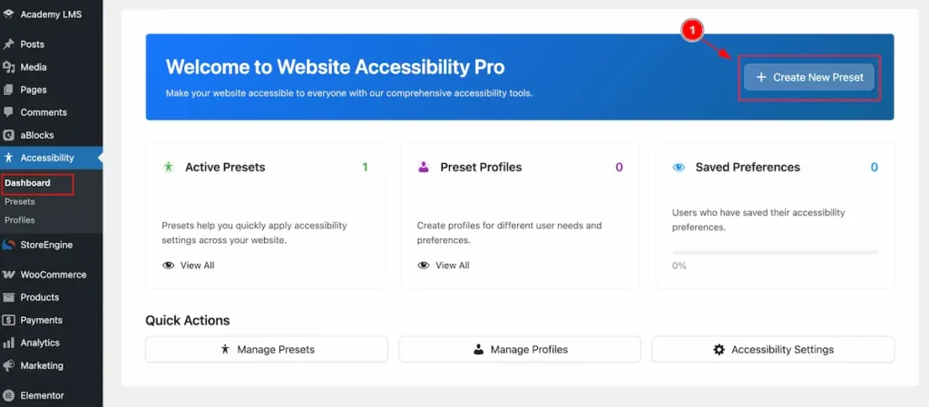
- Navigate to the Dashboard find the “ + Create New Preset ” button to create new Preset.
Getting Started
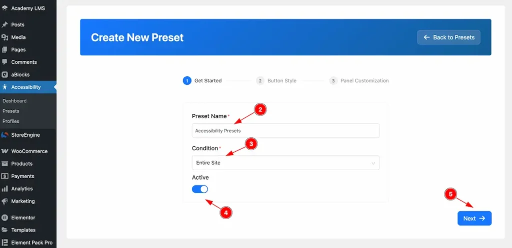
- Preset Name: Set the Name for the Preset. e.g.: Accessibility Presets.
- Condition: Set the condition for appearing the preset.
- Entire Site: It will display for entire website of the page.
- Singular: Set the singular page only.
- Archive: Appear the archive page Only.
- Active: Enable the switcher to Activate it.
- Click on the ” Next ” button to continue next page setup.
Button Style
Content
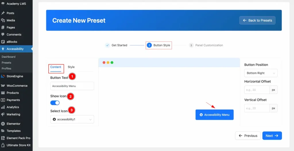
- Button Text: Set the text for the Button.
- Show Icon: Enable the Icon to demonstrate the Icon for the Button.
- Select Icon: Choose available Icon preset and select one.
Style
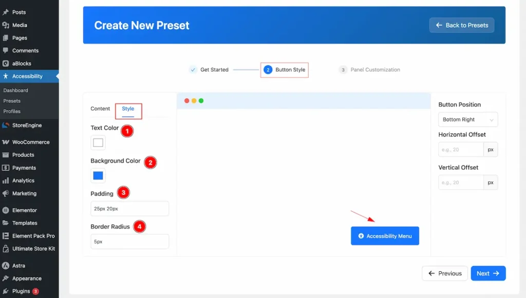
- Text Color: Set the Color for the Text of the button.
- Background Color: Set the Background Color for the Button.
- Padding: Set the padding for inner space of the Button.
- Border Radius: Set the Border Radius.
Set the Button Position
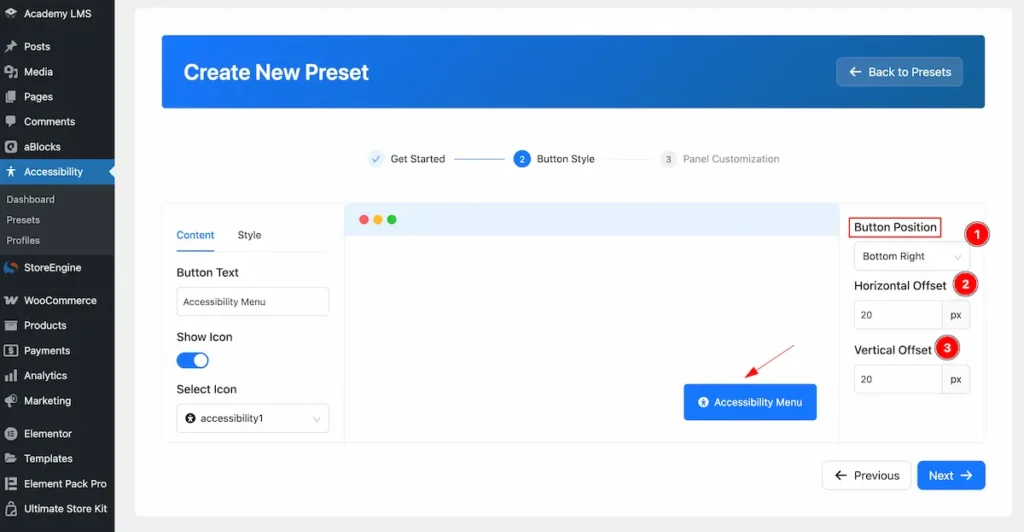
- Button Position: Set the position for the Button. e.g.: Bottom Right, Bottom Left, Top Left, Top Right.
- Horizontal Offset: Set the position from the Horizontal Offset.
- Vertical Offset: Set the position from the Vertical Offset.
Panel Customization
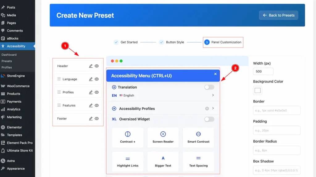
- Controls for Editing. Here appear the Header, Language, Profiles, Features and Footer.
- The Preview Box to demonstrate the changes.
Header
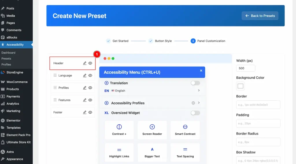
- Select the header and click on the Pen button and it will appear a top box there you will be able to Edit It.
Content
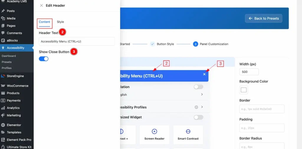
- Header Text: Set the Text for the Header.
- Show Close Button: Enable the switcher to demonstrate the Close button of it.
Style
Header
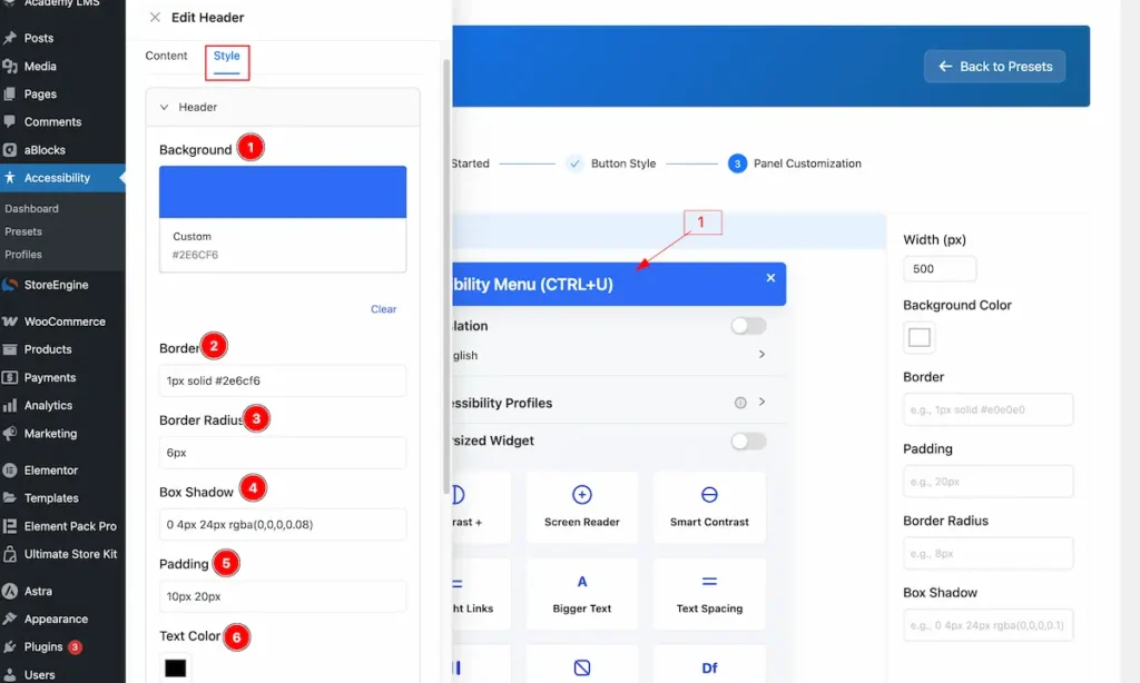
- Background: Set the backgroud color for the button.
- Border: Set the Border for the header section.
- Border Radius: Make the border radius.
- Box Shadow: Set a shadow for the box.
- Padding: Set the padding.
- Text Color: Choose the Text Clolor.
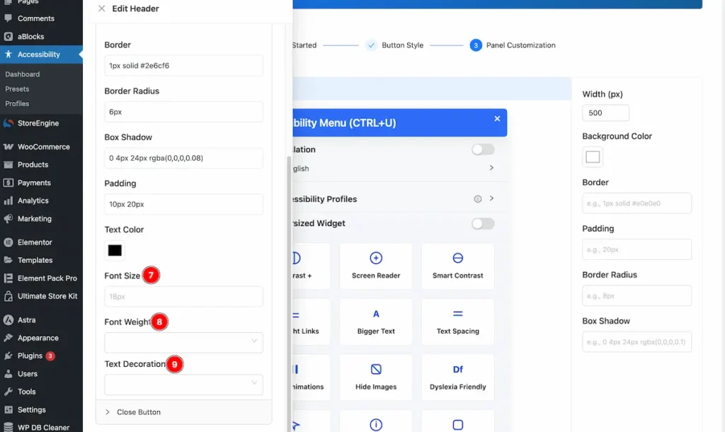
- Font Size: Set the size for the Font. e.g.: 16px.
- Font Weight: Set the weight for the Font. e.g.: Bold.
- Text Decoration: Set the decoration for the Font. e.g: Underline.
Close Button
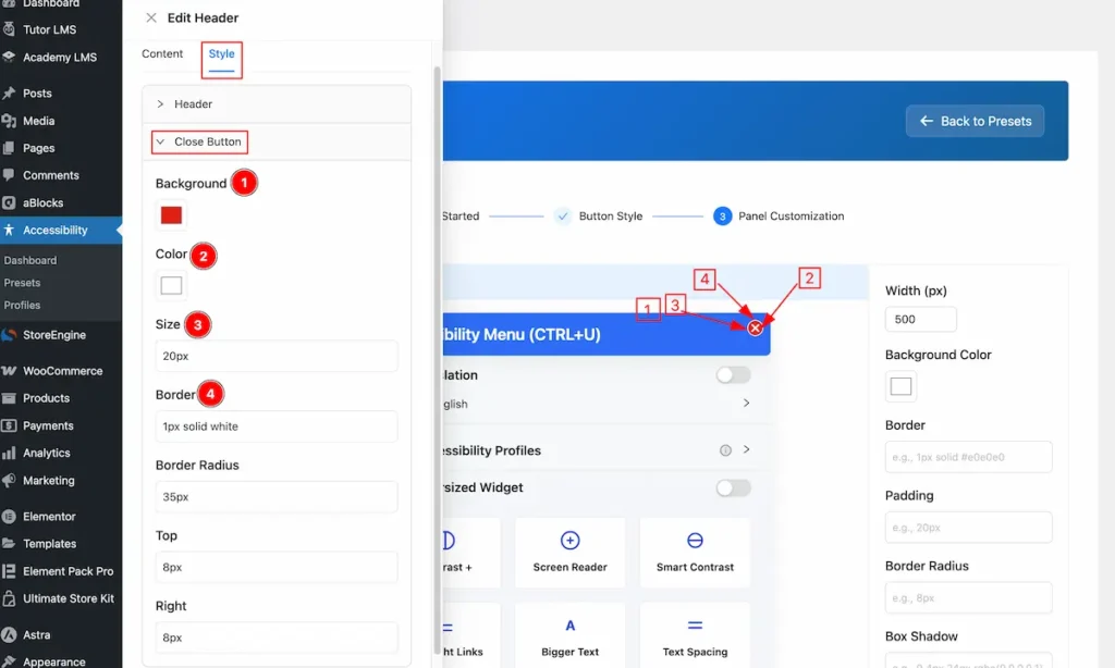
- Background: Set the background for the Close Button.
- Color: Set the color of the Close Icon.
- Size: Set the size for this.
- Border: Make the border radius for the cross button.
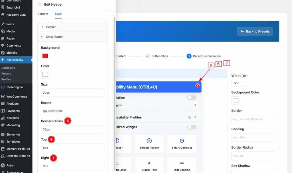
- Border Radius: Set the border radius for the Button.
- Top: Set the top position of the Button.
- Right: Set the right position of the Button.
Language
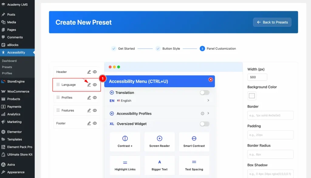
- Select the ” Language ” and click on the Edit icon.
General
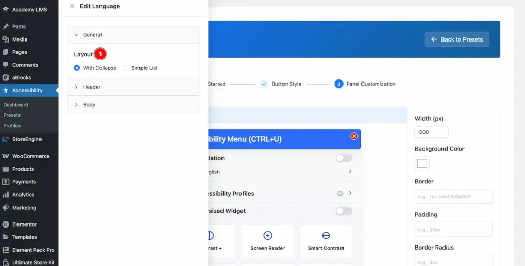
- Layout: Select the Layout for the language. With Collapse It will appear the list with collapse format.
- Layout: Simple List is to demonstrate the language code with simple list.
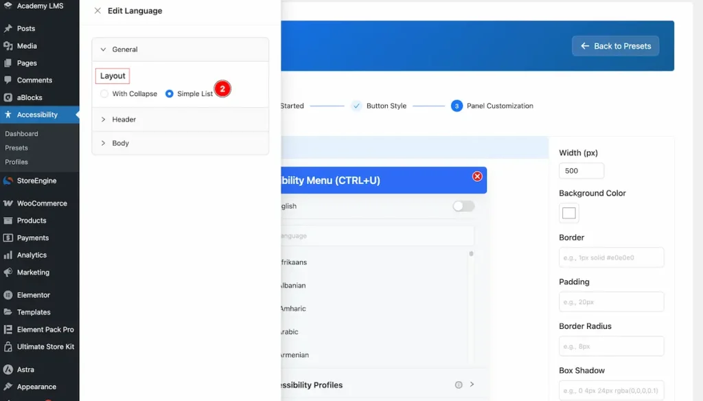
- List View of the language list appear.
Profile

- Profile: Select the Profile and click on the Edit Button.
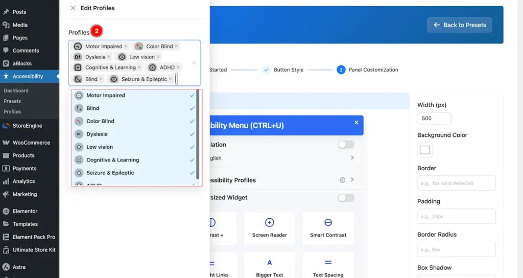
- Profile Items: Several profiles items are available. Select from the list.
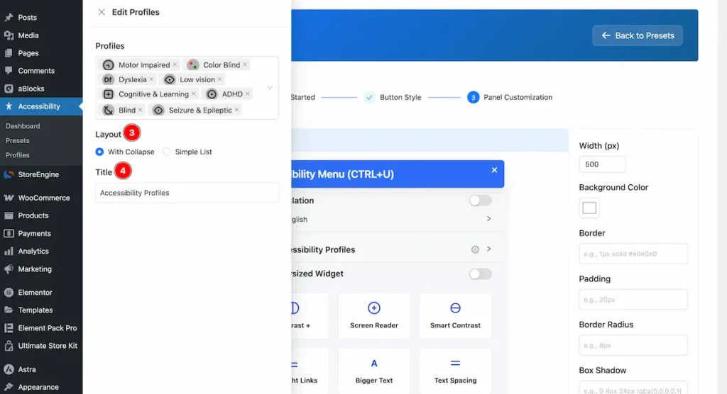
- Layout: Choose the layout for appearing the profiles. With Collapse or Simple List you can choose any of them.
- Title: Choose the Title for the accessibility.
Features
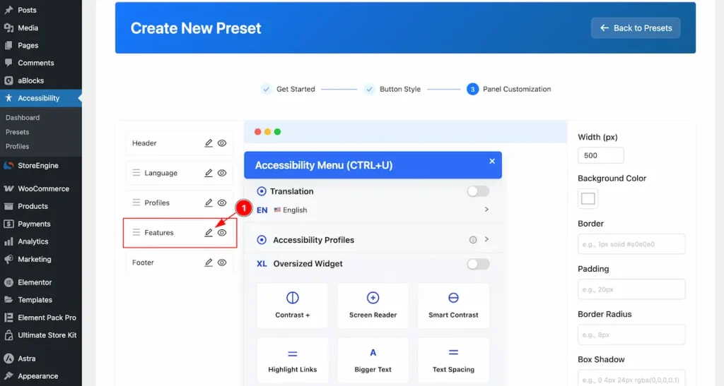
- Features: Choose the feature for the accessibility.
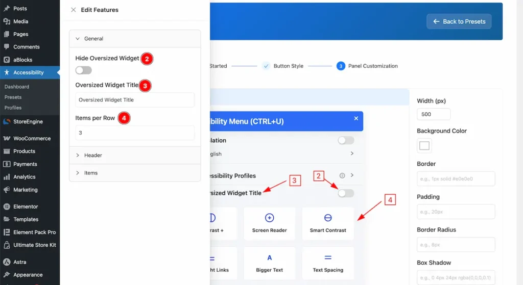
- Hide Oversized Widget: To demonstrate the Oversized widget use the Toggle switcher.
- Oversized Widget Title: Set the title for the Oversized widget.
- Items per Row: Set the number of Row to demonstrate the Items.
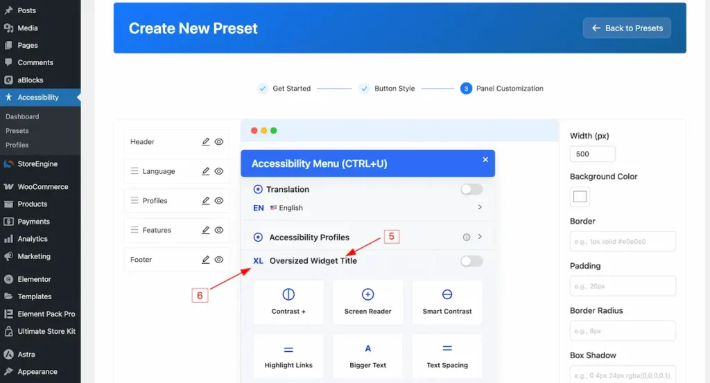
- Title appear on the Oversized.
- Icon appear on the profile section.
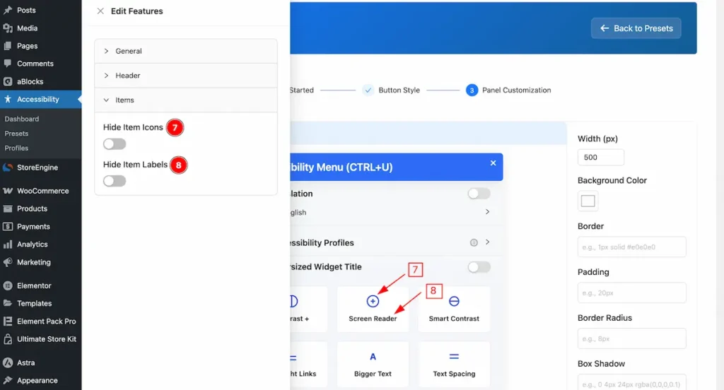
- Hide Item Icons: To hide the item to show the Icon on the Features.
- Hide Item Labels: To hide the item label on the Features.
Footer
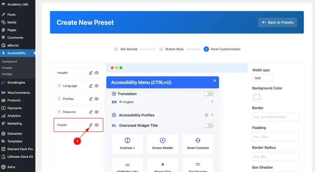
- Footer: Click on the footer section where you can customize and add style the footer.
Content
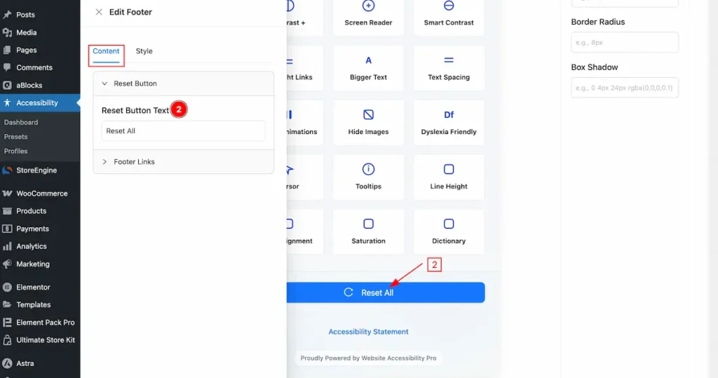
- Reset Button Text: Set the text for the reset button.
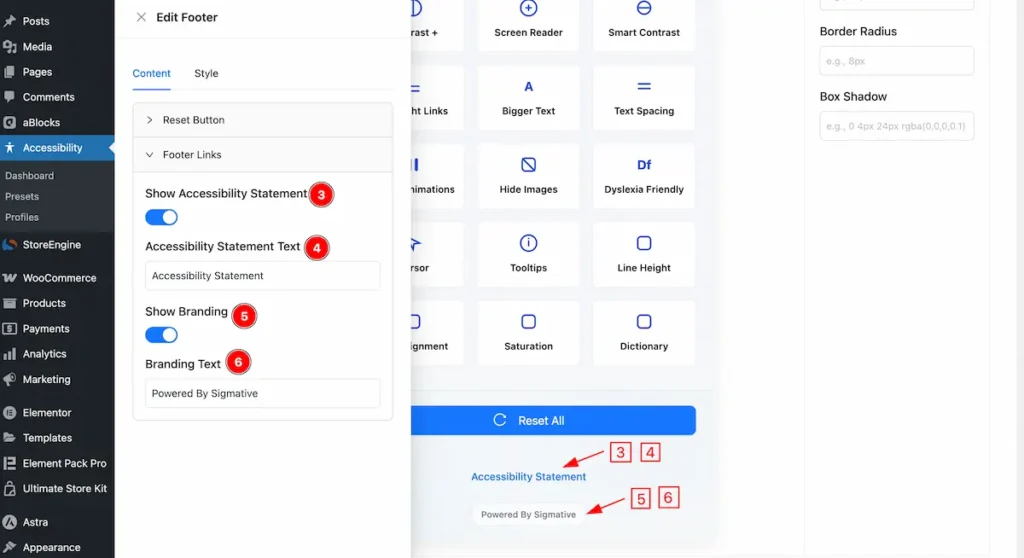
- Show Accessibility Statement: Enable the switcher to show the accessibility statement.
- Accessibility Statement Text: Set the Text for the accessibility statement.
- Show Branding: Enable the it to demonstrate the Branding.
- Branding Text: Set the Text for the branding.
Style
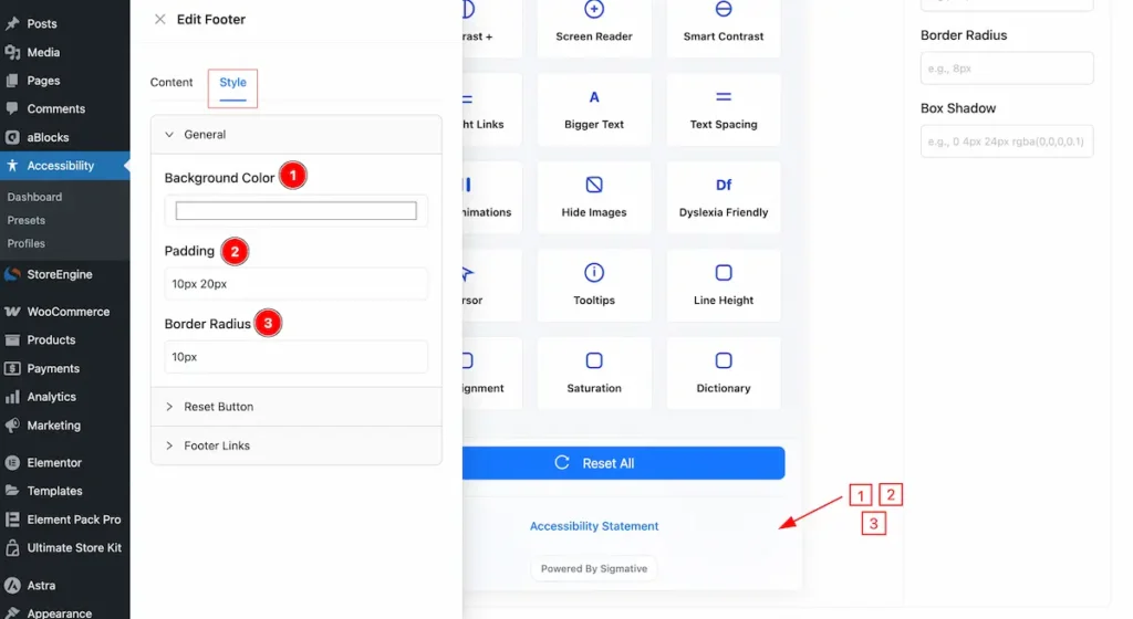
- Background Color: Set the background color for the footer section.
- Padding: Set the spacing for the inner spacing.
- Border Radius: Make the border radius.
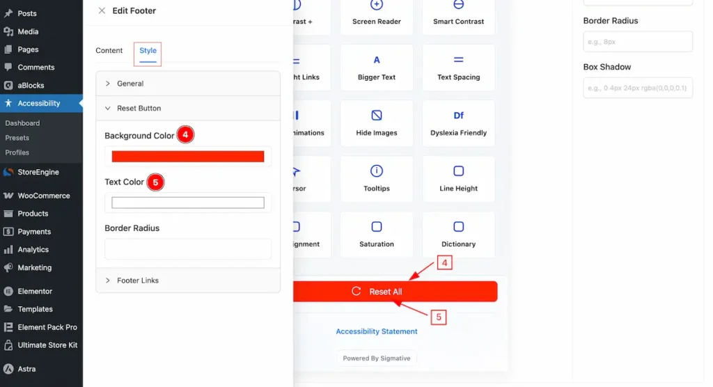
- Background Color: Se the color for the Background.
- Text Color: Set the color for the Text.
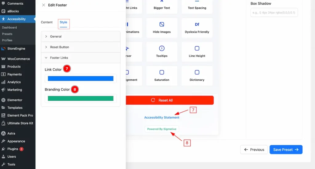
- Link Color: Set the color for the Link.
- Branding Color: Set the color for the Branding text.
Create Profiles
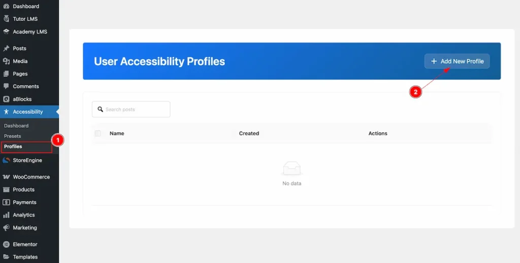
- Navigate to the Accessibility > Profiles and find the ” + Add New Profile ” button to create new profile.
Profile Informations
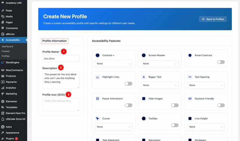
- Profile name: Set the name for the Profile.
- Description: Set the description of the profile you want to set.
- Profile Icon (SVG): You can add the SVG to set the profile icon.
Accessibility Features
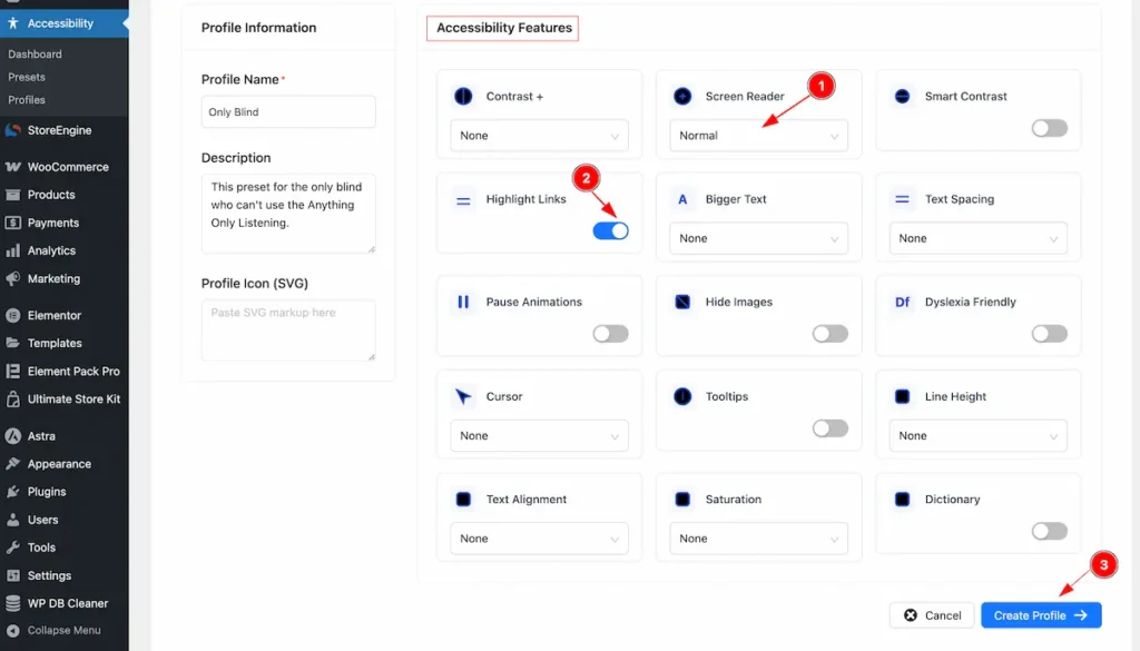
- Choose the Screen Reader to read the screen.
- Enable the switcher of the Highlight Links to set the links highlight.
- Click on the ” Create Profile ” button to complete the creating the profile.
Check the Complete Profile
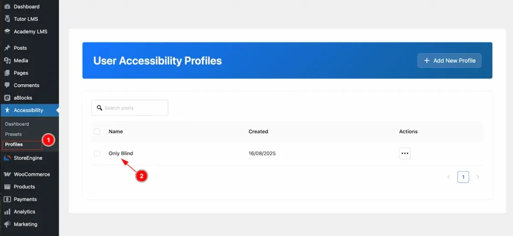
- Navigate to the Profile tab from the WordPress Dashboard.
- The Profile appear on there. How many profiles are created.
Accessibility Widgets Info
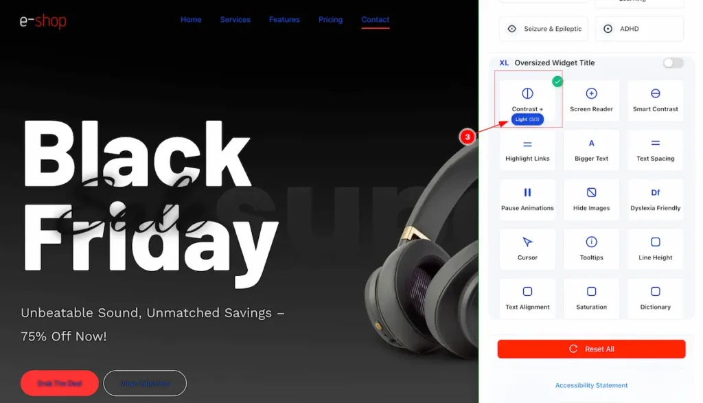
Contrast
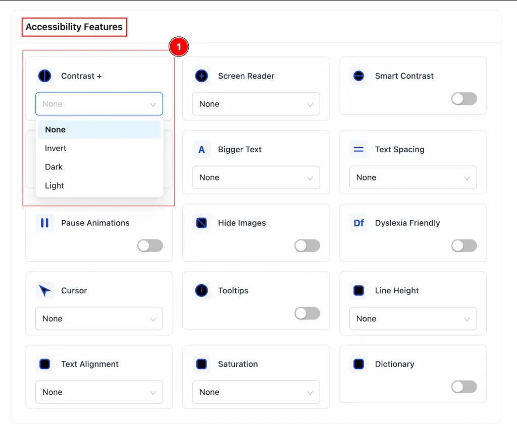
- Contrast +: The difference in brightness and color between the text (or important elements) and the background.
- None → Default color style.
- Invert → Swap each color with its opposite on the color wheel.
- Dark → Dark text on a light background (high contrast).
- Light → Light gray text on a white background (low contrast).
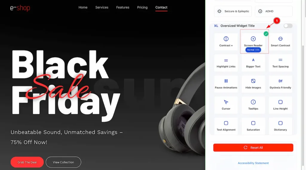
Screen Reader
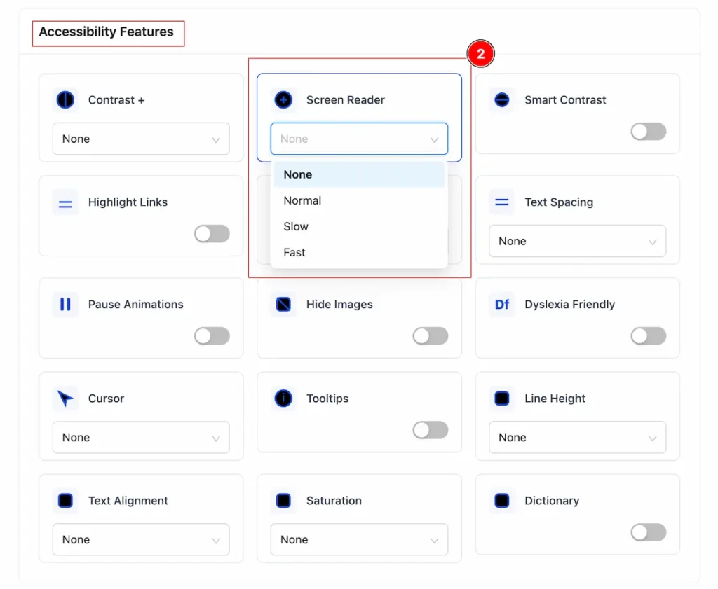
- Screen Reader: A screen reader’s function in accessibility is to make digital content usable for people who are blind or visually impaired. Translate visual content into audio or braille, ensuring everyone can access and interact with digital content.
- None → Screen reader is off.
- Normal → Reads content at normal speed.
- Slow → Reads content slowly.
- Fast → Reads content quickly.
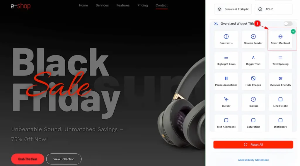
Smart Contrast
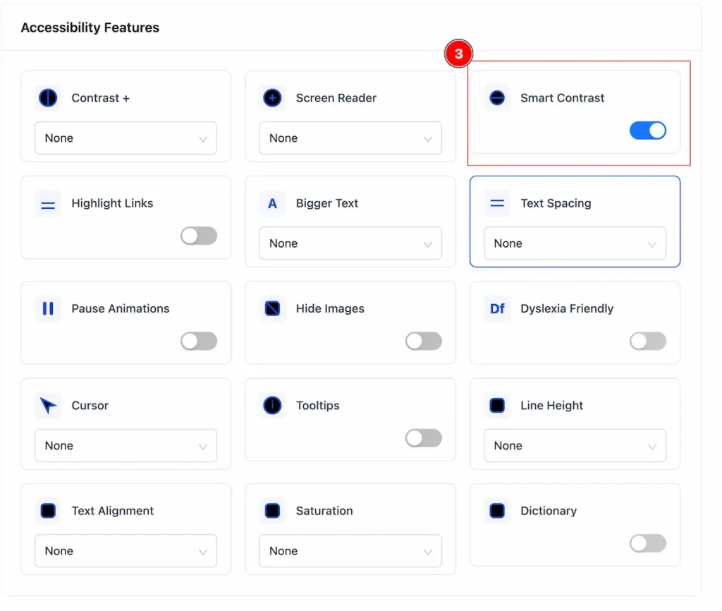
- Smart Contrast : It automatically adjusting or checking the color contrast between text and its background to ensure it meets accessibility standards. Enable the switcher to use this feature.
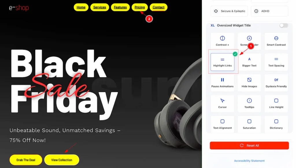
Highlight Links
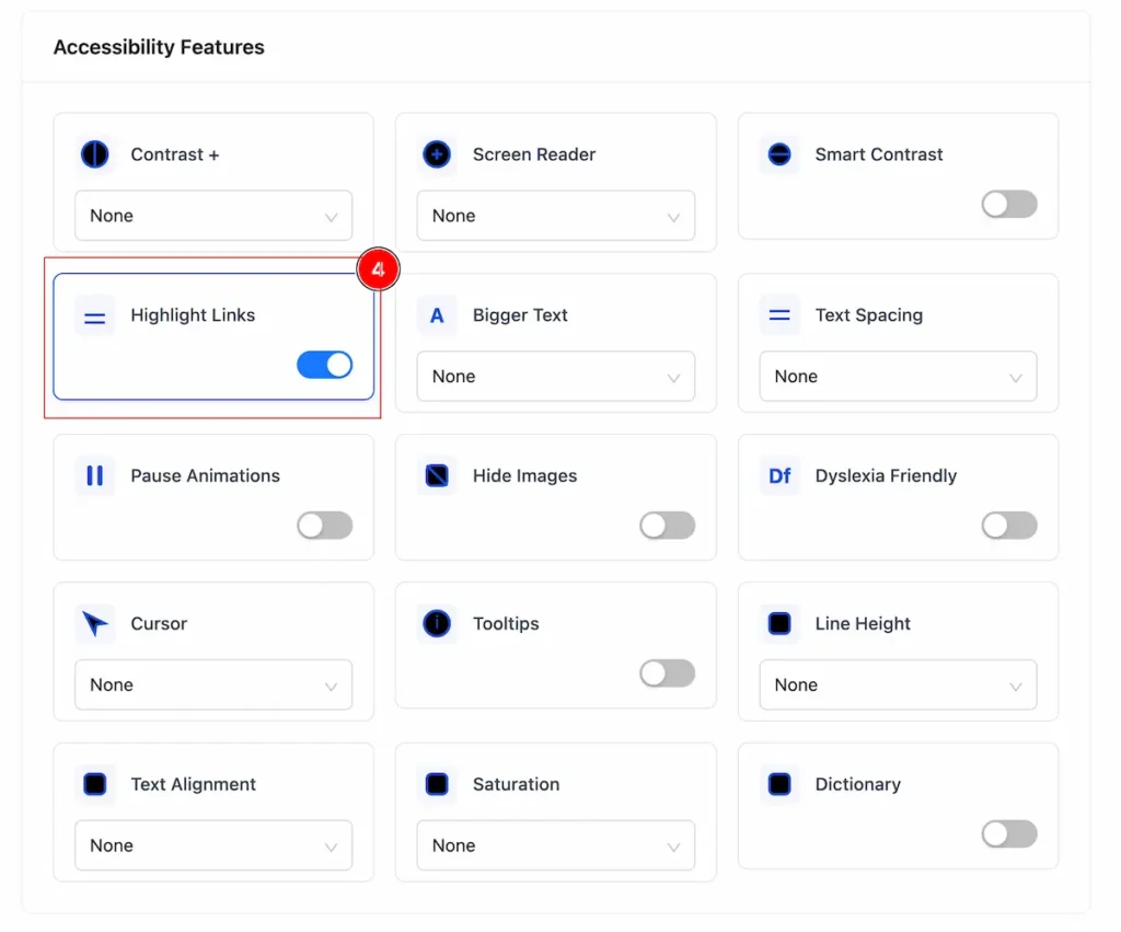
- Highlight links: It makes website links stand out clearly from regular text so users can easily notice and interact with them. Turn on the switcher to get benefit of it.
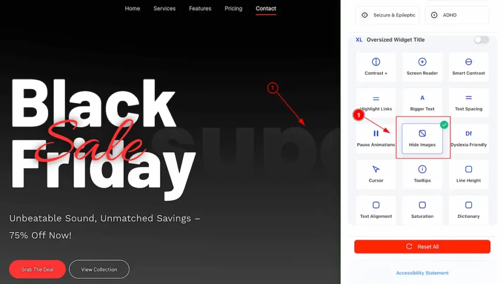
Hide Images
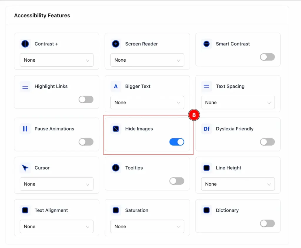
- Hide Images: It will hide all the images from the Page.
Bigger Text
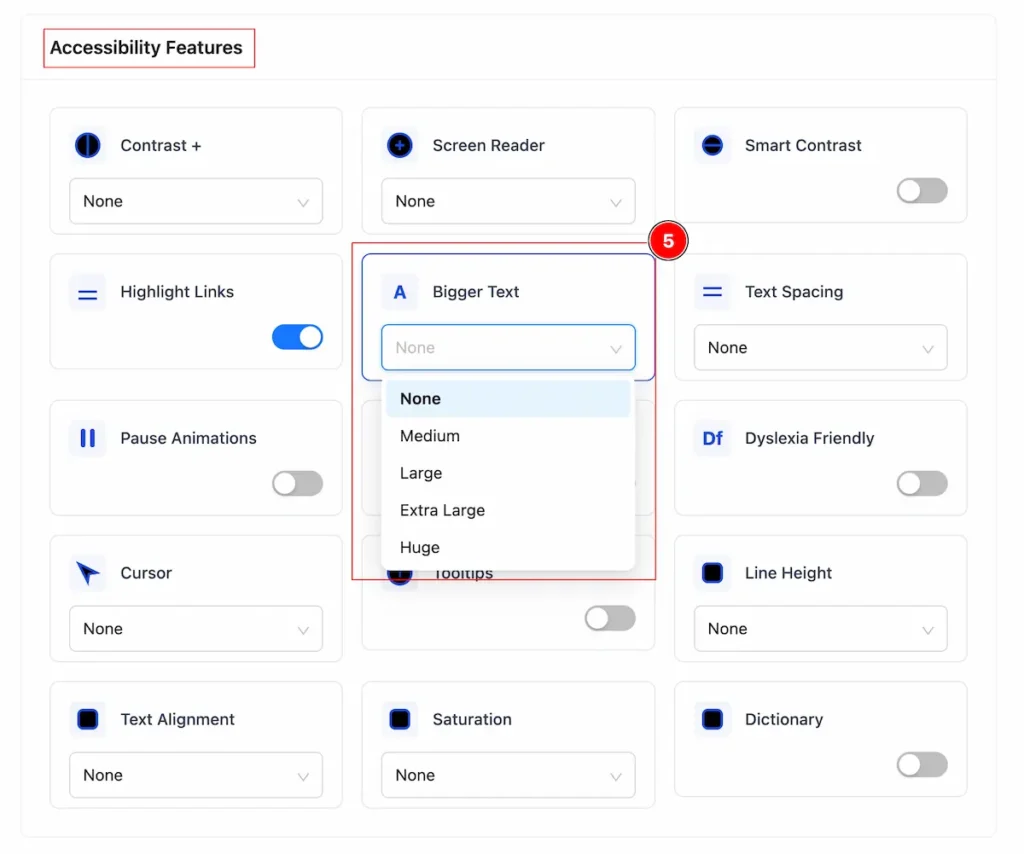
- Bigger Text: Increases the font size to make reading easier, especially for people with low vision or reading difficulties.
- None → Default text size
- Medium → Slightly larger than default
- Large → Bigger than Medium
- Extra Large → Bigger than Large
- Huge → Biggest size available
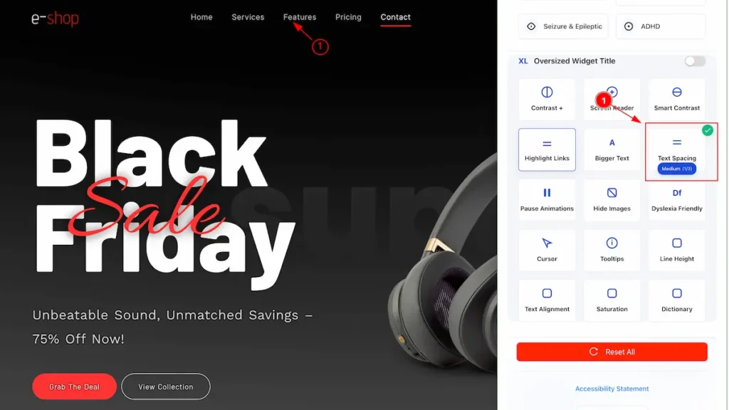
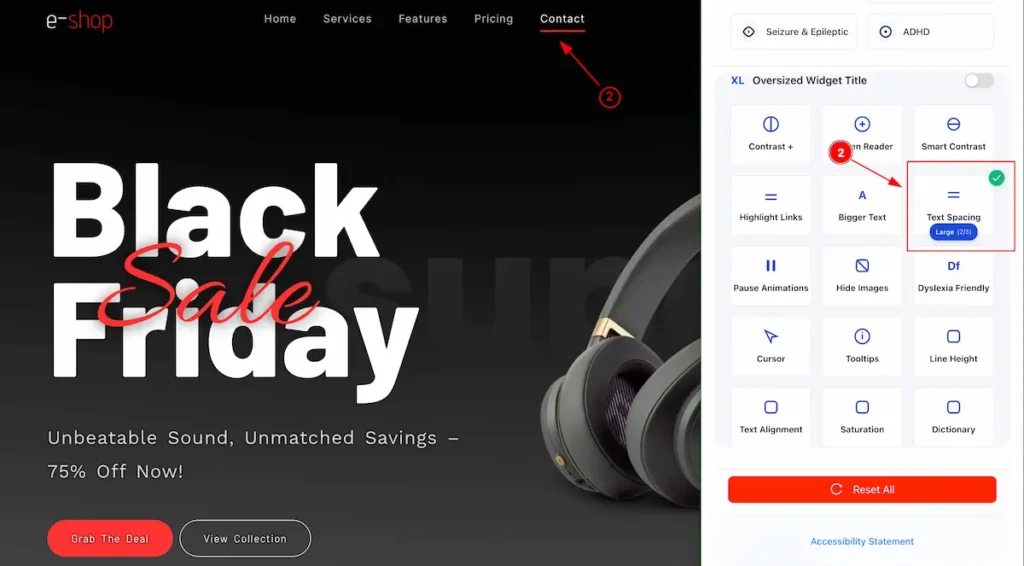
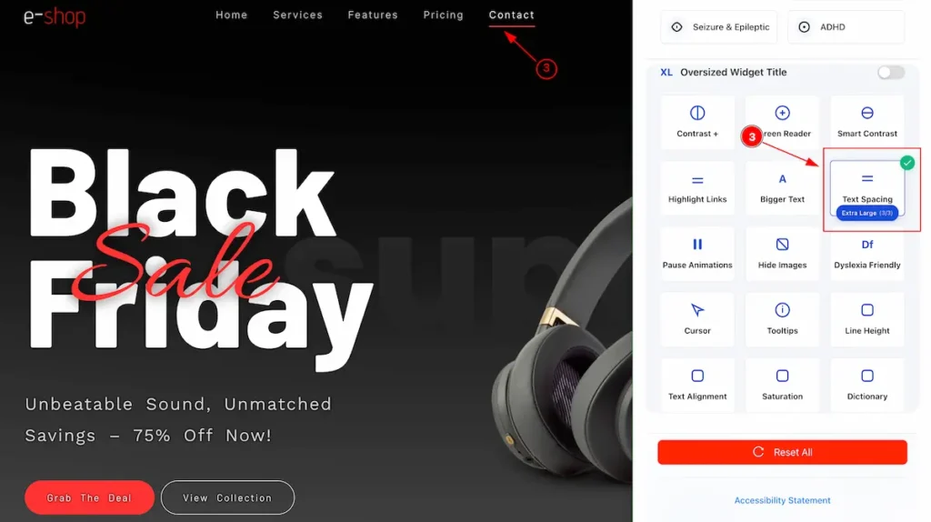
Text Spacing
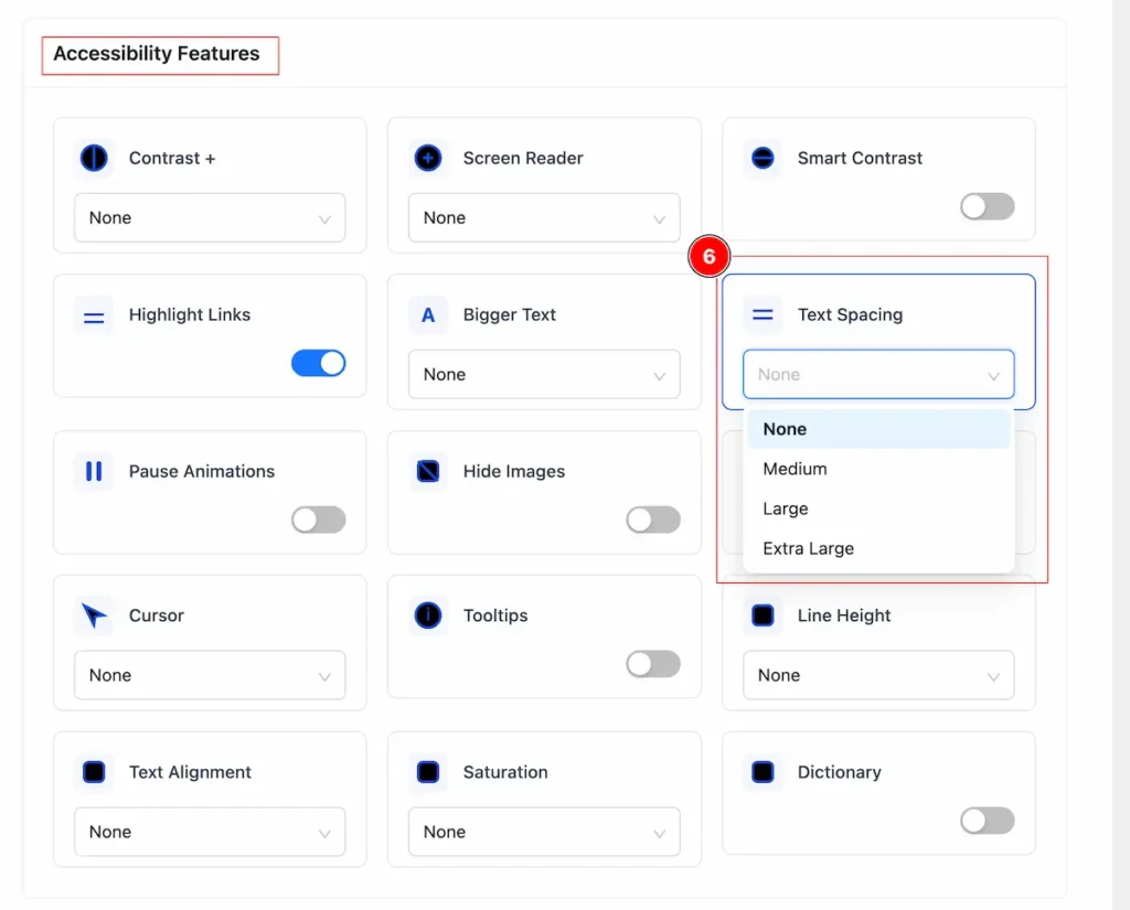
- Text spacing: Adjusts the space between letters, words, and lines to make reading easier. Increasing spacing can help people with dyslexia or visual impairments read more comfortably.
- Default – Set the normal spacing.
- Medium – Slightly increase spacing.
- Large – Noticeably wider spacing.
- XL – More than Large.
- Huge – Maximum spacing.
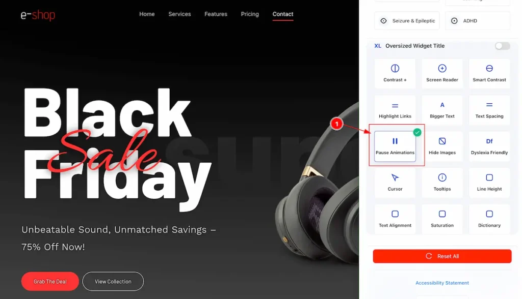
Pause Animation
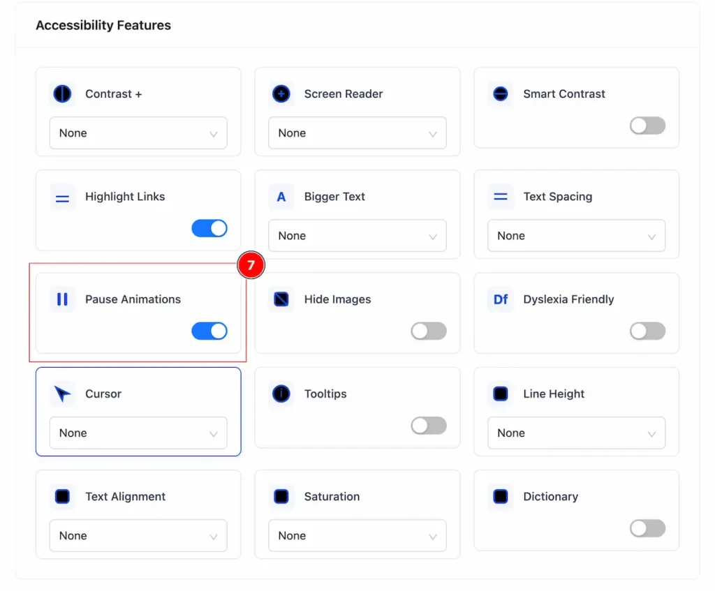
- Pause Animations: Allows users to stop or disable moving or flashing content on a website, helping those with motion sensitivity, vestibular disorders, or distractions to read more comfortably.
Hide Images

- Hide Images: Lets users remove or hide visual content on a website, making it easier to focus on text, reduce distractions, or improve accessibility for screen readers.
Dyslexia Friendly
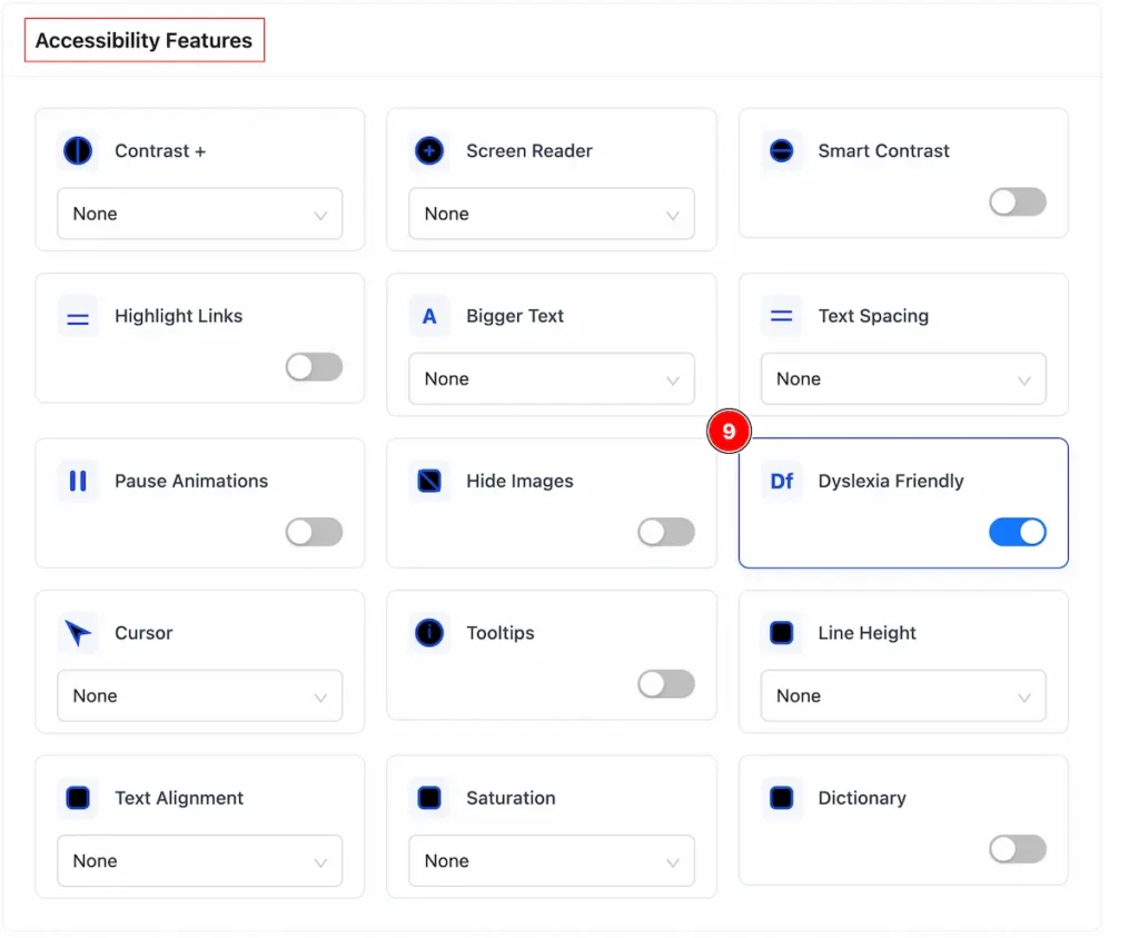
- Dyslexia Friendly: Designing text and content so people with dyslexia can read more easily — using clear fonts (sans-serif), good spacing, simple language, high contrast, and avoiding long blocks of text.
Cursor
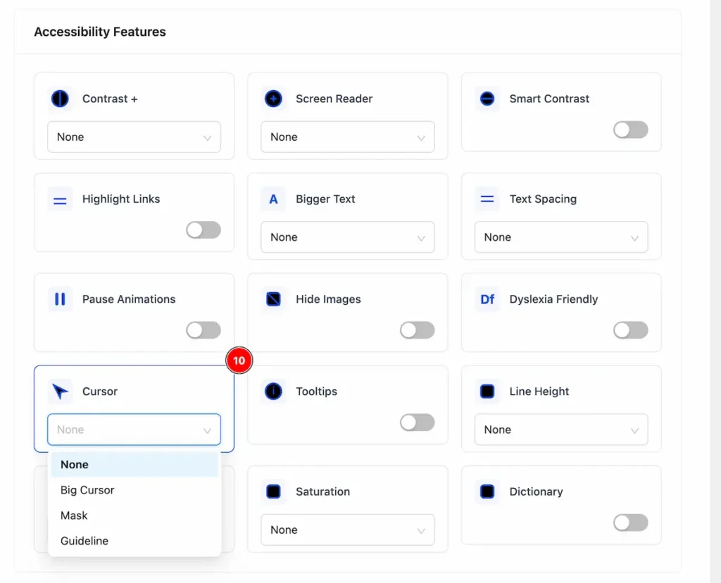
- Cursor: A visible and adjustable cursor helps users with low vision or motor difficulties navigate more easily.
- None → Standard cursor, no special modifications.
- Big Cursor → Enlarged cursor to make it easier to see for users with low vision.
- Mask → Adds a visual overlay or highlight around the cursor to improve focus.
- Guideline → Shows lines or guides extending from the cursor to help track its position across the screen.
Tooltips
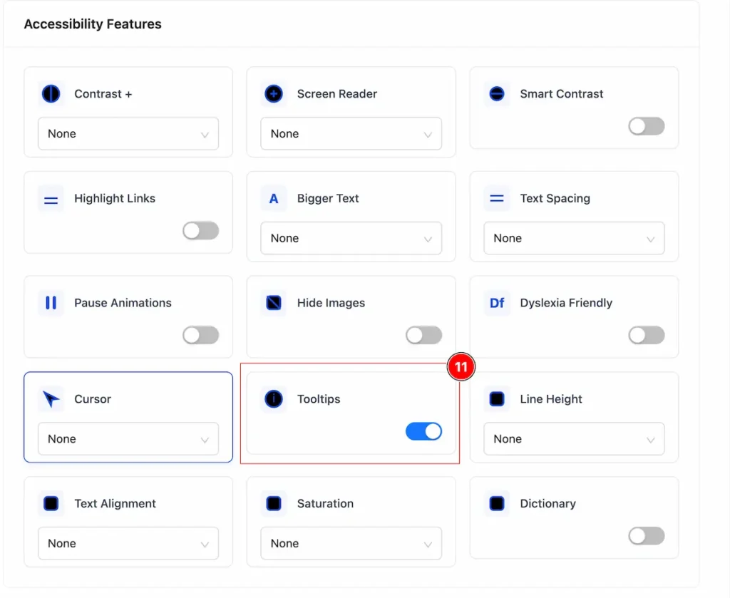
- Tooltips: Help users understand buttons, icons, or links, especially for those using screen readers or unfamiliar with the interface.
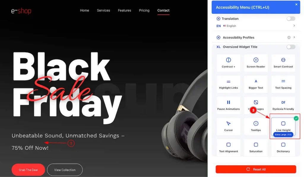
Line Height
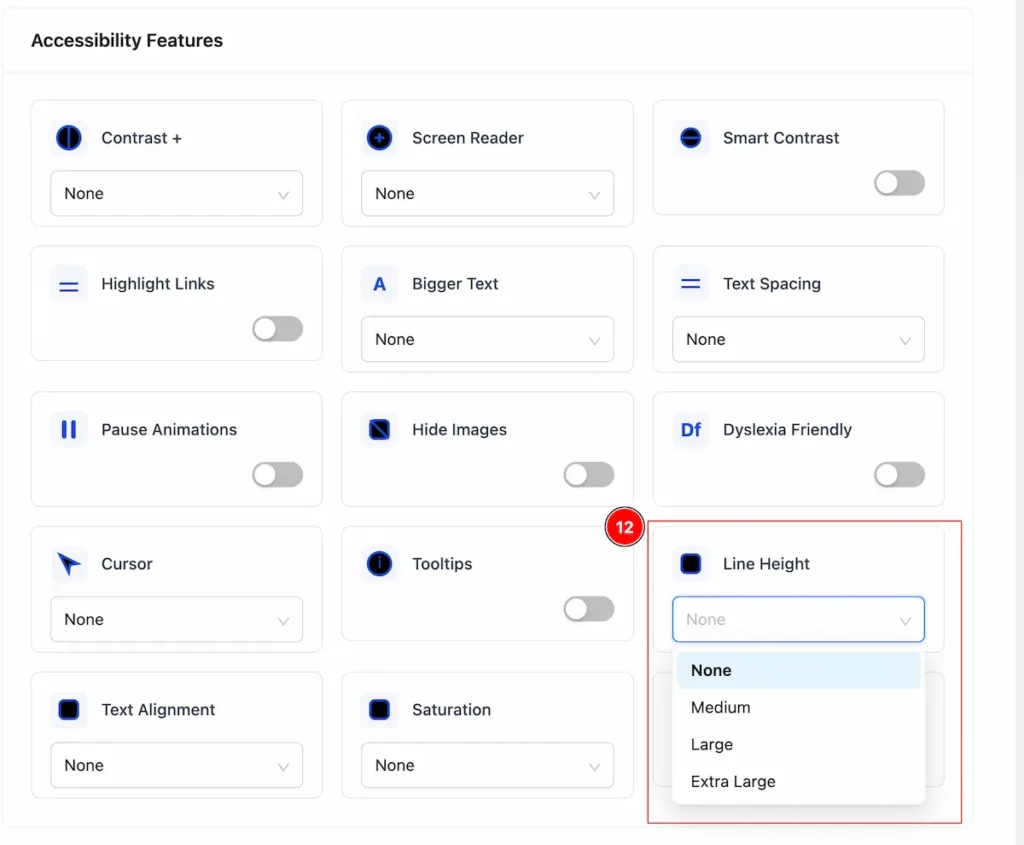
- Line Height: Vertical space between lines of text. Increasing line height improves readability, reduces eye strain, and helps people with visual or reading difficulties follow text more easily.
- None → Normal spacing, standard size.
- Medium → Slightly bigger or more spaced than default.
- Large → Noticeably bigger or more spaced.
- Extra Large (XL) → Maximum or very wide spacing/size for easier reading.
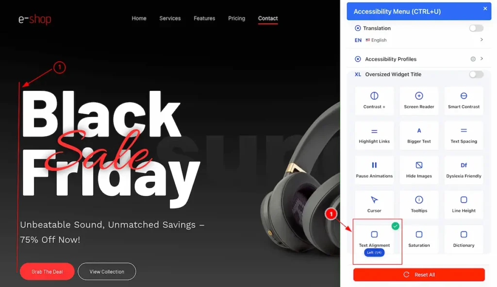
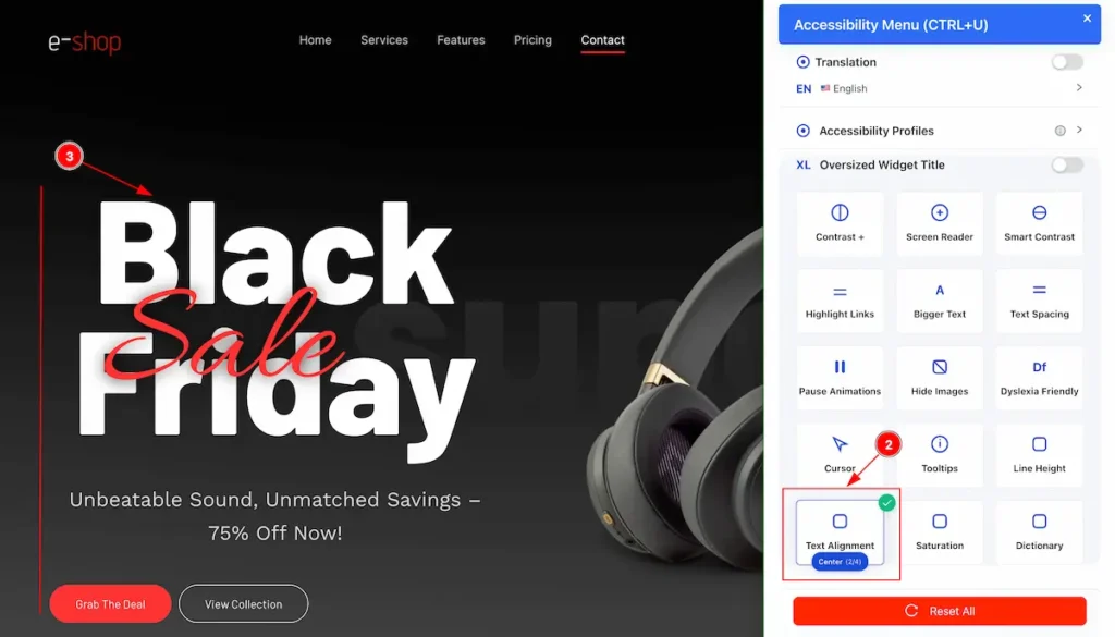
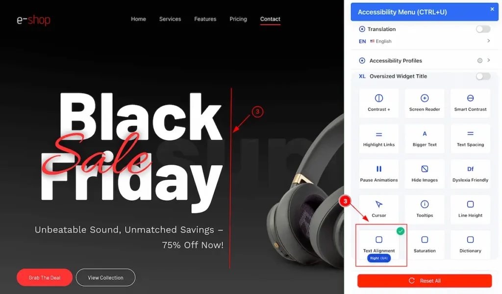
Text Alignment
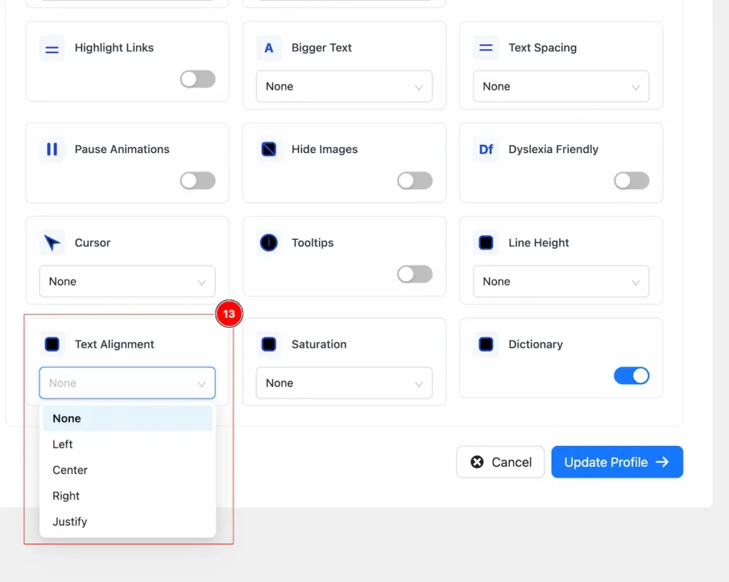
- Text Alignment: Controls how text lines up horizontally in a block of content, improving readability and layout.
- None → Uses the default alignment of the site.
- Left → Aligns text to the left edge.
- Center → Centers text horizontally.
- Right → Aligns text to the right edge.
- Justify → Aligns text evenly along both left and right edges.
Saturation
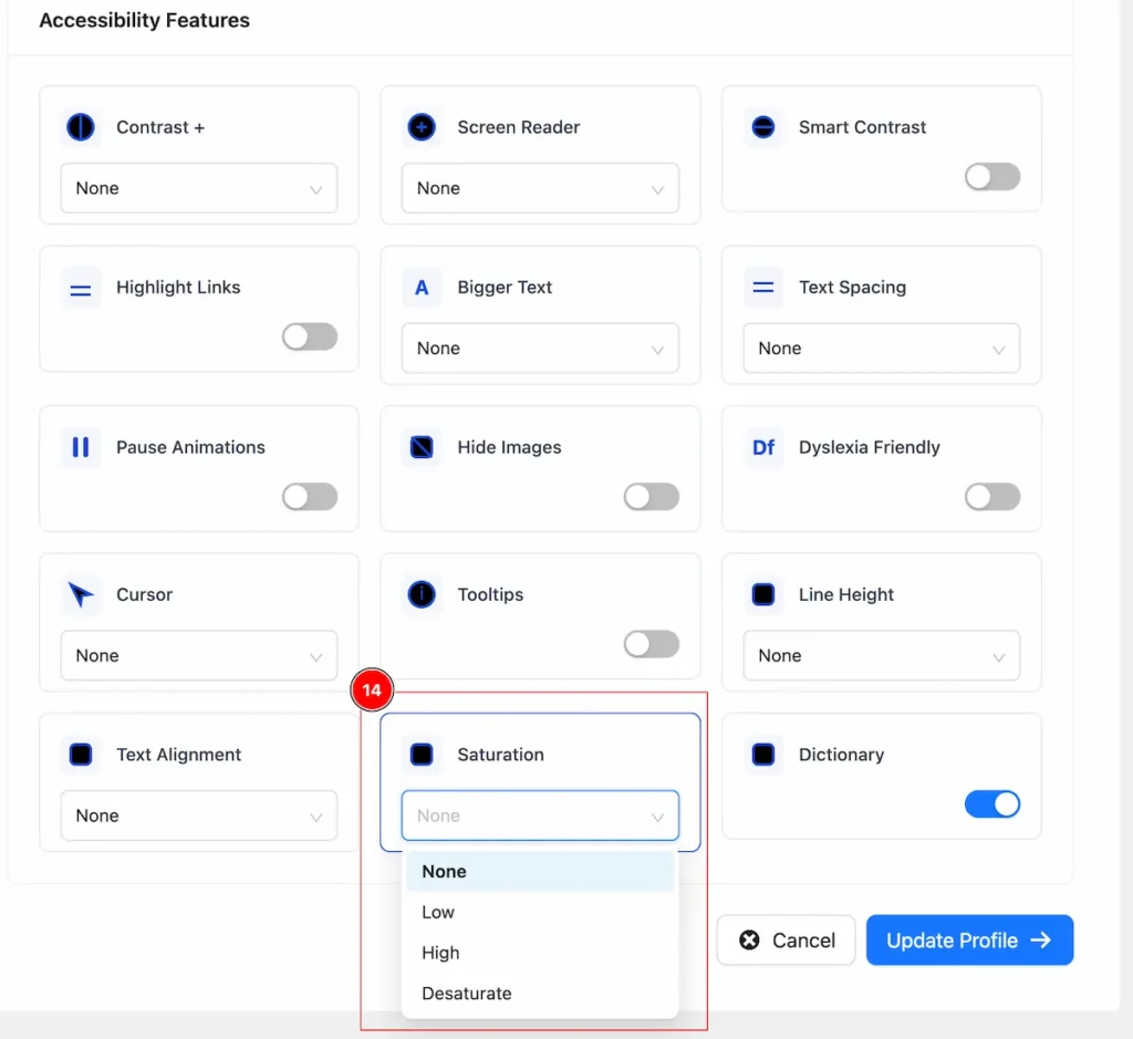
- Saturation: Controls the intensity of colors in images or elements. Adjusting it can help users with visual impairments or color sensitivity read content more comfortably.
- None → Normal colors.
- Low → Colors are muted, less intense.
- High → Colors are more vivid and intense.
- Saturate → Maximum color intensity.
Dictonary
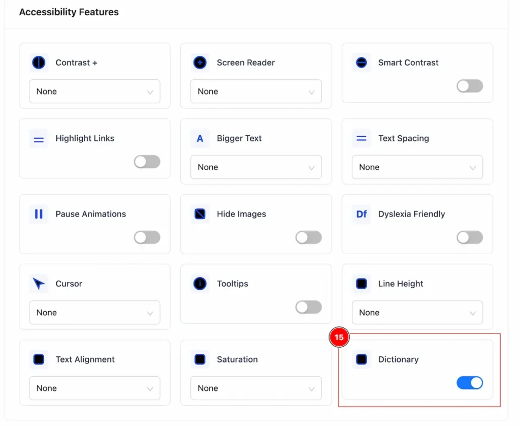
- Dictionary: Built-in dictionaries or dictionary tools help users understand unfamiliar words without leaving the page.
Check on the Website Page
After completing setup all the settings and preferences now navigate to the page and check it.
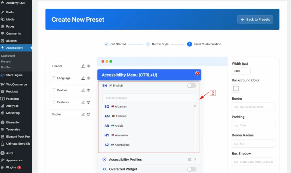
Accessibility Button and Menu Intro
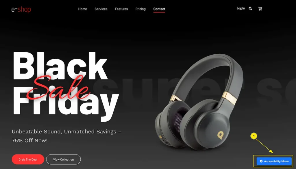
- Find the Accessibility Button with any Corner of the Webpage. e.g: Bottom Right. Click on the Button and it will appear a complete menu.
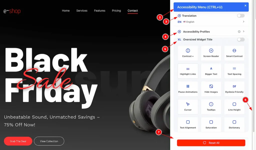
- The Menu name appear on the header ” Accessibility Menu ( CTRL + U ) “.
- Translation: To control the translation function click here. Default translate page is English.
- Accessibility Profiles: The profile controls appear here.
- Oversized Widget Title: All the widget appear here and click on it to view changes.
- To scroll down click on the scrollbar on the right.
- Reset All: Click on the reset button to reset the changes.
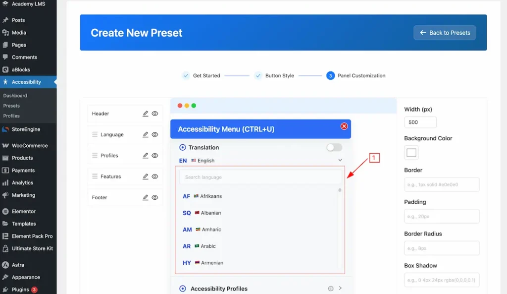
Translation
For translating the page this feature is available.
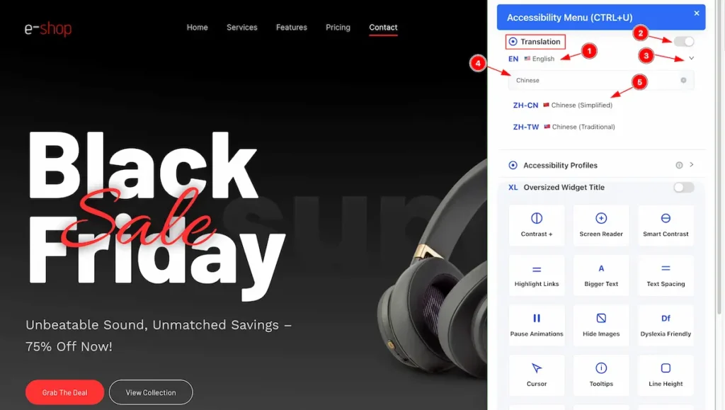
- The default Translate name appear. e.g.: English.
- Turn on the switcher to work with the Translator.
- Open the toggle option click on the Carrot Icon.
- Search by any name to translate and it will appear the result. e.g.: Chinese
- Now select the searched language to translate the webpage.
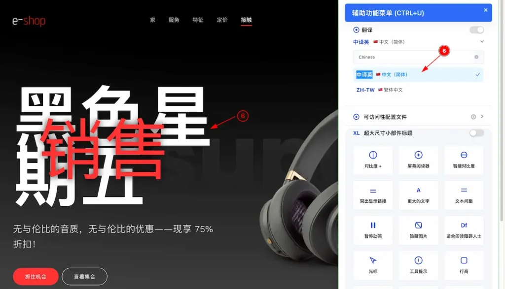
- After selecting the language it will appear the whole webpage into the selected language.
Accessibility Profiles
All the preset profiles and created profiles appear here.
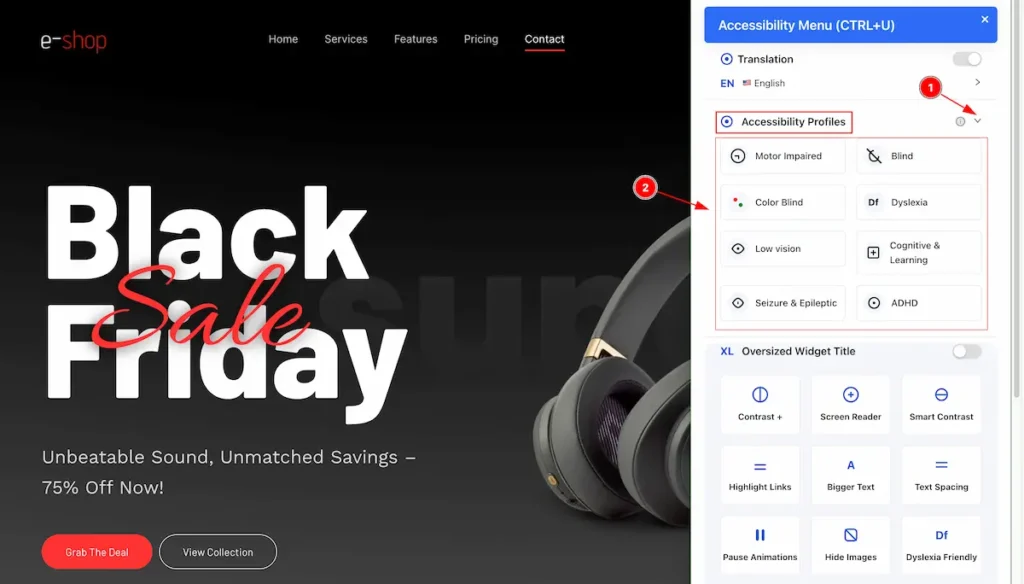
- Click on the ” carrot ” icon and it will toggle and open up all the profiles.
- The preset profiles appears.e.g.: Motor Impaired, Blind, Color Blind.
Motor Impaired
Motor impaired accessibility means making websites easy to use for people who have difficulty moving their hands or using a mouse.
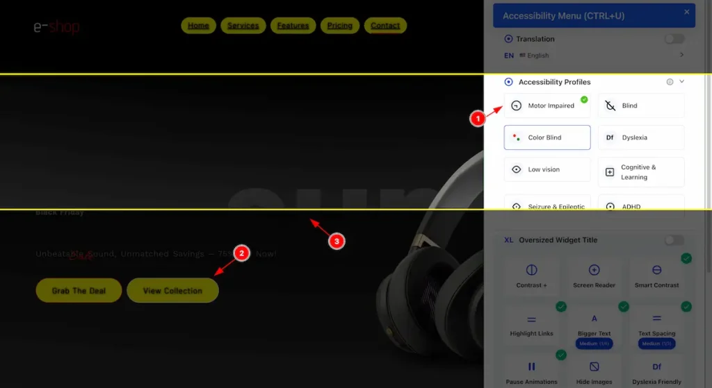
- Select “Motor Impaired,” it activates, shows a checkmark in the top corner, and applies the changes.
- The button have beed highlighted.
- The mark area appear while cursor move.
Blind
Accessibility features for users who cannot see, using screen readers or audio guidance.
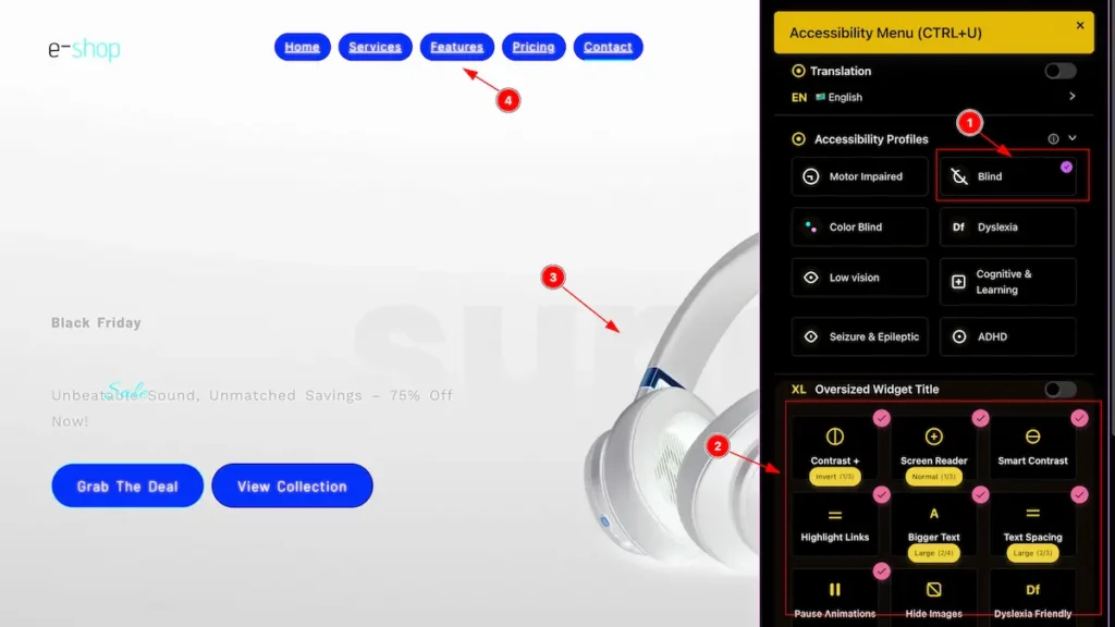
- When you select “Blind” it activates, shows a checkmark in the top corner, and applies the changes.
- The widget all also activate according to the blind preferences. e.g.: Contrast , Screen Reader, Smart Contrast. etc.
- The appear to the inverted.
- The menu area highlighted for reading.
Color Blind
Accessibility support for users who have difficulty distinguishing certain colors, using patterns, contrast, or labels.
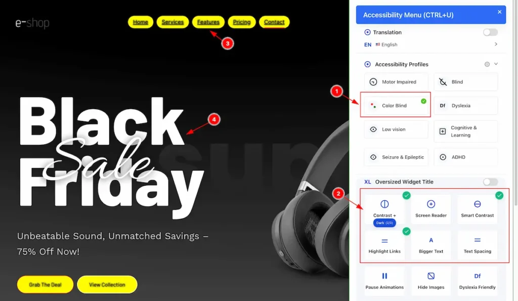
- When you select “ Color Blind” it activates, shows a checkmark in the top corner, and applies the changes.
- The widget all also activate according to the blind preferences. e.g.: Contrast , Smart Contrast, and Highlight Links etc.
- The heading appear to Highlight and Contrast.
- The heading text appear with smart contrast.
Dyslexia
Accessibility support for users with reading difficulties, using clear fonts, spacing, and text-to-speech options.
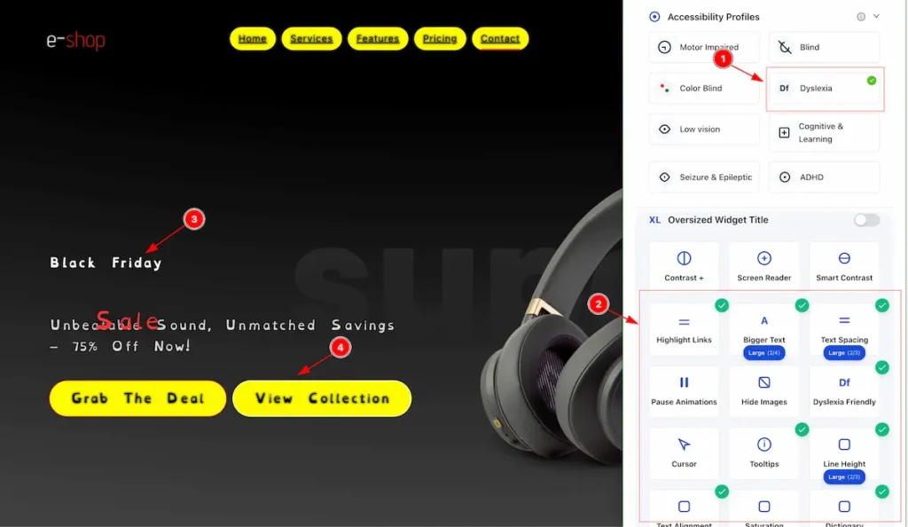
- When you select “ Dyslexia ” it activates, shows a checkmark in the top corner, and applies the changes.
- The widget all also activate according to the blind preferences. e.g.: Highlight Links, Bigger Text, Text Spacing, Dyslexia Friendly, Tooltips, Line Height etc.
- The Text appear dyslexia friendly.
- The button appear to highlight.
Low Vision
Accessibility support with zoom, high contrast, and screen reader compatibility for easier viewing.
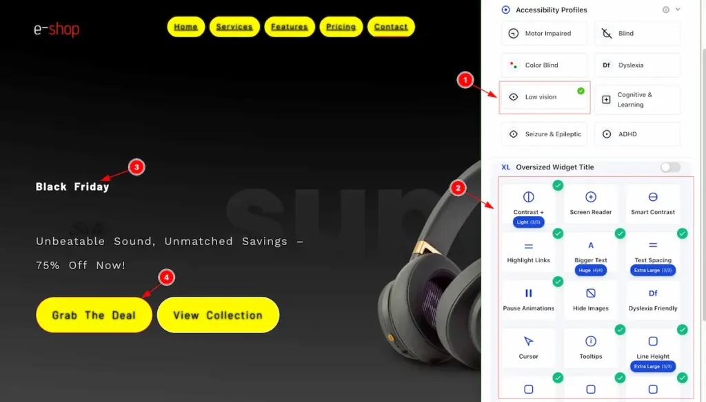
- When you select “ Dyslexia ” it activates, shows a checkmark in the top corner, and applies the changes.
- The widget all also activate according to the blind preferences. e.g.: Contrast, Highlight Links, Bigger Text, Text Spacing, Pause Animations, Tooltips, Line Height etc.
- The Text appear design.
- The button appear to highlight.
Cognitive & Learning
Accessibility support with simple layouts, clear navigation, and easy-to-read content.
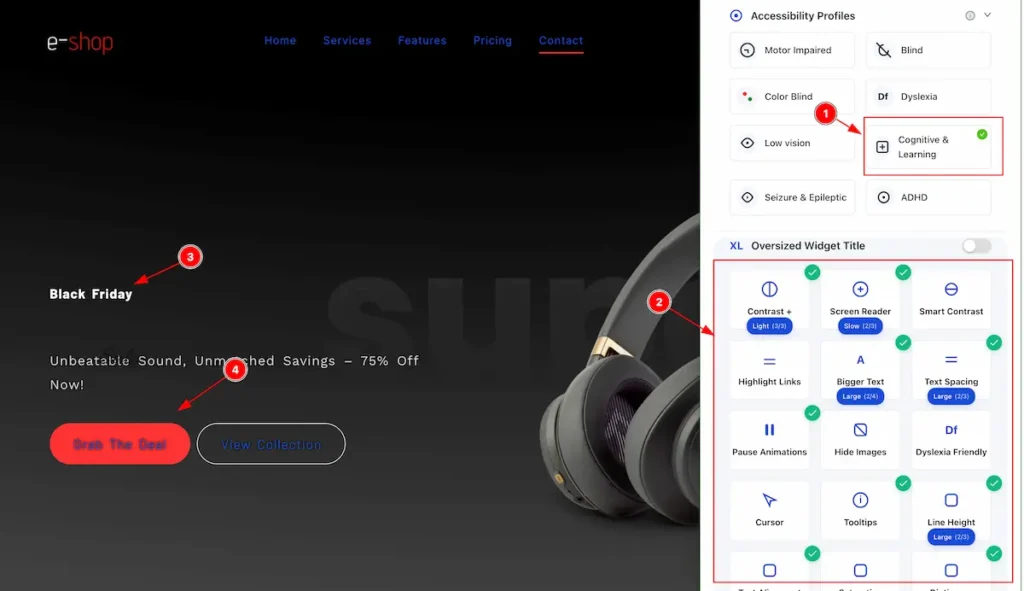
- When you select “ Cognitive & Learning ” it activates, shows a checkmark in the top corner, and applies the changes.
- The widget all also activate according to the blind preferences. e.g.: Contrast, Screen Reader, Bigger Text, Text Spacing, Pause Animations, Tooltips, Line Height etc.
- The Text appear hight lighted and dark screen.
- The button appear to highlight with read and black.
Seizure and Eliptic
Accessibility support by avoiding flashing lights, rapid animations, and high-contrast strobe effects.
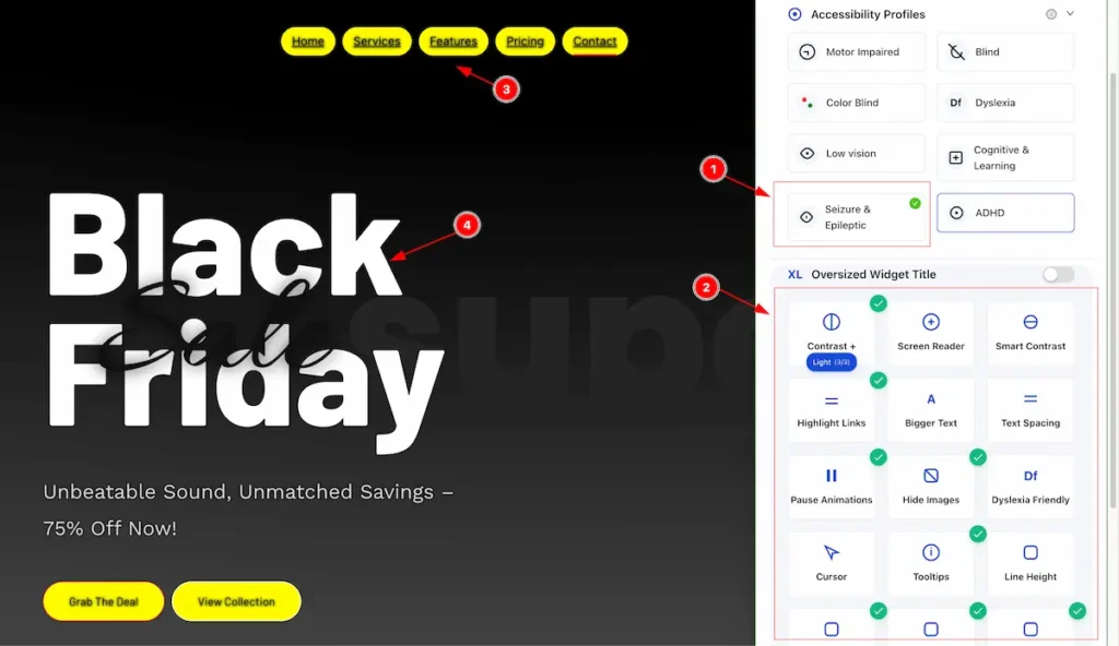
- When you select “ Seizure & Epileptic ” it activates, shows a checkmark in the top corner, and applies the changes.
- The widget all also activate according to the blind preferences. e.g.: Contrast, Screen Reader, Bigger Text, Text Spacing, Pause Animations, Tooltips, Line Height etc.
- The button & Link text appear to highlight.
- The heading text appear in black and white.
ADHD
Accessibility support with minimal distractions, clear layout, and focus aids to help users concentrate.
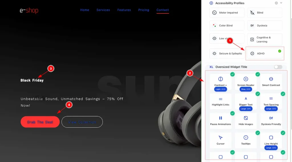
- When you select “ ADHD ” it activates, shows a checkmark in the top corner, and applies the changes.
- The widget all also activate according to the blind preferences. e.g.: Contrast, Screen Reader, Bigger Text, Text Spacing, Pause Animations, Tooltips, Line Height etc.
- The heading text appear in black and white.
- The button & Link text appear to highlight.
Oversized Widget Title Info
Contrast
Accessibility feature that adjusts the difference between text and background colors to make content easier to read.
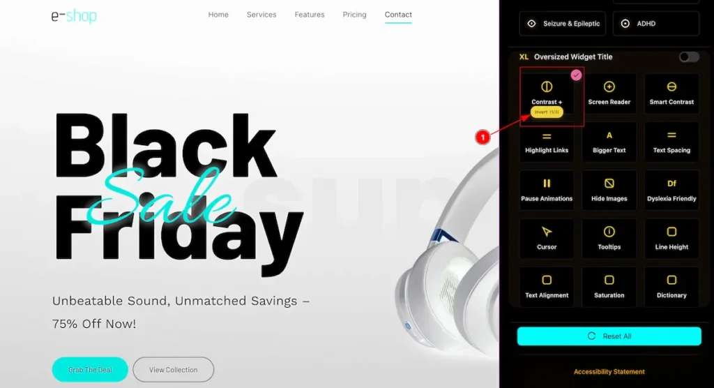
- Contrast Invert: Accessibility feature that swaps colors with their opposites (e.g., black ↔ white) to improve readability.
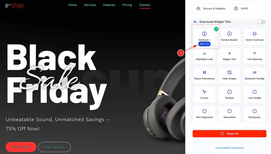
- Contrast Dark: Accessibility feature that displays dark text on a light background to enhance readability.
- Contrast Light: Accessibility feature that displays light-colored text on a light background, reducing intensity for sensitive eyes.
Screen Reader
- Screen Reader: Accessibility tool that reads website content aloud or converts it to braille for users who are blind or visually impaired.
Smart Contrast
- Smart Contrast: Accessibility feature that automatically adjusts text and background colors to ensure sufficient contrast for easier readability.
Highlight Links
- Highlight Links: Accessibility feature that makes clickable links stand out using color, underline, or other visual cues for easier identification.
Bigger Text
Accessibility feature that increases font size to make reading easier for users with low vision or reading difficulties.
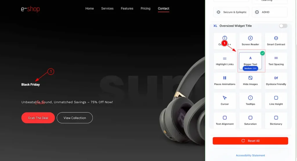
- Bigger Text – Medium: Increases text size slightly above the default for easier reading.
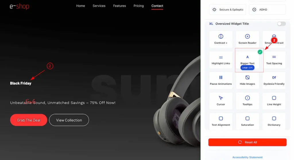
- Bigger Text – Large: Increases text size noticeably above the default for improved readability.
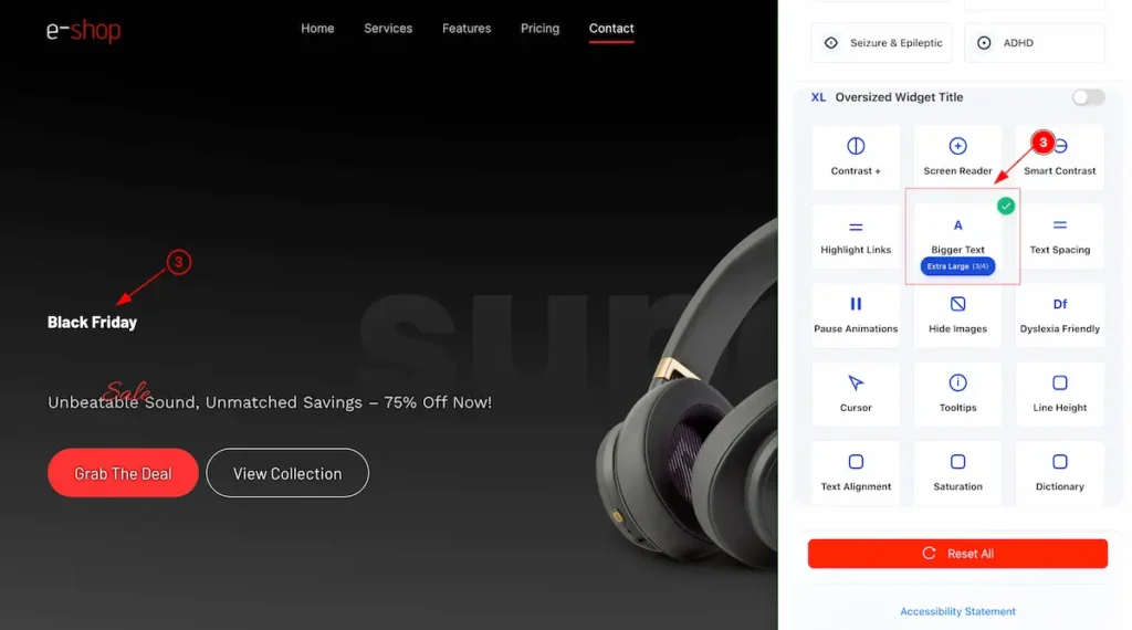
- Bigger Text – Extra Large: Enlarges text significantly for maximum readability.
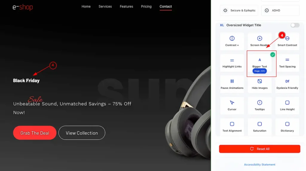
- Bigger Text – Huge: Sets text to the largest size for very easy reading.
Text Spacing
Accessibility feature that adjusts the space between letters, words, and lines to improve readability, especially for users with dyslexia or visual impairments.
- Text Spacing – Medium: Slightly increases spacing between letters, words, and lines for easier reading.
- Text Spacing – Large: Noticeably increases spacing between letters, words, and lines to improve readability.
- Text Spacing – Extra Large: Maximizes spacing between letters, words, and lines for the easiest reading.
Pause Animations
- Pause Animations: Accessibility feature that stops or disables moving or flashing content to reduce distractions and help users with motion sensitivity.
Hide Images
- Hide Images: Accessibility feature that removes or hides visual content, allowing users to focus on text and reduce distractions.
Dyslexia Friendly
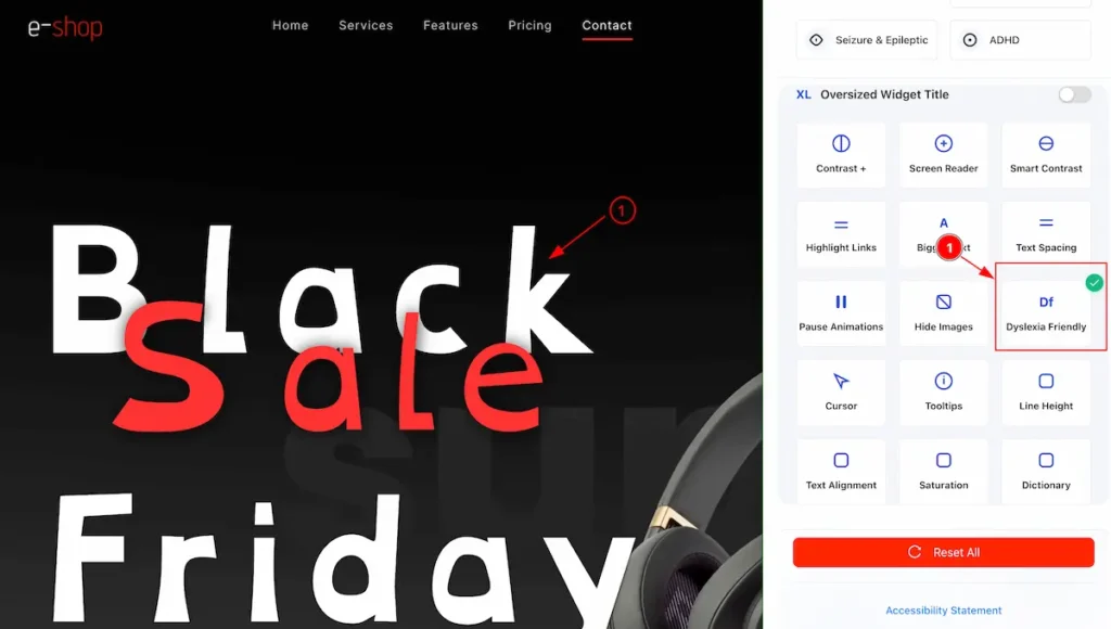
- Dyslexia Friendly: Accessibility feature that uses clear fonts, proper spacing, and simple layouts to make reading easier for users with dyslexia.
Cursor
Accessibility feature that enhances the visibility or size of the pointer, helping users with low vision or motor difficulties navigate the website.
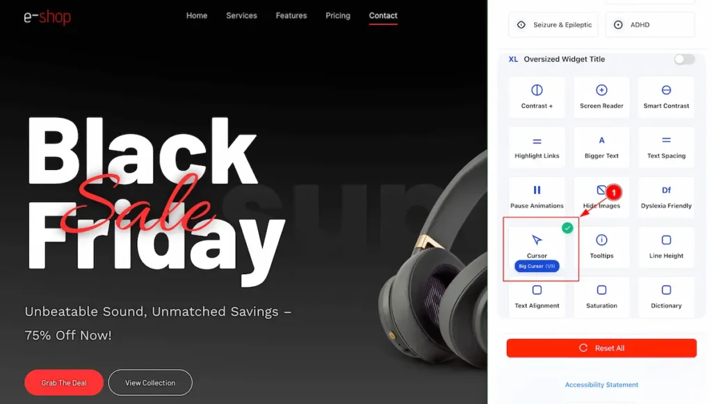
- Big Cursor: Accessibility feature that enlarges the pointer to make it easier to see and follow on the screen.
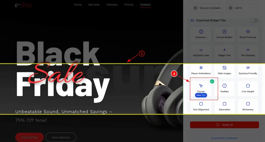
- Cursor Mask: Accessibility feature that adds a visual overlay or highlight around the cursor to improve focus and visibility.
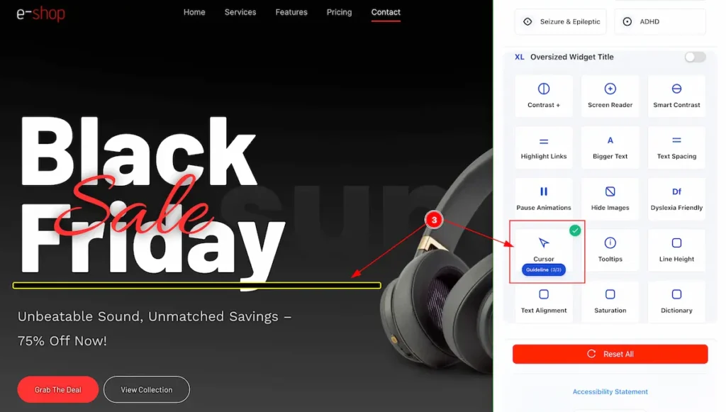
- Cursor Guideline: Accessibility feature that shows lines or guides extending from the cursor to help users track its position on the screen.
Tooltips
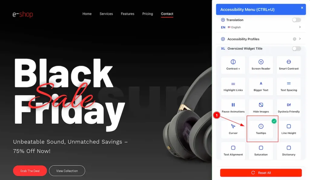
- Tooltips: Accessibility feature that shows small pop-up messages with additional information when users hover over or focus on elements, helping them understand buttons, links, or icons.
Line Height
Accessibility feature that adjusts the vertical space between lines of text to improve readability and reduce eye strain.
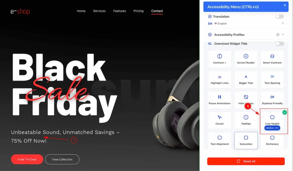
- Line Height – Medium: Slightly increases the space between lines for better readability.
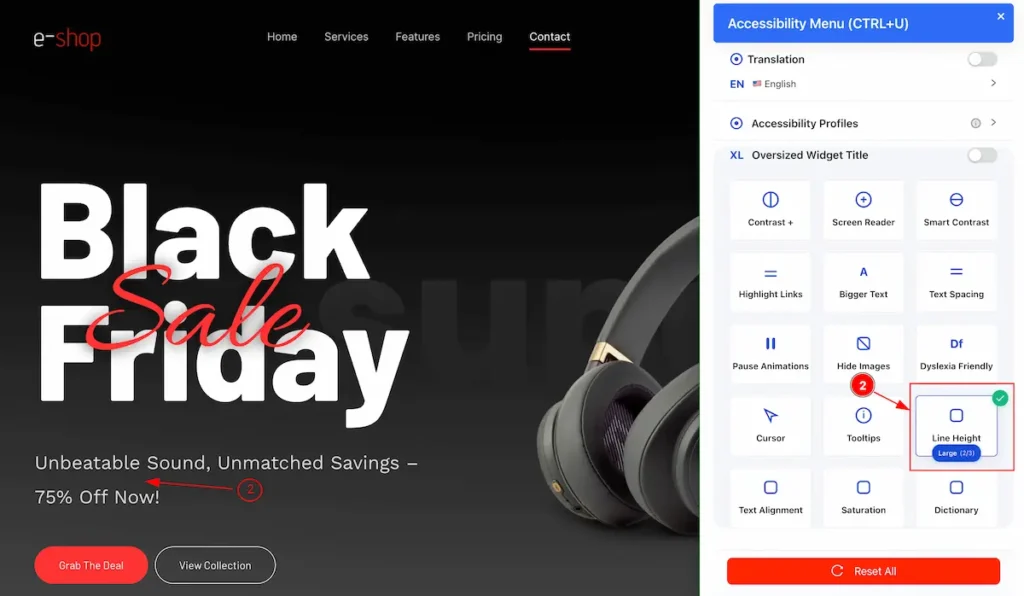
- Line Height – Large: Increases the space between lines noticeably to improve reading comfort.
- Line Height – Extra Large: Maximizes spacing between lines for the easiest reading experience.
Text Alignment
Accessibility feature that controls how text lines up horizontally to improve readability and layout.
- Text Alignment – Left: Aligns text along the left edge for standard readability.
- Text Alignment – Center: Centers text horizontally within its container.
- Text Alignment – Right: Aligns text along the right edge of its container.
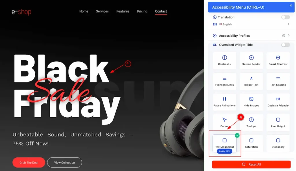
- Text Alignment – Justify: Aligns text evenly along both the left and right edges for a clean block appearance.
Saturation
Accessibility feature that adjusts the intensity of colors in images or content to make them easier to see and reduce visual strain.
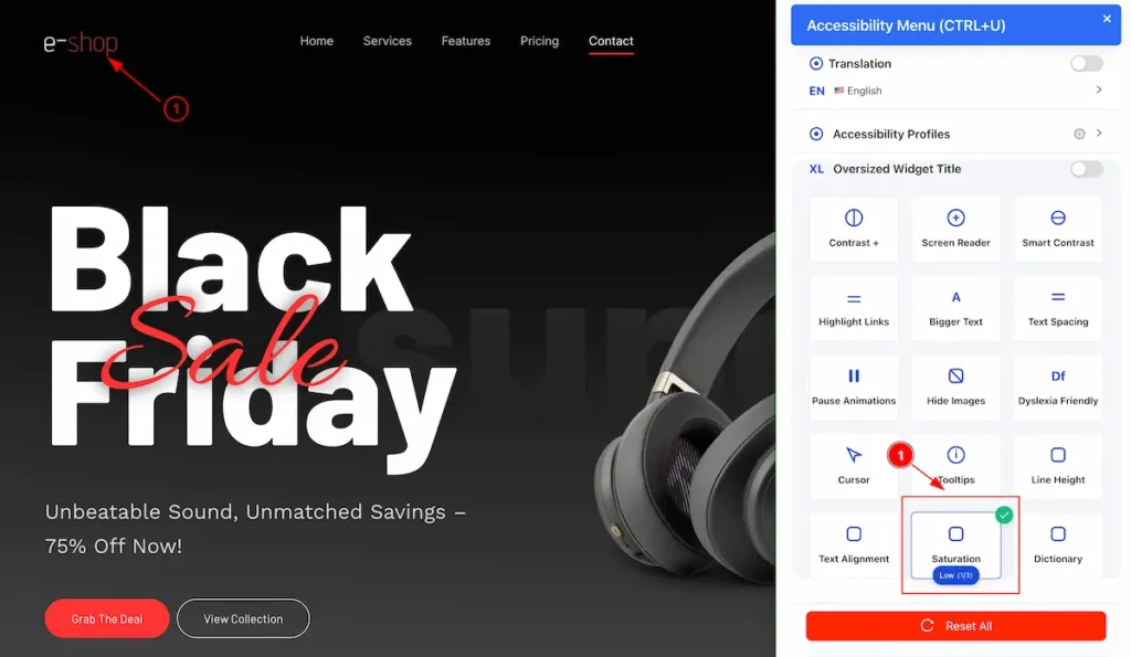
- Saturation – Low: Reduces color intensity, making colors appear more muted for easier viewing.
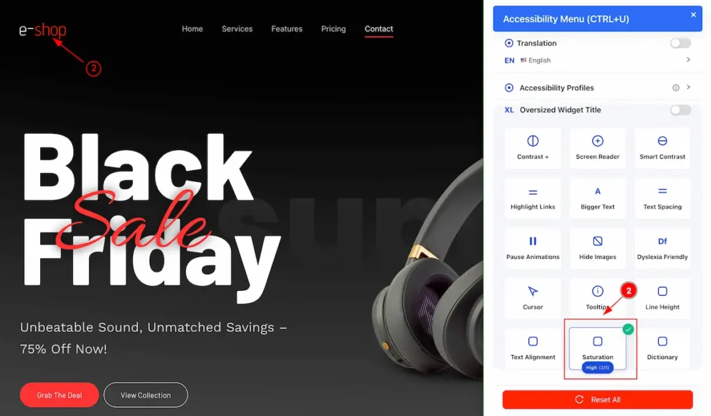
- Saturation – High: Increases color intensity, making colors more vivid and pronounced.
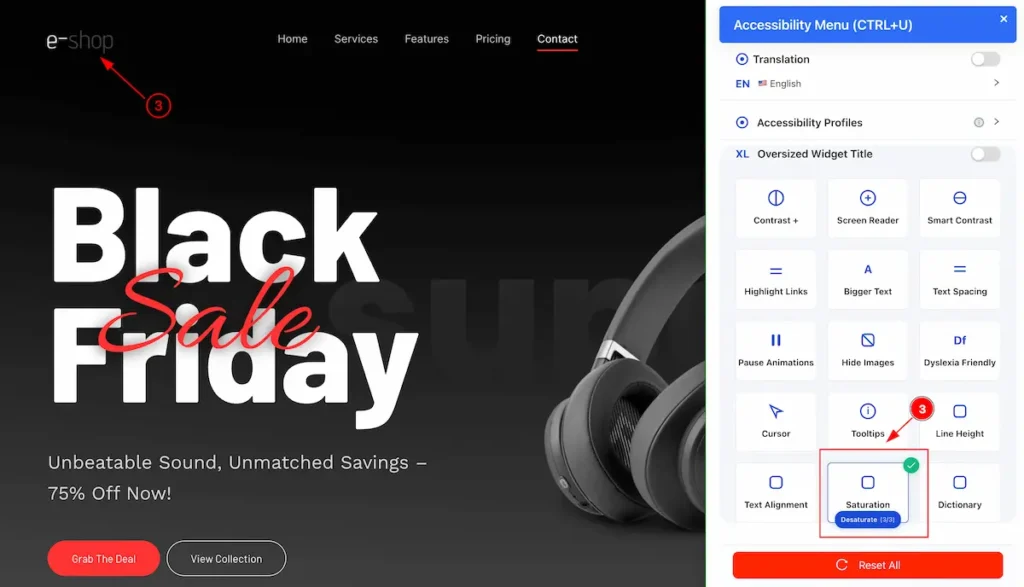
- Saturation – Desaturate: Removes most or all color, converting content to grayscale for easier focus or reduced visual strain.
Disctionary
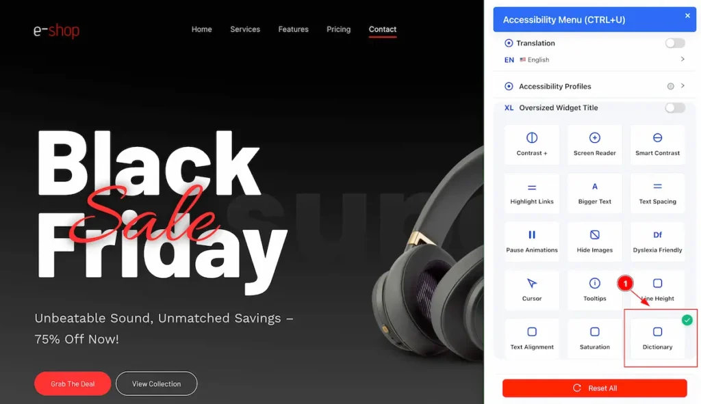
- Dictionary: Accessibility tool that provides definitions, pronunciations, and meanings of words to help users understand content more easily.
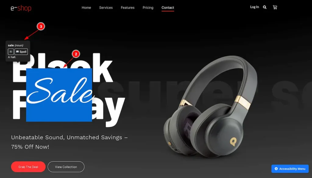
- Select any word form the page.
- The info of the word appear on the top of it.
Video Tutorial
The video tutorial is coming soon.
By following this you will be able to use the Accessibility feature of your WordPress website.