In this documentation, we will show you how to customize the EDD Beauty Carousel Widget by Ultimate Store Kit.
Enable the EDD Beauty Carousel Widget
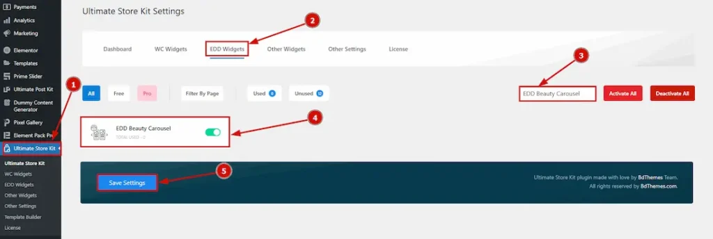
To use the EDD Beauty Carousel by Ultimate Store Kit, first, you have to enable the widget.
- Go to WordPress > Ultimate Store Kit Plugin dashboard.
- Then Click the EDD Widgets Tab.
- Search the EDD Beauty Carousel Widget Name.
- Enable the EDD Beauty Carousel Widget.
- Hit the Save Settings Button.
Inserting The EDD Beauty Carousel widget
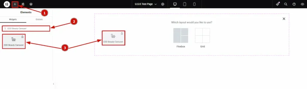
- Go to the Elementor Editor Page and Hit the “+” (Add Element) icon button.
- Search the EDD Beauty Carousel widget.
- Drag the widget and drop it on the editor page
Configuring the Content Tab
The Content Tab provides options to manage and structure the core settings of elements. It allows defining the content and functionality to align with design goals.
Layout Section
Go to Content > Layout
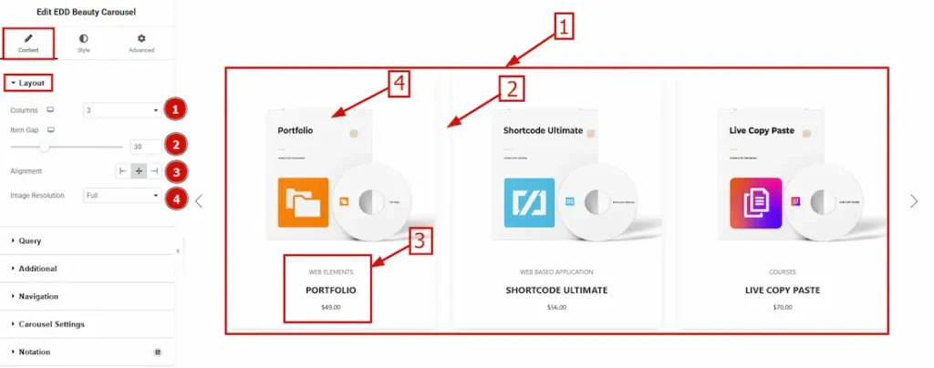
1. Columns: Set here how many columns you want to show for the layout section.
2. Item Gap: You can adjust the space between items by this option.
3. Alignment: This option allows you to move the content to the left, center & right.
4. Image Resolutions: You can select the image resolution here.
Query Section
Go to Content > Query
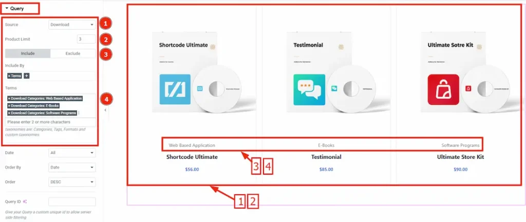
1. Source: Select the source for the EDD Beauty Carousel. You can select the source from Download, Manual Selection, Current Query & Related option.
2. Product Limit: Set limitations for the appearing product items.
3. Include/Exclude Selection: Select Include / Exclude filter to show/hide specific posts by Terms (Tags/Categories) or Authors.
4. Terms: Select the terms for specifying. You will get to select from Category or Tags.
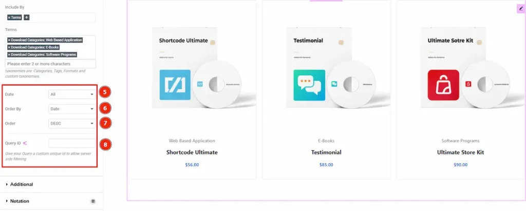
5 Date: You can select the date range to show the source from this option.
6. Order By: It controls the data you want to display through author, approved, date, content & random.
7. Order: This option controls the order by which data is arranged. There are two types of order. Ascending Order (Starts from the smallest or lowest value and goes to the largest or highest.) & Descending Order (Starts from the largest or highest value and goes to the smallest or lowest.)
8. Query ID: Give your query a custom unique id to allow server side filtering. Learn more about the Query.
Additional Options Section
Go to Content > Additional Options
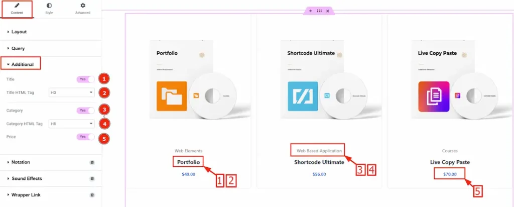
1. Title: By enabling this option the product name/title will be visible
2. Title HTML Tag: Set any HTML Tag for Title (H1, H2, H3, H4, H5, H6, p, span). The title tag is essential for both user experience and search engine optimization (SEO).
3. Category: Enable the switcher to show the Category.
4. Category HTML Tag: Set any HTML Tag for Category (H1, H2, H3, H4, H5, H6, p, span). The Category tag is essential for both user experience and search engine optimization (SEO).
5. Price: Enable the switcher to show the Price of the products.
Navigation Section
Go to Content > Navigation
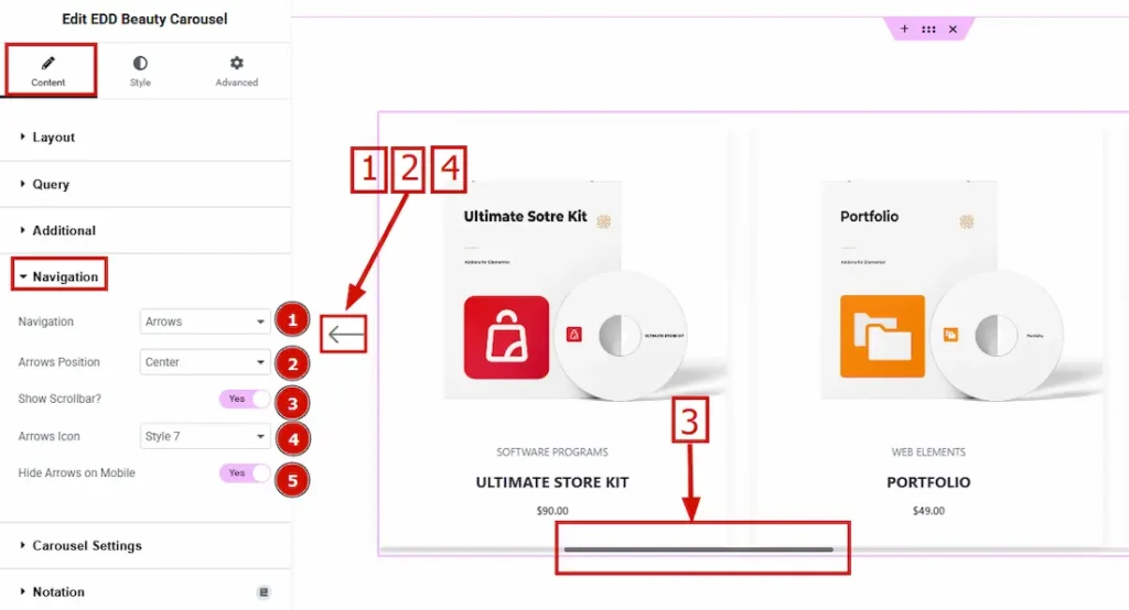
1. Navigation: This option allows you can set the Navigation Type- Arrows & Dots, Arrows & Fractions, Arrows, Dots, Progress and None.
2. Arrows Position: By this option, you can adjust the navigator position to Top Left, Top Center, Top Right, Center, Bottom Left, Bottom Center & Bottom Right.
3. Show Scrolbar: Enable or disable the Show Scrollbar switcher button to show/hide the Scrollbar on the carousel.
4. Arrows Icon: You can customize the appearance of navigation arrows using the selected style. (There are a total of 23 styles included.)
5. Hide Arrows on Mobile: By enabling this switcher button, the navigation Arrows will hide for Mobile devices.
Carousel Settings Section
Go to Content > Carousel Settings
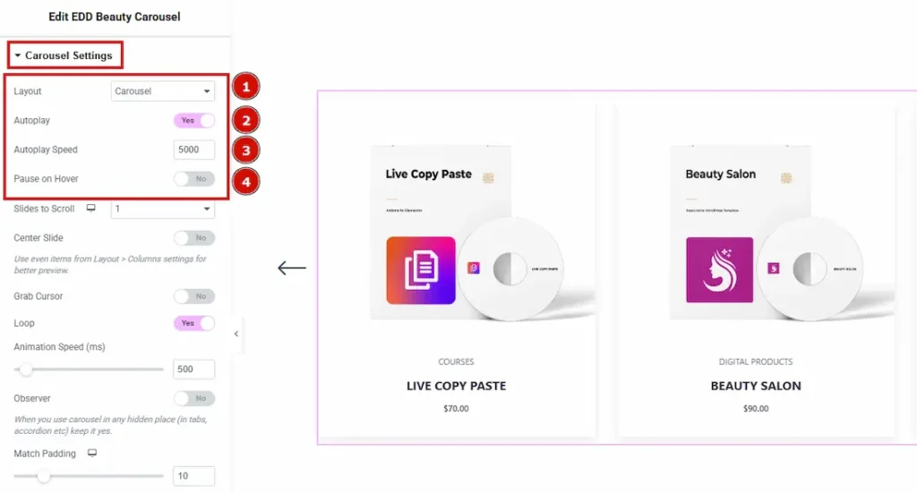
1. Layout: You can select the Layout type – Carousel & Coverflow. Here we selected the layout type – Carousel.
2. Autoplay: If you enable the Autoplay switcher button, your slider will slide into Autoplay mode.
3. Autoplay Speed: This option allows you to set the speed for automatically playing the carousel.
4. Pause on Hover: If you activate the pause on Hover button, when visitors hover the mouse cursor on the slider, then your slider will hold; otherwise, your slider will slide Autoplay.
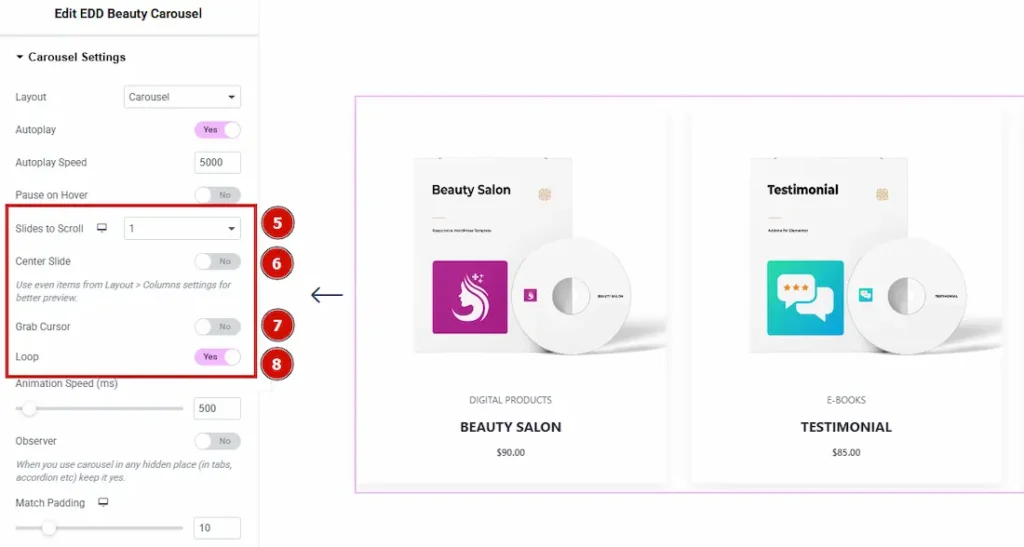
5. Slides to Scroll: It represents how many slides will slide at once.
6. Center Slide: If you enable the Switcher option, then your Active slider will show the center (depending on your widget style).
7. Grab Cursor: Your mouse pointer icon will be changed into a grab cursor. Visitors can slide your slider manually with your mouse cursor.
8. Loop: Enable the switch to loop the content.
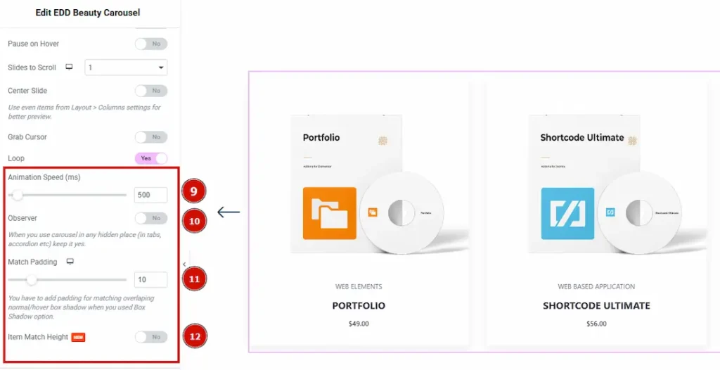
9. Animation Speed: Set the speed for animation. The speed count in (ms).
10. Observer: If you enable the option, then you will be able to use the slider/carousel in any hidden places (such as in tabs, Accordion, etc).
11. Match Padding: Controls the padding around carousel items to align with hover or box shadow effects.
12. Item Match Height: This feature is to control the items same height. Enable the switcher to match the same height of the carousel items.
Work with the Style Tab
Item Section
Go to Style > Item
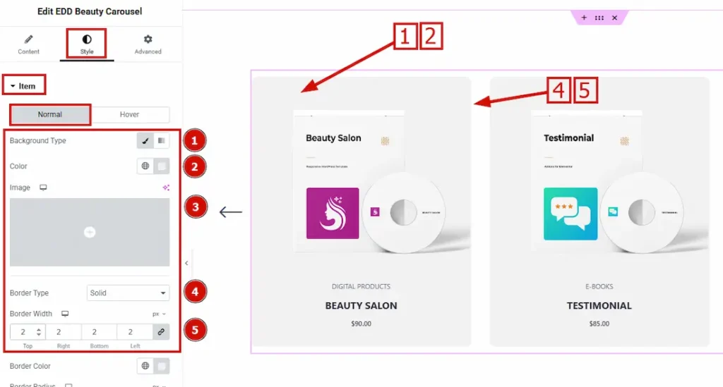
In this section, we have two tabs. One is Normal and the other is Hover. Let’s start with the Normal tab –
1. Background Type: You can change the color of any object background to classic or gradient. In Classic, you can change the background color and also set an image to the background. In the gradient option, you can also set background color along with locations and angle for each breakpoint to ensure the gradient adapts to different screen sizes. Also, you can change the gradient type (Radial & Linear) and positions.
2. Color: You can change the item background color with this option.
3. Image: You can change the item background image with this option.
4. Border Type: This option allows you to add borders to your items. You can select various border types from this option. Such as Solid, Double, Dotted, Dashed, Groove.
5. Border Width: Set the thickness of the border by selecting the width.
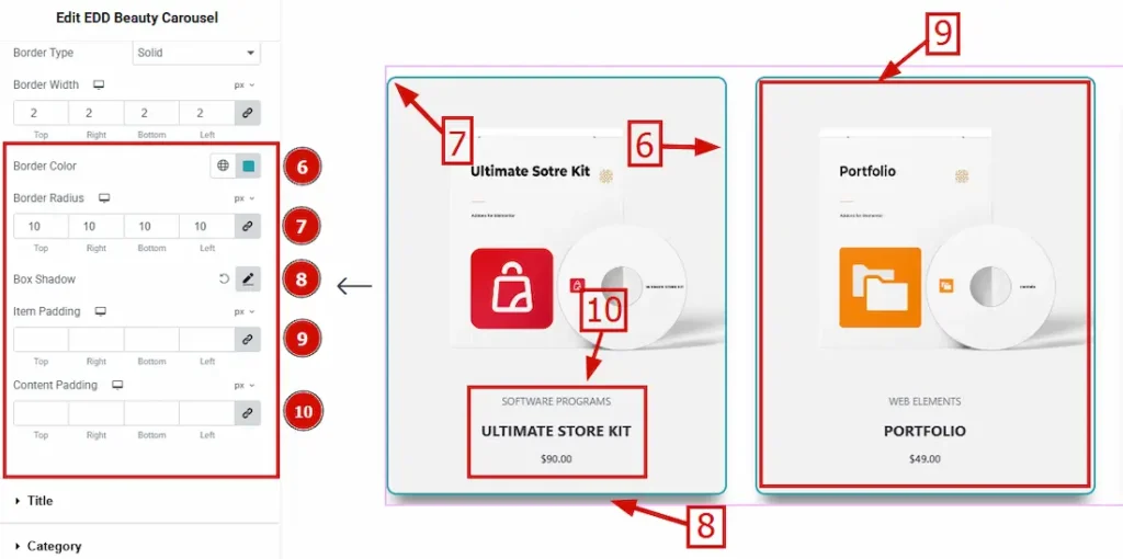
6. Border Color: You can change the border color by this option.
7. Border Radius: The Border Radius controls the roundness of the border.
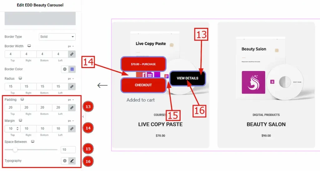
8. Box Shadow: The Box Shadow property is used to create the shadow around the Category Button. It takes four values: Horizontal offset, Vertical offset, Blur, and Spread to customize the Box shadow. Position: You can set the Box Shadow position, Outline and Inset. Here we set the Box Shadow position Outline. Box Shadow Color: This lets you change the Box Shadow color.
9. Item Padding: Add spaces around an object to increase the inner area. Padding allows you to control the internal space within an element.
10. Content Padding: This option allows you to adjust the space & create gaps between the content.
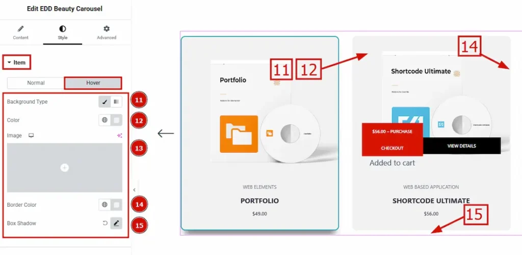
Now Let’s proceed to the Hover tab –
11. Background Type: You can change the background type (Classic or Gradient) by using this option.
12 Color: This option allows you to change the background hover color.
13. Image: This option allows you to change the background image.
14. Border Color: You can set hover color on your border by using this option.
15. Box Shadow: You can change the box shadow hover color by using this option.
Title Section
Go to Style > Title
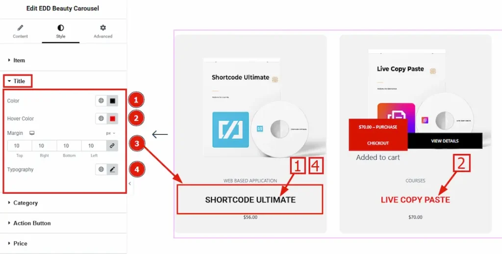
1. Color: This option allows you to change the title color.
2. Hover Color: You can change your title color by this option.
3. Margin: This option allows you to adjust the space & create gaps around the title.
4. Typography: Change the title’s font family, size, weight, transform, style, decoration, line height, letter spacing, and word spacing from here.
Category Section
Go to Style > Category
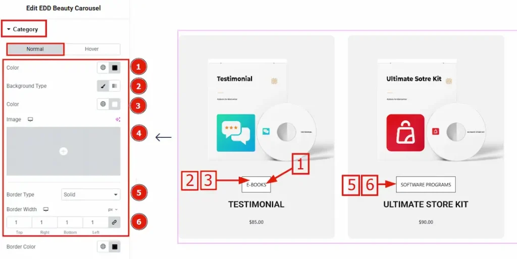
In this section, we have two tabs. One is Normal and the other is Hover. Let’s start with the Normal tab –
1. Color: You can change the category’s color with this option.
2. Background Type: You can change the category’s background type here. There are two options for background type. These are Classic & Gradient.
3. Color: You can change the category’s color with this option.
4. Image: You can change the category’s background image with this option.
5. Border Type: This option allows you to add borders to your items. You can select various border types from this option. Such as Solid, Double, Dotted, Dashed, Groove.
6. Border Width: Set the thickness of the border by selecting the width.
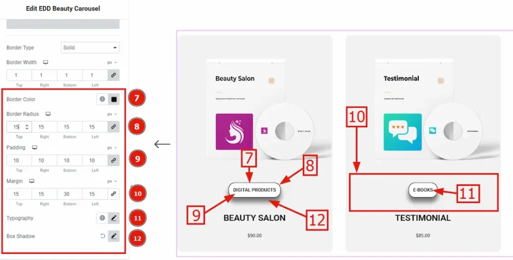
7. Border Color: You can change the border color by this option.
8. Border Radius: The Border Radius controls the roundness of the border.
9. Padding: Padding allows you to control the internal space around the category.
10. Margin: This option allows you to adjust the space & create gaps around the category border.
11. Typography: Change the title’s font family, size, weight, transform, style, decoration, line height, letter spacing, and word spacing from here.
12. Box Shadow: You can add a shadow and customize it by this option.
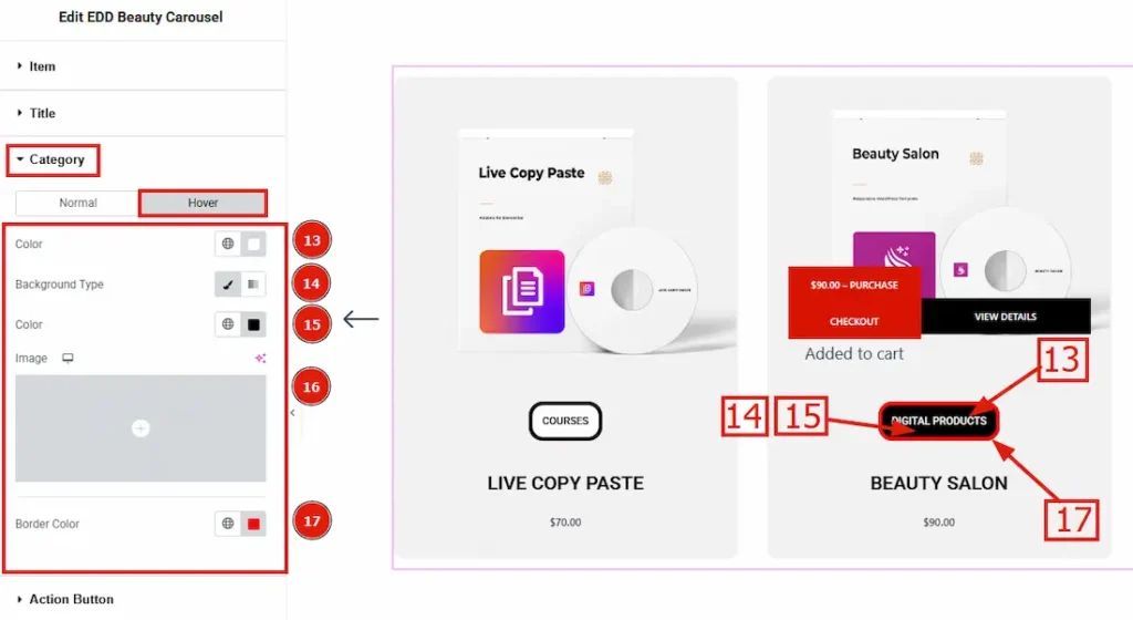
Now Let’s proceed to the Hover tab –
13. Color: This option allows you to change the category hover color.
14. Background Type: You can change the background type (Classic or Gradient) by using this option.
15. Color: This option allows you to change the category’s background hover color.
16. Image: This option allows you to change the background image.
17. Border Color: You can set hover color on your border by using this option.
Action Button Section
Go to Style > Action Button
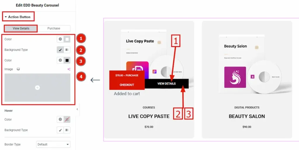
In this section, we will get 2 sub-sections. They are View Details & Purchase. Let’s go through the discussion step by step.
View Details Sub-Section
1. Color: This option allows you to change the view details button’s text color.
2. Background Type: You can change the background type to Classic or Gradient using this option. Here we choose classic.
3. Color: This option allows you to change the view details button’s background color.4. Image: You can add a background image by using this option.
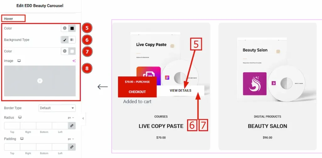
5. Color: This option allows you to change the action button hover text color.
6. Background Type: You can change the hover background type to Classic or Gradient using this option.
7. Color: This option allows you to change the action button hover background color.
8. Image: You can set a hover background image by using this option.
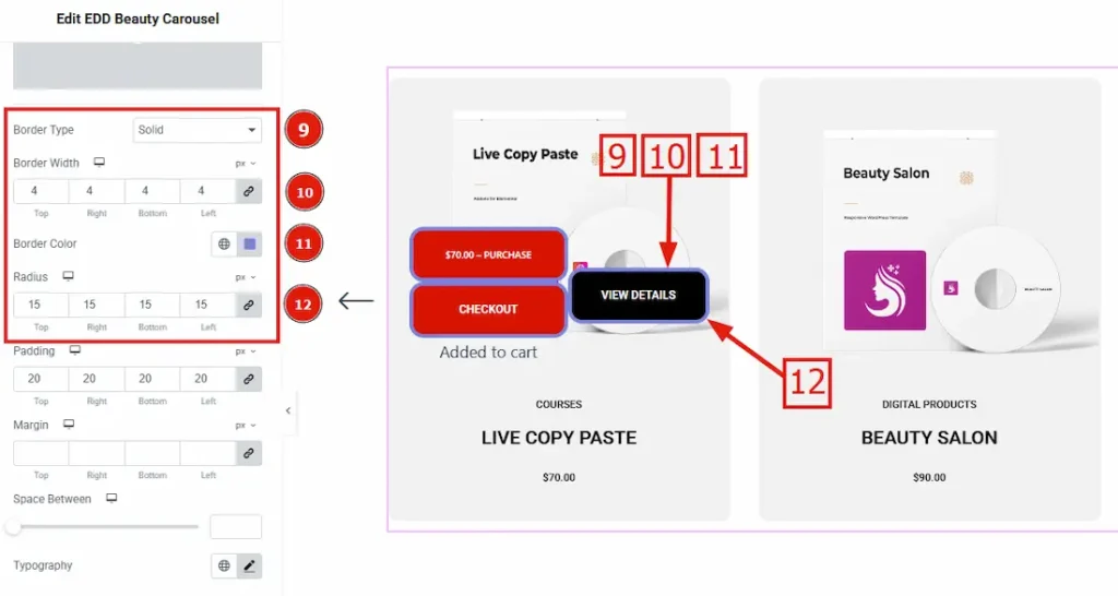
9. Border Type: This option allows you to add borders to your items. You can select various border types from this option. Such as Solid, Double, Dotted, Dashed, Groove.
10. Border Width: You can set the border thickness by this option.
11. Border Color: You can set the border color from here.
12. Border Radius: The Border Radius controls the roundness of the border.
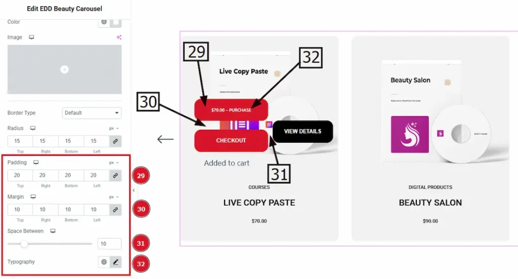
13. Padding: Padding allows you to control the internal space inside the button.
14. Margin: By using this option you can add/remove space from the margin around the button.
15. Space Between: This option allows you to adjust the space between view details & checkout button.
16. Typography: You can change the button’s font family, size, weight, transform, style, decoration, line height, letter spacing, and word spacing from here.
Purchase Sub-Section
The Purchase button is linked to the Checkout button, so any changes made to the Purchase button will automatically apply to the Checkout button as well and after clicking on Purchase button one notification will pop up as added to cart.
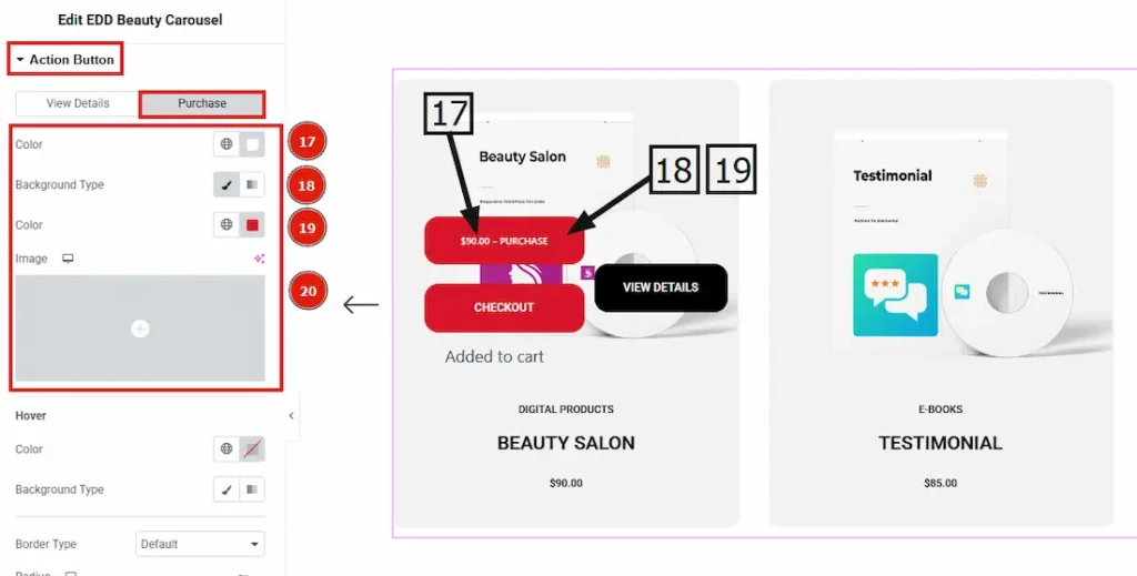
17. Color: This option allows you to change the view details button’s text color.
18. Background Type: You can change the background type to Classic or Gradient using this option. Here we choose classic.
19. Color: This option allows you to change the purchase button’s background color.
20. Image: You can add a background image by using this option.
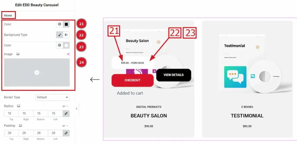
21. Color: This option allows you to change the action button hover text color.
22. Background Type: You can change the hover background type to Classic or Gradient using this option.
23. Color: This option allows you to change the action button hover background color.
24. Image: You can set a hover background image by using this option.
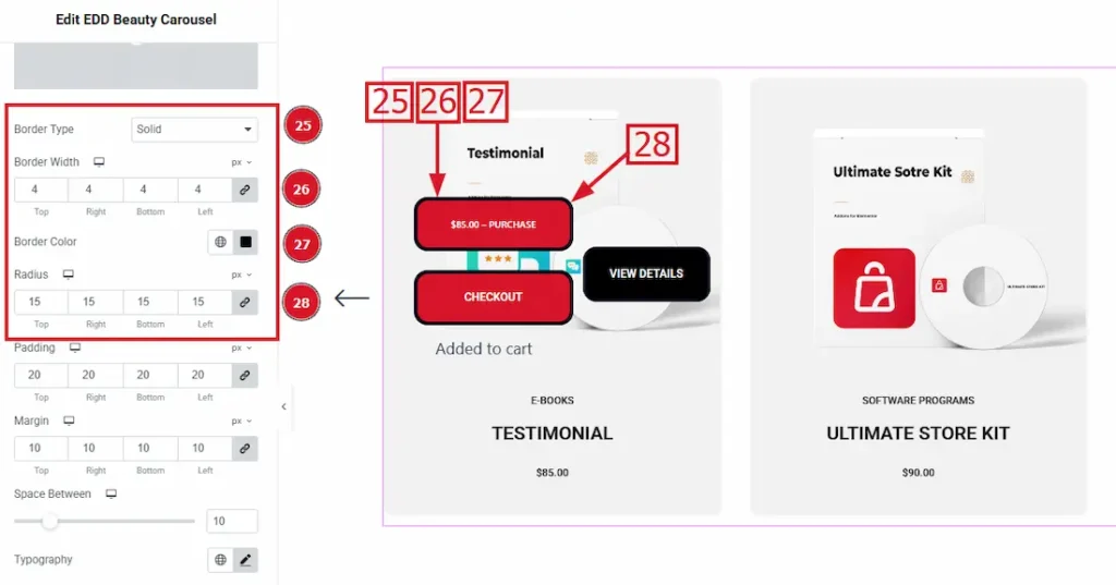
25. Border Type: This option allows you to add borders to your items. You can select various border types from this option. Such as Solid, Double, Dotted, Dashed, Groove.
26. Border Width: You can set the border thickness by this option.
27. Border Color: You can set the border color from here.
28. Border Radius: The Border Radius controls the roundness of the border.
29. Padding: Padding allows you to control the internal space inside the button.
30. Margin: By using this option you can add/remove space from the margin around the button..
31. Space Between: This option allows you to adjust the space between view details & checkout button.
32. Typography: You can change the button’s font family, size, weight, transform, style, decoration, line height, letter spacing, and word spacing from here.
Price Section
Go to Style > Price
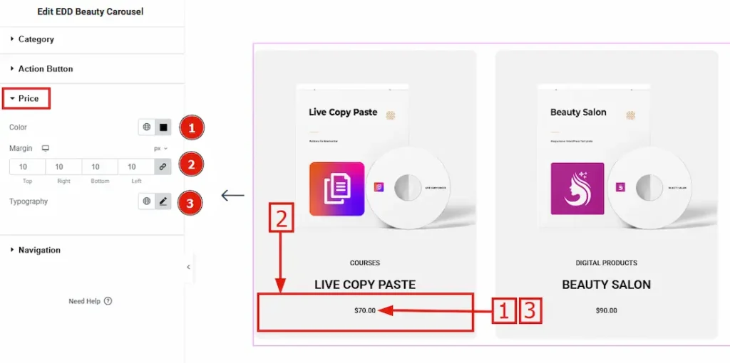
1. Color: This option allows you to change the rating star color.
2. Margin: By using this option, you can add/remove space around the price.
3. Typography: You can change the title’s font family, size, weight, transform, style, decoration, line height, letter spacing, and word spacing from here.
Navigation Section
Go to Style > Navigation
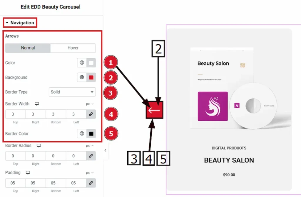
In this section, we will get three sub-sections. They are Arrows, Dots & Offset. Let’s go through the discussion step by step.
Arrows Sub-Section
In this sub-section, we have two tabs. One is Normal and the other is Hover. Let’s start with the Normal tab –
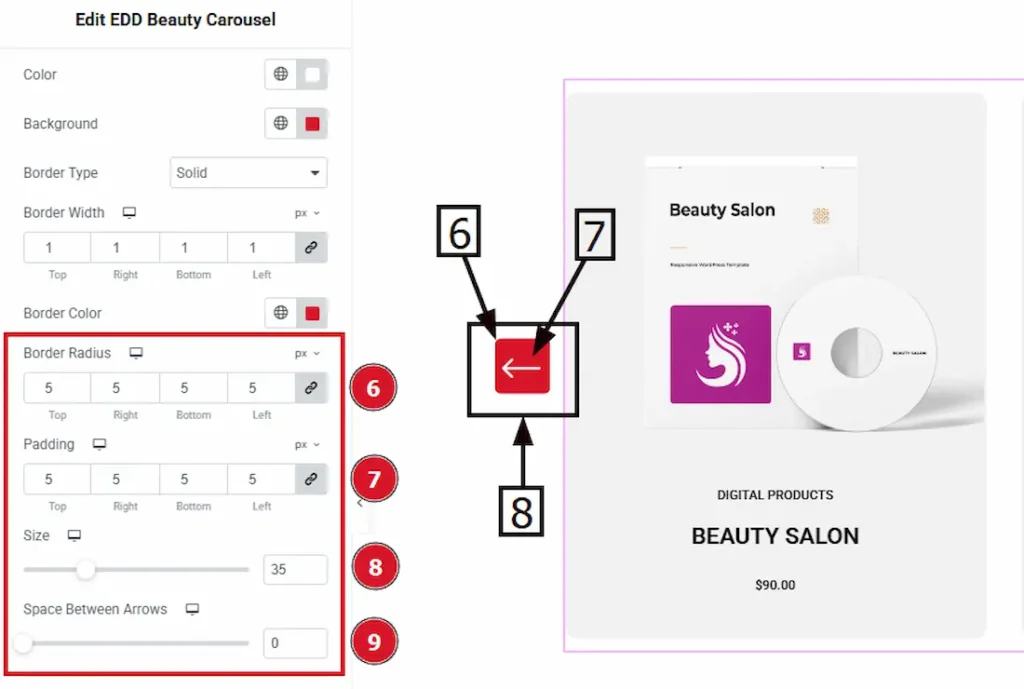
6. Border Radius: The Border Radius controls the roundness of the border.
7. Padding: Padding allows you to control the internal space around the arrow.
8. Size: You can adjust the arrow’s size by using this option.
9. Space Between Arrows: This option allows you to adjust the space between two arrows.
Now let’s proceed to the Hover tab section –
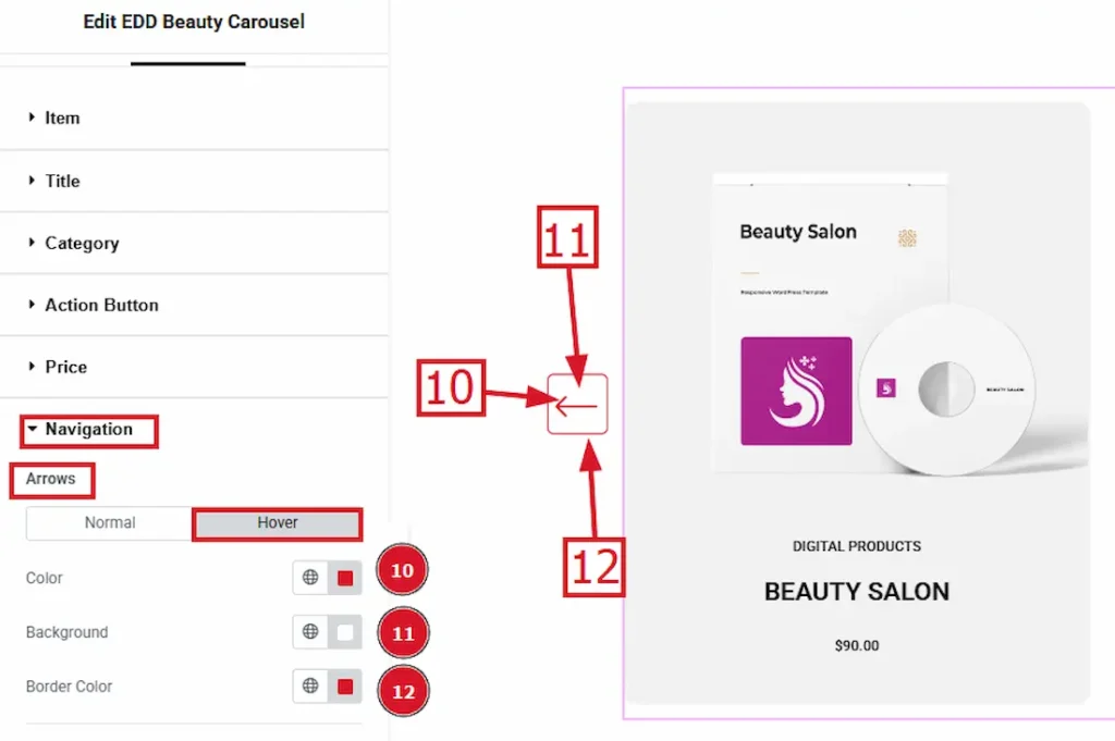
10. Color: This option allows you to change the arrow’s hover color.
11. Background: You can change the arrow’s background hover color by using this option.
12. Border Color: This option lets you set the Arrow hover border color.
Offset Subsection-
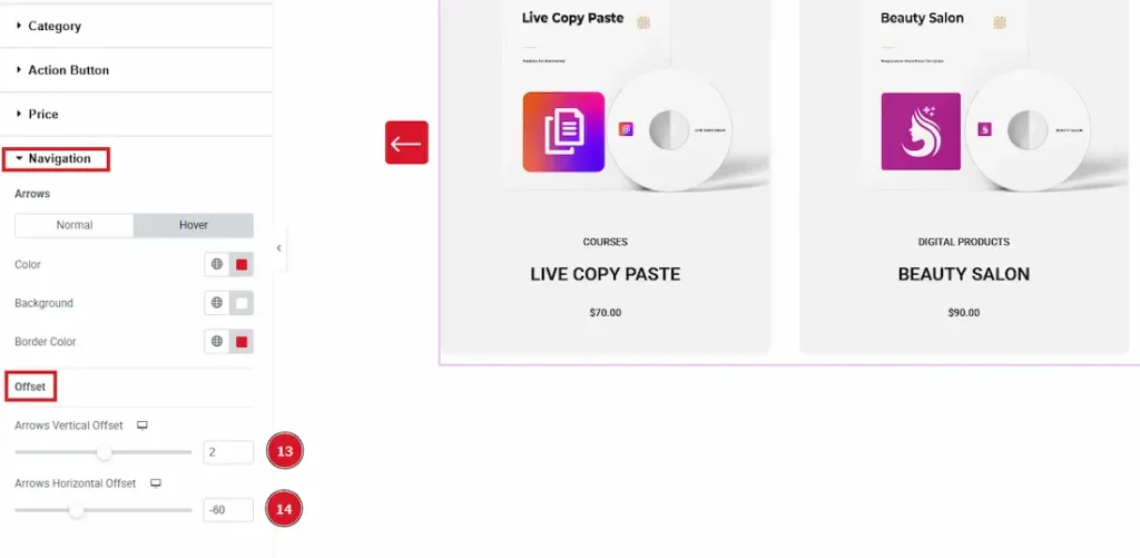
13. Arrows Vertical Offset: This option lets you set the arrows’ position vertically.
14. Arrows Horizontal Offset: This option lets you set the arrows’ position horizontally.
All done! You have successfully customized the EDD Beauty Carousel widget on your website.
Video Assist
You can also watch the video tutorial learn more about the EDD Beauty Carousel Widget. Please visit the demo page for examples.
Thanks for being with us.