In this documentation, we will show you how to customize the Sub Category Widget by Ultimate Store Kit.
Enable the Sub Category Widget
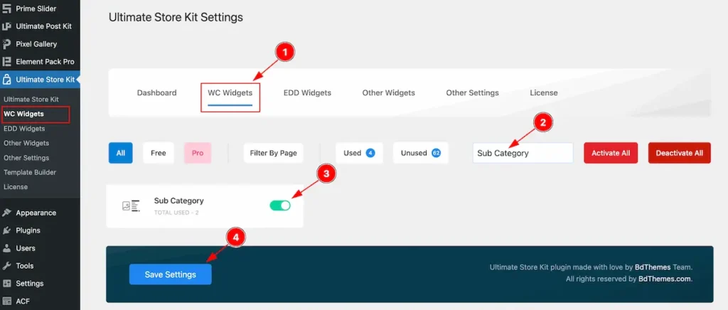
To use the Sub Category from Ultimate Store Kit Widget must be enabled. Navigate to WordPress Dashboard > Ultimate Store Kit Plugin dashboard.
- Navigate to WC Widgets Tab.
- Search by the Sub Category Widget Name.
- Enable the Sub Category Widget.
- Hit the Save Settings Button.
Inserting The Sub Category widget
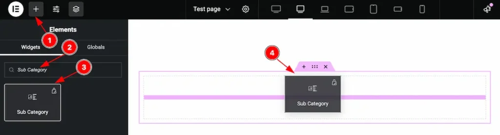
- Go to the Elementor Editor Page and Hit the Add Element ” + ” Icon.
- Search by the Sub Category widget name.
- The widget will appear, Check the Ultimate Store Kit logo on top right corner.
- Select the widget then Drag and Drop it on the editor page.
Configuring the Content Tab
The Content Tab provides options to manage and structure the core settings of elements. It allows to define the content and functionality to align with design goals.
Layout Section
Go to Content > Layout
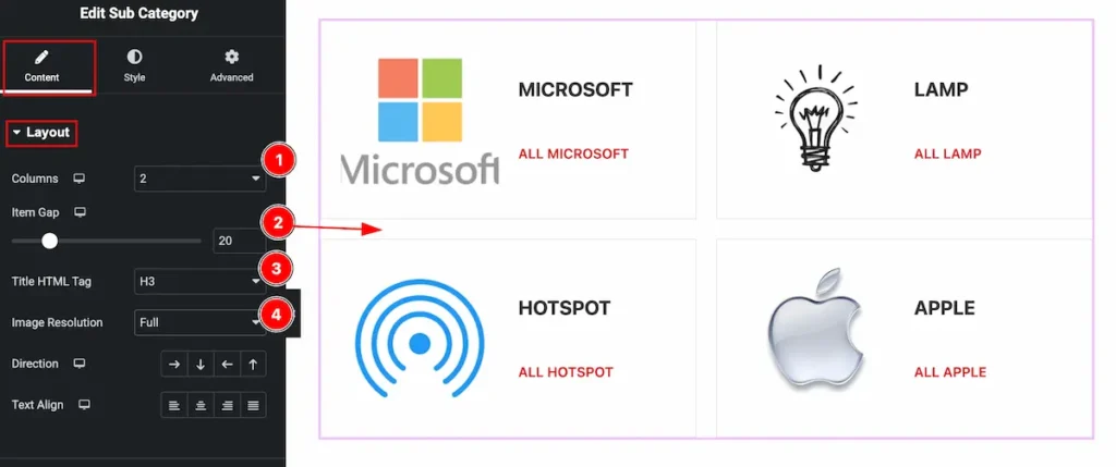
- Columns: Set the columns for the sub category layout. It support the 1 to 6 columns.
- Item Gap: Set the gap between the items. Use seek bar or input the value to add the gaps.
- Title HTML Tag: Set any HTML Tag for Title ( H1, H2, H3, H4, H5, H6, p, span ). The title tag is essential for both user experience and search engine optimization (SEO).
- Image Resolution: Select the desired resolution, such as thumbnail, full size, or other predefined dimensions.
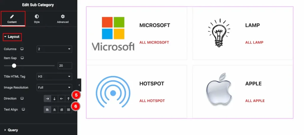
- Direction: Set the direction of the content. Right, Down, Left, Up direction are available. Set the position according to it.
- Text Align: Set the alignment of the text; Left, Center, Right, and Justified are available.
Query Section
Go to Content > Query
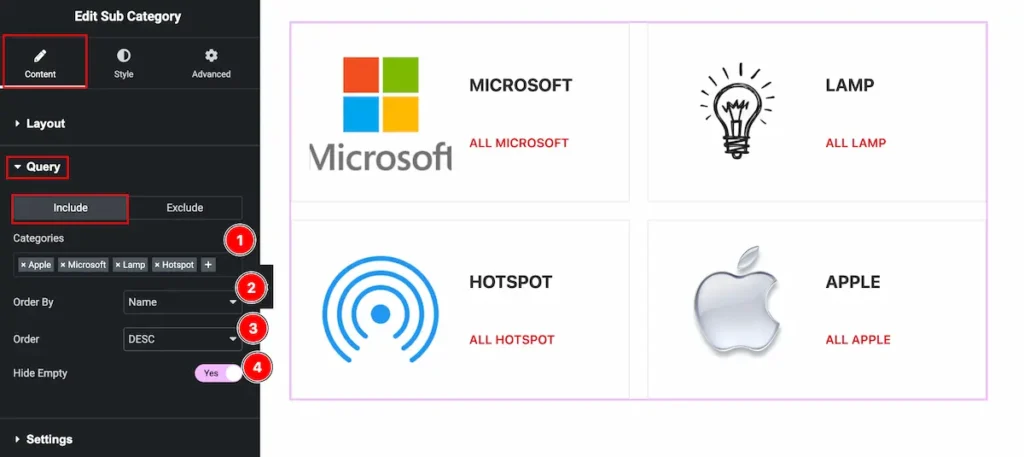
- Categories: Select the categories by clicking on the ” + ” icon. Here appear the available category.
- Order By: Set the order by following the Name, Slug and Count.
- Order: Arrange according to the order DESC or ASC,
- Hide Empty: Enable the switcher to hide the empty sub category.
Settings Section
Go to Content > Settings
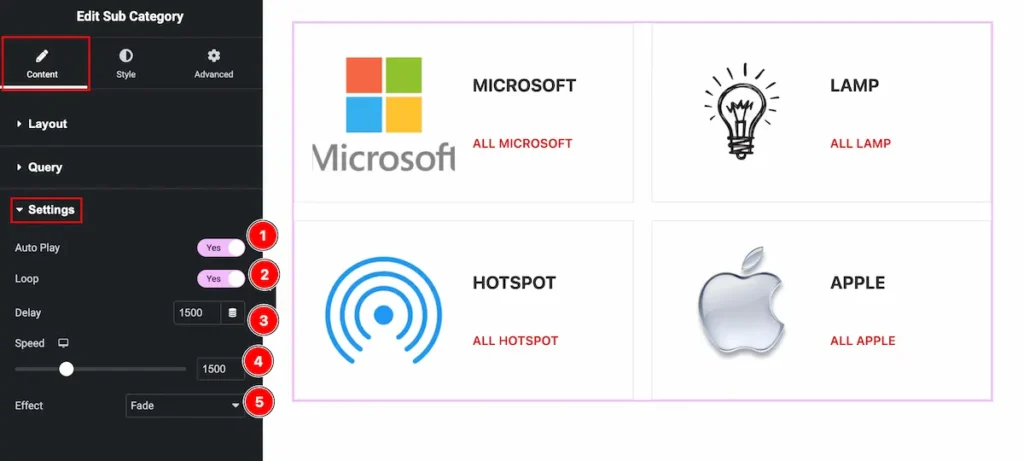
- Auto Play: Enable the switcher to play automatically. The sub category image will play.
- Loop: Enable the switcher to loop it and continue interaction.
- Delay: Set the delay time. It will start after delaying on certain time period.
- Speed: Set the speed for the time sliding.
- Effect: Select the effect Fade, Slide, and Creative. The image will change according to the effect. Creative effects has different effects.
Designing with the Style Tab
The Style Tab offers a range of options to enhance the visual appearance of elements, enabling precise adjustments and creative design possibilities. It helps create polished and engaging layouts effortlessly.
Item Section
Go to Style > Item
Normal Tab
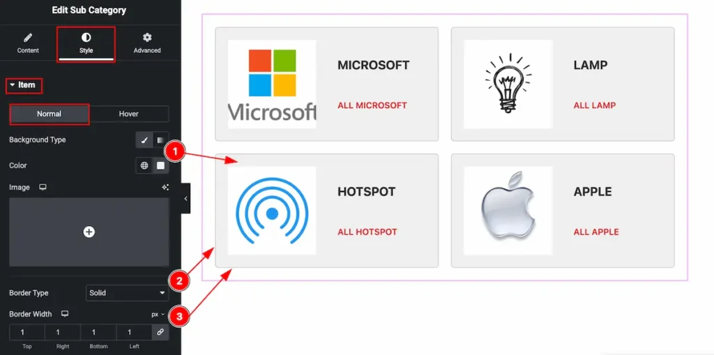
- Background Type: Set the background type normal for it.
- Border Type: Set the border type solid of the items. Select available border types None, Solid, Dashed, Dotted, Grove.
- Border Width: Set the width of the border.
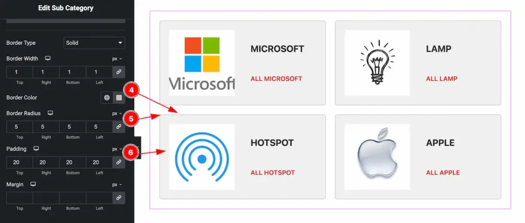
- Border Color: Set the border color of the items.
- Border Radius: Make the border radius by setting the value on top, right, bottom, and left.
- Padding: Make inner space by setting the padding of it.
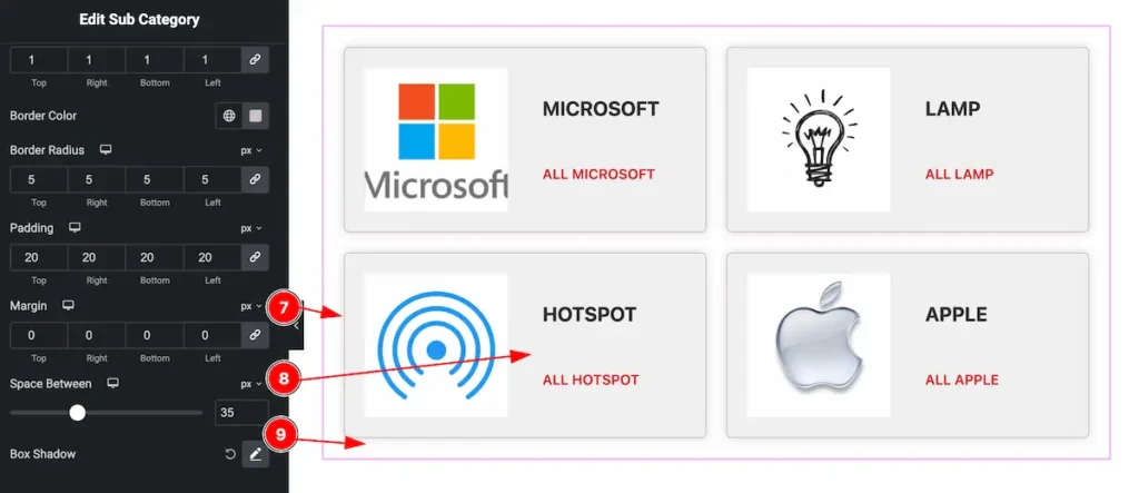
- Margin: Set the margin for the outer space of the item.
- Space Between: Make gap between the items.
- Box Shadow: Set the box shadow of the item.
Hover Tab
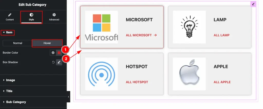
- Border Color: Make the border color for the item.
- Box Shadow: Make a shadow of the box.
Image Section
Go to Style > Image
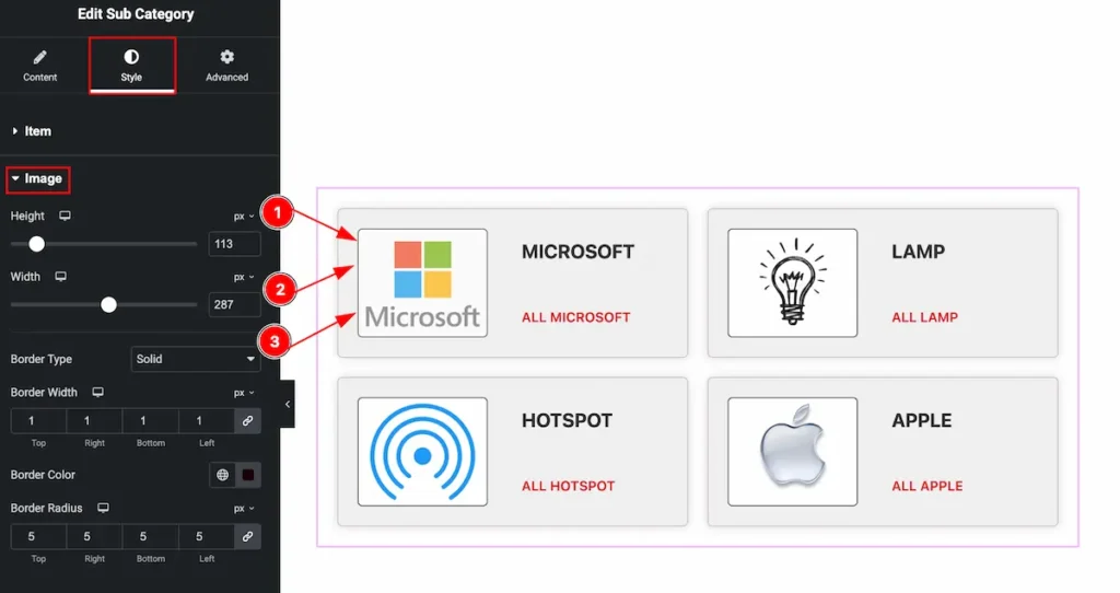
- Height: Select the height for the image.
- Width: Set the width for the image.
- Border Type: Select the border type from available, Solid, Dotted, Dashed, Grove.
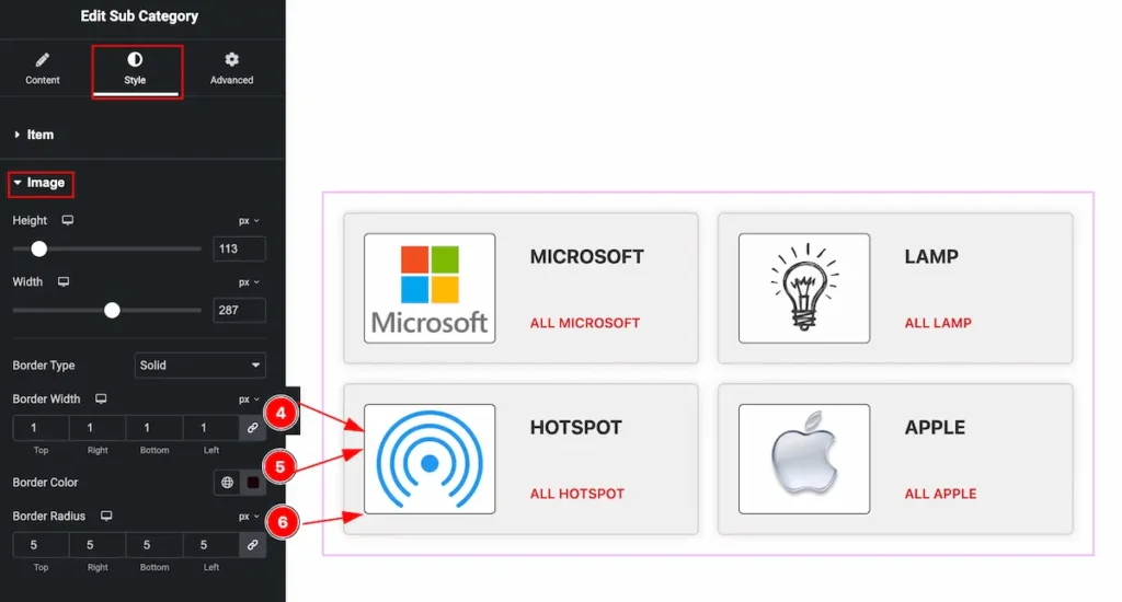
- Border Width: Set the width for the border.
- Border Color: Choose the border color from there.
- Border Radius: Make the border corner edges rounded by selecting the radius.
Title Section
Go to Style > Title
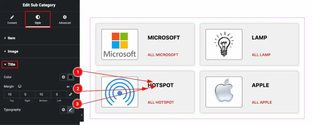
- Color: Choose color for the Title.
- Margin: Make spacing by setting the margin.
- Typography: Select typography for the title. Available typography options are Font Family, Size, Weight, Transform, Style, Line Height, Word Spacing etc.
Sub Category Section
Go to Style > Sub Category
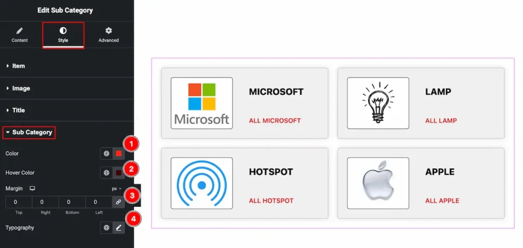
- Color: Choose the color for the sub category.
- Hover Color: Set the hover color. The changes will appear on mouse hover.
- Margin: Set outer space by selecting the margin.
- Typography: Select typography for the Sub Category. Available typography options are Font Family, Size, Weight, Transform, Style, Line Height, Word Spacing etc.
Read More Section
Go to Style > Read More
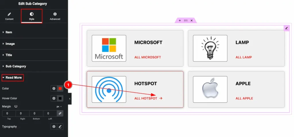
- Color: Choose the color for the Read More Button. The button appear on mouse hover over the item.
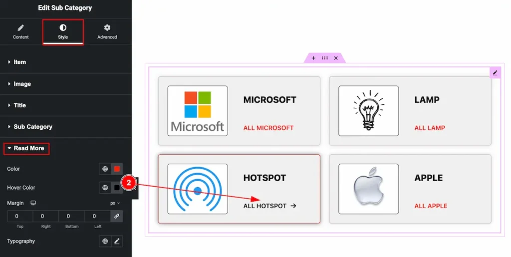
- Hover Color: Set the hover color for the read more item. Hover over it and set the color.
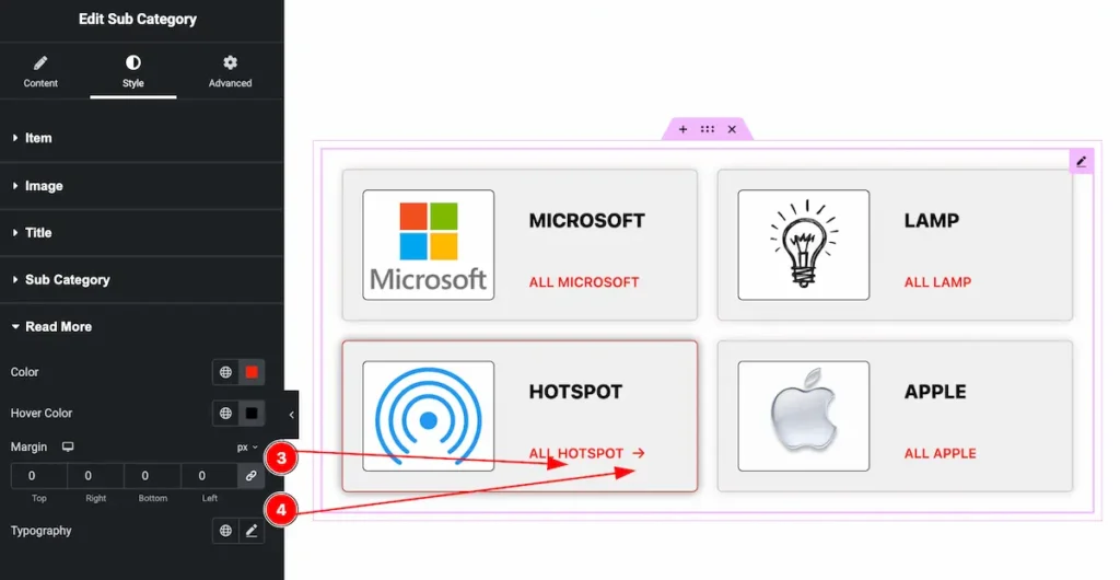
- Margin: Set the margin for the read more item.
- Typography: Select the typography of the read more button.
Video Assist
Watch the Tutorial to learn more.
Please visit the demo page for examples.
Thanks for being with us.