In this documentation, we will discuss the customization of the Table of Content block, brought to you by Zoloblocks.
Activate Table of Content Block
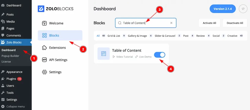
On WordPress Dashboard Navigate to ZoloBlocks from the sidebar menu.
- Select the Dashboard option under ZoloBlocks.
- Go to the Blocks tab.
- Use the search bar to search for “Table of Content ”
- Click Enable to activate the Table of Content block.
Adding a block to the editor
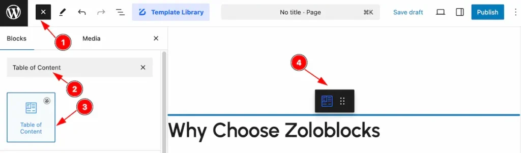
- Click the Toggle Block Inserter icon and a sidebar will appear on the left side, All the blocks will be visible here.
- Search by the Table of Content block name.
- Then select the appear blocks ( with zoloblocks logo T.R corner).
- After Drag and Drop it on the page.
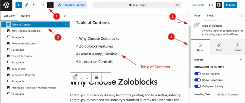
After Inserting the blocks, Follow this.
- Click on the Document Overviewer button and the Blocks list view will appear.
- Here the Selected block, the parent block, and its child block will appear.
- After on the right side, Click on the Block. Then the Table of Content box details appear.
- Here show all the control tabs( Basic, Style, Extra ) of a block.
Basic Tab
The Basic tab controller displayed here offers the flexibility to adjust the layout of blocks according to your preferences.
General Section
Go to Basic > General
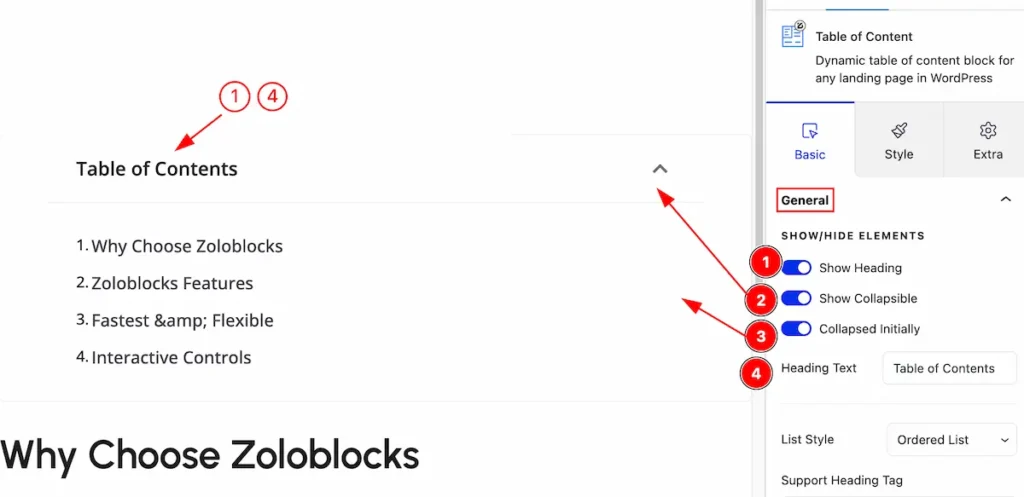
Set controls for the general section,
- Show Heading: Enable the switcher to show the heading.
- Show Collapsible: Enable the switcher to appear as collapsible.
- Collapsed Initially: Enable it to collapsed initially.
- Heading Text: Set the heading text.
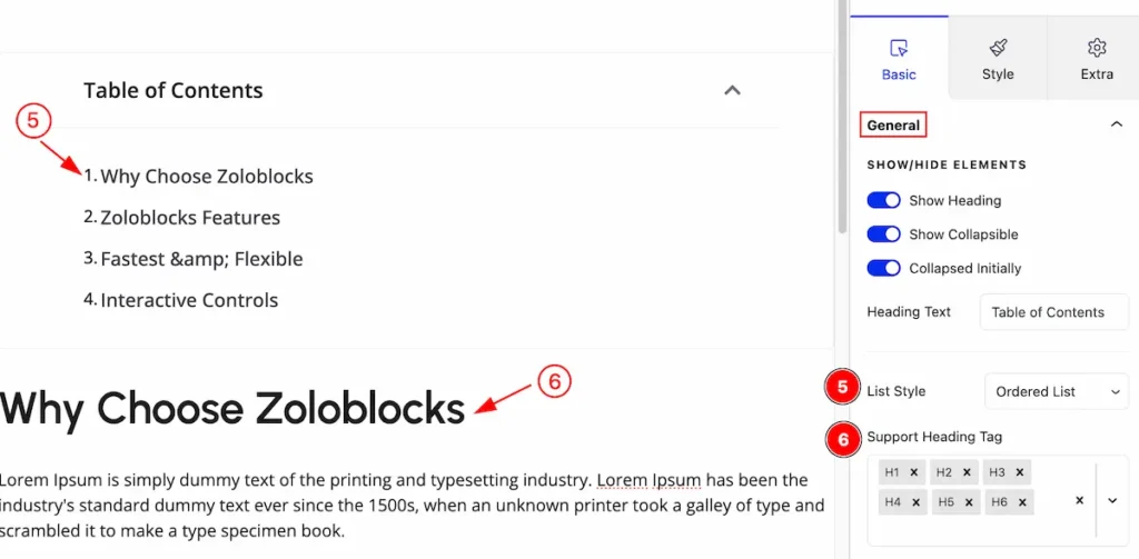
- List Style: Set the style for the list contents ( e.g.: Ordered List, Unordered List ).
- Support Heading Tag: Select the support heading for table of contents ( e.g.: H1, H2, H3 etc.).
Sticky Content
Go to Basic > Sticky Content
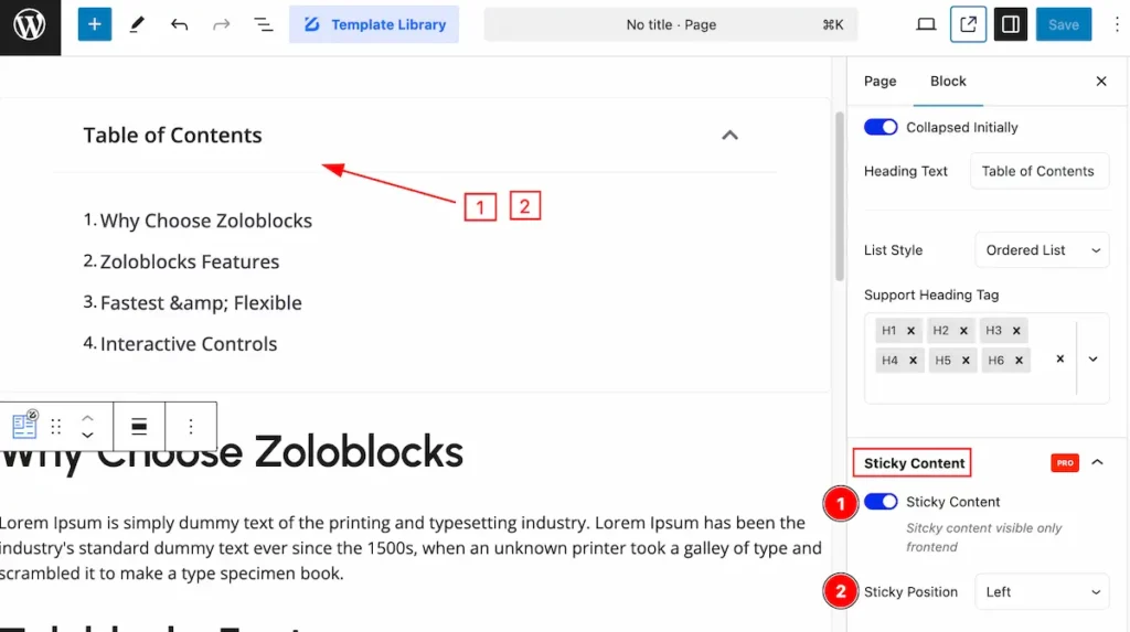
Make the table of content sticky by following the controls,
- Sticky Content: Enable the switcher for the sticky content.
- Section Position: Set the position for sticky ( e.g.: Left, Right ).
Style Tab
Provide the controller to make the visual appearance or presentation of the tabs. This includes aspects visually appealing and cohesive with the overall design of the interface.
Container Section
Go to Style > Container
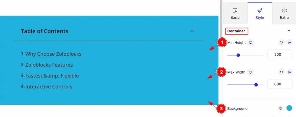
Make the container section interactive by following,
- Min Height: Set the min height.
- Max Width: Set the max width.
- Background: Set the background for the table of content.
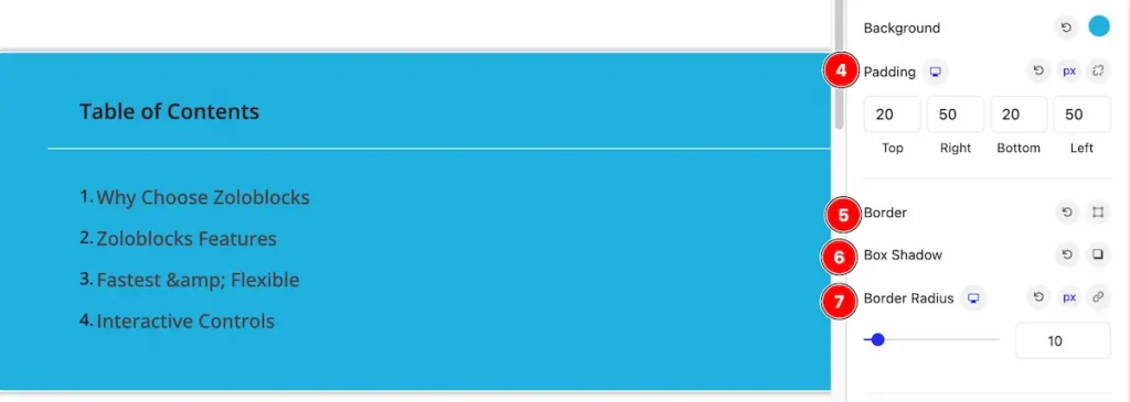
- Padding: Set the padding for the content area.
- Border: Set the border of it.
- Box Shadow: Make the box shadow.
- Border Radius: Make the border radius.
CONTENT
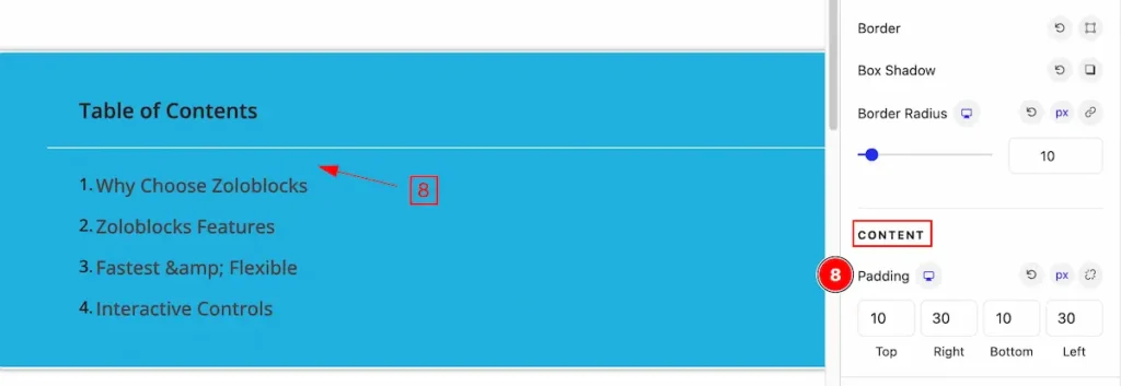
- Padding: Make the padding for the content.
Header Section
Go to Basic > Header
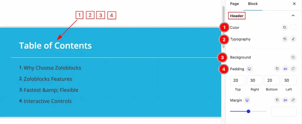
Make the header section by following,
- Color: Set the color for the header content.
- Typography: Set the typography of it.
- Background: Set the background color.
- Padding: Set the padding of it.
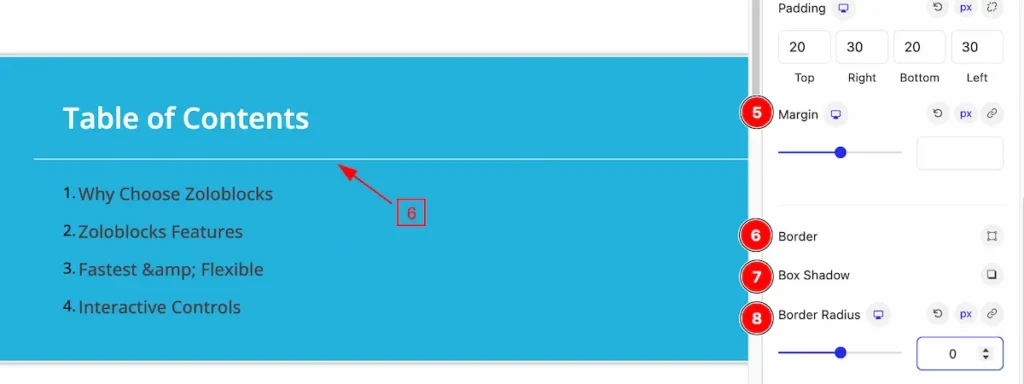
- Margin: Set the margin for the header section.
- Border: Set the border radius.
- Box Shadow: Make the box shadow of it.
- Border Radius: Make the border radius.
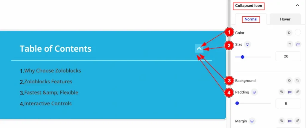
Collapsed Icon Section
Normal State
Make the collapsed item interactive by following,
- Color: Set the color for the collapsed icon.
- Size: Set the size of it.
- Background: Set the background of it.
- Padding: Set the padding.
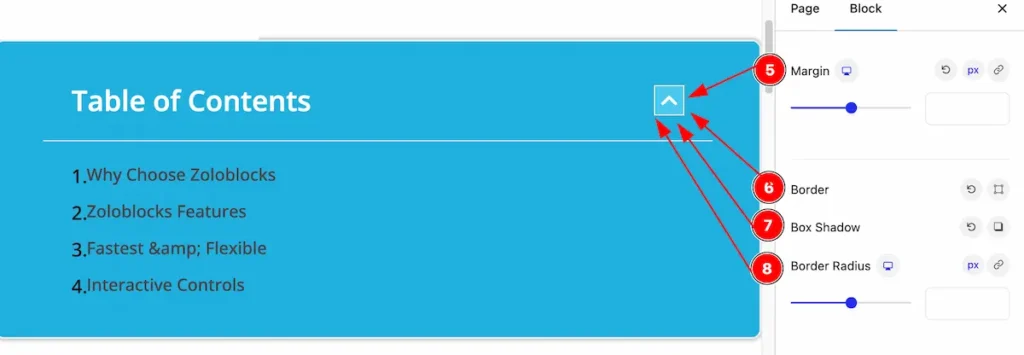
- Margin: Set the margin for the icon.
- Border: Make the border for the icon.
- Box Shadow: Make the box shadow.
- Border Radius: Make the border radius.
Hover State
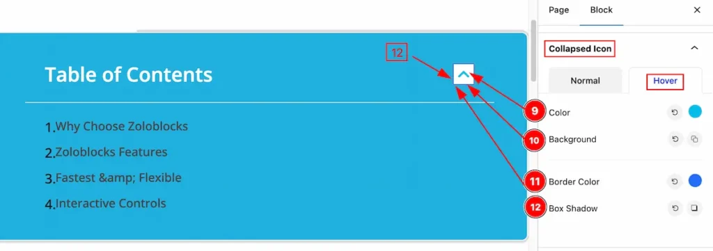
- Color: Set the color for the icon.
- Background: Set the background of it.
- Border Color: Set the border color.
- Box Shadow: Make the box shadow.
List Section
Go to Style > List
Normal State
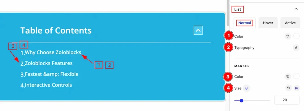
- Color: Set the color for the list.
- Typography: Set the typography of it.
MARKER
- Color: Set the color for the marker.
- Size: Set the size of it.
Hover State
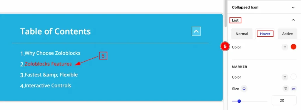
- Color: Set the color for the hover section.
Active State
- Color: Set the active color for the list items.
Extra Tab Control
The extra tabs provide the controls of any blocks. You can make different visual layouts by following these Controls.
Click to learn more>>.
Video Assist
Video Tutorial Coming Soon! Check the demo page.
Thanks for being with us!